Banja Lab / Benchmarks / Test
MKT-0001Marketing page · hard
Marketing landing page
The same task, run on 28 models. Compare the outputs side by side, or open any one in a popup to inspect it.
Top result: claude-fable-5 (high reasoning) at 87.5% composite. Lowest: claude-sonnet-4-6 at 8.3%. 28 models compared on this task.
How it ran
- Each model was given the brief below in a fresh, isolated session with no access to our tools, and returned a single self-contained index.html (inline CSS and JS, no external requests, no build step).
- The rendered output was scored 1 to 5 on brief fidelity, visual design, craft, and impact by a four-family vision panel - Anthropic (Claude Opus 4.8), OpenAI (GPT-5.5), Google (Gemini 3.1 Pro), and xAI (Grok 4.3) - using one identical prompt so the scores compare. The published judge score is leave-one-family-out: a model is never scored by a judge of its own family, so same-family self-preference is removed.
The brief
Build a complete single-page marketing landing page for a fictional B2B SaaS product called "Cohere" - a shared team inbox for customer support. Include: a sticky top nav with logo + links + a primary CTA; a hero (eyebrow, big headline, subhead, two CTAs, and a tasteful product mock or abstract visual built in HTML/CSS/SVG); a logo/trust strip; a 3-up feature section with icons; a "how it works" 3-step row; a metrics/stats band; a testimonial; a 3-tier pricing section with a highlighted plan; a final CTA band; and a footer with columns. Cohesive type scale, spacing, and one accent colour. Fully responsive.
claude-fable-5
High reasoning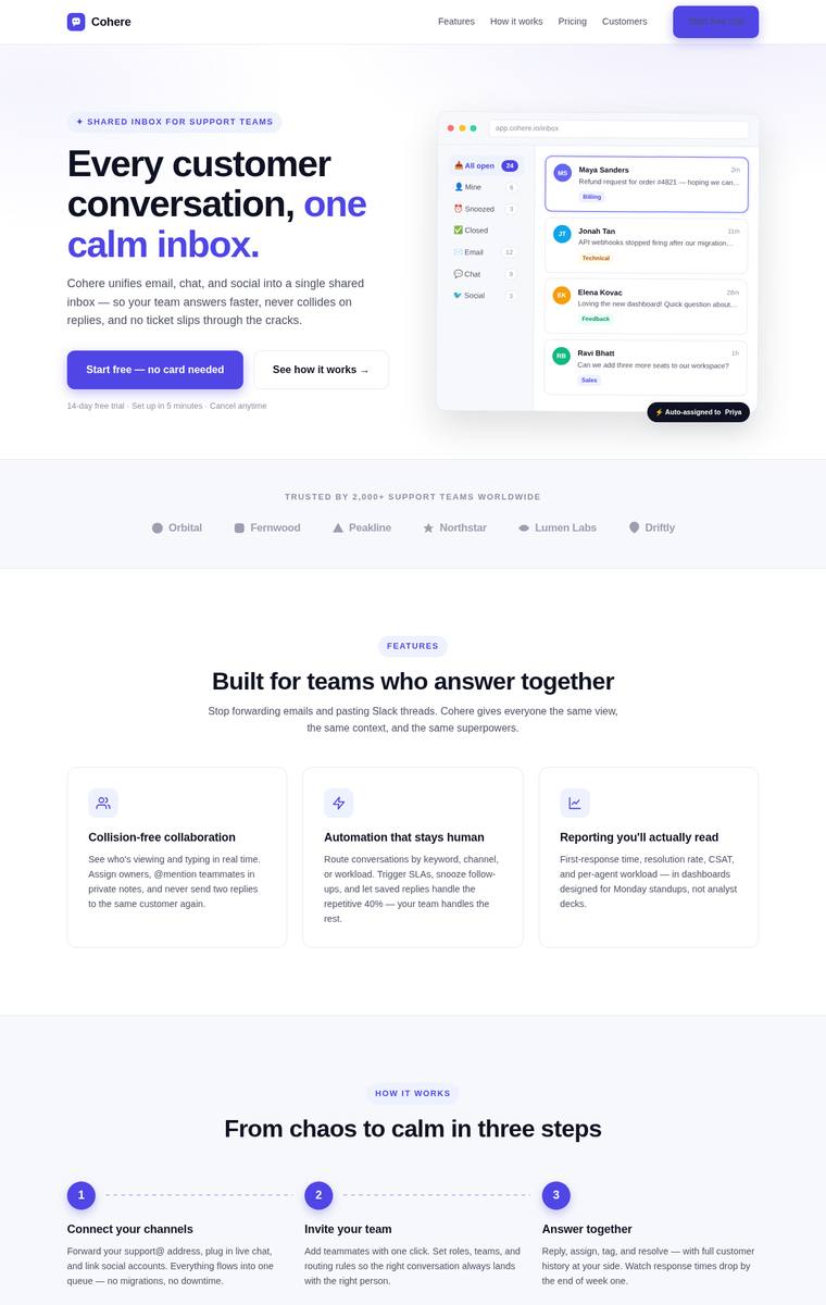
Composite 87.5%Judge 4.5/5
Judge panelAnthropic 4.3/5OpenAI 4.8/5Google 4.0/5
single-judge (Claude) 4.3/5 → leave-one-family-out 4.5/5
Anthropic: Every brief element is present and correct: sticky nav with logo/links/CTA, a hero with eyebrow, two-tone headline, subhead, two CTAs and a detailed HTML/CSS inbox mock, trust strip, 3-up icon features, a numbered how-it-works row, a dark stats band, a five-star testimonial, a 3-tier pricing block with a highlighted "Growth" plan, a gradient final CTA, and a multi-column footer. The violet accent, type scale, and spacing are coherent and modern, giving a polished, well-composed feel. It is executed to a high, consistent standard, though the aesthetic reads as a refined-but-familiar SaaS templa
OpenAI: The page visibly includes all requested sections: nav with CTA, full hero with mockup and CTAs, trust strip, features, how-it-works, stats, testimonial, pricing with highlighted plan, final CTA, and footer columns. The design is cohesive, polished, and consistent with strong spacing, typography, and a clear purple accent, with no visible broken or unfinished details. It feels premium and professional, though the overall SaaS aesthetic is familiar rather than highly distinctive.
Google: The design integrates all required brief elements seamlessly within a modern B2B SaaS aesthetic. Consistent typography, a unified accent color, and precise spacing ensure a highly professional appearance. The overall layout is polished, coherent, and visually effective.
claude-sonnet-5
High reasoning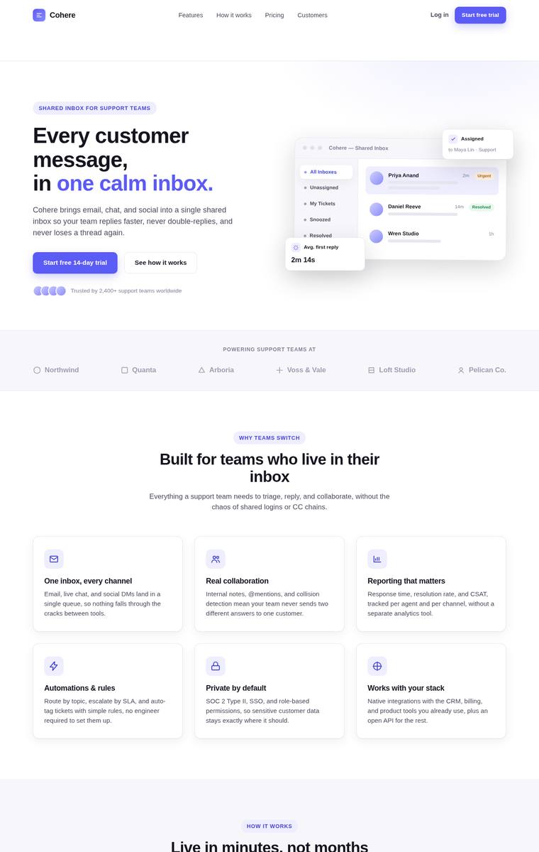
Composite 85.9%Judge 4.4/5
Judge panelAnthropic 4.5/5OpenAI 4.8/5Google 3.5/5
single-judge (Claude) 4.5/5 → leave-one-family-out 4.4/5
Anthropic: Every brief element is present and correct: sticky nav with logo/links/CTA, a hero with eyebrow, two-tone headline, subhead, two CTAs and a tasteful HTML/CSS inbox product mock, a logo trust strip, an icon feature grid, a numbered 3-step "how it works", a dark stats band, a five-star testimonial, a 3-tier pricing block with the Growth plan highlighted dark and badged "Most popular", a gradient final CTA, and a multi-column footer. The single violet accent, consistent type scale, generous spacing and finished card detailing make it cohesive and clearly above template-grade craft. It loses a poi
OpenAI: All requested landing-page sections are visible and well executed, including nav, hero with mockup, trust strip, features, workflow, stats, testimonial, pricing, CTA, and footer. The design is polished, cohesive, and carefully spaced with consistent purple accenting, though the overall SaaS aesthetic is premium but somewhat familiar rather than highly distinctive.
Google: The page includes all requested components with a clean, standard SaaS aesthetic. Typography and spacing are consistent, providing a professional look overall. It meets the requirements effectively but relies heavily on familiar design patterns.
claude-opus-4-8
Max reasoning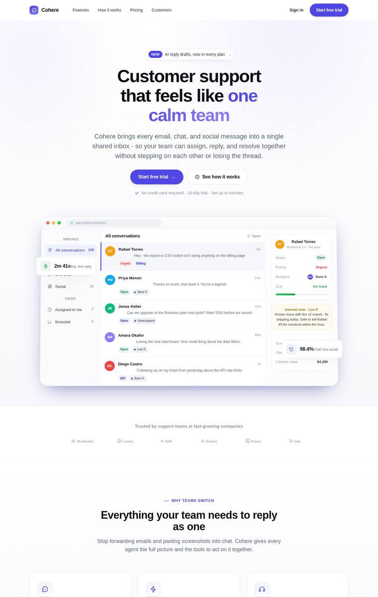
Composite 85.4%Judge 4.4/5
Judge panelAnthropic 4.8/5OpenAI 4.8/5Google 3.5/5
single-judge (Claude) 4.8/5 → leave-one-family-out 4.4/5
Anthropic: Every brief element is present and correct: sticky nav with logo/links/CTA, hero with eyebrow badge, two-tone headline, subhead, two CTAs and a detailed HTML/CSS inbox product mock, trust strip, 3-up icon feature cards, 3-step how-it-works row, gradient stats band, avatar testimonial, 3-tier pricing with the Growth plan highlighted, gradient final CTA, and a columned footer with status indicator. Design is cohesive and modern - consistent violet accent, clean type scale, generous spacing, and a convincing product mock with no visible broken or janky bits. It is a very strong, polished result;
OpenAI: All requested landing page sections are present and clearly executed, including the nav, hero with dual CTAs and product mock, trust strip, features, process steps, stats, testimonial, pricing, final CTA, and multi-column footer. The page has a cohesive modern SaaS aesthetic with strong spacing, consistent typography, polished cards, and a disciplined purple accent. It feels premium and complete, though the overall visual language is somewhat familiar rather than highly distinctive.
Google: The design fulfills all brief requirements with a consistent layout and clear sectioning. It applies a cohesive purple accent and neat typography for a clean finish. The overall result is a standard, effective SaaS appearance without standing out too drastically.
gpt-5.5
High reasoning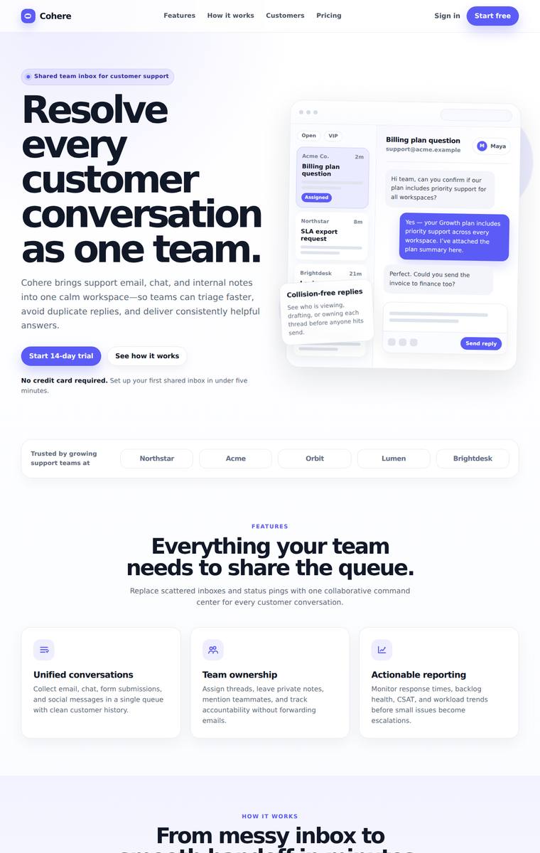
Composite 85.4%Judge 4.4/5
Judge panelAnthropic 4.8/5OpenAI 4.8/5Google 3.5/5
single-judge (Claude) 4.8/5 → leave-one-family-out 4.4/5
Anthropic: Every brief element is present and correct: sticky nav with logo/links/CTA, hero with eyebrow + big headline + subhead + two CTAs + a detailed HTML/CSS support-inbox product mock, trust strip, 3-up features, a labelled 3-step how-it-works row, a dark stats band, a testimonial, a 3-tier pricing block with the middle Pro plan highlighted, a final CTA band, and a multi-column footer. The design is cohesive and modern - one disciplined indigo accent, a consistent type scale, generous spacing, and well-judged alternating light/dark bands giving strong rhythm, with no broken or janky detail. It read
OpenAI: The screenshot includes all requested sections: nav with CTA, complete hero with mockup, trust strip, features, how-it-works, stats, testimonial, pricing with highlighted plan, final CTA, and multi-column footer. The design is cohesive and polished with strong typography, consistent spacing, a restrained purple accent, and no visible broken or unfinished details. It feels premium and professional, though the overall SaaS aesthetic is familiar rather than especially distinctive.
Google: The page successfully includes all requested sections with a consistent accent color and a solid typographic hierarchy. While the visual composition is clean and cohesive, the overall presentation remains standard for the B2B SaaS space.
gemini-3.1-pro-preview
High reasoning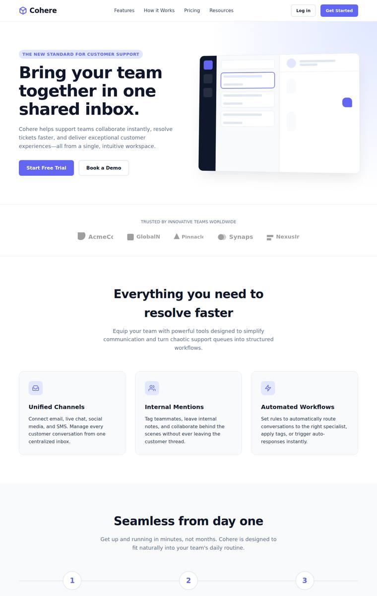
Composite 85.4%Judge 4.4/5
Judge panelAnthropic 4.0/5OpenAI 4.5/5Google 3.8/5
single-judge (Claude) 4.0/5 → leave-one-family-out 4.4/5
Anthropic: Every brief element is present and correct: sticky nav with logo/links/CTA, hero with eyebrow, headline, subhead, two CTAs and an HTML/CSS product mock, trust strip, 3-up feature grid, 3-step how-it-works, a stats band (45%/10k+/99.9%), a testimonial, 3-tier pricing with the middle plan highlighted, a final CTA band, and a multi-column footer, all on one consistent indigo accent. The composition is clean and modern with a coherent type scale and good section rhythm, though the visual language is fairly conventional SaaS-template and the hero mock and feature icons read a bit plain. Craft is so
OpenAI: The page includes all requested sections and content: sticky-style nav, complete hero with mockup, trust strip, features, steps, stats, testimonial, pricing, final CTA, and footer. The design is cohesive, polished, and modern with strong spacing and consistent accent color, though some trust-strip logos/text feel slightly clipped or less refined. Overall it presents as a high-quality SaaS landing page, if somewhat familiar rather than highly distinctive.
Google: The layout successfully includes all brief requirements with consistent spacing and clear typography. The execution is technically clean, though the visual direction feels standard for the industry.
gemini-3.5-flash
default reasoning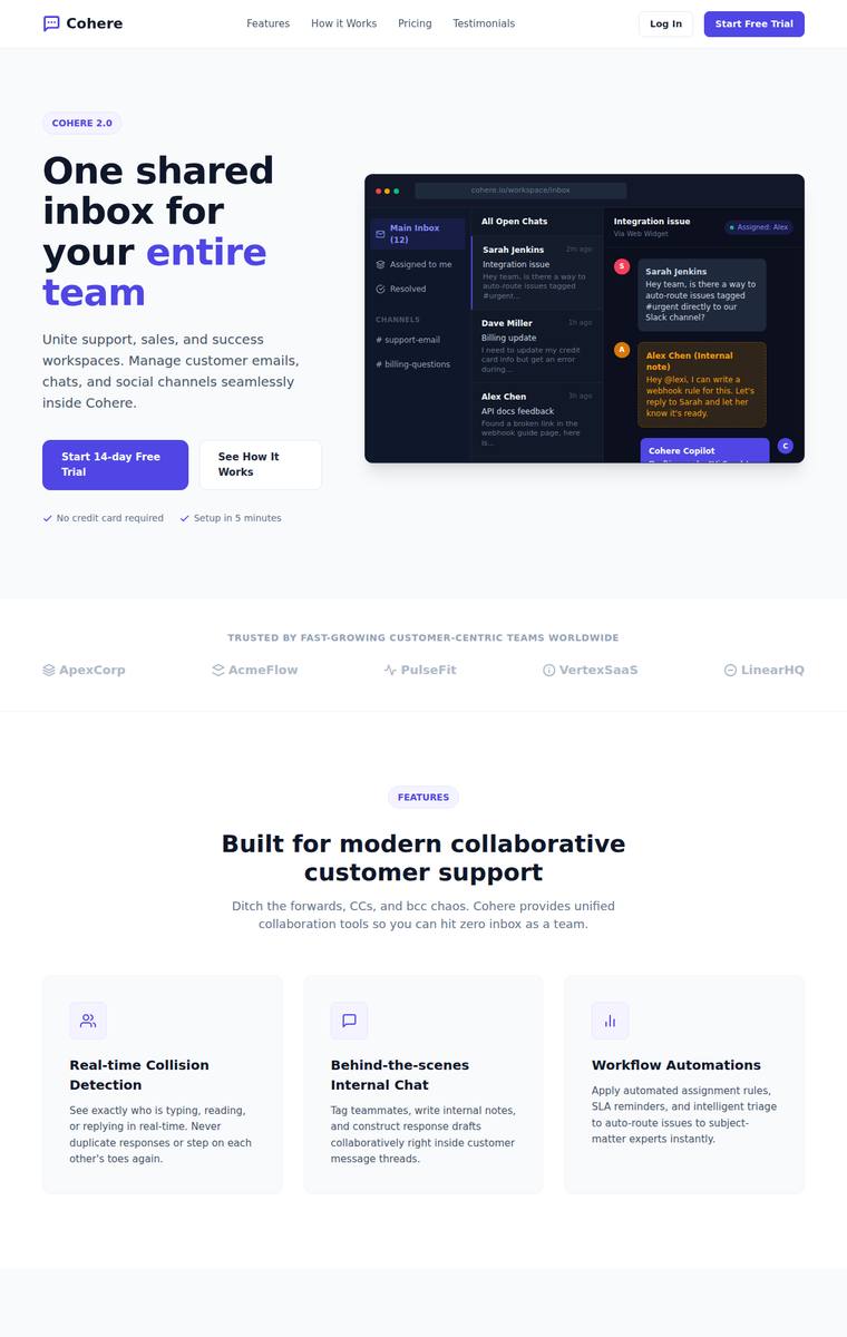
Composite 83.3%Judge 4.3/5
Judge panelAnthropic 3.8/5OpenAI 4.3/5Google 3.8/5
single-judge (Claude) 3.8/5 → leave-one-family-out 4.3/5
Anthropic: Every brief element is present and correctly ordered: sticky nav, hero with eyebrow/headline/subhead/two CTAs/dark product mock, trust strip, 3-up features, 3-step how-it-works, a metrics band, testimonial, 3-tier pricing with Growth highlighted, final CTA band, and multi-column footer. The single violet accent, type scale, and spacing are coherent and modern. Craft is dragged down by the pricing cards showing a bare "$" with no actual price numbers and a faint, unlabeled trust strip, so it lands as a clean but template-grade page rather than a distinctive one.
OpenAI: All requested landing-page sections are visible and correctly represented, including nav, hero with CTAs and mockup, trust strip, features, workflow, stats, testimonial, pricing, final CTA, and footer. The design is cohesive and modern with a consistent purple accent and strong hierarchy, though it is fairly conventional SaaS styling and has minor craft issues such as the slightly cramped/cropped hero mockup detail.
Google: The layout successfully incorporates all required brief elements within a clean, predictable structure. Consistent typography and a unified accent color contribute to a solid, though standard, B2B aesthetic.
claude-fable-5
High reasoning
Composite 82.8%Judge 4.3/5
Judge panelAnthropic 4.3/5OpenAI 4.8/5Google 3.5/5
single-judge (Claude) 4.3/5 → leave-one-family-out 4.3/5
Anthropic: Every brief element is present and correct: sticky nav with logo/links/CTA, hero with eyebrow, two-tone headline, subhead, two CTAs and a detailed HTML/CSS inbox mock, trust strip, 3-up icon features, numbered how-it-works row, a bold violet metrics band, a starred testimonial, three-tier pricing with the Growth plan highlighted, a dark final CTA band, and a multi-column footer. The design is cohesive and modern with a consistent indigo accent, clean type scale, and generous spacing, and the craft is finished with no broken or janky elements. It reads as a polished, professional SaaS page rath
OpenAI: All requested landing page sections are present and clearly executed: nav, hero with mockup, trust strip, features, steps, stats, testimonial, pricing, final CTA, and footer. The page is polished with cohesive typography, spacing, cards, icon treatment, and a consistent purple accent, though the overall SaaS aesthetic is somewhat familiar rather than highly distinctive.
Google: All brief requirements are present and executed using standard, professional SaaS patterns. The layout and cohesive purple accent color create a solid visual structure. Overall craft is clean, though the aesthetic lacks the aggressive distinctiveness needed to be highly memorable.
kimi-k2.7-code
default reasoning
Composite 81.3%Judge 4.3/5
Judge panelAnthropic 4.0/5OpenAI 4.5/5Google 3.8/5
single-judge (Claude) 4.0/5 → leave-one-family-out 4.3/5
Anthropic: Every brief element is present and correct: sticky nav with logo/links/CTA, hero with eyebrow, headline, subhead, two CTAs and a product mock, trust strip, 3-up icon features, a 3-step how-it-works row, a stats band, testimonial, 3-tier pricing with the Professional plan highlighted, a final CTA band, and a multi-column footer, all on one consistent blue accent. The composition is clean and modern with a coherent type scale and good spacing, and the alternating light/dark bands give it rhythm. It is competent and finished but reads as a conventional SaaS template rather than a distinctive, pre
OpenAI: The page visibly includes all requested sections: nav, hero with CTAs and product mock, trust strip, features, steps, stats, testimonial, pricing with highlighted plan, final CTA, and footer columns. The design is cohesive, polished, and consistent with strong spacing and a clear blue accent, though it follows a fairly familiar SaaS landing-page pattern rather than feeling highly distinctive.
Google: The layout successfully includes all requested sections and applies a cohesive accent color throughout. The visual design is highly professional and utilizes standard SaaS aesthetics with consistent spacing. While cleanly executed, the overall composition relies heavily on familiar conventions.
claude-sonnet-5
High reasoning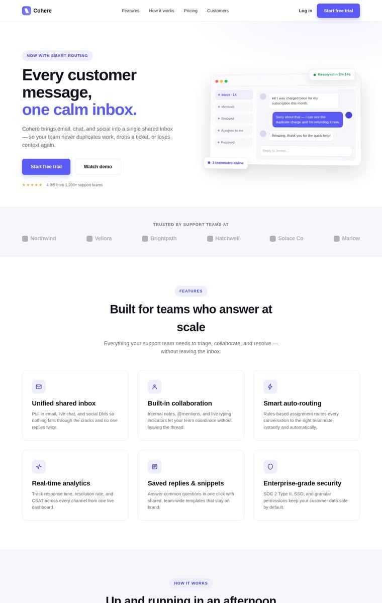
Composite 81.3%Judge 4.3/5
Judge panelAnthropic 4.0/5OpenAI 4.8/5Google 3.5/5
single-judge (Claude) 4.0/5 → leave-one-family-out 4.3/5
Anthropic: Every brief element is present and correct: sticky nav with logo/links/CTA, a full hero with eyebrow, two-tone headline, subhead, two CTAs and a tasteful HTML/CSS inbox mock, trust strip, 3-up icon features, a numbered 3-step how-it-works, a dark stats band, a testimonial with attribution, 3-tier pricing with the Growth plan highlighted and badged, a violet final CTA band, and a multi-column footer. The indigo accent, consistent type scale and card treatments read coherent and modern. Craft is mostly clean but undermined by large awkward vertical whitespace gaps around the stats band and testi
OpenAI: The page visibly includes all required landing-page sections: nav with CTA, hero with product mock, trust strip, feature cards with icons, 3-step workflow, stats, testimonial, pricing with highlighted plan, final CTA, and footer columns. The design is cohesive, polished, and well-spaced with a consistent purple accent and strong SaaS convention execution, though its overall concept is more refined than truly distinctive.
Google: The layout successfully includes all requested sections with a consistent structure and single accent color. While the execution is professional and well-spaced, the overall aesthetic feels standard rather than highly distinctive.
deepseek-v4-pro
default reasoning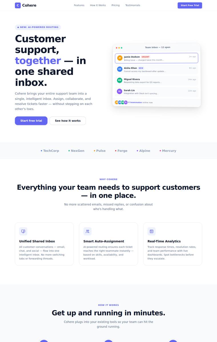
Composite 81.3%Judge 4.3/5
Judge panelAnthropic 4.3/5OpenAI 4.8/5Google 3.3/5
single-judge (Claude) 4.3/5 → leave-one-family-out 4.3/5
Anthropic: Every brief element is present and correct: sticky nav with logo/links/CTA, a hero with eyebrow, headline, subhead, two CTAs and an HTML/CSS inbox mock, a trust strip, a 3-up icon feature section, a numbered 3-step "how it works" row, a dark stats band, a testimonial, 3-tier pricing with a highlighted Pro plan, a final CTA band, and a multi-column footer. The indigo accent is applied consistently with a coherent type scale and generous spacing, and the dark stats and footer bands give good rhythm. It loses a little on impact and craft because the visual is fairly conventional/template-like, th
OpenAI: All requested landing page elements are present and clearly executed, including the nav, hero mockup, trust strip, features, process, stats, testimonial, pricing, CTA band, and footer. The design is cohesive, polished, and consistently spaced with a strong SaaS visual language, though it feels a bit familiar rather than highly distinctive.
Google: The layout successfully integrates all requested sections with a clean B2B aesthetic. Spacing and typography are consistently applied throughout the page. The design presents a recognizable and solid industry standard.
claude-opus-4-8
High reasoning
Composite 79.2%Judge 4.2/5
Judge panelAnthropic 4.3/5OpenAI 4.3/5Google 3.3/5
single-judge (Claude) 4.3/5 → leave-one-family-out 4.2/5
Anthropic: Every brief element is present and correct: sticky nav with logo/links/CTA, hero with eyebrow, headline, subhead, two CTAs, and a convincing shared-inbox product mock; trust strip, 3-up icon features, numbered how-it-works row, dark stats band, testimonial, 3-tier pricing with a highlighted "Growth" plan, gradient final CTA, and a columned footer. The indigo accent is applied consistently and the type scale, spacing, and dark/light section rhythm read as a coherent, modern SaaS page. Minor knocks: the hero mock UI is slightly busy/small and the design plays it safe rather than feeling truly di
OpenAI: The page visibly includes all required landing-page sections, including nav, hero with CTAs and mockup, trust strip, features, steps, stats, testimonial, pricing, final CTA, and footer. The design is polished, cohesive, and well-spaced with a consistent purple accent, though it feels fairly conventional and a few small details in the product mock/pricing typography look slightly cramped.
Google: The layout successfully includes all requested brief elements with a clean, standard structure. Visuals and spacing are consistent but lack a highly distinctive edge. Execution remains generally solid overall.
claude-sonnet-4-6
High reasoning
Composite 79.2%Judge 4.2/5
Judge panelAnthropic 4.0/5OpenAI 4.8/5Google 3.3/5
single-judge (Claude) 4.0/5 → leave-one-family-out 4.2/5
Anthropic: Every brief element is present and correct: sticky nav with logo/links/CTA, a hero with eyebrow, headline, subhead, two CTAs and a credible HTML/CSS inbox mock, trust strip, feature grid with icons, a 3-step how-it-works row, a stats band (62% / 3.4x / 18k+ / 99.9%), testimonial, 3-tier pricing with a highlighted middle plan, final CTA band, and a multi-column footer, all on one consistent blue accent with a clean type scale and even spacing. Craft is tidy with no broken bits, though the feature section uses six items rather than the requested 3-up and a couple of stats sit on a slightly low-c
OpenAI: All major requested sections are present and well executed: nav, hero with CTAs and product mock, trust strip, feature grid, how-it-works row, stats, testimonial, pricing, final CTA, and footer. The page has a cohesive modern SaaS aesthetic with strong spacing, typography, consistent blue accent, and polished UI details. It feels premium and complete, though the overall style is familiar rather than highly distinctive.
Google: The layout successfully includes all required sections with a consistent blue accent. Execution is solid, though the overall aesthetic feels standard rather than highly distinctive.
deepseek-v4-flash
default reasoning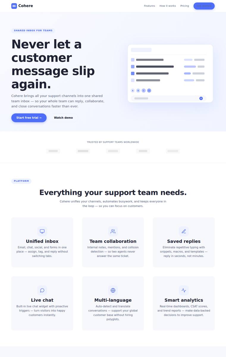
Composite 78.1%Judge 4.1/5
Judge panelAnthropic 4.0/5OpenAI 4.3/5Google 3.5/5
single-judge (Claude) 4.0/5 → leave-one-family-out 4.1/5
Anthropic: Every brief element is present and correct: sticky nav with logo/links/CTA, hero with eyebrow, headline, subhead, two CTAs and a product mock, trust strip, icon feature grid, numbered how-it-works row, dark stats band, testimonial, 3-tier pricing with the middle plan highlighted, a gradient final CTA, and a multi-column footer. Visual design is coherent and modern with a consistent indigo accent, clean type scale and good spacing, and the dark stats band plus gradient CTA provide tasteful contrast. Craft is clean with aligned grids and no broken bits, but the hero visual is a generic skeleton/
OpenAI: The page includes all requested sections: nav with CTA, complete hero with mockup, trust strip, feature grid, 3-step workflow, stats, testimonial, pricing with highlighted plan, final CTA, and footer columns. The design is cohesive, modern, and well-spaced with a consistent blue accent, though it feels fairly template-like and the trust logos are only generic placeholders. Overall craft is strong with no obvious broken elements, but the result is polished rather than especially distinctive.
Google: The layout successfully incorporates all required brief elements in a structured manner. It maintains a clean SaaS aesthetic with consistent spacing and typography. The overall execution is solid, though visually standard.
gpt-5.5-pro
High reasoning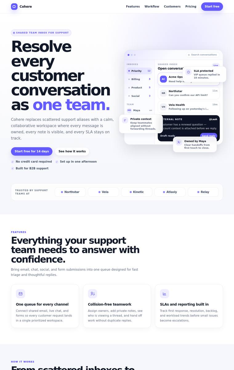
Composite 77.1%Judge 4.1/5
Judge panelAnthropic 4.3/5OpenAI 4.5/5Google 3.0/5
single-judge (Claude) 4.3/5 → leave-one-family-out 4.1/5
Anthropic: Every brief element is present and correct: sticky nav with logo/links/CTA, hero with eyebrow, big headline, subhead, two CTAs and an HTML product mock, trust strip, 3-up icon features, a numbered 3-step how-it-works row, a dark stats band (42%/31h/98%/4.8), a testimonial, 3-tier pricing with the Team plan highlighted, a final CTA band, and a multi-column footer. Type scale, spacing and the single violet accent are consistent and modern, giving a cohesive, well-composed page. It is clean and professional but lands as a competent, somewhat conventional SaaS template; the trust-strip logos and s
OpenAI: The page visibly includes every requested section: nav, hero with mockup and CTAs, trust strip, features, workflow, stats, testimonial, pricing, final CTA, and footer. The visual system is cohesive and polished with strong typography, spacing, and a consistent purple accent, though it follows familiar SaaS landing-page conventions and has a minor craft issue around the testimonial avatar/byline alignment.
Google: The layout successfully incorporates all requested sections with a cohesive aesthetic and consistent accent color. Spacing and typography are well-structured across the page. It effectively serves as a professional, high-level SaaS landing page.
gpt-5.4-mini
High reasoning
Composite 75.0%Judge 4.0/5
Judge panelAnthropic 4.0/5OpenAI 4.8/5Google 3.3/5
single-judge (Claude) 4.0/5 → leave-one-family-out 4.0/5
Anthropic: Every brief element is present and correct: sticky nav with logo/links/CTA, hero with eyebrow, big headline, subhead, two CTAs and a product mock, trust strip, 3-up icon features, a 3-step how-it-works, a dark stats band (42%/28%/4.9/18hrs), a testimonial, 3-tier pricing with a highlighted middle plan, a final CTA band, and a multi-column footer. The single violet accent, consistent type scale, and alternating white/dark bands give it a coherent, modern, well-spaced feel with clean craft and no obvious broken sections. It reads as a polished, professional SaaS page but stays in familiar templa
OpenAI: The page includes all requested sections and content: nav with logo/links/CTA, complete hero with mockup, trust strip, features, how-it-works, metrics, testimonial, three-tier pricing with a highlighted plan, final CTA, and columned footer. The design is polished, cohesive, and consistent with strong typography, spacing, cards, and a clear accent color; it feels premium, though the overall SaaS aesthetic is somewhat familiar rather than highly distinctive.
Google: All required sections are present with a consistent accent color and clean layout. Typography and spacing are standard for SaaS, ensuring solid execution. Overall impact is adequate without major visual errors.
grok-composer-2.5-fast
default reasoning
Composite 75.0%Judge 4.0/5
Judge panelAnthropic 4.0/5OpenAI 4.5/5Google 3.5/5
single-judge (Claude) 4.0/5 → leave-one-family-out 4.0/5
Anthropic: Every brief element is present and correct: sticky nav with logo/links/CTA, hero with eyebrow, headline, subhead, two CTAs and an inbox product mock, trust strip, 3-up icon features, 3-step how-it-works, a dark stats band (47%/2.1x/98%), testimonial, 3-tier pricing with a highlighted Growth plan, a gradient final CTA, and a multi-column footer. The execution is clean and coherent with a consistent violet accent, sensible type scale and spacing, and a believable inbox mock with no broken bits. It is well-finished but conventional and template-like, so it reads as competent SaaS rather than dist
OpenAI: All required landing-page sections are visible and correctly represented, including nav, hero with mockup, trust strip, features, steps, stats, testimonial, pricing, CTA, and footer. The design is polished, consistent, and well-spaced with a cohesive purple accent, though the overall aesthetic is fairly familiar SaaS-template territory rather than highly distinctive.
Google: The landing page includes all requested sections with a consistent aesthetic. The layout and typography are cohesive, though the overall presentation remains fairly conventional.
claude-haiku-4-5
default reasoning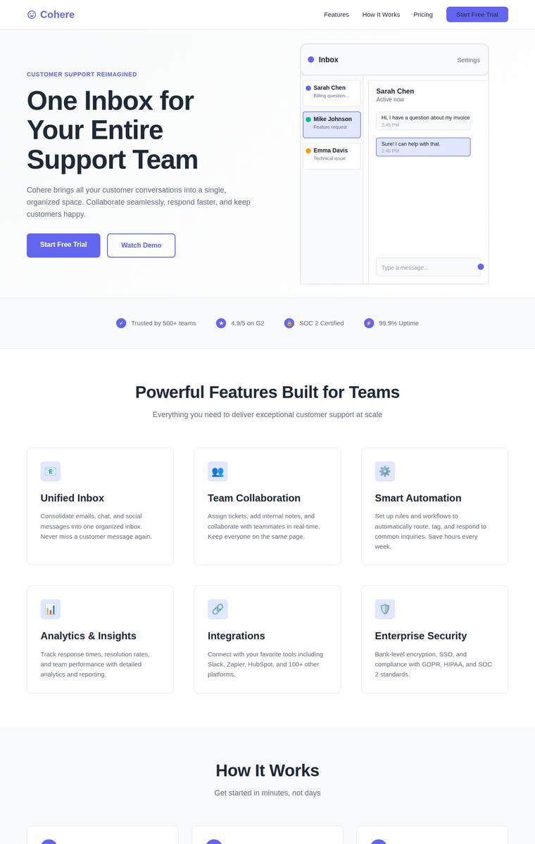
Composite 75.0%Judge 4.0/5
Judge panelAnthropic 4.0/5OpenAI 4.0/5Google 3.3/5
single-judge (Claude) 4.0/5 → leave-one-family-out 4.0/5
Anthropic: Every brief element is present and correct: sticky nav with logo/links/CTA, hero with eyebrow pills, headline, subhead, two CTAs and an HTML/CSS inbox product mock, a logo trust strip, an icon feature grid, a 3-step how-it-works row, a stats band (45%/3x/92%/$50K), a testimonial, 3-tier pricing with the Professional plan highlighted, a final CTA band, and a multi-column footer, all on one consistent purple accent. Type scale, spacing and colour are coherent and modern with no obvious broken or janky sections. It reads as a solid, well-built but template-like landing page; the small cramped her
OpenAI: All requested landing-page sections are visible and in the correct overall order, including nav, hero with CTAs and mockup, trust strip, features, how-it-works, stats, testimonial, pricing, final CTA, and footer. The design is clean, cohesive, and well-spaced with a consistent purple accent, though the visual language is fairly generic and the mockup/icons feel somewhat simple rather than premium or distinctive.
Google: The design fulfills the brief's requirements using a clean, familiar layout and consistent accent coloring. However, a rendering artifact in the bottom CTA band slightly reduces the overall polish. While functional and cohesive, the visual approach is standard and lacks unique impact.
claude-opus-4-8
Low reasoning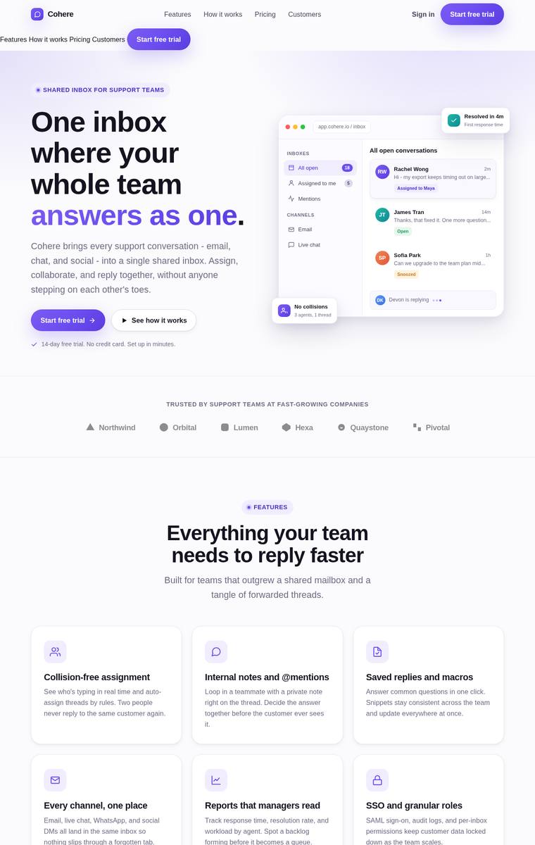
Composite 70.8%Judge 3.8/5
Judge panelAnthropic 4.3/5OpenAI 4.0/5Google 2.8/5
single-judge (Claude) 4.3/5 → leave-one-family-out 3.8/5
Anthropic: Every brief element is present and correct: sticky nav with logo/links/CTA, hero with eyebrow + headline + subhead + two CTAs + an HTML/CSS inbox mock, trust strip, feature grid with icons, 3-step how-it-works, dark stats band, testimonial, 3-tier pricing with a highlighted middle plan, final CTA band, and a multi-column footer. Visual design is coherent and modern with a consistent violet accent, clean type scale, and good spacing rhythm; the dark stats/CTA bands give nice contrast. It is well-finished and premium-feeling but lands as a competent, somewhat conventional SaaS template rather th
OpenAI: The page includes all requested sections and content: sticky-style nav, complete hero with mockup, trust strip, features, how-it-works steps, stats, testimonial, pricing, final CTA, and footer. The visual system is cohesive and modern with strong spacing, typography, and a consistent purple accent, but the duplicated navigation row at the top is a clear janky craft issue that hurts polish and premium impact.
Google: The build includes all required sections with a cohesive aesthetic and solid layout. An unstyled text glitch near the navigation detracts from the finish, though it functions adequately overall.
grok-build-0.1
default reasoning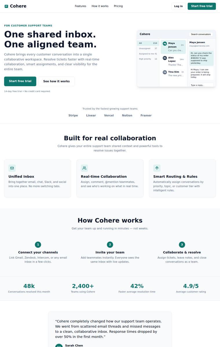
Composite 68.8%Judge 3.8/5
Judge panelAnthropic 4.0/5OpenAI 4.0/5Google 3.3/5
single-judge (Claude) 4.0/5 → leave-one-family-out 3.8/5
Anthropic: Every brief element is present and correct: sticky nav with logo/links/CTA, hero with eyebrow, dual headline, subhead, two CTAs and an HTML inbox mock, trust strip, 3-up icon features, 3-step how-it-works, a stats band, a testimonial, 3-tier pricing with a highlighted Professional plan (badge + accent border), final CTA band, and a multi-column footer. The teal accent, type scale, and spacing are consistent and modern, and details like the "Most popular" badge and avatar in the testimonial are well finished. It reads slightly template-like and the product mock is small and low-contrast, so it
OpenAI: The page includes all required sections: sticky-style nav, hero with CTAs and product mock, trust strip, features, how-it-works, stats, testimonial, pricing, final CTA, and footer. The design is cohesive, clean, and well-spaced with a consistent teal accent, though it feels fairly standard for a SaaS landing page and lacks a more distinctive premium visual moment. Craft is strong overall, with only minor generic/janky touches such as the plain logo treatment and slightly heavy bordered pricing CTA.
Google: The layout successfully incorporates all requested elements using a clean, standard structure. Typography and spacing are solid, though the overall visual approach is highly conventional for the industry. Execution remains competent without any noticeable flaws.
claude-haiku-4-5
High reasoning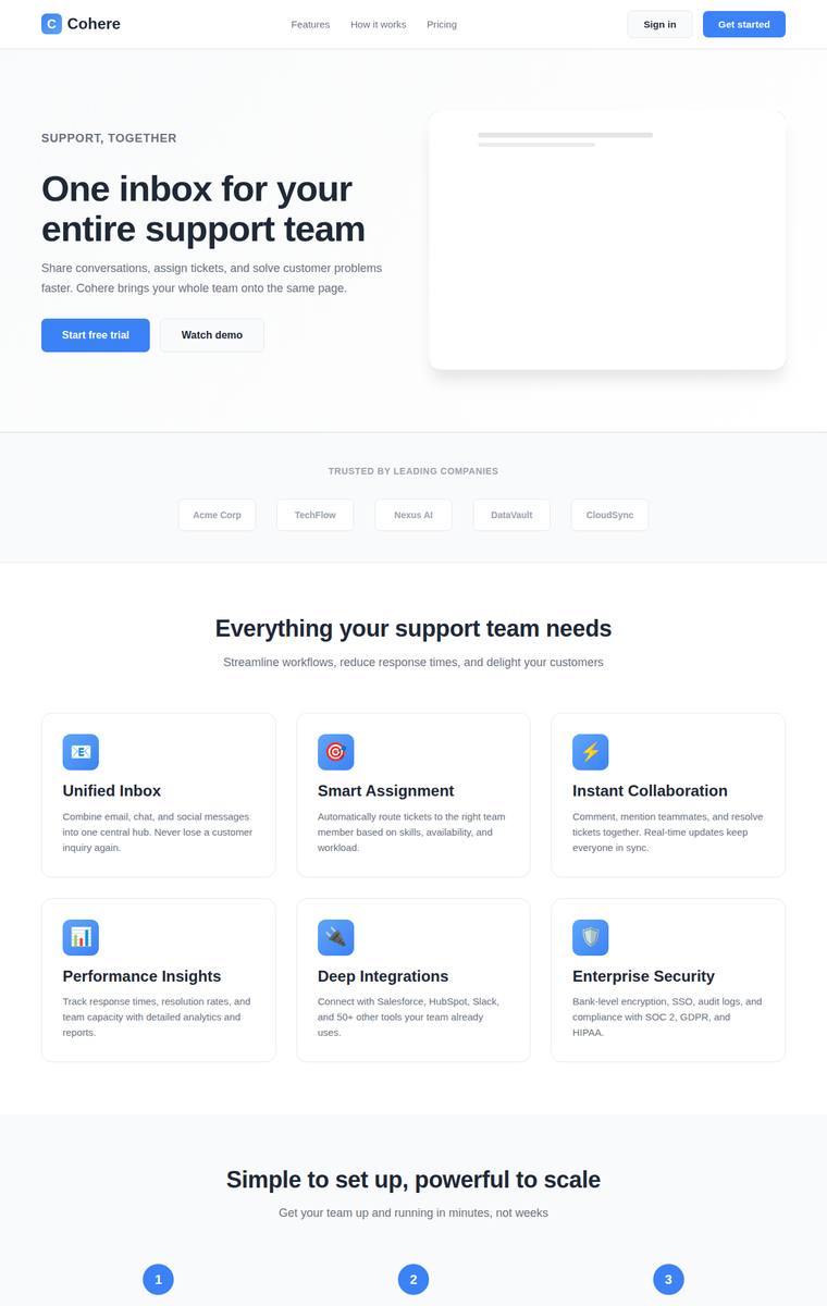
Composite 68.8%Judge 3.8/5
Judge panelAnthropic 3.3/5OpenAI 3.5/5Google 3.3/5
single-judge (Claude) 3.3/5 → leave-one-family-out 3.8/5
Anthropic: Every required section is present and in sensible order: sticky nav with CTA, hero with eyebrow/headline/subhead/two CTAs, trust strip, feature grid with icons, numbered 3-step how-it-works, a blue stats band, testimonial, 3-tier pricing with a highlighted Professional plan, final CTA band, and a multi-column footer, all on one coherent blue accent. However the hero "product mock" is just an empty white card with a couple of faint placeholder lines rather than a real visual, which reads as unfinished and flattens the most prominent area of the page. The result is competent and consistent but g
OpenAI: The page includes nearly all requested sections: nav, hero with CTAs, trust strip, feature grid, how-it-works steps, stats, testimonial, pricing, final CTA, and footer. The design is clean and cohesive with consistent spacing and a clear blue accent, but the hero mockup is very underdeveloped and the emoji-style icons/footer details make the execution feel somewhat generic rather than premium.
Google: The layout successfully includes all requested components with a clean SaaS aesthetic and consistent accent color. However, the hero graphic is overly simplistic and the overall design lacks the distinctiveness required for high impact.
grok-4.20-reasoning
default reasoning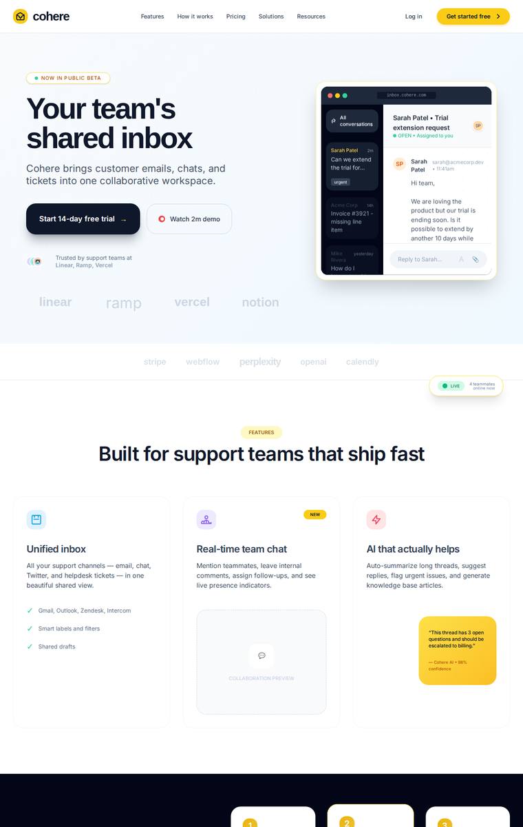
Composite 68.8%Judge 3.8/5
Judge panelAnthropic 3.5/5OpenAI 4.3/5Google 3.5/5
single-judge (Claude) 3.5/5 → leave-one-family-out 3.8/5
Anthropic: Nearly every brief element is present and in a sensible order: sticky nav, hero with eyebrow/headline/subhead/two CTAs/product mock, features, a dark how-it-works row, a stats band (2.4x/94%/18k/4.98), testimonial, 3-tier pricing with the $99 plan highlighted, gradient final CTA, and a footer with columns. The amber accent, type scale, and spacing are coherent and modern, but several sections feel under-built - the trust strip is just faint greyed placeholder text, the feature cards and how-it-works cards have empty/skeletal bodies, and the testimonial is sparse - which holds back craft and im
OpenAI: The page includes all requested landing-page sections with appropriate content: nav, hero with CTAs and mockup, trust strip, features, steps, stats, testimonial, pricing, final CTA, and footer. The design is polished and modern with strong hierarchy, though the use of several accent colors, very faint logo strip text, and a few slightly awkward footer/details keep it from feeling fully premium or flawless.
Google: The build successfully incorporates all required brief elements into a professional layout. Typography and spacing are well-structured, offering a clean SaaS aesthetic. The overall result is polished and visually cohesive.
gemini-3.1-flash-lite
default reasoning
Composite 41.7%Judge 2.7/5
Judge panelAnthropic 2.3/5OpenAI 2.5/5Google 2.3/5
single-judge (Claude) 2.3/5 → leave-one-family-out 2.7/5
Anthropic: The page covers only part of the brief: nav, hero, 3-up features, 3-tier pricing with a highlighted Pro plan, and a footer are present, but the logo/trust strip, "how it works" 3-step row, metrics/stats band, testimonial, and final CTA band are all missing. Craft is weak - the hero "product mock" is an empty box with two grey skeleton bars and a stray floating circle, the feature cards have no icons, the nav "Get Started" button is washed out/low-contrast, and pricing cards lack feature lists or buttons. The indigo accent and type are consistent, but large empty gaps and unfinished placeholder
OpenAI: The page includes a nav, hero with CTAs and mockup, three feature cards, pricing, and a footer, but it omits several required sections: trust strip, how-it-works row, stats band, testimonial, final CTA band, and feature icons. The design is clean and coherent with a consistent purple accent, but it feels sparse and generic, with excessive whitespace and a very minimal placeholder-like product visual.
Google: The layout is clean but omits several requested sections like testimonials, metrics, and the trust strip. The visual approach resembles a basic wireframe, limiting its overall premium feel.
claude-opus-4-8
Medium reasoning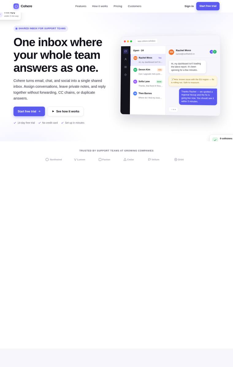
Composite 37.5%Judge 2.5/5
Judge panelAnthropic 2.3/5OpenAI 2.3/5Google 2.8/5
single-judge (Claude) 2.3/5 → leave-one-family-out 2.5/5
Anthropic: Only the nav, hero (with a genuinely polished inbox product mock and tasteful violet accent), trust strip, and footer render; the entire middle of the page - features, how-it-works, stats, testimonial, and the 3-tier pricing section - is missing, leaving large empty bands. Orphaned fragments (a stray "First reply" card top-left and a floating "0 collisions" chip) confirm components failed to render or position. The pieces that did appear are well-composed and modern, but more than half the briefed sections are simply absent, so fidelity and craft suffer badly.
OpenAI: The nav, hero, trust strip, and footer are visible and the hero/product mockup are polished, but most required sections—features, how it works, metrics, testimonial, pricing, and final CTA—are absent or rendered as huge blank bands. The design language is modern and cohesive where content exists, yet the massive empty spaces plus cropped/floating UI artifacts make the page feel unfinished and significantly reduce impact.
Google: The hero and footer display a modern aesthetic with solid typography and nice mockups. However, core brief requirements like features, pricing, and testimonials are entirely missing, leaving massive blank spaces. This incompleteness severely limits the overall effectiveness.
claude-opus-4-8
High reasoning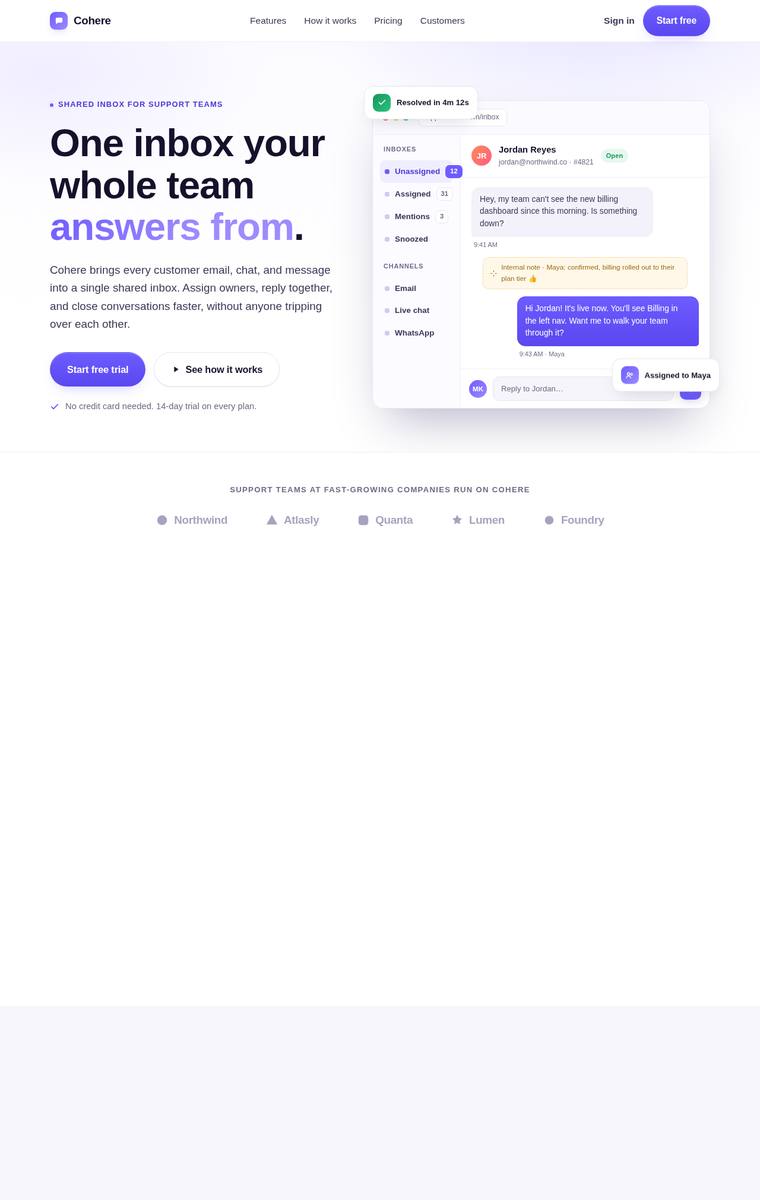
Composite 35.4%Judge 2.4/5
Judge panelAnthropic 1.8/5OpenAI 2.0/5Google 2.3/5
single-judge (Claude) 1.8/5 → leave-one-family-out 2.4/5
Anthropic: Only the nav, hero (with a decent inbox product mock), and a footer rendered; the trust strip shows greyed placeholder logos, and the entire middle of the page is blank white/grey bands where the 3-up features, how-it-works, stats, testimonial, 3-tier pricing, and final CTA should be - most required sections are missing or failed to render. The hero and footer that do appear are clean and on-brand with a violet accent, but the vast empty regions read as broken and unfinished. The headline also cuts off mid-sentence ("answers from."), reinforcing the impression of a half-built, janky result.
OpenAI: The nav, hero with CTAs and mockup, trust strip, and footer are visible and well styled, but most required sections are absent or render as large blank bands: features, how-it-works, metrics, testimonial, pricing, and final CTA are not visible. The hero itself has polished SaaS styling, but the page as a whole feels unfinished due to massive empty vertical space and missing content.
Google: The layout features a strong hero and footer but fails to include most of the required sections. Large empty spaces severely detract from the overall execution.
glm-5.2
default reasoning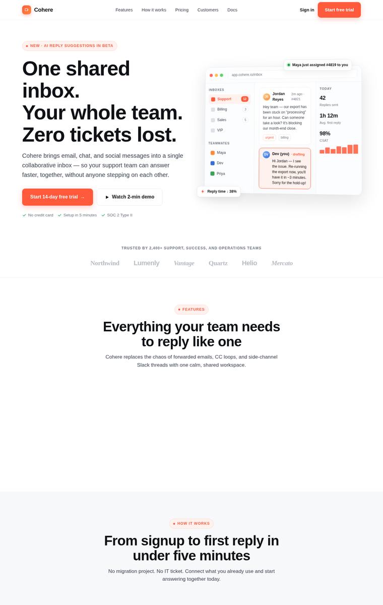
Composite 34.4%Judge 2.4/5
Judge panelAnthropic 2.0/5OpenAI 2.0/5Google 2.3/5
single-judge (Claude) 2.0/5 → leave-one-family-out 2.4/5
Anthropic: The hero (eyebrow, three-line headline, subhead, two CTAs, detailed inbox product mock), nav, trust strip, final CTA band, and footer render cleanly with a consistent orange accent. But the entire middle of the page is broken: the features, how-it-works, stats band, testimonial, and pricing sections show only their headings on empty backgrounds with no feature cards/icons, no 3-step row, no metric numbers, no testimonial, and no pricing tiers at all. This leaves most of the briefed content missing and large dead vertical gaps, a major fidelity and craft failure despite the strong hero.
OpenAI: The nav, hero with mockup, trust strip, final CTA, and footer are present and visually polished, but major required sections are incomplete or missing: no visible 3-up feature cards, no 3-step how-it-works row, no actual stats, no testimonial, and no pricing tiers. The typography and accent color are cohesive, but the page is dominated by huge empty gaps, making it feel unfinished rather than a complete premium landing page.
Google: The design establishes a clean style in the hero but fails to deliver most requested content blocks. Major sections like features, pricing, and testimonials are entirely empty, rendering the layout largely unfinished.
claude-opus-4-8
Extra-high reasoning
Composite 33.3%Judge 2.3/5
Judge panelAnthropic 1.5/5OpenAI 2.0/5Google 2.3/5
single-judge (Claude) 1.5/5 → leave-one-family-out 2.3/5
Anthropic: The hero (eyebrow, headline with accent, subhead, two CTAs, trust microcopy, and a tasteful inbox product mock), the logo trust strip, the sticky nav, and the footer with columns all render well and on-brand with a consistent violet accent. However, the entire middle of the ~5000px page is empty: the required 3-up feature section, 3-step how-it-works row, stats band, testimonial, 3-tier pricing, and final CTA are all missing, leaving large blank grey and dark bands. This is a severe failure of brief fidelity and craft - the page reads as broken, and only a fraction of the requested sections ar
OpenAI: The visible nav, hero, product mock, trust strip, and footer are polished and aligned with the brief, but most required sections—features, how-it-works, stats, testimonial, pricing, and final CTA—are not visibly rendered, leaving huge empty bands. The top section has strong typography and a cohesive purple accent, but the page overall feels unfinished due to large blank areas and missing content.
Google: The hero section and footer display decent typography and color choices. However, massive empty gaps replace most requested content blocks, rendering the page largely incomplete.
grok-4.3
default reasoning
Composite 8.3%Judge 1.3/5
Judge panelAnthropic 1.0/5OpenAI 1.0/5Google 2.0/5
single-judge (Claude) 1.0/5 → leave-one-family-out 1.3/5
Anthropic: The screenshot is a completely blank white page with zero visible content. None of the brief's required elements (nav, hero, feature section, pricing, footer, etc.) rendered, indicating a broken or empty build. There is nothing to assess on design, craft, or impact.
OpenAI: The screenshot is entirely blank, so none of the required landing page elements are visible. With no layout, typography, content, navigation, sections, or visual treatment present, it cannot satisfy the brief or demonstrate design craft.
Google: The screenshot is entirely blank, missing all requested elements for the landing page brief. Without any visible UI components or layout, the design lacks visual structure, craft, and overall impact.
claude-sonnet-4-6
High reasoning
Composite 8.3%Judge 1.3/5
Judge panelAnthropic 1.0/5OpenAI 1.0/5Google 2.0/5
single-judge (Claude) 1.0/5 → leave-one-family-out 1.3/5
Anthropic: The screenshot is entirely blank white with no rendered content whatsoever. None of the brief's required elements are visible - no sticky nav, hero, trust strip, features, how-it-works, stats, testimonial, pricing, CTA band, or footer. The build failed to render, so it fails every criterion.
OpenAI: The screenshot shows a blank white page with none of the required landing page sections visible, including navigation, hero, features, pricing, CTA, or footer. With no visible layout, typography, styling, or content, it cannot demonstrate visual quality, craft, or impact.
Google: The provided screenshot is entirely blank and lacks all requested components. Consequently, it fails to meet any brief requirements or display any design elements.