Mara Vieira
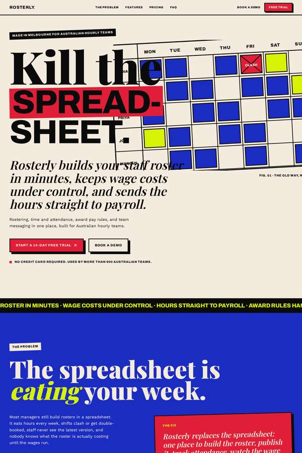
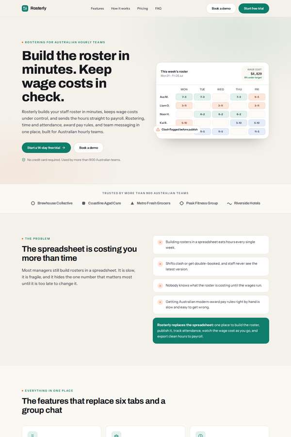
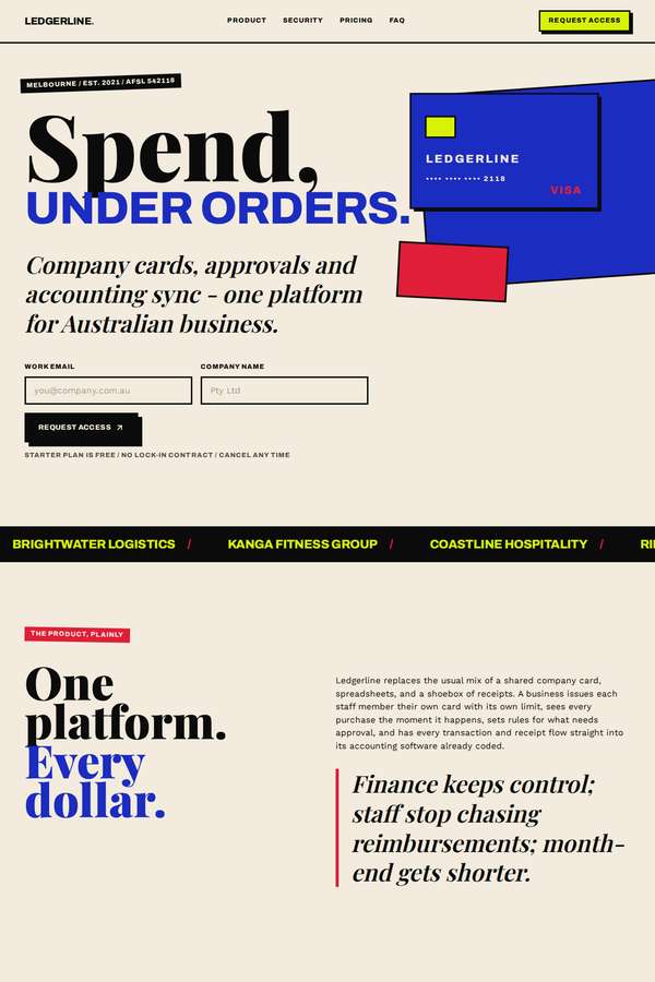
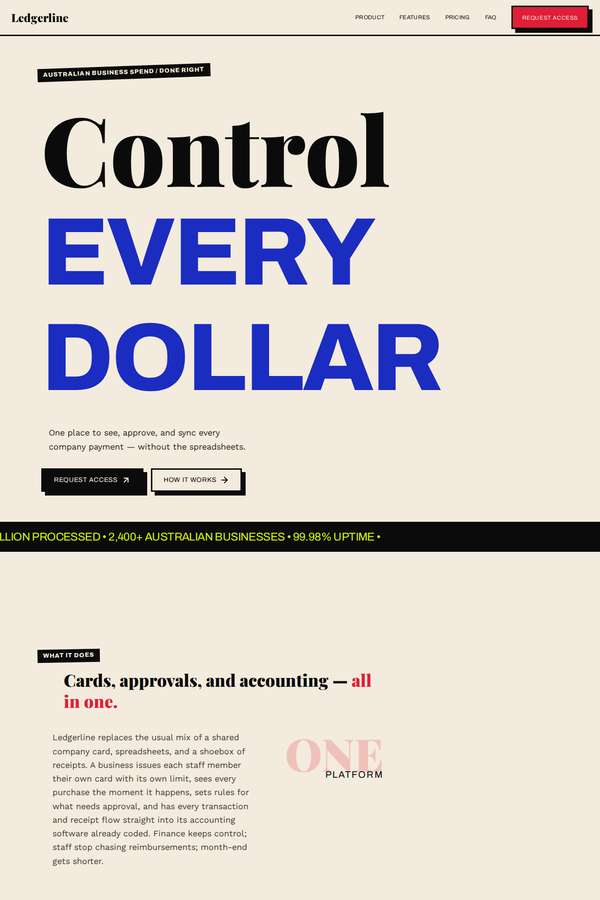
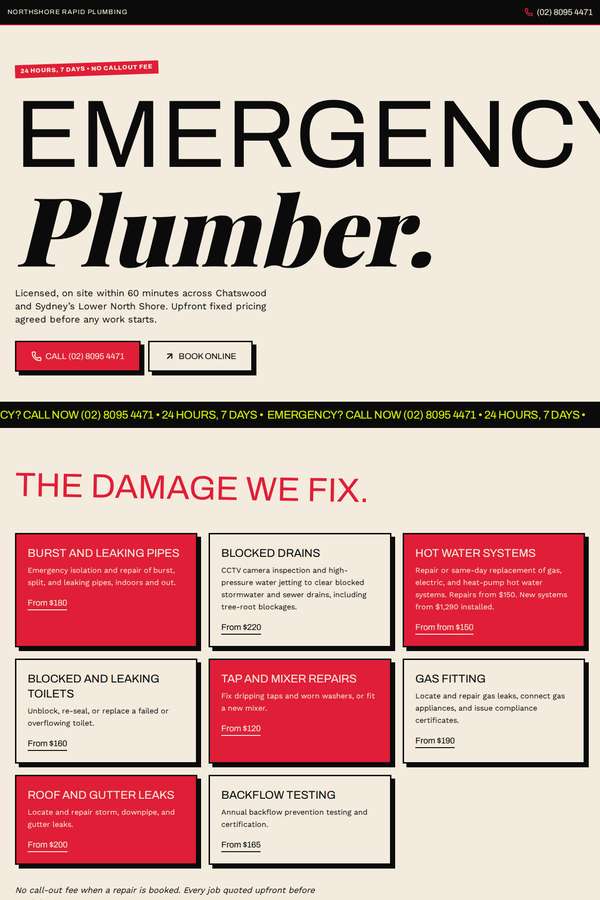
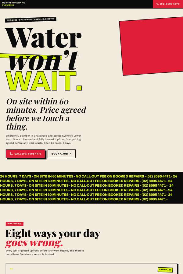
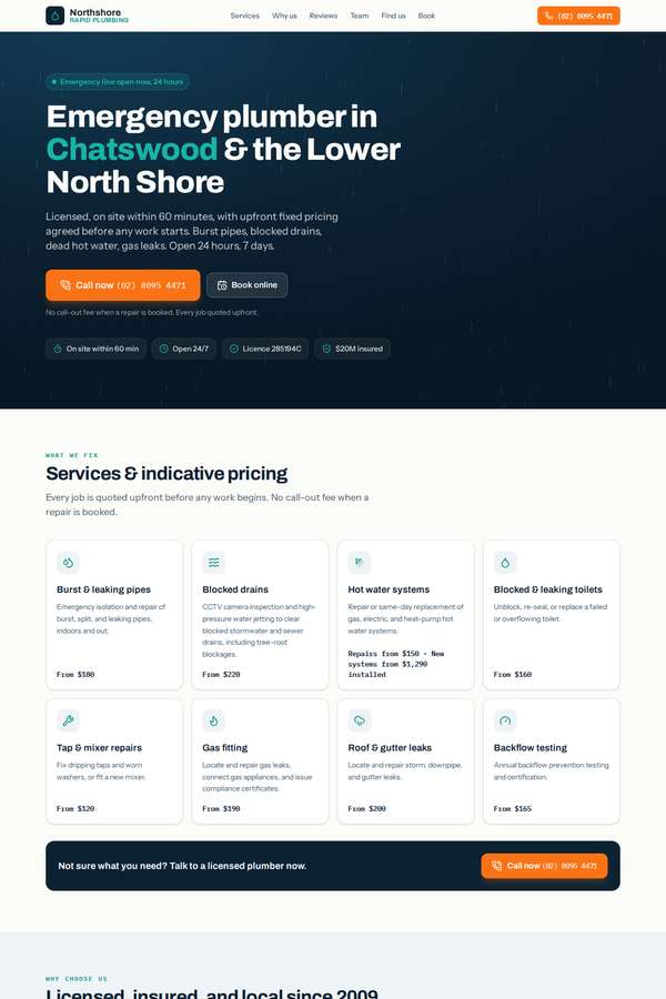
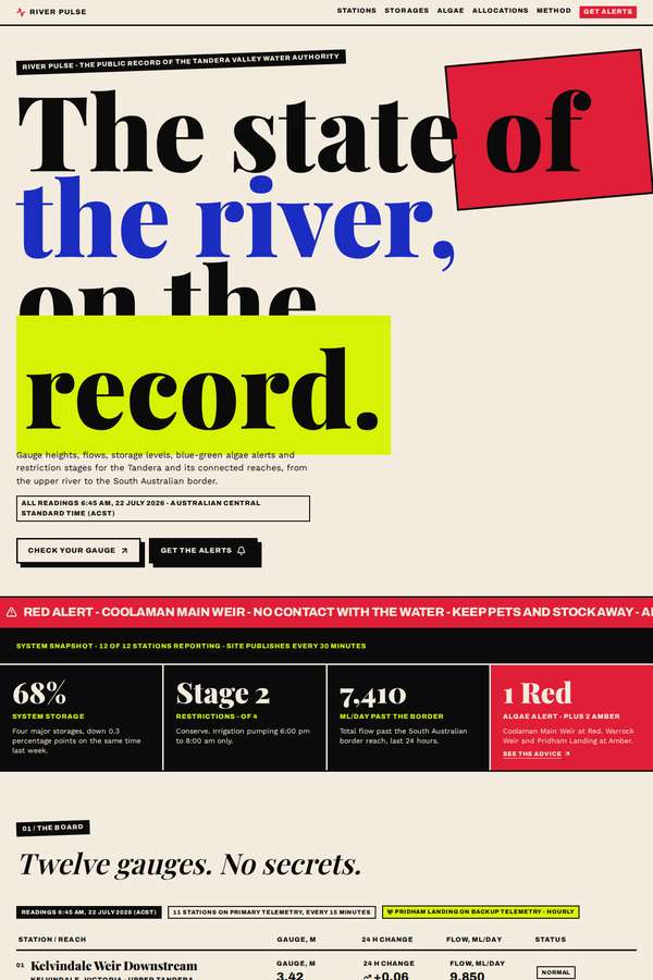
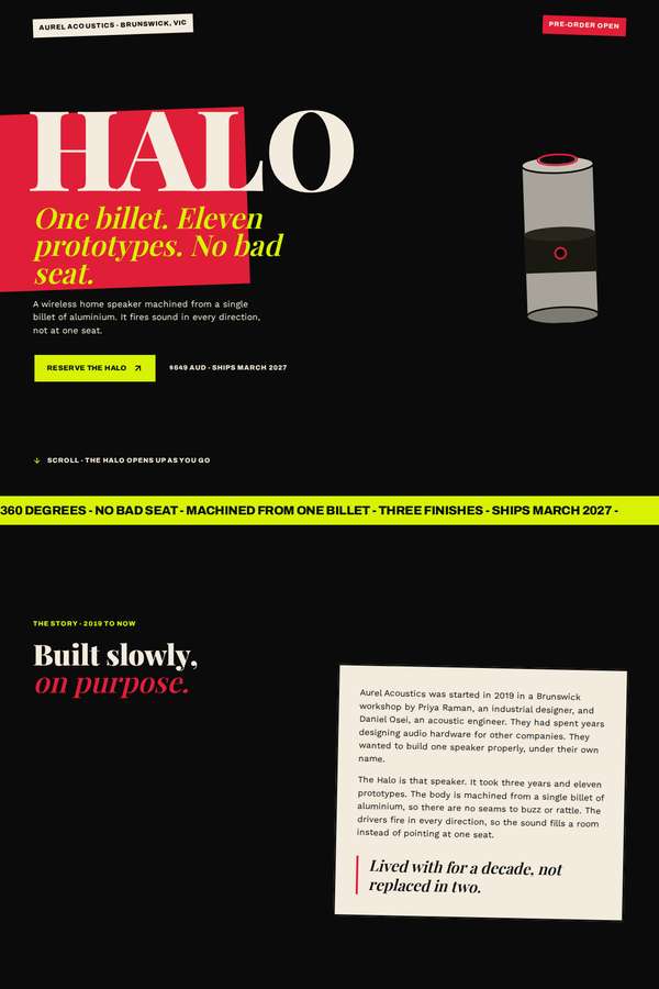
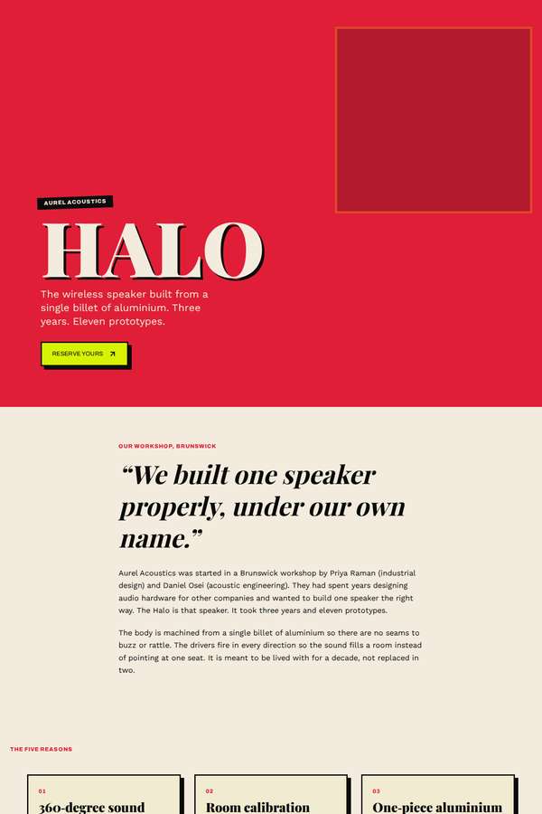
A fictional designer persona. Builds each page from one dominant idea at poster scale, so the eye lands in a single place and then follows a chosen path. Type is the loudest element and often the image itself, with one hot ground colour and one that fights it. The grid is broken on purpose, never sloppily, and whitespace has to earn its keep by giving a bold element room to hit.
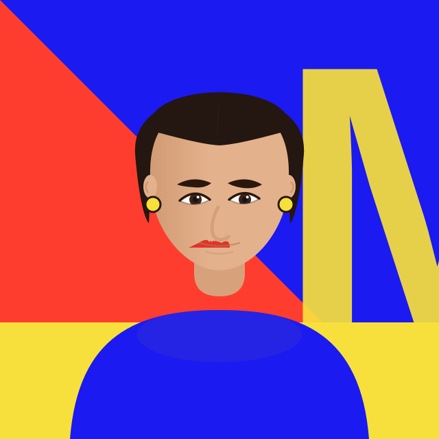
Editorial poster-scale, type as image
media and publishing · culture and the arts · fashion editorial · creative agencies · events and festivals · music
- Published builds
- 40
- Briefs
- 10
- Best build score
- 97.9%