Banja Lab / Benchmarks / Test
RESPO-0001Websites · medium
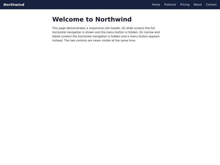
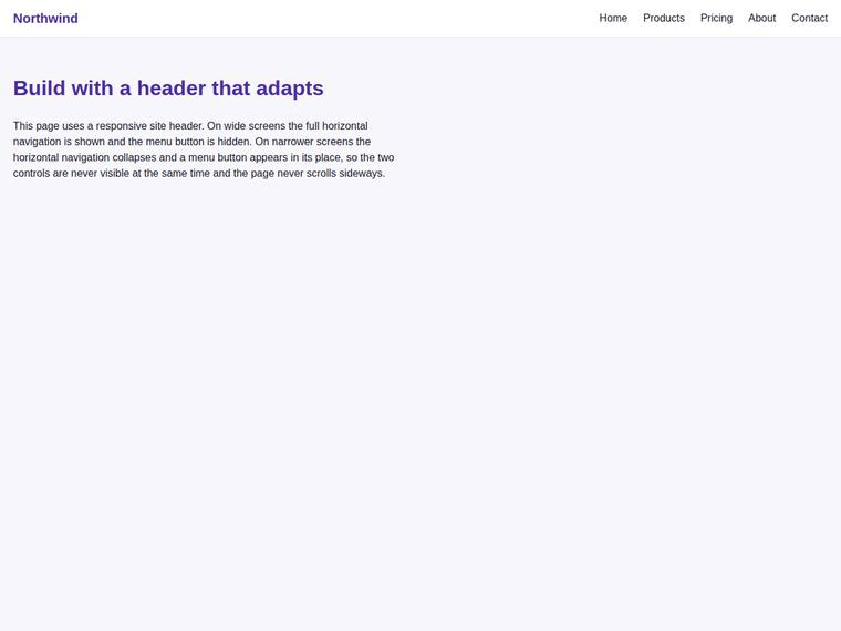
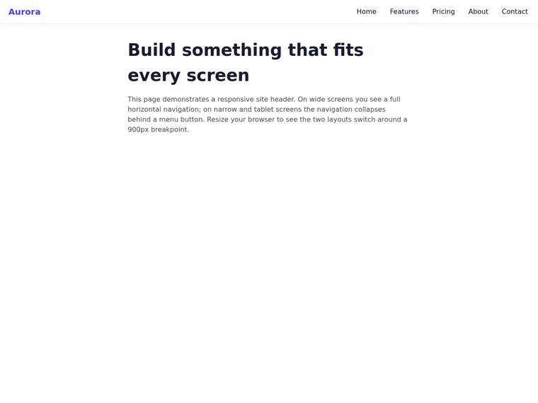
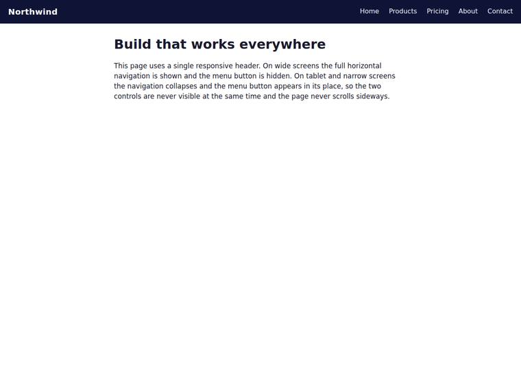
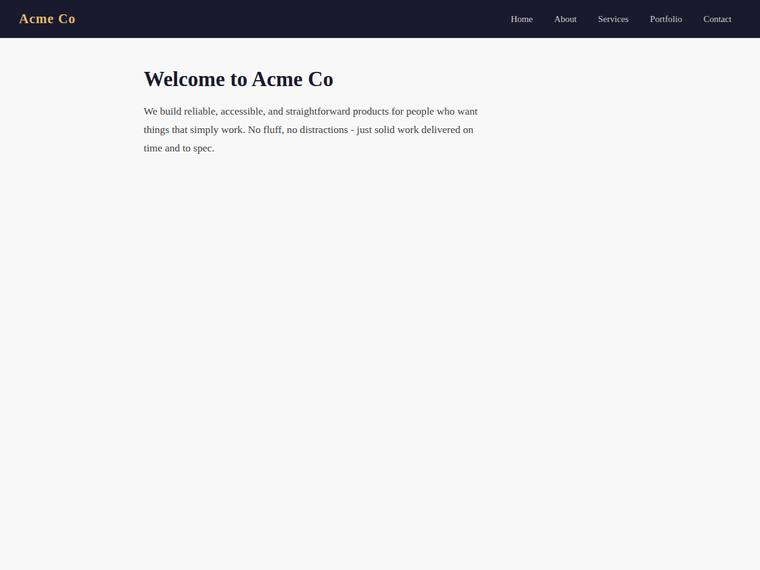
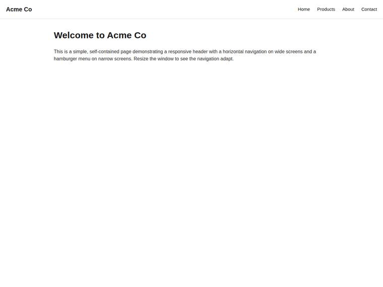
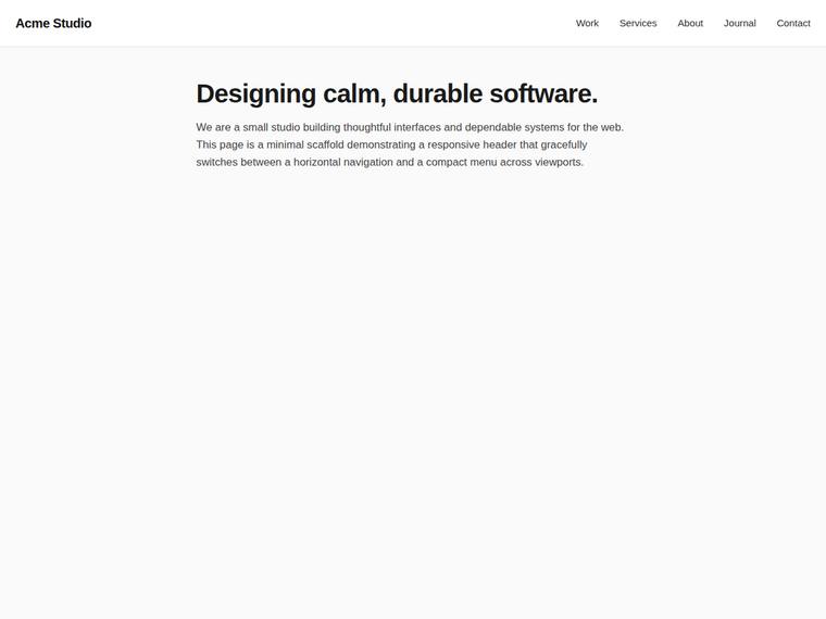
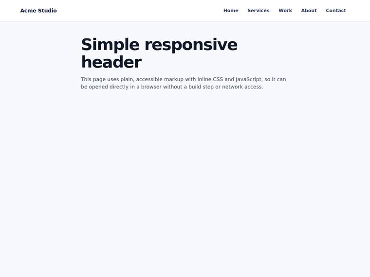
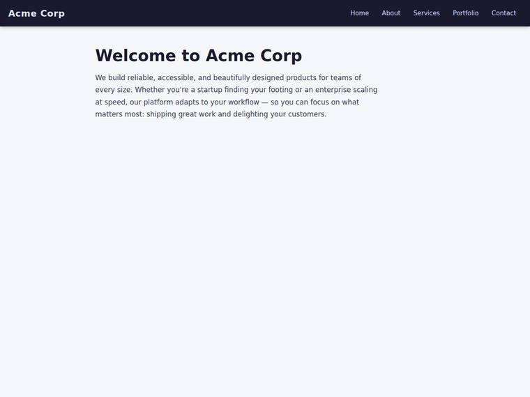
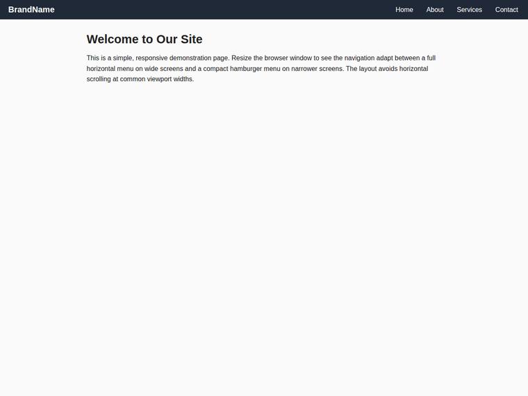
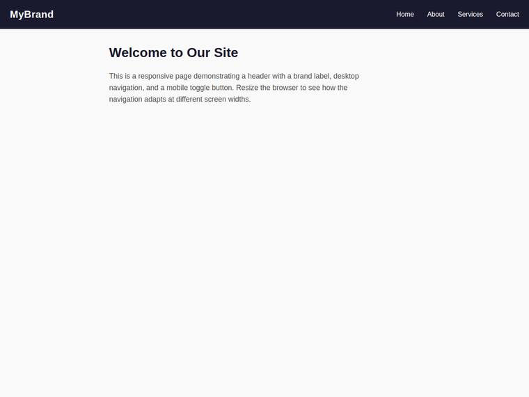
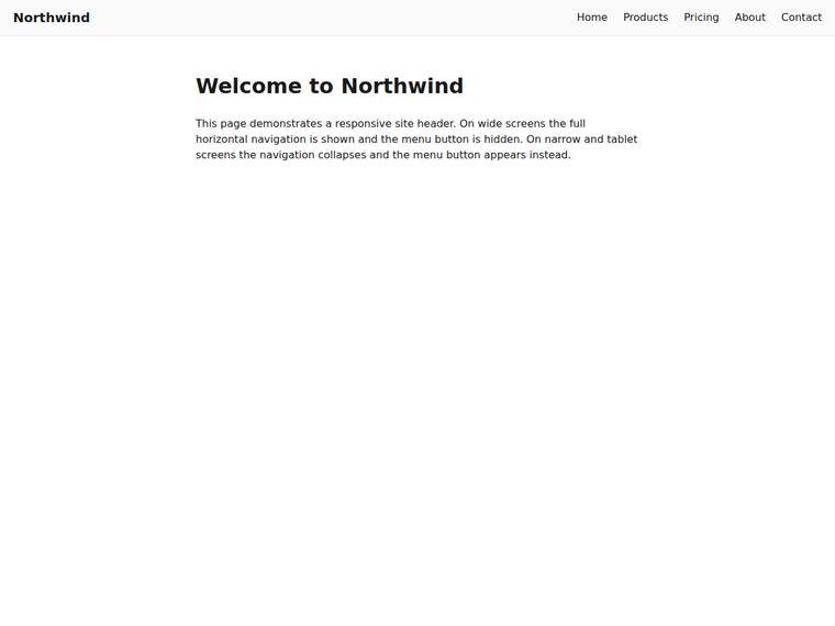
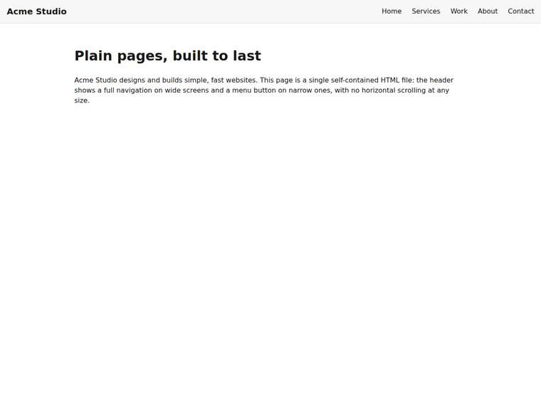
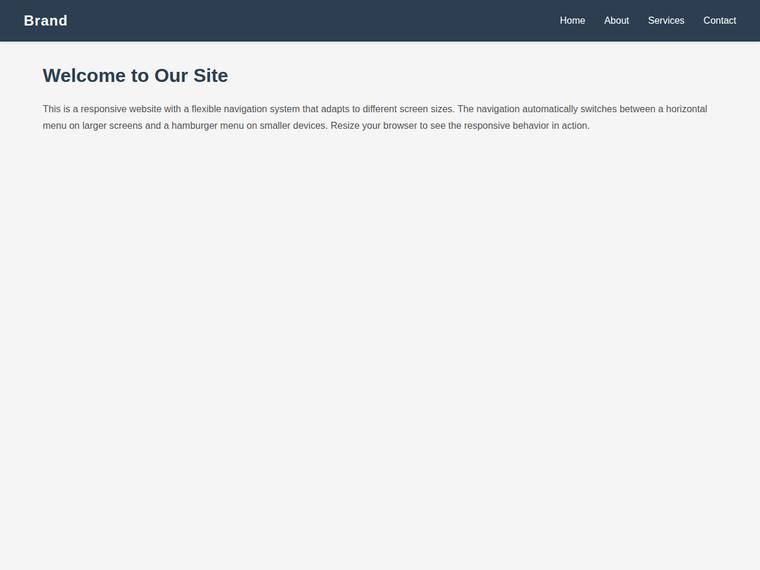
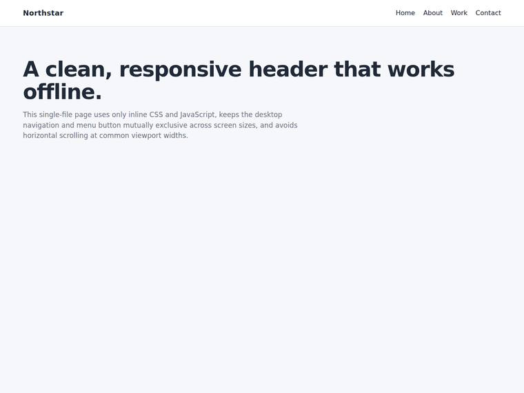
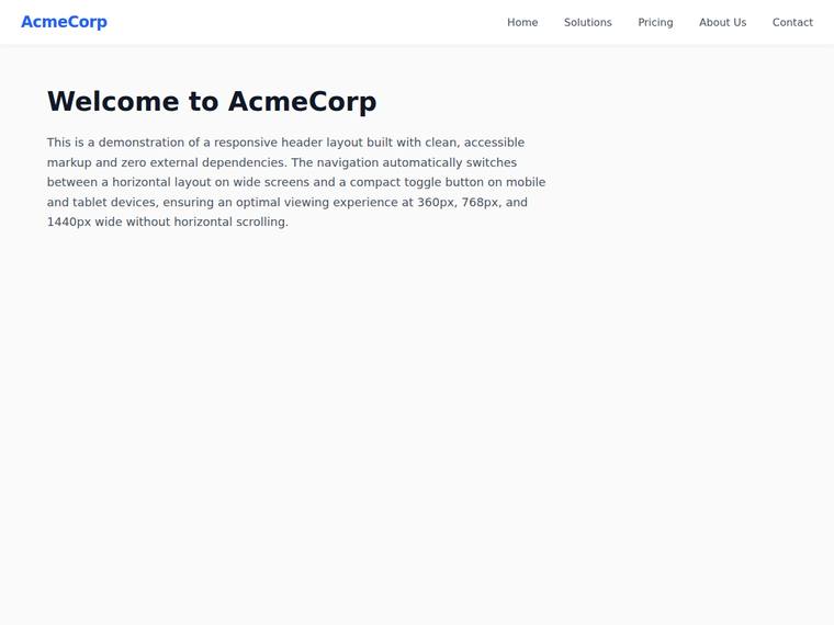
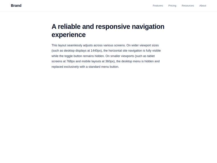
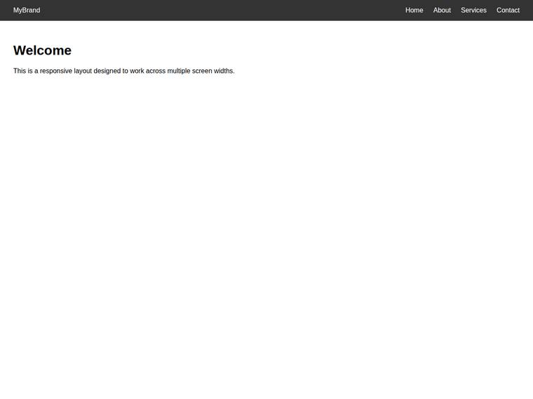
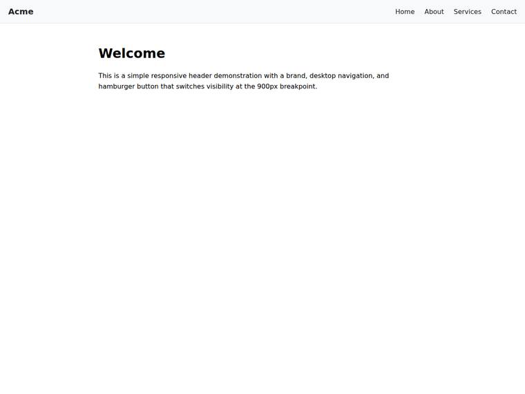
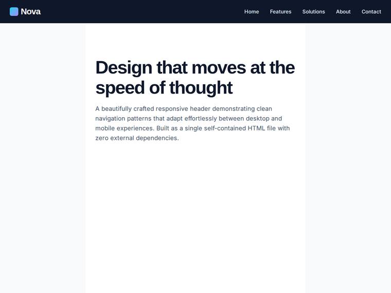
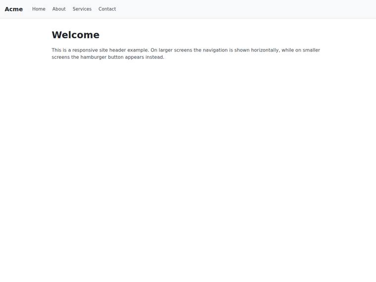
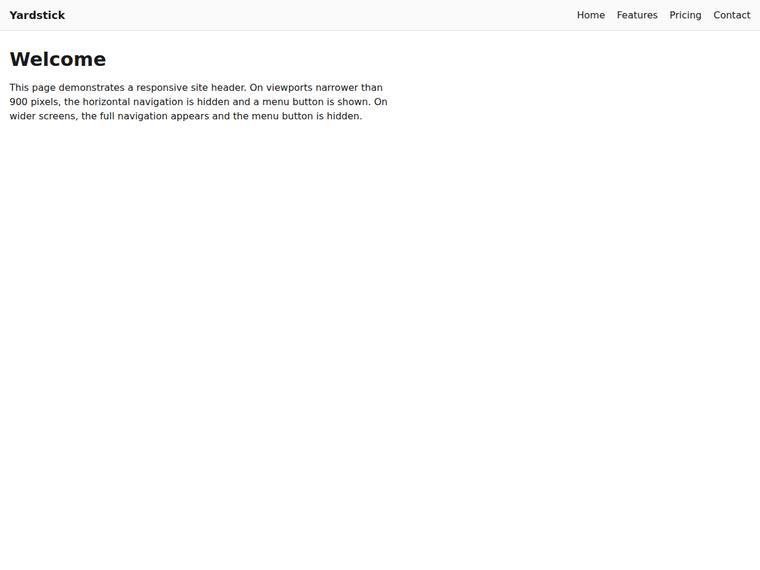
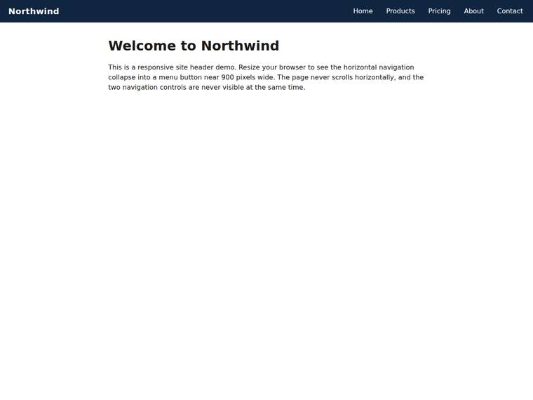
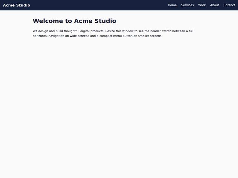
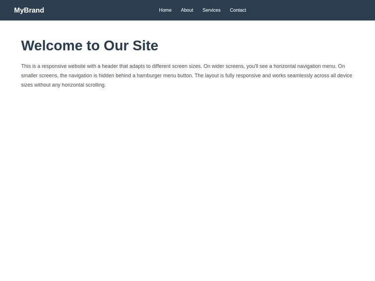
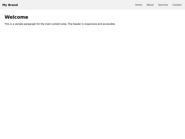
Header nav that collapses to a menu button below a breakpoint
The same task, run on 27 models. Compare the outputs side by side, or open any one in a popup to inspect it.
Top result: claude-opus-4-8 (medium reasoning) at 100.0% composite. Lowest: deepseek-v4-flash at 0.0%. 27 models compared on this task.
How it ran
- Each model was given the brief below in a fresh, isolated session with no access to our tools, and returned a single self-contained index.html (inline CSS and JS, no external requests, no build step).
- The rendered output was scored 1 to 5 on brief fidelity, visual design, craft, and impact by a four-family vision panel - Anthropic (Claude Opus 4.8), OpenAI (GPT-5.5), Google (Gemini 3.1 Pro), and xAI (Grok 4.3) - using one identical prompt so the scores compare. The published judge score is leave-one-family-out: a model is never scored by a judge of its own family, so same-family self-preference is removed.
The brief
Build a single self-contained HTML file (`index.html`) that renders with no build step and no network calls (inline all CSS and JS; no external fonts, scripts, or images). Build a site header containing: - a brand label on the left, - a full horizontal navigation with at least four links, in an element with class "desktop-nav", and - a menu (hamburger) button, a real <button> with id="nav-toggle" and class "nav-toggle". Make the header responsive about a breakpoint near 900px wide: - on wide screens (around 1440px) show the horizontal "desktop-nav" and keep the "nav-toggle" button hidden (display:none), - on narrow and tablet screens (around 360px and 768px) hide the "desktop-nav" (display:none) and show the "nav-toggle" button instead. The two navigation controls must never both be visible at the same width, and the page must not scroll horizontally at any of 360px, 768px, or 1440px wide. Also include a <main> with a single <h1> and a paragraph. Use plain, accessible markup.