Banja Lab / Benchmarks / Test
DASH-0001Dashboard · hard
SaaS analytics dashboard
The same task, run on 28 models. Compare the outputs side by side, or open any one in a popup to inspect it.
Top result: gemini-3.1-pro-preview (high reasoning) at 89.6% composite. Lowest: claude-sonnet-4-6 at 8.3%. 28 models compared on this task.
How it ran
- Each model was given the brief below in a fresh, isolated session with no access to our tools, and returned a single self-contained index.html (inline CSS and JS, no external requests, no build step).
- The rendered output was scored 1 to 5 on brief fidelity, visual design, craft, and impact by a four-family vision panel - Anthropic (Claude Opus 4.8), OpenAI (GPT-5.5), Google (Gemini 3.1 Pro), and xAI (Grok 4.3) - using one identical prompt so the scores compare. The published judge score is leave-one-family-out: a model is never scored by a judge of its own family, so same-family self-preference is removed.
The brief
Build a single-page SaaS analytics dashboard UI for a fictional product. Include: a top bar (logo, search, notifications, avatar); a left sidebar nav with icons + labels and an active state; a page header with title + date-range control; a row of 4 KPI stat cards (value, label, delta vs last period with up/down colour); a primary chart panel (draw a real line or area chart in inline SVG with axes and gridlines from sample data); a secondary chart (bar or donut in SVG); a "recent activity" feed; and a sortable-looking data table with status pills. Clean, dense-but-legible, responsive. Pick light or dark deliberately.
gemini-3.1-pro-preview
High reasoning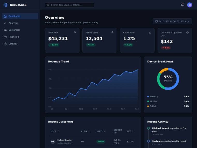
Composite 89.6%Judge 4.6/5
Judge panelAnthropic 4.5/5OpenAI 4.3/5Google 3.5/5
single-judge (Claude) 4.5/5 → leave-one-family-out 4.6/5
Anthropic: Every brief element is present and correct: top bar with logo/search/bell/avatar, icon+label sidebar with an active Dashboard state, header with title and date-range control, four KPI cards with coloured up/down deltas, a real SVG area chart with axis labels and gridlines, a donut device-breakdown with legend, a recent-activity feed, and a customers table with sort-arrow headers and a green status pill. The dark theme is deliberate and cohesive with a tasteful blue accent, consistent card styling, and good spacing/density. Minor knocks: the table is partially clipped at the fold so its full so
OpenAI: The dashboard includes all requested elements: top bar, active sidebar nav, header with date range, four KPI cards with deltas, SVG-style primary and secondary charts, activity feed, and a sortable-looking table with status pills. The dark visual system is cohesive, modern, and legible with strong spacing and hierarchy, though the composition is fairly conventional and the lower table/activity content appears partially cut off in the screenshot.
Google: All requested elements are present and functionally arranged. The dark mode aesthetic is clean and professional, though the overall presentation is fairly conventional.
gemini-3.5-flash
default reasoning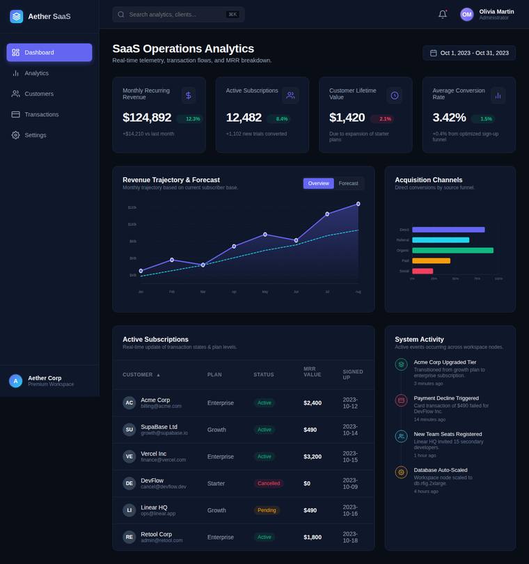
Composite 89.6%Judge 4.6/5
Judge panelAnthropic 4.3/5OpenAI 4.5/5Google 3.5/5
single-judge (Claude) 4.3/5 → leave-one-family-out 4.6/5
Anthropic: Every brief element is present and correct: top bar with logo/search/bell/avatar, an iconned sidebar with an active Dashboard state, a header with title plus date-range control, four KPI cards with coloured deltas, a real area-style line chart with axes and gridlines, a secondary acquisition bar chart, a System Activity feed, and a data table with colour-coded status pills. The dark theme is coherent and modern with a tasteful violet accent, good density, and consistent card styling. Composition is clean but a little safe and grid-uniform; the charts and pills are tidy rather than striking, so
OpenAI: All required dashboard elements are visible and well realized: top bar, sidebar, header/date control, four KPI cards with deltas, SVG-style primary and secondary charts, activity feed, and a sortable-looking table with status pills. The dark visual system is cohesive, modern, and premium, with strong spacing and hierarchy; minor craft issues include very small chart/table text and awkward date wrapping in the table, keeping it just short of flawless.
Google: The design successfully includes all required dashboard components within a cohesive dark theme. Layout and typography are well-structured, presenting dense data legibly without obvious visual flaws. The result is a polished and modern interface.
claude-fable-5
High reasoning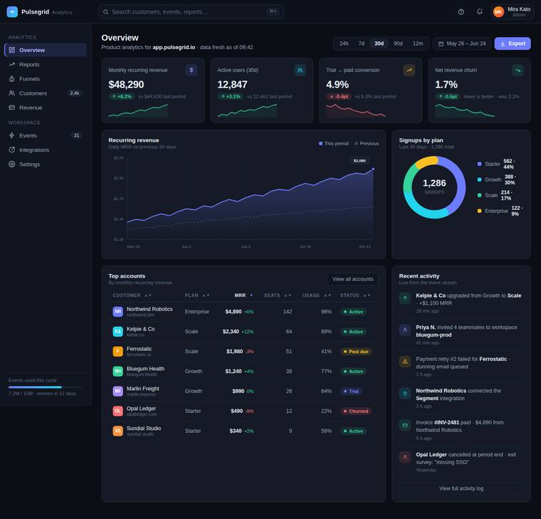
Composite 89.1%Judge 4.6/5
Judge panelAnthropic 5.0/5OpenAI 4.8/5Google 3.5/5
single-judge (Claude) 5.0/5 → leave-one-family-out 4.6/5
Anthropic: Every brief element is present and correct: top bar with logo/search/notifications/avatar, an icon+label sidebar with a clear active state, header with title and a full date-range control, four KPI cards with values/labels/coloured deltas plus sparklines, a real area line chart with axes/gridlines and a this-period-vs-previous comparison, a donut for signups by plan, a rich recent-activity feed, and a sortable-looking table with status pills (Active/Past due/Trial/Churned). The dark violet/teal palette is coherent and modern, spacing and typographic hierarchy are dense-but-legible, and details
OpenAI: The dashboard includes every requested element: top bar, active sidebar navigation, header/date controls, four KPI cards with colored deltas, SVG line and donut charts, recent activity, and a sortable-looking table with status pills. The dark visual system is cohesive, dense but readable, and very polished with consistent spacing, typography, iconography, and chart detailing. It feels premium and production-ready, though its SaaS dashboard language is more refined than truly distinctive.
Google: The dashboard successfully integrates all requested elements into a cohesive dark theme. Overall composition and chart executions are solid, resulting in a competent and straightforward interface.
claude-fable-5
High reasoning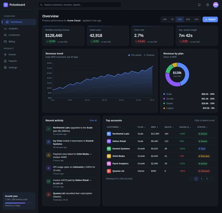
Composite 89.1%Judge 4.6/5
Judge panelAnthropic 4.8/5OpenAI 4.8/5Google 3.8/5
single-judge (Claude) 4.8/5 → leave-one-family-out 4.6/5
Anthropic: Every brief element is present and correct: top bar (logo, search, bell/help, avatar), sidebar with icons and a clear active "Dashboard" state, page header with title plus a real date-range segmented control and Export, four KPI cards with values and up/down-coloured deltas, a genuine inline area/line chart with axes, gridlines and a two-series legend, a donut with a percentage breakdown legend, a recent-activity feed with typed icons, and a sortable-looking table with coloured status pills. The dark theme is coherent and modern, with tasteful blue/violet accents, consistent spacing, and legib
OpenAI: The dashboard includes every requested element: top bar, active icon sidebar, header with date controls, four KPI cards with deltas, SVG-style primary and secondary charts, activity feed, and a sortable-looking table with status pills. The dark UI is polished, dense, and highly legible with consistent spacing, hierarchy, and color usage, though its overall aesthetic is more premium-standard than truly distinctive.
Google: The build successfully integrates all requested components with clean alignment. The dark theme presents a polished aesthetic with balanced color choices. Overall, the layout is competent and visually cohesive.
claude-opus-4-8
High reasoning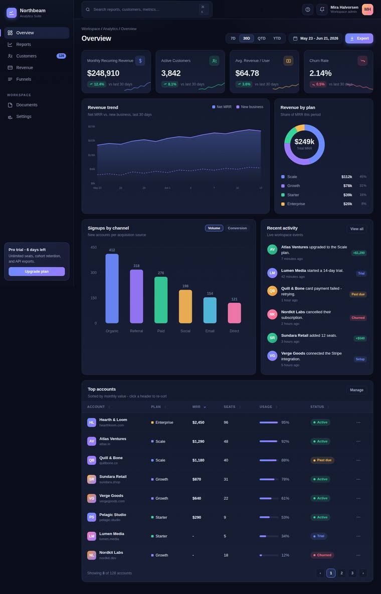
Composite 87.5%Judge 4.5/5
Judge panelAnthropic 4.5/5OpenAI 4.8/5Google 3.8/5
single-judge (Claude) 4.5/5 → leave-one-family-out 4.5/5
Anthropic: Every brief element is present and correct: top bar with logo/search/notifications/avatar, icon+label sidebar with a clear active state, header with title and a date-range control, four KPI cards with up/down coloured deltas, an area chart with axes and gridlines, a donut secondary chart, a recent-activity feed with status colours, and a data table with status pills and pagination - plus a bonus bar chart. The dark violet theme is coherent and modern with consistent spacing, tasteful accent colours, and a dense-but-legible layout. Minor craft nits keep it from a perfect score: some table rows
OpenAI: All requested dashboard elements are visible and well executed: top navigation, sidebar with active state, KPI cards with deltas, SVG-style line and donut/bar charts, activity feed, and a sortable-looking table with status pills. The dark theme is polished, dense but legible, with strong spacing, hierarchy, and consistent component styling. It feels premium and complete, though the overall SaaS-dashboard aesthetic is familiar rather than highly distinctive.
Google: The dashboard successfully meets all brief requirements with a solid layout and complete features. The dark theme uses contrast effectively, yielding a professional and cohesive appearance.
claude-sonnet-5
High reasoning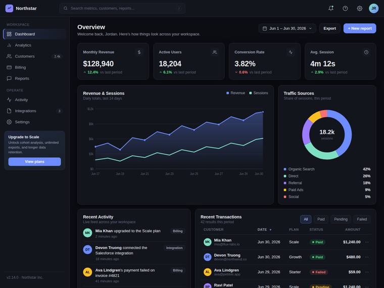
Composite 87.5%Judge 4.5/5
Judge panelAnthropic 4.8/5OpenAI 4.8/5Google 3.5/5
single-judge (Claude) 4.8/5 → leave-one-family-out 4.5/5
Anthropic: Every brief element is present and correct: top bar (logo, search, notifications, avatar), icon+label sidebar with a clear active state, header with title and date-range control, four KPI cards with up/down coloured deltas (including a red downward Conversion Rate), a real inline-SVG line/area chart with labelled axes and gridlines, a donut for Traffic Sources, a Recent Activity feed, and a transactions table with a sort arrow and Paid/Failed/Pending status pills. The dark theme is coherent and modern with a tasteful violet/teal accent palette, consistent spacing, and dense-but-legible type. C
OpenAI: All requested dashboard elements are visibly present, including the top bar, sidebar active nav, header/date control, KPI cards with deltas, SVG line and donut charts, activity feed, and sortable-looking table with status pills. The dark theme is cohesive, dense but legible, and executed with strong spacing, hierarchy, and consistent component styling. It feels polished and premium, though the overall SaaS analytics pattern is familiar rather than highly distinctive.
Google: The dashboard accurately implements all requested components within a cohesive dark theme. Typography and spacing are well-balanced, though the overall layout remains standard for typical SaaS templates. The execution is solid without necessarily breaking new ground visually.
kimi-k2.7-code
default reasoning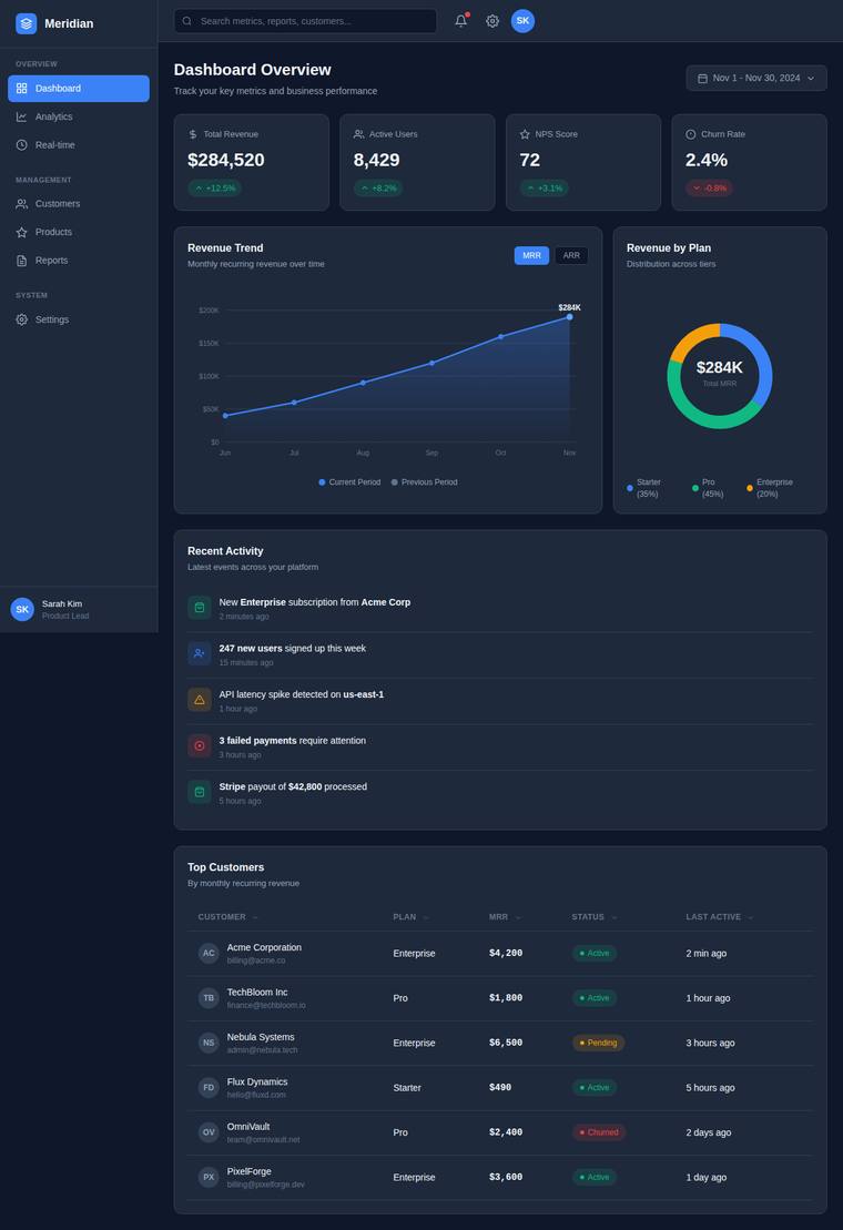
Composite 85.9%Judge 4.4/5
Judge panelAnthropic 4.3/5OpenAI 4.8/5Google 3.8/5
single-judge (Claude) 4.3/5 → leave-one-family-out 4.4/5
Anthropic: Every brief element is present and correct: top bar with logo/search/notifications/avatar, an icon+label sidebar with an active Dashboard state, a header with title and date-range control, four KPI cards with up/down delta pills, a real SVG line/area chart with gridlines/axes/legend, a donut secondary chart with center value, a recent-activity feed, and a status-pill data table with sortable-looking headers. The dark theme is coherent and modern with a tasteful violet/teal palette, good density, and clear hierarchy; charts render cleanly with no broken bits. It reads as a believable, polished
OpenAI: All required dashboard elements are visible and well executed, including the top bar, sidebar, KPI cards, SVG line and donut charts, activity feed, and sortable-looking table with status pills. The dark theme is cohesive, polished, and legible with consistent spacing and hierarchy, though the overall SaaS dashboard aesthetic is strong but somewhat familiar rather than highly distinctive.
Google: The dashboard successfully integrates all requested elements within a cohesive dark theme. Execution is professional and clean, though the overall aesthetic relies on standard patterns.
claude-sonnet-5
High reasoning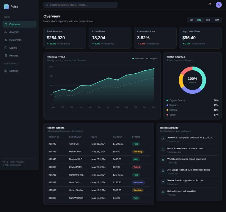
Composite 85.9%Judge 4.4/5
Judge panelAnthropic 4.5/5OpenAI 4.8/5Google 3.5/5
single-judge (Claude) 4.5/5 → leave-one-family-out 4.4/5
Anthropic: Every brief element is present and correct: top bar with logo/search/notifications/avatar, an icon+label sidebar with a clear active state, a header with a 7D/30D/90D/12M range control, four KPI cards with coloured up/down deltas, a real area+line chart with axes/gridlines/legend, a donut secondary chart, a recent-activity feed, and a data table with sort carets and coloured status pills. The dark theme is coherent and modern with a tasteful teal accent, strong type hierarchy, and consistent spacing. Minor blemishes hold back the top marks: the donut centre reads a meaningless "100% sessions"
OpenAI: All requested elements are visible and well-executed: top navigation utilities, sidebar with active state, header/date control, KPI cards, SVG-style charts, activity feed, and sortable-looking table with status pills. The dark theme is cohesive and polished with strong spacing, hierarchy, and consistent component styling. It feels premium and finished, though the overall dashboard pattern is familiar rather than highly distinctive.
Google: The dashboard fulfills all brief requirements using a cohesive dark theme and legible data visualizations. The dense layout is well-managed, yielding a competent overall structure. It provides a professional, albeit standard, SaaS aesthetic.
claude-opus-4-8
Medium reasoning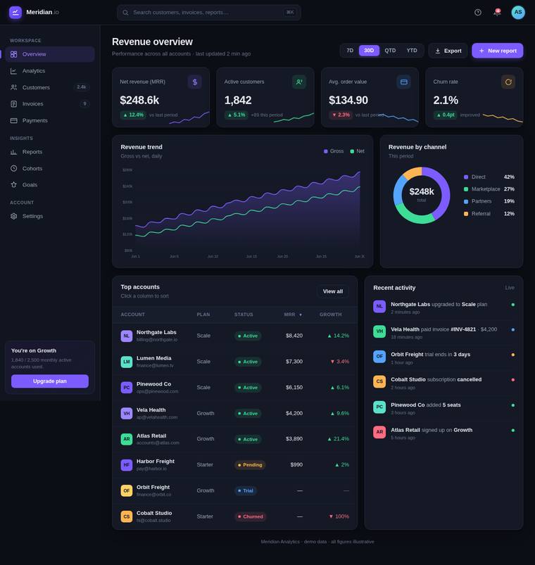
Composite 85.4%Judge 4.4/5
Judge panelAnthropic 4.3/5OpenAI 4.8/5Google 3.5/5
single-judge (Claude) 4.3/5 → leave-one-family-out 4.4/5
Anthropic: Every brief element is present and correct: top bar with logo/search/notifications/avatar, sidebar with active "Overview" state, header with title and 1D/7D/30D/12M date control, four KPI cards with up/down deltas, a real SVG revenue-trend line/area chart with gridlines, a donut "Revenue by channel" with legend, a recent-activity feed, and a "Top accounts" table with plan badges and colour-coded status pills. The dark violet/teal palette is coherent and modern with good density and legible spacing, reading like a believable production SaaS dashboard. Craft is solid with consistent detail; it f
OpenAI: All requested dashboard elements are present and clearly executed: top bar, sidebar, header controls, KPI cards, SVG-style primary and secondary charts, activity feed, and sortable table with status pills. The dark visual system is polished, dense but legible, and highly consistent in spacing, typography, color, and component treatment. It feels premium and reviewer-ready, though the overall pattern is more excellently executed than especially distinctive.
Google: The dashboard successfully incorporates all requested elements within a cohesive dark theme. The layout is sufficiently structured and legible, providing a standard but professional aesthetic.
claude-opus-4-8
Extra-high reasoning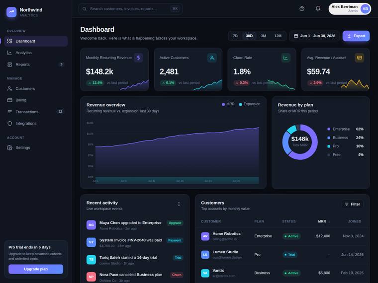
Composite 85.4%Judge 4.4/5
Judge panelAnthropic 4.5/5OpenAI 4.8/5Google 3.5/5
single-judge (Claude) 4.5/5 → leave-one-family-out 4.4/5
Anthropic: Every brief element is present and correct: top bar with logo/search/notifications/avatar, an icon+label sidebar with an active Dashboard state, a header with title and day/week/month date control, four KPI cards with deltas and sparklines, an SVG area chart with gridlines/axes, a donut "Revenue by plan" chart, a recent-activity feed, and a customers table with plan badges and status. The dark theme is coherent and modern with a tasteful purple accent, dense-but-legible spacing, and well-composed panels. It is a polished, professional result; minor low-contrast small text in the table and feed
OpenAI: All requested elements are visible and well executed: top/search/notification/avatar area, sidebar with active state, header/date controls, four KPI cards, SVG line and donut charts, recent activity, and a sortable-looking table with status pills. The dark dashboard is polished, dense but legible, and consistent in spacing, color, typography, and component treatment. It feels premium and production-ready, though the overall SaaS dashboard style is more expertly executed than highly distinctive.
Google: The dashboard successfully integrates all requested elements within a cohesive dark theme. Layout and data visualizations are generally clear, though the logo sits in the sidebar instead of the top bar. The overall execution is balanced and professional without being overly flashy.
claude-sonnet-4-6
High reasoning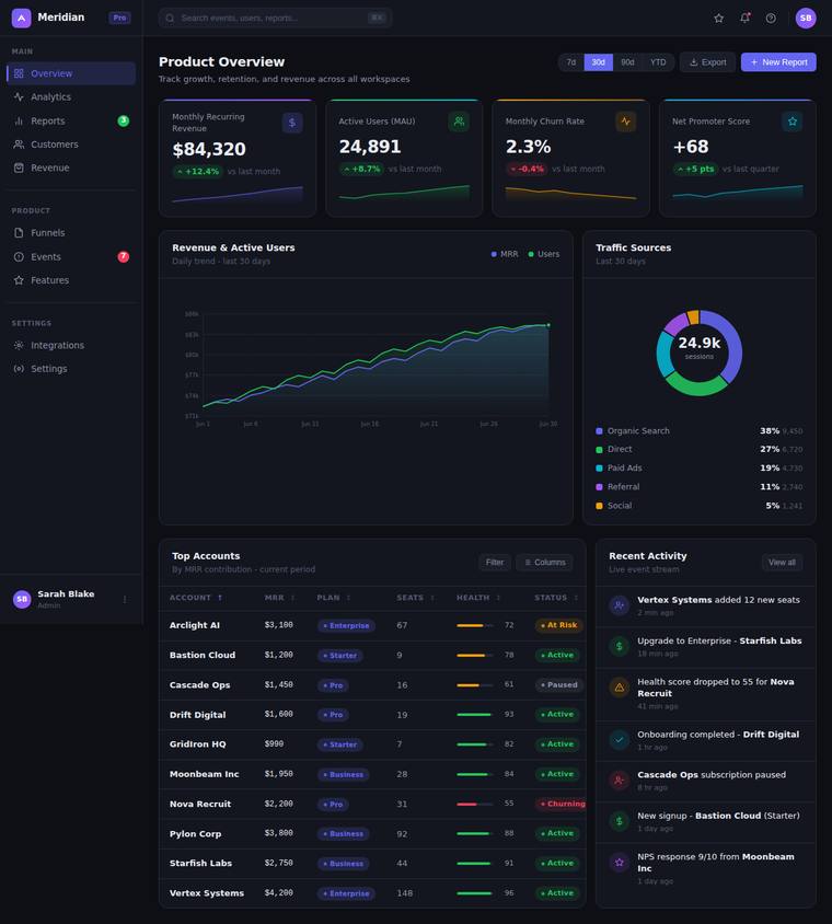
Composite 85.4%Judge 4.4/5
Judge panelAnthropic 4.5/5OpenAI 4.5/5Google 3.8/5
single-judge (Claude) 4.5/5 → leave-one-family-out 4.4/5
Anthropic: Every brief element is present and correct: top bar (logo, search, notifications, avatar), grouped sidebar with an active Overview state, a header with title and a 1D/7D/30D/90D range control, four KPI cards each with value, label, coloured delta and a sparkline, a real area chart with gridlines, a donut traffic-sources chart with legend, a recent-activity feed, and a Top Accounts table with sortable headers and Active/Trial/Churned status pills. The dark theme is coherent and modern with tasteful violet/teal accents, consistent spacing, and good information density that stays legible. Minor c
OpenAI: All requested dashboard elements are visible and well executed: top bar, sidebar, header controls, four KPI cards, SVG charts with axes/gridlines, activity feed, and sortable-looking table with status pills. The dark visual system is cohesive, modern, dense, and legible, with strong hierarchy and consistent color usage. Minor craft issues include the primary chart feeling underfilled within its large panel and an overall somewhat familiar SaaS-dashboard look, but the result is still polished and premium.
Google: The dashboard successfully integrates all requested components within a cohesive dark theme. Layout and typography are balanced, yielding a generally professional appearance. Overall execution is consistent and legible across sections.
gpt-5.5-pro
High reasoning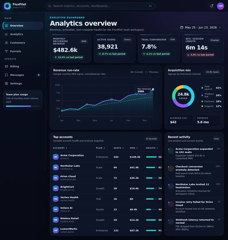
Composite 85.4%Judge 4.4/5
Judge panelAnthropic 4.8/5OpenAI 4.8/5Google 3.5/5
single-judge (Claude) 4.8/5 → leave-one-family-out 4.4/5
Anthropic: Every brief element is present and correct: top bar with logo/search/notifications/avatar, an icon+label sidebar with a clear active state on Overview, a page header with title and date-range control, four KPI cards with deltas in up/down colours, a real area chart with gridlines/axes, a donut acquisition-mix chart with legend, a recent-activity feed, and a Top accounts table with status pills and sortable-looking headers. The dark theme is coherent and modern with tasteful violet/cyan accents, tight but legible density, and consistent spacing and rounding throughout, with no visible broken or
OpenAI: Nearly all requested dashboard elements are present and well executed, including the top bar, sidebar, KPI row, SVG line chart, donut chart, activity feed, and sortable-looking table; the main gap is that the data table does not clearly include status pills. The visual design is polished, cohesive, and premium, with strong dark-theme composition, excellent spacing, typography, and chart/table detailing.
Google: The design accurately incorporates all requested components within a cohesive dark theme. Layout and charting are well-executed and legible. Overall presentation is solid and professional without being overly flashy.
claude-opus-4-8
High reasoning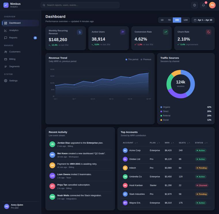
Composite 85.4%Judge 4.4/5
Judge panelAnthropic 4.5/5OpenAI 4.8/5Google 3.5/5
single-judge (Claude) 4.5/5 → leave-one-family-out 4.4/5
Anthropic: Every brief element is present and correct: top bar with logo/search/icons/avatar, grouped sidebar nav with a clear active state, header with title and date-range control, four KPI cards with coloured up/down deltas, an area-style Revenue Trend chart with gridlines, a donut Traffic Sources chart with legend, a recent-activity feed, and a Top Accounts table with status pills. The dark theme is coherent and modern with tasteful violet accenting, consistent spacing, and good information density. Minor deductions on craft/impact because the line/area chart reads a touch flat and the table area fee
OpenAI: All required dashboard elements are present and clearly executed, including top bar, sidebar active state, KPI cards with deltas, SVG-style charts, activity feed, and sortable-looking table with status pills. The dark UI is cohesive, polished, dense yet legible, with strong spacing, hierarchy, and consistent component styling. It feels premium and production-ready, though the overall aesthetic is more familiar SaaS-dashboard polished than highly distinctive.
Google: The design successfully integrates all requested features into a coherent dark mode layout. Spacing and typography are consistently applied, resulting in a clean and functional interface.
claude-opus-4-8
Low reasoning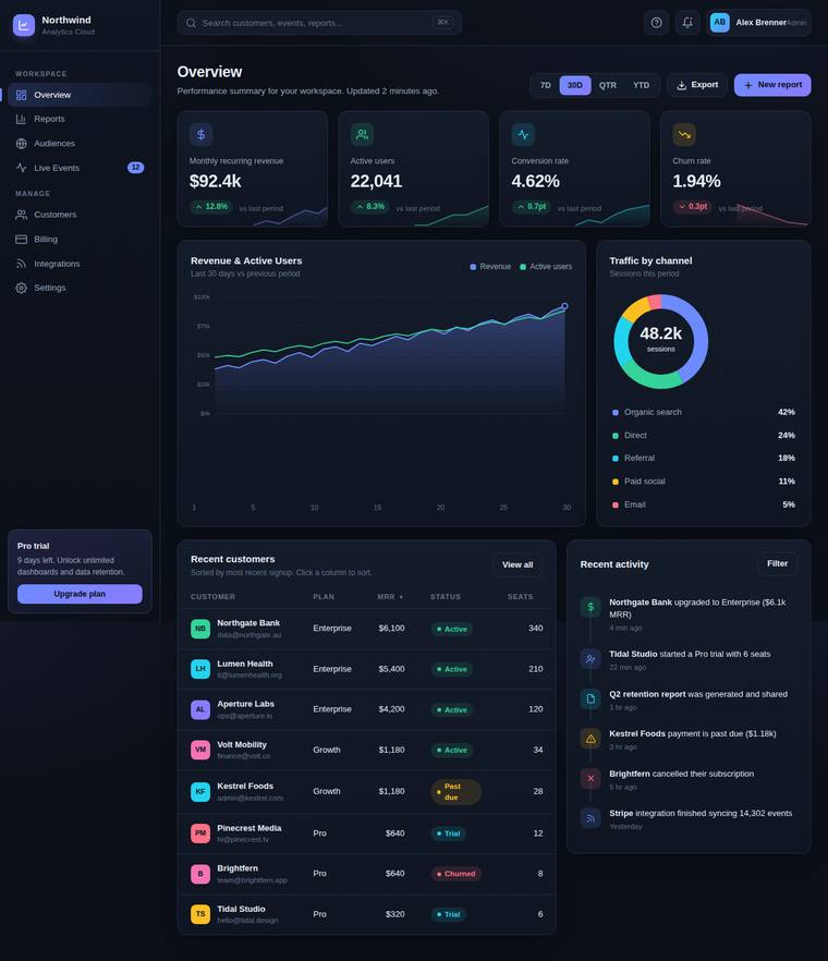
Composite 83.3%Judge 4.3/5
Judge panelAnthropic 4.5/5OpenAI 4.5/5Google 3.5/5
single-judge (Claude) 4.5/5 → leave-one-family-out 4.3/5
Anthropic: Every brief element is present and correct: top bar with logo/search/notifications/avatar, icon+label sidebar with an active Overview state, header with title and a 1D/7D/1M/3M/1Y date-range control, four KPI cards with values and colour-coded deltas, a real area+line chart with axes and gridlines, a donut (Traffic by channel) with a percentage legend, a recent activity feed, and a data table with status pills. The dark theme is cohesive with a tasteful violet/teal accent palette, consistent spacing, and strong information density that stays legible. Minor craft nits keep it from top marks: so
OpenAI: All required dashboard elements are visible and well executed, including navigation, KPI cards, SVG charts, activity feed, and a sortable-looking table with status pills. The dark visual system is polished, cohesive, and highly legible, though the primary chart has some awkward unused vertical space and the overall concept is premium but fairly conventional.
Google: The dashboard successfully incorporates all requested elements within a coherent dark theme. The layout is dense but legible, though it relies heavily on standard patterns.
gpt-5.5
High reasoning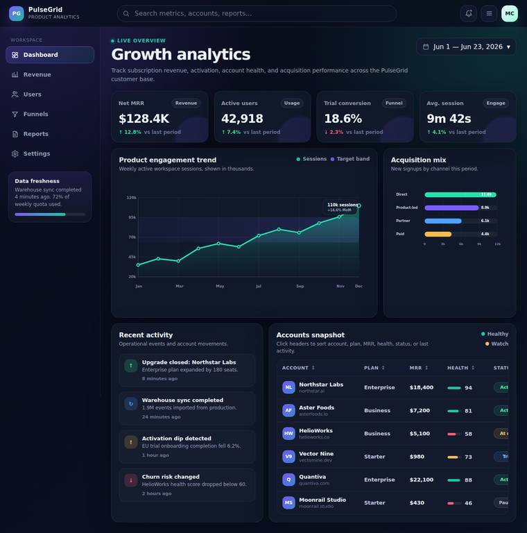
Composite 83.3%Judge 4.3/5
Judge panelAnthropic 4.8/5OpenAI 4.8/5Google 3.3/5
single-judge (Claude) 4.8/5 → leave-one-family-out 4.3/5
Anthropic: Every brief element is present and correct: top bar (logo/search/bell/avatar), icon+label sidebar with a clear active Dashboard state, header with title and date-range control, four KPI cards with up/down coloured deltas, a real multi-series line/area chart with axes, gridlines and a peak annotation, a secondary horizontal bar "Acquisition mix" chart, a timestamped activity feed, and an accounts table with sortable-looking headers and colour-coded status pills. The dark violet/cyan palette is coherent and modern, with consistent card treatment, tight but legible density, and clean alignment th
OpenAI: The dashboard includes all requested elements: top bar, sidebar with active nav, date header, four KPI cards, SVG-style primary and secondary charts, activity feed, and a sortable-looking table with status pills. The dark visual system is polished, cohesive, dense, and premium, with strong hierarchy and well-integrated chart styling. Minor craft concern: the table/status column appears slightly cramped or clipped at the right edge, but overall execution is excellent.
Google: The layout successfully includes all requested elements with a cohesive dark theme. Data visualizations are clear, though the right edge of the data table is slightly clipped. Overall execution provides a solid, professional aesthetic.
claude-opus-4-8
Max reasoning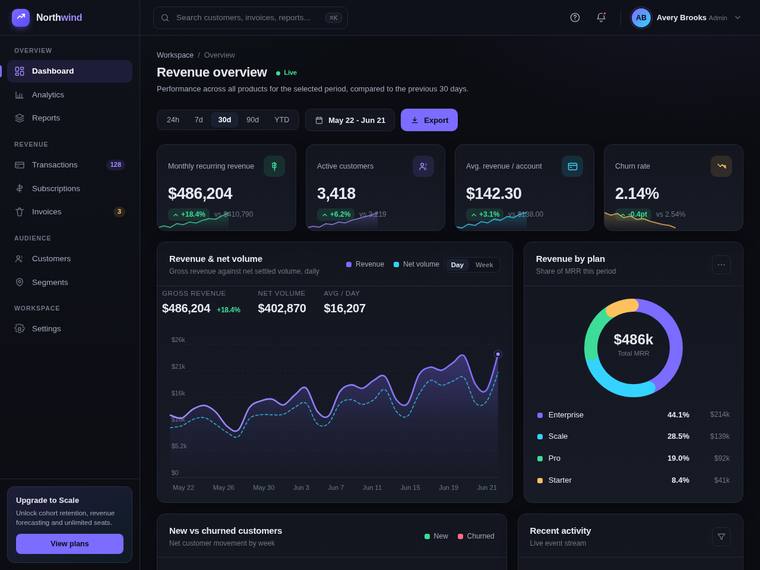
Composite 81.3%Judge 4.3/5
Judge panelAnthropic 4.8/5OpenAI 4.5/5Google 3.5/5
single-judge (Claude) 4.8/5 → leave-one-family-out 4.3/5
Anthropic: Every brief element is present and correct: top bar (logo, search, notifications, avatar), an iconned sidebar with an active Dashboard state, a header with title and date-range control plus Export, four KPI cards with up/down deltas, a real SVG area chart with gridlines and axes, a donut secondary chart, a recent-activity feed, and a status-pill data table. The dark theme is coherent and modern, with a tasteful violet/teal palette, consistent card treatment, and dense-but-legible spacing; alignment and detail are clean with no janky bits. It reads as a premium, finished product UI; it stops ju
OpenAI: The dashboard satisfies most of the brief with a complete top bar, sidebar, header/date controls, four KPI cards, SVG-style primary and secondary charts, and a recent activity panel visible, though the required sortable data table with status pills is not visible and the activity feed content is mostly below the fold. The visual design is polished, cohesive, and premium with strong dark-mode composition, refined spacing, typography, cards, and chart styling. Craft is high with consistent detailing and no obvious broken elements, though the overall impact is more highly professional than truly
Google: The dark mode design is cohesive with strong typography and attractive chart components. Most brief requirements are fulfilled, though the requested data table is missing from the visible area. Overall, the dashboard presents a premium aesthetic despite minor overlapping text in the KPI cards.
deepseek-v4-pro
default reasoning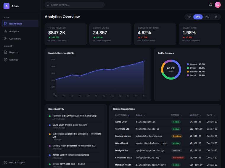
Composite 81.3%Judge 4.3/5
Judge panelAnthropic 4.5/5OpenAI 4.3/5Google 3.3/5
single-judge (Claude) 4.5/5 → leave-one-family-out 4.3/5
Anthropic: Every brief element is present and correct: top bar with logo/search/notifications/avatar, an icon+label sidebar with a clear active state, a header with date-range control, four KPI cards with up/down deltas, an area chart with axes and gridlines, a donut "Traffic Sources" with legend, a recent-activity feed, and a transactions table with status pills. The dark theme is deliberate and cohesive with tasteful violet accents, dense-but-legible spacing, and consistent type. It is a polished, premium-feeling result; craft and impact fall just short of a 5 because it reads as a competent-but-famili
OpenAI: All requested dashboard elements are visible: top bar, sidebar with active nav, header/date control, four KPI cards, SVG line and donut charts, activity feed, and sortable-looking table with status pills. The dark visual system is cohesive, modern, and dense but legible, though it is somewhat conventional and the table/date column appears slightly cramped or clipped at the right edge.
Google: All requested elements are accurately included within a standard, legible dark theme. The execution is highly competent but relies heavily on expected SaaS patterns rather than distinct aesthetics.
deepseek-v4-flash
default reasoning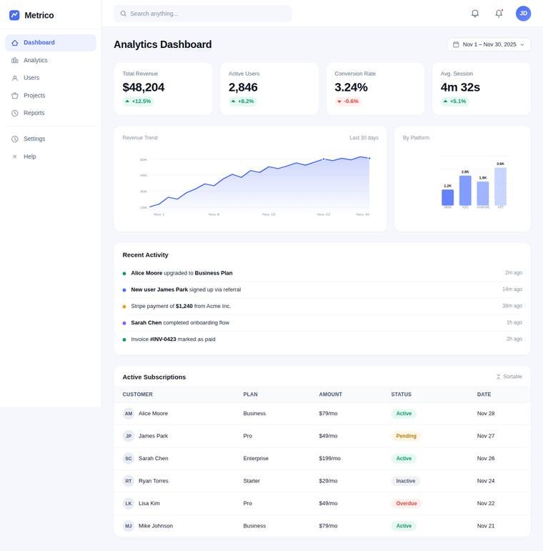
Composite 81.3%Judge 4.3/5
Judge panelAnthropic 4.0/5OpenAI 4.5/5Google 3.5/5
single-judge (Claude) 4.0/5 → leave-one-family-out 4.3/5
Anthropic: Every brief element is present and correct: top bar, active-state sidebar, header with date range, 4 KPI cards with up/down coloured deltas, a real area chart with axes and gridlines plus a labelled bar chart, an activity feed, and a status-pill data table with avatar initials. Composition is clean and legible with consistent spacing, tasteful light theme, and well-formed status pills, though the palette and layout are conventional dashboard-template territory. Craft is solid with only minor nits (two near-identical notification bells, generic "Sortable" affordance), so it reads finished and c
OpenAI: The screenshot includes all required dashboard elements: top bar with search/notifications/avatar, sidebar with active nav, header/date range, KPI cards, SVG charts, activity feed, and a sortable-looking table with status pills. The design is clean, modern, and highly legible with consistent spacing and color usage, though the chart details are somewhat small and the overall treatment is polished but fairly conventional rather than highly distinctive.
Google: The design successfully includes all required elements from the brief, presenting a clean and standard SaaS layout. Visuals are cohesive but lack distinctiveness, and the overall execution is structurally sound.
grok-composer-2.5-fast
default reasoning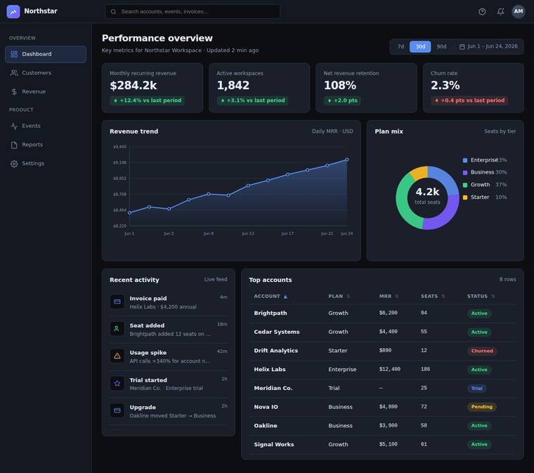
Composite 79.2%Judge 4.2/5
Judge panelAnthropic 4.8/5OpenAI 4.5/5Google 3.3/5
single-judge (Claude) 4.8/5 → leave-one-family-out 4.2/5
Anthropic: Every brief element is present and correct: top bar with logo, search, notifications and avatar; left sidebar with grouped icon+label nav and a clearly highlighted active Dashboard state; page header with title, subtitle and a 7d/30d/90d + date-range control; four KPI cards with values, labels and coloured up/down deltas; a real SVG line/area revenue chart with axes, gridlines and dated x-axis; a donut "Plan mix" with legend and centred total; a "Recent activity" feed with icons and timestamps; and a sortable-looking accounts table with sort carets and coloured status pills (Active/Churned/Tri
OpenAI: All required dashboard elements are present and clearly implemented, including the top bar, active sidebar, KPI cards, SVG line and donut charts, activity feed, and sortable-looking table with status pills. The dark visual system is polished, coherent, and legible with strong hierarchy and spacing, though there is a minor clipped/janky-looking bit at the bottom of the recent activity panel. Overall it feels premium and complete, if somewhat conventional for a SaaS analytics dashboard.
Google: The design fulfills all brief requirements with a cohesive dark theme and logical layout. General execution is solid, though minor text overlapping in the secondary chart legend slightly impacts overall polish.
glm-5.2
default reasoning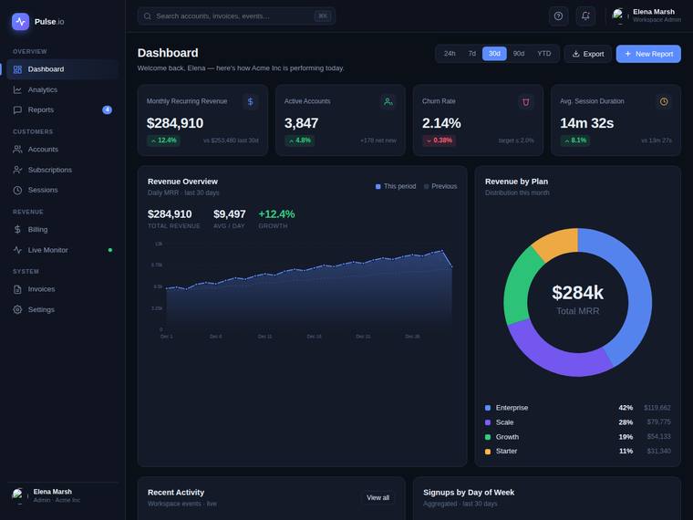
Composite 75.0%Judge 4.0/5
Judge panelAnthropic 4.3/5OpenAI 3.5/5Google 3.5/5
single-judge (Claude) 4.3/5 → leave-one-family-out 4.0/5
Anthropic: Nearly all brief elements are present and correct: top bar with logo/search/notifications/avatar, a grouped sidebar with a clear active state, header with a 30d-selected date-range control, four KPI cards with up/down coloured deltas, a real SVG area chart with axes and gridlines, and a donut secondary chart with a legend. The dark theme is coherent and modern with tasteful violet/multi-hue accents, good density, and strong composition. Marked down on fidelity/craft because the required sortable data table with status pills is not visible (the lower region shows a Recent Activity feed and a Si
OpenAI: Most core dashboard elements are present and visually well styled, including sidebar, top controls, KPI cards, primary SVG line chart, donut chart, and date range controls. However the recent activity feed content and required sortable data table with status pills are not visible, and there are some craft issues such as overly empty chart panels and apparent broken/avatar image details.
Google: The dark theme design is visually strong with well-executed charts and clean typography. However, fidelity is lowered since the required data table and activity feed content are cut off. It remains a polished, albeit standard, dashboard layout.
grok-build-0.1
default reasoning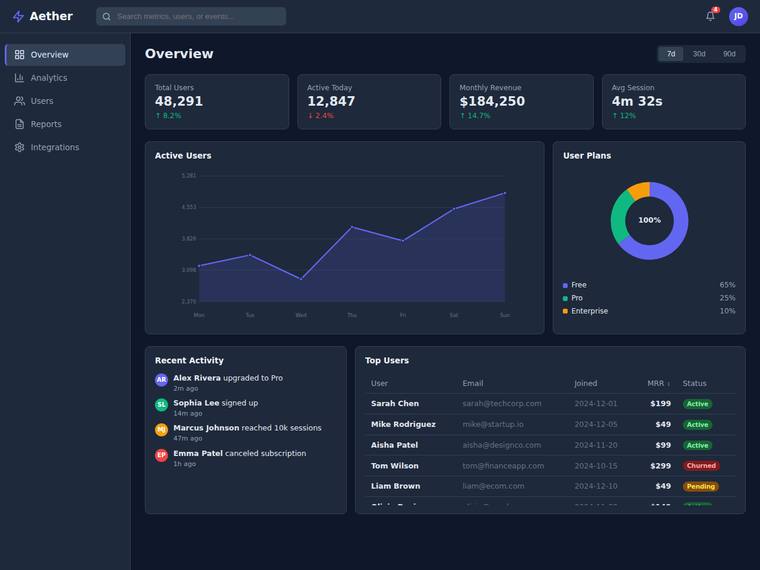
Composite 72.9%Judge 3.9/5
Judge panelAnthropic 4.3/5OpenAI 4.3/5Google 3.3/5
single-judge (Claude) 4.3/5 → leave-one-family-out 3.9/5
Anthropic: Every brief element is present and correct: top bar (logo, search, notifications with badge, avatar), sidebar with icons/labels and an active Overview state, header with 7d/30d/90d range control, four KPI cards with coloured up/down deltas, an SVG area chart with axes and gridlines, a donut with legend, a recent activity feed, and a data table with status pills and an MRR sort caret. The dark palette is coherent and modern with tasteful violet accents, good type hierarchy, and dense-but-legible spacing. Minor craft issues keep it from top marks: the table is clipped at the bottom edge (a parti
OpenAI: All requested dashboard elements are present, including the top bar, sidebar active nav, KPI cards, SVG-style primary and secondary charts, activity feed, and table with status pills. The dark theme is cohesive and modern with good hierarchy and spacing, though the data table appears slightly cramped/cut off at the bottom and the donut chart labeling is a bit generic. Overall it feels polished and production-ready, but not especially distinctive beyond a strong standard SaaS dashboard.
Google: The dashboard successfully incorporates all requested elements into a functional dark theme layout. While the spacing and typography are competent, the overall aesthetic remains fairly standard. It serves its analytical purpose efficiently but lacks distinct visual flair.
grok-4.20-reasoning
default reasoning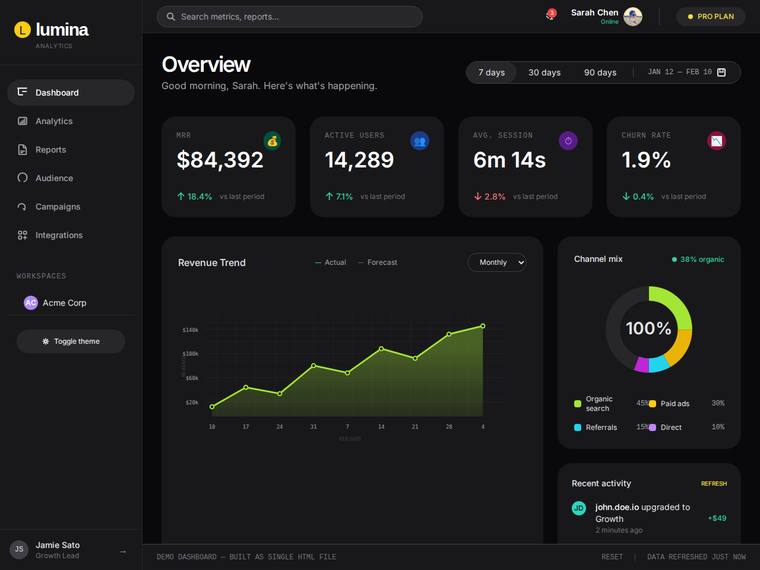
Composite 70.8%Judge 3.8/5
Judge panelAnthropic 4.3/5OpenAI 4.3/5Google 3.0/5
single-judge (Claude) 4.3/5 → leave-one-family-out 3.8/5
Anthropic: Almost every brief element is present and correct: full top bar, iconned sidebar with active state, header with date-range control, four KPI cards with coloured up/down deltas, a real SVG area chart with axes/gridlines/dated x-axis, a donut "channel mix" with legend, and a recent-activity feed. The dark theme is genuinely premium - confident type, tasteful lime/violet accents, consistent spacing and card treatment - a result a reviewer would pause on. It loses points because the required sortable data table with status pills is not visible in the rendered view, and the donut's central "100%" l
OpenAI: The dashboard includes the top bar, sidebar navigation, header/date controls, KPI cards, SVG line chart, donut chart, and recent activity feed, but the required sortable data table with status pills is not visible. The dark visual system is polished, coherent, and premium-looking, though the large empty chart panel area and partially cut-off lower content keep the craft and impact just short of excellent.
Google: The dark theme provides clear hierarchy and decent legibility across most elements. However, the requested data table is completely missing from the layout. The overall aesthetic is competent but standard for modern SaaS interfaces.
gpt-5.4-mini
High reasoning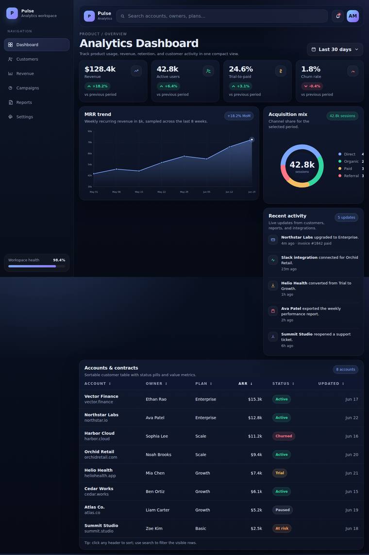
Composite 70.8%Judge 3.8/5
Judge panelAnthropic 3.5/5OpenAI 4.3/5Google 3.0/5
single-judge (Claude) 3.5/5 → leave-one-family-out 3.8/5
Anthropic: Nearly all brief elements are present: top bar with logo/search/notifications/avatar, an icon+label sidebar with an active Dashboard state, page header with title and "Last 30 days" date control, 4 KPI cards with deltas, a primary area chart, a donut secondary chart, a recent activity feed, and a data table with coloured status pills. The dark theme is coherent with a tasteful violet/teal accent palette and good density. Craft is held back by visible issues though: the primary line/area chart lacks proper axes and gridlines and reads as a vague gradient blob, the KPI delta arrows are tiny and
OpenAI: All requested dashboard elements are present and clearly represented, including the top bar, active sidebar, KPI cards, SVG charts, activity feed, and sortable-looking table with status pills. The dark visual system is polished and premium, though the large blank gap beneath the primary chart and before the table weakens the overall composition slightly.
Google: The dashboard successfully integrates all requested elements within a cohesive dark theme. However, the sidebar background abruptly cuts off midway down the screen, severely compromising the structural layout. This glaring flaw detracts from an otherwise standard and functional execution.
grok-4.3
default reasoning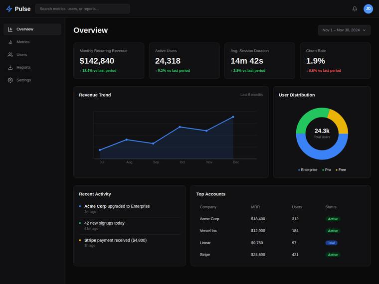
Composite 66.7%Judge 3.7/5
Judge panelAnthropic 4.3/5OpenAI 3.8/5Google 3.0/5
single-judge (Claude) 4.3/5 → leave-one-family-out 3.7/5
Anthropic: Every brief element is present and correct: top bar with logo/search/notifications/avatar, sidebar nav with active Overview state, header with date-range control, 4 KPI cards with up/down-colored deltas, an SVG area/line chart, a donut chart, a recent activity feed, and a table with colored status pills. The dark theme is coherent and modern with tasteful blue accents, good spacing, and a polished donut, giving it real premium feel. It falls short of excellent because the line chart has no Y-axis values and only faint gridlines, and the table is more static-looking than clearly sortable, leavi
OpenAI: The dashboard includes nearly all requested elements: top bar, sidebar with active state, date control, KPI cards with colored deltas, SVG-style charts, activity feed, and a status-pill table. The design is coherent and polished with a deliberate dark theme, though the table lacks clear sortable cues and the overall visual language is fairly standard rather than distinctive.
Google: The build incorporates all required components into a functional dark theme. The execution is cohesive and readable, though the overall layout remains quite conventional.
claude-haiku-4-5
default reasoning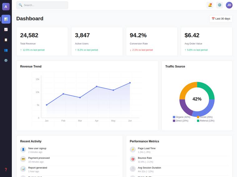
Composite 62.5%Judge 3.5/5
Judge panelAnthropic 3.5/5OpenAI 3.5/5Google 2.5/5
single-judge (Claude) 3.5/5 → leave-one-family-out 3.5/5
Anthropic: Most elements are present and well executed: top bar, KPI cards with coloured deltas, a real SVG area/line chart with axes and gridlines, a donut chart with legend, and an activity feed. However two brief items are unmet - the sidebar shows icons only with no labels, and the required sortable data table with status pills is absent (the lower row is two activity/metric lists). Visuals are clean, coherent, and modern with tasteful spacing and colour, but the result is competent rather than distinctive, and the layout reads slightly empty toward the bottom.
OpenAI: The dashboard includes the top bar, header/date control, KPI cards, primary SVG line chart, secondary donut chart, and recent activity feed, but the sidebar lacks text labels and there is no visible sortable data table with status pills. The visual design is clean, modern, and legible with consistent card structure and spacing, though it feels fairly generic and not especially premium or distinctive.
Google: The layout is functional but omits required elements like sidebar labels and a proper data table. Visually, it relies on generic styling that lacks strong distinction. Execution is adequate but falls short of a premium feel.
claude-haiku-4-5
High reasoning
Composite 58.3%Judge 3.3/5
Judge panelAnthropic 3.5/5OpenAI 3.5/5Google 2.5/5
single-judge (Claude) 3.5/5 → leave-one-family-out 3.3/5
Anthropic: Visible portion delivers a clean, coherent dark dashboard: top bar with logo/search/notifications/avatar, a well-grouped sidebar with active state, page header with period control, four KPI cards with correctly colour-coded deltas (red for the -2.1% drop, green for gains), and a polished SVG area/line chart with axes and gridlines. The composition, spacing, and restrained blue-on-navy palette read modern and finished with no janky bits visible. However the brief's secondary chart, recent-activity feed, and sortable data table with status pills are not visible in the screenshot, so several requ
OpenAI: The visible UI covers the top bar, sidebar navigation, page header/date control, KPI cards, and a real primary chart, but the secondary chart, recent activity feed, and sortable data table are not visible, and the KPIs are arranged 2x2 rather than in a row. The dark visual system is coherent and polished with good spacing and hierarchy, though it feels fairly generic and the oversized panels reduce dashboard density.
Google: The design establishes a basic dark theme but misses major brief requirements, including the secondary chart, activity feed, and data table. The visual execution is standard, resulting in an average, mostly generic appearance without standout polish.
gemini-3.1-flash-lite
default reasoning
Composite 47.9%Judge 2.9/5
Judge panelAnthropic 2.8/5OpenAI 3.0/5Google 2.5/5
single-judge (Claude) 2.8/5 → leave-one-family-out 2.9/5
Anthropic: Many brief elements land: dark sidebar nav with active state, "Overview" header with date control, four well-formed KPI cards with correctly coloured up/down deltas, a donut chart, and a status-pilled activity table. But several required pieces are missing or weak: no top-bar search or notifications, no sidebar icons, and crucially the primary "line chart" is a bare squiggle with no axes, gridlines, or data points despite the brief explicitly asking for them; the activity feed and data table are also merged into one. The light theme is clean and legible but generic, and the empty chart panels
OpenAI: The dashboard includes a sidebar, header/date control, four KPI cards, charts, and a table with status pills, but it is missing visible sidebar icons, search, notifications, a distinct recent activity feed, sortable cues, and proper axes/gridlines on the primary chart. The visual design is clean and legible with consistent spacing, but the execution is very generic and some details like the raw date input and minimal charting reduce polish and premium impact.
Google: The build omits key features like the top bar and sidebar icons. Visuals are adequately clean but lack structural refinement. The overall result feels generic rather than premium.
claude-sonnet-4-6
High reasoning
Composite 8.3%Judge 1.3/5
Judge panelAnthropic 1.0/5OpenAI 1.0/5Google 2.0/5
single-judge (Claude) 1.0/5 → leave-one-family-out 1.3/5
Anthropic: The screenshot is entirely blank white with no visible content whatsoever. None of the required elements (top bar, sidebar, KPI cards, charts, activity feed, data table) are present. The build effectively rendered nothing, so it fails every criterion.
OpenAI: The screenshot is entirely blank, with none of the required dashboard elements visible: no top bar, sidebar, KPI cards, charts, activity feed, or table. As a result it shows no visual composition, finished UI detail, or memorable product impact.
Google: The provided image is completely blank and lacks all required dashboard elements. There is no visual design or structural execution present.