Banja Lab / Benchmarks / Test
WDB-0008webdesign · hard
Ledgerline business spend platform marketing site
The same task, run on 28 models. Compare the outputs side by side, or open any one in a popup to inspect it.
Top result: Mara Vieira (kimi-k3) (default reasoning) at 93.8% composite. Lowest: Yuki Tanabe (deepseek-v4-pro) at 0.0%. 28 models compared on this task.
How it ran
- Each model was given the brief below in a fresh, isolated session with no access to our tools, and returned a single self-contained index.html (inline CSS and JS, no external requests, no build step).
- The rendered output was scored 1 to 5 on brief fidelity, visual design, craft, and impact by a four-family vision panel - Anthropic (Claude Opus 4.8), OpenAI (GPT-5.5), Google (Gemini 3.1 Pro), and xAI (Grok 4.3) - using one identical prompt so the scores compare. The published judge score is leave-one-family-out: a model is never scored by a judge of its own family, so same-family self-preference is removed.
The brief
# Client brief: Ledgerline You are designing and building the marketing site for a real Australian fintech. The brief below gives you the business facts, the goal, the audience, the sections the site must have, and the exact content to use. It gives you no visual direction on purpose. Every design decision - layout, type, colour, imagery, motion, tone - is yours to make. Read the whole brief, form a point of view on how this product should look and feel, and build it. ## The business Ledgerline is a business spend platform for Australian companies. It gives a business one place to control company spending: it issues company cards to staff, tracks every transaction in real time, routes spend for approval, and syncs the whole lot to the business's accounting software. Ledgerline Pty Ltd is based in Melbourne, was founded in 2021, and today has a team of about 60 people. The company holds an Australian Financial Services Licence (AFSL 542118), and the cards are issued through an Australian authorised deposit-taking institution (ADI) banking partner. ## What the site is for The single most important job of this site is to get a business to sign up. The primary action everywhere is "Request access": a visitor gives their work email and company name to start. Everything on the page should build enough understanding and trust that a finance decision-maker is willing to take that step. ## Who it is for The buyer is a finance decision-maker at a small or mid-sized Australian business: a finance manager, a CFO, a head of finance, or an owner who signs off on spending. They care about control, visibility, getting month-end done faster, and - because this is money and card data - whether the product is safe, compliant, and Australian. A more junior finance or operations person often does the research before the decision-maker signs off. ## What the site must contain (all of these sections) - a hero with the primary call to action (request access), - the product: a plain explanation of what Ledgerline does, - features: the four to six things it does, each with the benefit stated, - security and compliance: the regulated-trust section (encryption, Australian data residency, certifications, licensing, access controls), - social proof: customer testimonials and the names of businesses that use it, - pricing: the plans, shown so a visitor can compare them, - trust and credibility: who backs the company and the numbers that show its scale, - a frequently asked questions section, - a final call to action and a footer with the company's contact and legal details. ## Content to use Use the content below substantially as written, in Australian English. You may write your own section headings and any short connective microcopy (button labels, captions, form labels), but the facts, figures, names, dates, plans, prices, and claims are fixed. Do not invent extra features, drop any, change the plans or their prices, alter the security claims or certifications, or change any of the numbers. ### The product, in one paragraph Ledgerline replaces the usual mix of a shared company card, spreadsheets, and a shoebox of receipts. A business issues each staff member their own card with its own limit, sees every purchase the moment it happens, sets rules for what needs approval, and has every transaction and receipt flow straight into its accounting software already coded. Finance keeps control; staff stop chasing reimbursements; month-end gets shorter. ### The features Present all of these. Each has a name and the benefit it delivers. - Company cards. Issue virtual cards instantly and physical Visa cards to staff, each with its own spending limit set by finance. Freeze or cancel any card in one click. - Real-time tracking. Every transaction appears the moment it is made, already matched to the card, the person, and a category. No waiting for a statement at the end of the month. - Approvals. Route spend to the right approver with rules by amount, team, and category. A request over a set limit needs a sign-off before the money moves. - Accounting sync. Two-way sync with Xero, MYOB, and QuickBooks Online. Transactions, line items, and receipts flow through already coded to the right account. - Budgets. Set a budget for a team, a project, or a campaign and watch the remaining balance fall in real time, so nobody finds out they overspent a month later. - Receipt capture. Staff photograph a receipt on their phone and it is matched to the transaction automatically. Finance chases far fewer missing receipts. ### Security and compliance This is a regulated financial product and the site must say so plainly. Use these facts: - Encryption. All data is encrypted in transit with TLS 1.2 or higher and at rest with AES-256. - Australian data residency. All customer data is hosted in Australian data centres, in the Sydney and Melbourne regions. It does not leave the country. - Certifications. Ledgerline is ISO/IEC 27001 certified for information security, holds a current SOC 2 Type II report renewed annually by independent audit, and is PCI DSS Level 1 compliant for the handling of card data. - Licensing and funds. Ledgerline holds Australian Financial Services Licence 542118. Cards are issued through an Australian ADI banking partner, and customer funds are held in a segregated account with that partner, separate from Ledgerline's own money. - Access controls. Single sign-on, role-based access so people see only what they should, and an audit log that records every action taken in the account. ### Social proof Three customers, quoted as written, with their name, role, and business: - "Month-end used to take our team four days. With Ledgerline it takes half a day. Every receipt is already attached and coded." - Priya Nadkarni, Finance Manager, Brightwater Logistics, Brisbane. - "I can see exactly what the whole company is spending, right now, without asking anyone for a statement. That visibility on its own was worth the switch." - Tom Mercer, Chief Financial Officer, Kanga Fitness Group, Melbourne. - "Giving each site manager their own card with a set limit ended the reimbursement backlog overnight. Our people stopped fronting their own money." - Sarah Whitlam, Head of Finance, Coastline Hospitality, Gold Coast. Businesses that use Ledgerline (show these names): Brightwater Logistics, Kanga Fitness Group, Coastline Hospitality, Ridgeway Constructions, Two Foxes Coffee, and Marlin Digital. ### Pricing Three plans. Every plan can be paid monthly or annually, and the annual price is lower per month. Show both the monthly price and the annual price for each plan so a visitor can compare them without having to change anything on the page. Prices are in Australian dollars and exclude GST. - Starter. Monthly: $0 per month. Annual: $0 per month. For small teams getting started. Includes up to 5 users, up to 10 cards, real-time tracking, receipt capture, and accounting sync with Xero, MYOB, and QuickBooks Online. - Team. Monthly: $49 per month. Annual: $39 per month, billed yearly. For growing finance teams. Everything in Starter, plus up to 50 users, unlimited cards, approval workflows, budgets, and single sign-on. - Business. Monthly: $149 per month. Annual: $119 per month, billed yearly. For larger organisations. Everything in Team, plus unlimited users, custom approval rules, audit log export, a dedicated account manager, and priority support. There is no lock-in contract on any plan and a business can cancel at any time. Ledgerline also earns a share of card interchange, which is how the free and lower-priced plans stay sustainable. ### Trust and credibility - Backed by Southern Cross Ventures and Meridian Partners. - The numbers: more than 2,400 Australian businesses use Ledgerline; over $640 million in company spend was processed through the platform in the last financial year; 38,000 active cards have been issued; and the platform has maintained 99.98% uptime over the past year. ### Frequently asked questions Use these questions and answers: - Who can use Ledgerline? Any Australian business with an ABN: companies, trusts, and partnerships. You do not need to change banks to use it. - How are the cards issued? They are Visa cards issued through Ledgerline's Australian ADI banking partner. Virtual cards are available instantly and physical cards arrive within five business days. - Where is my data stored? In Australian data centres, in the Sydney and Melbourne regions. Your data does not leave the country. - Does it work with my accounting software? Yes. Ledgerline has a two-way sync with Xero, MYOB, and QuickBooks Online. - What does it cost? The Starter plan is free. Team is $49 per month, or $39 per month billed yearly. Business is $149 per month, or $119 per month billed yearly. There is no lock-in contract and you can cancel at any time. - Is my money safe? Customer funds are held in a segregated account with our ADI banking partner, separate from Ledgerline's own money. Ledgerline holds AFSL 542118 and is PCI DSS Level 1 compliant. - How long does setup take? Most teams are up and running within a day. ### Contact and legal details for the footer Ledgerline Pty Ltd. ABN 47 632 118 904. AFSL 542118. Level 8, 120 Spencer Street, Melbourne VIC 3000. Email hello@ledgerline.com.au. Phone 1300 042 118. ## Output contract (React, single page) Build one single-page site. Output exactly two files: - `App.tsx` - a default-exported React component. Define any subcomponents in this same file. This is the whole page. - `theme.css` - a Tailwind v4 `@theme` token block, your `font-family` choices from the shared font menu below, and any custom CSS you need. The only imports allowed in `App.tsx` are `react`, `framer-motion`, `lucide-react` (never the Sparkles icon), and, for 3D, `three`, `@react-three/fiber`, and `@react-three/drei`. No other packages, no network requests, and no external assets: all imagery must be inline SVG, CSS, drawn in code on a canvas, or rendered with WebGL. The fonts are bundled offline, so use only the shared menu: Archivo (including Archivo Expanded), Instrument Sans, Space Grotesk, Work Sans, IBM Plex Sans, IBM Plex Mono, JetBrains Mono, Fraunces, Instrument Serif, Playfair Display, Lora, Caveat. Make it responsive across mobile, tablet, and desktop. The page must also remain fully readable and usable if WebGL is unavailable: never leave a visitor with a blank screen or a missing section because a 3D canvas failed to start.
Mara Vieira (kimi-k3)
default reasoning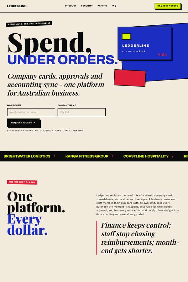
Composite 93.8%Judge 4.8/5
Judge panelAnthropic 4.8/5
single-judge (Claude) 4.8/5 → leave-one-family-out 4.8/5
Anthropic: A confident editorial/Swiss-brutalist treatment in cream with blue, red and yellow accents that renders essentially every required section: hero with a Request-access form, plain product explanation, six numbered features with benefits, a full blue security/compliance block, testimonials with named sticky-note quotes, a three-tier pricing grid showing both monthly and annual prices, the trust numbers (2,400+, $640M+, 38,000, 99.98%), an FAQ, and a red final CTA plus legal footer - very high brief fidelity. Typography is bold and distinctive, colour and spacing are cohesive, and the result is g
Mara Vieira (Opus 4.8)
High reasoning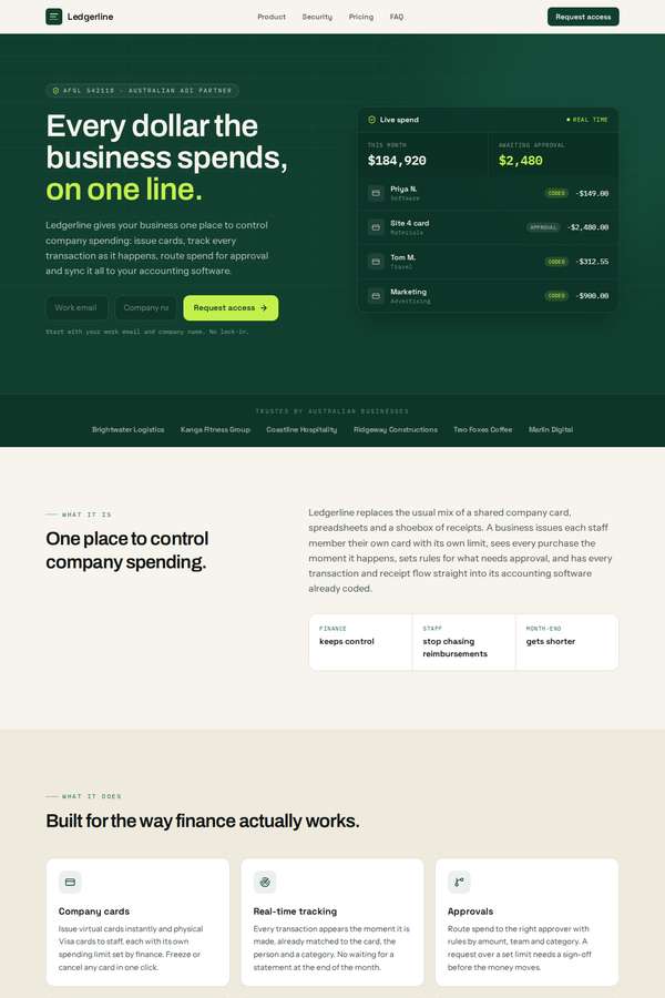
Composite 87.5%Judge 4.5/5
Judge panelAnthropic 4.5/5
single-judge (Claude) 4.5/5 → leave-one-family-out 4.5/5
Anthropic: Every required section is present and correct: a hero with a working "Request access" CTA and a detailed live-spend dashboard mockup, the plain product explanation, six benefit-stated features, a dedicated dark security/compliance block (encryption, AU residency, ISO/SOC2/PCI, AFSL/ADI, access controls), three named testimonials plus a trusted-by logo row, three comparable pricing plans ($0/$49/$149 with annual notes), the scale numbers (2,400+, $640M+, 38,000, 99.98%) and investor backing, an FAQ, and a final CTA with a full legal footer. The visual system is confident and coherent - deep for
Ingrid Kessler (kimi-k3)
default reasoning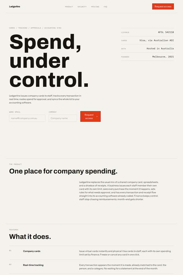
Composite 87.5%Judge 4.5/5
Judge panelAnthropic 4.5/5
single-judge (Claude) 4.5/5 → leave-one-family-out 4.5/5
Anthropic: Every required section is present and content-accurate: the hero with a Request-access email/company form, the product paragraph, six numbered features with benefits, five security/compliance items, three testimonials plus the customer name row, three pricing plans showing both monthly and annual prices ($0, $49/$39, $149/$119), the trust numbers (2,400+, $640m+, 38,000, 99.98%), FAQ, final CTA, and a full legal footer. The visual language is a confident, editorial Swiss/brutalist system - oversized Archivo-style black hero type, disciplined monospace section labels, generous whitespace, and a
Yuki Tanabe (kimi-k3)
default reasoning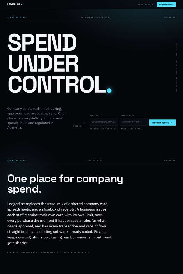
Composite 87.5%Judge 4.5/5
Judge panelAnthropic 4.5/5
single-judge (Claude) 4.5/5 → leave-one-family-out 4.5/5
Anthropic: Every required section is present and correct: a bold "SPEND UNDER CONTROL" hero with Request access, product paragraph, six named features, five-point security/compliance block, three testimonials plus the six business names, three-tier pricing showing both monthly and annual, the four trust numbers with backers, a full FAQ, and a final CTA with a complete legal/contact footer. The dark editorial system is cohesive and modern - heavy condensed display type, mono section labels, a single cyan accent dot, and disciplined spacing give it a confident, premium fintech feel. Craft is strong but a n
Noor El-Amin (Opus 4.8)
High reasoning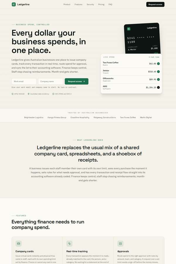
Composite 81.3%Judge 4.3/5
Judge panelAnthropic 4.3/5
single-judge (Claude) 4.3/5 → leave-one-family-out 4.3/5
Anthropic: Every required section is present and correct: hero with Request access CTA and email/company fields, product paragraph, a six-item features grid, a dark security/compliance block covering encryption, residency, certifications, licensing and access controls, three testimonials plus the customer-name trust bar, a three-tier pricing table ($0/$39/$119 with billed-yearly notes), the four scale numbers (2,400+, $640M+, 38,000, 99.98%), backers line, FAQ accordion, final CTA and a full legal footer. The warm cream-and-dark-green palette is coherent, modern and appropriately calm for a regulated fin
Elias Byrne (kimi-k3)
default reasoning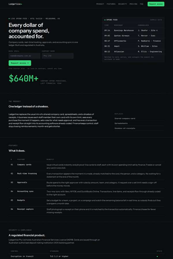
Composite 81.3%Judge 4.3/5
Judge panelAnthropic 4.3/5
single-judge (Claude) 4.3/5 → leave-one-family-out 4.3/5
Anthropic: Every required section is present and correct: hero with dual request-access forms, the $640M stat, product paragraph, all six numbered features with benefits, the full security/compliance table, three testimonials plus the six business names, a three-plan pricing table showing both monthly and annual prices, the trust numbers, an FAQ accordion, and a final CTA with a legal footer. The design commits fully to a coherent dark terminal/ledger aesthetic - mono type, a single green accent, tabular data layouts and a live spend feed - which is thematically apt and consistently executed with clean a
Noor El-Amin (kimi-k3)
default reasoning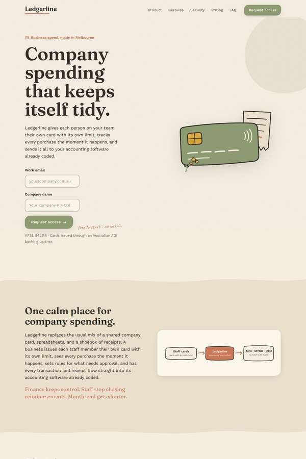
Composite 81.3%Judge 4.3/5
Judge panelAnthropic 4.3/5
single-judge (Claude) 4.3/5 → leave-one-family-out 4.3/5
Anthropic: Every required section is present and correct: hero with request-access form, product paragraph with a diagram, all six features with benefits, the dark regulated-trust block with all five compliance items, three named testimonials plus the customer logo row, three-tier pricing showing both monthly and annual prices, the four scale numbers, an FAQ accordion, and a final CTA with a full legal footer. The design commits to a distinctive, calm editorial direction - sage green, cream, and terracotta with serif display headings - which reads as intentional and differentiated from generic fintech bl
Ingrid Kessler (deepseek-v4-pro)
default reasoning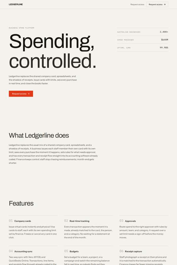
Composite 81.3%Judge 4.3/5
Judge panelAnthropic 4.3/5
single-judge (Claude) 4.3/5 → leave-one-family-out 4.3/5
Anthropic: Every required section is present and correct: bold editorial hero with "Request access" CTA, product explanation, six named features with benefits, full security/compliance block, three testimonials plus the customer name row, three-plan pricing showing both monthly and annual prices, the backers and scale numbers, FAQ, final email/company form, and a footer with all contact and legal details. The design commits to a confident Swiss/editorial fintech look - cream ground, single red-orange accent, big Archivo-style headline, generous whitespace, tidy grids - that reads coherent and modern. It
Cass Werner (Opus 4.8)
High reasoning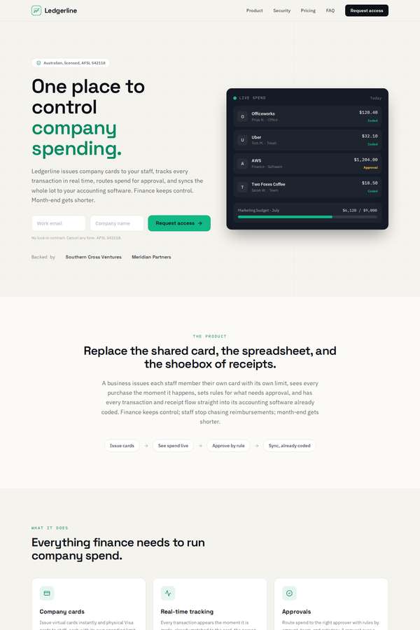
Composite 81.3%Judge 4.3/5
Judge panelAnthropic 4.3/5
single-judge (Claude) 4.3/5 → leave-one-family-out 4.3/5
Anthropic: Every required section is present and correct: hero with a Request access form, the plain product paragraph, all six named features with benefits, a full security/compliance block (encryption, AU residency, certifications, licensing, access controls), three testimonials plus the customer name row, three pricing plans showing both monthly and annual prices with a highlighted Team tier, backer/scale numbers, a full FAQ, and a final CTA with a complete footer carrying ABN/AFSL/address. The green-on-cream palette with a dark hero card and dark security band is coherent, modern, and well spaced, wi
Elias Byrne (Opus 4.8)
High reasoning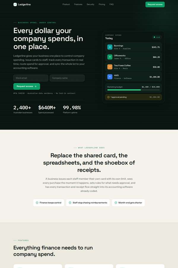
Composite 75.0%Judge 4.0/5
Judge panelAnthropic 4.0/5
single-judge (Claude) 4.0/5 → leave-one-family-out 4.0/5
Anthropic: All required sections are present and correctly populated: hero with "Request access", the product paragraph, six benefit-stated features, a detailed security/compliance block with the certifications and AFSL, three named testimonials plus the customer logo row, three pricing tiers ($0/$49/$149), the trust numbers (2,397+/$639M+/37,771/99.98%), FAQ, and a legal footer. The dark-green fintech palette with cream alternating sections is coherent, modern, and well spaced, and the hero dashboard mockup reads as a credible product. Craft is clean and consistent throughout; it loses a point on distin
Sol Kepler (Opus 4.8)
High reasoning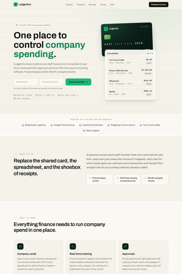
Composite 75.0%Judge 4.0/5
Judge panelAnthropic 4.0/5
single-judge (Claude) 4.0/5 → leave-one-family-out 4.0/5
Anthropic: All required sections are present and correct: hero with Request access CTA and email/company fields, plain product explanation, six benefit-stated features, a dark security/compliance block covering encryption, residency, certifications, licensing and access controls, three named testimonials plus the client logos, three pricing plans showing both monthly and annual figures, the trust numbers (2,400+, $640M+, 38,000, 99.98%), backers, FAQ, final CTA and a full legal footer. The green-on-cream palette with dark contrast bands and mono accent tags is coherent, modern and cleanly spaced, and the
Cass Werner (kimi-k3)
default reasoning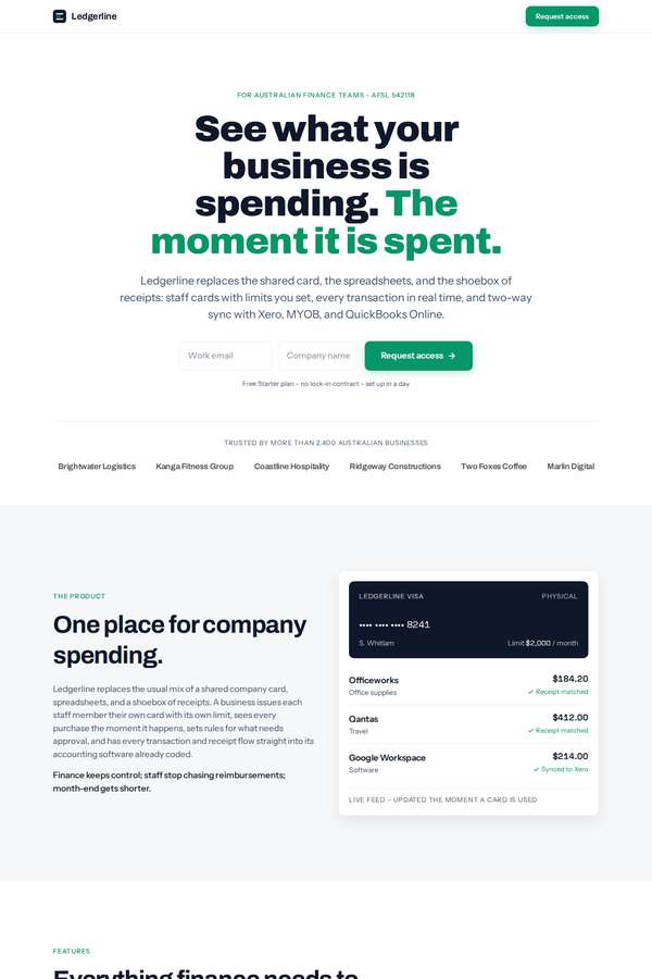
Composite 75.0%Judge 4.0/5
Judge panelAnthropic 4.0/5
single-judge (Claude) 4.0/5 → leave-one-family-out 4.0/5
Anthropic: All required sections are present and correct: hero with "Request access" form, product paragraph, six named features with benefits, a full regulated-trust section (encryption, AU data residency, ISO/SOC2/PCI certs, AFSL 542118, access controls), three testimonials plus the six customer names, a three-plan pricing table showing both monthly and annual prices, the four scale numbers, FAQ, final CTA, and a footer with ABN/AFSL/address/phone. Visually it is a clean, coherent, modern fintech layout with a confident green accent, alternating section backgrounds, and a nice card/transaction mockup i
Sol Kepler (kimi-k3)
default reasoning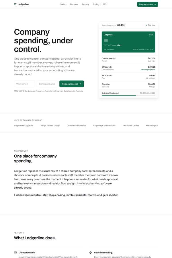
Composite 68.8%Judge 3.8/5
Judge panelAnthropic 3.8/5
single-judge (Claude) 3.8/5 → leave-one-family-out 3.8/5
Anthropic: All required sections are present and correctly ordered: hero with Request access form, product paragraph, six named features, a well-structured security/compliance table, customer logos and three testimonials, three pricing plans, the scale numbers (2,400+, $640M+, 38,000, 99.98%), backers, FAQ, and a green final CTA with a complete legal footer. The visual system is coherent and professional - restrained green accent, generous whitespace, clean type hierarchy, and a tasteful hero card mockup - and the execution looks finished with no broken elements. It loses points because the pricing cards
Cass Werner (deepseek-v4-pro)
default reasoning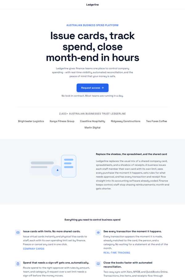
Composite 68.8%Judge 3.8/5
Judge panelAnthropic 3.8/5
single-judge (Claude) 3.8/5 → leave-one-family-out 3.8/5
Anthropic: All required sections are present and correct: hero with Request access CTA, product paragraph, six named features with benefits, a thorough security/compliance block, three testimonials with named businesses plus the customer-logo row, three pricing plans with monthly and annual pricing, backers and scale numbers, FAQ, final CTA, and a complete legal footer. The execution is clean, consistent, and finished - uniform icons, tidy pricing cards, aligned spacing - but the visual language is a fairly generic light SaaS template with a single blue accent, small low-contrast body text, and very spar
Yuki Tanabe (Opus 4.8)
High reasoning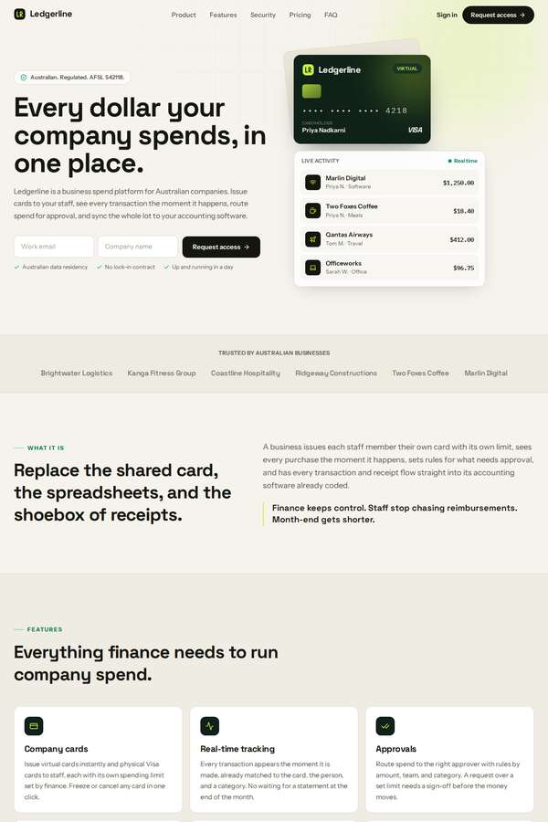
Composite 62.5%Judge 3.5/5
Judge panelAnthropic 3.5/5
single-judge (Claude) 3.5/5 → leave-one-family-out 3.5/5
Anthropic: All required sections are present and well ordered - hero with "Request access", product explainer, six features, a dark regulated-trust security block, three named testimonials plus the customer logo row, three pricing plans with monthly and annual prices, backing/scale numbers, FAQ, and a final CTA with a full legal footer. However the fixed trust figures were altered: the build shows 2,376+ businesses, $634M+, 37,619+ cards and notably 98.98% uptime versus the brief's mandated 2,400+, $640M, 38,000 and 99.98%, which the brief explicitly forbids changing. The lime-on-cream-and-deep-green fin
Elias Byrne (deepseek-v4-pro)
default reasoning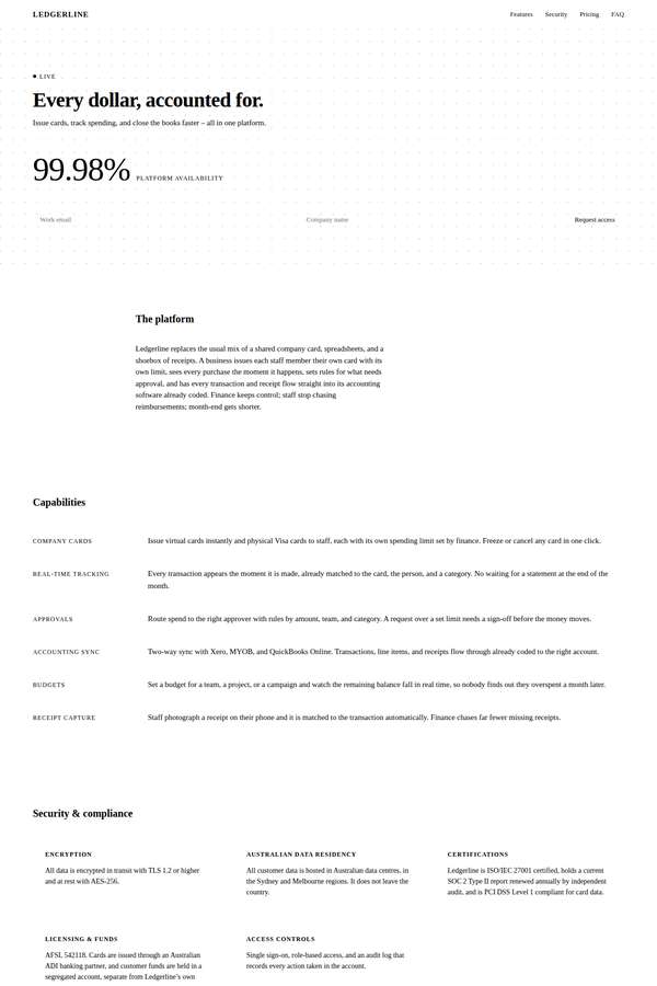
Composite 56.3%Judge 3.3/5
Judge panelAnthropic 3.3/5
single-judge (Claude) 3.3/5 → leave-one-family-out 3.3/5
Anthropic: Brief coverage is complete and accurate: hero with the Request-access form, the product paragraph, all six capabilities, the full security/compliance block, three testimonials plus the six customer names, a pricing table showing both monthly and annual prices with feature checkmarks, the by-the-numbers stats and backers, FAQ, and a footer with all legal/contact details. The execution takes a restrained editorial approach with a serif hero and a dotted texture, which is coherent but reads as very thin and small-type-heavy, with low contrast and lots of empty whitespace that makes sections feel
Noor El-Amin (deepseek-v4-pro)
default reasoning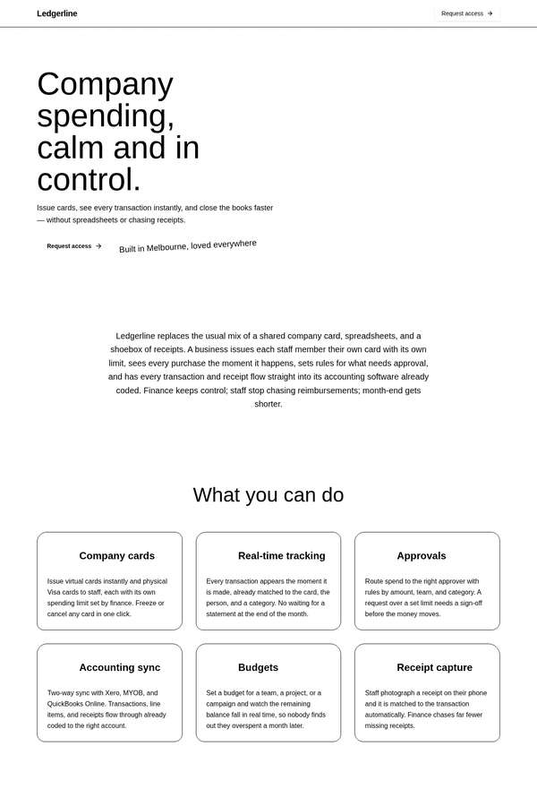
Composite 50.0%Judge 3.0/5
Judge panelAnthropic 3.0/5
single-judge (Claude) 3.0/5 → leave-one-family-out 3.0/5
Anthropic: All required sections are present and correct: hero with "Request access", the product paragraph, six named features with benefits, the full security/compliance block, three testimonials plus the business logos row, a three-plan pricing table showing both monthly and annual prices, scale numbers and backers, FAQ, and a footer with the ABN/AFSL/address/contact details - strong brief coverage. Visually, though, it reads as a near-monochrome wireframe: everything is black text on white with thin hairline borders, very small type, weak hierarchy, and no colour, imagery, or accent to anchor a premi
Sol Kepler (deepseek-v4-pro)
default reasoning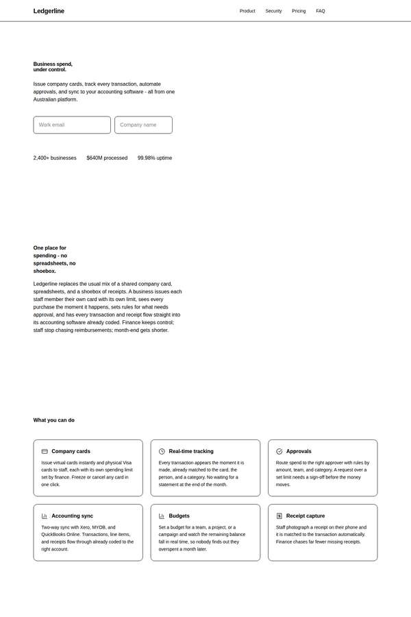
Composite 31.3%Judge 2.3/5
Judge panelAnthropic 2.3/5
single-judge (Claude) 2.3/5 → leave-one-family-out 2.3/5
Anthropic: Content fidelity is strong: every required section is present (hero with request-access form, product paragraph, six features, five security items, three testimonials plus the used-by names, three-tier pricing showing both monthly and annual prices, trust numbers, backers, FAQ, final CTA and a footer with contact/legal details), and the figures appear correct. Visually, however, it reads as a near-unstyled wireframe: monochrome black-on-white, tiny cramped type, thin generic bordered cards, no colour, no imagery, and weak hierarchy. Craft is undermined by enormous empty vertical gaps between s
Mara Vieira (deepseek-v4-pro)
default reasoning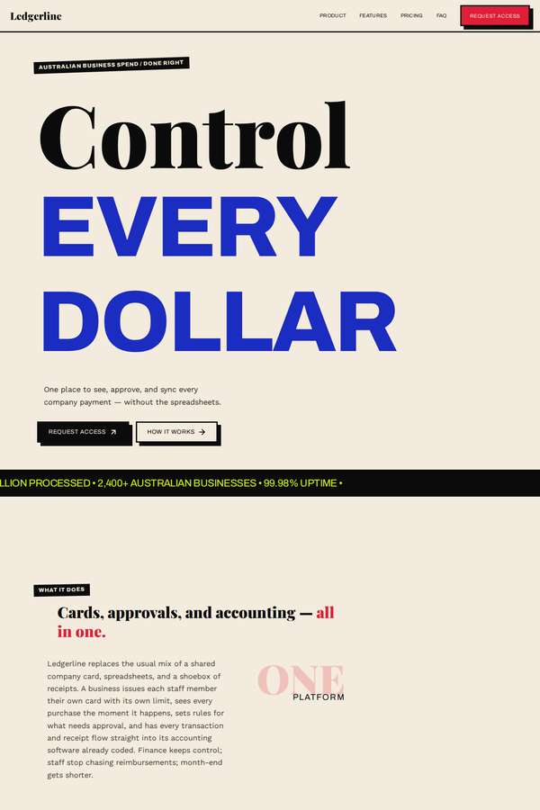
Composite 25.0%Judge 2.0/5
Judge panelAnthropic 2.0/5
single-judge (Claude) 2.0/5 → leave-one-family-out 2.0/5
Anthropic: The hero is distinctive and confident (bold serif "Control" over an oversized electric-blue "EVERY DOLLAR" on cream, with clear Request Access CTAs) and the trust stats block is cleanly rendered, but the visible page is largely empty where key content should be. The features section shows only a heading with no feature cards or benefits, testimonials is a near-black void with just business names and no quotes, pricing shows one line of microcopy but no plan cards, and the FAQ block is empty. These missing sections read as a broken or animation-gated render, badly hurting fidelity, composition,
Ingrid Kessler (Opus 4.8)
High reasoning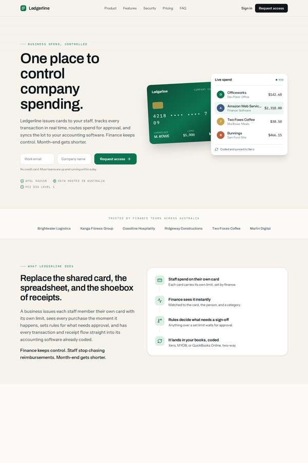
Composite 18.8%Judge 1.8/5
Judge panelAnthropic 1.8/5
single-judge (Claude) 1.8/5 → leave-one-family-out 1.8/5
Anthropic: The hero (headline, card mockup, live-spend panel, Request access CTA, AFSL/data-residency badges), a logo strip, a product explanation with four feature cards, and an FAQ plus footer with correct legal details do render competently and with clean, modern type. But the page is largely broken: enormous stretches are empty, including a full-height black void, blank cream bands, and a bare rounded placeholder rectangle where sections should be. Whole required sections are missing or unrendered - full six-feature set with benefits, security/compliance detail, testimonials, the trust numbers, and t
Ingrid Kessler (claude-fable-5)
High reasoning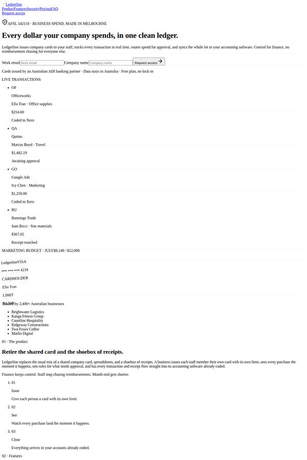
Composite 18.8%Judge 1.8/5
Judge panelAnthropic 1.8/5
single-judge (Claude) 1.8/5 → leave-one-family-out 1.8/5
Anthropic: The content is substantially complete and correct - hero with request-access form, product paragraph, all six features, the full security/compliance block, three testimonials with the six business names, three pricing plans with both monthly and annual prices, the trust numbers, FAQ, and footer legal details are all present, so brief fidelity is strong. But visually this is a near-total failure: the page renders as unstyled black-on-white text in a single narrow column with no layout, no colour, no spacing system, no cards, and tiny broken icon glyphs, reading like a raw HTML dump where the th
Sol Kepler (claude-fable-5)
High reasoning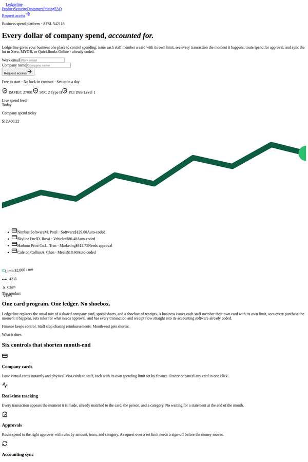
Composite 18.8%Judge 1.8/5
Judge panelAnthropic 1.8/5
single-judge (Claude) 1.8/5 → leave-one-family-out 1.8/5
Anthropic: Content fidelity is high: hero with Request access, product paragraph, all six features, security/compliance facts, three testimonials plus the business names, three pricing tiers with both monthly and annual prices, trust numbers, FAQ, and a full legal footer are all present and correct. But the render is almost completely unstyled - default browser serif/sans fonts, no grid or card layout, no spacing hierarchy, and pricing shown as stacked plain text rather than a comparable layout. Icons appear as tiny broken fragments and interactive-looking bits (nav, FAQ, forms) read as raw markup, so vi
Yuki Tanabe (claude-fable-5)
High reasoning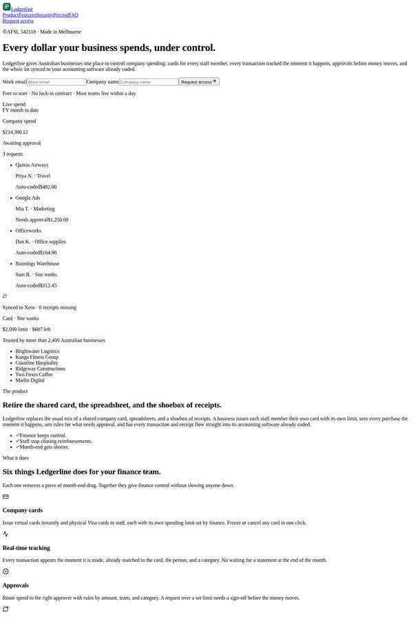
Composite 12.5%Judge 1.5/5
Judge panelAnthropic 1.5/5
single-judge (Claude) 1.5/5 → leave-one-family-out 1.5/5
Anthropic: The page renders as completely unstyled browser-default HTML: Times-style serif type, plain unordered lists, no layout grid, no colour, no cards or columns, and native select dropdowns in the FAQ. The theme.css / Tailwind styling has clearly failed to apply, so despite most required content being present (hero with Request access, product paragraph, six features, the full security block, three testimonials, six customer names, three pricing plans with both monthly and annual prices, backers, scale numbers, FAQ, and footer legals), there is no visual design, composition, or craft to speak of an
Mara Vieira (claude-fable-5)
High reasoning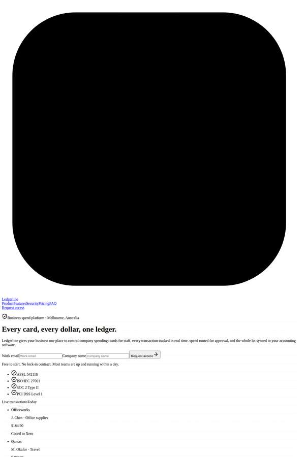
Composite 12.5%Judge 1.5/5
Judge panelAnthropic 1.5/5
single-judge (Claude) 1.5/5 → leave-one-family-out 1.5/5
Anthropic: The textual content is largely present (hero request-access form, product explanation, six features, security/compliance facts, testimonials, three-tier pricing, trust numbers, FAQ, footer with legal details), so brief coverage survives in the markup. But the visual build has effectively failed: the hero and final CTA are giant opaque black rectangles (a WebGL/canvas that never produced a readable fallback), and the entire body renders as unstyled default HTML - native bullet lists, raw checkboxes, browser-default form fields, no type hierarchy, colour, grid, or spacing. It reads as a broken p
Elias Byrne (claude-fable-5)
High reasoning
Composite 12.5%Judge 1.5/5
Judge panelAnthropic 1.5/5
single-judge (Claude) 1.5/5 → leave-one-family-out 1.5/5
Anthropic: The textual content is largely present in order (hero with "Request access", the six features, security/compliance, testimonials, pricing tiers, FAQ, trust numbers, and footer legal details), so the brief's required sections are covered. But the visual build has collapsed: the hero, a large mid-page grid, and the footer render as empty pastel and black rounded blobs with no content, and the rest is default-browser-styled tiny text with bare bullet lists and underlined links, so styling clearly failed to apply. It reads as a broken, unfinished page with no cohesive typography, colour, or layout
Cass Werner (claude-fable-5)
High reasoning
Composite 12.5%Judge 1.5/5
Judge panelAnthropic 1.5/5
single-judge (Claude) 1.5/5 → leave-one-family-out 1.5/5
Anthropic: The theme/CSS clearly failed to load: nearly all copy renders as tiny near-invisible faint-gray text on white with no layout, hierarchy, cards, or pricing structure, and the only bold elements are three oversized blurry gradient blobs (blown-up logo/hero SVGs) at top, middle, and bottom. The brief's content is mostly present in the DOM (hero, product paragraph, six features, security/compliance, three testimonials, pricing tiers, FAQ, footer with ABN/AFSL), which keeps fidelity marginally acceptable, but it is barely usable. As a finished visual build it is broken and janky, with no premium or
Yuki Tanabe (deepseek-v4-pro)
default reasoning
Composite 0.0%Judge 1.0/5
Judge panelAnthropic 1.0/5
single-judge (Claude) 1.0/5 → leave-one-family-out 1.0/5
Anthropic: The screenshot is a completely blank near-black page with zero visible content: no hero, no CTA, no product, features, pricing, security, testimonials, FAQ, or footer. None of the brief's required sections render, and the page is exactly the blank-screen failure the brief explicitly said to avoid. With nothing visible to assess, there is no visual design, craft, or impact to credit.