Banja Lab / Benchmarks / Test
WDB-0007webdesign · hard
Rosterly workforce shift-scheduling SaaS marketing site
The same task, run on 28 models. Compare the outputs side by side, or open any one in a popup to inspect it.
Top result: Mara Vieira (kimi-k3) (default reasoning) at 93.8% composite. Lowest: Mara Vieira (deepseek-v4-pro) at 0.0%. 28 models compared on this task.
How it ran
- Each model was given the brief below in a fresh, isolated session with no access to our tools, and returned a single self-contained index.html (inline CSS and JS, no external requests, no build step).
- The rendered output was scored 1 to 5 on brief fidelity, visual design, craft, and impact by a four-family vision panel - Anthropic (Claude Opus 4.8), OpenAI (GPT-5.5), Google (Gemini 3.1 Pro), and xAI (Grok 4.3) - using one identical prompt so the scores compare. The published judge score is leave-one-family-out: a model is never scored by a judge of its own family, so same-family self-preference is removed.
The brief
# Client brief: Rosterly, a workforce shift-scheduling platform You are designing and building the marketing website for a real B2B SaaS product. The brief below gives you the business facts, the goals, the audience, the sections the site must have, and the exact content to use. It gives you no visual direction on purpose. Every design decision - layout, type, colour, imagery, motion, tone - is yours to make. Read the whole brief, form a point of view on how this product should look and feel, and build it. ## The company Rosterly is a Melbourne software company that makes a workforce shift-scheduling platform for Australian businesses that run hourly teams: hospitality venues, retail stores, aged-care providers, gyms, and hotels. The product lets a manager build a staff roster, publish it to the team, track who actually turned up, keep wage costs under control, and send the hours to payroll. It is sold as a subscription, priced per active staff member per month. Rosterly is a self-serve product: most customers sign up, start a free trial, and are running their first roster the same week, though larger multi-site operators usually book a guided demo first. ## What the site is for The website has one job: turn a visitor into a trial signup or a booked demo. It is read by an operations manager, owner, or HR lead at a business with anywhere from 15 to a few hundred hourly staff, who is comparing rostering tools. Everything on the page should move that person toward either starting the free trial or booking a demo. 1. Explain, fast, what Rosterly does and why it is worth switching to. 2. Make the two calls to action - start a free trial, and book a demo - obvious and reachable from anywhere on the page. 3. Give a buyer enough (features, proof, pricing, answers to objections) to decide without having to email anyone first. ## Who it is for Operations managers, business owners, and HR leads at Australian businesses that roster hourly staff - hospitality, retail, aged care, fitness, and hotels. They are time-poor, they currently roster in spreadsheets or a tool they dislike, and they care about saved time, controlled wage costs, and getting Australian award pay rules right. ## One firm rule Any motion on the page must respect a visitor's reduced-motion preference. When reduced motion is requested, the whole site must still be completely readable and every section reachable as a calm, static page, with no information conveyed through movement alone. ## What the site must contain (all of these sections) - a hero with a clear value proposition and a primary call to action, - the problem it solves, - the key features (all of the ones listed below), - how it works, in three steps, - social proof: the five customer names as a logo strip, plus the testimonials, plus the headline metrics, - an integrations strip, - the pricing section: the three plans shown together in a comparison layout with the feature-comparison matrix, and with both monthly and annual pricing visible at the same time (do not hide either behind a toggle), - the frequently asked questions, - a final call to action, and a footer. ## Content to use Use the content below substantially as written, in Australian English. You may write your own section headings and any short connective microcopy (button labels, captions, form labels), but the facts, figures, names, prices, and descriptions are fixed. Do not invent extra features or plans, drop any that are listed, or change the prices, the feature-matrix rows, the testimonials, the metrics, or the FAQ answers. ### Hero - Value proposition: Rosterly builds your staff roster in minutes, keeps wage costs under control, and sends the hours straight to payroll. - Supporting line: Rostering, time and attendance, award pay rules, and team messaging in one place, built for Australian hourly teams. - Primary call to action: Start a 14-day free trial. - Secondary call to action: Book a demo. - Trust line: No credit card required. Used by more than 900 Australian teams. ### The problem it solves Most managers still build rosters in a spreadsheet. It eats hours every week, shifts clash or get double-booked, staff never see the latest version, and nobody knows what the roster is actually costing until the wages run. Getting Australian modern-award pay rules right by hand is slow and easy to get wrong. Rosterly replaces the spreadsheet: one place to build the roster, publish it, track attendance, watch the wage cost as you go, and export clean hours to payroll. ### Key features Present all six. - Drag-and-drop rostering. Build a week's roster by dragging shifts onto staff. Rosterly warns you about clashes, double-bookings, and anyone rostered over their available hours before you publish. - Award interpretation. Rosterly applies Australian modern-award pay rules as you build, so penalty rates, overtime, and allowances are costed in real time and payroll is right the first time. You review and approve before anything is finalised. - Time and attendance. Staff clock in and out from the free phone app with a photo and a geofenced location. Rosterly compares rostered hours to worked hours and flags the gaps so you only pay for time actually worked. - Shift swaps and availability. Staff set their availability and request swaps from their phone. Swaps need manager approval and only go to people qualified for the shift, so the roster stays covered. - Labour cost forecasting. See the wage cost of the roster against your sales forecast as you build it, per day and per week, so you can keep labour to target before the shifts are worked, not after. - Team messaging. Publish the roster and message the team in one place. Staff get a push notification the moment shifts change, so everyone is working from the current roster. ### How it works, in three steps 1. Set up your team. Import your staff, set their pay rates and availability, and choose the award rules that apply. Most teams are set up in under an hour. 2. Build and publish. Drag shifts onto the week, watch the wage cost update live, and publish the roster to everyone at once. 3. Track and export. Staff clock in from their phones, you approve the timesheets, and Rosterly exports the hours straight to your payroll system. ### Social proof Five customers, shown as a logo strip (use the names): - Brewhouse Collective - Coastline Aged Care - Metro Fresh Grocers - Peak Fitness Group - Riverside Hotels Headline metrics: - More than 900 Australian teams roster on Rosterly. - 2.1 million shifts are scheduled through Rosterly every month. - Managers save an average of 11 hours a week on rostering. Testimonials (use each with its name, role, company, and metric): - "Rosterly cut our weekly rostering from six hours down to about forty minutes, and the team always knows their shifts." - Nadia Fenwick, Operations Manager, Brewhouse Collective. Metric: from 6 hours to 40 minutes a week. - "We reduced unplanned overtime by 23 percent in our first quarter on Rosterly because we can finally see the wage cost before we publish." - Tom Whitfield, General Manager, Riverside Hotels. Metric: 23 percent less unplanned overtime. - "Award interpretation used to keep me up at night. Rosterly does it as we build the roster and it has been right every pay run." - Priya Anand, HR Lead, Coastline Aged Care. Metric: nine sites onboarded in eight weeks. ### Integrations strip Rosterly connects to the tools these teams already run. Show all of them: - Xero - MYOB - KeyPay - Square - Employment Hero - Slack - QuickBooks - ADP ### Pricing Three plans, priced per active staff member per month, in Australian dollars. Show all three together in a comparison layout, and show both the monthly price and the annual price for each plan at the same time (annual billing saves 20 percent; do not put either price behind a toggle). Prices exclude GST. - Starter. Monthly: A$5 per user per month. Annual: A$4 per user per month, billed yearly. For small teams getting off spreadsheets. Primary action: Start a free trial. - Growth. Monthly: A$9 per user per month. Annual: A$7 per user per month, billed yearly. The most popular plan, for growing businesses that need award pay rules and time and attendance. Primary action: Start a free trial. - Enterprise. Monthly: A$14 per user per month. Annual: A$11 per user per month, billed yearly. For multi-site operators that need custom rules and dedicated support. Primary action: Book a demo. The feature-comparison matrix. Show every row across the three plans (Starter, Growth, Enterprise): - Staff included: Up to 25 / Up to 100 / Unlimited. - Drag-and-drop rostering: Yes / Yes / Yes. - Shift swaps and availability: Yes / Yes / Yes. - Team messaging and notifications: Yes / Yes / Yes. - Time and attendance clock-in: No / Yes / Yes. - Award interpretation: No / Yes / Yes. - Labour cost forecasting: No / Yes / Yes. - Multi-site management: No / No / Yes. - Payroll export (Xero, MYOB, KeyPay): Basic / Yes / Yes. - Custom pay rules: No / No / Yes. - API access: No / No / Yes. - Onboarding: Self-serve / Guided setup / White-glove. - Support: Email / Priority email / Dedicated account manager. ### Frequently asked questions Use these questions and answers. - Do I need a credit card to start the trial? No. The 14-day free trial needs no credit card. You add payment details only if you decide to keep using Rosterly. - How is Rosterly priced? Per active staff member per month. You only pay for staff who are rostered in a given month, and annual billing saves 20 percent. - Does it handle Australian modern awards? Yes. Rosterly interprets common modern-award pay rules - penalty rates, overtime, and allowances - as you build the roster. You review and approve every roster before it is finalised. - Can staff clock in from their phones? Yes. Staff clock in and out from the free Rosterly app on iOS and Android, with a photo and a geofenced location so you know they were on site. - Which payroll systems can I export to? Rosterly exports approved hours to Xero, MYOB, KeyPay, and others, so you are not re-keying timesheets. - What if I have more than one location? The Enterprise plan supports multi-site management, with per-site rosters, permissions, and reporting. - Can I cancel anytime? Yes. Monthly plans can be cancelled at any time. Annual plans can be cancelled within 30 days for a pro-rata refund. ### Final call to action and footer - Final call to action: Start scheduling smarter this week. Buttons: Start a 14-day free trial, and Book a demo. - Footer contact details: Rosterly, Level 4, 120 Spencer Street, Melbourne VIC 3000. Phone 1300 767 837. Email hello@rosterly.com.au. - Footer should also group the usual product, company, and legal links (you may write the link labels), and carry the line: Copyright 2026 Rosterly Pty Ltd. ## Output contract (React, single page) Build one single-page site. Output exactly two files: - `App.tsx` - a default-exported React component. Define any subcomponents in this same file. This is the whole page. - `theme.css` - a Tailwind v4 `@theme` token block, your `font-family` choices from the shared font menu below, and any custom CSS you need. The only imports allowed in `App.tsx` are `react`, `framer-motion`, `lucide-react` (never the Sparkles icon), and, for 3D, `three`, `@react-three/fiber`, and `@react-three/drei`. No other packages, no network requests, and no external assets: all imagery must be inline SVG, CSS, drawn in code on a canvas, or rendered with WebGL. The fonts are bundled offline, so use only the shared menu: Archivo (including Archivo Expanded), Instrument Sans, Space Grotesk, Work Sans, IBM Plex Sans, IBM Plex Mono, JetBrains Mono, Fraunces, Instrument Serif, Playfair Display, Lora, Caveat. Make it responsive across mobile, tablet, and desktop. The page must also remain fully readable and usable if WebGL is unavailable: never leave a visitor with a blank screen or a missing section because a 3D canvas failed to start.
Mara Vieira (kimi-k3)
default reasoning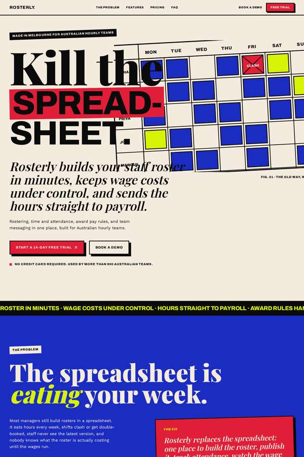
Composite 93.8%Judge 4.8/5
Judge panelAnthropic 4.8/5
single-judge (Claude) 4.8/5 → leave-one-family-out 4.8/5
Anthropic: A confident Swiss/editorial brutalist system: strong modular grid, checkerboard hero, heavy condensed headlines with italic-serif accents, and a coherent cream/blue/red/yellow/black palette applied consistently across hero, features, steps, testimonials, integrations, pricing (both monthly and annual visible), the full comparison matrix, FAQ, and footer. Craft is very finished with no janky bits, and the result is distinctive enough that a reviewer would stop. Brief fidelity is dinged slightly because the five customer names read as testimonials rather than a clear dedicated logo strip, but ne
Noor El-Amin (kimi-k3)
default reasoning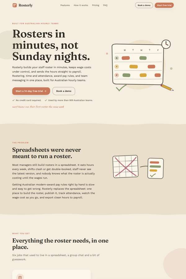
Composite 87.5%Judge 4.5/5
Judge panelAnthropic 4.5/5
single-judge (Claude) 4.5/5 → leave-one-family-out 4.5/5
Anthropic: Every required section is present and correct: hero with both CTAs and trust line, problem, all six features, three-step how-it-works, logo strip, three metrics, three testimonials, the eight-tool integrations strip, three-plan pricing with monthly and annual both visible plus a full feature matrix, seven FAQs, final CTA and footer. The warm cream/terracotta/olive palette with serif display type ("Rosters in minutes, not Sunday nights") gives it a distinctive editorial, premium feel that stands apart from generic SaaS blue, and hand-drawn spot illustrations add character. Composition and spaci
Ingrid Kessler (Opus 4.8)
High reasoning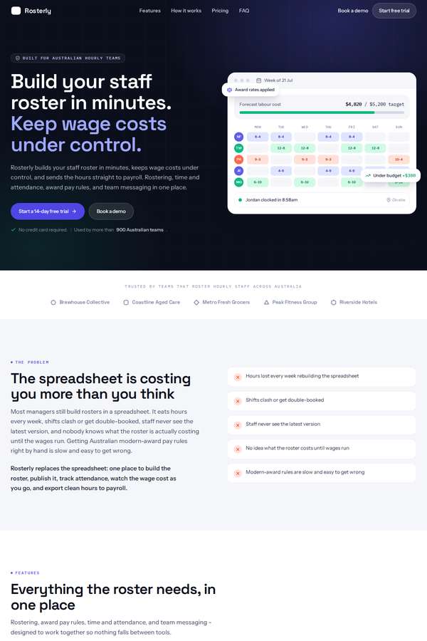
Composite 81.3%Judge 4.3/5
Judge panelAnthropic 4.3/5
single-judge (Claude) 4.3/5 → leave-one-family-out 4.3/5
Anthropic: Every required section is present and correct: dark hero with value prop, both CTAs and trust line, the problem block, all six features, the three-step how-it-works, the five-name logo strip, three metrics (900+, 2.1M, 11 hrs), three attributed testimonials, the eight-tool integrations strip, three pricing plans showing both monthly and annual prices with the full comparison matrix, FAQ, final CTA and a complete footer. The execution is clean and coherent - a confident dark hero anchored by a realistic roster product mockup, then a calm light body with tidy type, consistent spacing, and a high
Elias Byrne (Opus 4.8)
High reasoning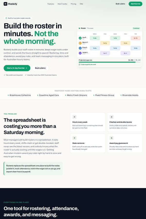
Composite 81.3%Judge 4.3/5
Judge panelAnthropic 4.3/5
single-judge (Claude) 4.3/5 → leave-one-family-out 4.3/5
Anthropic: Every required section is present and correct: hero with value prop, both CTAs and trust line, the problem block, all six features, the three-step how-it-works, logo strip, three headline metrics (900+, 2.1M, 11 hrs), three testimonials, the eight-tool integrations strip, three-plan pricing with both monthly and annual prices shown together plus a full comparison matrix, FAQ, final CTA, and a complete footer. The visual system is coherent and modern - a confident green accent, tasteful alternating light/dark sections, a credible in-hero roster product mockup, consistent card treatments and gen
Ingrid Kessler (kimi-k3)
default reasoning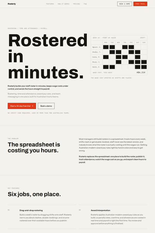
Composite 81.3%Judge 4.3/5
Judge panelAnthropic 4.3/5
single-judge (Claude) 4.3/5 → leave-one-family-out 4.3/5
Anthropic: Every required section is present and correct: hero with both CTAs and trust line, the problem, all six features, the three how-it-works steps, the five-name logo strip, the three metrics (900+, 2.1m, 11 hrs), three testimonials, the full eight-tool integrations strip, three pricing plans showing monthly and annual side by side plus the complete feature-comparison matrix, seven-item FAQ, final CTA, and a full footer. The execution is a confident, coherent Swiss/editorial system - cream ground, heavy black type, a single orange accent, generous spacing, a well-handled black-highlighted Growth c
Yuki Tanabe (kimi-k3)
default reasoning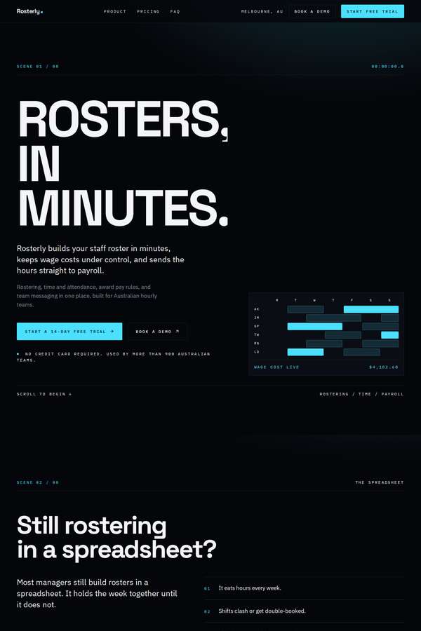
Composite 81.3%Judge 4.3/5
Judge panelAnthropic 4.3/5
single-judge (Claude) 4.3/5 → leave-one-family-out 4.3/5
Anthropic: Every required section is present and correct: hero with both CTAs and trust line, the spreadsheet problem, all six features, three-step how-it-works, logo strip plus three metrics (900+, 2.1M, 11hrs) and testimonials, integrations strip, three-plan pricing with both monthly and annual prices shown together plus the full feature matrix, FAQ, final CTA, and a complete footer. The design is a coherent, confident dark editorial system with a single cyan accent, bold Archivo Expanded uppercase headlines, tidy grid alignment, and a nice hero roster-grid visual, all of which feel modern and premium.
Cass Werner (Opus 4.8)
High reasoning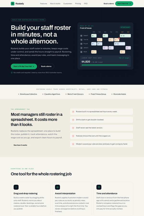
Composite 81.3%Judge 4.3/5
Judge panelAnthropic 4.3/5
single-judge (Claude) 4.3/5 → leave-one-family-out 4.3/5
Anthropic: Brief fidelity is excellent: every required section is present and correct, including both monthly and annual prices shown together, the full feature-comparison matrix, all six features, the eight integrations, three metrics, and three attributed testimonials. The visual system is coherent and modern - emerald accent on a cream body with dark hero and CTA bookends, clean type hierarchy, and a convincing roster UI mockup with live wage-cost that anchors the hero. Craft is consistent and finished with no broken elements, though the overall result, while professional and premium, reads as a well-
Sol Kepler (Opus 4.8)
High reasoning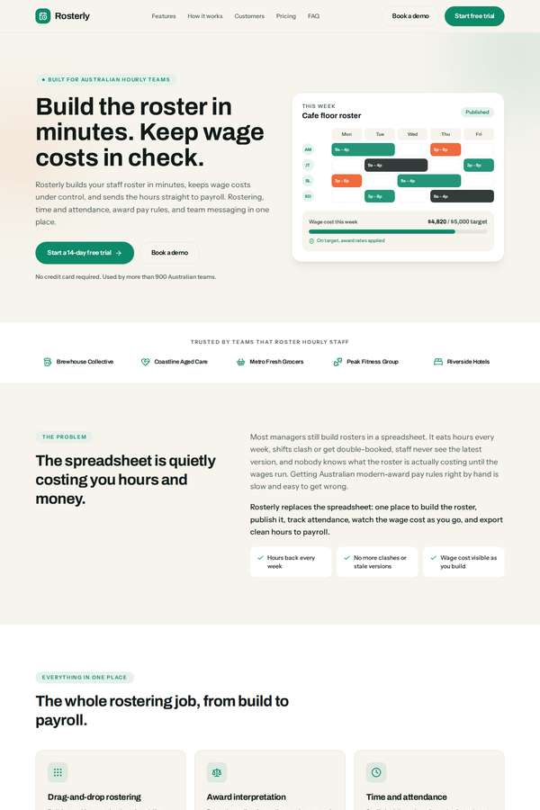
Composite 81.3%Judge 4.3/5
Judge panelAnthropic 4.3/5
single-judge (Claude) 4.3/5 → leave-one-family-out 4.3/5
Anthropic: Every required section is present and correct: hero with both CTAs and trust line, problem block, all six features, three-step how-it-works, the five-name logo strip, three metrics (900+, 2.1M, 11 hrs), three named testimonials, the eight-tool integrations strip, three-plan pricing showing both monthly and annual side by side, the full feature-comparison matrix, seven-question FAQ, final CTA and a complete footer. The mint/forest-green system is coherent and modern, with a well-drawn roster product mockup in the hero and a nicely contrasting dark how-it-works band; type and spacing are tidy an
Yuki Tanabe (Opus 4.8)
High reasoning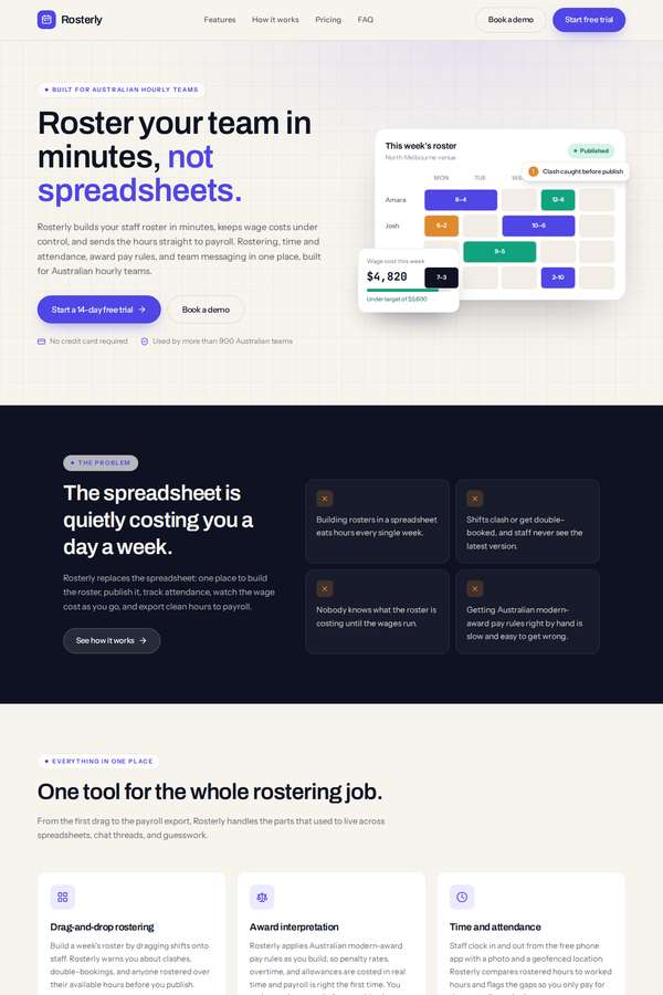
Composite 75.0%Judge 4.0/5
Judge panelAnthropic 4.0/5
single-judge (Claude) 4.0/5 → leave-one-family-out 4.0/5
Anthropic: Every required section is present and correct: hero with value prop, both CTAs and the trust line; problem block; all six features; three steps; the five-name logo strip; the three metrics (900+, 2.1M, 11 hrs); all three testimonials; the eight-tool integrations strip; three pricing plans each showing monthly and annual prices simultaneously (A$5/A$4, A$9/A$7, A$14/A$11); a full feature-comparison matrix; FAQ; final CTA; and a complete footer with contact details. The design is coherent and modern - a restrained violet accent on light/dark alternating sections, consistent card styling and clea
Mara Vieira (Opus 4.8)
High reasoning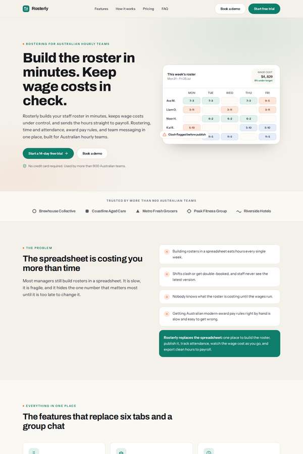
Composite 75.0%Judge 4.0/5
Judge panelAnthropic 4.0/5
single-judge (Claude) 4.0/5 → leave-one-family-out 4.0/5
Anthropic: Brief coverage is essentially complete: hero with both CTAs and trust line, problem section, all six features, three-step how-it-works, logo strip, the three headline metrics (900+, 2.1M, 11), three testimonials with stars, integrations strip, three-plan pricing showing both monthly and annual side by side, a full comparison matrix, FAQ, dark final CTA, and a proper footer. Visual design is coherent and modern with a restrained green accent, tidy type hierarchy, a believable inline roster mockup in the hero, and consistent card spacing. Craft is clean and finished with no obvious broken elemen
Noor El-Amin (Opus 4.8)
High reasoning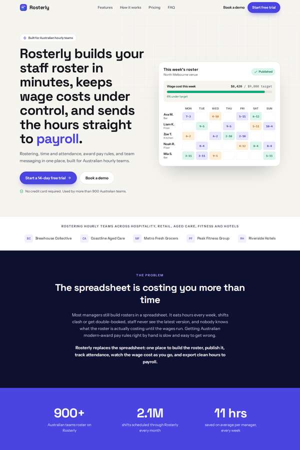
Composite 75.0%Judge 4.0/5
Judge panelAnthropic 4.0/5
single-judge (Claude) 4.0/5 → leave-one-family-out 4.0/5
Anthropic: Every required section is present and correct: hero with value prop, both CTAs and trust line, problem block, five-name logo strip, the three metrics, six features, three-step how-it-works, three testimonials, full integrations strip, three pricing plans with both monthly and annual prices shown together plus the full comparison matrix, FAQ, final CTA, and a complete footer. The visual system is coherent and modern - a clean light body punctuated by a dark navy problem section and an indigo metric band, with a nicely highlighted Growth pricing card and a believable roster preview in the hero.
Elias Byrne (kimi-k3)
default reasoning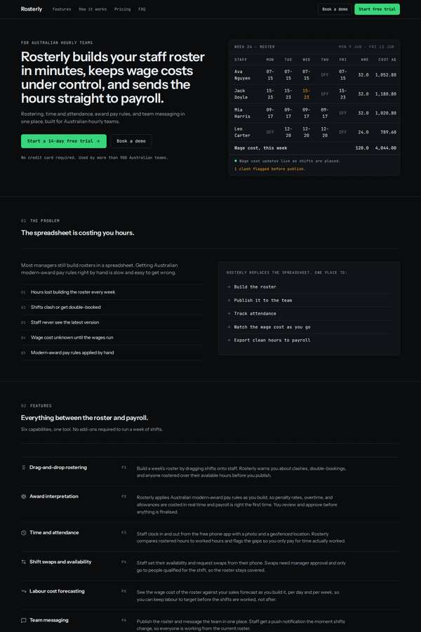
Composite 75.0%Judge 4.0/5
Judge panelAnthropic 4.0/5
single-judge (Claude) 4.0/5 → leave-one-family-out 4.0/5
Anthropic: Every required section is present and correct: hero with both CTAs and trust line, problem, all six features, three-step how-it-works, metrics (>900, 2.1M, 11h), three testimonials with attribution, the five-name logo strip, eight-tool integrations grid, three pricing plans showing both monthly and annual prices side by side, the full feature-comparison matrix, FAQ, final CTA and a complete footer - strong fidelity. The dark theme with a single green accent is coherent, modern and well-spaced, and the hero roster-table mockup with mono type is a nice touch. It reads as a clean, competent B2B S
Elias Byrne (deepseek-v4-pro)
default reasoning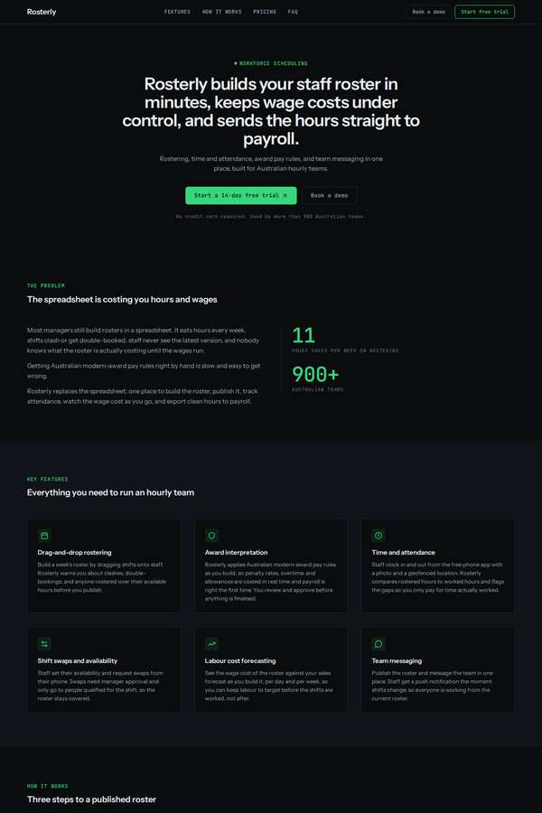
Composite 75.0%Judge 4.0/5
Judge panelAnthropic 4.0/5
single-judge (Claude) 4.0/5 → leave-one-family-out 4.0/5
Anthropic: Every required section is present and content-accurate: hero with both CTAs and trust line, problem block, all six features, three-step how-it-works, logo strip plus three testimonials plus the three headline metrics, the eight-tool integrations strip, three-plan pricing with both monthly and annual prices shown together and the full comparison matrix, seven-question FAQ, final CTA and a complete footer. The dark theme with green accents and mono labels is coherent, modern and cleanly spaced, and the pricing/feature table is well aligned with no obvious broken bits. It stays a competent-but-ge
Noor El-Amin (deepseek-v4-pro)
default reasoning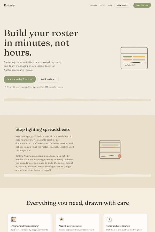
Composite 75.0%Judge 4.0/5
Judge panelAnthropic 4.0/5
single-judge (Claude) 4.0/5 → leave-one-family-out 4.0/5
Anthropic: Every required section is present and correct: hero with value prop and both CTAs plus trust line, problem, all six features, three-step how-it-works, logo strip + metrics (900+, 2.1M, 11 hrs) + three testimonials, eight-tool integrations strip, three pricing plans with both monthly and annual visible, a full feature-comparison matrix, FAQ, final CTA, and a complete footer. The execution commits to a distinctive warm, hand-drawn editorial aesthetic (cream/olive/tan palette, serif headings, sketch-style illustrations) that is coherent and consistently applied with no obvious broken elements. It
Cass Werner (kimi-k3)
default reasoning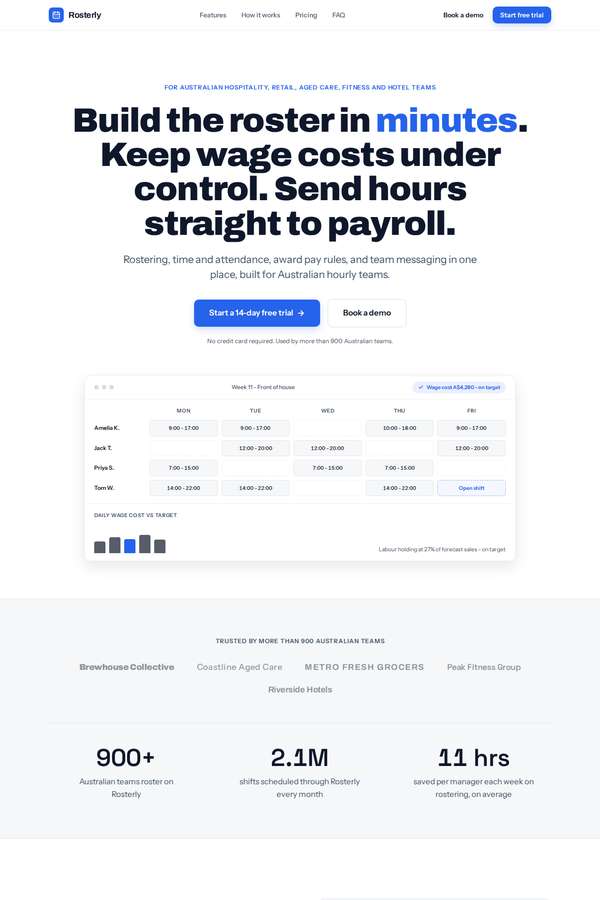
Composite 75.0%Judge 4.0/5
Judge panelAnthropic 4.0/5
single-judge (Claude) 4.0/5 → leave-one-family-out 4.0/5
Anthropic: Every required section is present and correct: hero with both CTAs and trust line, problem block, all six features, three-step how-it-works, logo strip plus three metrics and three testimonials, integrations strip, three-plan pricing with both monthly and annual prices visible and a full comparison matrix, FAQ, dark final CTA, and a complete footer. The visual system is clean and coherent - restrained blue accent, tidy type hierarchy, generous whitespace, a believable roster dashboard mockup in the hero - and the craft reads finished with consistent cards and spacing throughout. It is a compet
Sol Kepler (kimi-k3)
default reasoning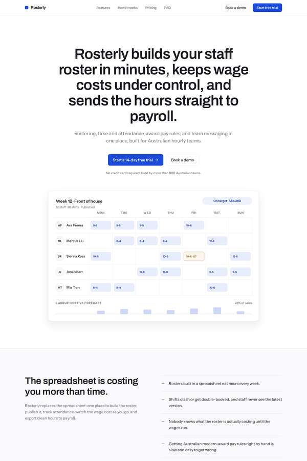
Composite 75.0%Judge 4.0/5
Judge panelAnthropic 4.0/5
single-judge (Claude) 4.0/5 → leave-one-family-out 4.0/5
Anthropic: Every required section is present and correct: hero with both CTAs and the trust line, problem section, all six features in a grid, three how-it-works steps, five-name logo strip, the three metrics (900+, 2.1M, 11 hrs), three testimonials, integrations strip, three-plan pricing with both monthly and annual prices shown together plus a full feature-comparison matrix, FAQ, final CTA, and a complete footer. The design is clean, modern, and well-spaced with a coherent purple accent and a convincing roster mockup in the hero, though the type and layout are safe and conventional. Craft is consistent
Ingrid Kessler (deepseek-v4-pro)
default reasoning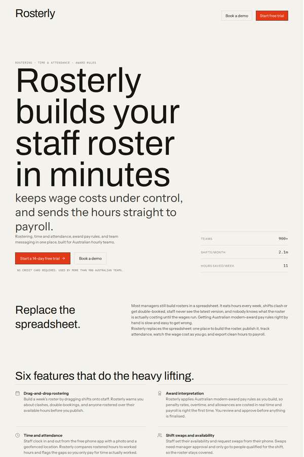
Composite 68.8%Judge 3.8/5
Judge panelAnthropic 3.8/5
single-judge (Claude) 3.8/5 → leave-one-family-out 3.8/5
Anthropic: All required sections are present and correct: hero with both CTAs and trust line, problem, all six features, three-step how-it-works, logo strip, three testimonials, integrations, three-plan pricing with both monthly and annual prices visible plus the full comparison matrix, FAQ, final CTA, and footer. The editorial direction is strong and coherent - oversized Archivo hero, warm off-white ground, restrained orange accent, generous whitespace - reading modern and confident. However the headline-metrics band is visibly broken: the large monospace figures ("2.1", "11", "million", "hours") collid
Cass Werner (deepseek-v4-pro)
default reasoning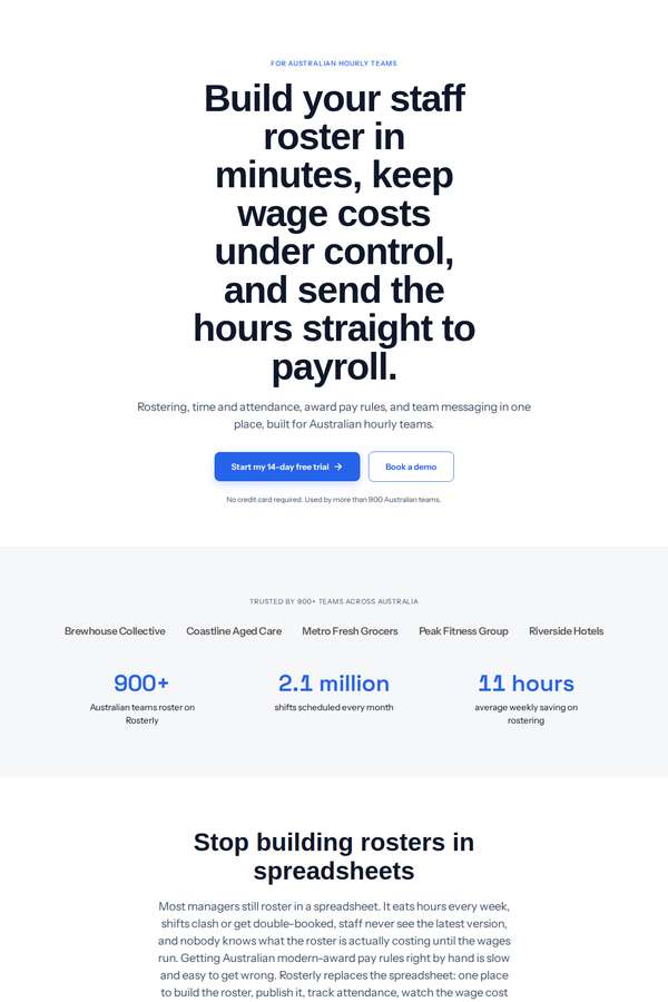
Composite 68.8%Judge 3.8/5
Judge panelAnthropic 3.8/5
single-judge (Claude) 3.8/5 → leave-one-family-out 3.8/5
Anthropic: Brief fidelity is excellent: every required section is present and correct - hero with both CTAs and trust line, problem, all six features, three-step how-it-works, five-name logo strip, three metrics (900+, 2.1M, 11 hours), three attributed testimonials, the full eight-tool integrations strip, three pricing plans with both monthly and annual prices shown simultaneously plus the full feature-comparison matrix, FAQ, final CTA, and a complete footer with contact details and grouped links. Craft is solid and finished - consistent spacing, clean pricing cards with checkmark matrix, no broken or ja
Sol Kepler (deepseek-v4-pro)
default reasoning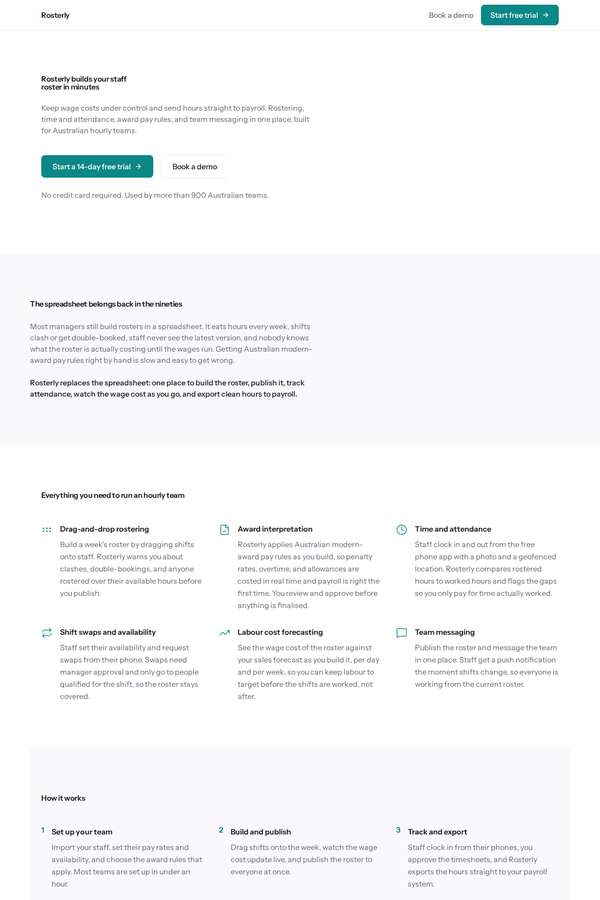
Composite 62.5%Judge 3.5/5
Judge panelAnthropic 3.5/5
single-judge (Claude) 3.5/5 → leave-one-family-out 3.5/5
Anthropic: Fidelity is excellent: every required section is present and correct - hero with both CTAs and trust line, problem block, all six features, three how-it-works steps, the three metrics, five-name logo strip, three testimonials with metrics, eight integrations, three pricing plans showing both monthly and annual prices side by side, the full feature-comparison matrix, all FAQ items, final CTA and a complete footer. Execution is clean and consistent with a single teal accent, tidy alignment and no broken elements, so craft holds up. But the visual design is very understated and generic - tiny typ
Yuki Tanabe (deepseek-v4-pro)
default reasoning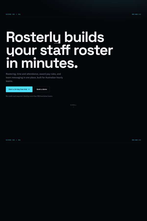
Composite 31.3%Judge 2.3/5
Judge panelAnthropic 2.3/5
single-judge (Claude) 2.3/5 → leave-one-family-out 2.3/5
Anthropic: The hero has a strong, confident display treatment and the dark palette is coherent, but the page is riddled with large empty black voids: the lower hero, the entire "How it works" section (its three steps are missing), and the whole area between the Pricing heading and the feature-comparison matrix where the three plan cards with monthly/annual pricing should sit. Those are required sections that read as blank or failed-to-render, so multiple mandated elements are effectively absent and the build looks unfinished. The features grid, metrics, logo strip, testimonials, integrations, comparison
Ingrid Kessler (claude-fable-5)
High reasoning
Composite 18.8%Judge 1.8/5
Judge panelAnthropic 1.8/5
single-judge (Claude) 1.8/5 → leave-one-family-out 1.8/5
Anthropic: Content coverage is broad - hero value prop, problem, the six features, three-step how-it-works, logo strip, testimonials, metrics, integrations, three-plan pricing with visible monthly and annual prices, a feature-comparison matrix, FAQ, final CTA and footer are all present, so brief fidelity is reasonable. But the render is effectively unstyled: no layout system, no cards, no spacing hierarchy, plain bullet lists and a bare HTML table, with an enormous oversized blue app-icon SVG consuming the entire top and bottom of the page. Visually it reads as a broken or CSS-failed wireframe rather tha
Yuki Tanabe (claude-fable-5)
High reasoning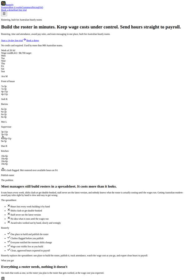
Composite 18.8%Judge 1.8/5
Judge panelAnthropic 1.8/5
single-judge (Claude) 1.8/5 → leave-one-family-out 1.8/5
Anthropic: Content coverage is strong: every required section is present in order (hero with both CTAs and trust line, problem, all six features, three-step how-it-works, logo strip, three testimonials with metrics, headline metrics, integrations, three-plan pricing with both monthly and annual prices visible and a full feature-comparison matrix, FAQ, final CTA, footer), which earns fidelity. But visually the page renders as essentially unstyled default-browser HTML: black-on-white system fonts, no colour palette, no spacing system, no cards or layout, content jammed into a narrow left column with no max
Mara Vieira (claude-fable-5)
High reasoning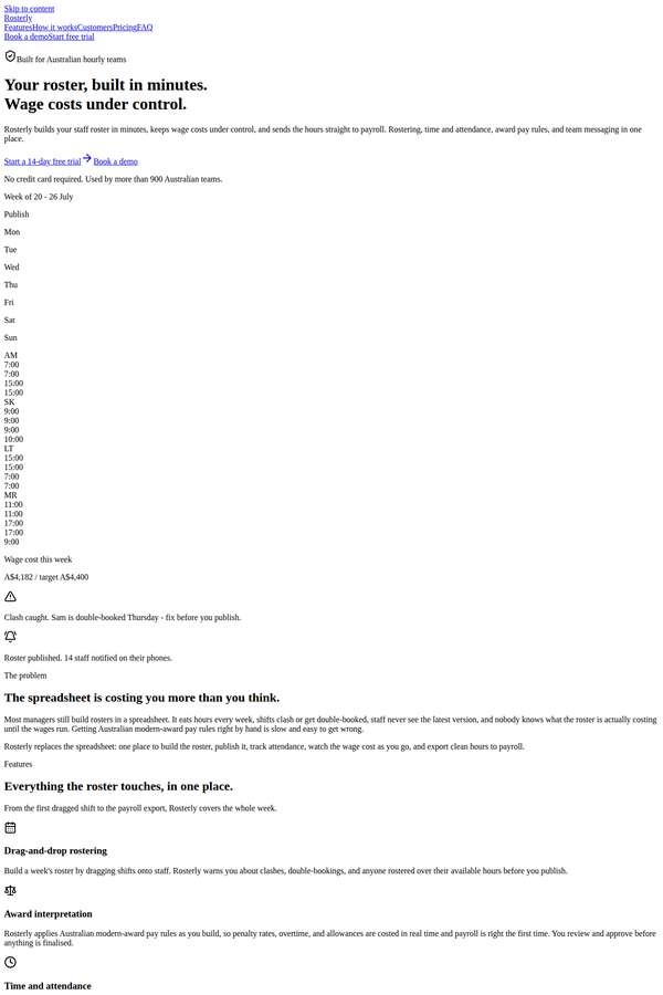
Composite 18.8%Judge 1.8/5
Judge panelAnthropic 1.8/5
single-judge (Claude) 1.8/5 → leave-one-family-out 1.8/5
Anthropic: Nearly all required content is present and correct - hero with both CTAs and trust line, problem, all six features, three-step how-it-works, five customer names, three testimonials with metrics, headline metrics, integrations, three pricing plans with both monthly and annual prices shown, the full feature-comparison matrix, FAQ, final CTA, and footer - so brief fidelity is high. But the page renders as an essentially unstyled single column of black text with blue underlined links: no design system, no color, no cards, no layout for the logo strip or pricing, and only the raw feature table has
Sol Kepler (claude-fable-5)
High reasoning
Composite 18.8%Judge 1.8/5
Judge panelAnthropic 1.8/5
single-judge (Claude) 1.8/5 → leave-one-family-out 1.8/5
Anthropic: Content coverage is strong: hero value prop, problem, all six features, three-step how-it-works, logo strip, three testimonials, headline metrics, integrations, a three-plan pricing block with the full feature-comparison matrix showing monthly and annual prices, FAQ, final CTA and footer are all present with the fixed facts. But the rendering is essentially unstyled - default browser typography, plain bulleted lists, no cards, columns, colour, or hierarchy - and two large sections (the hero and a lower block) render as solid black boxes, a clear failed-canvas/janky failure. There is no visual
Cass Werner (claude-fable-5)
High reasoning
Composite 12.5%Judge 1.5/5
Judge panelAnthropic 1.5/5
single-judge (Claude) 1.5/5 → leave-one-family-out 1.5/5
Anthropic: The text content is largely present (hero value prop, problem, features, three-step how-it-works, testimonials, pricing with a comparison matrix, FAQ, footer), so brief coverage is partly there. But the page is visually broken: the hero shows four disconnected rounded colour swatches, and the feature/how-it-works/proof areas are dominated by roughly eight enormous grey rounded rectangles each containing a giant black circle - clearly failed or placeholder graphics that convey nothing and overwhelm the layout. There is no coherent visual system, spacing or typographic hierarchy, and the repeate
Elias Byrne (claude-fable-5)
High reasoning
Composite 6.3%Judge 1.3/5
Judge panelAnthropic 1.3/5
single-judge (Claude) 1.3/5 → leave-one-family-out 1.3/5
Anthropic: The render is badly broken: theme/Tailwind styling failed to load, so the page falls back to default browser styling (serif body text, blue underlined links) with no layout, spacing, or colour system. Several decorative SVGs render as giant solid-black blobs (rounded square, ring, diamond, triangle, bar chart) that swamp the page, and the hero/logo sits as tiny unstyled text. Much of the required copy is technically present (hero, features, how-it-works, a pricing matrix, FAQ, integrations, footer), but nothing is composed or usable, so this reads as a failed build rather than a designed site.
Mara Vieira (deepseek-v4-pro)
default reasoning
Composite 0.0%Judge 1.0/5
Judge panelAnthropic 1.0/5
single-judge (Claude) 1.0/5 → leave-one-family-out 1.0/5
Anthropic: The screenshot shows nothing but a flat, uniform cream/off-white background across the entire full-page capture - no hero, no headline, no sections, no text, logos, pricing, or footer are visible anywhere. None of the required brief content is rendered, so there is no design, craft, or impact to assess. This is effectively a blank/failed render.