Banja Lab / Benchmarks / Test
WDB-0005webdesign · hard
The Yard - Wallanbah Railway Workshops centenary oral history
The same task, run on 28 models. Compare the outputs side by side, or open any one in a popup to inspect it.
Top result: Ingrid Kessler (kimi-k3) (default reasoning) at 93.8% composite. Lowest: Mara Vieira (deepseek-v4-pro) at 12.5%. 28 models compared on this task.
How it ran
- Each model was given the brief below in a fresh, isolated session with no access to our tools, and returned a single self-contained index.html (inline CSS and JS, no external requests, no build step).
- The rendered output was scored 1 to 5 on brief fidelity, visual design, craft, and impact by a four-family vision panel - Anthropic (Claude Opus 4.8), OpenAI (GPT-5.5), Google (Gemini 3.1 Pro), and xAI (Grok 4.3) - using one identical prompt so the scores compare. The published judge score is leave-one-family-out: a model is never scored by a judge of its own family, so same-family self-preference is removed.
The brief
# Client brief: The Yard You are designing and building a single-page site for a real heritage trust. The brief below gives you the commissioning body, the goals, the audience, the sections the site must have, and the exact content to use. It gives you no visual direction on purpose. Every design decision - layout, type, colour, imagery, motion, tone - is yours to make. Read the whole brief, form a point of view on how this material should be presented, and build it. ## The commissioning body The Wallanbah Railway Workshops Heritage Trust is a volunteer trust in Wallanbah, a town of about 3,100 people on the mid-north coast railway line in New South Wales. The workshops opened in 1926 and closed in 1996. 2026 is therefore both the centenary of the opening and thirty years since the closure, and the trust is marking it with this site. The trust holds the workers' recorded testimony. Its position is that the site should present the workers' own words, in full, and let them carry the story. The trust is not selling anything and is not promoting the town. ## What the site is for 1. Present the eight recorded testimonies in full, so a visitor reads the workshops in the words of the people who worked there. 2. Set the testimony in enough factual context - what the workshops were, what happened to them, and what closing them did to the town - that a visitor with no connection to Wallanbah understands it. 3. Ask former workers and their families to contribute recordings, documents, and objects to the trust's collecting project, and get them to fill in the contribution form. 4. Tell people how to visit the site and contact the trust. ## Who it is for Former workers and their families, most of them now over sixty; local school and university students researching the district; and general visitors and railway historians who have never been to Wallanbah. ## Two constraints that come from the trust **There are no photographs.** The trust's digital collection holds no images at all yet. The photographic material that exists is in private hands, uncatalogued, and not cleared for publication. So the site cannot rely on photography, and you must not use, imply, or fake photographs of the workshops or the people in it. Whatever visual language you build has to be made in code, and it has to carry the material honestly rather than decorate it. **The register is plain and respectful.** These are real working lives and a real closure that damaged a town. The site must not be sentimental, nostalgic in a greeting-card way, or promotional. No triumphal language, no elegiac overwriting, no "heroes of industry". Present the facts and the words plainly and let them do the work. The trust would rather the site read as too restrained than as too moved. A firm rule that comes with this: any motion must respect a visitor's reduced-motion preference. When reduced motion is requested, the whole site must still be completely readable and every section reachable as a calm, static page, with no information conveyed only through movement. ## What the site must contain (all of these sections) - a hero that opens the site, - what the workshops were, - the eight worker testimonies, each presented in full, - the timeline, all ten events, - the closure and what it did to the town, - what stands on the site today, - the trust's collecting project, with the contribution form, - visit and contact. ## Content to use Use the content below substantially as written, in Australian English. You may write your own section headings and any short connective microcopy (button labels, captions, form labels), but the facts, figures, names, dates, and the testimony text are fixed. Do not invent extra people or events, do not drop any of the eight testimonies or any of the ten timeline entries, and do not shorten, paraphrase, or truncate a testimony: each one is published in full. ### What the workshops were The Wallanbah Railway Workshops were opened by the New South Wales Government Railways in 1926 to carry out heavy repair and overhaul on locomotives and rolling stock working the northern line. The site covered 14 hectares beside the Wallanbah station yard and held an erecting shop, a boiler shop, a machine shop, a blacksmith's shop, a paint shop, a drawing office, a store, a canteen, and the turning shed over the 27-metre turntable. The workshops were the town's main employer for seventy years. Wallanbah had no other industry of that size, and for three generations most working households in the town had someone in the yard. The workshops trained their own tradespeople: an apprentice intake ran almost every year from 1927 to 1991, and about 1,900 apprentices completed their time there. Employment at three points: - 1936: 780 people. - 1951: 1,430 people, the highest the workshops ever employed. - 1996: 236 people, at closure. ### The eight testimonies These are the eight recorded testimonies held by the trust. Each is published in full, with the person's name, trade, and years worked. **Ron Kavanagh, boilermaker, 1953 to 1988** I started at seventeen and I was deaf in one ear by forty, and I would tell you that was the trade rather than bad luck. The boiler shop was two hundred feet of noise. You worked inside the barrel of a locomotive boiler holding a dolly against the rivets while a fellow outside drove them, and the sound came through the steel and into your bones. We called the men who worked inside the boilers holders-up, and every one of them went deaf. Nobody wore protection until about 1971 and even then you were laughed at for it. I am not making a complaint. It was the best work I ever had and it kept a house and four children. But when people talk about the yard now they talk about the whistle and the smoke and they leave the noise out, and the noise was the whole of it. Thirty-five years and I can still hear it in a quiet room. **Wayne Trethewey, apprentice fitter, then fitter and turner, 1972 to 1996** I came in as an apprentice in 1972, sixteen years old, and on my first morning a fitter called Dessie sent me to the store for a long weight. I stood at that counter for forty minutes before the storeman asked me if I had got a long enough wait yet. That was the induction. After that they taught me properly. Five years of it, day release at the tech on Wednesdays, and by the end of my time I could scrape a bearing by hand and know it was right by the feel. I was the last apprentice year that got a full intake behind them. By the mid-eighties there were three or four a year and then none. I did twenty-four years in the machine shop and I was there on the last day. The thing I think about is that nobody ever taught me anything after I left. That yard was the only place that ever bothered to. **Margaret Ellis, tracer, drawing office, 1957 to 1969** The drawing office was upstairs above the store and there were four tracers, all women, and eleven draftsmen, all men. A draftsman drew in pencil and a tracer went over it in ink on linen so it could be printed. It was very fine work. You held your breath at the end of a long line. If you blotted a sheet at four o'clock you had lost the day. We were paid about two-thirds of what the men were and that was simply the rate for the job and nobody in the room thought about it much, including me, which I find harder to explain now than I did then. I left in 1969 because I was expecting and that was the end of it, that was the rule. I have one of my own tracings at home, a valve gear detail. My grandson thinks it is a piece of art. It is not. It is a drawing of a part, done properly. **Nola Barrett, canteen cook, 1961 to 1990** Six hundred dinners a day at the peak and I knew what nearly all of them wanted before they asked. Corned beef Tuesday, sausages Thursday, fish on Friday for the Catholics and a good many others. The canteen opened at half past five in the morning for the early shift and I was in at four. You learn a lot about a workplace from behind a counter. I could tell you which men were on the drink and which ones were sending money home and which ones had a boy in the yard and were watching him. When there was an accident the canteen would go quiet, everybody eating and not talking, and you would know before the notice went up. In 1978 a young dogman was killed in the erecting shop and I served lunch to two hundred men who did not say a word. I fed that yard for twenty-nine years and they were decent to me every one of them. **Bill Andronikos, overhead crane driver, 1966 to 1996** My father came from Kythera in 1953 and I was born here, and I got in the yard at eighteen. Thirty years in the cab of a fifty-ton overhead crane in the erecting shop. You are up there on your own all day, forty feet above everybody, and you learn to read hands. The dogman on the floor gives you the signals and you never hear a word he says, you only see his hands, and after a while you know a man by the way he signals the same way you know him by his voice. I lifted locomotive boilers out of frames for thirty years and never dropped anything and never touched anybody, and I want that written down because it was the only thing I was ever proud of at work. There were four Greek families and two Italian in the yard when I started and nobody gave us any trouble. The railway was fair like that. It was fairer than the town was. **Alan Dowsett, electrician, 1968 to 1996** I came in when they were still overhauling steam and I went out when the place shut, so I saw the whole change. In 1968 the electrical gang was mostly lighting, motors and the shop machinery. By 1985 I was on diesel-electric control gear and traction motors and I had to learn it twice over, once off the books and once off the men who knew. The management never spent a dollar on training us after about 1980. They would send the hard work to Chullora and leave us the running repairs, and every year there was a bit less of it. You could see it going. We all could. A yard tells you what is coming: the store gets thinner, they stop replacing the fellows who retire, the paint shop goes quiet. I had eight years of watching it before anyone in Sydney said the word. When they finally announced it, the only thing anybody was surprised about was that it took them so long. **Joyce Mahoney, storewoman and union delegate, 1974 to 1996** I was elected delegate in 1983 and I held it until the gates shut. In the last two years it stopped being about wages and started being about who was going to be all right. We had men of fifty-eight in the machine shop who had never applied for a job in their lives because they came straight from school into the yard and never left it. I sat with a lot of them and helped them write down what they could do, and it is a hard thing to explain to a man that he has to prove a trade he has done for forty years. We fought the closure properly, we had the meetings and the rally and the petition with four thousand names on it, and we lost. I do not think we were ever going to win it. What we did get was redundancy paid properly and the apprentices placed, all nine of them. That was the win. It is a small one to carry for thirteen years but I carry it. **Helen Sowden, pay office clerk, daughter of erecting shop foreman Keith Sowden, 1971 to 1976** My father was foreman of the erecting shop from 1948 to 1979 and I grew up on the yard's hours. The whistle went at ten to seven, half past twelve and twenty past four, and the whole town ran on it. My mother put dinner on when she heard it. When I started in the pay office in 1971 I found out something that changed how I saw him: I was making up the pay packets and I could see that he had put through overtime for men who had not worked it, in the winter of 1972, when there was no work in the boiler shop and three of them had new babies. He never mentioned it to me and I never asked. He was a hard man at home and a hard foreman, and I had no idea until then that he had another side to him. He died in 1994, two years before it closed, and I have always been glad of the order of those two things. ### The timeline - 12 October 1926 - the workshops open. The first locomotive into the erecting shop is a C32 class for heavy overhaul. - 3 March 1931 - the workforce goes onto a three-day week through the Depression. It stays on short time for four years. - February 1942 - the workshops take on wartime production: shell casings, armoured vehicle components, and repair work for the Allied Works Council alongside the locomotive program. 190 women are employed on the site by 1943. - 1951 - employment peaks at 1,430. The workshops run three shifts. - 1962 - the last steam locomotive overhaul leaves the erecting shop. The site converts to diesel-electric work over the following six years. - 1968 - the diesel-electric traction motor shop opens, and the electrical gang doubles. - 1979 - heavy overhaul work is progressively transferred to Chullora. Wallanbah is left with running repairs and component work. - 1989 - the workforce is down to 410. The apprentice intake is suspended. - 14 June 1996 - the workshops close. The last shift finishes at 3.20 pm. - 2003 - the turning shed and turntable are added to the State Heritage Register. ### The closure and what it did to the town Write this plainly. It is the part of the site most likely to be overwritten. The closure was announced on 2 November 1995 and took effect on 14 June 1996. 236 jobs went. Wallanbah's population at the time was about 3,100, so the workshops were carrying roughly one household in six directly, and more than that through the businesses that served them. A public meeting at the Wallanbah School of Arts on 19 November 1995 drew about 900 people. A petition with 4,100 signatures went to the Legislative Assembly. There was a march to the station on 8 December 1995. None of it changed the decision. What the town did afterwards is the more useful record. A retraining scheme ran out of the School of Arts for two years and put 61 people through trade recognition and licence courses. All nine remaining apprentices were placed with other employers. Of the 236 who lost their jobs, a survey by the shire in 1999 found 84 had left the district. Four shops on Bourke Street closed within eighteen months. Enrolments at Wallanbah Central School fell by 71 students between 1996 and 2000, and have not returned to the 1995 figure. The Wallanbah Railway Workshops Heritage Trust was formed in 1998 by a group of former workers, initially to stop the turning shed being demolished. ### What stands on the site today - **The turning shed.** The 1926 roundhouse-style turning shed and its 27-metre turntable, added to the State Heritage Register in 2003. It is the only workshop building still standing. The turntable is intact and is turned by hand on open days. The erecting shop, boiler shop, and machine shop were demolished in 2001. - **The interpretive walk.** A 900-metre walk around the perimeter of the site with eleven marker posts, opened in 2011, following the line of the old workshop road. The posts mark the footprints of the demolished buildings. - **The trust's archive.** Housed in the turning shed office: 4,200 documents, 61 recorded interviews, and about 300 objects, including the erecting shop time clock, the pay office ledgers from 1926 to 1974, and a complete set of the workshops' drawing office tracings for the C32 class. ### The collecting project The trust is asking former workers and their families to contribute. The text the trust wants on the site: The trust's archive is incomplete, and the gaps are getting harder to fill each year. We are looking for recorded or written recollections, photographs, documents, pay records, union material, tools, and objects from the workshops. We will copy and return anything you do not want to part with. If you worked in the yard, or your parent or grandparent did, we would like to hear from you. The contribution form takes these fields: - Name - Relationship to the workshops (worked there, family of someone who did, researcher, other) - Years connected to the workshops - What you would like to contribute - Contact details (email or phone) ### Visit and contact The Wallanbah Railway Workshops Heritage Trust, Turning Shed, 2 Yard Road, Wallanbah NSW 2422. Open days: the first Saturday of each month, 9 am to 1 pm. Entry is free. The interpretive walk is open at all times and can be walked without a guide. Centenary open weekend: Saturday 10 and Sunday 11 October 2026, 9 am to 4 pm both days. Phone (02) 6558 0417. Email archive@wallanbahworkshops.org.au. Secretary: Dianne Halloran. ## Output contract (React, single page) Build one single-page site. Output exactly two files: - `App.tsx` - a default-exported React component. Define any subcomponents in this same file. This is the whole page. - `theme.css` - a Tailwind v4 `@theme` token block, your `font-family` choices from the shared font menu below, and any custom CSS you need. The only imports allowed in `App.tsx` are `react`, `framer-motion`, `lucide-react` (never the Sparkles icon), and, for 3D, `three`, `@react-three/fiber`, and `@react-three/drei`. No other packages, no network requests, and no external assets: all imagery must be inline SVG, CSS, drawn in code on a canvas, or rendered with WebGL. The fonts are bundled offline, so use only the shared menu: Archivo (including Archivo Expanded), Instrument Sans, Space Grotesk, Work Sans, IBM Plex Sans, IBM Plex Mono, JetBrains Mono, Fraunces, Instrument Serif, Playfair Display, Lora, Caveat. Make it responsive across mobile, tablet, and desktop. The page must also remain fully readable and usable if WebGL is unavailable: never leave a visitor with a blank screen or a missing section because a 3D canvas failed to start.
Ingrid Kessler (kimi-k3)
default reasoning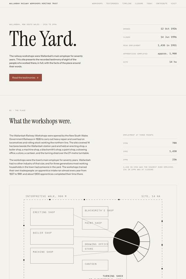
Composite 93.8%Judge 4.8/5
Judge panelAnthropic 4.5/5OpenAI 5.0/5
single-judge (Claude) 4.5/5 → leave-one-family-out 4.8/5
Anthropic: Comprehensive fidelity: hero, "what the workshops were", all eight named testimonies presented in full, a ten-event timeline, the closure section, "what stands today", the collecting project with a five-field contribution form, and visit/contact are all present, with no photography and code-drawn schematics/donut chart honouring the constraints. The editorial newsprint aesthetic - Fraunces-style serif heads, monospace metadata labels, warm paper background, single rust accent, disciplined columns - is coherent and pitch-perfect for the plain, respectful register the brief demands. Craft is hig
OpenAI: The page visibly includes every required section, all eight full testimonies, the chronology, closure context, site-today content, contribution form, and visit/contact details, while respecting the no-photography and plain-register constraints. The restrained archival layout, refined typography, careful schematic drawing, and consistent rule-based spacing feel highly polished and appropriate. It is distinctive without being decorative, giving the material a premium editorial presence.
Elias Byrne (Opus 4.8)
High reasoning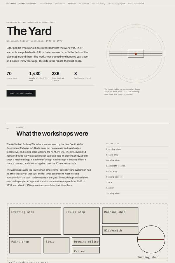
Composite 90.6%Judge 4.6/5
Judge panelAnthropic 4.3/5OpenAI 5.0/5
single-judge (Claude) 4.3/5 → leave-one-family-out 4.6/5
Anthropic: Every required section is present and correct: an austere hero, the workshops explainer with a code-drawn site plan and employment bar chart, all eight numbered testimonies in full, the ten-event timeline, a dark closure section carrying the key statistics (236, 4,100, 61, 84, 71), what stands today in three columns, the collecting project with a labelled contribution form, and visit/contact details - and it honours the no-photographs and plain-register constraints with a purely typographic, diagrammatic visual language. The design is a coherent editorial monochrome with a confident serif/mono
OpenAI: All required sections and fixed content appear present, including the eight full testimonies, ten timeline entries, closure context, site-today details, collecting form, and visit/contact information, with no reliance on photography. The restrained archival/technical visual language is highly appropriate, coherent, and distinctive, with polished typography, spacing, diagrams, and section structure that make the long material feel deliberate and respectful.
Noor El-Amin (Opus 4.8)
High reasoning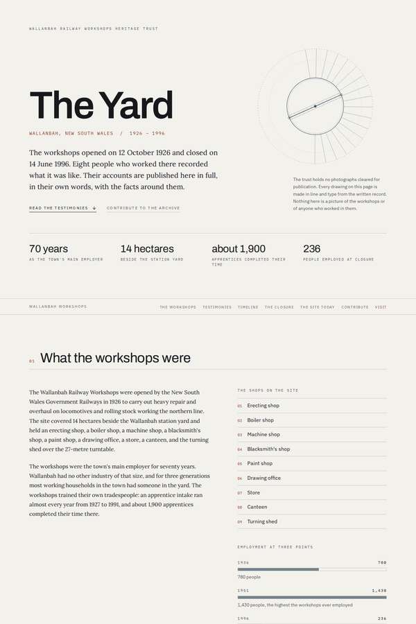
Composite 87.5%Judge 4.5/5
Judge panelAnthropic 4.3/5OpenAI 4.8/5
single-judge (Claude) 4.3/5 → leave-one-family-out 4.5/5
Anthropic: Every required section is present and correct: hero with masthead and turntable diagram, stats row, "what the workshops were" with an employment bar chart, all eight testimonies in full, the full timeline, the closure with a stat grid, what stands today as code-drawn cards, the collecting project with a complete contribution form, and visit/contact - all built honestly in code with no faked photography, matching the plain, restrained register the trust asked for. The editorial monochrome-on-warm-paper system with serif display, mono labels, hairline rules and numbered sections is coherent, con
OpenAI: The page appears to include every required section with the full testimonies, all timeline entries, collecting form fields, visit details, and a respectful non-photographic visual language. The restrained editorial design is highly coherent and well-crafted, with strong grid discipline, tasteful typography, and precise diagrammatic details; its impact is premium but deliberately quiet rather than immediately dramatic.
Yuki Tanabe (kimi-k3)
default reasoning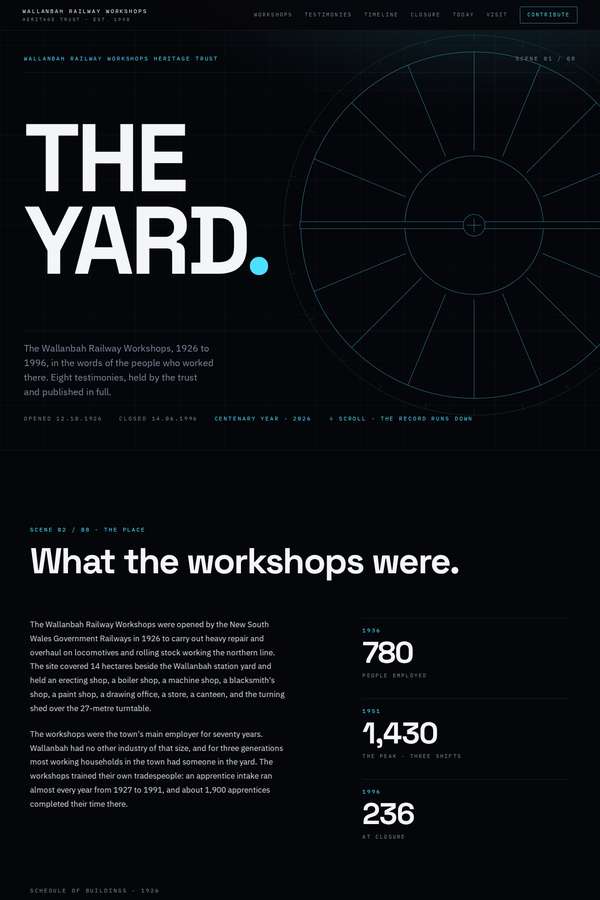
Composite 87.5%Judge 4.5/5
Judge panelAnthropic 4.3/5OpenAI 4.8/5
single-judge (Claude) 4.3/5 → leave-one-family-out 4.5/5
Anthropic: All required sections are present and correct: hero, what the workshops were with the three employment figures and 1,900 apprentices, all eight named testimonies in full, the ten-event timeline, the closure with its figures, what stands today (with code-drawn SVG diagrams instead of photos, honouring the no-photography constraint), the collecting form, and visit/contact with the centenary weekend. The visual language is a coherent, restrained dark editorial system driven by large Archivo-style bold headings with a code-drawn radial turntable motif in the hero - tasteful, modern, and appropriat
OpenAI: The page visibly includes all required sections, all eight testimonies, the ten-entry timeline, closure context, current site information, contribution form, and visit/contact details, while respecting the no-photography constraint with restrained coded graphics. The visual system is distinctive and appropriate: stark typography, cyan drafting-line details, and strong spacing give it a serious heritage/archive tone. Craft is high overall, though some small text and navigation details appear very fine, which slightly affects readability for the stated older audience.
Mara Vieira (kimi-k3)
default reasoning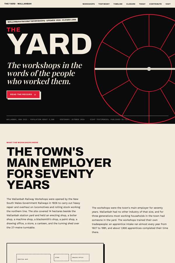
Composite 87.5%Judge 4.5/5
Judge panelAnthropic 4.5/5OpenAI 4.5/5
single-judge (Claude) 4.5/5 → leave-one-family-out 4.5/5
Anthropic: Every required section is present and correct: hero, what the workshops were with the three employment figures (780/1,430/236), all eight numbered testimonies rendered in full, the ten-date timeline, the closure section, what stands today, the collecting form with its fields, and visit/contact plus a centenary open-weekend banner. The visual system is a confident editorial treatment in red/black/cream with strong Archivo-expanded type hierarchy, and it honours the no-photographs constraint by drawing a code-built circular turntable motif rather than faking imagery. Craft is finished and consis
OpenAI: The page visibly includes every required section, all eight testimonies, the ten-date timeline, the collecting form, and visit/contact details, while respecting the no-photography constraint with coded schematic graphics. The visual direction is distinctive and appropriate, with strong industrial typography and a restrained black/cream/red palette, though some body text, captions, and navigation are very small for the older audience. Overall it feels polished and memorable, with only minor readability and clipping/scale concerns keeping craft and design from a perfect score.
Ingrid Kessler (Opus 4.8)
High reasoning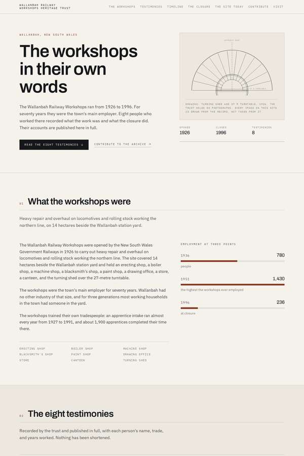
Composite 84.4%Judge 4.4/5
Judge panelAnthropic 4.3/5OpenAI 4.5/5
single-judge (Claude) 4.3/5 → leave-one-family-out 4.4/5
Anthropic: Every required section is present and correct: a restrained hero, "what the workshops were" with the 1936/1951/1996 employment figures, all eight testimonies in full with name/trade/years, the ten-event timeline, a dark closure section with stat callouts, a code-drawn "what stands today" site map, the collecting project with the contribution form, and visit/contact details - all honouring the no-photography, plain-register constraints. The execution is a coherent editorial "paper" aesthetic with monospace labels, hairline rules, and honestly code-drawn SVG diagrams (the hero fan chart and the
OpenAI: The page includes all required sections and appears to preserve the testimonies, timeline, closure facts, collecting form, and visit/contact content while respecting the no-photography, plain-register constraint. The editorial layout, restrained palette, technical diagrams, and typography are highly coherent and appropriate, though some microtext is very small and the form submit button appears as an unlabeled black block. Overall it feels polished and distinctive, if intentionally quiet rather than strongly dramatic.
Elias Byrne (kimi-k3)
default reasoning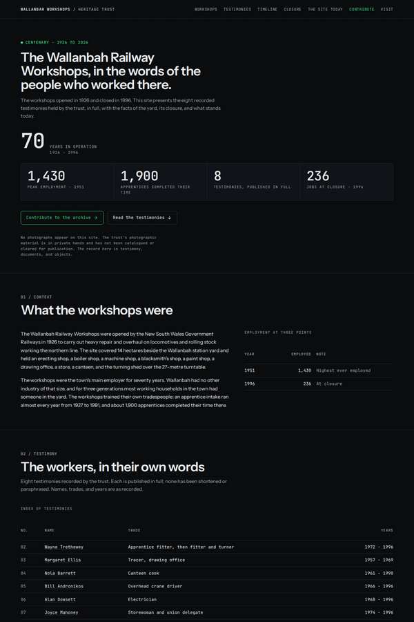
Composite 84.4%Judge 4.4/5
Judge panelAnthropic 4.3/5OpenAI 4.5/5
single-judge (Claude) 4.3/5 → leave-one-family-out 4.4/5
Anthropic: Every required section is present and correct: hero with an employment stat row (1,430 / 1,900 apprentices / 8 testimonies / 236 at closure), a full testimony index table, all eight testimonies with name/trade/years, a ten-event timeline, the closure narrative, "what stands today", a collecting form with the correct fields, and visit/contact - all with no photography and an honest code-drawn schematic of the turning shed and turntable. The dark, monospace-labelled editorial system is coherent, well-spaced, and matches the brief's demand for a plain, restrained, non-sentimental register, with t
OpenAI: The page includes all required major sections and presents the testimonies in full with a plain, respectful register, though the employment table appears to omit the 1936 figure and the timeline/index seem to miss or obscure one required entry. The dark archival/technical visual system is highly coherent and distinctive, with strong typography, restrained colour, and a well-crafted code-drawn site plan; minor content/table issues keep craft and fidelity just below perfect.
Yuki Tanabe (Opus 4.8)
High reasoning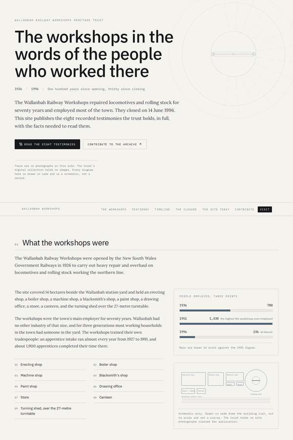
Composite 81.3%Judge 4.3/5
Judge panelAnthropic 4.0/5OpenAI 4.5/5
single-judge (Claude) 4.0/5 → leave-one-family-out 4.3/5
Anthropic: Every required section is present and correct: hero, what the workshops were (with honest code-drawn bar charts for the employment figures), all eight testimonies rendered in full with name/trade/years, the ten-event timeline, the closure section with its stats, what stands on the site today in three columns, the collecting project with a contribution form, and visit/contact - all in a restrained, photo-free editorial register that matches the trust's constraints precisely. The visual language is coherent and disciplined: cream ground, monospace eyebrow labels, serif headings, tidy grids and r
OpenAI: All required sections and substantive content are visible, including the eight full testimonies, full timeline, collecting form, visit details, and a clear non-photographic visual language. The design is restrained, typographically strong, and well suited to the heritage-trust tone, with elegant schematic and archival details. Craft is high overall, though some microtext is very small and the contribution form’s dark submit button appears unlabeled, slightly reducing polish and impact.
Noor El-Amin (kimi-k3)
default reasoning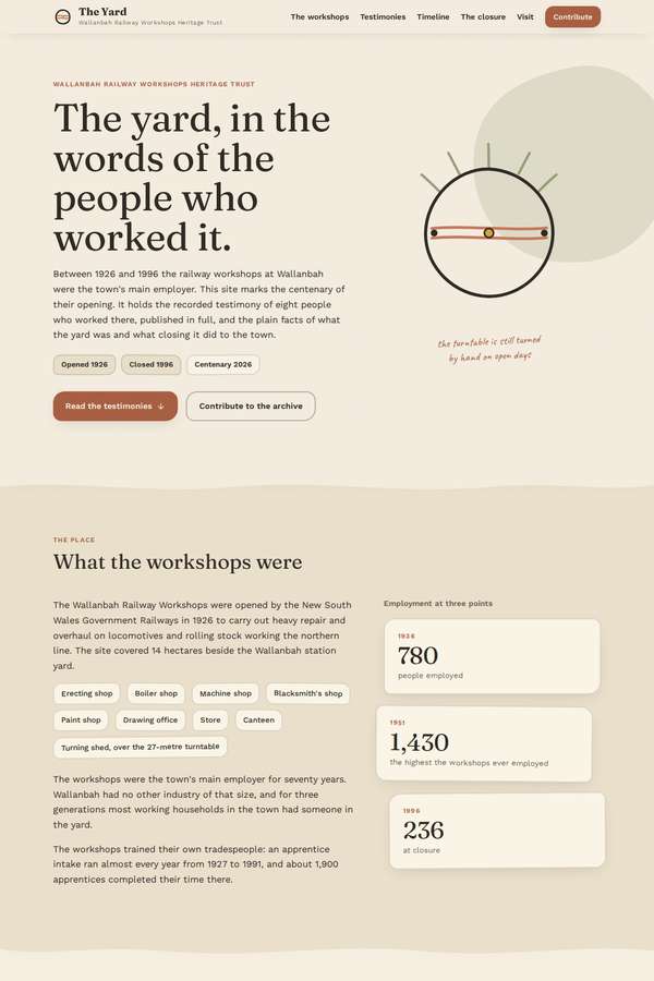
Composite 81.3%Judge 4.3/5
Judge panelAnthropic 3.8/5OpenAI 4.8/5
single-judge (Claude) 3.8/5 → leave-one-family-out 4.3/5
Anthropic: All required sections are present and in order - hero, what the workshops were with the three employment stats, all eight named testimonies as full-text cards, a ten-entry timeline, the closure section, "what stands today" three-card grid, the collecting project with a labelled contribution form, and visit/contact - and the register is appropriately plain and unsentimental, honouring the no-photography constraint with code-drawn SVG marks only. The warm cream paper palette with dark serif headings is coherent, well-spaced, and reads as considered editorial design suited to a heritage trust; cr
OpenAI: The page visibly includes every required section, all eight full testimonies, the ten-date timeline, collecting form fields, and visit/contact details, while respecting the no-photography and restrained-register constraints. The visual system is cohesive and tasteful, with strong typography, muted heritage colours, careful spacing, and code-drawn railway motifs that support the material without sentimentality. It feels polished and premium, though its deliberately quiet restraint makes the overall impact more dignified than arresting.
Yuki Tanabe (deepseek-v4-pro)
default reasoning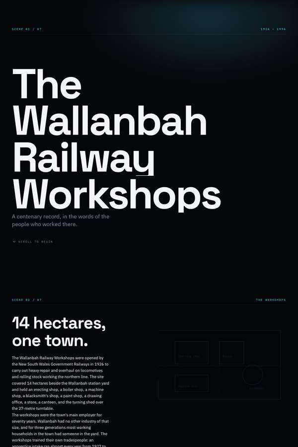
Composite 81.3%Judge 4.3/5
Judge panelAnthropic 4.3/5OpenAI 4.3/5
single-judge (Claude) 4.3/5 → leave-one-family-out 4.3/5
Anthropic: All required sections are present and correctly ordered - a bold typographic hero, the workshops overview with the 780/1430/236 employment figures, the full testimony set, a timeline, the "236 jobs. One town." closure section, the three "what stands today" columns, a styled collecting form, and visit/contact - with no faked photography, matching the brief's constraints. The restrained near-black palette with numbered section labels and large Archivo Expanded display type reads as coherent, modern and respectful, an apt register for the material. Execution is clean and consistent, though the lo
OpenAI: All required sections, the eight testimonies, timeline, closure context, current-site information, contribution form, and visit/contact details appear to be present, with an appropriately plain and non-photographic treatment. The visual system is coherent and restrained, with strong typographic hierarchy and a fitting industrial-document mood, though much of the body and timeline text is very small/low-contrast for the older audience. Overall it feels polished and distinctive, but the extreme minimalism and readability issues hold it just short of excellent.
Cass Werner (Opus 4.8)
High reasoning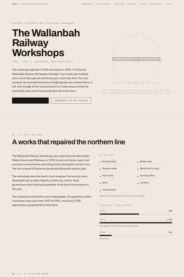
Composite 81.3%Judge 4.3/5
Judge panelAnthropic 4.3/5
single-judge (Claude) 4.3/5 → leave-one-family-out 4.3/5
Anthropic: All required sections are present and content-complete: hero, what the workshops were, all eight numbered testimonies in full, the ten-date timeline, the closure section with the correct figures (236, ~900, 4,100, 61, 84, 71), the three "what stands today" items, a contribution form with the specified fields, and visit/contact details. The visual language is a restrained editorial/newspaper treatment with serif headings, mono metadata labels and generous whitespace, and it honours the no-photography and plain-register constraints, using a single code-drawn turntable diagram as its only motif r
Sol Kepler (Opus 4.8)
High reasoning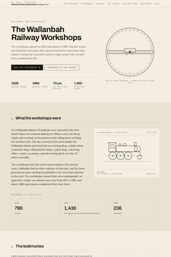
Composite 81.3%Judge 4.3/5
Judge panelAnthropic 4.3/5
single-judge (Claude) 4.3/5 → leave-one-family-out 4.3/5
Anthropic: Every required section is present and in the right register: hero, what the workshops were, eight numbered testimonies shown at full length, the ten-event timeline, a dark closure block with the population/jobs stat grid, three cards for what stands today, the collecting project with a labelled contribution form, and visit/contact details. The visual language is a coherent warm-paper editorial system with restrained serif display type and honest code-drawn imagery (a turntable compass diagram and a locomotive line drawing) rather than faked photography, which respects the no-photos and plain-r
Cass Werner (kimi-k3)
default reasoning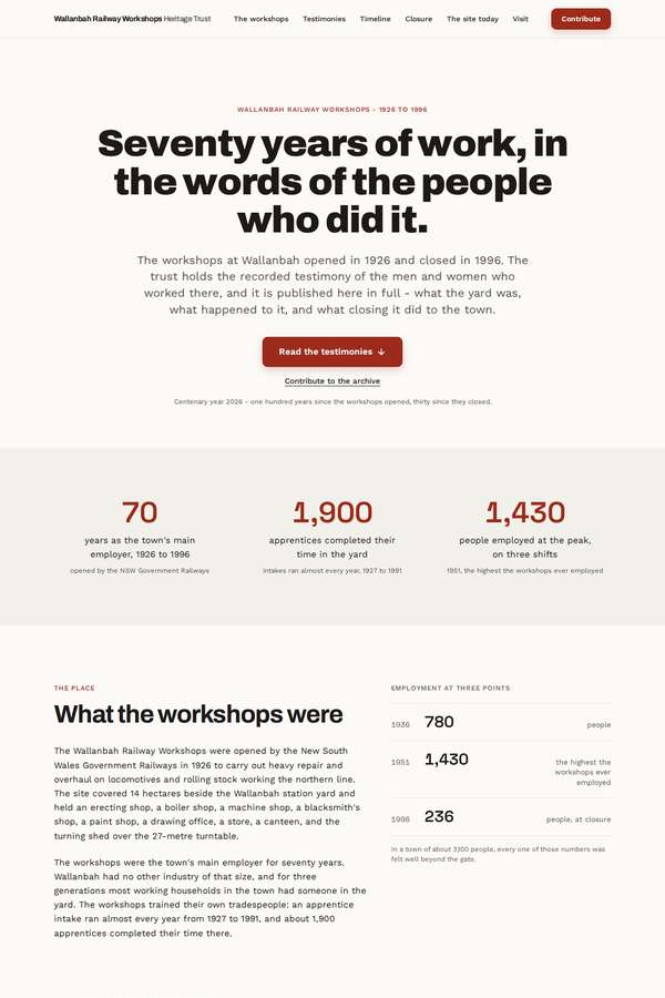
Composite 81.3%Judge 4.3/5
Judge panelAnthropic 4.3/5
single-judge (Claude) 4.3/5 → leave-one-family-out 4.3/5
Anthropic: Every required section is present and correct: a serif hero, "what the workshops were" with the three employment figures and honest code-drawn diagrams (site plan, employment bar chart, donut), all eight testimonies laid out in full with name/trade/years attribution, a vertical timeline, the closure section with its 236 / 1-in-6 / 4,100 stats, what-stands-today, the collecting project with a full contribution form, and visit/contact details. The visual language is coherent and well-judged for the brief: a restrained cream-and-rust editorial palette, dignified serif headings, generous whitespac
Ingrid Kessler (deepseek-v4-pro)
default reasoning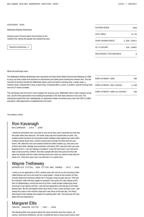
Composite 75.0%Judge 4.0/5
Judge panelAnthropic 4.0/5OpenAI 4.0/5
single-judge (Claude) 4.0/5 → leave-one-family-out 4.0/5
Anthropic: Fidelity is excellent: all eight named testimonies appear in full, the ten-event timeline, closure section, what-stands-today, a complete contribution form, and visit/contact are all present, with the fact tables handling figures honestly and no faked photography. The design is coherent and tonally spot-on for the brief's restrained, archival register, using monospaced labels, hairline rules, and right-aligned data tables to structure a dense document. Craft looks finished and consistent, but impact is modest: the page is very plain, the testimonies read as a wall of small grey text, and there
OpenAI: The screenshot appears to include every required section, all eight testimonies, the full timeline, closure context, present-day site information, collecting form, and visit/contact details, while respecting the no-photography and plain-register constraints. The design is coherent, restrained, and readable with consistent typographic and rule-based detailing, though it is quite bare and document-like. It feels appropriate and well finished, but not especially distinctive or premium enough to have strong visual impact.
Noor El-Amin (deepseek-v4-pro)
default reasoning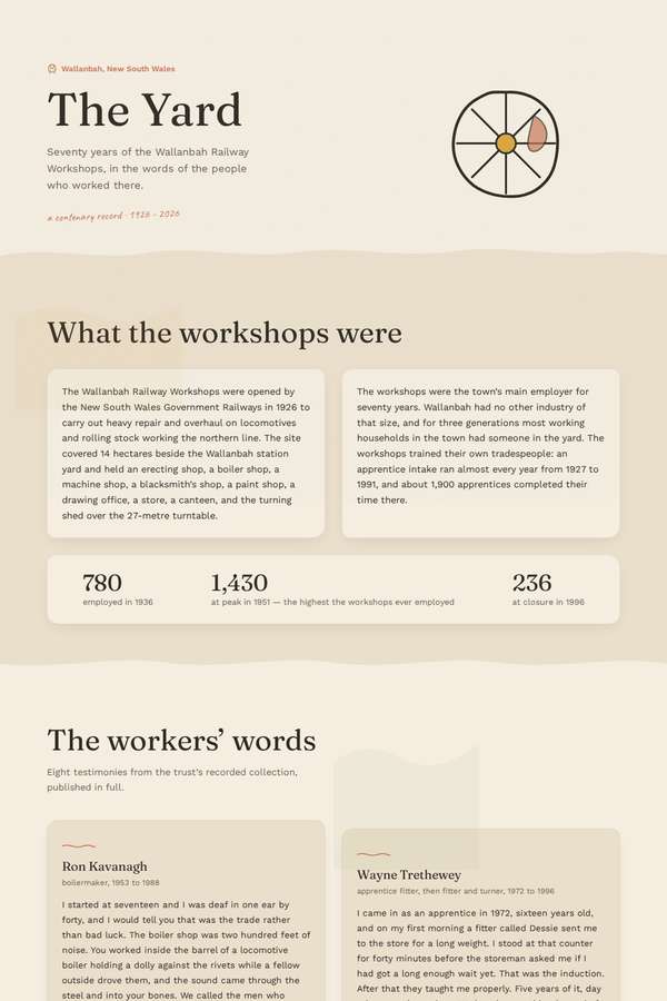
Composite 75.0%Judge 4.0/5
Judge panelAnthropic 3.8/5OpenAI 4.3/5
single-judge (Claude) 3.8/5 → leave-one-family-out 4.0/5
Anthropic: All required sections are present and in order: hero with a code-drawn turntable/compass motif, "what the workshops were" with the 780/1,430/256 stats, eight testimony cards, a full vertical timeline, the closure section, what stands today, the collecting project with a working contribution form, and visit/contact - no faked photography, which respects the constraint. The warm cream palette, serif display type and restrained register are coherent and well suited to the plain, respectful brief, with clean spacing and one gold accent card for the centenary. Execution is finished and consistent b
OpenAI: All required sections and substantive content appear present, including the eight full testimonies, ten timeline entries, collecting form, and visit/contact details, with no photographic imagery implied. The design is coherent, restrained, and readable with a consistent heritage-inspired palette and strong typography, though the warm parchment styling and decorative waves make it feel slightly conventional rather than truly distinctive.
Sol Kepler (kimi-k3)
default reasoning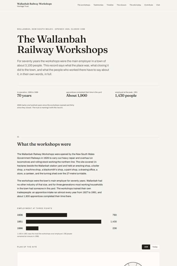
Composite 75.0%Judge 4.0/5
Judge panelAnthropic 4.0/5
single-judge (Claude) 4.0/5 → leave-one-family-out 4.0/5
Anthropic: All required sections are visibly present and correct: hero, what the workshops were with the three employment figures, eight full named testimonies with a sticky index, the ten-event timeline, the closure section, what stands today, the collecting project with a contribution form, and visit/contact - and it honours the no-photographs constraint with code-drawn charts and a schematic site plan. The editorial warm-cream, serif-led treatment is coherent and suits the restrained, plain register the brief demanded, with tidy spacing and finished detail throughout. It reads competent and appropriat
Cass Werner (deepseek-v4-pro)
default reasoning
Composite 75.0%Judge 4.0/5
Judge panelAnthropic 4.0/5
single-judge (Claude) 4.0/5 → leave-one-family-out 4.0/5
Anthropic: All required sections are present and correct: hero, what the workshops were with the three employment figures, all eight named testimonies in full, a ten-event vertical timeline, the closure section, what stands today (turning shed, walk, archive), a contribution form with the right fields, and visit/contact - with no photography and a plain, respectful register that matches the trust's ask. The editorial layout is coherent and tasteful: serif display headings, a single rust/red accent, clean stat callouts, and a centred alternating timeline, all appropriately restrained. Craft is consistent
Sol Kepler (deepseek-v4-pro)
default reasoning
Composite 75.0%Judge 4.0/5
Judge panelAnthropic 4.0/5
single-judge (Claude) 4.0/5 → leave-one-family-out 4.0/5
Anthropic: All required sections are present and correct: hero, what the workshops were (with the three employment stat figures), all eight named testimonies in full, a vertical timeline, the closure section, what stands today, the collecting project with a labelled contribution form, and visit/contact details - and it honours the no-photography, plain-register constraint faithfully. The visual language is a coherent, well-spaced editorial layout with restrained sans-serif type, tidy stat callouts and a clean timeline rail, which suits the brief, though it reads fairly monotone (grey-on-white, small type
Elias Byrne (deepseek-v4-pro)
default reasoning
Composite 62.5%Judge 3.5/5
Judge panelAnthropic 4.0/5OpenAI 3.0/5
single-judge (Claude) 4.0/5 → leave-one-family-out 3.5/5
Anthropic: Every required section is present and complete: hero, what the workshops were with the three-point employment table, all eight testimonies in full with name/trade/years, the full timeline, the closure with its statistics, what stands today, the collecting project with the contribution form, and visit/contact details. The design commits to a restrained archival/drawing-office aesthetic - serif headings, monospace labels, and dotted hairline rules - that honestly matches the brief's plain, non-photographic, respectful register, and it is consistently executed with no broken bits. It is tasteful
OpenAI: The page appears to include all required major sections, all eight testimonies, the full timeline, collecting form, and visit/contact information, though at least one contextual closure detail seems omitted and some content is flattened into crude tables. The design is restrained and respectful with a consistent archival dot-grid motif, but the typography is dense, hierarchy is limited, form fields are barely visible, and the overall result feels more like a plain document than a distinctive finished heritage site.
Noor El-Amin (claude-fable-5)
High reasoning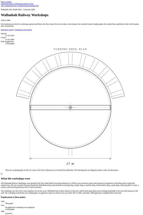
Composite 43.8%Judge 2.8/5
Judge panelAnthropic 2.8/5OpenAI 2.8/5
single-judge (Claude) 2.8/5 → leave-one-family-out 2.8/5
Anthropic: All required sections are present and content-complete: hero, what the workshops were, the eight full testimonies, all ten timeline events, the closure, what stands today, the collecting project with contribution form, and visit/contact, plus two honest code-drawn SVG plans (turning shed and site plan) that respect the no-photographs constraint. But the page reads as essentially unstyled document HTML - default serif/sans fonts, blue underlined links, a bare "skip to content" link, and default form controls - so there is no evident type system, colour, or spatial composition; the restraint fee
OpenAI: The visible page appears to include all required sections, all eight full testimonies, the full timeline, closure/context material, collecting form, and visit/contact details while respecting the no-photography constraint. However the presentation is largely browser-default typography and spacing with very long line lengths, cramped navigation, default links/forms, and a few rough caption/spacing issues; the code-drawn plans are appropriate but not enough to make the overall result feel polished or premium.
Cass Werner (claude-fable-5)
High reasoning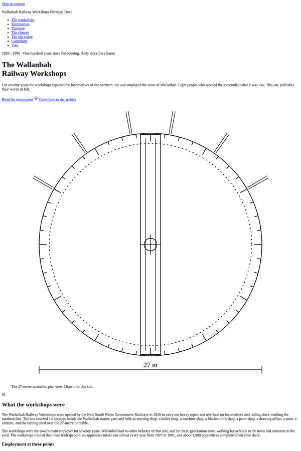
Composite 43.8%Judge 2.8/5
Judge panelAnthropic 2.8/5
single-judge (Claude) 2.8/5 → leave-one-family-out 2.8/5
Anthropic: Every required section is present and correct: hero, what the workshops were, all eight named testimonies in full, the ten-event timeline, the closure section, what stands today, the collecting project with a complete contribution form, and visit/contact - and it honours the no-photography rule with a code-drawn turntable dial and a schematic site plan. But visually it reads as near-default browser styling: a generic serif body face, blue underlined nav links, no colour system, flat hierarchy and cramped, unmanaged spacing, so it looks like an unstyled document rather than a designed page. The
Mara Vieira (claude-fable-5)
High reasoning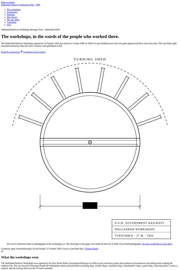
Composite 41.7%Judge 2.7/5
Judge panelAnthropic 3.0/5OpenAI 2.8/5Google 2.3/5
single-judge (Claude) 3.0/5 → leave-one-family-out 2.7/5
Anthropic: Brief fidelity is excellent: all eight named testimonies, the ten-date timeline, employment figures, closure, what-stands-today, contribution form, and visit/contact are all present, and the two code-drawn technical diagrams (turntable and site plan) honour the no-photographs/made-in-code constraint honestly. But the visual design reads as an essentially unstyled document - default-looking serif headings, tiny cramped body type, a single narrow column, and default form controls with little deliberate hierarchy or spacing, showing scant use of the premium font menu. The restrained register is a
OpenAI: The page appears to include all required sections, the full testimonies, timeline, collecting form, and visit/contact details, and it respects the no-photography constraint with coded line drawings. However, the visual execution is largely browser-default typography and controls with cramped spacing, broken-looking run-together labels, and minimal composition beyond the SVG diagrams. The restrained archival idea is appropriate, but the finish and distinctiveness fall well short of a premium rendered build.
Google: All mandatory content is present, accompanied by impressive custom SVG diagrams. However, the apparent failure to apply CSS leaves the page looking like unstyled default HTML, crippling layout, typography, and overall visual polish.
Elias Byrne (claude-fable-5)
High reasoning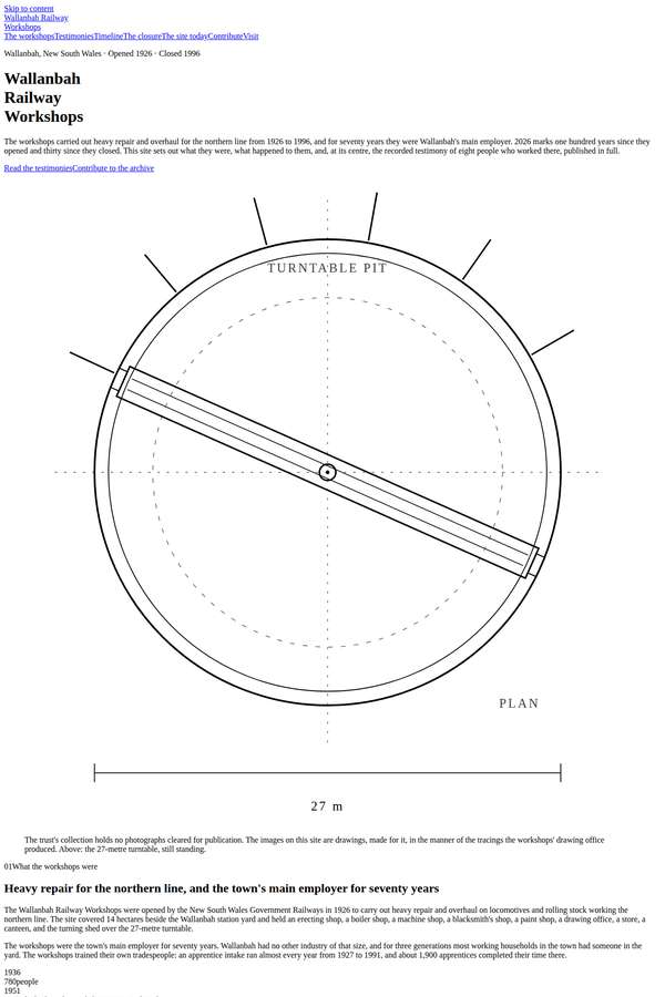
Composite 37.5%Judge 2.5/5
Judge panelAnthropic 3.0/5OpenAI 2.0/5
single-judge (Claude) 3.0/5 → leave-one-family-out 2.5/5
Anthropic: All required sections are present and content-complete: hero, what the workshops were, all eight named testimonies in full, the ten-event timeline, the closure section, what stands today, the collecting project with contribution form, and visit/contact - and the visual language is honestly code-made (technical turntable and site-plan line drawings with dimension callouts), respecting the no-photographs and plain-register constraints. But the execution reads as a near-unstyled document: default-serif headings on white, tiny dense body text running the full page width with no measure control or
OpenAI: The page appears to include all required sections, the eight testimonies, timeline entries, collecting form, and visit/contact details, with an honest non-photographic drawing language. However the rendered site is largely unstyled browser-default text with cramped navigation, weak hierarchy, very long line lengths, and several janky spacing/formatting issues, so it feels unfinished despite the solid content coverage.
Ingrid Kessler (claude-fable-5)
High reasoning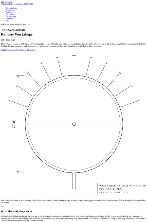
Composite 34.4%Judge 2.4/5
Judge panelAnthropic 2.0/5OpenAI 2.8/5
single-judge (Claude) 2.0/5 → leave-one-family-out 2.4/5
Anthropic: Content coverage is strong: all eight testimonies in full, the ten-event timeline, closure, site-today, collecting form, and visit/contact all appear, and the two honest in-code visuals (an SVG turntable and a dashed site plan) respect the no-photography rule. But visually it reads as near-unstyled HTML - default fonts, tiny cramped text, default blue links, no spacing system, no colour, and no typographic hierarchy - so the plainness looks like absent design rather than a deliberate restrained point of view. Craft is thin (browser-default janky feel) and impact is negligible; a reviewer would
OpenAI: The build appears to include all required sections, the eight full testimonies, the full timeline, collecting form, visit/contact details, and uses drawn diagrams rather than photographs. Visually it is extremely plain and largely browser-default, with overlong text measures, default link/list/form styling, cramped spacing, and some awkward form alignment, though the technical drawing motifs are appropriate. The result is respectful and complete but lacks polish, composition, and premium impact.
Mara Vieira (Opus 4.8)
High reasoning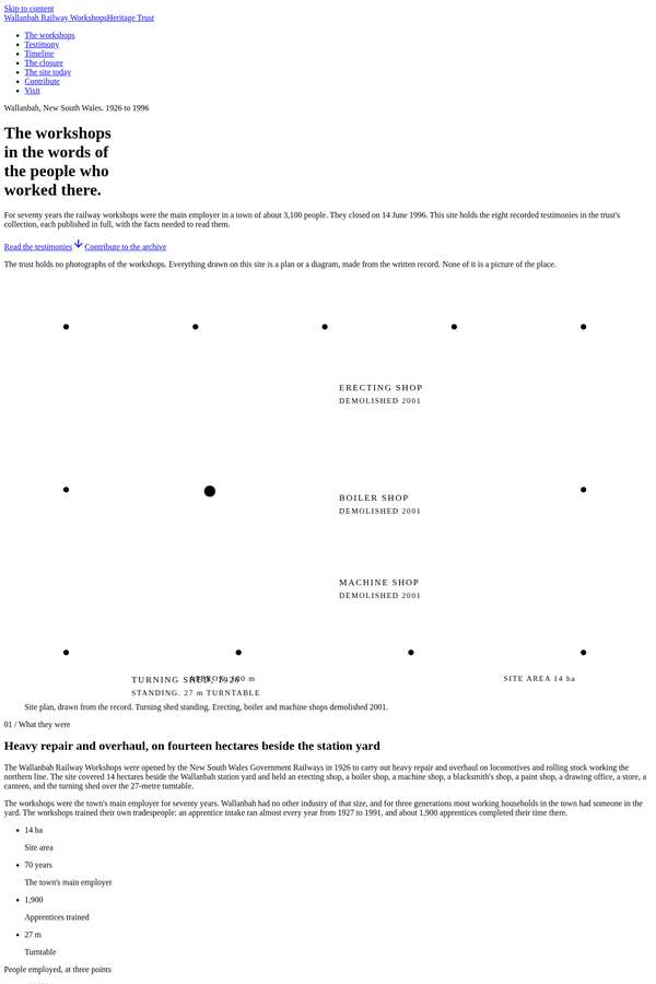
Composite 28.1%Judge 2.1/5
Judge panelAnthropic 2.5/5OpenAI 1.8/5
single-judge (Claude) 2.5/5 → leave-one-family-out 2.1/5
Anthropic: All required sections appear present and honest to the brief: hero, what the workshops were, eight testimonies in full, a ten-entry timeline, the closure, what stands today, the collecting project with contribution form, and visit/contact - and it correctly avoids photography, using a code-drawn schematic site plan of the shops. But visually it reads as near-unstyled: black-on-white with default type, weak hierarchy, cramped spacing, and almost no compositional design, so restraint tips into looking unfinished rather than deliberate. Craft suffers around the contribution form where fields and
OpenAI: Most required sections and content are visible, including all eight testimonies, the timeline, closure context, site-today information, collecting form, and visit/contact details, with no photographic fakery. However the page appears largely unstyled with default browser typography, malformed spacing, concatenated numbers/dates, overlapped diagram labels, and a broken-looking form layout, making the overall craft and visual impact very poor.
Yuki Tanabe (claude-fable-5)
High reasoning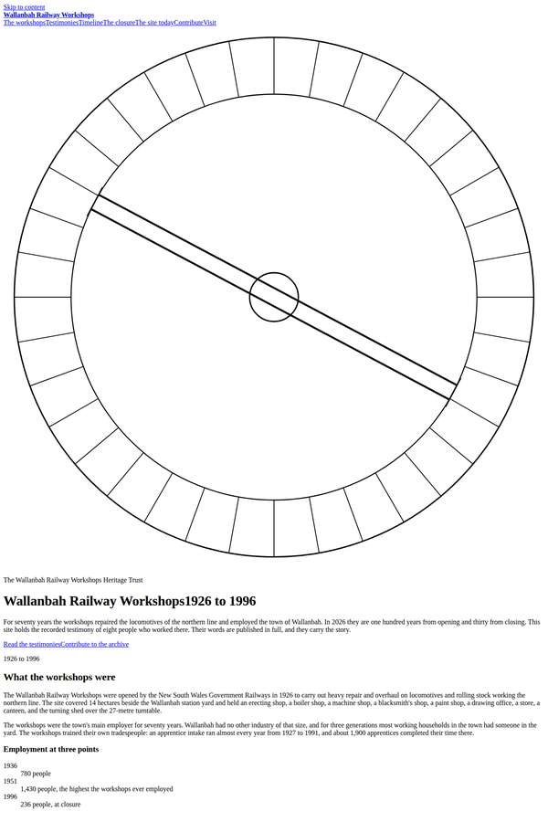
Composite 28.1%Judge 2.1/5
Judge panelAnthropic 2.0/5OpenAI 2.3/5
single-judge (Claude) 2.0/5 → leave-one-family-out 2.1/5
Anthropic: Content coverage is strong: all eight testimonies appear in full, the ten-event timeline, the closure section, what-stands-today, the collecting project with its contribution form, and visit/contact are all present, and the code-drawn turntable ring at the top honours the no-photography constraint. But the page is essentially unstyled - default Times-style serif, full-bleed text with no max-width or margins, no type hierarchy beyond browser defaults, no colour system or spacing rhythm, and a raw stacked form. This reads as an undesigned document dump rather than the deliberately restrained, co
OpenAI: The required content appears to be present: all major sections, eight full testimonies, timeline entries, closure context, collecting form, and visit/contact details are visible and consistent with the brief. However the page is largely unstyled default HTML with cramped full-width text, concatenated links and headings, awkward form layout, and an oversized line drawing, making the visual design and overall impact very weak despite some honest code-drawn diagramming.
Sol Kepler (claude-fable-5)
High reasoning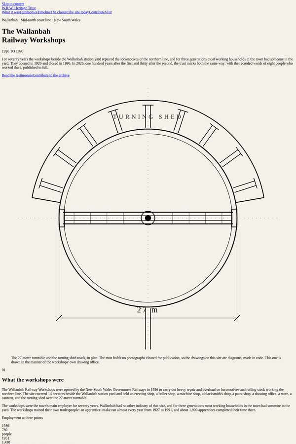
Composite 25.0%Judge 2.0/5
Judge panelAnthropic 2.0/5
single-judge (Claude) 2.0/5 → leave-one-family-out 2.0/5
Anthropic: All required content is present and handled with the correct restrained register: the eight testimonies appear in full, the ten-event timeline, closure impact, form, and contact details are all there, and the trust's no-photography constraint is respected via two honest code-drawn SVG diagrams (the 27m turntable plan and a site footprint plan). But visually the page is essentially unstyled - default serif/sans headings, default blue underlined links, no palette, no spacing system, cramped inline number lists, an unstyled form, and a broken/overlapping nav strip at the top - so it reads as a ra
Mara Vieira (deepseek-v4-pro)
default reasoning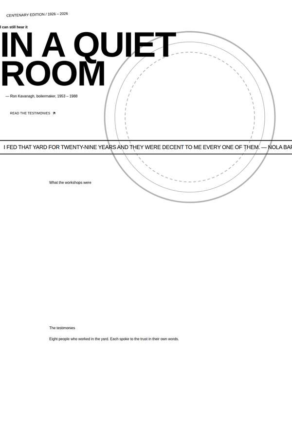
Composite 12.5%Judge 1.5/5
Judge panelAnthropic 1.5/5OpenAI 1.5/5
single-judge (Claude) 1.5/5 → leave-one-family-out 1.5/5
Anthropic: The hero is genuinely strong - restrained "IN A QUIET ROOM" in heavy Archivo Expanded, a plain Kavanagh attribution, a quote bar, and a dashed-circle turntable motif that honours the no-photography constraint. But below the fold the build collapses: the entire page is vast empty white space with only tiny floating section labels ("The testimonies", "The timeline", "The closure...", "The collecting project", "Visit & contact") and a single stray line of body text. None of the eight testimonies, the ten timeline events, the closure narrative, the contribution form, or the visit details actually
OpenAI: Only the hero and a series of section headings are visible; the required full testimonies, timeline entries, closure text, collecting form, and visit/contact details are effectively absent from the screenshot. The stark monochrome hero and turntable linework have a restrained conceptual direction, but the page reads as unfinished with excessive empty space and truncated text.