Banja Lab / Benchmarks / Test
WDB-0002webdesign · hard
The Wreck of the Coralyn maritime museum microsite
The same task, run on 110 models. Compare the outputs side by side, or open any one in a popup to inspect it.
Top result: Noor El-Amin (claude-opus-4-8) (high reasoning) at 96.9% composite. Lowest: Noor El-Amin (gpt-5.6-luna) at 0.0%. 110 models compared on this task.
How it ran
- Each model was given the brief below in a fresh, isolated session with no access to our tools, and returned a single self-contained index.html (inline CSS and JS, no external requests, no build step).
- The rendered output was scored 1 to 5 on brief fidelity, visual design, craft, and impact by a four-family vision panel - Anthropic (Claude Opus 4.8), OpenAI (GPT-5.5), Google (Gemini 3.1 Pro), and xAI (Grok 4.3) - using one identical prompt so the scores compare. The published judge score is leave-one-family-out: a model is never scored by a judge of its own family, so same-family self-preference is removed.
The brief
# Client brief: The Wreck of the Coralyn You are designing and building an interactive microsite for a real small museum. The brief below gives you the business facts, the goals, the audience, the sections the site must have, and the exact content to use. It gives you no visual direction on purpose. Every design decision - layout, type, colour, imagery, motion, tone - is yours to make. Read the whole brief, form a point of view on how this story should look and feel, and build it. ## The commissioning body The Port Camden Maritime Museum is a small volunteer-run museum on the mid-north coast of New South Wales. It is the custodian of the wreck of the SS Coralyn, a coastal steamer that went down off Port Camden Heads in 1908 and now lies as a protected dive site in 40 metres of water. The museum wants a microsite that tells the whole story of the ship, the night she was lost, the people aboard, what has been recovered, and how the wreck can be dived today. It is used by three kinds of visitor: locals and history readers who want the full story, recreational divers planning a dive, and teachers arranging school visits. ## What the site is for 1. Tell the story of the Coralyn - the ship, the sinking, and the people - so a first-time reader understands what happened and why it matters. 2. Give divers the practical facts they need to dive the wreck lawfully and safely. 3. Bring in visits: send people to the museum, and get teachers to request a school group pack from the education officer. ## Who it is for History readers of any age who want a story told well, recreational scuba divers planning a dive on the wreck, and teachers of upper-primary and secondary classes arranging a museum visit. ## The experience the museum wants The museum's one request about the experience, not the look: they want the site to carry the visitor down. As you scroll from the surface into the story, the museum wants a reader to feel the descent onto the wreck - the water closing over, the light going, the wreck arriving out of the dark. How you achieve that is entirely your call. This is a note about the experience, not a style instruction. One firm rule that comes with it: any motion must respect a visitor's reduced-motion preference. When reduced motion is requested, the whole site must still be completely readable and every section reachable as a calm, static page, with no information only conveyed through movement. ## What the site must contain (all of these sections) - a hero that opens the story, - the ship (the vessel's facts), - the night of the sinking, - an interactive dive, or descent, that presents the three depth bands of the wreck, - the six recovered artifacts, - the timeline (launch to protection to today), - dive access rules, - plan your visit, with the museum's contact details and the school-pack request. ## Content to use Use the content below substantially as written, in Australian English. You may write your own section headings and any short connective microcopy (button labels, captions, form labels), but the facts, figures, names, dates, and descriptions are fixed. Do not invent extra artifacts, drop any of the six, or change the manifest, the timeline, the depth bands, or the names of those lost. ### The ship The SS Coralyn was a 62-metre iron-hulled coastal steamer of 812 gross tons. She was launched in 1899 at the Ferguson and Aird shipyard at Port Glasgow, on the Clyde, and delivered later that year to her owners, the Ardmore Coastal Line of Sydney. She was driven by a single triple-expansion steam engine fed by two coal-fired boilers, and made a service speed of about ten knots. She carried general cargo and up to twelve passengers, and worked the coastal run between Sydney and Newcastle, taking coal south and general goods north. Her master on her final voyage was Captain William Renshaw, who had commanded her for six years. ### The night of the sinking On the night of 14 August 1908 the Coralyn was on her regular northbound run to Newcastle when she was caught by a severe southerly gale off Port Camden Heads. In heavy seas her engine failed, and without power she was driven onto the reef that lies off the Heads, now marked on charts as Coralyn Reef. She struck at about 11:40 pm, held on the reef for a short time, then slipped off it and foundered before half past midnight - down in under an hour. Of the twenty-six people aboard that night, eighteen crew and eight passengers, twenty-one got away in two of the ship's boats and were picked up at first light. Five were lost. The museum asks that the five who were lost be named plainly and with respect: - James Corradine, second engineer, who stayed below trying to restart the engine. - Patrick Hoyle, fireman. - Thomas Byrne, able seaman. - Eleanor Vance, passenger, travelling to Newcastle. - Albert Sturrock, passenger. ### The manifest The cargo aboard the Coralyn on her final voyage, from the surviving Ardmore Line manifest: - Steam coal - 60 tons - Wool bales - 120 bales - Sawn red cedar - 30 lengths - Royal Mail - 14 canvas sacks - Tinned provisions - 40 cases - Tallow - 22 barrels - Ironmongery - 8 crates - Rum - 6 hogsheads - Crated pianos - 3 - Fencing wire - 15 bundles ### The six recovered artifacts Six items have been recovered from the wreck over the years, under permit, and are held by the museum. Present all six. - The engine-room telegraph. A brass ship's telegraph recovered from the engine room in 1957, its handle still set to "Stand By" - the last order Captain Renshaw is thought to have rung down before the engine failed. It is the museum's centrepiece. - A passenger's pocket watch. A gold half-hunter pocket watch recovered in 1961, its hands stopped at 11:47, a few minutes after the Coralyn struck the reef. It was found in the debris field and has never been matched to a name. - The ship's bell. The Coralyn's bell, cast with "CORALYN 1899" around its rim, recovered in 1984 from the sand near the bow. It is rung once each year on the anniversary of the loss. - The binnacle compass. The ship's steering compass and its brass binnacle, recovered in 1969 from the wreck of the bridge. The card is gone but the gimbals still swing freely. - An Ardmore Line dinner plate. A white porcelain plate bearing the blue crest of the Ardmore Coastal Line, recovered intact from the debris field in 1972 - one of a service that went down with the ship. - The steam whistle. The Coralyn's brass steam whistle, recovered from the after funnel stay in 1998. Divers who have handled it say it is the piece that most makes the ship feel real. ### The timeline - 3 May 1899 - launched at the Ferguson and Aird shipyard, Port Glasgow. - September 1899 - arrived in Sydney and entered the Ardmore Coastal Line's Sydney to Newcastle run. - 1904 - refitted with two new boilers after a boiler-room fire off Broken Bay. - 14 August 1908 - foundered on Coralyn Reef off Port Camden Heads; five lives lost. - November 1908 - a Court of Marine Inquiry found the loss was caused by engine failure in heavy weather and laid no blame on Captain Renshaw or his crew. - 1953 - the wreck was relocated by local fishermen whose nets snagged on it, and dived soon after. - 1976 - declared a protected historic shipwreck under the Historic Shipwrecks Act. - 2004 - a public mooring was installed over the wreck and the Port Camden Maritime Museum became its custodian. ### The dive today The Coralyn sits upright and broken on a sand bottom off Port Camden Heads, across three depth bands: - The bow, at 28 metres. The most intact part of the wreck. The bow section stands clear of the sand and is where the bell was found. - The boilers, at 34 metres. The two boilers and the engine are the largest structures on the wreck, in the midships section. - The debris field, at 40 metres. The stern and the scattered cargo lie in a debris field on the sand at the wreck's deepest point, where the pocket watch and the dinner plate were recovered. Visibility is typically 8 to 15 metres and is usually best in autumn. The water is cold below the bow and there can be surge across the debris field. This is a deep dive for experienced, appropriately certified divers. ### Dive access rules The wreck is a protected historic shipwreck. These rules are not optional: - A permit is required to dive the wreck. Apply through Heritage NSW before you dive. - Do not anchor on or near the wreck. Use the public mooring installed over the site. - Do not remove, disturb, or damage anything on the wreck. Everything on it is protected, down to loose fittings in the sand. - Penalties for interfering with a protected historic shipwreck are severe and include substantial fines. Two licensed operators run permitted charters to the wreck: - Camden Heads Dive Charters - Southern Reef Diving Company ### Plan your visit The Port Camden Maritime Museum is at 3 Wharf Road, Port Camden NSW 2445. It is open daily from 10 am to 4 pm, closed Christmas Day. Phone (02) 6555 0192. General enquiries: visit@portcamdenmaritime.org.au. Teachers: the museum runs school programs on the Coralyn for upper-primary and secondary classes. To request a school group pack, email the education officer, Harriet Doyle, at schools@portcamdenmaritime.org.au. ## Output contract (React, single page) Build one single-page site. Output exactly two files: - `App.tsx` - a default-exported React component. Define any subcomponents in this same file. This is the whole page. - `theme.css` - a Tailwind v4 `@theme` token block, your `font-family` choices from the shared font menu below, and any custom CSS you need. The only imports allowed in `App.tsx` are `react`, `framer-motion`, `lucide-react` (never the Sparkles icon), and, for 3D, `three`, `@react-three/fiber`, and `@react-three/drei`. No other packages, no network requests, and no external assets: all imagery must be inline SVG, CSS, drawn in code on a canvas, or rendered with WebGL. The fonts are bundled offline, so use only the shared menu: Archivo (including Archivo Expanded), Instrument Sans, Space Grotesk, Work Sans, IBM Plex Sans, IBM Plex Mono, JetBrains Mono, Fraunces, Instrument Serif, Playfair Display, Lora, Caveat. Make it responsive across mobile, tablet, and desktop. The page must also remain fully readable and usable if WebGL is unavailable: never leave a visitor with a blank screen or a missing section because a 3D canvas failed to start.
Noor El-Amin (claude-opus-4-8)
High reasoning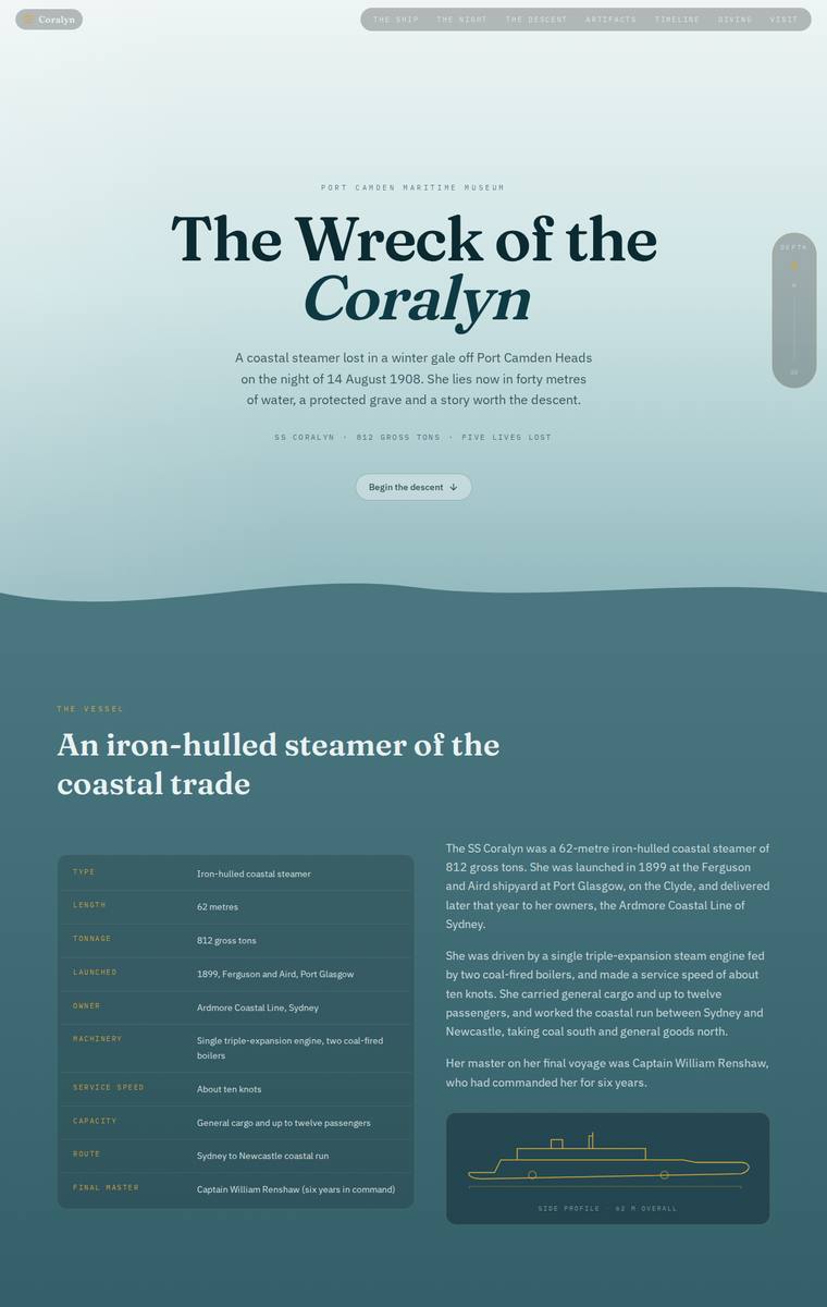
Composite 96.9%Judge 4.9/5
Judge panelAnthropic 4.8/5OpenAI 4.8/5Google 5.0/5
single-judge (Claude) 4.8/5 → leave-one-family-out 4.9/5
Anthropic: Every required section is present and correctly populated: hero, the ship with a stat table and vessel illustration, the night of the sinking with the five lost named respectfully and 26/21/5 stats, the manifest, the three depth-band dive, all six artifacts in a grid, the full timeline, the protected-grave rules with both charter operators, and plan-your-visit with contact details and a teacher school-pack form. The descent concept is realised as a background that deepens from surface teal to near-black over the scroll, tying an elegant Fraunces/serif-plus-sans system and restrained gold accen
OpenAI: All major required sections are present with accurate core content, including ship facts, sinking story, named losses, artifacts, timeline, rules, operators, and visit/school-pack details; the only notable gap visible in the screenshot is that the dive/descent section only shows the full description for the selected bow band while the other depth-band details appear collapsed. The visual system is highly polished, with a strong descent-from-surface concept, elegant typography, restrained maritime colours, consistent card detailing, and a premium editorial feel.
Google: The design brilliantly captures the requested 'descent' experience through a seamless background color gradient from the light surface to the dark depths. Typography and layout are highly refined, creating a premium, editorial museum feel, and every single piece of specific content from the brief is meticulously and beautifully integrated.
Elias Byrne (claude-opus-4-8)
High reasoning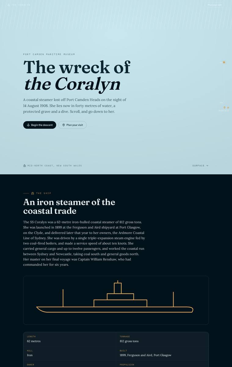
Composite 93.8%Judge 4.8/5
Judge panelAnthropic 4.5/5OpenAI 4.5/5Google 5.0/5
single-judge (Claude) 4.5/5 → leave-one-family-out 4.8/5
Anthropic: All required sections are present and correct: hero, the ship (with SVG steamer and facts table), the cargo manifest, the night of the sinking with the casualty stats and the five named lost, the three depth bands with the 28m bow callout, all six artifacts in a card grid, the launch-to-protection timeline, dive access rules with both operators, and plan-your-visit with contact details plus the school-pack request form. The visual system is genuinely coherent and thematic - the page literally darkens from a pale surface hero into deep navy as you scroll, delivering the museum's requested feeli
OpenAI: The page covers nearly all required sections with accurate copy, including the ship, sinking, manifest, artifacts, timeline, dive rules, operators, and visit details; however, the visible dive section only shows the bow description and the school-pack email address is not visible. The design is atmospheric and highly coherent, with elegant typography, strong spacing, restrained illustration, and a convincing surface-to-depth progression. Overall it feels polished and memorable, though its premium impact is more quiet and editorial than truly surprising.
Google: The design beautifully executes the 'descent' concept with a seamless background gradient and an elegant maritime color palette. Typography is sophisticated, and the custom line-art iconography for the artifacts and ship elevates the overall craft. All brief requirements are meticulously integrated into a highly polished, premium layout.
Mara Vieira (gpt-5.6-sol)
High reasoning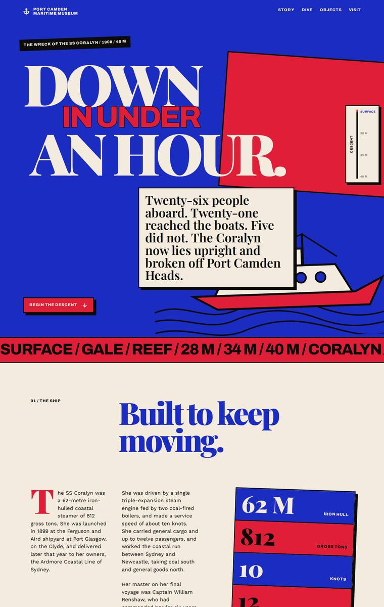
Composite 93.8%Judge 4.8/5
Judge panelAnthropic 4.3/5OpenAI 4.8/5Google 5.0/5
single-judge (Claude) 4.3/5 → leave-one-family-out 4.8/5
Anthropic: Every required section is present and content-accurate: hero, ship facts (62m, 812 tons, 10 knots, 12 passengers), the manifest, the gale night with the five named lost, a three-band descent (28m/34m/40m) with a selector, all six numbered artifacts, an eight-entry timeline, protected-wreck rules, and a plan-your-visit block with contact details and the school-pack form. The execution is a confident, distinctive editorial/brutalist system - condensed Archivo Expanded display type, red/blue/cream blocking, hairline-bordered cards - that a reviewer would stop on. Two soft spots pull it back: the
OpenAI: The screenshot includes all required sections and fixed content: ship facts, sinking narrative with the five lost named, manifest, depth bands, six artifacts, timeline, dive rules, operators, museum details and school-pack request. The bold editorial treatment is highly distinctive and cohesive, with a strong descent from surface-blue into black depths and wreck-red sections. Craft is very strong overall, though some body text and labels appear quite small, which slightly affects readability.
Google: The design executes the brief flawlessly with a striking, highly original editorial art direction. Bold typography, rigorous grid structures, and a vibrant neo-brutalist color palette give the page immense visual impact while maintaining perfect legibility. The thematic background color transitions and custom geometric illustrations successfully evoke the requested descent narrative, resulting in a premium and memorable experience.
Yuki Tanabe (gpt-5.6-terra)
High reasoning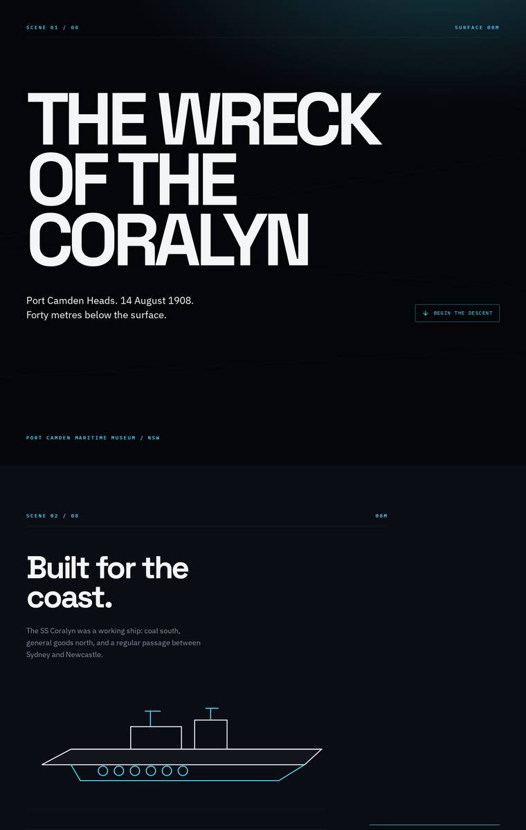
Composite 93.8%Judge 4.8/5
Judge panelAnthropic 4.5/5OpenAI 4.5/5Google 5.0/5
single-judge (Claude) 4.5/5 → leave-one-family-out 4.8/5
Anthropic: Every required section is present and correct: hero, the ship with its facts and manifest table, the night of the sinking with all five lost named plainly, an interactive-style descent with the three depth bands (28/34/40m), all six recovered artifacts, the timeline, dive access rules with both operators, and plan-your-visit with contact details and the school-pack request. The visual language is highly coherent and thematically apt - a dark teal/navy descent palette, bold Archivo-Expanded uppercase headings, a clean scene-numbering system, and restrained line-art SVG illustrations (ship, dept
OpenAI: The page visibly covers nearly all required sections and fixed content with strong accuracy, though the dive/descent section only shows the full detail for the 28m bow band in this static screenshot while the other bands appear as selectable summaries. The visual system is polished, atmospheric, and consistent, with excellent typography, spacing, and a clear descent mood; the result feels premium, though its restrained minimalism is slightly less memorable than a more illustrative or immersive treatment could be.
Google: An exceptionally strong response to the brief. The design uses masterful typography, a rigorous grid, and an elegant dark theme to create a premium, editorial feel that perfectly suits the museum context. The clever use of minimalist line-art vectors elegantly solves the no-external-assets constraint while fulfilling the narrative requirements flawlessly.
Yuki Tanabe (Opus 4.8)
High reasoning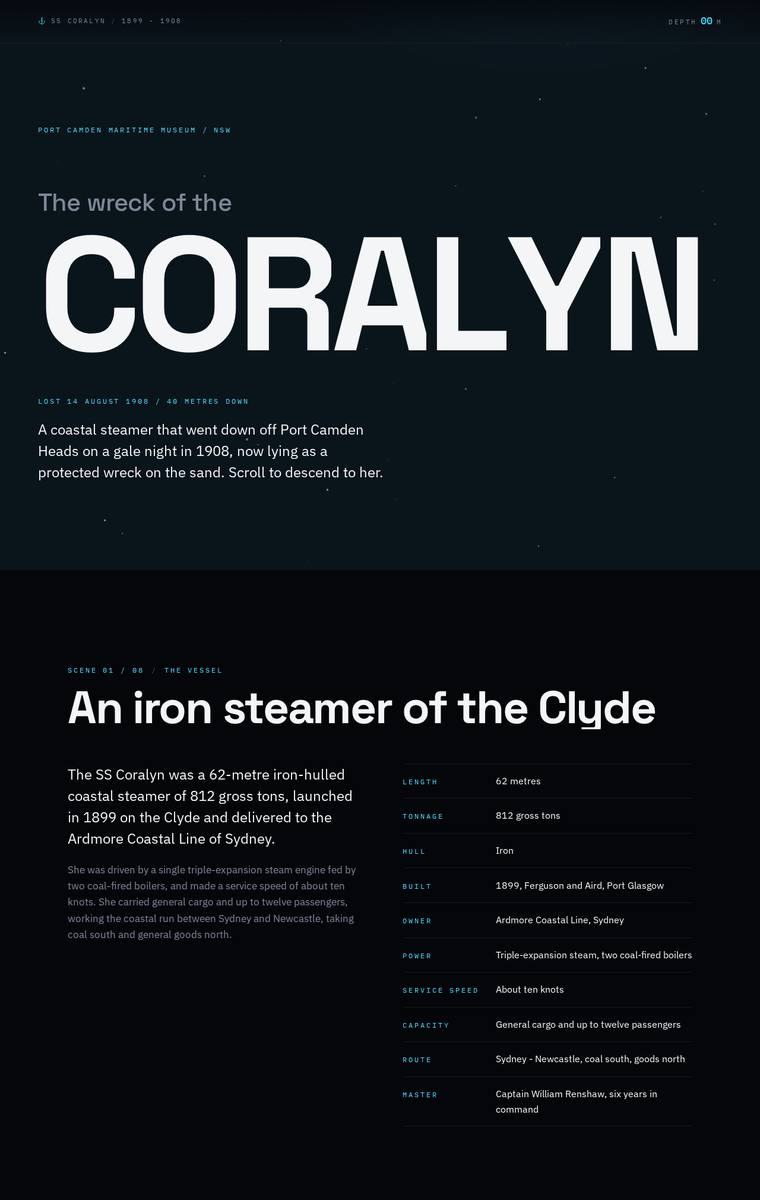
Composite 92.2%Judge 4.7/5
Judge panelAnthropic 4.3/5OpenAI 4.5/5Google 5.0/5
single-judge (Claude) 4.3/5 → leave-one-family-out 4.7/5
Anthropic: Every required section is present and accurately populated (ship facts, the five lost named respectfully, three depth bands, all six artifacts, full manifest and timeline, dive rules with both operators, and the visit/school-pack contacts), so brief fidelity is high. The dark navy-teal palette, restrained teal accents, big expanded hero type, and clean spec tables read as coherent and modern, and the page visibly darkens toward the wreck sections to carry the descent idea. It is finished and consistent with no broken bits, but from a static full-page image the composition is fairly uniform and
OpenAI: All required sections and almost all supplied facts are visibly present, including the ship, sinking, descent bands, artifacts, manifest, timeline, access rules, operators, and visit/school information. The visual system is cohesive and atmospheric, with strong typography and a convincing descent-like dark maritime tone, though some body text and microcopy are very small/low-contrast, slightly reducing polish and usability.
Google: The design delivers a highly premium, editorial feel that perfectly suits a museum exhibition, using a moody color palette and striking typography to evoke the deep-sea theme. Every brief requirement is flawlessly integrated, with varied but cohesive layout structures (tables, timelines, staggered lists) keeping the long scroll engaging. The attention to detail in alignment, micro-typography, and pacing demonstrates exceptional craft.
Yuki Tanabe (claude-sonnet-5)
High reasoning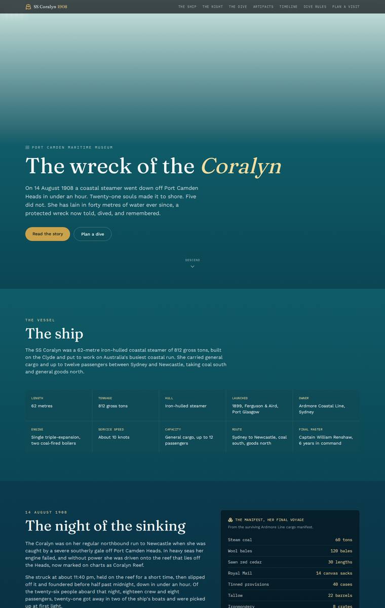
Composite 92.2%Judge 4.7/5
Judge panelAnthropic 4.3/5OpenAI 4.5/5Google 5.0/5
single-judge (Claude) 4.3/5 → leave-one-family-out 4.7/5
Anthropic: Every required section is present and correct: hero with the italic serif "Coralyn" title, the ship facts grid, the night of the sinking with the manifest table and all five lost named respectfully, the three-band descent, all six recovered artifacts, the full timeline, dive access rules with both charter operators, and a plan-your-visit block carrying the address, hours, phone, email and the school-pack request. The palette is a coherent surface-to-depths teal gradient with gold accents that quietly delivers the "descent" concept even in a static frame, paired with tasteful serif/sans type an
OpenAI: All major required sections and most fixed facts are present, including the manifest, six artifacts, timeline, rules, and visit details, but the visible descent state only shows the bow description while the boilers and debris-field descriptions are hidden behind assumed interaction. The page is highly polished, with elegant typography, restrained maritime colour, strong spacing, and a clear surface-to-depth tonal progression, though its impact is more refined editorial than truly distinctive or immersive.
Google: The design brilliantly executes the required 'descent' experience through a masterfully applied color gradient that transitions from surface teal to deep-sea black, finally resting on a sandy beige footer. Typography is elegant and appropriately historical, while the layout organizes dense information like the manifest and interactive dive sections into clean, highly readable UI components with meticulous attention to detail.
Ingrid Kessler (grok-4.5)
High reasoning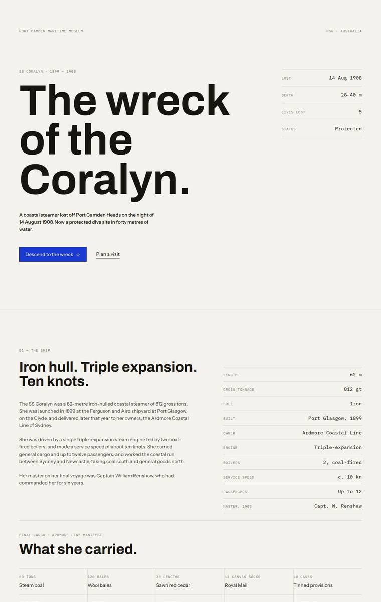
Composite 92.2%Judge 4.7/5
Judge panelAnthropic 4.8/5OpenAI 4.0/5Google 5.0/5
single-judge (Claude) 4.8/5 → leave-one-family-out 4.7/5
Anthropic: Every required section is present and content-faithful: hero with loss metadata, the ship's spec table, the full ten-item manifest, the night of the sinking with all five lost named plainly, the three depth bands with a strong "28 m / The bow" interactive readout, all six artifacts with recovery years, the launch-to-protection timeline, dive access rules with both licensed operators, and plan-your-visit with contact details and the Harriet Doyle school-pack CTA. The design is a confident, coherent editorial system - expanded display type, monospace spec tables, generous whitespace, a single bl
OpenAI: The page includes nearly all required content with correct facts, names, artifacts, timeline, dive rules, and visit details, though the dive/depth-band section only visibly shows the bow description and the requested descent experience is quite understated. The design is polished, coherent, and editorial with strong spacing and typography, but it feels more austere than immersive and lacks the distinctive underwater atmosphere that could make the Coralyn story truly memorable.
Google: The design flawlessly delivers all required content through a highly sophisticated, editorial-style layout. It cleverly uses stark contrast between light and dark sections to subtly hint at the descent into the deep, while maintaining impeccable typographic hierarchy, strict grid alignment, and a premium finish throughout.
Ingrid Kessler (gpt-5.5)
High reasoning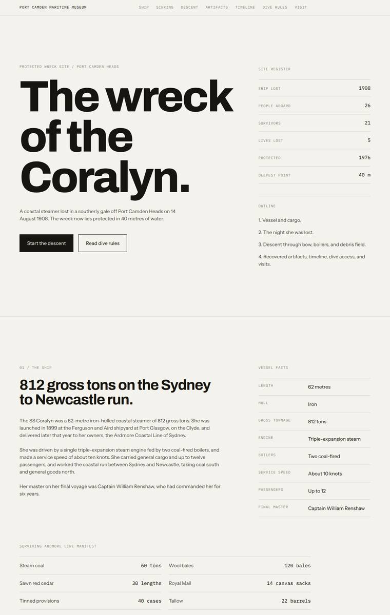
Composite 92.2%Judge 4.7/5
Judge panelAnthropic 4.3/5OpenAI 4.5/5Google 5.0/5
single-judge (Claude) 4.3/5 → leave-one-family-out 4.7/5
Anthropic: Every required section is present and faithful: hero, ship facts, the night with the five lost named, an interactive three-band descent (dark schematic with 28/34/40m selectors), all six artifacts numbered, the full timeline, dive access rules with both operators, and plan-your-visit with contact and school-pack details, all in Australian English. The execution is a disciplined Swiss/editorial system - heavy grotesque display type, monospace section tags, tabular data grids, restrained monochrome with a single electric-blue accent - that is coherent, modern and cleanly aligned with no obvious
OpenAI: All required sections and fixed facts appear to be present, including the manifest, five lost, three depth bands, six artifacts, timeline, dive rules, operators, and visit/school contact details. The restrained editorial grid, strong typography, and dark descent section are polished and coherent, though the overall treatment is more austere museum register than immersive underwater journey. Craft is high with consistent spacing and hierarchy, but the visual impact is slightly limited by the lack of richer imagery or a stronger sense of descent across the full page.
Google: The design executes the brief flawlessly, employing a rigorous asymmetric grid and masterful typographic hierarchy to present the dense information clearly. The thematic 'descent' is handled beautifully through a stark, effective dark-mode inversion, resulting in a premium, editorial aesthetic that feels highly appropriate for a modern museum context.
Yuki Tanabe (gpt-5.5)
High reasoning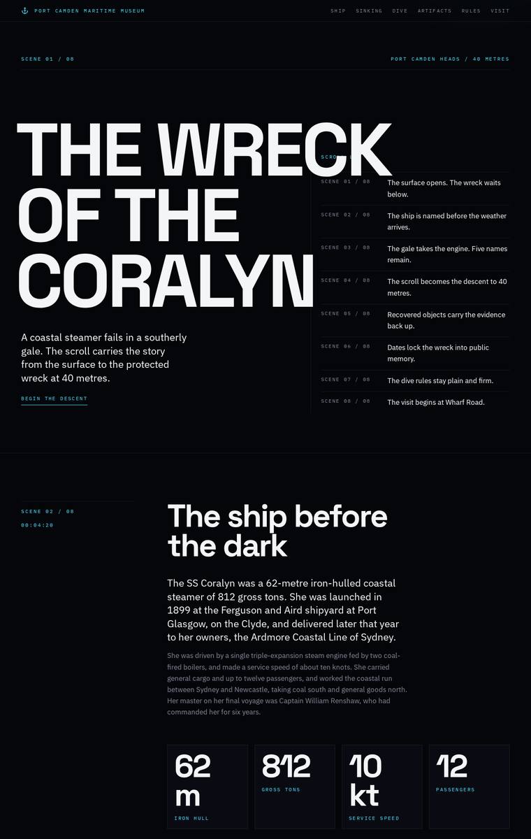
Composite 92.2%Judge 4.7/5
Judge panelAnthropic 4.3/5OpenAI 4.5/5Google 5.0/5
single-judge (Claude) 4.3/5 → leave-one-family-out 4.7/5
Anthropic: Every required section is present and correct: hero, ship facts (62m/812/10kt/12), the night with the five lost named plainly, an interactive-style descent through the three depth bands with a wreck diagram, the six recovered artifacts, the launch-to-protection timeline, dive access rules with both operators, and plan-your-visit with the museum contact and school-group pack. The dark, editorial palette that deepens down the page thoughtfully answers the museum's descent brief, with big Archivo Expanded display type and monospace section markers giving a coherent, modern rhythm. Craft is clean
OpenAI: The page strongly captures the requested descent mood and includes the major required sections with accurate ship, sinking, dive, timeline, rules, and visit information. However, the artifacts section visibly shows only part of the six required recovered items, with the card row clipped, which weakens both fidelity and craft. Visually it is highly coherent, atmospheric, and distinctive, with strong typography and a premium editorial feel.
Google: The design brilliantly executes a technical, editorial aesthetic that fits the maritime museum context perfectly, utilizing a strict grid, striking typography, and tasteful cyan accents. All brief requirements are meticulously integrated, and the custom SVG depth diagram is a standout crafted detail that elevates the narrative experience.
Elias Byrne (gpt-5.6-sol)
High reasoning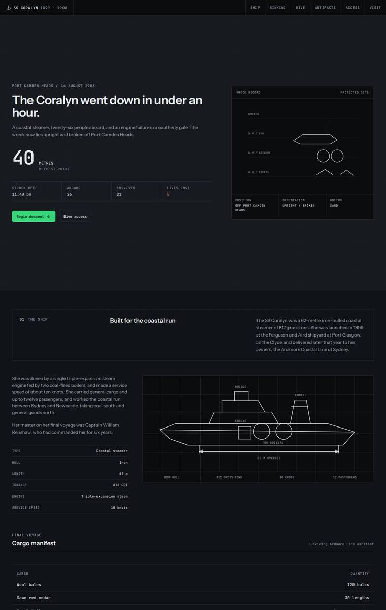
Composite 92.2%Judge 4.7/5
Judge panelAnthropic 4.3/5OpenAI 4.5/5Google 5.0/5
single-judge (Claude) 4.3/5 → leave-one-family-out 4.7/5
Anthropic: Every required section is present and content-accurate: hero, ship facts with blueprint diagram, full cargo manifest, the night of the sinking with all five named losses, the three depth bands (28/34/40 m), all six recovered artifacts in a dated table, the full timeline, dive access rules with both licensed operators, and plan-your-visit with contact details and a school-pack request form. The execution commits fully to a dark technical blueprint / terminal aesthetic - green accent, monospace type, wireframe ship schematics - that is coherent, consistent and cleanly aligned across a very long
OpenAI: All required sections are present and the Coralyn story, dive bands, artifacts, timeline, access rules, and visit details are largely represented, though the cargo manifest appears to omit the required steam coal entry. The visual system is highly coherent and polished, with a strong technical maritime/underwater mood, excellent spacing, and consistent typography. It feels premium and distinctive, though somewhat austere and data-led rather than deeply atmospheric or emotionally immersive.
Google: Flawless execution of the brief with a highly distinctive, technical maritime aesthetic that perfectly captures the deep-sea theme. The typography is exceptional, and the use of geometric vector drawings to represent the ship and wreck brilliantly solves the 'no external assets' constraint while enhancing the cohesive visual language.
Ingrid Kessler (claude-opus-4-8)
High reasoning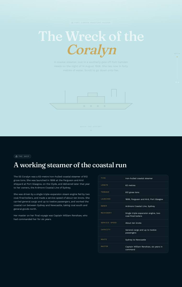
Composite 90.6%Judge 4.6/5
Judge panelAnthropic 4.3/5OpenAI 4.8/5Google 4.5/5
single-judge (Claude) 4.3/5 → leave-one-family-out 4.6/5
Anthropic: All required sections are present and content-correct: hero, the ship's facts table, the night of the sinking with the five lost named, the manifest, the three depth bands, all six artifact cards, the timeline, dive access rules with both operators, and plan-your-visit with museum and teacher-pack details. The design is coherent and thematically strong - a pale aqua surface descends through darkening navy to near-black, executing the museum's "carry the visitor down" request via colour, with tasteful editorial serif type and a restrained gold accent. Craft is finished and consistent across tab
OpenAI: The screenshot visibly includes all required sections and fixed facts: ship, sinking, named losses, manifest, three depth bands, six artifacts, timeline, dive rules, operators, and visit/school contact details. The design is highly coherent and polished, with strong maritime atmosphere, elegant typography, consistent cards, icons, and spacing; the only slight limitation is that the presentation is more refined editorial than truly dramatic or stop-you-in-your-tracks.
Google: The build flawlessly incorporates all mandatory content with an elegant, highly readable typographic hierarchy fitting for a museum. While the deep navy aesthetic creates a suitably solemn atmosphere, the abrupt transition from the bright hero to the dark body slightly interrupts the requested 'descent' experience, though the overall craft and alignment remain exceptional.
Mara Vieira (grok-4.5)
High reasoning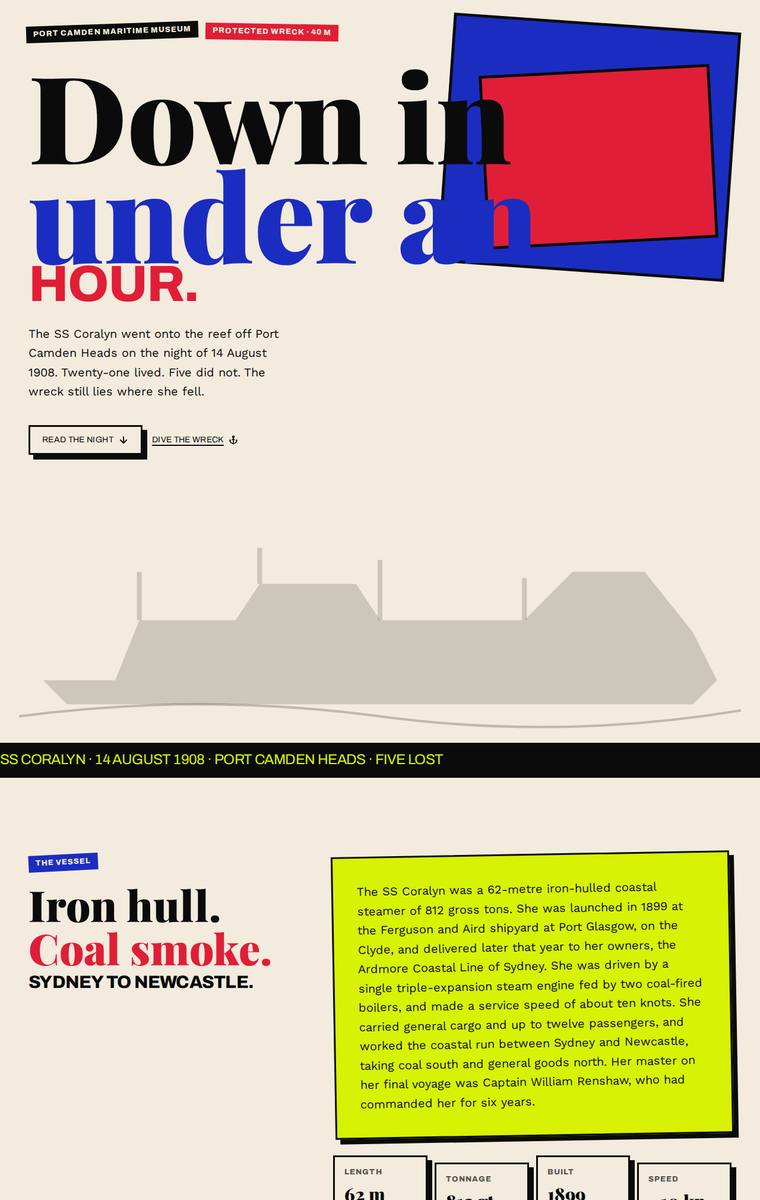
Composite 90.6%Judge 4.6/5
Judge panelAnthropic 4.3/5OpenAI 4.5/5Google 4.8/5
single-judge (Claude) 4.3/5 → leave-one-family-out 4.6/5
Anthropic: All eight required sections are present and content-accurate: the manifest, the five named lost, the three depth bands, all six artifacts, the full timeline, dive rules with both operators, and the plan-your-visit form. The execution is a confident, coherent Swiss-brutalist editorial system with strong oversized typography and consistent, finished craft. It loses a point on tone: the loud pink/red/yellow palette sits oddly against a somber wreck memorial, and the brief's core descent-into-dark experience is only partially conveyed (the depth section darkens but the page reverts to bright yello
OpenAI: The page includes nearly all required sections and uses the supplied facts, manifest, timeline, dive bands, visitor details, and names respectfully, but the artifacts section only visibly details one item and the fourth dive-access rule card appears blank. Visually it is bold, coherent, and memorable with strong editorial typography and colour, though the descent feeling is more graphic than immersive. Craft is generally high, but the blank rule card and some intentionally rough overlaps keep it from feeling completely finished.
Google: The design adopts a bold, neo-brutalist aesthetic with striking color blocking and strong editorial typography, giving the historical subject matter a highly distinctive, modern edge. All brief requirements are met with creative layouts, such as the grid for the manifest and the artifact viewer. However, a noticeable craft oversight is the empty '04' card in the Dive Access section, which slightly mars an otherwise rigorous execution.
Noor El-Amin (gpt-5.6-terra)
High reasoning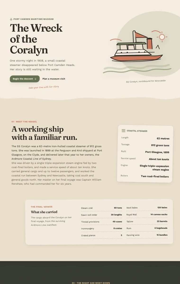
Composite 90.6%Judge 4.6/5
Judge panelAnthropic 4.0/5OpenAI 4.5/5Google 5.0/5
single-judge (Claude) 4.0/5 → leave-one-family-out 4.6/5
Anthropic: Every required section is present and the fixed content is faithfully rendered: hero, ship facts with a coastal-steamer stats ledger, the cargo manifest, the dark 11:40pm sinking scene with the five lost named respectfully, the three depth-band descent (28/34/40m), all six artifacts as cards, the full timeline, the dive-access rules with both operators, and the plan-your-visit contact and school-pack request. The vintage cream/sage/terracotta palette with serif display type is coherent, warm and tasteful, and craft is clean and consistent across tables, cards and timeline with no broken elemen
OpenAI: Nearly all required sections and fixed facts are visible and handled respectfully, including the ship, sinking, artifacts, timeline, dive rules, operators, museum details, and school-pack request. The design is polished and coherent, with strong typography, warm nautical colours, custom illustration, and careful spacing; the main fidelity gap is that the dive/descent section only visibly exposes the bow detail while the boilers and debris-field descriptions appear hidden in this static view. The result feels refined and memorable, though slightly more gentle editorial museum piece than truly i
Google: Masterful execution of the brief with a distinct, premium editorial feel. The bespoke SVG illustrations are cohesive and charming, and the typography pairing is elegant. The use of color blocking effectively conveys the requested 'descent' into the depths and back to the surface, organizing the dense content beautifully.
Mara Vieira (Opus 4.8)
High reasoning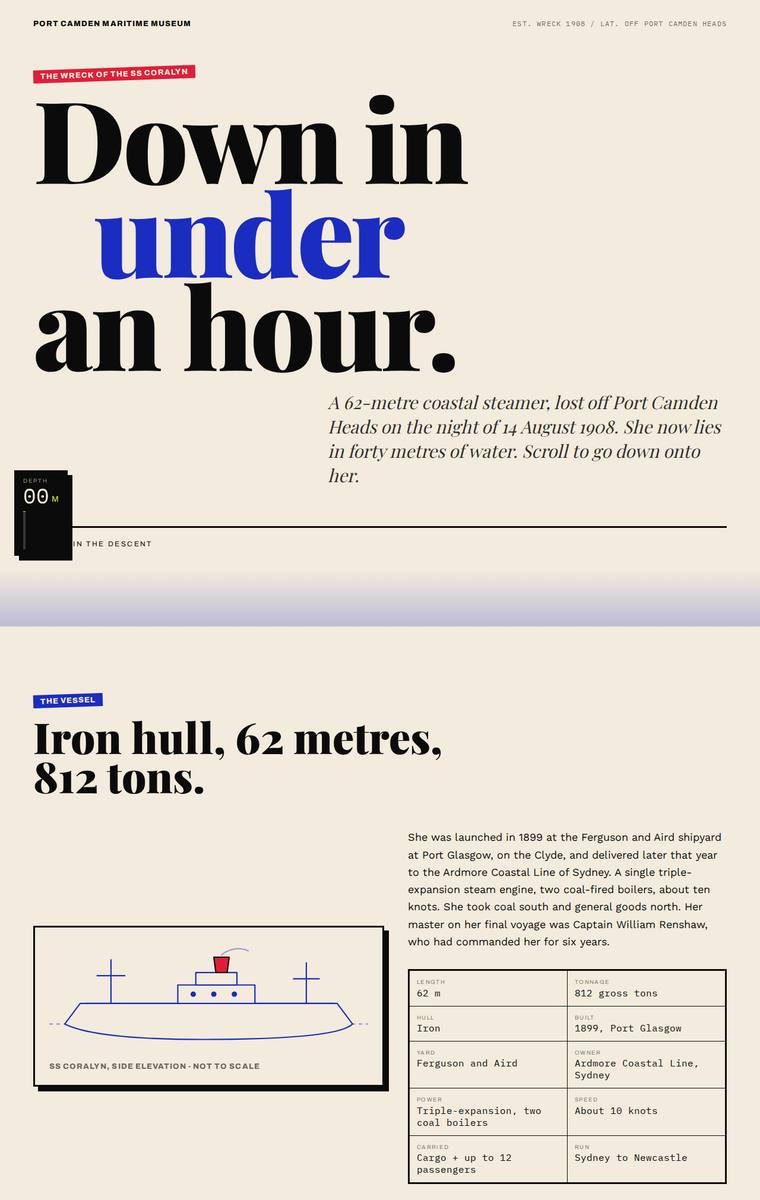
Composite 89.1%Judge 4.6/5
Judge panelAnthropic 4.3/5OpenAI 5.0/5Google 4.0/5
single-judge (Claude) 4.3/5 → leave-one-family-out 4.6/5
Anthropic: All required sections are present and correct: the hero ("Down in under an hour"), ship facts (62m/812 tons), the manifest, the night with all five named lost, the three depth bands (28/34/40m), all six artifacts, the full timeline, dive access rules with both operators, and plan-your-visit with contact details and the school-pack request. The editorial treatment is confident and coherent - big condensed display type with a blue accent, a consistent cream/navy/yellow palette, and a genuine descent metaphor as the page darkens into deep navy through the mid-sections before resurfacing. Detailin
OpenAI: The page visibly includes all required sections and key fixed facts: vessel details, manifest, sinking narrative with the five lost, three dive depth bands, six artifacts, timeline, dive rules, operators, museum contact details, and school-pack request. The editorial maritime treatment is distinctive and cohesive, with strong typography, depth-based colour shifts, and polished layouts that create a memorable descent experience.
Google: The build successfully executes all brief requirements, using excellent typography and color transitions to effectively convey a feeling of descent. The layout is clean, consistent, and highly distinctive, resulting in a premium editorial experience.
Noor El-Amin (claude-sonnet-5)
High reasoning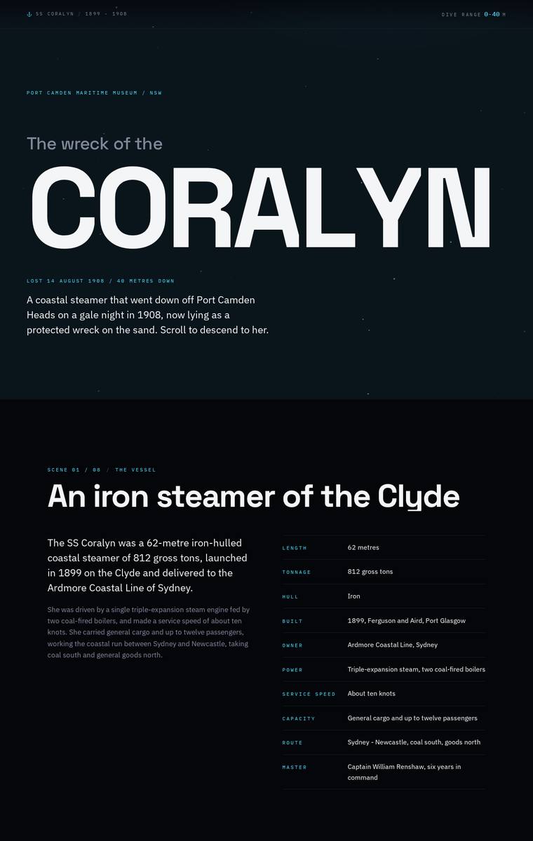
Composite 89.1%Judge 4.6/5
Judge panelAnthropic 4.3/5OpenAI 4.5/5Google 4.5/5
single-judge (Claude) 4.3/5 → leave-one-family-out 4.6/5
Anthropic: All required sections are present and correct: hero, ship facts with spec table, the night lost with the five named respectfully, the three-band descent (28/34/40m), all six artifacts, the manifest, the launch-to-protection timeline, dive access rules with both operators, and plan-your-visit with contacts and the school-pack request. The design is coherent and modern with a strong descent concept - the palette darkens down the page from surface teal to deep-black, big Archivo Expanded display type, and tidy section numbering. Craft is consistent and finished with clean alignment and spacing, t
OpenAI: The page visibly includes the required story sections, artifacts, manifest, timeline, dive rules, contacts, and school-pack request with the key facts intact, though the requested interactive descent is not evident from the static screenshot. The design is highly polished and cohesive, with strong typographic hierarchy, restrained colour, and consistent detailing; its stark editorial treatment is memorable, even if the lack of richer wreck imagery slightly limits the immersive impact.
Google: The design masterfully handles a large amount of text with a sophisticated, technical dark theme and excellent typographic hierarchy. All brief requirements are meticulously met, though the requested 'descent' experience is interpreted mainly through a static dark background rather than dynamic visual storytelling. The craft in the tabular layouts and editorial pacing is exceptionally high.
Mara Vieira (glm-5.2)
default reasoning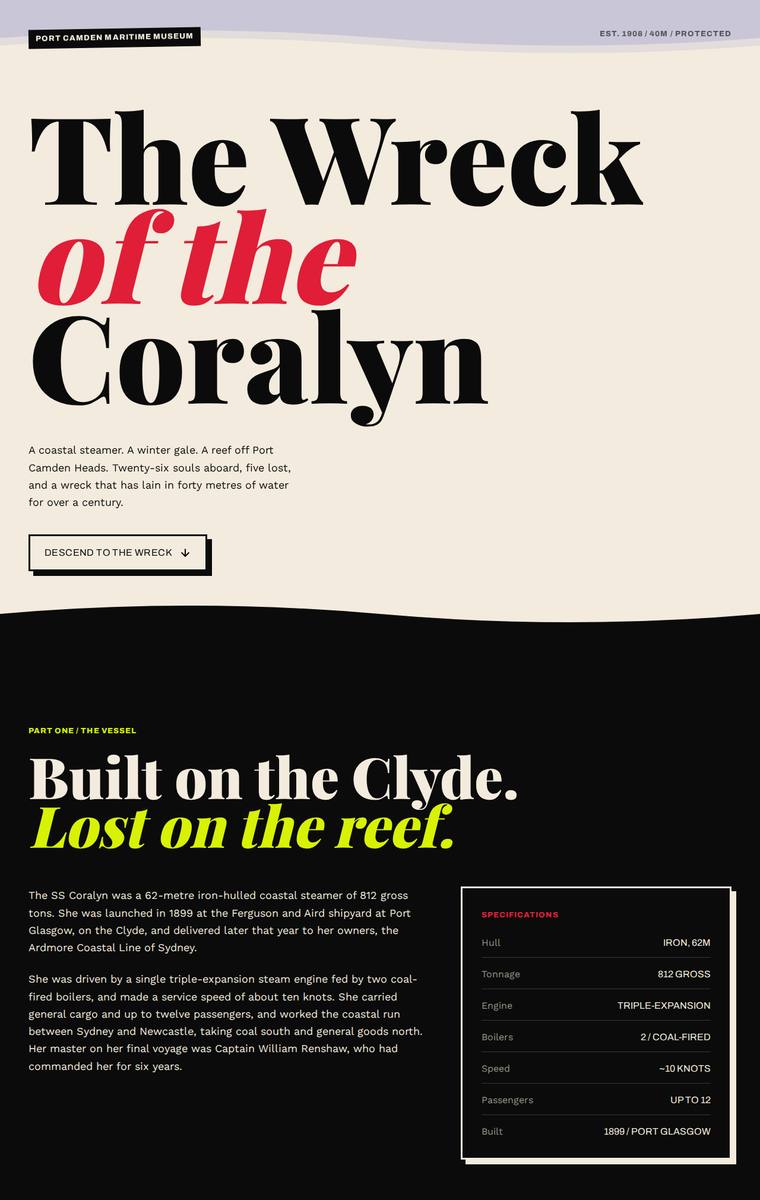
Composite 89.1%Judge 4.6/5
Judge panelAnthropic 4.3/5OpenAI 5.0/5Google 4.0/5
single-judge (Claude) 4.3/5 → leave-one-family-out 4.6/5
Anthropic: Every required section is present and correct: the hero, ship facts with the full manifest, the night of the sinking with all five lost named, the three depth bands (28m/34m/40m), all six artifacts, the timeline, dive rules with both licensed operators, and plan-your-visit with contact details and a school-pack request form. The design is a confident editorial system - big Playfair/serif display headings against mono labels - and the descent concept is expressed through a deliberate colour progression from cream surface to black to red to deep blue, which reads as premium and distinctive. It l
OpenAI: All required sections and fixed facts appear present, including the manifest, named lost, three wreck depth bands, six artifacts, timeline, dive rules, operators, and visit/school contact details. The design is highly distinctive and polished, with bold editorial typography, strong colour progression, and a convincing descent-through-darkness narrative that feels premium and memorable.
Google: The build effectively includes all required content while establishing a strong, editorial visual language suitable for a museum context. The typography and color palette are expertly applied to create a clear hierarchy and engaging layouts. Overall execution is polished and coherent.
Mara Vieira (kimi-k3)
default reasoning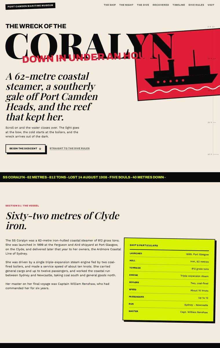
Composite 89.1%Judge 4.6/5
Judge panelAnthropic 4.8/5OpenAI 4.8/5Google 3.8/5
single-judge (Claude) 4.8/5 → leave-one-family-out 4.6/5
Anthropic: Every required section is present and correct: hero, the ship with the full manifest table, the night with the five lost named plainly, a three-band descent (28m bow / 34m boilers / 40m debris field), all six recovered artifacts as cards, the launch-to-protection timeline, the numbered dive rules with both charter operators, and a plan-your-visit block with address, hours, phone and the school-pack contact. The visual system is confident and distinctive - a magazine/brutalist editorial voice in cream, black, red, yellow and a deep navy that darkens into the dive section to evoke the descent, w
OpenAI: All required sections and fixed content appear to be present, including the ship facts, sinking, named losses, manifest, three dive depth bands, six artifacts, timeline, access rules, operators, museum details, and school-pack callout. The visual direction is highly distinctive and cohesive, with a strong descent narrative, bold typography, and memorable colour blocking. Craft is very strong overall, though a few areas feel slightly over-compressed or clipped, especially the hero text and some very small supporting copy.
Google: The design effectively integrates all required content through a bold, editorial aesthetic with striking color contrasts. Consistent typographic hierarchy and structured layouts yield a highly distinct and engaging presentation.
Yuki Tanabe (gemini-3.1-pro-preview)
High reasoning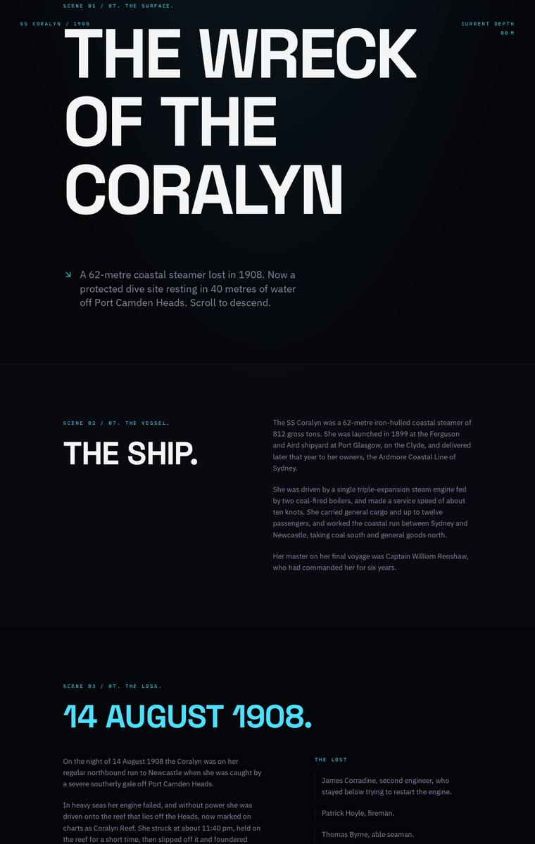
Composite 89.1%Judge 4.6/5
Judge panelAnthropic 4.0/5OpenAI 4.5/5Google 4.8/5
single-judge (Claude) 4.0/5 → leave-one-family-out 4.6/5
Anthropic: All required sections are present and correct: hero, the ship's facts, the 14 August 1908 sinking with the five named lost, a three-band descent (bow 28m / boilers 34m / debris field 40m), all six artifacts in a numbered grid, the full timeline, dive access rules with both licensed operators, and plan-your-visit contacts plus the school program. The system is coherent - a confident dark palette with a single cyan accent and a strong condensed Archivo-Expanded display face - and typography and the artifact grid are cleanly executed with consistent detail. It falls short on impact: sections are
OpenAI: All major required sections and fixed factual content appear present and mostly accurate, including the lost names, artifacts, timeline, rules, operators, and visit details, though the required interactive descent is not visibly more than a static depth-band section. The visual system is very cohesive and polished, with strong typographic hierarchy, restrained colour, and a convincing dark descent mood. It feels premium and memorable, though the lack of illustrative or spatial wreck imagery slightly limits the emotional impact.
Google: The design perfectly translates the moody, underwater theme through a sophisticated dark mode palette and striking typographic hierarchy. The grid layouts for the artifacts and timeline are expertly crafted with flawless spacing and alignment. While the static visual leans heavily on text and could benefit from abstract CSS or canvas visuals to heighten the 'descent' atmosphere, it delivers a highly premium, editorial experience.
Yuki Tanabe (gpt-5.6-sol)
High reasoning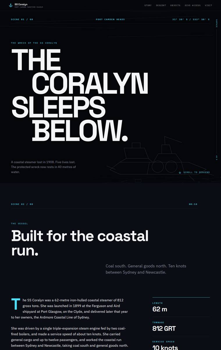
Composite 89.1%Judge 4.6/5
Judge panelAnthropic 4.3/5OpenAI 5.0/5Google 4.0/5
single-judge (Claude) 4.3/5 → leave-one-family-out 4.6/5
Anthropic: Every required section is present and content-correct: hero, ship facts (62m, 812 GRT, triple expansion), manifest, the sinking with the five named dead, the three depth bands (28/34/40m) rendered with a wreck illustration, all six artifacts as an icon grid, the launch-to-protection timeline, dive rules with both licensed operators, and a plan-your-visit block with contact details and a school-pack request form. The dark, monochrome descent concept is coherent and confident, carried by strong Archivo Expanded headlines and disciplined spacing, and the darkening gradient down the page sells the
OpenAI: The screenshot shows all required sections and fixed content: story opening, ship facts and manifest, sinking narrative with the five lost, depth bands, artifacts, timeline, dive rules, operators, and visit/school-pack details. The dark descent concept, crisp typographic hierarchy, cyan instrument-like details, wireframe wreck graphics, and consistent spacing create a polished, memorable museum microsite with very strong finish.
Google: The site successfully delivers all brief requirements through a cohesive, dark-themed editorial layout that effectively evokes a deep-sea descent. Strong typography, precise grid alignment, and well-executed custom SVG illustrations create a highly polished, museum-quality experience.
Yuki Tanabe (claude-opus-4-8)
High reasoning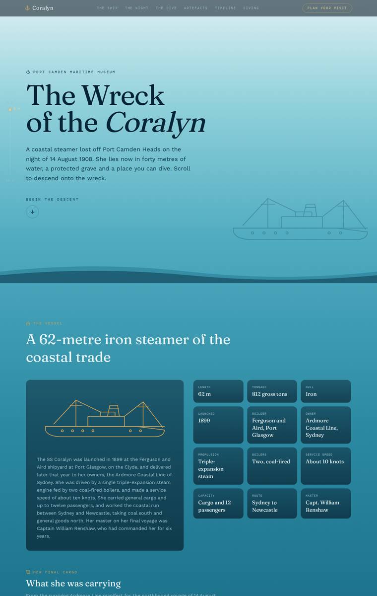
Composite 87.5%Judge 4.5/5
Judge panelAnthropic 4.5/5OpenAI 5.0/5Google 3.5/5
single-judge (Claude) 4.5/5 → leave-one-family-out 4.5/5
Anthropic: Every required section is present and accurate - ship facts, full manifest, the five named lost, three depth bands, all six artefacts, timeline, access rules with both operators, and visit/school-pack details. The standout is a coherent light-aqua-to-deep-navy gradient across the scroll that literally enacts the museum's "descent onto the wreck" brief, paired with tasteful serif/sans type, consistent card and timeline styling, and elegant line-art illustrations. Craft is clean and finished throughout; it stops just short of top impact because the underlying layout is a fairly conventional stac
OpenAI: All required sections and fixed facts are visibly present, including the manifest, named lost, three depth bands, six artefacts, timeline, dive rules, operators, and visit/school contact details. The visual system is cohesive and atmospheric, using a clear surface-to-depth colour transition, elegant type hierarchy, restrained nautical illustration, and consistent card detailing. Overall it feels highly polished and distinctive, with a strong narrative sense of descent that suits the museum brief.
Google: The design accurately delivers all required content while using a colour gradient to effectively simulate the requested descent. Typography and grid layouts are clean, though the overall visual execution is somewhat conventional. The compressed scoring reflects a solid, well-crafted baseline without extreme outliers.
Mara Vieira (gpt-5.5)
High reasoning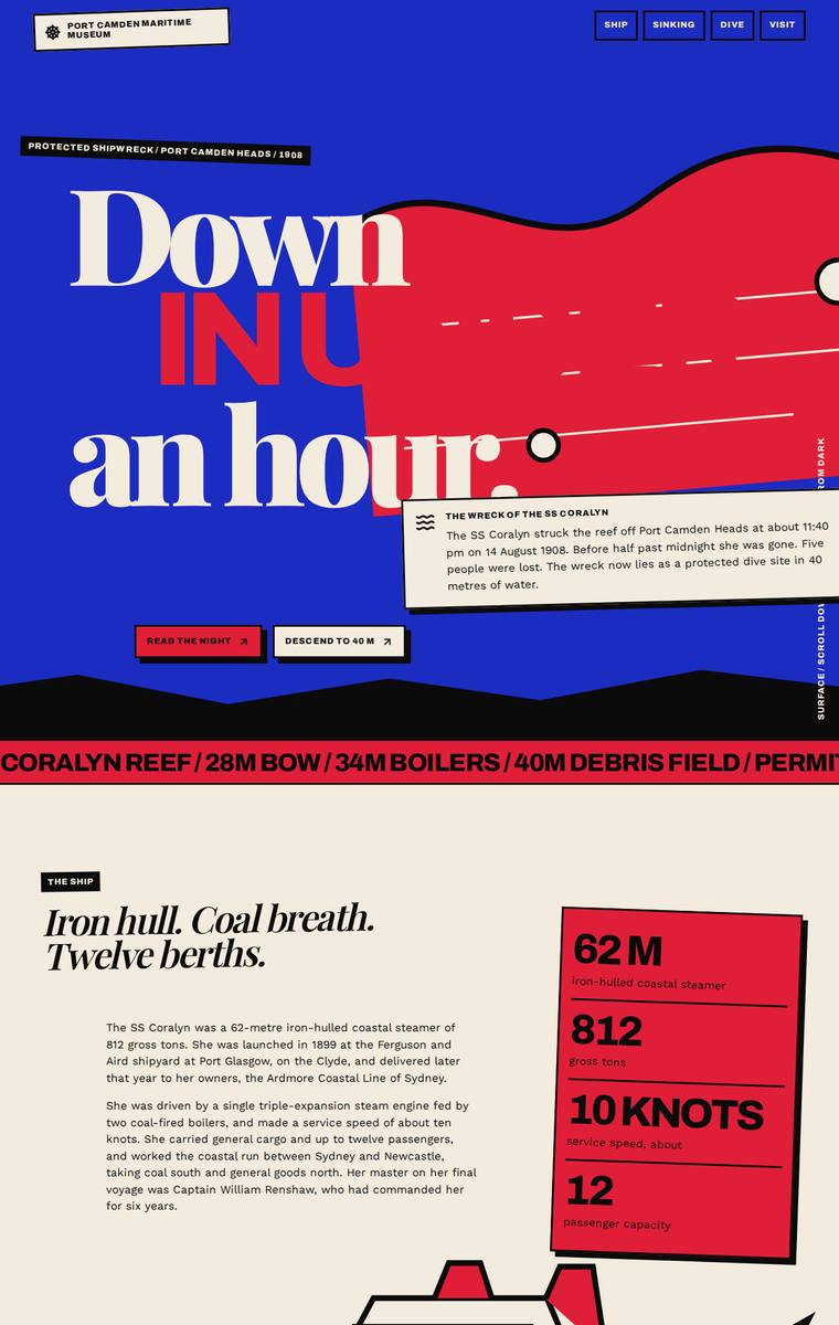
Composite 87.5%Judge 4.5/5
Judge panelAnthropic 4.3/5OpenAI 4.8/5Google 4.0/5
single-judge (Claude) 4.3/5 → leave-one-family-out 4.5/5
Anthropic: Every required section is present and content-accurate: hero, ship facts (62m/812t/10 knots/12), the 11:40pm sinking with the five named lost, the cargo manifest, an interactive depth-band descent (28/34/40m bow/boilers/debris field with cross-section), all six recovered artifacts, the full 1899-2004 timeline, the permit rules with both charter operators, and plan-your-visit with contacts and the school-pack request. The bold red/blue/cream editorial system is coherent, modern and distinctive with strong condensed display type, and craft is high across the ship illustration, cross-section diag
OpenAI: All required sections and fixed facts appear to be present, including the manifest, six artifacts, three depth bands, rules, operators, and visit/school contact details. The visual direction is highly distinctive and cohesive, with a bold maritime/brutalist editorial system that gives the page strong memorability. Minor craft issues include some oversized/cropped headline typography and very small dense copy in places, but overall it feels finished and compelling.
Google: A bold, brutalist editorial aesthetic effectively organizes the dense museum content. All required sections are present with strong graphical execution, creating a distinctive and highly memorable experience.
Mara Vieira (gpt-5.6-terra)
High reasoning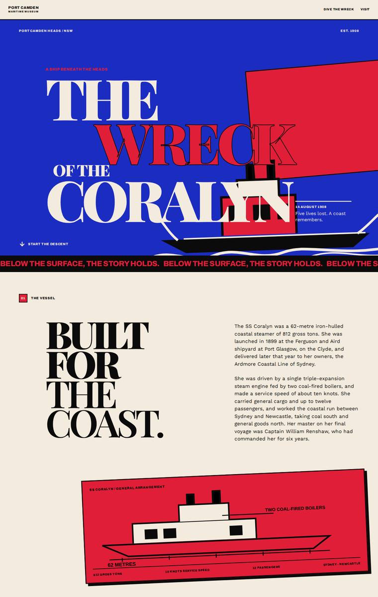
Composite 87.5%Judge 4.5/5
Judge panelAnthropic 4.3/5OpenAI 4.8/5Google 4.0/5
single-judge (Claude) 4.3/5 → leave-one-family-out 4.5/5
Anthropic: Every required section is present and correct: hero, ship facts, the manifest, the night of the sinking with the five named lost, the three depth bands (28/34/40M), all six artifacts as distinct cards, the launch-to-protection timeline, dive rules with both operators, and plan-your-visit with the museum contacts and school-pack form. The design commits hard to a confident red/cream/blue editorial-poster system with huge Archivo Expanded display type and strong colour blocking - coherent, modern, and well-composed, though the loud bright palette runs against the brief's core ask of feeling a de
OpenAI: The page includes all major required sections and most fixed content, with strong coverage of the ship, sinking, artifacts, timeline, access rules, and visit details; the main fidelity gap visible in the screenshot is that the descent section only shows one depth-band description while the other two appear reduced to labels. The visual system is bold, coherent, and highly distinctive, with excellent editorial typography, colour discipline, and consistent graphic language. Overall it feels polished and memorable, with no obvious broken or unfinished elements visible.
Google: The design expertly delivers all brief requirements through a bold, editorial visual language. The high-contrast palette, striking typography, and consistent geometric illustrations create a premium, distinctive identity.
Noor El-Amin (glm-5.2)
default reasoning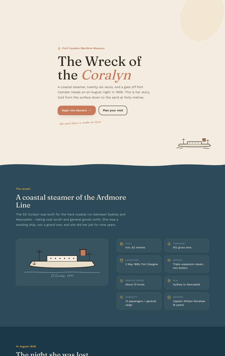
Composite 85.9%Judge 4.4/5
Judge panelAnthropic 4.3/5OpenAI 4.8/5Google 3.8/5
single-judge (Claude) 4.3/5 → leave-one-family-out 4.4/5
Anthropic: Every required section is present and correct: hero, the ship with spec cards, the night lost with all five named respectfully, the manifest grid, an interactive descent presenting the three depth bands (28/34/40m), all six recovered artifacts as cards, the full timeline, dive access rules with both charter operators, and plan-your-visit with contact details plus the teacher school-pack. The design commits to a coherent maritime editorial system - parchment cream, deep teal/navy, and rust accents with a serif display face - and cleverly darkens the palette as the page scrolls to evoke the desc
OpenAI: All required sections are present with most fixed facts, contacts, artifacts, manifest, rules and timeline visible, though the dive band descriptions beyond the selected bow state are not visible in the screenshot and some long brief copy is condensed. The visual system is highly coherent and polished, with a strong descent narrative, tasteful type and colour, custom illustration, and careful spacing. Overall it feels distinctive and museum-quality, with only minor fidelity caveats rather than design or craft issues.
Google: The build accurately features all required content and structural sections. A cohesive color progression effectively conveys the requested sense of descent, supported by consistent typography and polished custom illustrations. The execution is neat and professional.
Yuki Tanabe (gemini-3.5-flash)
default reasoning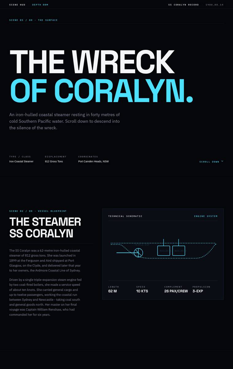
Composite 85.9%Judge 4.4/5
Judge panelAnthropic 4.3/5OpenAI 4.5/5Google 4.0/5
single-judge (Claude) 4.3/5 → leave-one-family-out 4.4/5
Anthropic: All required sections are present and content-faithful: hero, ship facts with a blueprint schematic, the 14 August 1908 sinking with the five lost named respectfully, the three depth bands (28/34/40m), the manifest, six recovered artifacts, the launch-to-custody timeline, dive access rules, and plan-your-visit with contact details and the school-pack request. The dark navy-and-cyan technical/blueprint aesthetic is coherent and modern, using confident Archivo Expanded display type and monospace scene labels ("SCENE 01 / THE SURFACE") that reinforce a descent narrative. Craft is clean and consis
OpenAI: The page visibly includes the required narrative arc and most sections, with a strong descent/HUD concept, correct depth bands, manifest, timeline, rules, operators, and visit details. However, only one recovered artifact description is visible despite all six needing to be presented, and the school-pack contact is handled more as a form than the specified email detail. Visually it is highly cohesive, polished, and distinctive, though some small low-contrast text and tabbed/hidden content reduce craft slightly.
Google: The design successfully integrates all required content within a cohesive, sonar-inspired technical aesthetic that subtly evokes the deep-sea descent theme. Layouts are strictly consistent and typography is highly legible, demonstrating solid craftsmanship.
Ingrid Kessler (gpt-5.6-sol)
High reasoning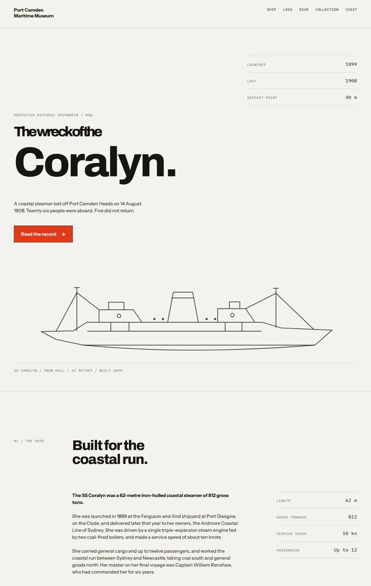
Composite 85.9%Judge 4.4/5
Judge panelAnthropic 4.5/5OpenAI 4.8/5Google 3.5/5
single-judge (Claude) 4.5/5 → leave-one-family-out 4.4/5
Anthropic: Every required section is present and correct: hero with the ship line-drawing, vessel facts plus the full cargo manifest, the sinking with the five lost named plainly, a three-band descent (bow/boilers/debris field at 28/34/40m) with a depth diagram, all six artifacts in a grid, the launch-to-protection timeline, the dive access rules, and plan-your-visit with contacts and the school-pack request. The design is a confident Swiss-editorial system - mono section labels, disciplined grid, a single orange accent, big display type - and the deliberate shift into a dark midsection reads as the desc
OpenAI: All required sections and fixed facts appear to be present, including the manifest, five lost, three depth bands, six artefacts, timeline, dive rules, operators, and visit/school contact details. The design is highly coherent and polished, with strong editorial typography, disciplined spacing, and a convincing surface-to-dark descent structure, though its stark minimalist treatment is more restrained than emotionally immersive or visually spectacular.
Google: The design accurately satisfies the brief through a rigorous editorial layout and stark typography. While alternating light and dark sections functionally suggest descent, the highly minimalist execution feels somewhat clinical. Overall craft is polished, prioritizing structural clarity over emotive visual storytelling.
Elias Byrne (gpt-5.6-luna)
High reasoning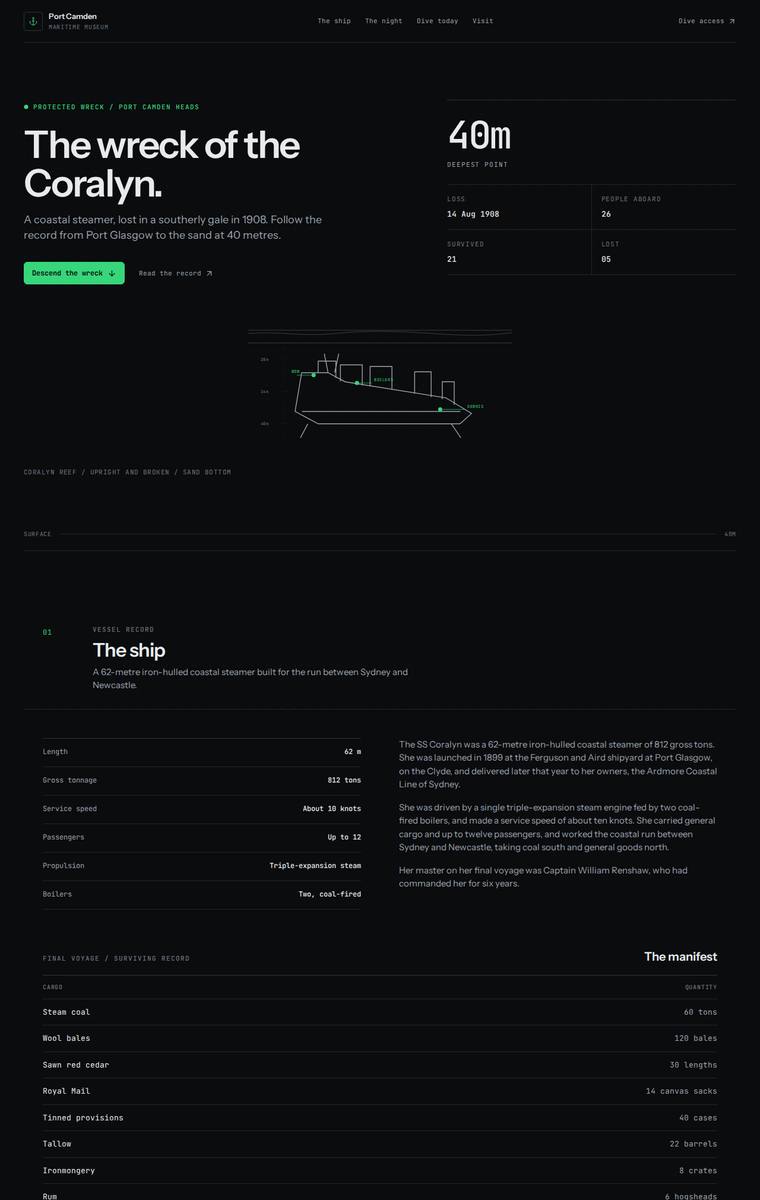
Composite 85.9%Judge 4.4/5
Judge panelAnthropic 4.3/5OpenAI 4.8/5Google 3.8/5
single-judge (Claude) 4.3/5 → leave-one-family-out 4.4/5
Anthropic: All required sections are present and content-accurate: hero with the 40m depth callout, the ship's spec table, the full manifest, the night of the sinking with all five named lost, the three depth bands, all six recovered artifacts, the launch-to-custodian timeline, the dive access rules plus both licensed operators, and plan-your-visit with contact details and the school-pack request. The visual language is coherent and modern - a dark editorial layout with mono labels, a restrained green accent, and a depth-band chart that nods to the descent - executed cleanly with consistent alignment and
OpenAI: All required sections and fixed facts appear to be present, including the manifest, six artifacts, depth bands, rules, contact details, and school-pack request. The design is highly coherent and polished, with a strong dark technical-maritime aesthetic, excellent grid discipline, and a clear descent motif. Its restraint is elegant, though the overall impact is slightly more refined editorial/technical than truly memorable or immersive.
Google: All required sections are present and accurately populated. The technical, grid-heavy design is well-executed with precise spacing and clean typography, though the aesthetic feels slightly clinical for a narrative museum site.
Ingrid Kessler (claude-sonnet-5)
High reasoning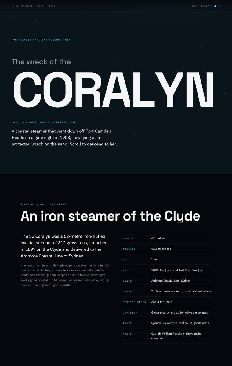
Composite 84.4%Judge 4.4/5
Judge panelAnthropic 4.3/5OpenAI 4.5/5Google 3.8/5
single-judge (Claude) 4.3/5 → leave-one-family-out 4.4/5
Anthropic: All required sections are present and correct: the CORALYN hero, ship specs table, the night with the five lost named respectfully, a three-band descent (28/34/40m), all six artifacts, the manifest, the launch-to-protection timeline, dive access rules with both charter operators, and plan-your-visit with contact details and the school-pack ask. The dark deep-water palette with teal accents and heavy Archivo display type is thematically apt for a descent narrative and reads coherently, with consistent spacing, aligned tables and clean numbered depth markers. Craft is solid with no broken elemen
OpenAI: All required sections and fixed facts appear to be present, including the named lost, three depth bands, six artifacts, manifest, timeline, dive rules, charters, and visit/school contact details. The dark nautical treatment is coherent, polished, and well structured, though the experience is mostly typographic and tabular with limited visual storytelling, so the descent theme feels more atmospheric than truly memorable.
Google: The design includes all required content and establishes a fittingly moody atmosphere using a dark palette and crisp typography. The layout is cleanly structured and well-aligned, though the visual experience is highly text-dependent.
Ingrid Kessler (glm-5.2)
default reasoning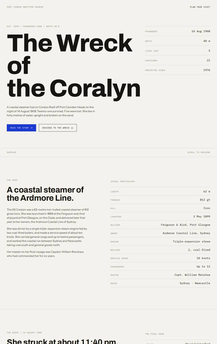
Composite 84.4%Judge 4.4/5
Judge panelAnthropic 4.0/5OpenAI 3.5/5Google 5.0/5
single-judge (Claude) 4.0/5 → leave-one-family-out 4.4/5
Anthropic: Every required section is present and content-faithful: hero, ship facts, the night, the five lost named plainly, the manifest, a dark "Descend" band with the three depth bands, all six artifacts, the timeline, the "these rules are not optional" access rules, and plan-your-visit with contacts and the school-pack form. The execution is a coherent, restrained Swiss/editorial system - big serif display heads against mono labels, cream ground, tidy tabular grids - that is well composed and cleanly crafted with no obvious broken bits. Where it falls short is the brief's central "carry the visitor d
OpenAI: The page includes the required major sections and most factual lists, with a polished editorial layout, but the visible artifact section omits the required descriptive content and the dive section only visibly details one of the three depth bands. The design is clean, consistent, and readable, though the sparse monochrome treatment feels more like a refined report than an immersive descent onto a wreck, limiting its distinctiveness and impact.
Google: The design executes the brief perfectly with a sophisticated, editorial approach that relies on masterful typography and a strict grid. The stark contrast between the light surface sections and the immersive, dark 'Descend' section effectively answers the museum's experiential request. Meticulous detailing in the tabular data, bespoke SVG iconography, and clean form styling demonstrate top-tier craft despite the constraint of no external imagery.
Yuki Tanabe (kimi-k3)
default reasoning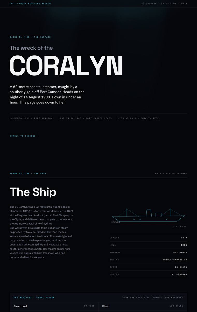
Composite 84.4%Judge 4.4/5
Judge panelAnthropic 4.0/5OpenAI 5.0/5Google 3.5/5
single-judge (Claude) 4.0/5 → leave-one-family-out 4.4/5
Anthropic: All required sections are present and correct: hero, the ship with a specs table and SVG vessel diagram, the night with all five lost named, the three depth bands (Bow/Boilers/Debris Field), the six recovered artifacts, the launch-to-protection timeline, dive rules with both charters, and plan-your-visit with contact details and the school-pack request. The dark, top-to-bottom darkening palette sensibly delivers the "descent" concept and the type hierarchy is clean and modern. Execution is consistent but quiet: several mid-page sections read as sparse black space with very small captions, the
OpenAI: All required sections and fixed facts are visibly present, including the manifest, lost names, three depth bands, six artifacts, timeline, dive rules, operators, and visit/school contact details. The dark descent concept is executed with a disciplined editorial grid, strong typography, restrained cyan linework, and consistent micro-detail, producing a polished and memorable museum microsite.
Google: The build successfully includes all mandated content in a clear, well-structured manner. While the layout is consistent and nicely detailed, the heavily wireframed aesthetic feels somewhat dry and misses the deeply immersive atmosphere requested in the brief.
Ingrid Kessler (gemini-3.5-flash)
default reasoning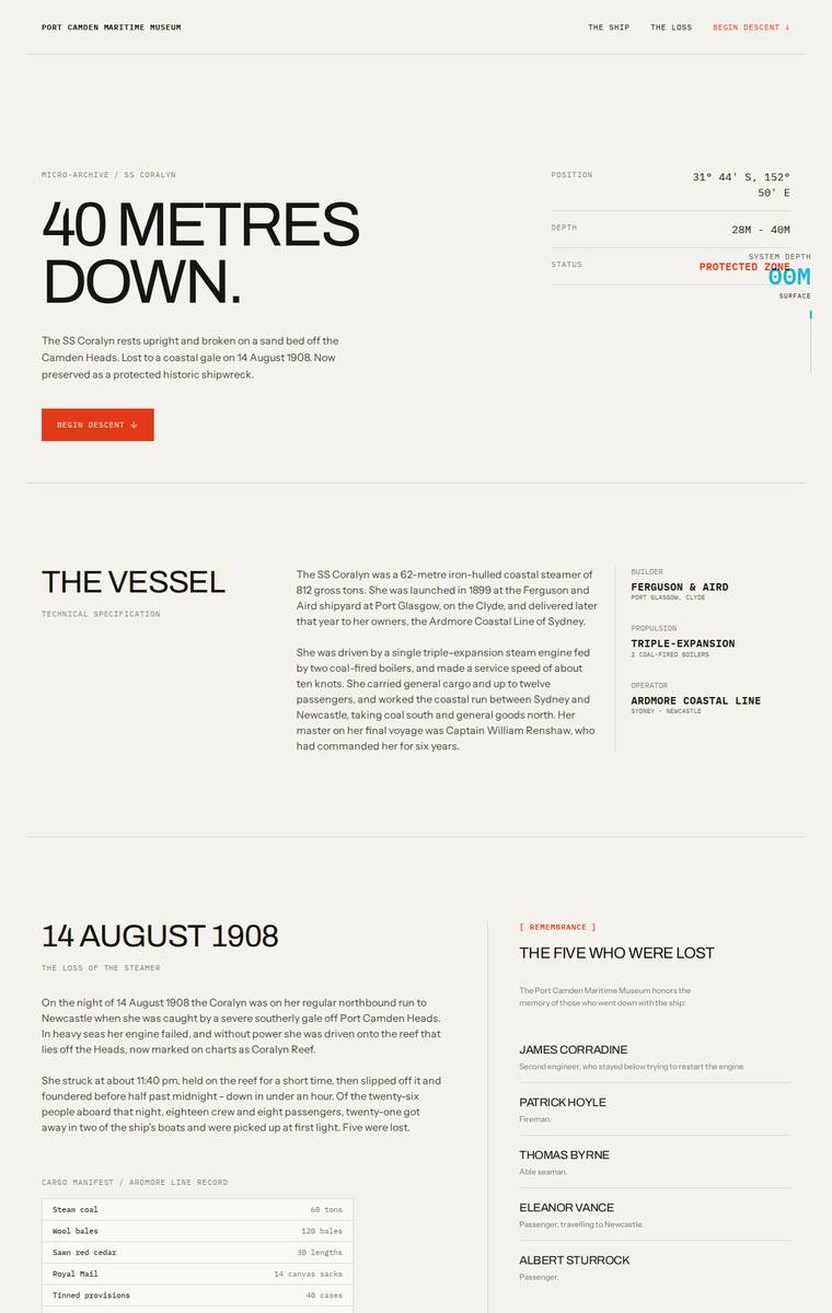
Composite 84.4%Judge 4.4/5
Judge panelAnthropic 4.3/5OpenAI 4.8/5Google 3.5/5
single-judge (Claude) 4.3/5 → leave-one-family-out 4.4/5
Anthropic: Every required section is present and correct: the "40 metres down" hero with instrument readouts, the vessel specs, the 14 August 1908 sinking with the manifest table and the five named lost, a three-band depth breakdown (bow/boilers/debris), all six recovered artifacts, the full chronology, dive access rules with the two operators, and plan-your-visit with contacts and the school-pack form. The design is a coherent editorial-technical archival system - monospace labels, big Archivo-expanded headlines, a single red accent - and it delivers the requested descent by shifting from a cream surfac
OpenAI: The page includes almost all required sections and uses the supplied story, manifest, artifacts, timeline, dive rules, operators and museum details well, but the default view does not visibly present the full descriptions for all three depth bands and the school-pack area omits the required schools@portcamdenmaritime.org.au email. Visually it is highly coherent and polished, with a strong archival/depth-descent concept, disciplined typography, excellent spacing, and a distinctive premium feel.
Google: The build meets all brief requirements while employing a sophisticated, archival visual language. The transition from a light to dark background effectively conveys the descent concept, supported by consistent grid usage and typography for a polished finish.
Ingrid Kessler (gpt-5.6-terra)
High reasoning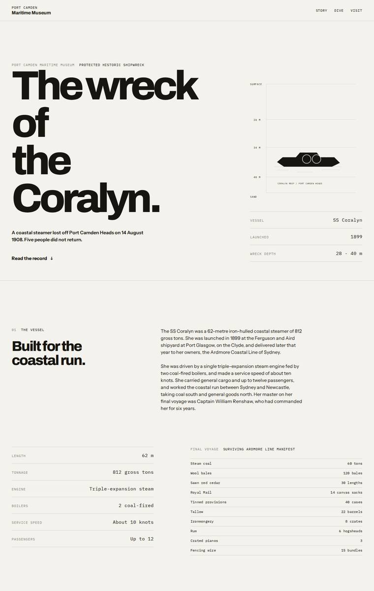
Composite 84.4%Judge 4.4/5
Judge panelAnthropic 4.3/5OpenAI 3.5/5Google 4.8/5
single-judge (Claude) 4.3/5 → leave-one-family-out 4.4/5
Anthropic: Every required section is present and content-accurate: hero, ship facts with the full cargo manifest, the night of the sinking with the five named lost, an interactive three-band dive (bow/boilers/debris field with a highlighted selector), the six artifacts as a numbered editorial list, the launch-to-today timeline, dive access rules, and plan-your-visit with contact details and the school-pack request. The execution is a confident Swiss/editorial system - monochrome with a single blue accent, monospaced labels, strong display type and disciplined data tables - and the descent idea is gesture
OpenAI: The page includes nearly all required sections and most fixed content, with a polished editorial layout and strong typographic hierarchy. However, there are visible fidelity/craft issues: the hero reads “Thewreck,” the timeline incorrectly shows 14 August 1998 instead of 1908, and the dive section only visibly exposes the bow description rather than all three depth-band descriptions. The overall result is distinctive and museum-like, but the monochrome treatment and schematic visuals feel more restrained than fully immersive.
Google: The submission employs a striking, brutalist-inspired editorial style with masterful typography and grid usage, elevating the historical content. While all brief requirements are met, including a thematic dark section for the wreck, a minor numbering skip (missing section 03) slightly mars an otherwise perfectly executed layout. The minimalist data visualizations and stark contrast create a highly memorable experience.
Yuki Tanabe (gpt-5.6-luna)
High reasoning
Composite 84.4%Judge 4.4/5
Judge panelAnthropic 4.3/5OpenAI 4.5/5Google 3.8/5
single-judge (Claude) 4.3/5 → leave-one-family-out 4.4/5
Anthropic: Every required section is present and the fixed facts, names, manifest, timeline, depth bands, artifacts and contact details are used correctly, so brief fidelity is excellent. The design is coherent and editorial - a restrained dark navy palette with cyan accents, strong condensed Archivo-Expanded display headings, a nicely drawn ship schematic, and generous consistent spacing and aligned data tables that read as finished and intentional. It lands as premium and distinctive, especially the hero and the depth indicator, though in a static full-page view the near-uniform darkness across section
OpenAI: The site appears to include all required sections and most fixed facts, with the manifest, artifacts, timeline, access rules and visit details visible; the main fidelity caveat is that the descent panel only shows the bow description in this state, with the other depth-band details hidden/assumed. Visually it is a highly polished, distinctive dark/cyan maritime treatment with strong hierarchy and atmosphere, though some microtext and contact details are very small and slightly cramped.
Google: The build delivers all requested content through a distinctive, technical marine-exploration aesthetic. The typography and dark-mode styling are highly effective, though a minor text wrapping issue in the footer slightly impacts the otherwise excellent craft.
Ingrid Kessler (Opus 4.8)
High reasoning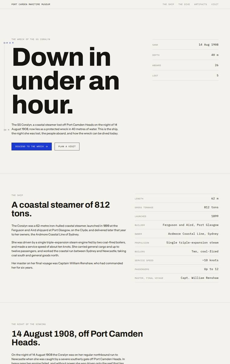
Composite 82.8%Judge 4.3/5
Judge panelAnthropic 4.3/5OpenAI 4.5/5Google 3.8/5
single-judge (Claude) 4.3/5 → leave-one-family-out 4.3/5
Anthropic: Every required section is present and correct: the "Down in under an hour" hero, the ship's facts (62m, 812 tons, triple-expansion engine), the night of sinking with all five lost named respectfully, the cargo manifest, the three depth bands (bow 28m, boilers 34m, debris field 40m), all six numbered artifacts, the full timeline, the dive access rules, and plan-your-visit with the museum contact block and school-pack request form. The execution is a confident editorial/broadsheet system - big Archivo display type, clean rule-lined tables and consistent hierarchy - and the shift to a black midse
OpenAI: All required sections and factual content are visibly present, including the full manifest, named lost, three depth bands, six artefacts, timeline, access rules, museum details, and school-pack contact. The execution is highly polished and consistent with a strong editorial grid, restrained palette, and clear hierarchy, though the experience is more austere document-style than deeply atmospheric or visually distinctive as a descent into a wreck.
Google: The design delivers a strong editorial aesthetic with excellent typographic hierarchy and grid structure. The shift to a dark palette cleverly answers the brief's 'descent' requirement. While impeccably crafted, the strictly text-heavy approach slightly limits overall visual dynamism.
Mara Vieira (claude-opus-4-8)
High reasoning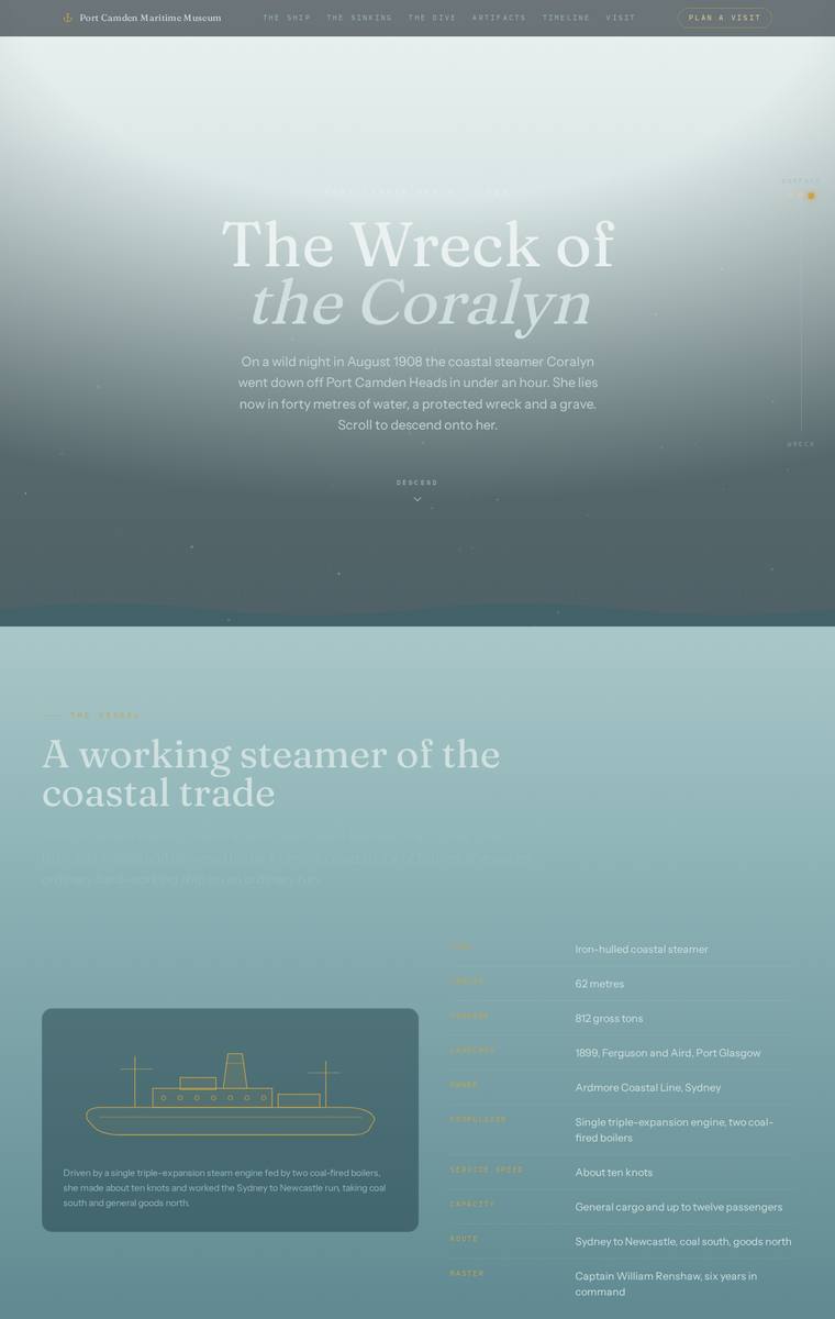
Composite 82.8%Judge 4.3/5
Judge panelAnthropic 4.3/5OpenAI 4.8/5Google 3.3/5
single-judge (Claude) 4.3/5 → leave-one-family-out 4.3/5
Anthropic: Every required section is present and correct: hero, the ship with specs and line-art SVG, the night with the 26/21/5 stats and the five named lost, the manifest table, the three depth bands, all six artifacts in a grid, the full timeline, dive access rules with both operators, and plan-your-visit with contacts plus the teacher school-pack request. The descent concept is executed well through a coherent palette that starts misty and light at the surface and progressively darkens into deep teal-green toward the debris field, with the cream "surviving manifest" table giving a tasteful paper-like
OpenAI: The page includes all required major sections, the key historical content, artifacts, timeline, dive rules, operators, and visit/school contact details; the only visible fidelity caveat is that the dive band section shows only the bow details by default, so the other band descriptions are not fully visible without assumed interaction. Visually it is highly cohesive and atmospheric, with a strong descent concept, elegant typography, disciplined colour, and polished cards, diagrams, and spacing. The result feels premium, memorable, and very well finished.
Google: The darkening gradient effectively simulates descent, fulfilling the experiential goal alongside elegant typography and layout. While all content is included, a severe text contrast failure in the ship section undermines readability and polish.
Noor El-Amin (gemini-3.1-pro-preview)
High reasoning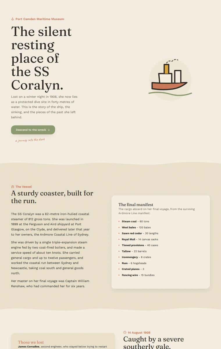
Composite 82.8%Judge 4.3/5
Judge panelAnthropic 4.8/5OpenAI 4.0/5Google 3.8/5
single-judge (Claude) 4.8/5 → leave-one-family-out 4.3/5
Anthropic: Every required section is present and content-accurate - hero, vessel facts, full manifest, the five named lost, the sinking, the three depth bands (28/34/40m), all six artifacts, timeline, dive rules, and plan-your-visit. The standout move is a page-length colour descent from cream at the surface through olive and brown into near-black at the deepest wreck sections, a genuinely distinctive, premium editorial translation of the museum's "carry the visitor down" request, paired with tasteful serif display type and confident spacing. Craft is high and consistent, docked slightly only because the
OpenAI: All major required sections are visible and most fixed content appears substantially correct, including the ship, sinking, manifest, depth bands, artifacts, timeline, dive rules, and visit information; the school-pack email itself is not visibly shown, only an “Email Harriet” button. The design is cohesive and polished with warm maritime colours, strong typography, and a clear descent into darker sections, though the illustrative style is a little gentle and familiar rather than truly distinctive or immersive.
Google: The build successfully incorporates all required content and faithfully structures the requested sections. However, the earthy, desert-like color palette and simplistic hero illustration fail to capture the maritime theme or the gravity of the story, resulting in a visually underwhelming execution that lacks premium impact.
Elias Byrne (grok-4.5)
High reasoning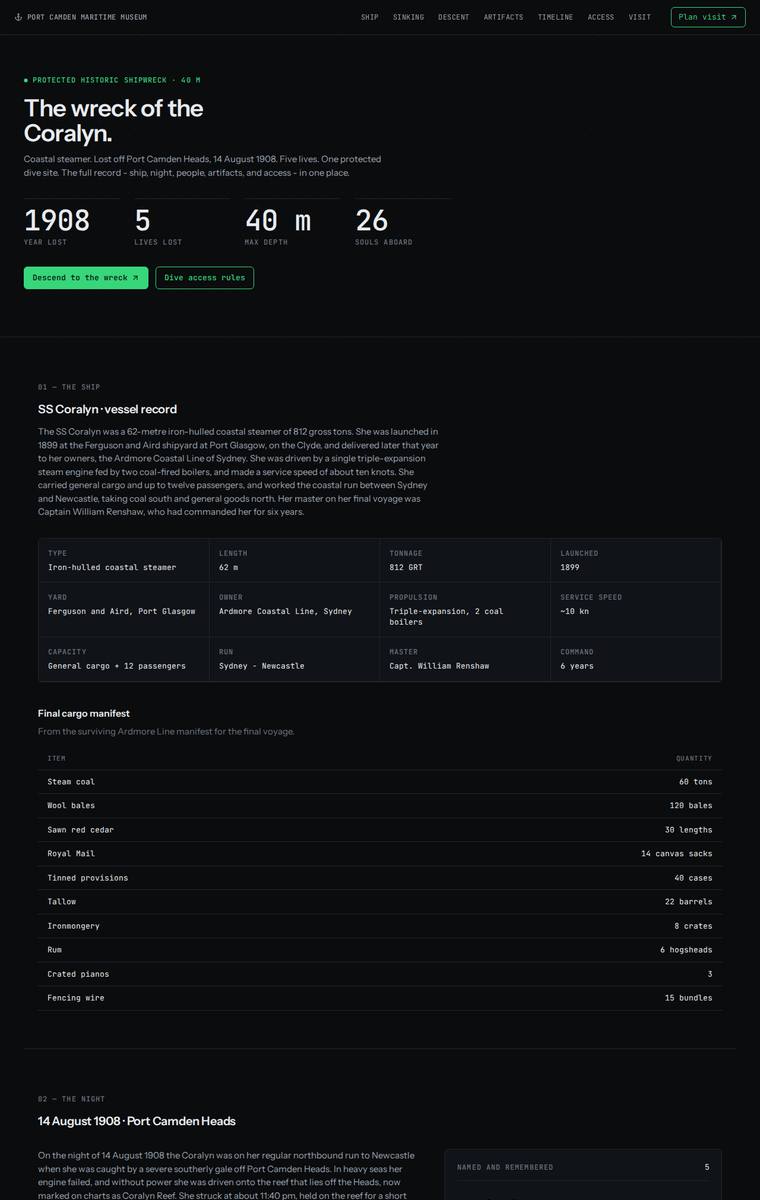
Composite 82.8%Judge 4.3/5
Judge panelAnthropic 4.0/5OpenAI 3.8/5Google 4.5/5
single-judge (Claude) 4.0/5 → leave-one-family-out 4.3/5
Anthropic: Every required section is present and factually correct: hero with the 1908/5/40m/26 stat row, ship record with the full manifest, the night with all five named lost, the three depth bands, all six recovered artifacts with correct years, the launch-to-custodian timeline, the four access rules plus both charter operators, and the visit/school-pack contact block. The dark, progressively darkening palette with a single green accent and monospace labels reads as a coherent "descent" system and is cleanly composed with consistent, aligned tables and no broken elements. Impact is solid but not arres
OpenAI: All required major sections are visible and most facts appear accurate, including the manifest, names lost, timeline, dive rules, operators, and visit details; however the artifact and descent areas only show one selected detail state in the screenshot, and there is a small brief-copy leak/numbering gap. The dark technical maritime treatment is coherent, readable, and polished, though it feels more like a restrained data dossier than an immersive descent or emotionally distinctive museum microsite.
Google: The design adopts a striking, highly technical 'archive' aesthetic executed with exceptional craft and typographic precision. All brief requirements are elegantly structured into dashboard-like modules. While the clinical visual style slightly misses the atmospheric 'descent' requested by the client, the overall result is premium, distinct, and highly legible.
Noor El-Amin (gpt-5.5)
High reasoning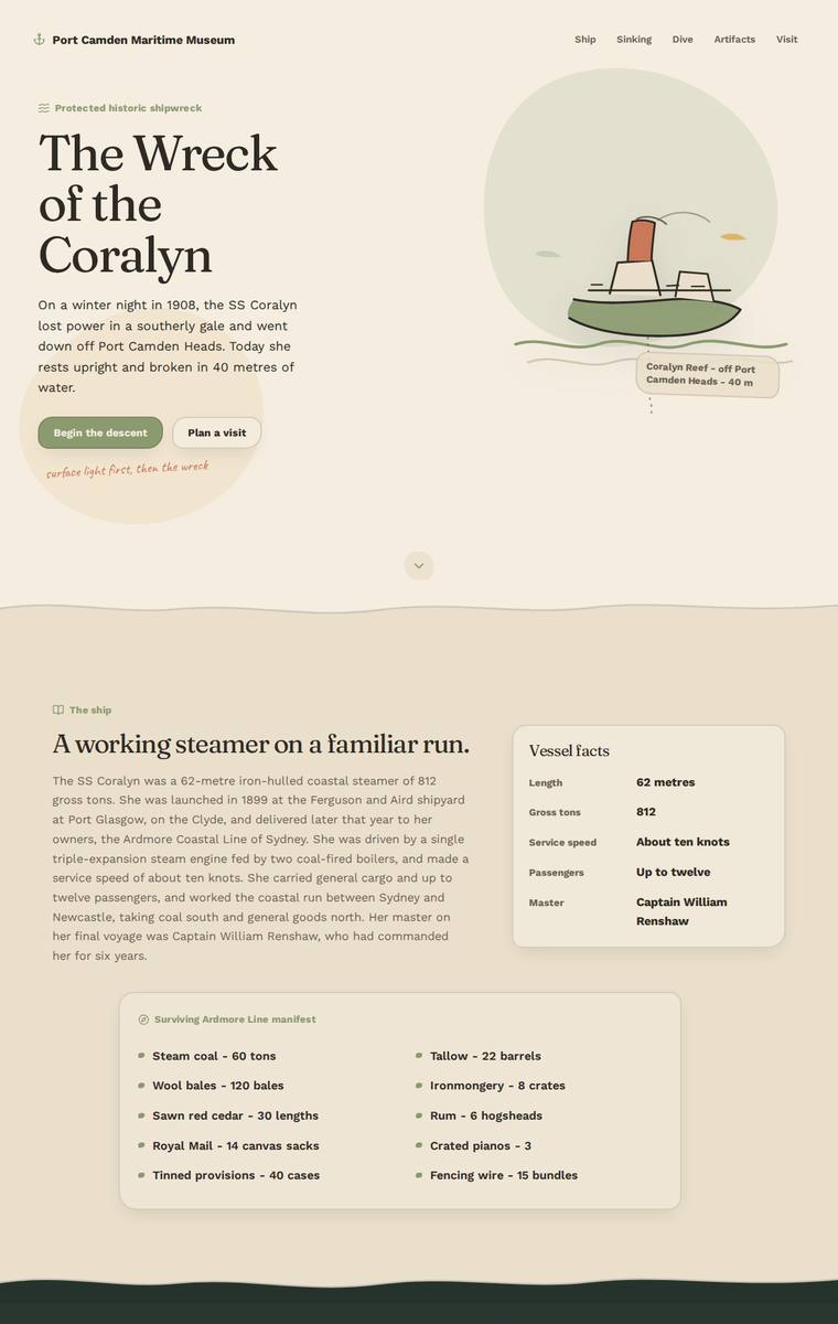
Composite 82.8%Judge 4.3/5
Judge panelAnthropic 4.3/5OpenAI 4.3/5Google 4.0/5
single-judge (Claude) 4.3/5 → leave-one-family-out 4.3/5
Anthropic: Exceptionally complete against the brief: every required section is present with correct facts, all five lost named, all six artifacts, the full manifest, timeline, both charters, and complete contact/school-pack details. The design is coherent and tasteful - warm cream-to-deep-green palette, serif display type, a charming illustrated steamer, and a genuine descent arc as the page darkens through the sinking and wreck sections. Craft is finished and consistent with only the somewhat abstract wreck diagram reading a touch sparse; the result is a premium, distinctive editorial museum site rather
OpenAI: The page includes all required major sections with largely accurate content, including the manifest, artifacts, timeline, dive rules, contact details, and school-pack information; the only notable fidelity concern is that the default visible dive/descent state does not show the full text for all three depth bands. The visual system is cohesive and evocative, with strong typography, a clear descent from warm surface tones into dark water, and charming inline illustration. Craft is high overall, though the artifact grid has some awkward empty-space/orphan-card composition that keeps it just shor
Google: The design accurately includes all required content while using an effective color-banding strategy to simulate the requested descent experience. Its cohesive typography, tasteful nautical palette, and custom illustrations deliver a polished, premium museum aesthetic.
Mara Vieira (gpt-5.4-mini)
High reasoning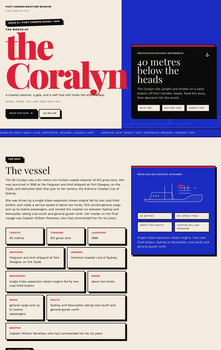
Composite 82.8%Judge 4.3/5
Judge panelAnthropic 4.3/5OpenAI 5.0/5Google 3.0/5
single-judge (Claude) 4.3/5 → leave-one-family-out 4.3/5
Anthropic: Every required section is present and content-accurate: masthead hero, vessel facts, manifest, the sinking with all five lost named, three depth bands at correct depths, all six artifacts, full timeline, dive rules with both operators, and the visit/school-pack details. The build commits to a strong, coherent maritime-broadsheet identity (cobalt blue, red accents, cream/black panels, bold serif masthead) that darkens through the sinking section to nod at the descent. Craft is finished and consistent with disciplined grids, but the layout leans heavily on repeated red-bordered card motifs, maki
OpenAI: The screenshot visibly includes all required sections and fixed facts: ship, sinking, manifest, three dive depths, six artifacts, full timeline, access rules, operators, museum contacts, and school-pack request. The visual system is highly coherent and distinctive, with strong editorial typography, confident colour blocking, and consistent card details that create a polished maritime archive/descent feeling. Nothing appears broken or unfinished, and the bold hero and graphic section treatments give it strong reviewer-stopping impact.
Google: The neo-brutalist aesthetic and strong typography create a striking initial impression. However, the build suffers from careless copy-pasting of client instructions into the live text, a prominent visual rendering glitch on the compass card, and it fails to deliver the requested continuous 'descent' experience by jarringly alternating between dark and bright backgrounds.
Noor El-Amin (gpt-5.6-sol)
High reasoning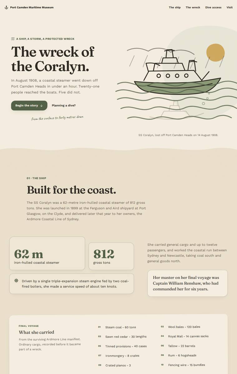
Composite 82.8%Judge 4.3/5
Judge panelAnthropic 4.3/5OpenAI 4.5/5Google 3.8/5
single-judge (Claude) 4.3/5 → leave-one-family-out 4.3/5
Anthropic: Every required section is present and correct: hero, ship facts (62m, 812 tons), the night of the sinking with the five lost named respectfully, the cargo manifest, the three depth bands (28m bow, 34m boilers, 40m debris field) in a "Follow the wreck down" descent, all six recovered artifacts, the full launch-to-protection timeline, dive access rules with both operators, and plan-your-visit with contact details and the school-pack request. The design is coherent and editorial with a considered cream-to-forest-green palette that literally darkens as you scroll, executing the "carry the visitor
OpenAI: The page includes nearly all required sections and content with strong factual coverage, though the dive/descent area only visibly presents the full detail for one depth band, so the other two cannot be credited beyond their labels in this static screenshot. The visual system is cohesive and polished, with an effective surface-to-depth colour progression, elegant typography, custom illustration, and consistent detailing throughout; it feels memorable and museum-appropriate, if slightly restrained rather than truly spectacular.
Google: The site meets all brief requirements with a cohesive, elegant visual style. Layout and typography are well-crafted, though the overall presentation feels slightly subdued.
Noor El-Amin (Opus 4.8)
High reasoning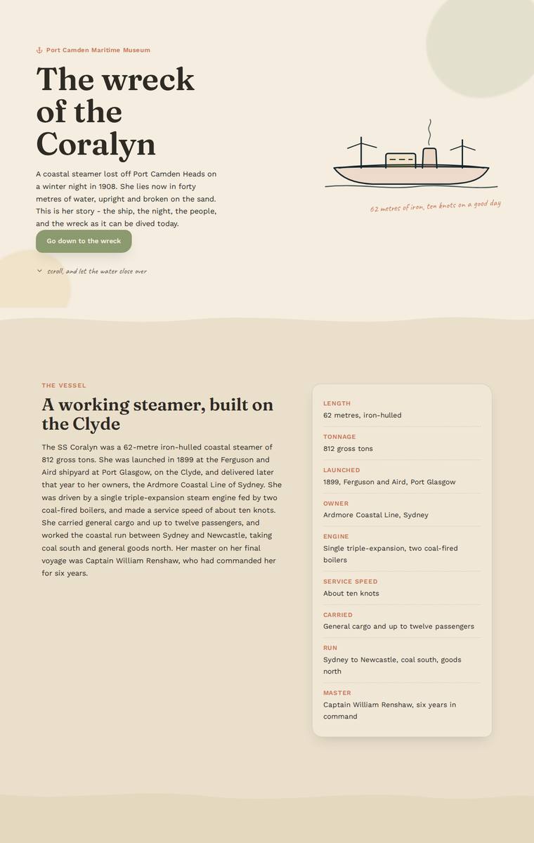
Composite 81.3%Judge 4.3/5
Judge panelAnthropic 4.3/5OpenAI 4.5/5Google 3.5/5
single-judge (Claude) 4.3/5 → leave-one-family-out 4.3/5
Anthropic: All required sections are present and content-correct: hero, ship facts sidebar, the cargo manifest, the night of the sinking with the five lost named plainly, an interactive dive with the three depth-band tabs (28m bow, 34m boilers, 40m debris field), the six recovered artifacts in a clean card grid, a full launch-to-protection timeline, protected-wreck access rules with both licensed operators, and plan-your-visit with contacts and the school-pack request. The standout is the descent metaphor executed through a background that darkens from cream at the surface through deep olive-black at the
OpenAI: The build visibly includes nearly all required sections and fixed content, with a strong descent narrative, named losses, artifacts, timeline, access rules, and visit details. The only notable fidelity issue is that the dive/descent section appears to hide the full boilers and debris-field descriptions behind tabs, so not all three depth-band details are visible in the static screenshot. Visually it is polished, cohesive, and memorable, with excellent typography, colour progression, illustration, and spacing.
Google: The build includes all required content and effectively uses a darkening color palette to simulate a descent. The typography and layout are clean and readable, though the overall presentation relies on standard card patterns rather than highly distinctive visual motifs.
Elias Byrne (claude-sonnet-5)
High reasoning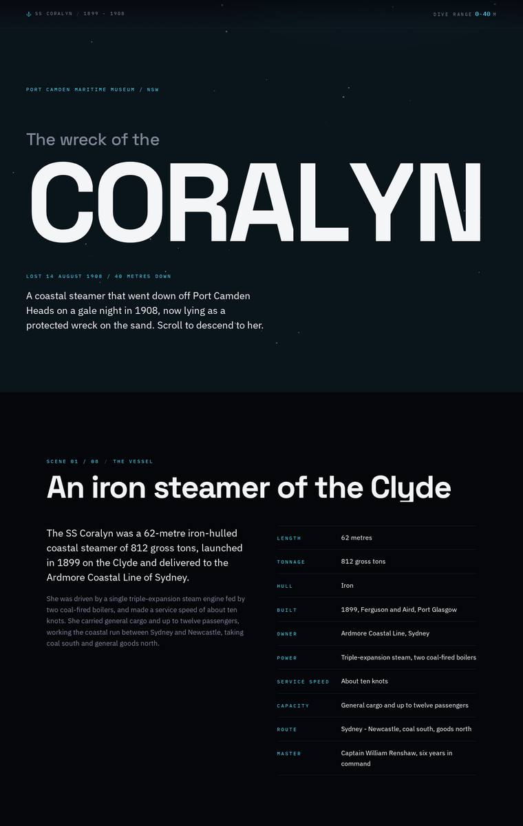
Composite 81.3%Judge 4.3/5
Judge panelAnthropic 4.0/5OpenAI 4.3/5Google 3.8/5
single-judge (Claude) 4.0/5 → leave-one-family-out 4.3/5
Anthropic: All required sections are present and accurate: the hero wordmark, the ship's facts panel, the five lost named plainly, the descent with the three depth bands (28/34/40 m), all six recovered artifacts, the manifest table, the launch-to-protection timeline, the dive access rules, and Plan Your Visit with contact details and the school-pack request. The dark, near-monochrome navy palette with cyan accents and confident type hierarchy (the huge CORALYN wordmark, mono labels) reads as a coherent, modern editorial system and the whole thing is finished and consistently aligned. It falls short of pr
OpenAI: All required sections and factual content appear to be present, including the depth bands, artifacts, manifest, timeline, dive rules, operators, and visit/school contact details. The design is cohesive and polished with a strong dark maritime atmosphere and excellent typographic hierarchy, though it is quite text-heavy, with some very small low-contrast supporting copy and limited visual storytelling beyond the hero treatment.
Google: The design captures the descent theme through a cohesive dark palette and structured typography. All brief requirements are met with strong alignment and consistent spacing, ensuring excellent readability. The polished, functional aesthetic provides a calm and atmospheric museum experience.
Noor El-Amin (grok-4.5)
High reasoning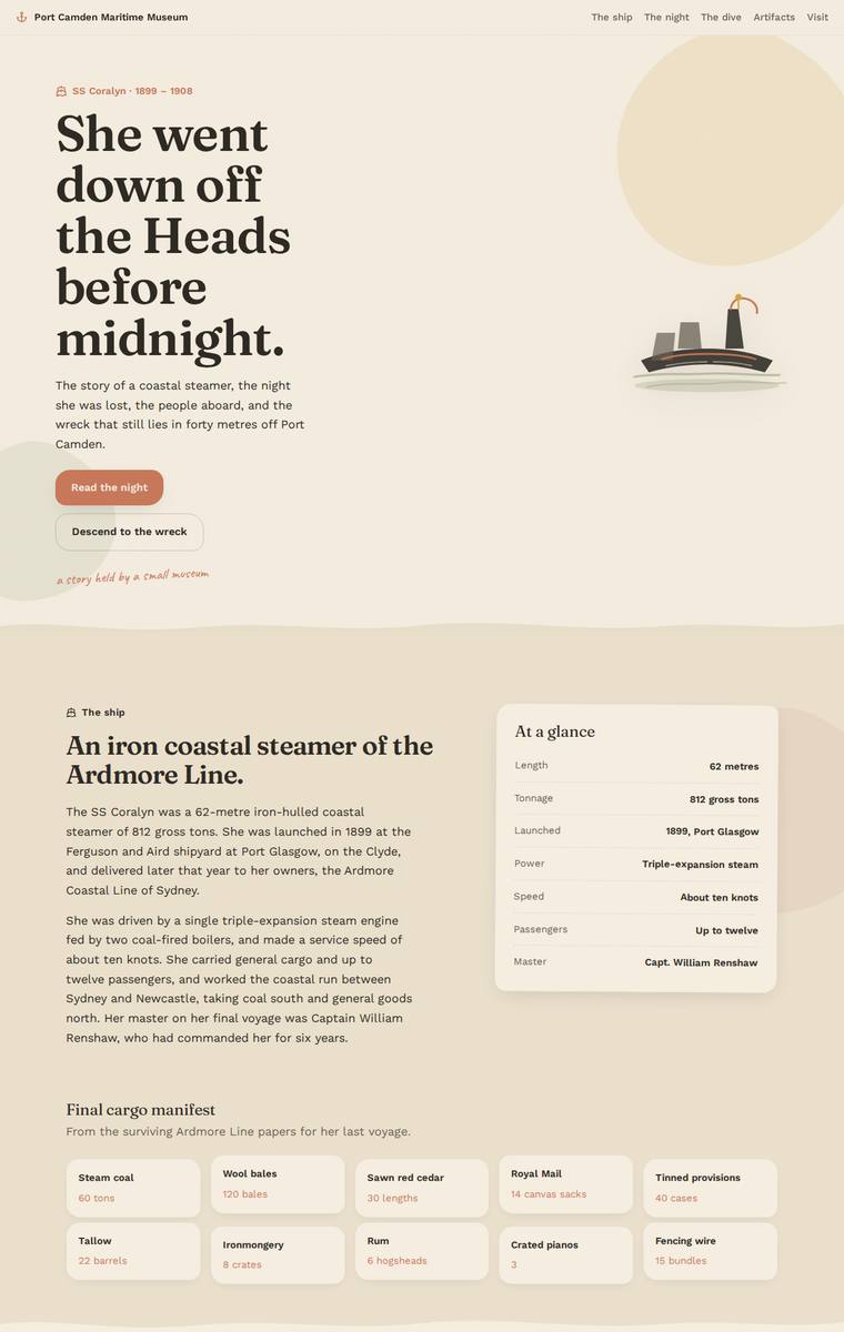
Composite 81.3%Judge 4.3/5
Judge panelAnthropic 4.3/5OpenAI 4.5/5Google 3.3/5
single-judge (Claude) 4.3/5 → leave-one-family-out 4.3/5
Anthropic: All eight required sections are present with the fixed content correctly rendered: the hero, the ship with an "at a glance" spec panel and full cargo manifest, the night of the sinking with the five named lost, a descent section presenting the three depth bands (28m/34m/40m), the six artifacts, the timeline, the dive-access rules with both charter operators, and plan-your-visit with contact details and a school-pack request form. The design is coherent and editorial - a warm cream palette with confident serif display type, and the descent section's teal-to-dark gradient is a tasteful answer to
OpenAI: The screenshot includes all required content sections with the specified facts, names, artifacts, timeline entries, dive rules, operators, museum details, and school-pack request. The visual system is cohesive and polished, with a clear surface-to-depth progression, warm maritime palette, strong typography, and consistent card treatments. It feels finished and carefully built, though the overall presentation is more tasteful and restrained than truly striking or premium.
Google: The layout successfully incorporates all brief requirements within a clear, consistent structure. The visual execution and standard card-based UI are functional but lack the immersive depth requested for the descent experience, resulting in a competent yet visually flat presentation.
Mara Vieira (deepseek-v4-flash)
default reasoning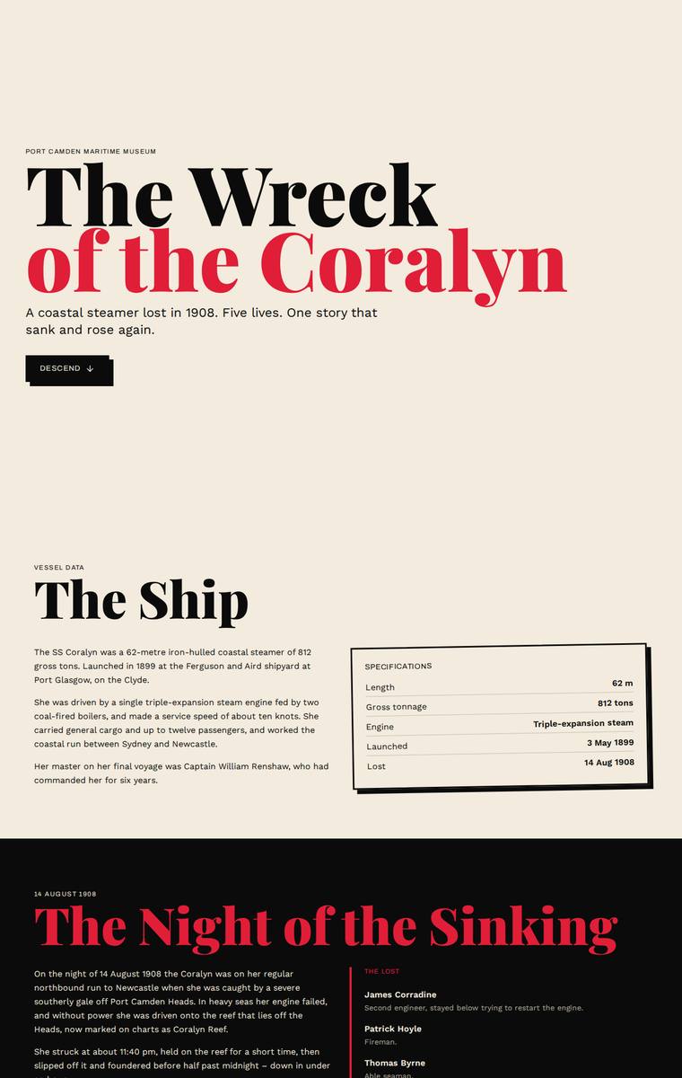
Composite 81.3%Judge 4.3/5
Judge panelAnthropic 4.0/5OpenAI 4.8/5Google 3.3/5
single-judge (Claude) 4.0/5 → leave-one-family-out 4.3/5
Anthropic: Every required section is present and content-accurate: hero, the ship with a specs table, the night of the sinking with all five named lost, the three depth bands (28/34/40m), all six recovered artifacts with permit dates, the full manifest, the eight-point timeline, dive access rules with both operators, and plan-your-visit with contacts and the school-pack request. The bold editorial serif headings, offset hard-shadow framed boxes, and the alternating light-to-dark rhythm give a competent, coherent structure that gestures at the requested descent. It is held back from premium by inconsisten
OpenAI: All required story sections and most fixed facts are visibly present, including the lost names, depth bands, six artifacts, timeline, rules, and visit details, though the requested interactive/descent experience is not really evident in the static screenshot. The design is highly polished and distinctive, with bold editorial typography, confident colour use, strong spacing, and consistent card/detail treatments that feel finished and memorable.
Google: Includes all requested content with a consistent, heavily styled aesthetic. However, the alternating light and dark backgrounds fail to convey the requested continuous descent into darkness, and the style feels disconnected from the maritime subject.
Ingrid Kessler (kimi-k2.7-code)
default reasoning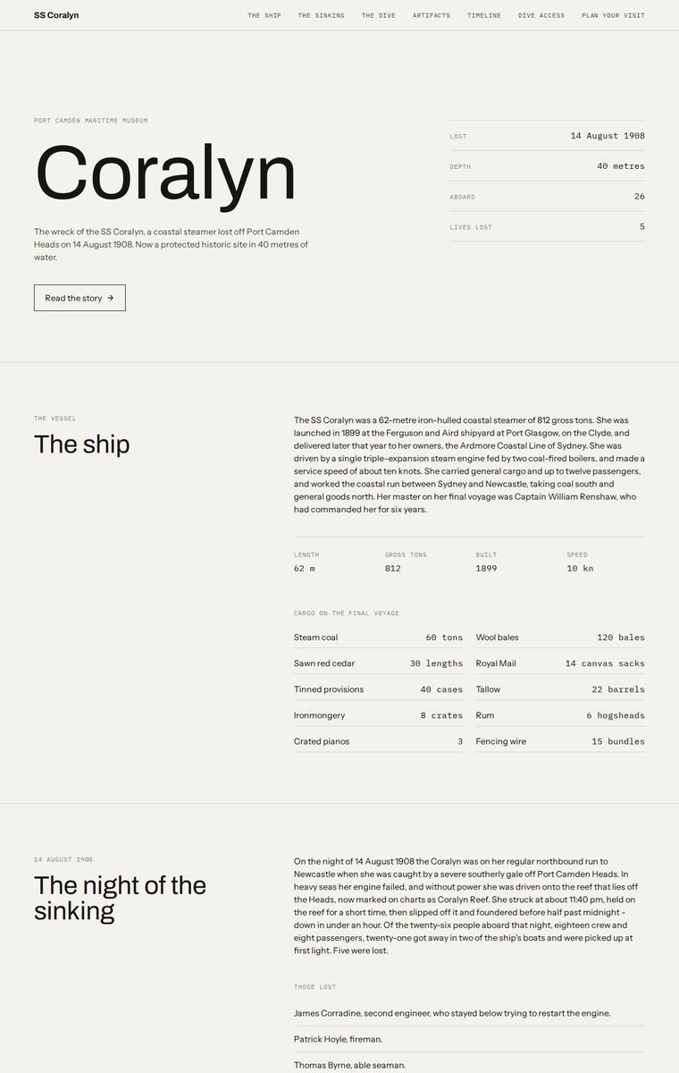
Composite 79.7%Judge 4.2/5
Judge panelAnthropic 4.3/5OpenAI 3.8/5Google 3.8/5
single-judge (Claude) 4.3/5 → leave-one-family-out 4.2/5
Anthropic: Every required section is present and content-accurate: ship facts and manifest table, the five lost named plainly, three depth bands (Bow 28m, Boilers 34m, Debris field 40m), all six recovered artifacts, the full timeline, dive access rules with both operators, and plan-your-visit with contact details plus the school-pack request. The design is a coherent, well-composed editorial system with confident serif display type and a smart cream-to-black gradient that literally enacts the requested descent as you scroll from surface into the dark wreck. Craft is clean and consistent with tidy alignme
OpenAI: All major required sections are visible and most fixed content appears substantially present, including the ship, sinking, descent bands, artifacts, timeline, dive rules, and visit details, though the school-pack email contact appears to be replaced by a form and the descent is quite static in the screenshot. The design is clean, coherent, and well-spaced with a strong editorial grid, but it is very restrained and largely typographic, with little visual storytelling or memorable wreck/descent atmosphere beyond the dark section.
Google: The design includes all required content within a clean, editorial layout. The requested descent experience is effectively achieved through stark background color transitions, though the overarching minimalism limits distinctive visual impact. Overall craft and typographic alignment are consistently precise.
Elias Byrne (kimi-k2.7-code)
default reasoning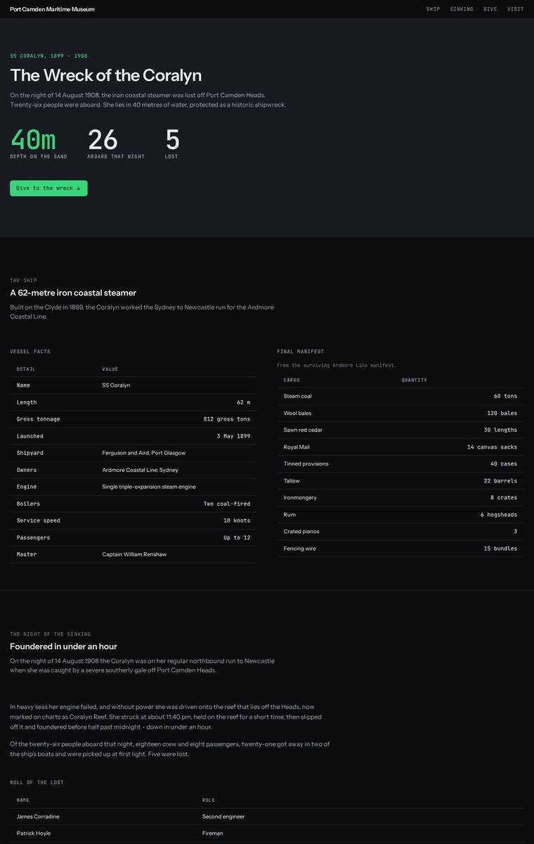
Composite 79.7%Judge 4.2/5
Judge panelAnthropic 4.0/5OpenAI 3.8/5Google 4.0/5
single-judge (Claude) 4.0/5 → leave-one-family-out 4.2/5
Anthropic: Every required section is present and correctly populated: hero with depth/aboard/lost stats, ship facts table, the full cargo manifest, the night of the sinking with the five named lost, six numbered recovered artifacts, the launch-to-custodian timeline, a depth-banded descent (28/34/40m) with a depth gauge, dive access rules with the two licensed operators, and plan-your-visit with contact details and the school-pack request. The dark teal-and-green deep-sea palette is coherent and appropriate, with tidy mono-accented labels, aligned tables and consistent card treatments, so craft holds up t
OpenAI: The page includes all major required sections and most fixed facts, with the six artifacts, manifest, timeline, dive bands, rules, and visit details visible, though some brief content is condensed and the teachers’ school-pack email is not shown. The visual system is clean, readable, and consistent with a strong dark maritime/data-log tone, but it relies heavily on tables and cards with little atmospheric storytelling or memorable wreck/descent imagery. Craft is generally polished, aside from a slightly awkward dive gauge/selected-depth area and a relatively restrained impact.
Google: The design delivers all required content accurately, adopting a bold, technical "dive computer" aesthetic with stark typography and neon accents. While the layout and tabular data are crafted with precision, this highly clinical approach strips emotional resonance from the historical narrative, making it feel more like a data dashboard than an atmospheric museum experience.
Ingrid Kessler (kimi-k3)
default reasoning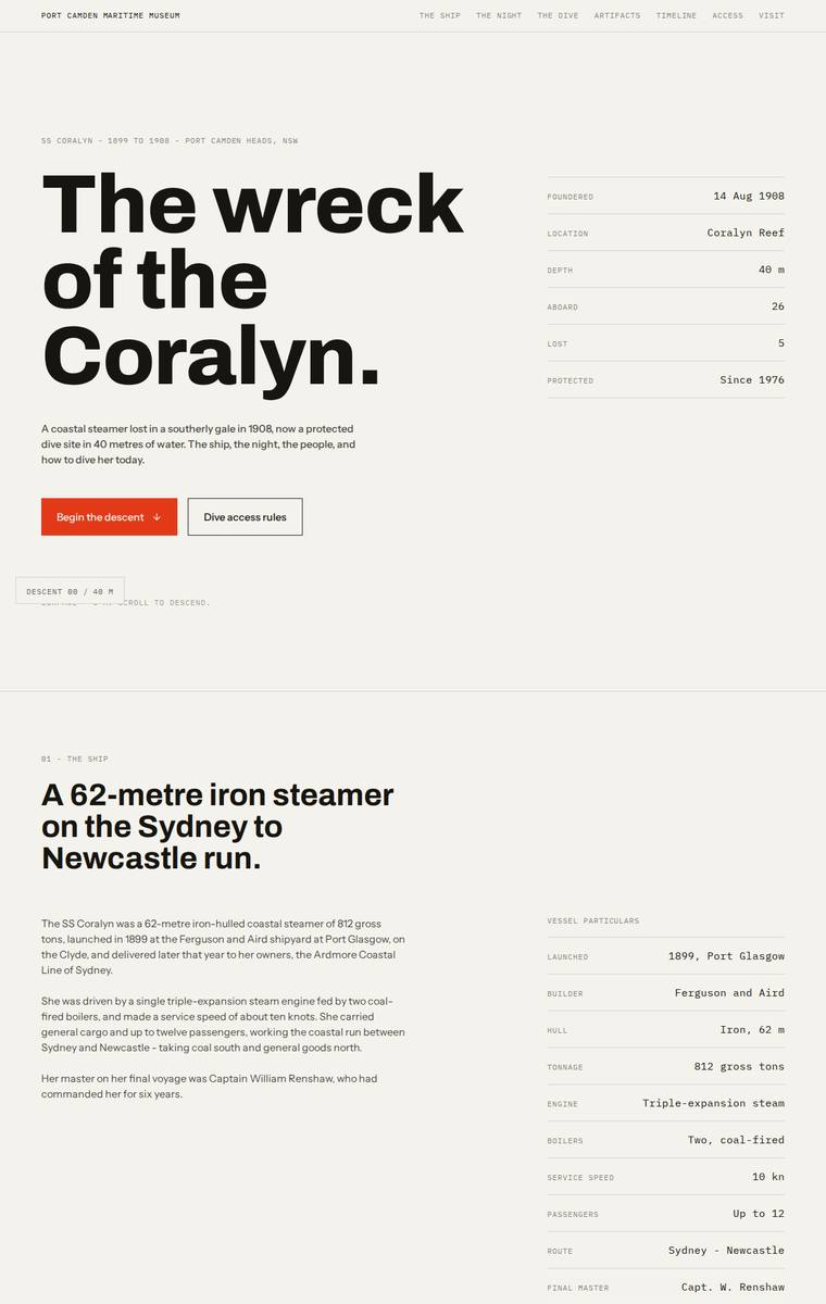
Composite 79.7%Judge 4.2/5
Judge panelAnthropic 4.3/5OpenAI 3.8/5Google 3.8/5
single-judge (Claude) 4.3/5 → leave-one-family-out 4.2/5
Anthropic: All required sections are present and content-correct: hero, the ship with vessel particulars, the night of the sinking with the manifest and the five lost named respectfully, the three depth bands (bow 28m / boilers 34m / debris field 40m), all six artifacts, the full timeline, the non-optional dive rules, and plan-your-visit with contact details and the school-pack request. The editorial Swiss/brutalist system (cream, black, orange accent, monospace labels, strong type hierarchy) is coherent and modern, and the light-to-dark-to-light section progression is a smart static reading of the desce
OpenAI: The build visibly covers the hero, ship, sinking, manifest, lost names, artifacts, timeline, access rules, and visit details with mostly accurate content, though the dive section only visibly explains the bow band rather than all three depth bands. The design is polished, restrained, and coherent with strong typography and spacing, but the descent experience is relatively minimal and more editorial than immersive. Overall it feels finished and professional, though not especially distinctive or memorable.
Google: The design executes a precise, editorial aesthetic with strong typographic hierarchy and rigorous grid alignment. Background color transitions effectively suggest the requested descent. All content requirements are met cleanly, resulting in a highly professional presentation.
Ingrid Kessler (gpt-5.6-luna)
High reasoning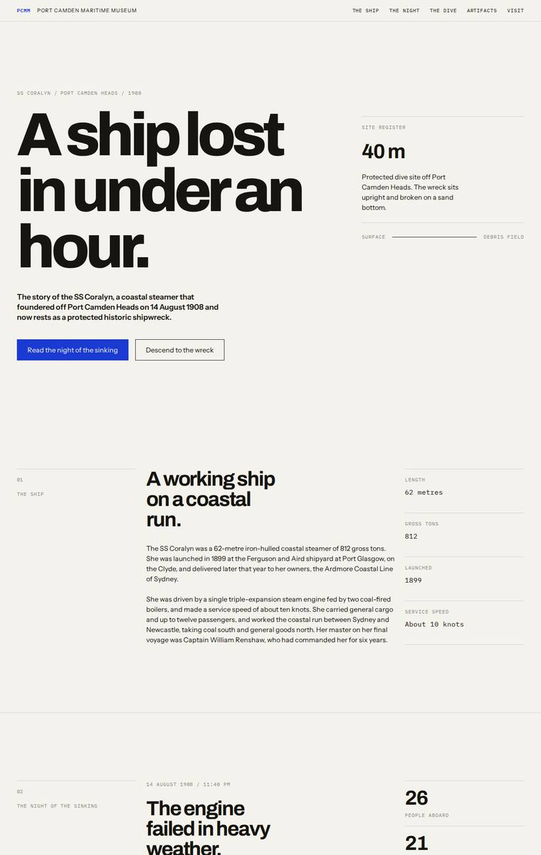
Composite 79.7%Judge 4.2/5
Judge panelAnthropic 4.8/5OpenAI 3.8/5Google 3.3/5
single-judge (Claude) 4.8/5 → leave-one-family-out 4.2/5
Anthropic: Every required section is present and correctly populated: hero ("A ship lost in under an hour"), the ship's facts, the night/engine failure with the five lost named plainly, the full manifest as a ledger, a dark descent section with the bow at 28 metres and depth-band scrubber, six recovered objects, the launch-to-today timeline, the protected-wreck dive rules, plan-your-visit contact details, and the school-pack ask to Harriet Doyle. The execution is a confident, highly coherent Swiss editorial system - compressed Archivo Expanded headlines, monospace micro-labels, numbered rows and hairline
OpenAI: The page includes nearly all required sections and fixed content, with the ship, sinking, lost names, manifest, artifacts, timeline, access rules, operators, and visit details clearly present. However, the dive/descent area only visibly presents the bow detail while the boilers and debris-field descriptions appear hidden behind interaction, and the school-pack email is not plainly shown. The visual system is polished and coherent with strong editorial typography, but it is quite austere and only lightly evokes the requested descent into the wreck, limiting its distinctiveness and emotional imp
Google: Faithfully delivers all requested content using a precise, editorial typographic layout. The dark section effectively implies descent, though the complete absence of graphic elements limits the overall visual impact.
Noor El-Amin (gemini-3.5-flash)
default reasoning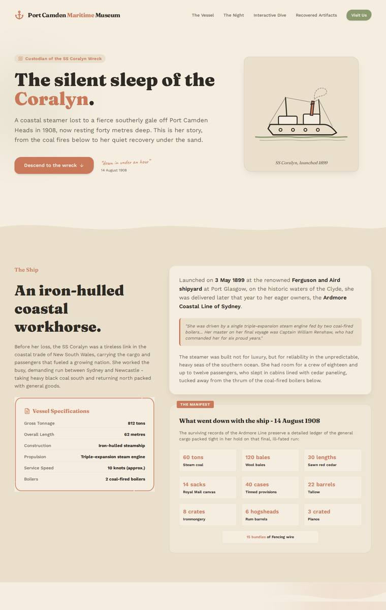
Composite 78.1%Judge 4.1/5
Judge panelAnthropic 3.8/5OpenAI 4.5/5Google 3.3/5
single-judge (Claude) 3.8/5 → leave-one-family-out 4.1/5
Anthropic: All required sections are present and content-accurate: hero, ship facts with spec table, the night of the sinking with the five lost named, the three depth bands, all six artifacts in a grid, the full timeline, dive access rules with the two operators, and plan-your-visit with contact details plus a school-pack request form. The warm cream/rust editorial palette with serif display type is coherent and tasteful, and the build looks finished and consistent with no obvious broken elements. The main weakness is impact and concept: the museum's firm request to carry the visitor down is barely expr
OpenAI: All required sections are visible and the key facts, names, dates, artifacts, depth bands, access rules, contact details, and school-pack request are substantially represented. The visual system is cohesive and attractive, with strong typography, spacing, and a fitting maritime archival palette, though the descent experience is mostly concentrated in one dark section rather than carried through the whole page. Craft is generally polished, with only minor small-text and decorative-border quirks keeping it from feeling completely flawless.
Google: The build meets all brief requirements with a structured layout and a thematic dark section for the dive. Typography and spacing are consistent, resulting in a clean but conventional museum aesthetic.
Elias Byrne (glm-5.2)
default reasoning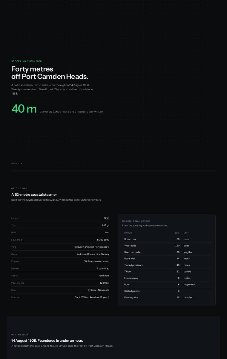
Composite 76.6%Judge 4.1/5
Judge panelAnthropic 3.8/5OpenAI 3.8/5Google 3.8/5
single-judge (Claude) 3.8/5 → leave-one-family-out 4.1/5
Anthropic: All required sections are present and content-accurate: hero, ship facts table plus the cargo manifest, the sinking narrative with the five named lost, the three depth bands (28/34/40 m), all six recovered artifacts, the full timeline, dive access rules with both operators, and plan-your-visit with contact details and a school-pack request form. The dark green-accented theme is coherent, modern and cleanly typeset with good spacing, so visual design is solid. Craft and impact are held back by large dead black voids in and below the hero (likely an uncaptured WebGL canvas) and a mostly empty ar
OpenAI: The build includes all major required sections and most facts are visible, with a clear dark descent theme and practical dive/visit information. However, the tabbed presentation means most artifact descriptions and some depth-band details are not visible in the screenshot, and the school-pack email address is not shown. The visual system is polished and coherent, though quite sparse and dashboard-like, so it feels professional but not especially memorable.
Google: The build perfectly incorporates all requested content with flawless alignment and precise grid execution. However, the visual direction feels misaligned with the brief: the strict dark mode, dashboard-like layout, and bright green accents make it look like developer documentation rather than an engaging maritime museum story, missing the atmospheric weight of a deep-water descent.
Mara Vieira (gemini-3.5-flash)
default reasoning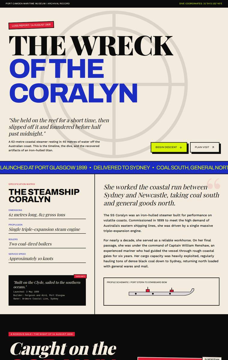
Composite 76.6%Judge 4.1/5
Judge panelAnthropic 3.8/5OpenAI 3.5/5Google 4.0/5
single-judge (Claude) 3.8/5 → leave-one-family-out 4.1/5
Anthropic: Strong editorial-brutalist system (cream/black/electric-blue/red with heavy Archivo Expanded display) and a genuinely arresting hero; nearly all required sections are present - ship facts, sinking with manifest and the named five lost, artifacts, timeline, rules, and a plan-your-visit form. Composition falters in the descent: large empty dark voids and an under-filled "2M" depth band leave uneven vertical rhythm and awkward blank stretches that read as janky in a static view, and the three depth bands don't clearly resolve. Distinctive and mostly finished, but the sparse mid-page sections keep
OpenAI: The build includes the major required sections and much of the core story, but several required details are only implied or hidden in interactive states, including most artifact descriptions, the full dive-depth content, and the school-pack email; it also invents some extra factual microcopy. The visual direction is bold, coherent, and memorable with strong editorial typography, but the very large empty descent area and reliance on tabbed/scroll states make the page feel partly unfinished in this static render.
Google: The design features a bold, distinctive archival aesthetic with excellent typography and a striking color palette. While all requested content is present, the 'descent' section translates poorly to a static full-page screenshot, appearing as a massive empty void that severely disrupts the page layout and pacing. Despite this structural flaw in the static context, the component-level execution and overall art direction are highly memorable and impactful.
Yuki Tanabe (grok-4.5)
High reasoning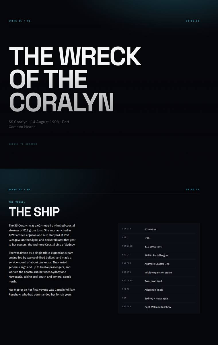
Composite 76.6%Judge 4.1/5
Judge panelAnthropic 4.0/5OpenAI 4.3/5Google 3.0/5
single-judge (Claude) 4.0/5 → leave-one-family-out 4.1/5
Anthropic: Every required section is present and correct: hero, the ship with a facts table, the night with the five named lost, the cargo manifest, the three-band interactive dive (bow 28m / boilers 34m / debris field 40m with a submarine diagram and a cyan depth marker), all six artifacts with the telegraph highlighted, the full timeline, dive access rules with both charter operators, and plan-your-visit with contact details and the school-pack request. The dark navy palette with a single cyan accent is coherent and thematically apt for a descent, with a clean, confident type hierarchy in condensed san
OpenAI: The page includes all required major sections with accurate core story, timeline, dive rules, contact details, and a strong descent-themed structure, but the artifacts are only fully described for the first item in the static screenshot rather than visibly presenting all six descriptions. The visual system is highly coherent and cinematic, with excellent dark maritime atmosphere, bold typography, and disciplined spacing, though some text is very small/low-contrast and the manifest table appears cramped. Overall it feels polished and distinctive, if slightly more austere than richly museum-like
Google: The dark, technical aesthetic effectively sets a moody tone appropriate for a deep-sea wreck. While typography is bold and all brief requirements are met, overlapping text in the manifest section presents a clear layout flaw.
Elias Byrne (gpt-5.6-terra)
High reasoning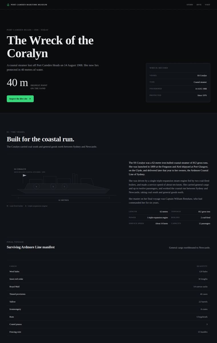
Composite 76.6%Judge 4.1/5
Judge panelAnthropic 3.8/5OpenAI 4.0/5Google 3.8/5
single-judge (Claude) 3.8/5 → leave-one-family-out 4.1/5
Anthropic: Nearly every required section is present and content-faithful: hero, ship facts, the sinking with the five named lost, manifest, three-band interactive dive (28/34/40m), artifact table, timeline, access rules with both operators, and plan-your-visit with school pack. The dark-to-green atmospheric palette and progressively darkening layout are a coherent, tasteful read on the "descent" experience, and craft is finished with consistent spacing, aligned tables, and clean SVG diagrams. It lands as competent premium-editorial rather than distinctive; the static frame reads a touch conventional and
OpenAI: The page covers the required structure well and has a polished archival maritime tone, but it visibly omits fixed required content: the engine-room telegraph artifact and the steam coal manifest entry are missing. The visual system is cohesive, elegant, and museum-appropriate, with strong typography and spacing, though the descent experience feels more implied than dramatically realised in the static screenshot.
Google: The design employs a rigorous grid and elegant typography to create a premium, editorial aesthetic with precise SVG diagrams. However, fidelity suffers because the engine-room telegraph is missing from the artifacts list, though the execution remains highly polished overall.
Elias Byrne (gpt-5.5)
High reasoning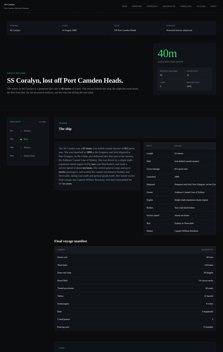
Composite 73.4%Judge 3.9/5
Judge panelAnthropic 4.0/5OpenAI 3.8/5Google 3.0/5
single-judge (Claude) 4.0/5 → leave-one-family-out 3.9/5
Anthropic: Every required section is present and faithful: hero with a 40m depth readout, the ship's facts table, the manifest, the night of the sinking, the five named lives lost, a descent module presenting the three depth bands (bow 28m / boilers 34m / debris 40m) with a depth-profile chart, the six recovered artifacts, the full timeline, the dive rules and licensed operators, and Plan your visit with contact details and the school-pack request. The dark palette with a consistent teal-green accent is coherent, modern and thematically apt for a sinking-into-the-deep story, and tables are cleanly aligne
OpenAI: The page appears to include all required sections and the fixed factual content, including the manifest, lost names, depth bands, artifacts, timeline, rules, operators, and visit/school-pack details. The design is coherent and readable with an appropriate dark maritime tone, but it is very table-heavy and restrained, with limited sense of immersive descent or distinctive storytelling. Craft is generally consistent, though some table content appears cramped or clipped, reducing polish.
Google: The build includes all required content but presents it as a dry, data-driven dashboard rather than an atmospheric museum narrative. The utilitarian aesthetic lacks emotional resonance, and the execution is marred by severely truncated text in multiple data tables.
Noor El-Amin (kimi-k2.7-code)
default reasoning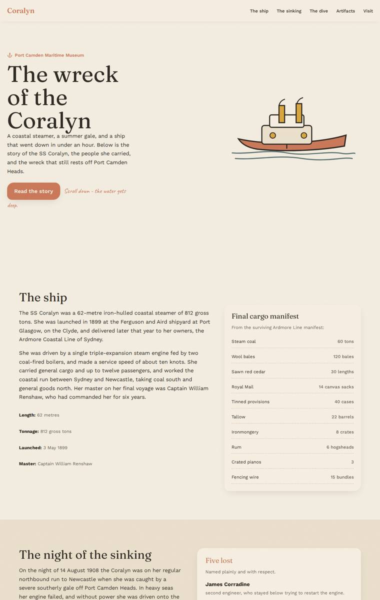
Composite 71.9%Judge 3.9/5
Judge panelAnthropic 3.8/5OpenAI 4.0/5Google 2.8/5
single-judge (Claude) 3.8/5 → leave-one-family-out 3.9/5
Anthropic: All required sections are present and content-accurate: hero, ship facts with full cargo manifest, the sinking with the five lost named, an interactive depth-band descent, six artifact cards, the timeline, dive access rules with both operators, and plan-your-visit with the school-pack form. The warm cream/sage palette and display serif are coherent and the descent section shifts to dark teal to hint at the concept, but the page reverts to light immediately after, so the "carry the visitor down" experience feels only partially realised and the overall layout stays conventional. Craft is finishe
OpenAI: The page includes the required story arc and most mandated sections/content, with strong coverage of ship facts, sinking, artifacts, timeline, rules, and visit planning, though the dive section only visibly presents the bow details and the school-pack email is not shown. The visual system is cohesive and atmospheric, with a convincing surface-to-depth transition, but some low-contrast artifact headings and occasional sparse spacing keep it from feeling fully polished or premium.
Google: The layout successfully incorporates all required sections and uses a background color transition to simulate descending to the wreck. However, a severe contrast failure in the artifacts section makes text entirely illegible, significantly degrading both craft and visual design.
Elias Byrne (kimi-k3)
default reasoning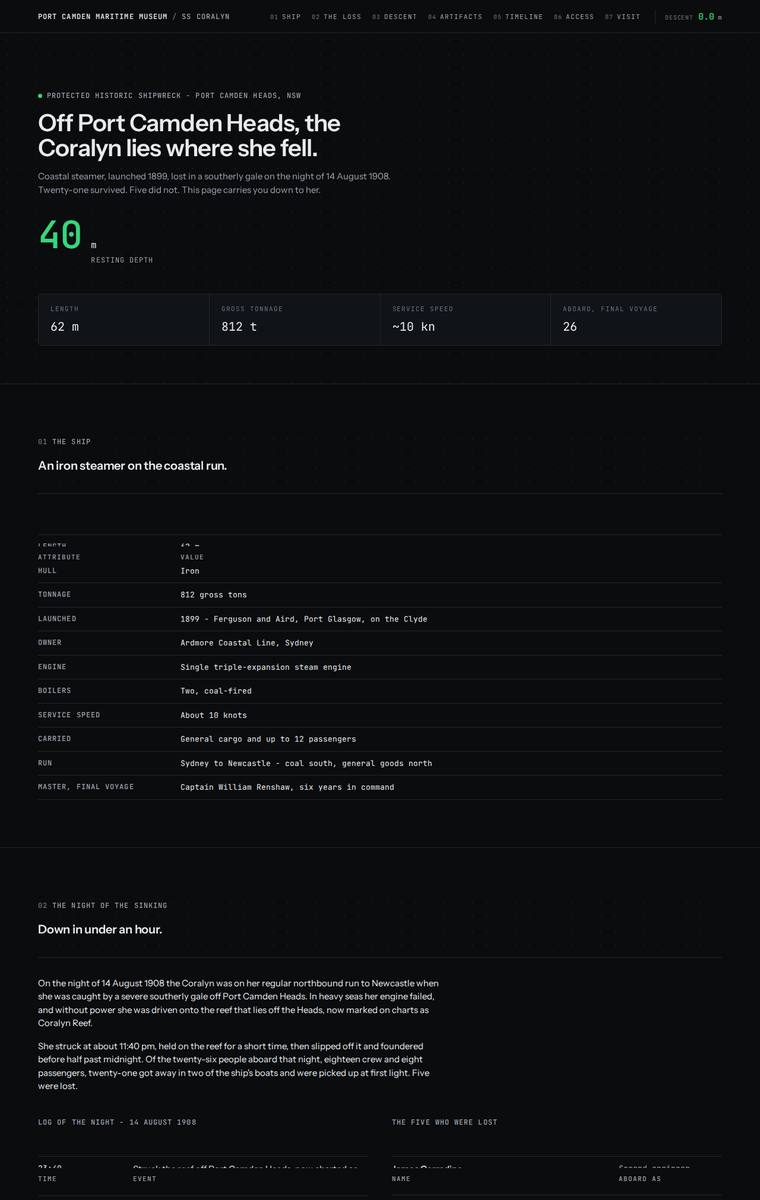
Composite 71.9%Judge 3.9/5
Judge panelAnthropic 3.8/5OpenAI 3.8/5Google 3.0/5
single-judge (Claude) 3.8/5 → leave-one-family-out 3.9/5
Anthropic: Brief coverage is essentially complete: hero, ship specs, night of the sinking with the five lost named, cargo manifest, three depth bands (28/34/40m), all six recovered artifacts, the full timeline, dive access rules with both operators, and plan-your-visit with contact details plus the school-pack request are all present and accurate. The execution commits to a dark terminal/sonar aesthetic with green depth-gauge accents and a wave-line descent diagram - internally consistent and cleanly aligned, with no obvious broken elements - but it reads as a cold data-dashboard of monospace tables rath
OpenAI: The build includes the required hero, ship facts, sinking story, depth-band descent, artifacts, timeline, dive rules, operators, and visit/school contact information, with a strong descent-oriented maritime/technical concept. The visual system is cohesive and polished, but several table first rows are visibly clipped or partially hidden, affecting readability of required content such as names, manifest items, timeline entries, and charter operators. Overall it feels distinctive and premium, though the repeated clipping/jank holds back craft.
Google: The design adopts a consistent, technical sonar-inspired aesthetic that covers all required content. However, systemic layout bugs causing text overlap in almost every data table severely compromise the execution.
Noor El-Amin (kimi-k3)
default reasoning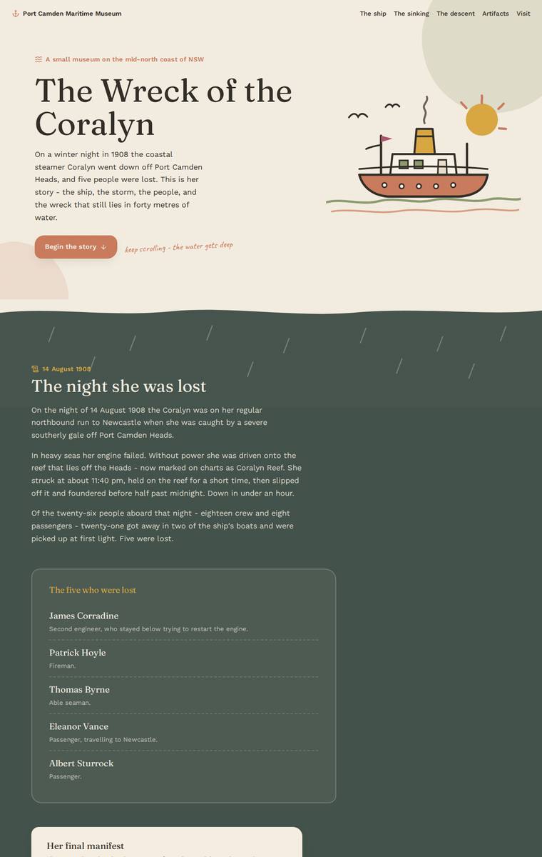
Composite 71.9%Judge 3.9/5
Judge panelAnthropic 4.0/5OpenAI 4.0/5Google 2.8/5
single-judge (Claude) 4.0/5 → leave-one-family-out 3.9/5
Anthropic: Every required section is present and correct: hero, ship facts, the sinking with the five named lost and the full manifest table, an interactive dive with all three depth bands (28/34/40 m), the six recovered artifacts, the launch-to-today timeline, dive access rules with both operators, and plan-your-visit with contact details plus the school-pack request. The design is coherent and tasteful - a warm cream/ochre surface that deepens into a dark sage/near-black dive zone then lightens back up, which nicely conveys the requested descent, paired with confident serif display type and consistent
OpenAI: The build includes most required content sections and handles the sinking, descent bands, artifacts, timeline, dive rules, and visit information well, but the required dedicated ship/vessel facts section appears to be missing. The visual system is coherent, warm, and museum-appropriate with a strong surface-to-depth transition, though some text in the dark descent cards has poor contrast. Overall it feels polished and distinctive, if not quite fully complete against the brief.
Google: The design establishes a pleasant aesthetic with a muted palette and consistent line-drawn illustrations. However, it completely omits the mandatory 'The ship' section, and severe contrast issues in the dark descent section render critical text illegible.
Ingrid Kessler (gemini-3.1-pro-preview)
High reasoning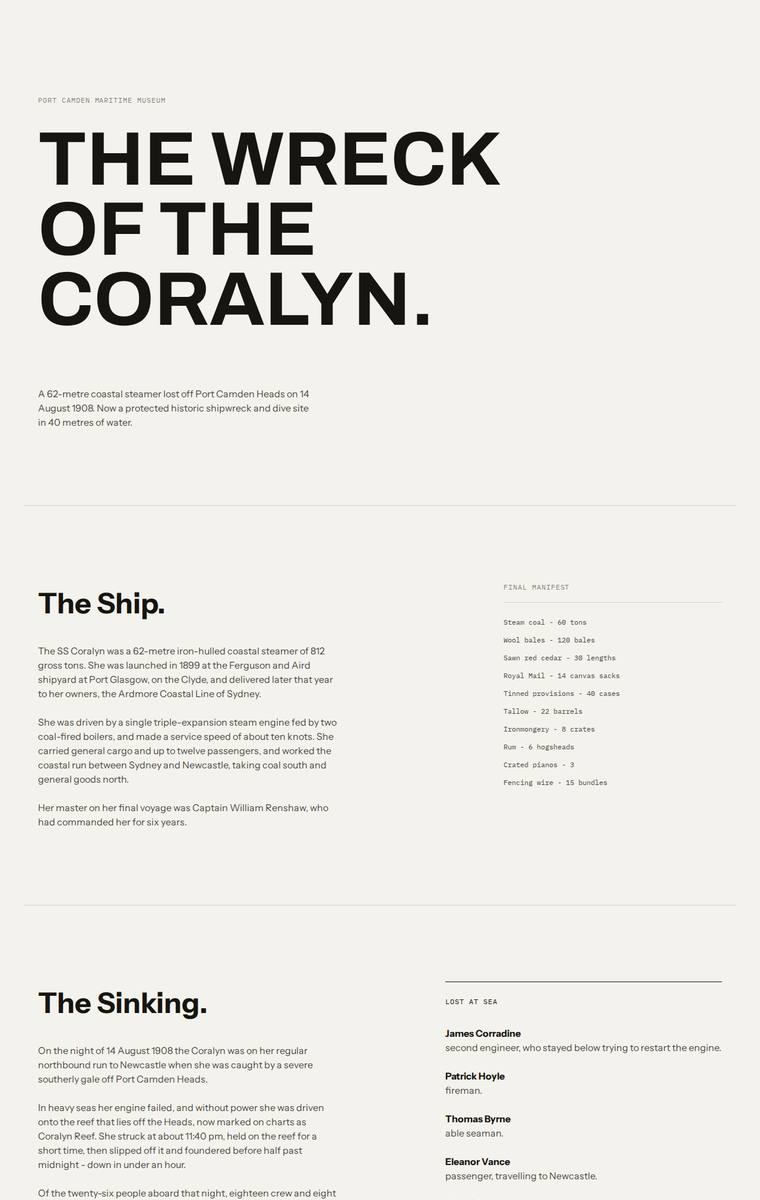
Composite 71.9%Judge 3.9/5
Judge panelAnthropic 4.0/5OpenAI 3.8/5Google 3.0/5
single-judge (Claude) 4.0/5 → leave-one-family-out 3.9/5
Anthropic: Every required section is present and content-accurate: hero, ship facts with manifest, the sinking with the five lost named plainly, a three-band dive (28/34/40m bow, boilers, debris field), all six recovered artifacts, the full timeline, access rules with both operators, and plan-your-visit with contact details and the school-pack CTA. The execution is a confident editorial/Swiss layout - strong Archivo display type, clear hierarchy, generous whitespace, and a well-judged dark "Dive" band that gives the one nod toward descent, lifted by a single red accent button. Craft is clean and consiste
OpenAI: The page includes almost all required sections and core facts, including manifest, names lost, artifacts, timeline, dive bands, access rules, and visit details, though the visible school-pack email is missing and the dive/descent reads as a static section rather than a clearly interactive descent. The visual system is clean, editorial, and well spaced with strong typography, but it is quite austere and does not strongly deliver the immersive feeling of descending onto a wreck. Overall it is polished and readable, but not especially distinctive or atmospheric.
Google: The layout is cleanly structured and includes all mandated content, but fails to deliver the requested immersive 'descent' experience. While the typography is well-crafted, the sterile, document-like visual approach lacks the atmospheric storytelling appropriate for a museum shipwreck exhibit.
Elias Byrne (gemini-3.1-pro-preview)
High reasoning
Composite 71.9%Judge 3.9/5
Judge panelAnthropic 4.0/5OpenAI 3.3/5Google 3.8/5
single-judge (Claude) 4.0/5 → leave-one-family-out 3.9/5
Anthropic: Every required section is present and content-accurate: hero with the 1908 loss date, vessel specs, full manifest, the night of the sinking with all five lost named in a respectful table, three depth bands (28/34/40m), all six recovered artifacts, the complete timeline, dive access rules with both charter operators, and plan-your-visit with museum details plus the education officer school-pack request. The dark, austere editorial treatment with serif headings, the running depth indicator, and left-hand section nav is coherent and moody, but it reads flat and documentary with large expanses of
OpenAI: Most required sections and facts are visible, including the manifest, depth bands, artifacts, timeline, access rules and visit details, but some required contact emails and parts of the ship story are hidden or omitted, and the dive/descent feels only lightly expressed in the static page. The layout is coherent and carefully aligned, but the near-monochrome editorial treatment is very sparse and lacks the atmospheric, immersive visual impact the brief calls for.
Google: The design accurately includes all required content and employs a clean, elegant typographic hierarchy. While the sticky depth counter addresses the 'descent' requirement, the overall presentation is somewhat stark, relying heavily on text tables rather than visual elements to engage the user.
Yuki Tanabe (grok-4.20-reasoning)
default reasoning
Composite 71.9%Judge 3.9/5
Judge panelAnthropic 4.0/5OpenAI 3.5/5Google 3.3/5
single-judge (Claude) 4.0/5 → leave-one-family-out 3.9/5
Anthropic: All required sections are present and content-correct: hero, the ship (with 62m/812 GRT/triple-expansion/1899 Clyde stat row), the night of the sinking with the five named lost and the manifest, a three-band wreck diagram, six artifact cards, the full timeline, dive access rules, and plan-your-visit with contacts and the teachers' school-pack. The dark, monochromatic navy treatment and the massive Archivo Expanded hero commit convincingly to the descent concept, and the sectioned numbering plus consistent artifact cards read as coherent and deliberate. It loses points on impact and design beca
OpenAI: All required sections and nearly all fixed content are visible and substantially correct, including the manifest, lost names, artifacts, rules, contacts, and school-pack information. The stark deep-water editorial treatment is coherent and atmospheric, but much of the page feels sparse with very small low-contrast text, and the wreck/descent section has visible layout/overlap issues that reduce polish and impact.
Google: The design establishes a strong, moody documentary aesthetic with its dark palette and scene-based navigation structure, accurately including all requested content. However, the execution suffers significantly due to a severe layout collision in the 'Wreck Today' section, where text overlaps unintelligibly with a graphical element, breaking the otherwise clean presentation.
Noor El-Amin (gpt-5.4-mini)
High reasoning
Composite 71.9%Judge 3.9/5
Judge panelAnthropic 3.0/5OpenAI 4.0/5Google 3.5/5
single-judge (Claude) 3.0/5 → leave-one-family-out 3.9/5
Anthropic: All required sections are present and content-accurate: hero, the ship facts, the cargo manifest table, the night of the sinking with the five lost named, three depth bands, six artifacts, launch-to-protection timeline, dive-access rules with the two charter operators, and a plan-your-visit block with contact details and a school-pack request. The execution is a coherent warm-parchment palette with a serif display face, but it reads as a flat, boxy document: the museum's central request to feel the descent is barely conveyed - the only tonal shift is one muted green panel rather than a deepeni
OpenAI: The page includes all required sections and nearly all factual content appears accurate, including the manifest, depth bands, artifacts, timeline, rules, and visit details, though one brief instruction (“Present all six”) has leaked into the artifact intro. The visual system is cohesive and polished with tasteful typography, warm maritime colours, and charming drawn diagrams, but the descent experience is relatively gentle rather than especially immersive or dramatic. Overall it feels finished and well-composed, with strong editorial craft but not quite a standout premium impact.
Google: The layout is clean and the custom hand-coded SVGs show great effort, but the design completely ignores the brief's core experiential request to simulate a descent into darkness as the user scrolls. Additionally, prompt instructions ('Present all six.') were accidentally left in the live copy.
Yuki Tanabe (glm-5.2)
default reasoning
Composite 70.3%Judge 3.8/5
Judge panelAnthropic 4.0/5OpenAI 3.5/5Google 2.8/5
single-judge (Claude) 4.0/5 → leave-one-family-out 3.8/5
Anthropic: All required sections appear present and content-accurate: hero, ship facts with a stats table, the sinking with the five lost named respectfully, a depth-band block (28m bow), the manifest, six artifacts with the telegraph as centrepiece, the timeline, the non-optional dive rules with both charter operators, and a plan-your-visit block with address, hours, phone and Harriet Doyle's school-pack contact. The execution is a confident, coherent dark editorial system - restrained monochrome navy/black with a single cyan accent, strong Archivo-style condensed headings and generous whitespace - that
OpenAI: The page covers most required sections with correct core facts, but the visible descent only fully presents the 28 m bow band and the artifacts section only expands the engine-room telegraph, leaving several required descriptions not visibly available. The dark nautical system, oversized type, cyan detailing and structured editorial layout are strong and memorable, though the very large blank descent area and tiny low-contrast text make the build feel less finished.
Google: Incorporates all required content within an appropriate dark theme. However, a massive structural gap below the dive section suggests broken rendering, and repetitive layouts lack distinction.
Ingrid Kessler (gpt-5.4-mini)
High reasoning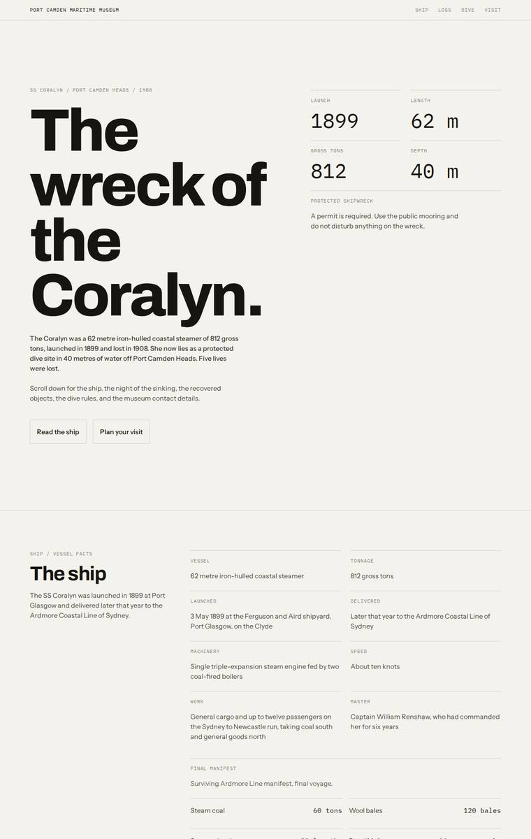
Composite 70.3%Judge 3.8/5
Judge panelAnthropic 3.0/5OpenAI 3.8/5Google 3.5/5
single-judge (Claude) 3.0/5 → leave-one-family-out 3.8/5
Anthropic: All required content sections are present and correct: hero, the ship facts, the night of the sinking with the five lost named, the manifest, the three depth bands (bow 28m, boilers 34m, debris field 40m), all six artifacts, the timeline, dive access rules with both charter operators, and plan-your-visit with contact and school-pack details. However the build is a uniformly light, beige editorial document with no visual attempt at the museum's central request - the sense of descent, water closing over, light going, the wreck arriving from the dark - so it reads as flat and atmospheric-neutral.
OpenAI: The page includes nearly all required content accurately: hero, ship facts, sinking, depth bands, artifacts, timeline, rules, and visit/contact details. The layout is clean, consistent, and readable with strong editorial typography, but the experience does not visibly deliver the requested descent into darkness or a particularly immersive wreck atmosphere. It feels polished and competent, though more restrained than memorable or premium.
Google: The layout features strong typography and rigorous grid alignment. However, it misses the brief's core experiential requirement to simulate a descent, resulting in a sterile aesthetic that lacks narrative impact.
Elias Byrne (Opus 4.8)
High reasoning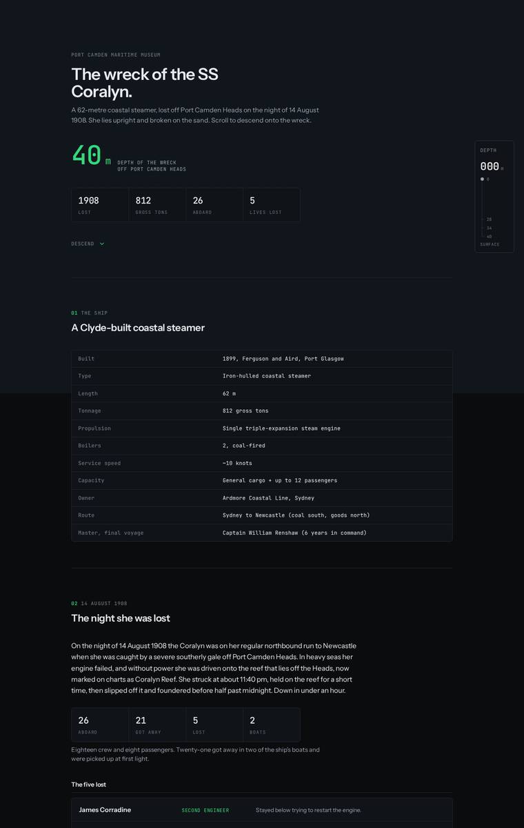
Composite 68.8%Judge 3.8/5
Judge panelAnthropic 4.0/5OpenAI 3.8/5Google 2.5/5
single-judge (Claude) 4.0/5 → leave-one-family-out 3.8/5
Anthropic: All required sections are present and content-faithful: hero, ship facts, the night lost with the five named plainly, the manifest, three depth bands (28/34/40m), a six-row artifact table, the launch-to-protection timeline, dive access rules with both operators, and a plan-your-visit block with contact details and a school-pack form. The execution is coherent and disciplined - a dark, monospace "engineering dossier" aesthetic with a single mint-green accent, generous spacing, and clean aligned tables, finished with no visibly broken bits. It reads as competent and consistent but stays flat and
OpenAI: The build includes nearly all required sections and factual content, with a clear descent structure, manifest, timeline, dive rules, and visit information, though the recovered artifact descriptions and school-pack email are not visibly presented in the screenshot. The visual system is coherent and polished, with strong dark maritime atmosphere and good typographic consistency, but it is quite table-heavy and restrained, with limited imagery or dramatic payoff for the wreck story. Overall it feels finished and usable, but not especially distinctive or emotionally memorable.
Google: The design includes all required text but presents it as a sterile, technical dashboard heavily reliant on data tables, stripping the narrative of its emotional weight. It fails to meet the core experience requirement of an atmospheric descent, as the site is uniformly dark from the top with no sense of transition or discovery.
Yuki Tanabe (gpt-5.4-mini)
High reasoning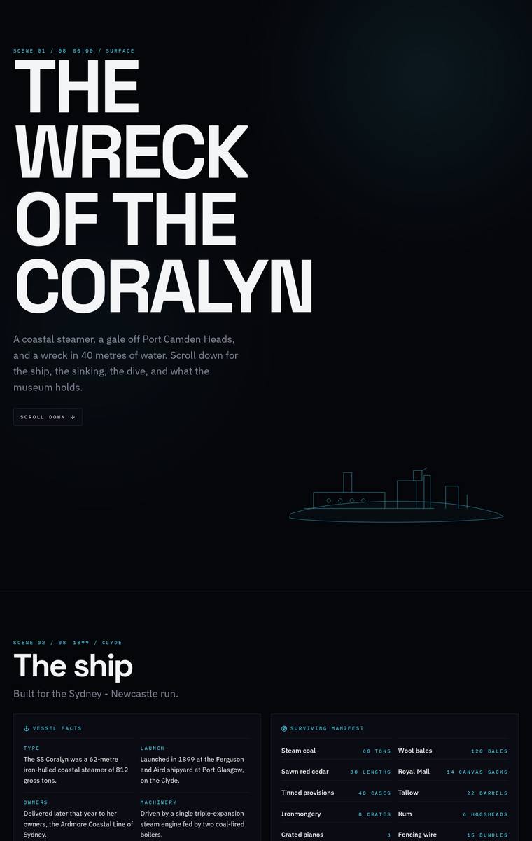
Composite 68.8%Judge 3.8/5
Judge panelAnthropic 3.0/5OpenAI 4.0/5Google 3.0/5
single-judge (Claude) 3.0/5 → leave-one-family-out 3.8/5
Anthropic: All required sections are present and content-complete: hero, ship facts with the cargo manifest, the night of the sinking with the five lost named, the three depth bands, six recovered artifacts, timeline, dive access rules, and plan-your-visit with contacts and the school-pack ask. However the execution is visually monotone - nearly every section is the same flat dark-navy block with small label-and-body pairs, so the museum's central "descent" idea (light going, wreck arriving from the dark) never really registers as a visual progression. Type is competent but uniform and several panels rea
OpenAI: The build includes all required sections with most facts, names, dates, artifacts, rules, and visit details visible and accurate, though the dive band content appears partly abbreviated in the static screenshot. The visual system is coherent and atmospheric, with strong typography and a clear descent-like dark maritime tone, but the repeated card layouts and sparse imagery make it feel slightly less rich than a top-tier museum microsite.
Google: All required content and sections are accurately included. However, the visual execution resembles a technical dashboard rather than an immersive storytelling experience, lacking imagery or layout variation to create a premium feel.
Noor El-Amin (claude-haiku-4-5)
default reasoning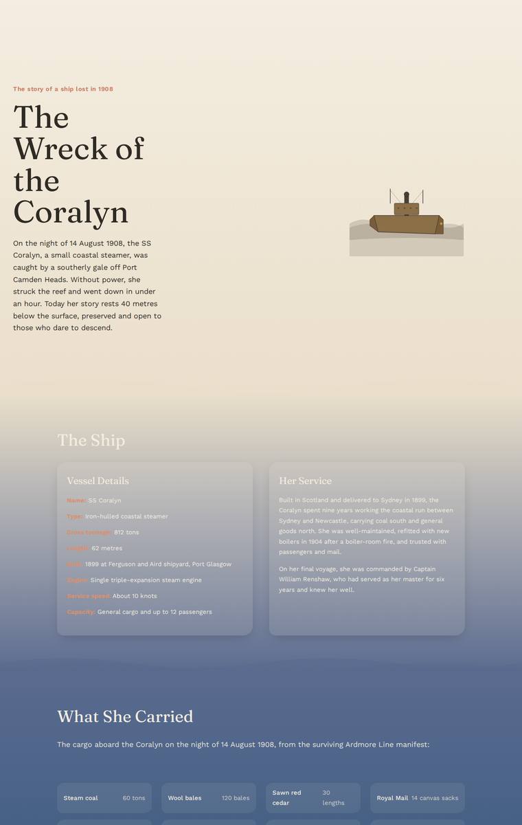
Composite 67.2%Judge 3.7/5
Judge panelAnthropic 3.3/5OpenAI 3.5/5Google 3.0/5
single-judge (Claude) 3.3/5 → leave-one-family-out 3.7/5
Anthropic: All required sections are present and the content is used faithfully: hero, the ship, the manifest, the night of the sinking with the five named lost, the three depth bands, six recovered artifacts, timeline, dive rules, and plan-your-visit. The strongest idea is the descent gradient, moving from a parchment surface through deepening ocean blue to near-black at the debris field, which reads as the museum's requested downward journey. Execution is let down by legibility: the ship-facts cards, several mid-page blocks, and the faded plan-your-visit panel sit at very low contrast (dark text on dar
OpenAI: The page includes the required sections, manifest, three depth bands, six artifacts, timeline, rules, operators, and visit details, though some required wording is condensed and the dive/descent reads more as static cards than a clearly interactive feature. The visual concept of descending from a pale surface into deep blue is coherent and appropriate, but some sections have weak contrast and the plan-your-visit cards are particularly hard to read. Overall it is polished and complete, but the illustration and layout treatment feel restrained rather than memorable or premium.
Google: The design successfully includes all required content and employs a thematic background gradient to simulate descent. However, heavy reliance on generic translucent cards creates a repetitive layout, and severe color contrast failures in the footer render vital text unreadable. The basic inline SVG illustrations lack the premium polish expected for a modern museum microsite.
Ingrid Kessler (deepseek-v4-flash)
default reasoning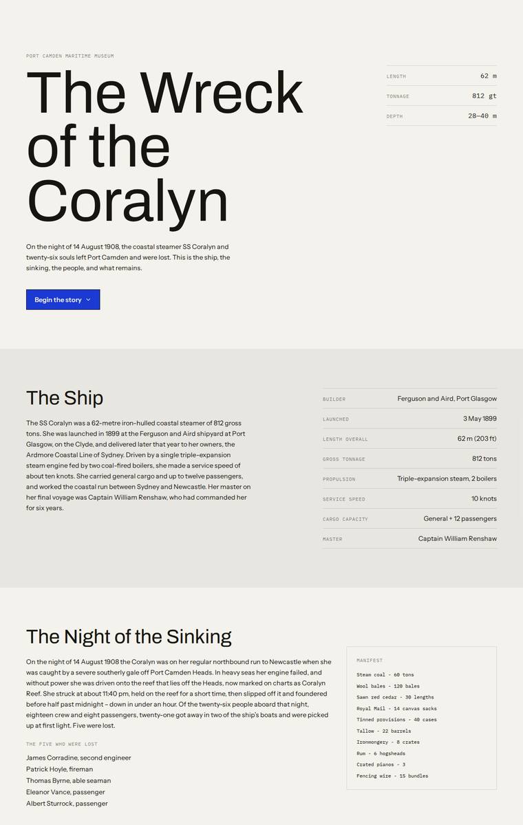
Composite 67.2%Judge 3.7/5
Judge panelAnthropic 4.0/5OpenAI 3.8/5Google 2.3/5
single-judge (Claude) 4.0/5 → leave-one-family-out 3.7/5
Anthropic: All required sections are present and content-correct: hero, the ship's facts table, the sinking with the five named lost and the full manifest, three depth bands (Bow/Boilers/Debris Field), all six recovered artifacts, the timeline, dive access rules with both charter operators, and Plan Your Visit with contacts plus the teacher school-pack request. The execution is a clean, confident editorial system - big Archivo display type, cream/ink palette, a single dark band for the dive section - that is coherent and tasteful but largely flat; the brief's signature ask of a felt descent into darkness
OpenAI: All required sections and most fixed facts are visible, including the six artifacts, timeline, dive rules, operators, and visit/school contact details, though several artifact and timeline descriptions are significantly abbreviated and the descent/interactive idea is only lightly expressed as a dark section. The visual system is clean, restrained, and well spaced, but it feels more like a polished editorial page than a distinctive wreck microsite, with limited atmosphere or memorable storytelling impact.
Google: The build includes all requested sections but severely truncates the artifact descriptions, violating the instruction to keep fixed content intact. Visually, it resembles a mid-fidelity wireframe with basic typography and plain background blocks, completely failing to deliver the evocative 'descent' experience the museum requested.
Mara Vieira (claude-sonnet-5)
High reasoning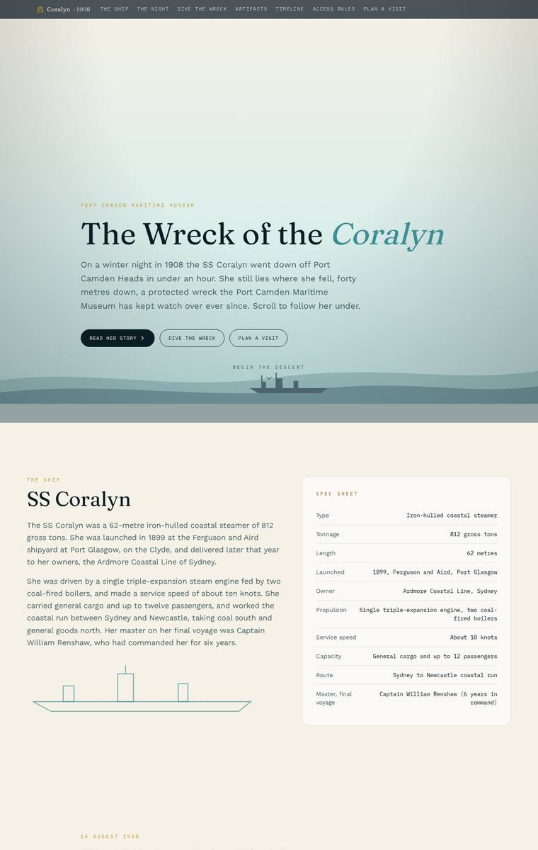
Composite 65.6%Judge 3.6/5
Judge panelAnthropic 3.3/5OpenAI 3.8/5Google 3.0/5
single-judge (Claude) 3.3/5 → leave-one-family-out 3.6/5
Anthropic: All required sections are present and content-faithful: hero, ship fact-sheet, night of the sinking with named lost, manifest, depth-band descent, six artifact cards, timeline, dive rules, and a Plan Your Visit block with contacts and school-pack form. The hero has a genuinely atmospheric maritime water treatment, but the concept is abandoned below the fold: the body stays flat beige with no darkening descent gradient, and several sections (night, timeline, dive rules) render as very low-contrast faint text that reads as washed-out and unfinished. It is competent and complete but not distincti
OpenAI: All major required sections appear to be included, with the ship facts, sinking, manifest, artifacts, timeline, access rules, and visit/school-pack information represented, though the dive section only visibly details one depth band and some required text is very hard to read. The visual system is elegant and coherent with a strong maritime descent mood, but excessive low-contrast fading across several sections hurts readability and polish. Overall it feels refined and memorable, but the accessibility and legibility issues keep it from top marks.
Google: The layout includes all required content and establishes a fitting nautical theme with neat structural elements. However, severe color contrast failures render significant portions of the text completely illegible against the light background, fatally compromising both usability and overall design execution.
Ingrid Kessler (grok-4.3)
default reasoning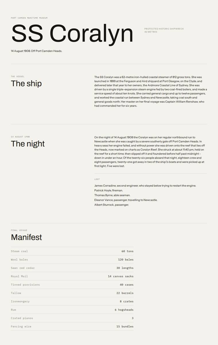
Composite 65.6%Judge 3.6/5
Judge panelAnthropic 3.3/5OpenAI 3.8/5Google 2.8/5
single-judge (Claude) 3.3/5 → leave-one-family-out 3.6/5
Anthropic: All required sections are present and content-accurate: hero, ship, the night with the five lost named, full manifest, a tabbed descent covering the three depth bands (28m/34m/40m), all six artifacts, timeline, dive rules, and plan-your-visit with contacts and the school-pack email. Execution is a clean, consistent Swiss-editorial layout with tidy monospace labels and well-aligned tables, so craft is solid. But the design is entirely flat, beige, and monochrome with no imagery or atmosphere, and it makes no visible attempt at the museum's central request - the feeling of descending into darken
OpenAI: The page includes nearly all required sections and content, with strong factual coverage of the ship, sinking, artifacts, timeline, access rules, and visit details, but the descent section only visibly presents the 28m bow band and omits visible detail for the other two bands and some dive-condition text. The visual system is clean, readable, and consistent with refined editorial typography, though it feels very restrained and does little to create the requested immersive descent into darker water. Craft is solid with no obvious broken elements, but the overall result is more polished document
Google: All mandatory content is clearly presented in a highly legible layout, but the execution entirely misses the brief's core experiential requirement to visually simulate a dark, underwater descent. The aesthetic remains stark and wireframe-like without thematic atmosphere, and a visible escaping typo slightly mars the finish.
Mara Vieira (grok-4.3)
default reasoning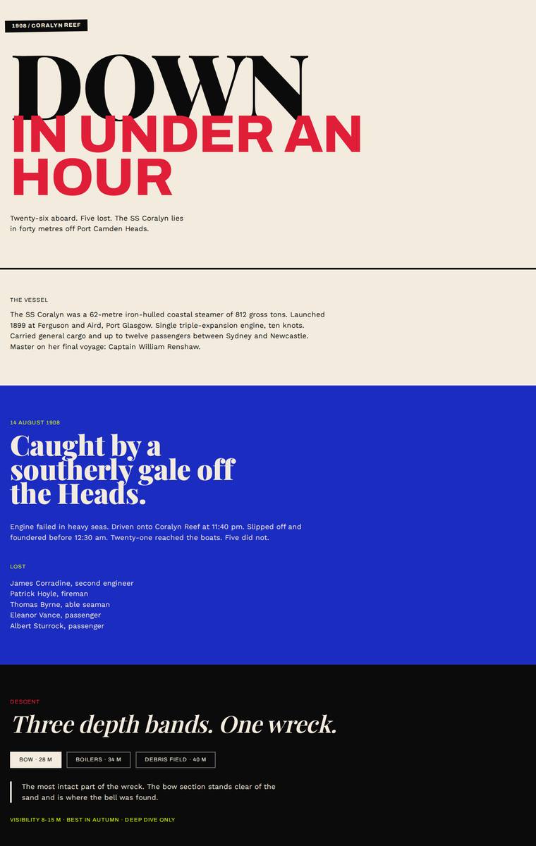
Composite 65.6%Judge 3.6/5
Judge panelAnthropic 4.0/5OpenAI 3.8/5Google 2.0/5
single-judge (Claude) 4.0/5 → leave-one-family-out 3.6/5
Anthropic: All required sections are present and content-accurate: hero, the vessel, the night with all five lost named, three depth bands (28/34/40 m), all six artifacts, timeline, protected-wreck rules with both operators, and plan-your-visit with contacts and the school-pack email to Harriet Doyle. The bold Swiss-editorial system (giant Archivo hero, Playfair serif accents, red/blue/black bands) is coherent, finished, and distinctive, and the oversized "DOWN IN UNDER AN HOUR" hero is a genuine stop moment. Its main weakness is the core "descent" ask: the colour arc oscillates cream-blue-black-cream-bl
OpenAI: The page includes most required sections and key facts, but it omits the cargo manifest, heavily compresses several required descriptions, and only the bow depth-band content is visible in the static screenshot. The visual direction is bold and cohesive, with strong typography and a clear descent-like tonal shift, though the execution is more editorial/minimal than deeply immersive.
Google: The design aggressively truncates the provided copy, violating the instruction to use it 'substantially as written.' It also fails the requested 'descent' experience by alternating between light and dark backgrounds rather than getting progressively darker. Visually, the stark brutalist approach feels barren and lacks immersive storytelling impact.
Noor El-Amin (deepseek-v4-flash)
default reasoning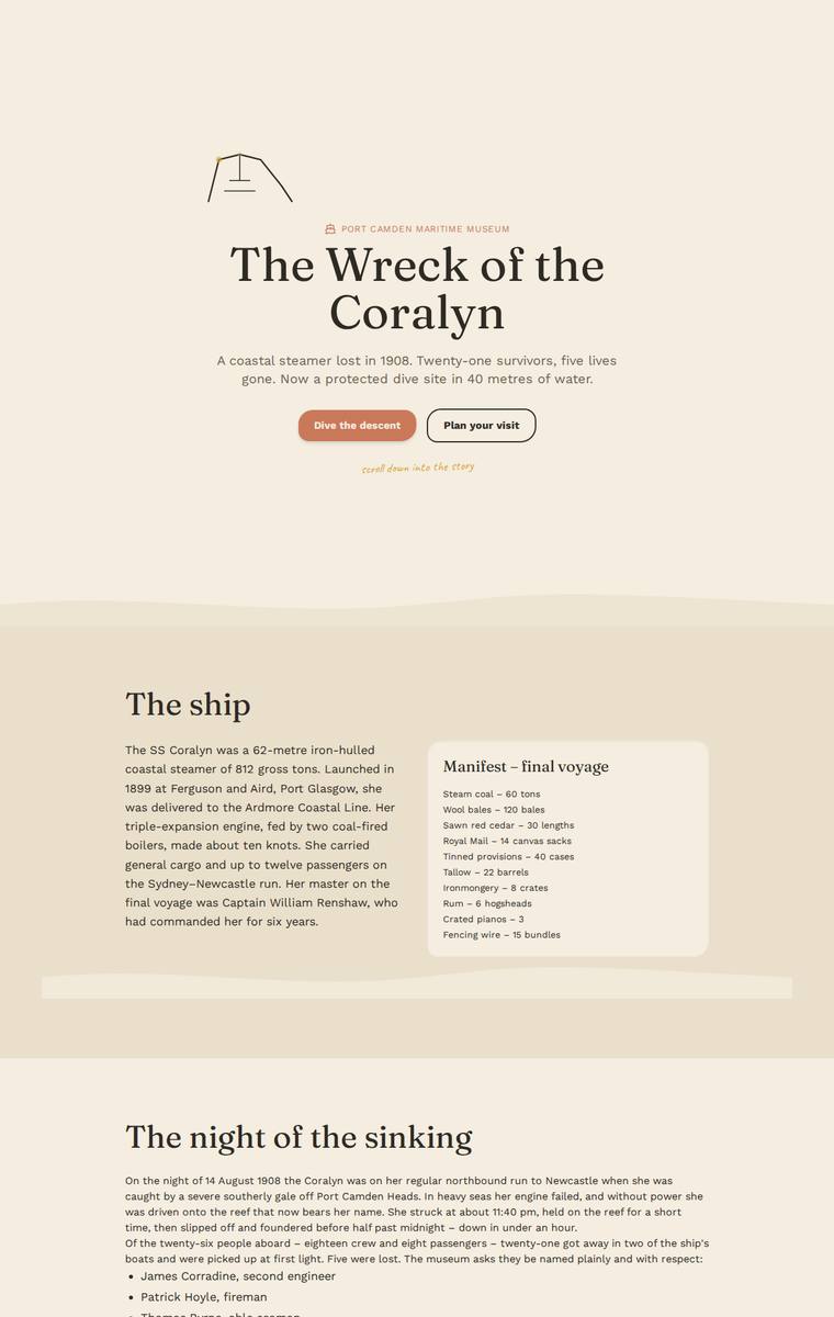
Composite 65.6%Judge 3.6/5
Judge panelAnthropic 3.8/5OpenAI 3.3/5Google 2.8/5
single-judge (Claude) 3.8/5 → leave-one-family-out 3.6/5
Anthropic: Every required section is present and content-accurate: hero, ship facts with the manifest, the sinking with the five lost named, the three depth bands (bow 28m, boilers 34m, debris 40m), all six artifacts, the full timeline, dive rules, and plan-your-visit with contacts and the school-pack request. The descent concept reads well visually, with the cream surface darkening through progressively deeper blue dive bands into near-black, plus a tasteful serif/terracotta palette. Craft is let down by visible defects: the timeline date markers are truncated (showing "904", "953", "976", "004" instead
OpenAI: All major required sections are visible and the overall story structure is present, but several mandated details are abbreviated or missing, especially the dive conditions/safety facts and fuller descriptions of those lost and artifacts; the timeline also visibly clips the first characters of dates. The visual system is coherent and tasteful with strong type and a calm maritime palette, but the execution is fairly simple and the timeline bug plus minimal descent treatment reduce polish and impact.
Google: Includes all required content with an appropriate maritime color palette. However, a prominent text-overlap bug in the timeline detracts from the finish, and the descent section relies on simple color blocking rather than an immersive experience.
Elias Byrne (claude-haiku-4-5)
default reasoning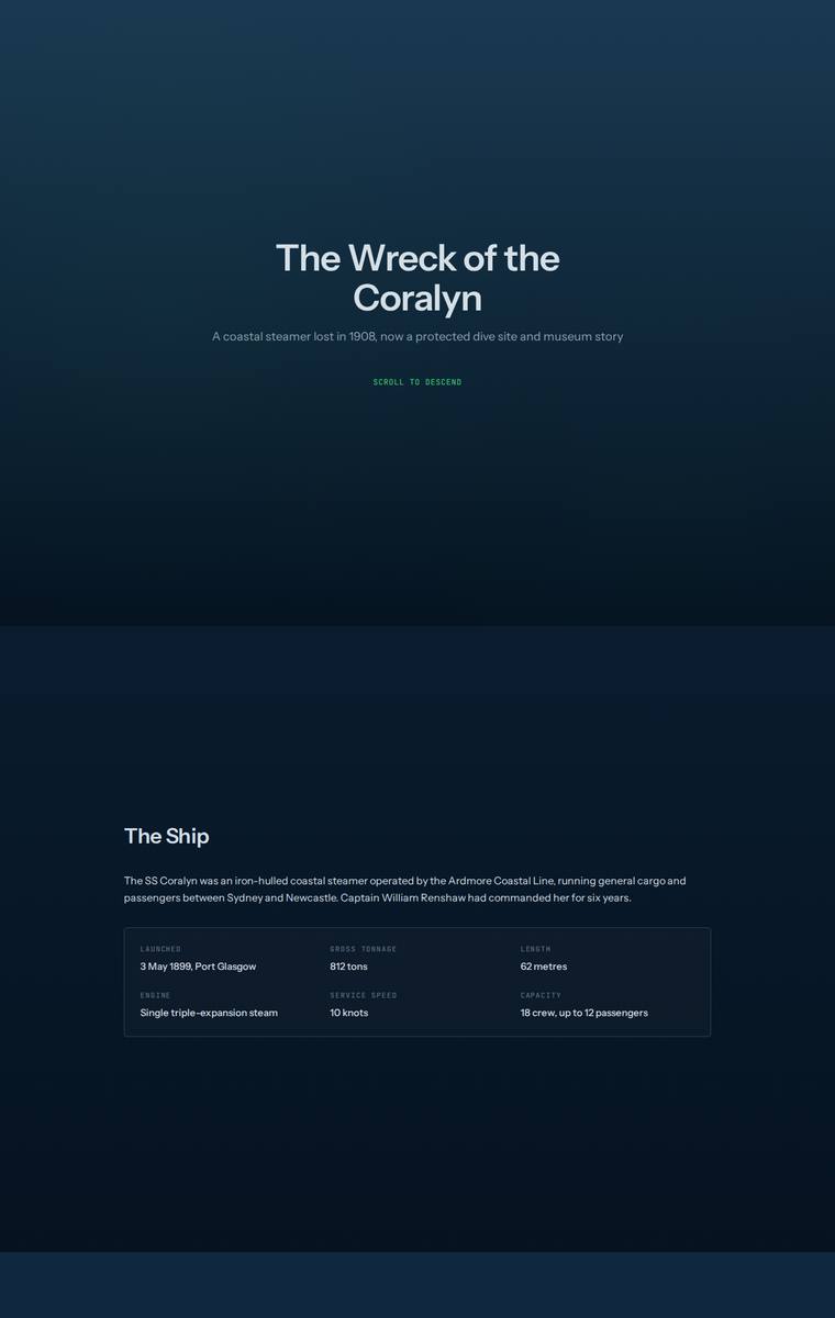
Composite 64.1%Judge 3.6/5
Judge panelAnthropic 3.3/5OpenAI 2.8/5Google 3.5/5
single-judge (Claude) 3.3/5 → leave-one-family-out 3.6/5
Anthropic: All required sections are present and content-complete: hero, ship facts, the night with the five named lost, the cargo manifest, three depth bands, six recovered artifacts, timeline, access rules, and plan-your-visit with contact and school-pack details. The dark navy palette shifting from surface to depth is an on-brief nod to the descent concept, but the execution is plain and low-contrast: uniformly small type with weak hierarchy, near-identical blue cards throughout, and monotonous single-column pacing that reads generic rather than premium. Craft is competent and consistent with no obvio
OpenAI: All major required sections are visible and the core facts are mostly present, but much of the mandated copy is heavily condensed, some details are missing, and the required interactive dive/descent reads as static cards. The visual system is clean and readable with a coherent blue descent palette, but it is very text-heavy and generic, with little imagery or atmospheric storytelling. Craft is generally consistent, though the timeline/date treatment appears cramped or clipped in places, and the overall result lacks the premium distinctiveness the brief invites.
Google: The design cleverly uses a deepening background gradient to simulate the requested descent into the wreck, and all required content is thoughtfully structured. However, a significant layout bug in the timeline obscures text, and overall the visual presentation feels slightly rigid and utilitarian rather than premium.
Ingrid Kessler (grok-4.20-reasoning)
default reasoning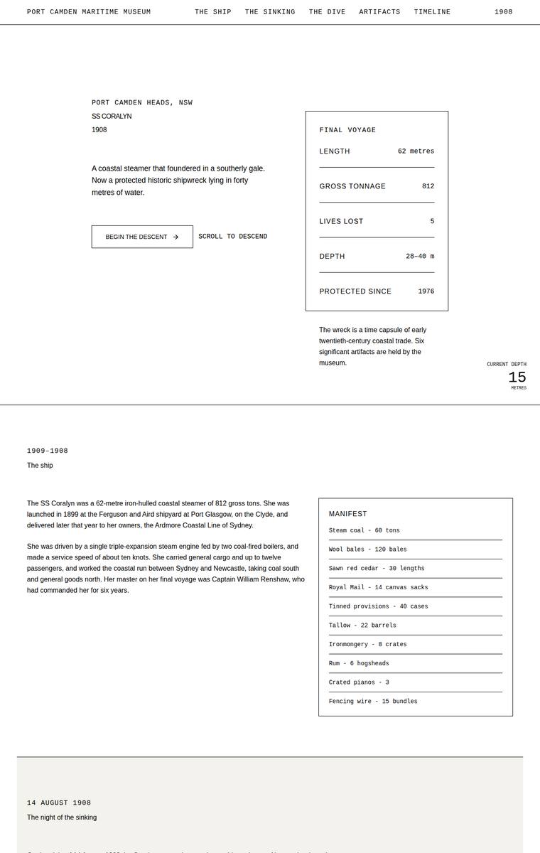
Composite 64.1%Judge 3.6/5
Judge panelAnthropic 3.8/5OpenAI 3.3/5Google 2.8/5
single-judge (Claude) 3.8/5 → leave-one-family-out 3.6/5
Anthropic: Every required section and fact is present and correct - hero facts panel, manifest, all five named lost, three depth bands, all six artifacts with years, full timeline, dive rules, both operators, and the visit/school-pack block. The editorial newspaper aesthetic is coherent and typographically disciplined, but it runs very light and sparse with large empty columns, and it almost entirely misses the brief's core request to carry the reader down into darkness - the single small dark wreck image reads like a placeholder. Craft is clean and consistent, but the overall result feels like a well-se
OpenAI: The page includes nearly all required sections and most fixed content, including ship facts, sinking, dive bands, artifacts, timeline, rules, and visit details, but there are visible fidelity/copy issues such as malformed timeline dates, a typo in the ship date range, and the school email address is not plainly shown. The minimalist monochrome grid is coherent and readable, but it does little to create the requested sense of descending into the wreck, and several details feel rough or underdeveloped rather than premium.
Google: While the design includes all required sections, it completely ignores the brief's experiential request to simulate a descent into darkness, maintaining a stark, bright theme throughout. The brutalist aesthetic is heavily utilitarian, and execution suffers from noticeable craft issues, including overlapping icons in the timeline and awkwardly misplaced content in the footer grid.
Yuki Tanabe (grok-build-0.1)
default reasoning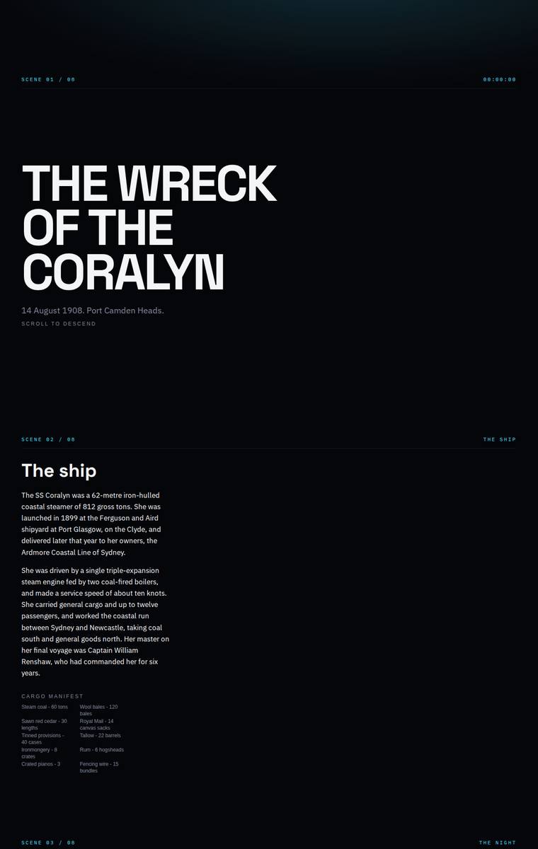
Composite 64.1%Judge 3.6/5
Judge panelAnthropic 3.0/5OpenAI 3.8/5Google 3.3/5
single-judge (Claude) 3.0/5 → leave-one-family-out 3.6/5
Anthropic: All required sections appear present and correct: the "scene 01/08"-framed hero, the ship facts with cargo manifest, the night of the sinking with the five named lost, a depth-band descent diagram, the six recovered artifacts, the timeline, dive access rules, and plan-your-visit with the museum contacts and school-pack email, so brief fidelity is strong. The dark navy palette with teal mono labels and the bold Archivo-style display headings give it a coherent, moody editorial tone that suits the descent concept. However the static capture reveals large tracts of dead black space, especially th
OpenAI: All required sections and fixed factual content appear to be present, including the lost names, manifest, three depth bands, artifacts, timeline, access rules, operators, and visit/school contact details. The stark black-and-cyan treatment is coherent and supports the descent mood, but the page is very sparse with large empty areas and some notably small text, which weakens readability and visual richness. Craft is generally consistent and finished, though the result feels more like a restrained data dossier than a premium, memorable museum microsite.
Google: The build successfully incorporates all required content within a dark, terminal-style interface that fits the underwater theme. However, the visual execution is overly stark, and a massive layout gap in the descent section significantly disrupts the page flow.
Elias Byrne (gemini-3.5-flash)
default reasoning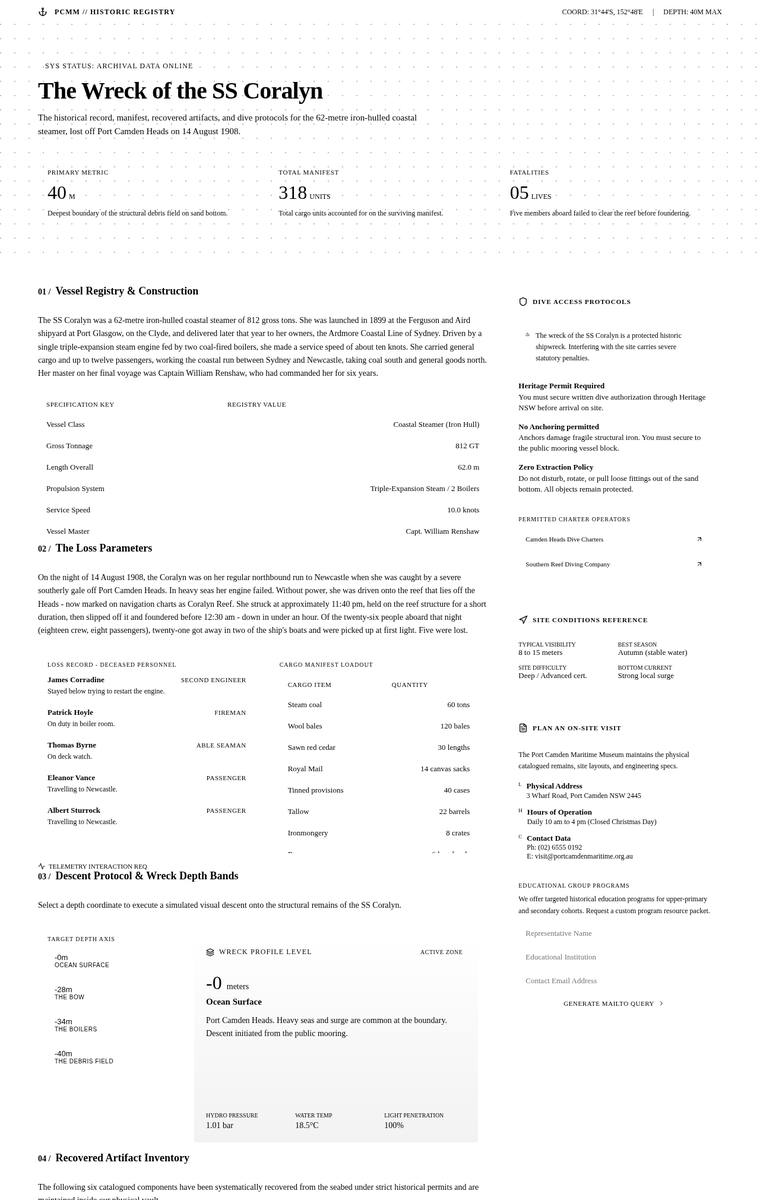
Composite 60.9%Judge 3.4/5
Judge panelAnthropic 3.0/5OpenAI 2.8/5Google 3.0/5
single-judge (Claude) 3.0/5 → leave-one-family-out 3.4/5
Anthropic: All the required sections are present and the fixed facts are handled well: the ship registry, the loss parameters with the five lost named respectfully, the interactive depth-band picker, all six artifacts with recovery dates, the timeline, dive access rules, and a plan-your-visit block with contacts and a school-pack form. The execution is a coherent "archival registry" point of view with monospace labels, a dotted grid, and serif headings, but it is a flat, uniformly bright white document that reads as a dense data sheet. It entirely misses the museum's central experiential request - the se
OpenAI: Most required sections are visible, including the ship, sinking, artefacts, timeline, access rules and visit information, but key brief details appear incomplete or hidden, especially the full manifest, the three depth-band descriptions, and the named school-pack contact/email. The monochrome archival-register treatment is coherent and consistent, but it feels very static and text-heavy, with little sense of descent, atmosphere, or premium storytelling impact.
Google: The archival aesthetic is visually striking and features excellent typography, but it completely ignores the museum's core request to create an atmospheric, scrolling descent experience. Additionally, a severe layout bug causes the cargo manifest to be cut off and overlapped by the subsequent section.
Noor El-Amin (grok-4.3)
default reasoning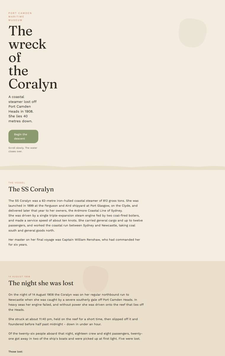
Composite 60.9%Judge 3.4/5
Judge panelAnthropic 3.0/5OpenAI 3.5/5Google 2.5/5
single-judge (Claude) 3.0/5 → leave-one-family-out 3.4/5
Anthropic: All required sections are present and content-accurate: hero, the ship, the night lost (with the five named respectfully), a three-band descent panel, all six artifacts, the timeline, dive rules, and plan-your-visit with contacts and the school-pack email. But the whole page renders in one flat warm-cream palette top to bottom, so the museum's central request - the feeling of descending into darkness onto the wreck - is entirely absent visually; nothing darkens, cools, or shifts. The layout is clean but plain and undesigned, with awkward narrow hero wrapping (one word per line, tight sub-copy
OpenAI: The page includes the main required sections and most core facts, but it omits the cargo manifest entirely and abbreviates several fixed descriptions, especially the lost persons, dive conditions, and artifact details. The editorial beige palette and serif typography are coherent and polished, with good spacing and readable structure, but the descent experience is visually very restrained and lacks the immersive underwater impact the brief called for.
Google: The design completely ignores the brief's core experiential directive to simulate a descent into the dark, opting instead for a uniform, dry beige palette. It also omits the required cargo manifest content. While the typography is legible and the layout functional, the execution feels like a basic wireframe rather than an immersive, premium museum experience.
Mara Vieira (grok-4.20-reasoning)
default reasoning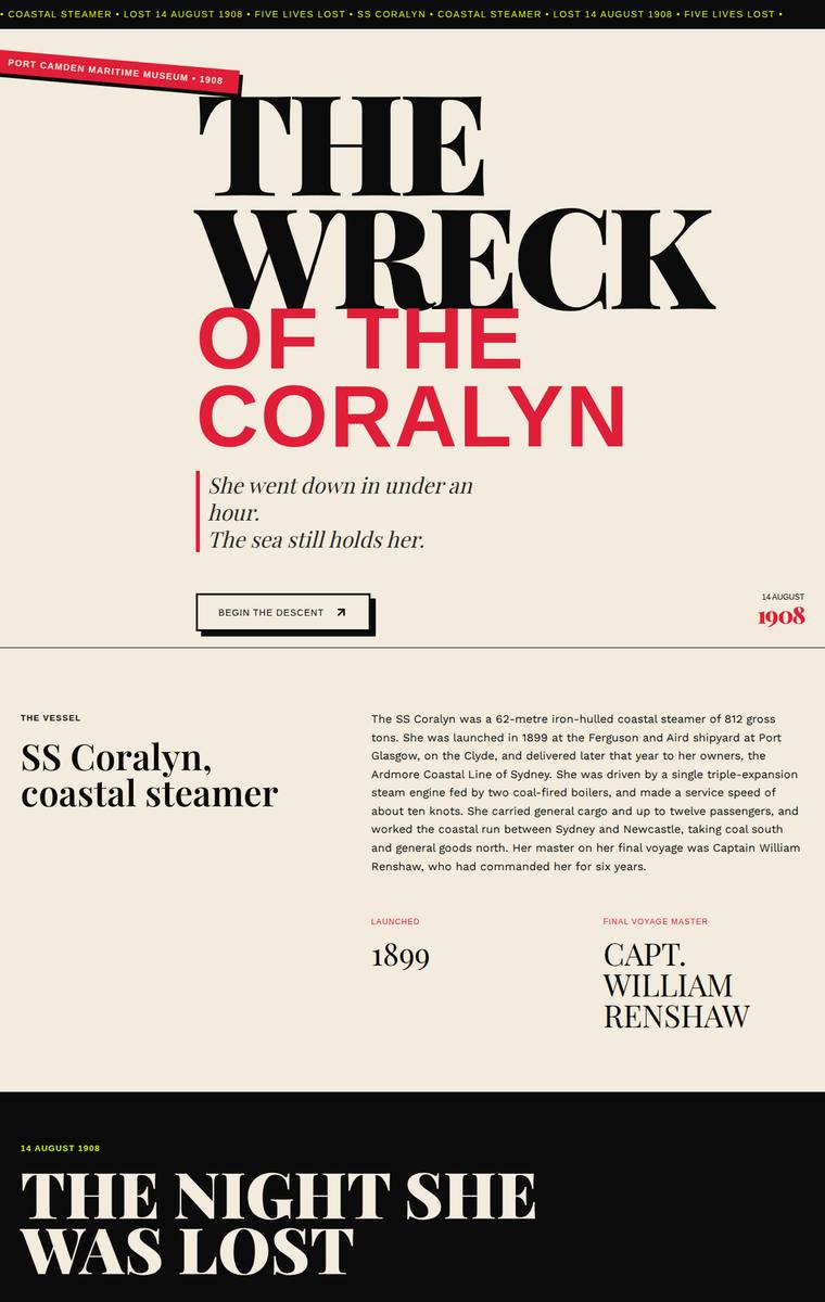
Composite 60.9%Judge 3.4/5
Judge panelAnthropic 3.0/5OpenAI 3.0/5Google 2.8/5
single-judge (Claude) 3.0/5 → leave-one-family-out 3.4/5
Anthropic: The editorial system is genuinely strong: a bold Playfair-style display hero ("THE WRECK OF THE CORALYN"), confident red accents on cream, and dark descent sections that support the "carry the visitor down" concept, with ship facts, the named lost, manifest, three depth bands (28/34/40m), rules, and plan-your-visit all present. But two required sections render as large empty black voids in the static view: the "Six artifacts" section shows only a heading and no artifacts, and the "From launch to protection" timeline shows only a heading and a thin line with no content, which reads as broken an
OpenAI: The top half has a strong editorial maritime identity and includes the hero, vessel, sinking, manifest, descent outline, rules, and visit details with generally accurate content. However, the six artifacts and timeline content are visibly missing, and the dive section only shows one depth-band description, leaving major brief requirements incomplete. The large blank sections make the build feel unfinished despite the distinctive visual direction.
Google: The design establishes a striking, premium editorial aesthetic with excellent typography and a fitting high-contrast color palette. However, the build suffers from critical omissions: the 'Six artifacts' and 'A brief history' (timeline) sections are entirely empty, missing essential required content. While the visible sections are well-crafted, these massive blank spaces severely undermine the fidelity and overall execution.
Yuki Tanabe (deepseek-v4-pro)
default reasoning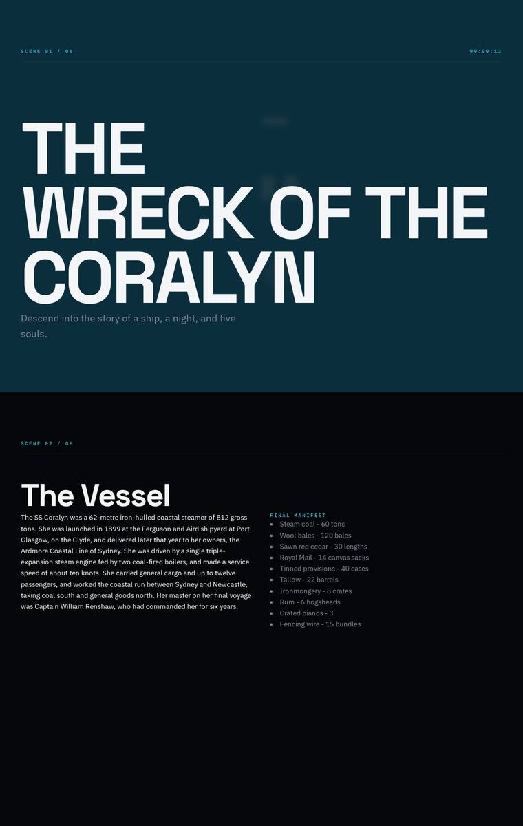
Composite 60.9%Judge 3.4/5
Judge panelAnthropic 2.8/5OpenAI 3.3/5Google 3.5/5
single-judge (Claude) 2.8/5 → leave-one-family-out 3.4/5
Anthropic: Content coverage is strong: the hero, vessel facts, manifest, the night with the five lost named, three depth bands, six recovered artifacts, timeline, dive guidance and a Plan Your Visit block with contacts and a school-pack form are all present. But the execution is thin and janky - the depth-band labels (The Bow / The Boilers / The Debris Field) sit as faint right-aligned ghost text bleeding off the edge, and vast stretches of flat dark space between sections read as unfinished or failed-to-render rather than deliberate descent. Type is small and sparse, composition is weak, and nothing her
OpenAI: All major required content appears to be present, including the ship, sinking, manifest, depth bands, artifacts, timeline, dive rules, operators, and visit/school contact details. The dark descending editorial treatment fits the brief, but the execution is very sparse with large empty stretches, tiny/low-contrast body text, and some awkward right-edge composition in the dive section, making it feel more like a stylish draft than a polished museum microsite.
Google: The design includes all required content and establishes a moody, appropriate aesthetic with strong typography and a fitting dark color palette. However, the enormous empty vertical spaces in the 'descent' section severely disrupt the visual flow and composition of the static page, suggesting a poorly handled fallback for a 3D or scroll-based interactive element. While individual sections like the timeline and artifacts are neatly structured, the overall layout feels disjointed due to these massive gaps.
Mara Vieira (deepseek-v4-pro)
default reasoning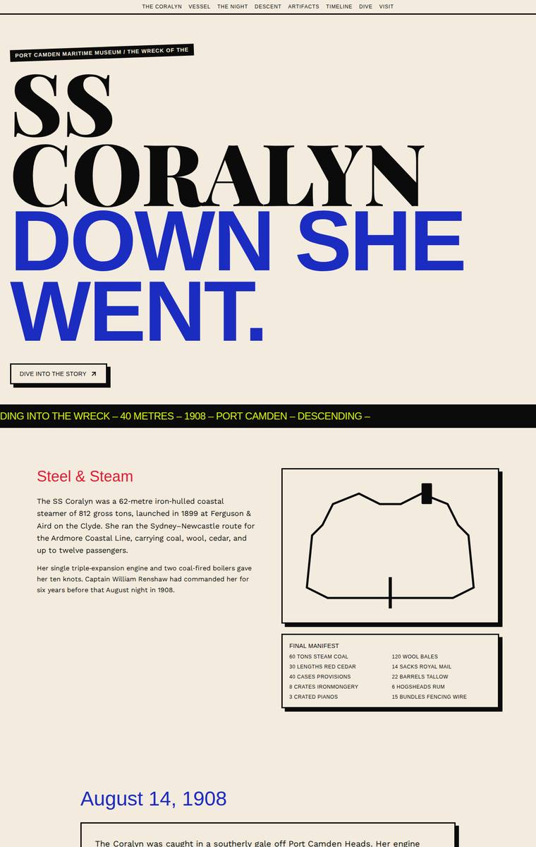
Composite 59.4%Judge 3.4/5
Judge panelAnthropic 2.5/5OpenAI 3.5/5Google 2.8/5
single-judge (Claude) 2.5/5 → leave-one-family-out 3.4/5
Anthropic: All required sections are present and content-correct: a strong typographic hero ("SS CORALYN / DOWN SHE WENT"), ship facts with a line-drawn SVG and cargo manifest, the sinking with the five lost named respectfully, the six artifacts, the timeline, the dive-access rules, and plan-your-visit contact details. But the flagship interactive descent/depth-band section renders as an enormous flat blue void occupying roughly a third of the page, with illegible red axis text on the left edge - a broken, janky centrepiece that also undercuts the museum's core "carry the visitor down" ask. The abrupt cr
OpenAI: The build includes the major required sections and much of the fixed content, with a strong descent concept and all six artefacts visible, but it omits or alters important specifics such as the third depth-band card, dive-condition facts, exact timeline dates, and the school-pack email. The visual direction is bold and memorable with confident type and colour, though the huge empty blue descent area, clipped depth labels, and some compressed content make the execution feel less polished.
Google: The brutalist aesthetic provides a strong initial impact with bold typography and consistent offset-shadow motifs. However, a massive layout gap in the descent section breaks the narrative flow and hides the 40-metre depth band, negatively impacting overall polish.
Mara Vieira (gemini-3.1-pro-preview)
High reasoning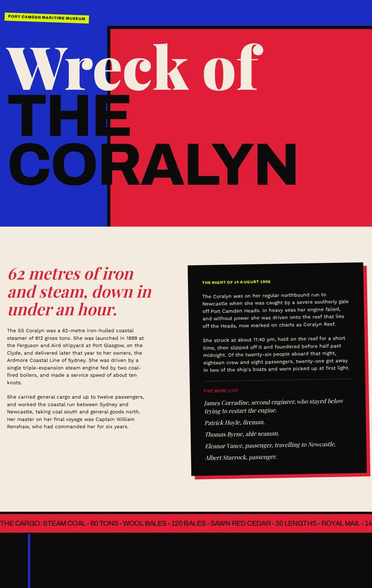
Composite 56.3%Judge 3.3/5
Judge panelAnthropic 3.5/5OpenAI 3.5/5Google 2.3/5
single-judge (Claude) 3.5/5 → leave-one-family-out 3.3/5
Anthropic: Bold, coherent Bauhaus/Swiss-modernist treatment with primary-colour blocks, huge Archivo-Expanded display type, a running cargo-manifest ticker, clean artifact cards, timeline, rules panel and a strong visit close with contact details and the school-pack request - most required sections are present and content is accurate. However, a very large empty black void dominates the upper-middle (the interactive descent / three depth-band section), showing no readable depth-band information in the static frame; the brief requires that content to stay readable without motion/WebGL, so this reads as a
OpenAI: The page includes the main story, artifacts, timeline, access rules, and visit information, but the required dive/descent depth-band section appears as a huge mostly empty black area with no visible bow/boilers/debris-field facts, and the manifest is only partially visible as a ticker. The bold editorial/brutalist visual system is distinctive and often well composed, though the blank descent section and some missing practical details, such as the school-pack email, make the build feel unfinished.
Google: The design fails significantly on fidelity by entirely omitting the required content for the three depth bands and dive conditions, leaving a massive empty black void instead. Furthermore, the bright, neo-brutalist primary color palette feels jarringly inappropriate for a historical tragedy, completely ignoring the requested somber 'descent' experience.
Noor El-Amin (grok-4.20-reasoning)
default reasoning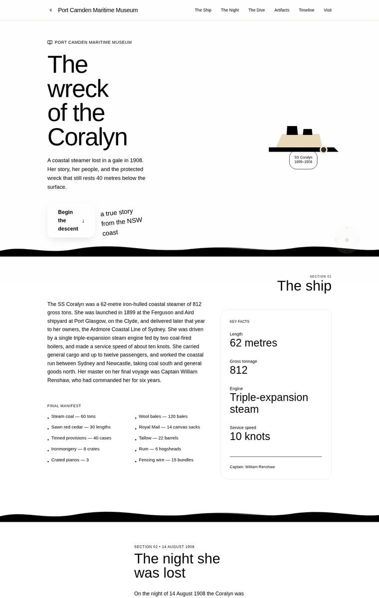
Composite 54.7%Judge 3.2/5
Judge panelAnthropic 2.5/5OpenAI 3.0/5Google 2.3/5
single-judge (Claude) 2.5/5 → leave-one-family-out 3.2/5
Anthropic: All required sections are present and content-correct: hero, the ship's facts (62m, 812 tons, triple-expansion, 10 knots), the manifest, the night lost with the five named, the three depth bands (bow 28m, boilers 34m, debris field 40m), six artifacts, timeline, dive rules, and plan-your-visit with contacts. But the page is dominated by heavy black wavy bands slicing across nearly every section, which read as broken rendering rather than a considered darkening-descent, and the artifacts grid has clear text collisions where the "debris field" card overlaps adjacent artifact copy. The clean serif
OpenAI: Most required sections and facts are present, including the ship details, sinking, manifest, artifacts, timeline, dive bands, access rules, operators, and museum visit information, though the school-pack email and the full penalties/fines wording are not clearly visible. The minimalist monochrome maritime treatment has a coherent point of view, but several serious layout issues undermine it: descent cards overlap the artifacts section, text collides, wave dividers cut awkwardly through content, and the dark visit section has poor contrast. The concept has some memorability, but the unfinished
Google: The design attempts a clean approach but suffers from catastrophic layout failures. Overlapping elements in the descent and artifacts sections render text unreadable, indicating poor craft and execution. Consequently, the requested immersive feeling of descent is completely lost.
Ingrid Kessler (grok-build-0.1)
default reasoning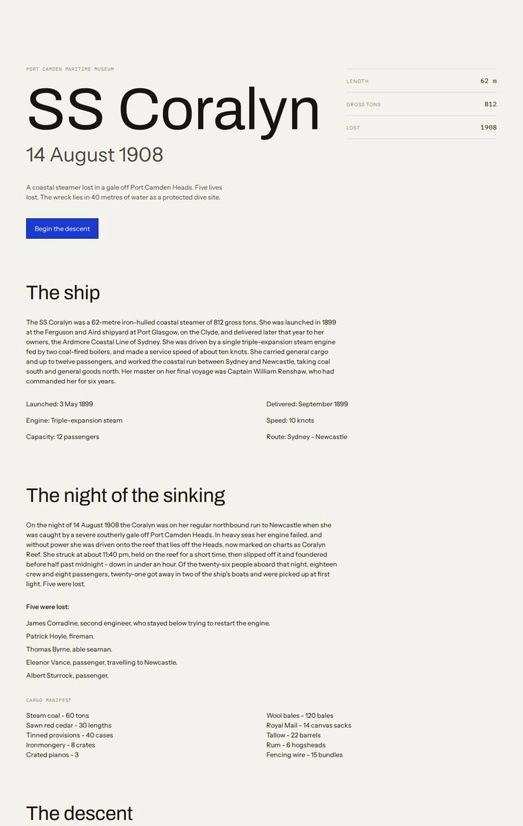
Composite 53.1%Judge 3.1/5
Judge panelAnthropic 3.0/5OpenAI 3.0/5Google 2.5/5
single-judge (Claude) 3.0/5 → leave-one-family-out 3.1/5
Anthropic: All required sections are present and content is accurate: hero with ship stats, the ship facts, the sinking with the five named lost and the full cargo manifest, the three depth bands, all six recovered artifacts, the complete timeline, dive rules, and the plan-your-visit contacts and school-pack request. But the execution is a flat, light cream editorial page that completely misses the brief's core intent - to carry the visitor down into darkening water; there is no atmosphere of depth or wreck, and the "descent" interactive is just a small grey box with tiny rough SVG labels that reads as t
OpenAI: The page includes the required sections and most fixed content visibly, including the manifest, six artifacts, timeline, dive rules, and visit details, though the descent experience is only lightly represented and not especially immersive. The design is clean and readable with disciplined spacing, but it feels very plain and editorial, with little maritime atmosphere or premium visual treatment; the depth diagram in particular looks rudimentary. Overall it is functional and coherent, but not distinctive enough to create the requested sense of descending onto a wreck.
Google: While all requested content is present, the design completely ignores the brief's atmospheric requirement to convey a sense of underwater descent. The aesthetic resembles a low-fidelity wireframe with utilitarian typography and simplistic graphics, resulting in a purely functional but uninspiring experience.
Ingrid Kessler (deepseek-v4-pro)
default reasoning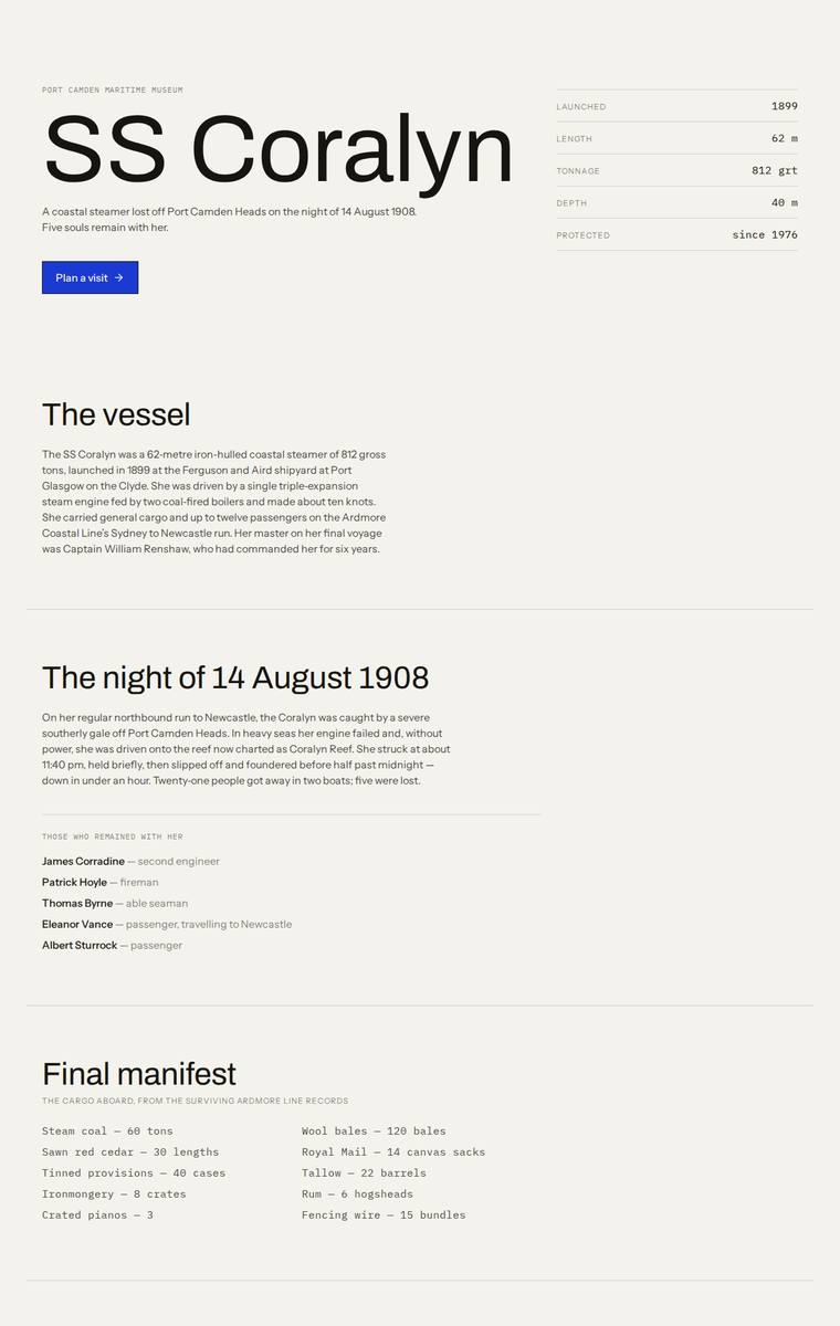
Composite 53.1%Judge 3.1/5
Judge panelAnthropic 3.0/5OpenAI 3.3/5Google 2.5/5
single-judge (Claude) 3.0/5 → leave-one-family-out 3.1/5
Anthropic: All required sections and fixed content are present and correct: the hero with vessel stats, the vessel, the night of the sinking with the five lost named respectfully, the full manifest, three depth bands, the six recovered artifacts, timeline, access rules, and plan-your-visit with contacts and the school-pack request. But this is a flat, light, monochrome editorial page that gives no visual sense of the brief's central ask - the descent into darkness onto the wreck - and the "wreck today" depth-band section renders as a broken-looking axis chart with tiny floating "28m/34m/40m 0" labels and
OpenAI: All required content areas are visible and the key facts are mostly correct, though the dive/descent section appears static and the requested sense of being carried down into the wreck is largely absent. The typographic, archival minimalism is coherent and tasteful, but the depth graphic feels underdeveloped and some sections are heavily compressed. Overall it is clean and usable, but not especially atmospheric or memorable for such a dramatic story.
Google: The build delivers the required text cleanly but completely ignores the brief's core experiential directive to visually simulate a descent into dark water. The sterile, document-like aesthetic lacks emotional resonance, and the depth band visualization appears to contain broken UI elements.
Yuki Tanabe (grok-4.3)
default reasoning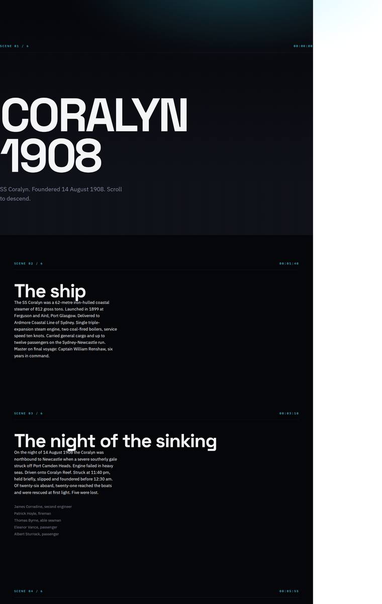
Composite 51.6%Judge 3.1/5
Judge panelAnthropic 2.8/5OpenAI 2.8/5Google 2.0/5
single-judge (Claude) 2.8/5 → leave-one-family-out 3.1/5
Anthropic: All required sections are present and correct: hero, the ship, the night of the sinking with the five named lost, a descent with the three depth bands (BOW/BOILERS/DEBRIS), the six recovered artifacts, the timeline, dive access and plan your visit, so brief fidelity is strong. But craft is badly hurt by an obvious layout failure - the content is jammed into a narrow left column with a large blank column filling the right ~20% of the page, and the hero "CORALYN" plus the intro line are clipped off the left edge. The dark, cinematic mono-label treatment (SCENE 01, timecodes) suits the descent co
OpenAI: The build includes the main required sections and the six artefacts, but much of the supplied content is heavily abbreviated, the manifest appears absent, and the timeline omits several required entries. The dark cinematic treatment has a clear point of view, but the page has major craft issues including a persistent white gutter on the right, clipped/awkward hero alignment, and sparse sections that feel unfinished rather than premium.
Google: The design fails the brief by heavily editing and omitting mandatory fixed content, including a major typo on the sinking year (1988 instead of 1908). Visually, it is overly stark with severe contrast issues in the descent section, resulting in an unfinished appearance.
Elias Byrne (deepseek-v4-pro)
default reasoning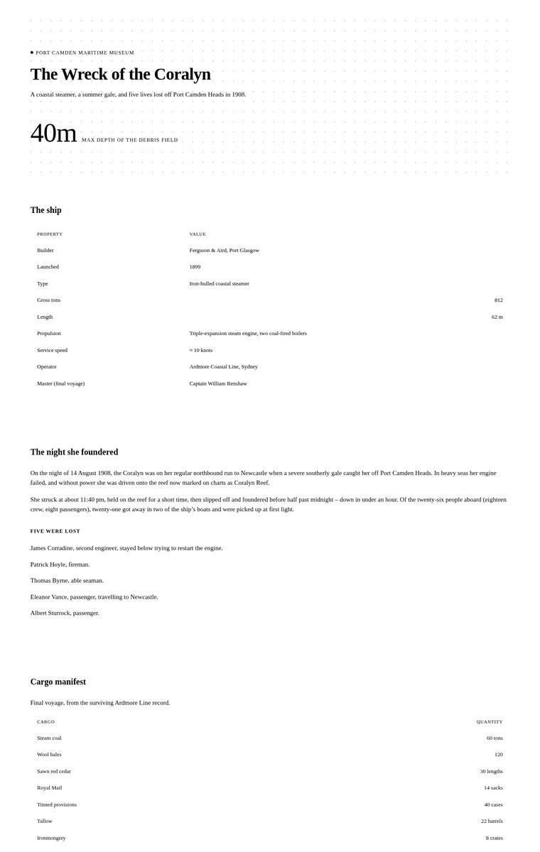
Composite 50.0%Judge 3.0/5
Judge panelAnthropic 2.8/5OpenAI 2.5/5Google 2.5/5
single-judge (Claude) 2.8/5 → leave-one-family-out 3.0/5
Anthropic: Clean editorial treatment with all required sections present and the fixed content (ship facts, five named lost, full manifest, six artifacts, timeline, access rules, visit details) faithfully reproduced. However, the interactive descent section renders as a near-black band with grey-on-black text that is almost unreadable in this static state, with the depth-band labels barely visible - a broken-looking bit that undercuts craft and directly conflicts with the brief's requirement that the page stay fully readable without motion. The overall look is competent but sparse and understated rather t
OpenAI: Most required sections and fixed facts are present, including the ship, sinking, depth bands, artifacts, timeline, dive rules and visit details, though the hero incorrectly calls August a summer gale and the school email is not visibly provided. The visual system is coherent but extremely plain, with overlong text measures and a dark dive panel where black-on-black content and awkward labels feel unfinished, significantly reducing polish and impact.
Google: All required content is present, but the site lacks the requested atmospheric 'descent' experience, feeling more like a clinical document. A severe contrast and layout failure in the dark section makes the text illegible, compromising both craft and visual design.
Elias Byrne (deepseek-v4-flash)
default reasoning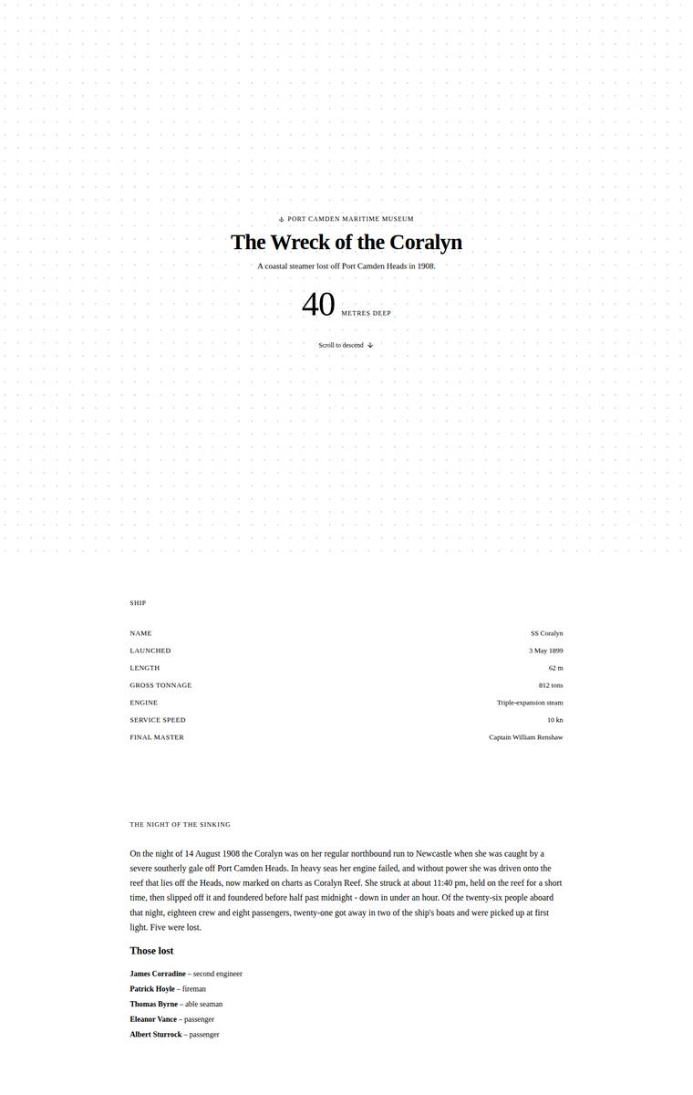
Composite 50.0%Judge 3.0/5
Judge panelAnthropic 2.5/5OpenAI 2.8/5Google 2.3/5
single-judge (Claude) 2.5/5 → leave-one-family-out 3.0/5
Anthropic: Most required sections are present and content-correct - hero with the 40m depth, ship facts, the night with the five named lost, three depth bands (28/34/40m), six artifacts, timeline, dive access, and plan-your-visit with contacts and the teacher pack. But the page reads as a bare, near-unstyled white document: flat typography, no colour, no imagery, and large awkward whitespace bands, with none of the museum's central "carry the visitor down" descent atmosphere conveyed even as a static fallback. It is clean and consistent with no obviously broken bits, but it is generic and underwhelming -
OpenAI: The page includes most required high-level sections and key facts, but it omits the cargo manifest, heavily abbreviates fixed content, and the required interactive/descent experience is essentially a static text list. The visual system is clean and readable with disciplined spacing, but it is very plain, mostly black text on white, and does little to evoke the underwater descent or wreck. Craft is consistent, though the result feels more like a minimalist document than a distinctive museum microsite.
Google: The design fails to capture the requested descent experience, remaining entirely bright and document-like instead of descending into darkness. Furthermore, it completely omits the required manifest section, resulting in a stark, clinical page that lacks both full content fidelity and visual engagement.
Elias Byrne (gpt-5.4-mini)
High reasoning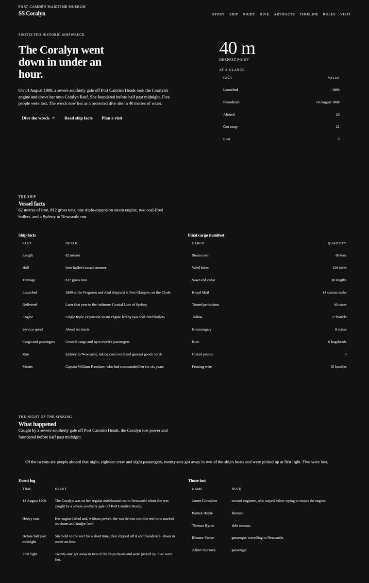
Composite 50.0%Judge 3.0/5
Judge panelAnthropic 2.5/5OpenAI 2.5/5Google 2.3/5
single-judge (Claude) 2.5/5 → leave-one-family-out 3.0/5
Anthropic: Content coverage is strong: hero, vessel facts, cargo manifest, the night of the sinking with the five lost named, three depth bands, all six artifacts, timeline, access rules, and plan-your-visit with contacts and school pack are all present and faithful to the brief. But the execution is a near-unstyled dark document - cramped tiny-text tables, flat hierarchy, no imagery, and zero sense of the commissioned descent; the dive section shows an empty dark/green canvas box that reads as a broken or failed interactive element. The result is coherent only in its monotony and lands with no premium o
OpenAI: All major required sections and most fixed facts are visible, including the manifest, artifacts, timeline, rules, operators, and visit/school details, though the dive/descent only visibly exposes the selected bow description rather than all three depth-band details. The design is coherent but extremely plain and table-heavy, with little sense of descent or maritime atmosphere beyond a dark background. Craft is weakened by tiny text, awkward wrapping in rule labels, a nearly empty dive graphic, and generally sparse presentation that feels unfinished rather than premium.
Google: While all required content is technically present, the bizarre decision to format almost every section—including the narrative, artifacts, and timeline—as data tables completely strips the site of any storytelling or atmospheric quality. Combined with poor text wrapping in the rules table and a seemingly broken or bare-minimum interactive dive graphic, the result feels like an administrative database rather than an immersive museum experience.
Ingrid Kessler (gemini-3.1-flash-lite)
default reasoning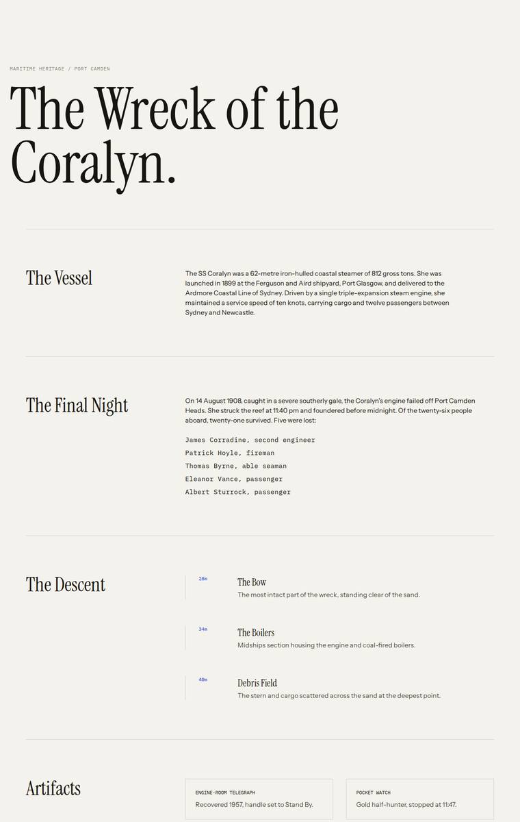
Composite 46.9%Judge 2.9/5
Judge panelAnthropic 2.8/5OpenAI 2.8/5Google 1.8/5
single-judge (Claude) 2.8/5 → leave-one-family-out 2.9/5
Anthropic: Most required sections appear (hero, vessel, final night with the five named, three depth bands, six artifacts, access, plan your visit), but the required timeline section is not visible and the depth bands are a flat static list rather than the descent experience the brief centres on. Visually it is a clean, competent editorial serif layout on cream, but entirely monochrome and generic - no colour, imagery, atmosphere, or any sense of water closing over or light fading. Craft is consistent and unbroken yet sparse and thin, and with the whole descent concept absent it reads as a plain document
OpenAI: The page is elegant and readable with a restrained editorial typographic system, but it omits or heavily compresses key brief content: the timeline is absent, the manifest is absent, dive conditions and legal rules are incomplete, and many artifact/story details are shortened. Craft is generally clean, though the experience lacks the requested sense of descending into the wreck and feels more like a static text layout than a distinctive microsite.
Google: The build fails to include mandatory sections like the timeline and heavily truncates the provided text instead of using it substantially as written. It completely ignores the museum's core experiential request to simulate a descent into darkness, presenting instead a static, unengaging, light-themed text document that lacks any visual impact.
Noor El-Amin (claude-fable-5)
High reasoning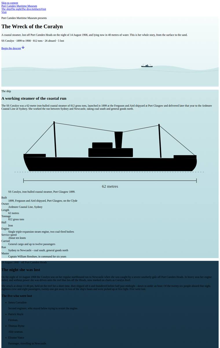
Composite 42.2%Judge 2.7/5
Judge panelAnthropic 2.3/5OpenAI 2.0/5Google 2.0/5
single-judge (Claude) 2.3/5 → leave-one-family-out 2.7/5
Anthropic: Most required sections appear present (ship with a labelled technical drawing, story, manifest, artifacts, and a light-to-dark descent that gestures at the brief's descent request), so content coverage is moderate. But the visual execution is weak and unfinished: the upper half is largely unstyled text blocks and loose placeholder-looking geometric shapes, and the dark artifact section is a series of enormous near-empty panels each holding one thin line icon, with tiny illegible footer text at the bottom. Nothing here reads as premium or finished; it looks like a rough draft rather than a comp
OpenAI: Most required sections and fixed content appear to be present, including the ship, sinking, dive depths, six artefacts, timeline, access rules, and visit information. However the execution is very rough: typography is tiny, many dark sections use near-black text on dark navy backgrounds, spacing is wildly oversized, and default-looking controls/links undermine polish. The descent concept is visible, but the result feels unfinished rather than premium or memorable.
Google: Although all required text and sections are included, the execution is severely flawed. The attempt to simulate descent by darkening the background fails entirely because the text colour remains black, rendering the majority of the page unreadable, while the comically oversized SVGs destroy the layout and ruin the professional feel.
Elias Byrne (claude-fable-5)
High reasoning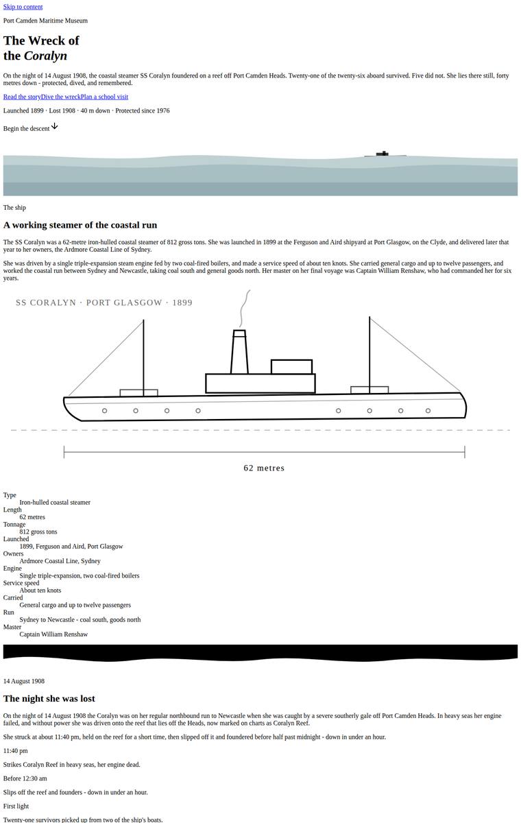
Composite 37.5%Judge 2.5/5
Judge panelAnthropic 1.5/5OpenAI 2.5/5Google 1.8/5
single-judge (Claude) 1.5/5 → leave-one-family-out 2.5/5
Anthropic: Most required content is present - all sections appear, and the six artifacts have simple inline SVG line drawings - so brief fidelity is partially met, but the core "carry the visitor down into the descent" experience is entirely absent and the depth-band section renders as an empty, broken chart. Visually the page reads as unstyled default HTML: black-on-white, no colour, no type hierarchy, no spacing system, strongly suggesting the Tailwind theme never applied. The result looks like a wireframe with janky, unfinished elements and has no premium or distinctive quality a reviewer would stop o
OpenAI: Most required sections and fixed facts appear to be present, including the people lost, artifacts, timeline, dive rules and visit details, though the dive/descent section only visibly exposes one depth-band description and the requested immersive descent is very weak. The visual treatment is extremely plain, with tiny typography, awkward spacing, oversized line icons and little hierarchy, making it feel unfinished rather than a polished museum microsite.
Google: While the required content is present, the build completely lacks visual styling, appearing as a raw HTML document with default fonts. Craft is exceptionally poor, evidenced by comically oversized, unscaled SVGs and missing spaces in critical text (e.g., 'James CorradineSecond engineer'). It fails entirely to deliver the requested immersive 'descent' experience or any level of professional design impact.
Mara Vieira (grok-build-0.1)
default reasoning
Composite 37.5%Judge 2.5/5
Judge panelAnthropic 3.5/5OpenAI 2.5/5Google 2.3/5
single-judge (Claude) 3.5/5 → leave-one-family-out 2.5/5
Anthropic: Every required section is present and content-correct: the FOUNDERED hero, the SS Coralyn vessel facts with full cargo manifest, the night of the sinking with all five named lost, a three-band descent diagram (28m bow / 34m boilers / 40m debris) with a depth selector, all six artifacts, the full timeline, dive access rules with both charter operators, and plan-your-visit with contacts and school-pack request. The stark black/white/red Swiss-editorial styling gives a bold, coherent hero, but the execution is uneven: sections are sparse with large empty gaps, and the key descent diagram is crude
OpenAI: Most required sections and fixed factual content are visible, including the ship, sinking, depth bands, artifacts, timeline, access rules, and visit details, though the descent experience is only weakly realised and some depth-band detail appears hidden behind the selected state. The visual direction is stark and consistent but feels unfinished: the hero text appears clipped/obscured, the giant red block and crude line illustrations read more like placeholders than a polished museum microsite, limiting both craft and impact.
Google: While all the required content sections are present, the design completely ignores the brief's specific request for an immersive descent experience where the light fades into the dark. The execution feels unfinished, highlighted by an obstructive red rectangle overlapping text in the hero, rudimentary placeholder graphics in the dive section, and awkward alignment issues in the timeline.
Elias Byrne (grok-4.3)
default reasoning
Composite 32.8%Judge 2.3/5
Judge panelAnthropic 2.5/5OpenAI 2.5/5Google 2.0/5
single-judge (Claude) 2.5/5 → leave-one-family-out 2.3/5
Anthropic: Nearly all required sections and fixed content are present and correct: the ship facts, the night of the sinking with the five named lost, the full manifest, all six artifacts, the timeline, dive rules, and plan-your-visit with contacts and school pack. But the visible execution is badly compromised: the hero is smothered in a broken dotted-grid texture that reads as a failed render, and the interactive descent section is a near-black block with barely-legible text where only "28 m / The Bow" surfaces, so two of three depth bands and the descent experience effectively disappear on the page. Ou
OpenAI: Most required sections are present and the core facts are broadly visible, but much of the supplied copy is heavily abbreviated and the interactive dive only visibly presents the 28 m band, with the other depth-band details not readable in the screenshot. The minimalist archival treatment is coherent, but the page feels very sparse and the dark dive panel has near-black text on black, making a key section effectively illegible. Overall it is clean but underdeveloped, with limited sense of descent or premium storytelling impact.
Google: While all mandated content is present, the design completely fails the client's singular experience request to convey a feeling of descent. The visual execution is overly stark, resembling a wireframe, and suffers from a severe accessibility failure in the 'interactive dive' section where dark text on a black background is virtually unreadable.
Noor El-Amin (grok-build-0.1)
default reasoning
Composite 31.3%Judge 2.3/5
Judge panelAnthropic 2.0/5OpenAI 2.3/5Google 2.0/5
single-judge (Claude) 2.0/5 → leave-one-family-out 2.3/5
Anthropic: Content fidelity is strong: nearly every required section is present and factually intact - the ship facts, the cargo manifest, the night of the sinking, the five named lost, the three depth-band dive selector (bow 28m, boilers 34m, debris 40m), all six artifacts, the full timeline, dive rules, and plan-your-visit with contacts and the school-pack email. But visually the page reads as essentially unstyled HTML: a flat white background top to bottom, default black body type, no colour palette, no typographic hierarchy, and none of the requested descent/underwater atmosphere. Craft is broken and
OpenAI: Most required content and sections are visible, including the ship story, manifest, sinking, artifacts, timeline, dive rules and visit details, though the descent section only visibly exposes one depth-band description and the school email is not plainly shown. The presentation is largely default black text on white with sparse crude SVG waves and inconsistent spacing, giving it a rough, unfinished feel rather than an immersive descent or museum-quality microsite.
Google: While all the required content from the brief is present, the visual execution is severely lacking. The stark white background completely ignores the client's request for a darkening, descending experience, and the jagged section dividers appear glitchy and broken.
Mara Vieira (claude-fable-5)
High reasoning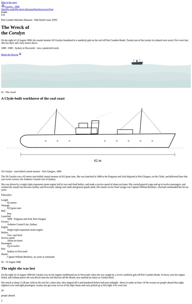
Composite 28.1%Judge 2.1/5
Judge panelAnthropic 1.8/5OpenAI 2.5/5Google 2.0/5
single-judge (Claude) 1.8/5 → leave-one-family-out 2.1/5
Anthropic: Most required content appears present (ship facts with a passable line drawing, the sinking, a descent band, the six artifacts, timeline, dive rules, plan-your-visit), so brief coverage is moderate. But visually the page reads as an unstyled fallback: a single cramped column of default black-on-white text, raw checkbox-bullet lists, no cohesive type or colour system, and grossly oversized outline icons standing in for artifacts. The signature "carry the visitor down" descent is reduced to one thin dark strip, and the overall result is janky and unfinished with no premium quality a reviewer wou
OpenAI: All required sections and fixed facts appear to be present, including the ship, sinking, manifest, three dive depths, six artifacts, timeline, access rules, and visit/school contact details. However the page reads mostly like unstyled default HTML, with tiny type, visible skip links, weak spacing, and oversized crude artifact illustrations, so the composition feels unfinished rather than immersive or premium.
Google: While all required content from the brief is present, the visual execution resembles unstyled HTML with poor typographic hierarchy and unconstrained line lengths. The layout is severely broken by massively oversized, rudimentary SVG icons in the artifacts section, completely failing to deliver a premium, atmospheric experience.
Ingrid Kessler (claude-fable-5)
High reasoning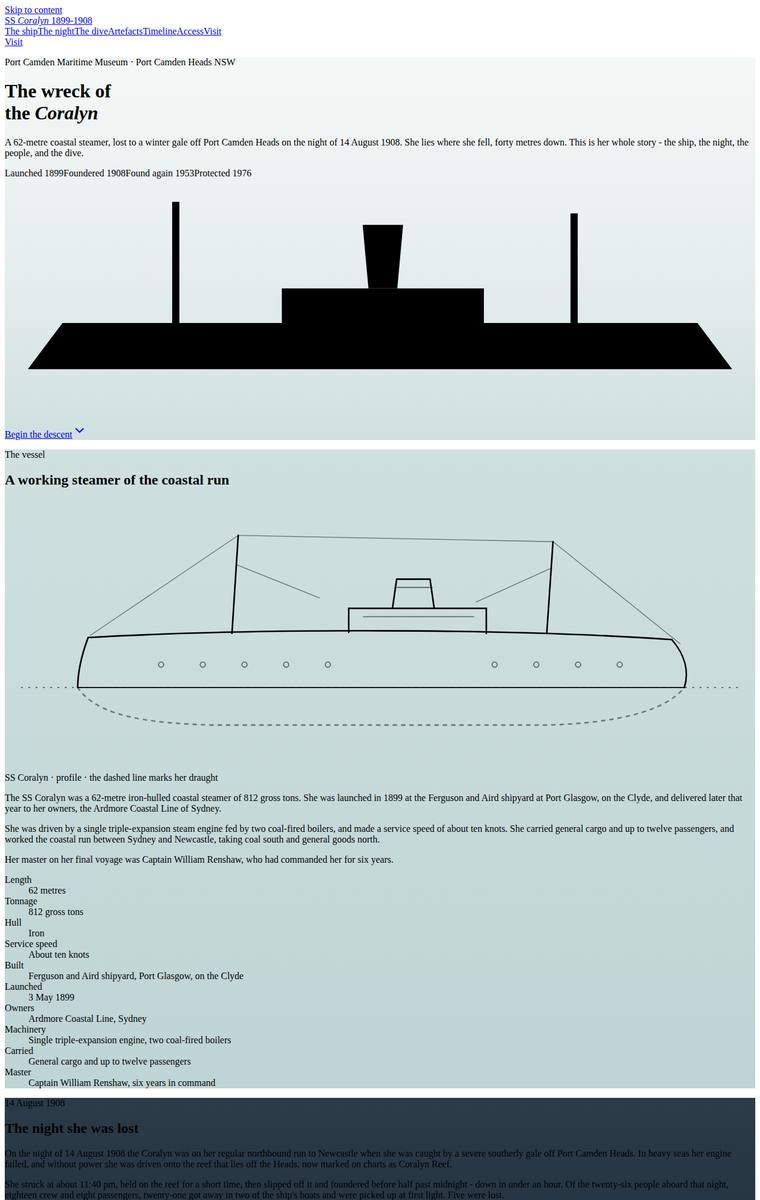
Composite 26.6%Judge 2.1/5
Judge panelAnthropic 2.0/5OpenAI 2.5/5Google 2.3/5
single-judge (Claude) 2.0/5 → leave-one-family-out 2.1/5
Anthropic: Most required sections appear present (hero, ship, night, dive, six artifacts, timeline, plan your visit) and the descent-into-darkness concept is genuinely attempted via a top-to-bottom light-to-black gradient. But visual execution is poor: a crude ship silhouette, unstyled black-on-white body text and raw bullet lists mid-page, and huge ghost-outline artifact icons at near-invisible contrast. Craft is the weakest point - the lower sections read as dark-on-dark text that is barely legible, looking broken rather than intentional, which badly undercuts any premium impression.
OpenAI: Most required sections and facts appear to be present, including the ship, sinking, three dive bands, six artifacts, timeline, access rules, and visit details, though the descent reads mostly as a static stack rather than a compelling interactive experience. The surface-to-depth concept is visible, but the typography is tiny, spacing is awkward, default link styling shows through, and large black illustrations/text on near-black backgrounds make major sections nearly unreadable. Overall it has a basic narrative structure but lacks polish, accessibility, and premium visual impact.
Google: While the build includes the required sections, critical contrast failures render large portions of text completely illegible. Oversized SVG assets further break the layout, resulting in poor overall visual and technical execution.
Yuki Tanabe (claude-fable-5)
High reasoning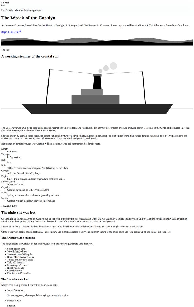
Composite 26.6%Judge 2.1/5
Judge panelAnthropic 2.0/5OpenAI 1.8/5Google 2.5/5
single-judge (Claude) 2.0/5 → leave-one-family-out 2.1/5
Anthropic: Content fidelity is strong: all mandated sections are present and correct - the ship's facts, the night of the sinking, the five named lost, the full manifest, three depth bands, all six recovered artifacts, the timeline, dive access rules, and the plan-your-visit contact details in Australian English. But the page renders essentially as unstyled black-on-white body text with default serif/sans fallbacks, cramped run-together definition lists, and only two crude inline SVGs (a ship silhouette and a depth-profile), so the theme and layout appear to have failed almost entirely. There is a lone "
OpenAI: Nearly all required factual sections and content are present, including the ship, sinking, manifest, named lost, artifacts, timeline, rules and visit details, though the three depth-band dive content is only partially visible and the requested descent experience is barely realised. Visually it appears largely unstyled with default serif typography, native buttons, cramped lists and minimal composition, making the build feel unfinished and non-premium.
Google: While all mandatory content and sections are present, the visual execution resembles an unstyled wireframe. It lacks the requested atmospheric 'descent' experience and suffers from basic formatting issues like squished list text.
Mara Vieira (gemini-3.1-flash-lite)
default reasoning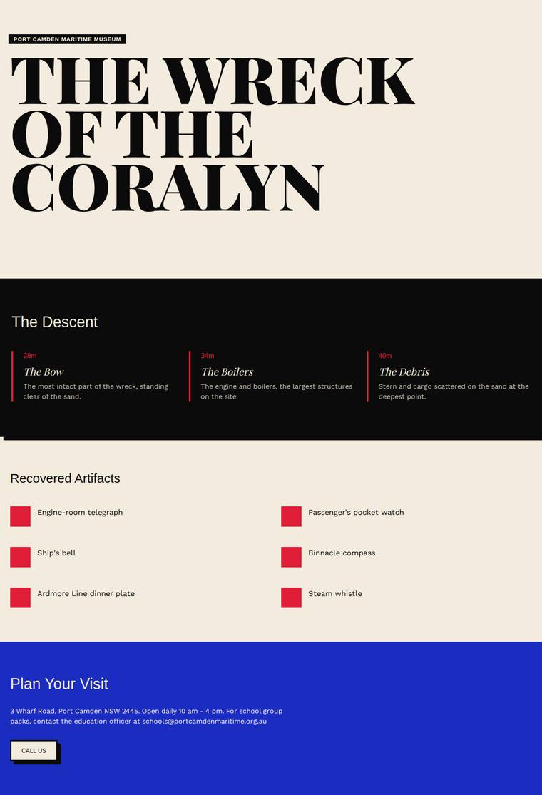
Composite 26.6%Judge 2.1/5
Judge panelAnthropic 2.0/5OpenAI 1.8/5Google 1.5/5
single-judge (Claude) 2.0/5 → leave-one-family-out 2.1/5
Anthropic: Only three of the eight required sections are visibly realised (the descent depth bands, the six artifacts, plan-your-visit); the ship facts, the night of the sinking with the five named lost, the timeline, and the dive access rules are all missing, and the six artifacts render as bare red placeholder squares with no imagery or icons. The palette is incoherent - a striking cream/black hero with a bold display serif collides with an abrupt cobalt-blue contact block and jarring red boxes, and no sense of descent comes through. Craft reads unfinished: the red squares look like broken image placeh
OpenAI: The build includes a bold hero, a basic three-depth descent, artifact names, and a partial visit section, but it omits or severely truncates major required content including the ship, sinking story, timeline, manifest, dive rules, full artifact descriptions, phone/general enquiries, and named education officer. The visual language has a clear editorial direction with strong type and simple colour blocking, but the page feels sparse, unfinished, and not especially immersive for the requested descent experience.
Google: The submission fails completely on brief fidelity, omitting mandatory sections like the ship's history, the night of the sinking, the timeline, and dive rules, while stripping out the provided artifact descriptions. Visually, it feels like an unfinished wireframe with jarring color blocks, generic placeholder squares instead of artistic assets, and zero execution of the requested descent experience.
Mara Vieira (claude-haiku-4-5)
default reasoning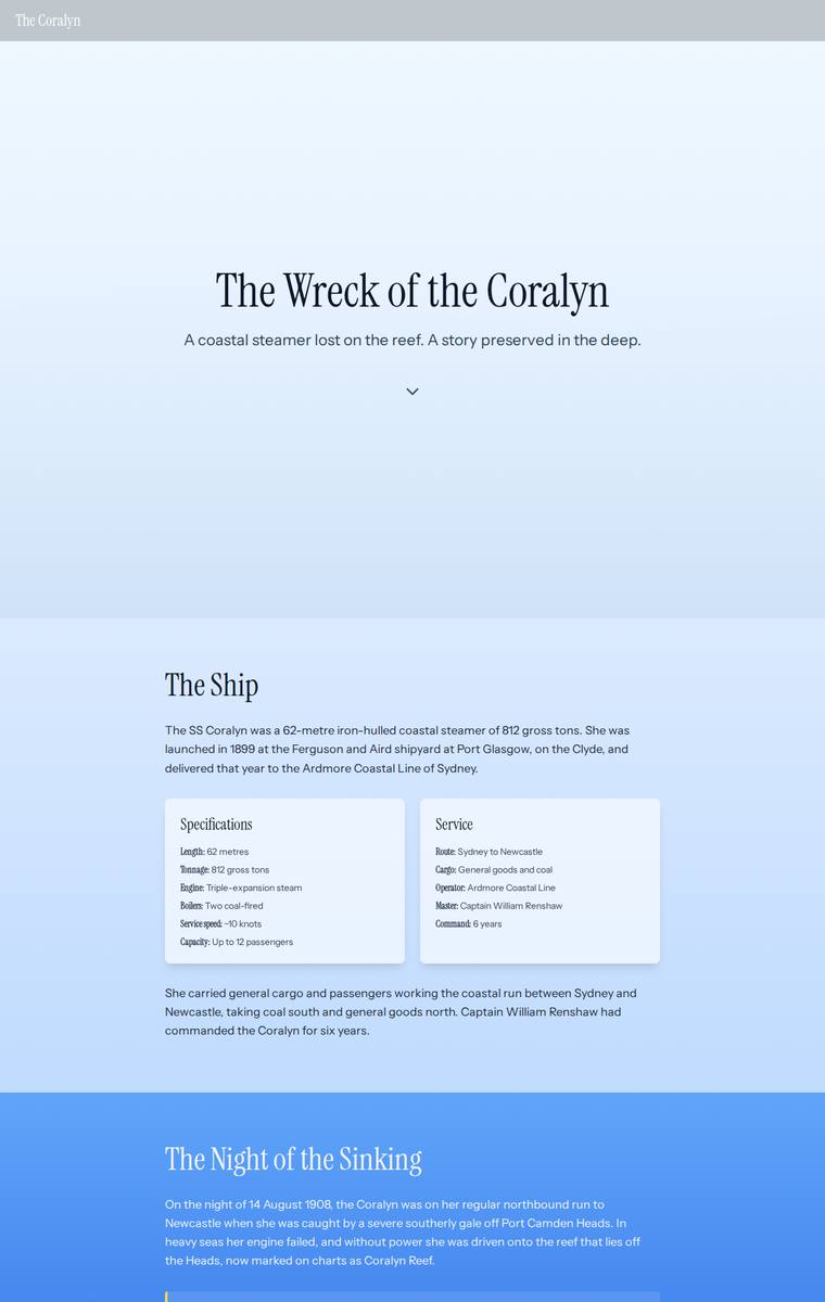
Composite 25.0%Judge 2.0/5
Judge panelAnthropic 1.8/5OpenAI 2.0/5Google 1.3/5
single-judge (Claude) 1.8/5 → leave-one-family-out 2.0/5
Anthropic: Only three of the eight required sections actually render (hero, the ship, the night of the sinking); the interactive descent/depth bands, six artifacts, timeline, dive-access rules and plan-your-visit are all absent, replaced by an enormous empty dark gradient that fills the bottom two-thirds of the page - a clearly broken build. The visible upper portion has competent, clean serif/sans typography and a sensible surface-to-deep colour idea, but the vast void of empty space wrecks composition and craft. Nothing here reads as finished or premium; a reviewer would stop only to note the page is t
OpenAI: The screenshot includes a hero, ship section, and part of the sinking story with the five lives lost, but the required dive/descent bands, six artifacts, timeline, dive access rules, manifest, and visit/school contact content are absent. The typography and blue descent gradient are pleasant and coherent, but the page becomes an enormous empty dark area, making the build feel unfinished rather than immersive. Overall it has a modest visual direction but lacks the content completeness and polish needed for the brief.
Google: The build fundamentally fails the brief by omitting the majority of required sections, including the artifacts, timeline, depth bands, and visit information. While the background gradient attempts the requested descent effect, it resolves into a massive, broken empty void rather than presenting content.
Elias Byrne (gemini-3.1-flash-lite)
default reasoning
Composite 23.4%Judge 1.9/5
Judge panelAnthropic 1.5/5OpenAI 1.8/5Google 2.0/5
single-judge (Claude) 1.5/5 → leave-one-family-out 1.9/5
Anthropic: The page renders as essentially unstyled black serif text on white, reading like a browser default document with no theming, colour, imagery, or spacing system, so the brief's central ask - carrying the visitor down into the wreck - is entirely absent. Several required sections are also missing from the visible page: no timeline, no dive access rules, no cargo manifest, and no interactive descent (the three depth bands appear only as a flat list). What is present (hero, vessel, the loss with the five named, recovered artifacts, plan your visit) is consistent but bare and unfinished, with no di
OpenAI: The page includes a basic hero, vessel/loss summaries, depth bands, artifacts, and partial visit details, but it omits major required sections such as the timeline and dive access rules, lacks the manifest and much practical dive information, and does not provide an interactive or immersive descent. Visually it is a plain, default-looking document with little atmosphere, hierarchy, or museum-specific identity; it is readable but feels unfinished and has minimal impact.
Google: The build ignores the core experiential requirement to simulate a descent and omits mandatory content like the timeline and dive rules. It acts as a barebones, unstyled text document lacking visual engagement or polish.
Elias Byrne (grok-4.20-reasoning)
default reasoning
Composite 21.9%Judge 1.9/5
Judge panelAnthropic 2.0/5OpenAI 1.8/5Google 2.3/5
single-judge (Claude) 2.0/5 → leave-one-family-out 1.9/5
Anthropic: Content fidelity is strong: all required sections are present and correct - hero, the ship's facts, the night of the sinking with the five named lost, the full manifest, three depth bands, all six artifacts with dates, the timeline, dive rules, and plan-your-visit with the school-pack form. But visually this reads like an unstyled document dump: default left-aligned serif headings and plain body text, no colour, no spacing system, no atmosphere, and the central "carry the visitor down" descent experience is entirely unrealised - the 3D wreck is a tiny dark blob and the depth bands are plain ou
OpenAI: Most required sections and factual content are visible, including the ship, sinking, depth bands, six artifacts, timeline, rules, and visit details, though some details are abbreviated or missing such as the education officer reference and parts of the dive conditions. Visually it appears largely unstyled or broken, with default typography, cramped navigation, inconsistent spacing, and little sense of an immersive descent. The result is readable but unfinished and not distinctive or premium.
Google: While all required text content is present, the design completely ignores the brief's core experiential mandate to simulate a descent into water. The visual execution resembles an unstyled HTML document with default typography and broken layout elements, resulting in no aesthetic appeal.
Yuki Tanabe (gemini-3.1-flash-lite)
default reasoning
Composite 20.3%Judge 1.8/5
Judge panelAnthropic 1.5/5OpenAI 2.3/5Google 1.0/5
single-judge (Claude) 1.5/5 → leave-one-family-out 1.8/5
Anthropic: The build renders only a skeleton of the brief: hero, brief vessel/night text, a three-column depth row, and a bare artifact name-list with no descriptions, while the timeline, manifest, full artifact detail, dive operators, and most access rules are missing or truncated. Enormous stretches of the page are empty black voids, which read as failed/blank canvases rather than a designed descent and violate the "never leave a blank screen" rule. The hero typography is clean, but the broken composition and vast unfilled gaps make the page feel unfinished and low-impact rather than premium.
OpenAI: The page includes a hero and some required topics, but it omits the timeline, manifest, operators, much of the dive safety/access detail, most visit/contact details, and reduces the artifacts and story content to fragments. The stark black typographic treatment is coherent and the hero has some presence, but the rest of the page is extremely sparse with vast empty sections and little sense of an interactive descent or museum storytelling.
Google: The submission completely fails the content requirements by omitting massive portions of mandatory text, including the timeline, manifest, and all detailed artifact descriptions. Visually, it appears entirely broken, presenting isolated text snippets separated by vast empty black voids, indicating a missing or failed visual centerpiece with an unacceptable fallback state.
Yuki Tanabe (deepseek-v4-flash)
default reasoning
Composite 18.8%Judge 1.8/5
Judge panelAnthropic 1.3/5OpenAI 1.8/5Google 2.0/5
single-judge (Claude) 1.3/5 → leave-one-family-out 1.8/5
Anthropic: The page is almost entirely an empty black void: only the hero title "THE WRECK OF THE CORALYN" with a "Port Camden Maritime Museum" subtitle renders at the top and a tiny copyright footer at the very bottom, with thousands of pixels of blank nothing between them. Effectively none of the mandated sections (the ship, the sinking, the descent, the six artifacts, the timeline, dive rules, plan your visit) are visible, so brief fidelity is near zero and the build reads as broken. The hero's bold Archivo-style condensed type is clean and the dark palette suits a shipwreck theme, but a reviewer stop
OpenAI: Only the opening hero and a small footer are visible; the required ship facts, sinking story, dive bands, artifacts, timeline, access rules, and visit information are absent in the full-page screenshot. The stark dark treatment and oversized typography have some atmosphere, but the page is overwhelmingly empty, making the result feel unfinished rather than immersive.
Google: The build fails to render almost all required content, displaying only a hero title and footer separated by a massive empty void. It likely relies on a broken script or WebGL canvas without the mandated static fallback, resulting in an unusable page.
Noor El-Amin (gemini-3.1-flash-lite)
default reasoning
Composite 17.2%Judge 1.7/5
Judge panelAnthropic 1.8/5OpenAI 1.8/5Google 2.0/5
single-judge (Claude) 1.8/5 → leave-one-family-out 1.7/5
Anthropic: This full-page render omits several mandatory sections entirely: the six recovered artifacts, the timeline, the dive access rules, and the manifest are all absent, and the ship facts and sinking narrative are heavily truncated, so brief fidelity is poor. Visually it is an unstyled black-serif-on-white document with no colour, imagery, or any of the requested descent atmosphere; the crude black wavy bar and large empty gaps in the descent list read as unfinished and janky. There is nothing premium or distinctive here - it looks like raw content dumped onto a page rather than a designed maritime
OpenAI: The page includes a basic hero, partial vessel/sinking text, three depth bands, and partial visit details, but it omits major required sections such as the six artifacts, timeline, dive access rules, manifest content, full museum details, and much of the fixed factual copy. The visual treatment is clean but extremely sparse and unfinished, with little sense of descent, depth, museum storytelling, or interactive/premium microsite design.
Google: The build fails to include several mandatory sections, such as artifacts and the timeline, and heavily truncates required text. The visual design is rudimentary, lacking the requested atmospheric descent experience and relying on a plain, unengaging single-column layout.
Elias Byrne (grok-build-0.1)
default reasoning
Composite 17.2%Judge 1.7/5
Judge panelAnthropic 1.5/5OpenAI 1.8/5Google 2.3/5
single-judge (Claude) 1.5/5 → leave-one-family-out 1.7/5
Anthropic: Content fidelity is largely intact - all sections are present (ship facts, the night with the five named lost, the full manifest, all six artifacts, the timeline, dive access rules, plan-your-visit with contacts), and there is a small SVG depth diagram showing the three bands, so the brief's information requirements are mostly met. But visually the page has rendered as raw, unstyled text: no theme, no colour system, no cards or columns, default black-on-white body copy with a broken dotted hero and a tiny cramped diagram - the Tailwind/theme styling clearly did not apply. There is no craft, no
OpenAI: Most required factual sections and content are visible, including the ship, sinking, manifest, artifacts, timeline, dive rules, and visit details, though the descent/depth-band presentation appears only minimally realised and not all band descriptions are plainly visible. Visually this reads like largely unstyled default HTML with poor spacing, cramped tables, run-together labels, and almost no coherent art direction or immersive descent experience. The result lacks polish, composition, and memorability.
Google: The implementation includes the required text content but entirely lacks CSS styling, presenting as a raw HTML document. It fails to deliver the requested descent experience and features a poorly integrated graphic with overlapping text, resulting in a severely unfinished appearance.
Ingrid Kessler (claude-haiku-4-5)
default reasoning
Composite 6.3%Judge 1.3/5
Judge panelAnthropic 1.0/5OpenAI 1.0/5Google 2.0/5
single-judge (Claude) 1.0/5 → leave-one-family-out 1.3/5
Anthropic: The screenshot is effectively blank: a nearly empty cream page with only faint horizontal section dividers and a single line of tiny footer text ("Port Camden Maritime Museum - custodian of the Coralyn, since 2004") at the very bottom. None of the eight required sections render any visible content - no hero, ship facts, sinking, descent, artifacts, timeline, dive rules, or visit details are present. It reads as a broken build with no usable content, type, or imagery, so it fails every criterion.
OpenAI: The screenshot shows an almost entirely blank page with only faint section dividers and a tiny footer line, so the required hero, story sections, dive information, artifacts, timeline, rules, and visit details are not visibly present. The build appears broken or unrendered rather than intentionally minimal, leaving no meaningful visual system, storytelling, or immersive descent experience to assess.
Google: The build completely failed to render the requested content, resulting in a mostly blank page with empty sections and a tiny footer. It lacks the required text, visual styling, and interactive elements specified in the brief.
Yuki Tanabe (claude-haiku-4-5)
default reasoning
Composite 6.3%Judge 1.3/5
Judge panelAnthropic 1.0/5OpenAI 1.0/5Google 2.0/5
single-judge (Claude) 1.0/5 → leave-one-family-out 1.3/5
Anthropic: The screenshot is an essentially blank dark navy screen with no visible content whatsoever - no hero, no headings, no text, no sections, no imagery. None of the eight required sections (ship facts, sinking, the five lost, interactive descent, six artifacts, timeline, dive rules, plan-your-visit) are present or legible. This reads as a failed render or a WebGL/hydration crash that left the visitor with a blank screen, which the brief explicitly warned against; there is nothing to assess for design, craft, or impact.
OpenAI: The screenshot shows only a blank dark page with no visible content, navigation, sections, or storytelling elements from the brief. As rendered, it does not demonstrate the required ship story, dive information, artifacts, timeline, access rules, or visit details, and appears broken rather than intentionally designed.
Google: The screenshot displays a completely blank, dark screen, indicating a fatal render failure. None of the required content or design elements from the brief are visible.
Mara Vieira (gpt-5.6-luna)
High reasoning
Composite 6.3%Judge 1.3/5
Judge panelAnthropic 1.0/5OpenAI 1.0/5Google 2.0/5
single-judge (Claude) 1.0/5 → leave-one-family-out 1.3/5
Anthropic: The screenshot is a completely blank cream-coloured page with no visible content at all - no hero, no ship facts, no sinking narrative, no dive descent, no artifacts, no timeline, no access rules, and no visit/contact section. None of the brief's required sections rendered, so there is nothing to assess for design, craft, or impact. This reads as a failed build that never mounted its content.
OpenAI: The screenshot shows only a blank beige page with none of the required microsite sections, content, navigation, or descent experience visible. There is no evident typography, composition, imagery, or interaction, so the build appears incomplete or failed to render.
Google: The screenshot shows a completely blank canvas with no visible content or design elements. None of the required sections or styling requested in the brief are present.
Noor El-Amin (deepseek-v4-pro)
default reasoning
Composite 0.0%Judge 1.0/5
Judge panelAnthropic 1.0/5OpenAI 1.0/5Google 1.0/5
single-judge (Claude) 1.0/5 → leave-one-family-out 1.0/5
Anthropic: The screenshot is completely blank - a full white page with no visible content, text, imagery, or layout of any kind. None of the required sections (hero, ship facts, sinking, descent, artifacts, timeline, dive rules, visit) rendered, so there is nothing to evaluate for design, craft, or impact. This is a failed render with zero fidelity to the brief.
OpenAI: The screenshot shows a completely blank white page, so none of the required sections, content, navigation, dive information, artifacts, timeline, or visit details are visible. As rendered, it appears broken or not loaded, with no visual design, craft detail, or distinctive impact to assess.
Google: The screenshot is completely blank, indicating a critical failure in the build or rendering process. No content or design is visible to evaluate.
Noor El-Amin (gpt-5.6-luna)
High reasoning
Composite 0.0%Judge 1.0/5
Judge panelAnthropic 1.0/5OpenAI 1.0/5Google 1.0/5
single-judge (Claude) 1.0/5 → leave-one-family-out 1.0/5
Anthropic: The screenshot shows a completely blank cream/beige page with no rendered content whatsoever - no hero, no ship facts, no sinking narrative, no dive descent, no artifacts, no timeline, no dive rules, no visit section. None of the required brief elements are present. This is a broken/failed build that leaves the visitor with an empty screen, which the brief explicitly forbids, so every criterion fails at the floor.
OpenAI: The screenshot shows only a blank beige page with none of the required microsite sections, content, navigation, story, dive information, artifacts, timeline, or visit details visible. With no visible composition beyond a flat background, it cannot demonstrate visual design quality, craft, or impact.
Google: The provided screenshot is completely blank, displaying only a solid background color. None of the requested content, design elements, or sections from the brief are present, indicating a critical failure in rendering the build.