Banja Lab / Benchmarks / Test
WDB-0001webdesign · medium
Two Rivers Coffee Roasters single-page site
The same task, run on 115 models. Compare the outputs side by side, or open any one in a popup to inspect it.
Top result: Mara Vieira (gpt-5.6-luna) (high reasoning) at 93.8% composite. Lowest: Noor El-Amin (claude-sonnet-4-6) at 0.0%. 115 models compared on this task.
How it ran
- Each model was given the brief below in a fresh, isolated session with no access to our tools, and returned a single self-contained index.html (inline CSS and JS, no external requests, no build step).
- The rendered output was scored 1 to 5 on brief fidelity, visual design, craft, and impact by a four-family vision panel - Anthropic (Claude Opus 4.8), OpenAI (GPT-5.5), Google (Gemini 3.1 Pro), and xAI (Grok 4.3) - using one identical prompt so the scores compare. The published judge score is leave-one-family-out: a model is never scored by a judge of its own family, so same-family self-preference is removed.
The brief
# Client brief: Two Rivers Coffee Roasters You are designing and building the website for a real small business. The brief below gives you the business facts, the goals, the audience, the sections the site must have, and the exact copy to use. It gives you no visual direction on purpose. Every design decision - layout, type, colour, imagery, tone - is yours to make. Read the whole brief, form a point of view on how this business should look and feel, and build it. ## The business Two Rivers Coffee Roasters is a small-batch coffee roaster in Mudgee, New South Wales. It was founded in 2016 by siblings Dan and Priya Halloran. They roast in small batches on a restored 1962 Probat drum roaster. They sell two ways: direct to home customers online (250g and 1kg bags, plus a monthly subscription), and wholesale to cafes across the Central West and Sydney. The business is named for the two rivers that meet near the roastery. ## What the site is for 1. Sell coffee beans online (single bags and the monthly subscription). 2. Sign people up to the subscription. 3. Bring in wholesale enquiries from cafe owners. ## Who it is for Home-brew enthusiasts aged 25 to 45 who buy whole beans and care about origin and freshness, and cafe owners looking for a wholesale roaster. ## What the site must contain (all of these sections) - a hero, - the story, - the range (all six coffees below), - the subscription, - a wholesale enquiry section with a form, - stockists (the five cafes below), - a brewing guides teaser, - contact and a newsletter signup. ## Copy to use Use the copy below substantially as written, in Australian English. You may write your own section headings and any short connective microcopy (button labels, form labels), but the body facts and the coffee details are fixed. Do not invent extra products or drop any of the six coffees or five stockists. ### Story Dan and Priya Halloran started Two Rivers in 2016, roasting for friends out of a shed before the first cafe order turned it into a business. Everything still comes off one machine: a 1962 Probat drum roaster they stripped back and rebuilt by hand. They roast in small batches through the week and ship within a few days of roasting, so what lands on your bench is fresh. Green beans are bought a few sacks at a time and the roast profiles are dialled in by taste, not by volume. ### The range (six coffees, each 250g and 1kg) - Cudgegong House Blend - a mix of Central and South American beans for everyday drinking. Milk chocolate, brown sugar, roasted almond. 250g $19, 1kg $60. - Ethiopia Guji - washed single origin from the Guji zone. Jasmine, stone fruit, black tea. 250g $24, 1kg $78. - Colombia Huila - washed single origin from smallholders in Huila. Red apple, caramel, milk chocolate. 250g $21, 1kg $68. - Guatemala Antigua - washed single origin grown in volcanic soil near Antigua. Cocoa, toasted almond, orange peel. 250g $22, 1kg $72. - Brazil Cerrado - natural process from the Cerrado region. Dark chocolate, hazelnut, dried fig. 250g $20, 1kg $64. - Sugarcane Decaf (Colombia) - decaffeinated with the sugarcane process. Cocoa, malt, dried plum. 250g $22, 1kg $72. ### Subscription Pick a coffee, a size, and how often you want it, and we roast it fresh and post it out. Choose 250g or 1kg, weekly, fortnightly, or monthly. Pause, skip, or cancel any time from your account. Free shipping on subscription orders over $60. ### Wholesale We supply cafes across the Central West and Sydney. If you run a cafe and want to talk about a wholesale account, send us a few details and we will be in touch within two business days. We can roast to your order, help with dialling in, and supply on a regular delivery schedule. The wholesale enquiry form should collect: cafe name, contact name, email, suburb, and rough weekly volume. ### Stockists You can also find our beans on the shelf at these cafes: - Ironbark Espresso - Orange - The Lane Cafe - Bathurst - Riverstone Coffee House - Dubbo - Small Grind - Newtown, Sydney - Meridian Coffee - Surry Hills, Sydney ### Brewing guides (teaser) New to brewing at home, or want to get more out of your beans? Our guides walk through pour-over, plunger, espresso, and AeroPress, with grind, dose, and timing for each. Full guides coming soon. ### Contact and newsletter The roastery is in Mudgee, NSW. Email hello@tworiverscoffee.com.au. Sign up to the newsletter for new coffees, seasonal releases, and the occasional brewing tip. We send about one email a month and you can unsubscribe any time. ## Output contract (React, single page) Build one single-page site. Output exactly two files: - `App.tsx` - a default-exported React component. Define any subcomponents in this same file. This is the whole page. - `theme.css` - a Tailwind v4 `@theme` token block, your `font-family` choices from the shared font menu below, and any custom CSS you need. The only imports allowed in `App.tsx` are `react`, `framer-motion`, and `lucide-react` (never the Sparkles icon). No other packages, no network requests, and no external assets: all imagery must be inline SVG, CSS, or drawn in code on a canvas. The fonts are bundled offline, so use only the shared menu: Archivo (including Archivo Expanded), Instrument Sans, Space Grotesk, Work Sans, IBM Plex Sans, IBM Plex Mono, JetBrains Mono, Fraunces, Instrument Serif, Playfair Display, Lora, Caveat. Make it responsive across mobile, tablet, and desktop.
Mara Vieira (gpt-5.6-luna)
High reasoning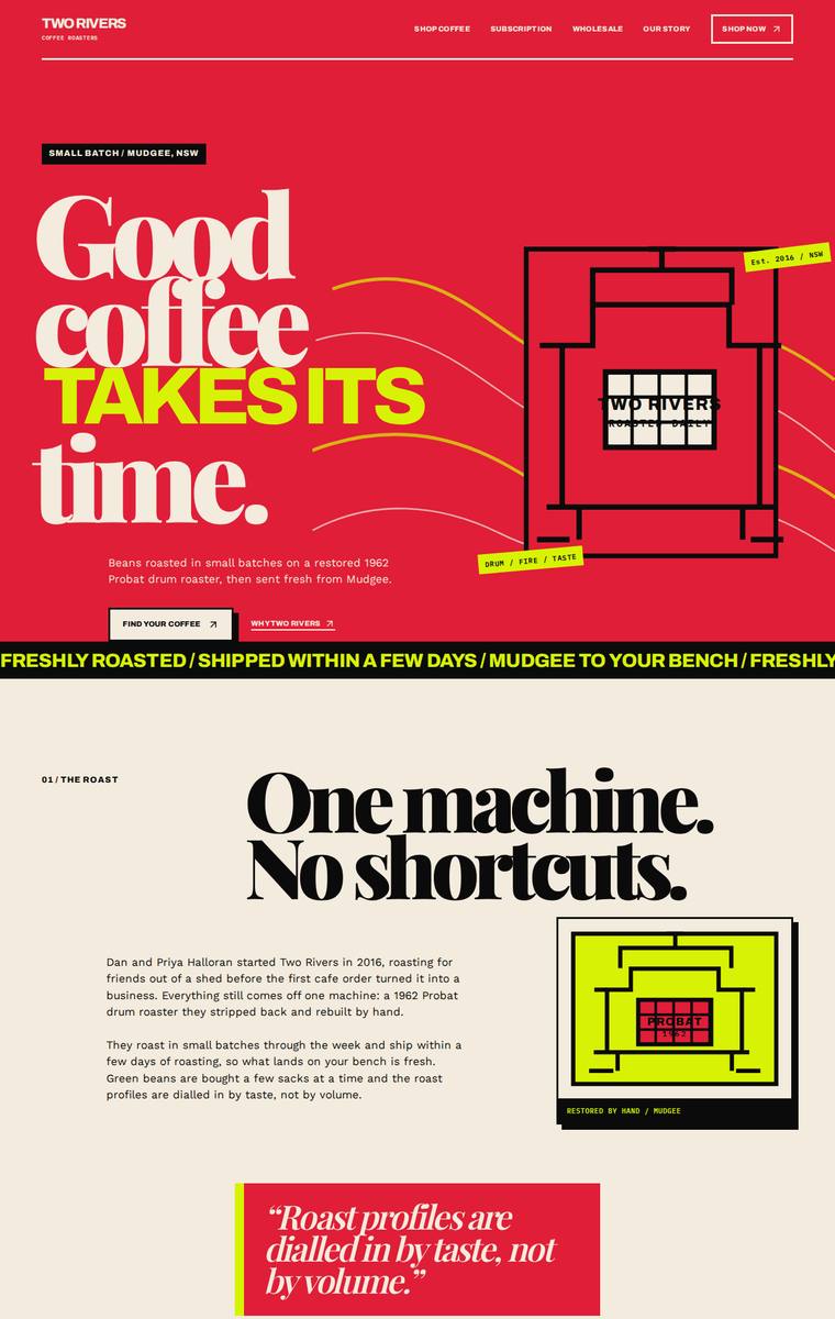
Composite 93.8%Judge 4.8/5
Judge panelAnthropic 5.0/5OpenAI 5.0/5Google 4.0/5
single-judge (Claude) 5.0/5 → leave-one-family-out 4.8/5
Anthropic: Every required section is present and correct: hero, story ("One machine. No shortcuts."), all six coffees with tasting notes and both prices, subscription builder, wholesale form (cafe name, contact, email, suburb, weekly volume), all five stockists with locations, brewing-guides teaser (pour-over, plunger, espresso, AeroPress), and contact plus newsletter. The design is a coherent, confident editorial system - oversized Playfair-style display serif against condensed sans, a striking black/crimson/lime palette, marquee strips, and alternating colour cards that read as one intentional identity
OpenAI: All required sections and fixed facts are visible, including the six coffees with prices, subscription details, wholesale form fields, stockists, brewing teaser, contact, and newsletter signup. The design is highly distinctive and cohesive, with bold typography, strong colour blocking, custom illustrative details, and a polished editorial/brutalist coffee-brand feel that gives it real stopping power.
Google: The design accurately includes all requested sections with a striking, brutalist-inspired aesthetic using bold colors and expressive typography. Execution is polished, featuring consistent grid layouts and sharp UI elements that create a memorable brand presence.
Mara Vieira (Opus 4.8)
High reasoning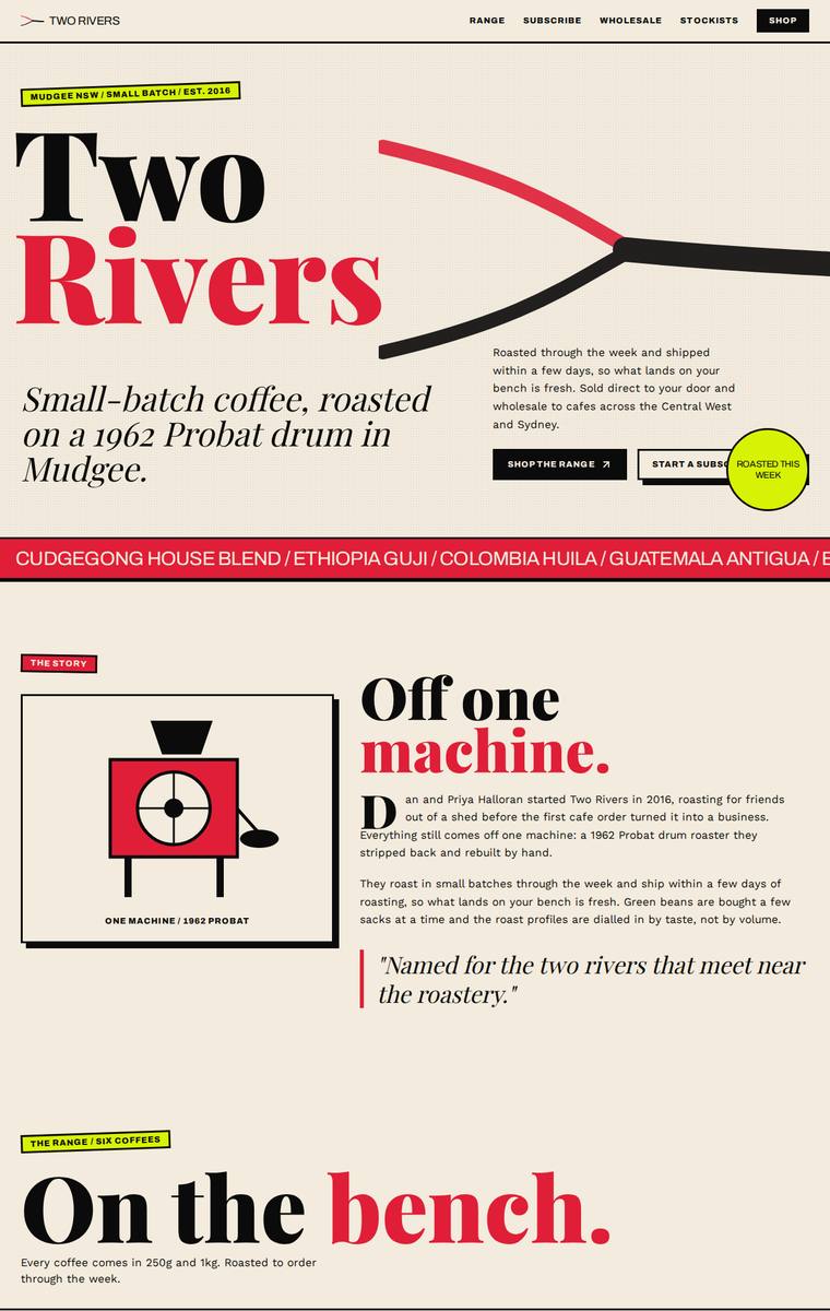
Composite 92.2%Judge 4.7/5
Judge panelAnthropic 5.0/5OpenAI 4.8/5Google 4.0/5
single-judge (Claude) 5.0/5 → leave-one-family-out 4.7/5
Anthropic: Every required section is present and accurate: hero, story (2016, 1962 Probat), all six coffees with correct 250g/1kg prices, subscription with size/frequency toggles and free-shipping-over-$60 note, wholesale form collecting cafe name/contact/email/suburb/volume, all five stockists with locations, brewing-guides teaser (four methods), and contact plus newsletter. The design is a confident editorial system - bold Fraunces-style serif display, a cream/black/red/lime colour-blocked layout, ticket-style price tags, numbered range rows, and a hand-drawn Probat roaster SVG - all executed with cons
OpenAI: All required sections are visible, with the six coffees, prices, subscription details, wholesale form fields, stockists, brewing teaser, contact, and newsletter included accurately. The design is bold, cohesive, and highly distinctive, with strong typography and a memorable colour system. Minor craft issues include some cramped/overlapping hero CTA elements and slightly rough small-text formatting, but the overall execution feels polished and premium.
Google: The design accurately incorporates all brief requirements within a highly distinctive and cohesive visual system. Bold typographic choices and a striking color palette create strong impact, while consistent spacing and structural details demonstrate solid craft.
Yuki Tanabe (claude-opus-4-8)
High reasoning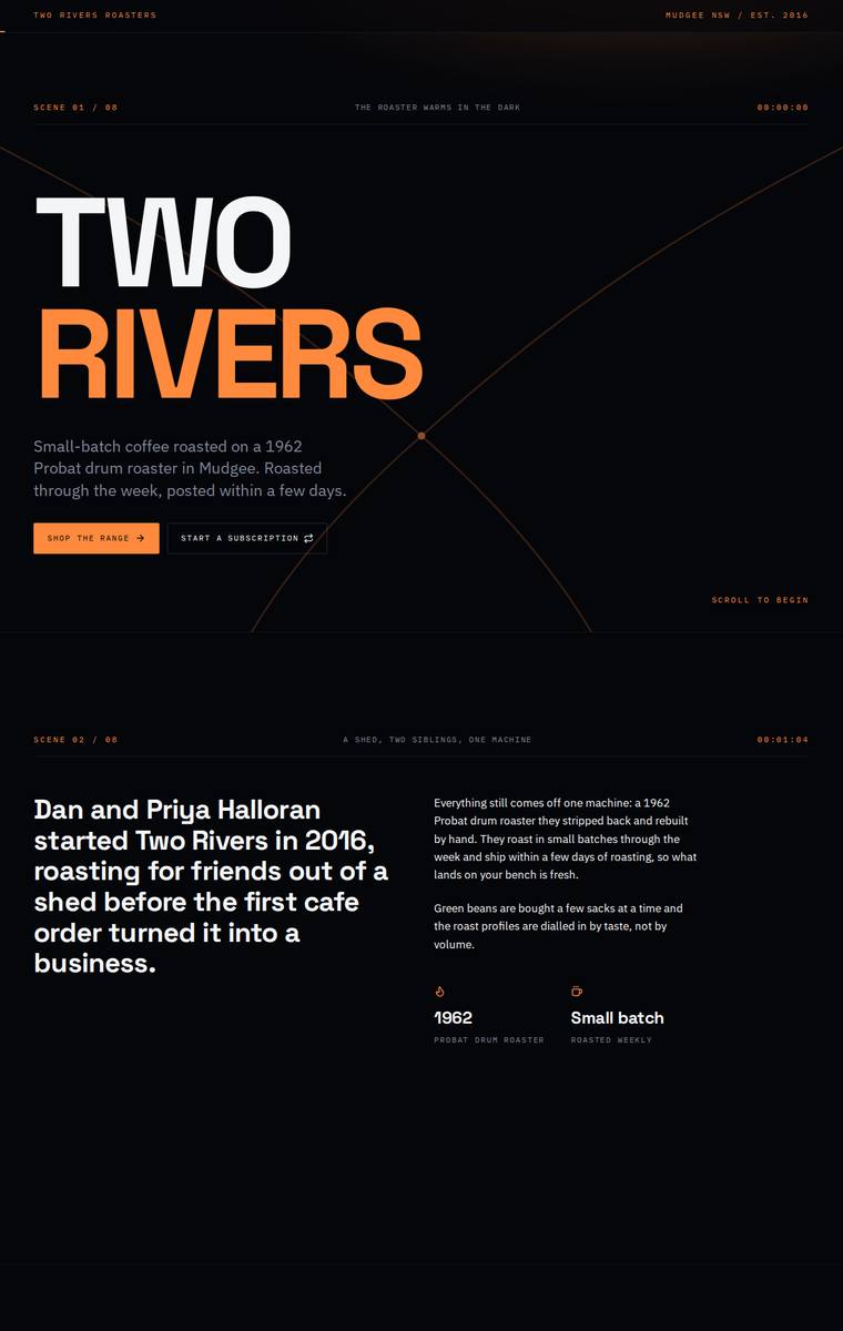
Composite 92.2%Judge 4.7/5
Judge panelAnthropic 4.8/5OpenAI 5.0/5Google 4.0/5
single-judge (Claude) 4.8/5 → leave-one-family-out 4.7/5
Anthropic: Every required section is present and correct: the TWO RIVERS hero, the 2016/Probat story with 1962 and small-batch stats, all six coffees with 250g/1kg prices and tasting notes, a subscription block with size/frequency toggles, a wholesale form collecting cafe name, contact, email, suburb and weekly volume, all five stockists with towns, the four brewing-guide methods, and contact plus newsletter signup. The design is a coherent, distinctive dark editorial system - oversized Archivo-Expanded hero type, an orange accent, and monospace "scene 01/08" section markers create a premium magazine fee
OpenAI: All required sections are present, with the six coffees, prices, stockists, wholesale fields, brewing teaser, contact and newsletter visible and substantially aligned to the supplied copy. The dark cinematic art direction, oversized type, orange accents and scene structure feel highly polished and distinctive, with consistent spacing, forms and details throughout.
Google: The design accurately incorporates all required content within a cohesive, technical dark-mode aesthetic. Consistent typography, precise spacing, and the structural 'scene' motif create a polished, premium experience tailored to the target audience.
Mara Vieira (claude-sonnet-4-6)
High reasoning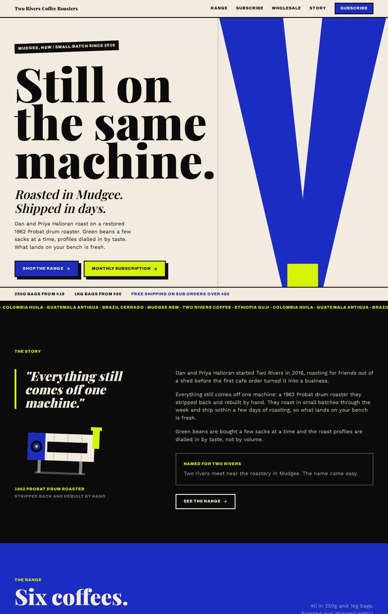
Composite 92.2%Judge 4.7/5
Judge panelAnthropic 4.8/5OpenAI 5.0/5Google 4.0/5
single-judge (Claude) 4.8/5 → leave-one-family-out 4.7/5
Anthropic: Every required section is present and the fixed facts are correct - all six coffees with accurate 250g/1kg prices, all five stockists with locations, the full wholesale form (cafe name, contact, email, suburb, weekly volume), subscription options, brewing-guide teaser, and contact/newsletter footer. The design is a confident editorial system: cream/black/electric-blue/lime blocking, heavy Fraunces-style display serifs, a distinctive V brand mark and hand-drawn Probat roaster, giving it real premium, stop-and-look impact. Craft is finished and consistent overall; only minor nits keep it from a
OpenAI: All required sections and fixed business details are visible, including the six coffees with prices, subscription details, wholesale form fields, five stockists, brewing teaser, contact, and newsletter signup. The design is highly distinctive and cohesive, with confident editorial typography, bold colour blocking, strong hierarchy, and consistent brutalist-inspired detailing. It feels polished and memorable, with only minor readability tradeoffs from the very expressive style.
Google: The design delivers a striking, brutalist-inspired aesthetic that fulfills all brief requirements with high accuracy. Bold typography and an energetic color palette create strong visual impact and consistency. Craftsmanship is solid throughout, featuring well-aligned grids and effective use of constrained inline graphics.
Mara Vieira (kimi-k3)
default reasoning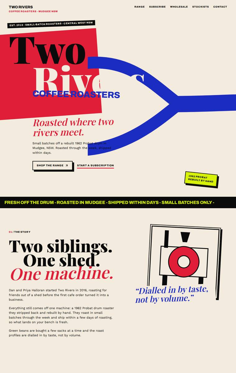
Composite 92.2%Judge 4.7/5
Judge panelAnthropic 4.8/5OpenAI 5.0/5Google 4.0/5
single-judge (Claude) 4.8/5 → leave-one-family-out 4.7/5
Anthropic: Every required section is present and correct: hero, story, all six numbered coffees with 250g/1kg pricing, subscription with the $60 free-shipping detail, a wholesale form collecting cafe name, contact, email, suburb and volume, all five stockists with towns, the four brewing methods, and contact plus newsletter. The editorial system is confident and coherent - cream, red, blue and black with a bold display serif against mono labels, and the blue river motif meeting in the hero is a smart nod to the name. Impact is high; a reviewer would stop on this. Craft is slightly held back by the hero w
OpenAI: All required sections and fixed business details are visible, including the six coffees with correct prices, subscription details, wholesale form fields, five stockists, brewing teaser, contact and newsletter. The bold editorial/brutalist visual system is highly cohesive, distinctive, and polished, with strong typography, colour, spacing, and consistent hand-drawn graphic details throughout.
Google: The design utilizes a striking editorial style with bold typography and a confident color palette that perfectly fits the brand. All brief requirements are seamlessly integrated with consistent, high-quality detailing like offset shadows and custom geometric illustrations.
Mara Vieira (gpt-5.6-terra)
High reasoning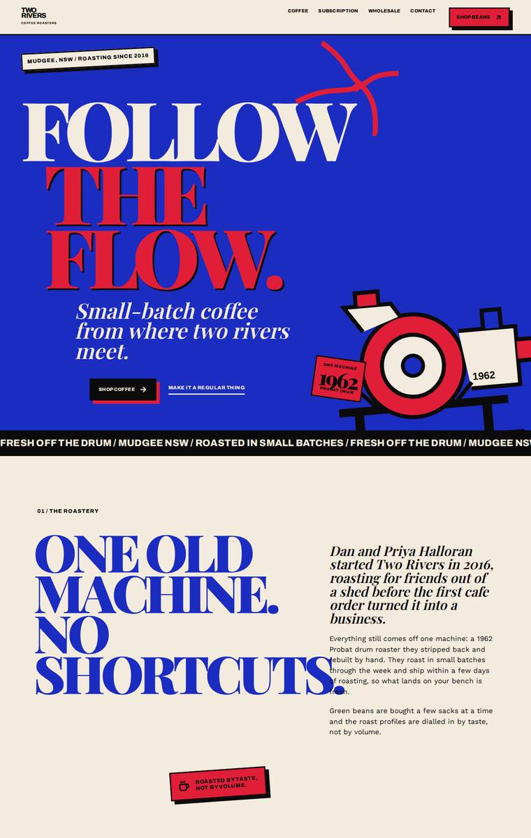
Composite 92.2%Judge 4.7/5
Judge panelAnthropic 5.0/5OpenAI 5.0/5Google 3.8/5
single-judge (Claude) 5.0/5 → leave-one-family-out 4.7/5
Anthropic: Every required section is present and accurate: hero, story with the 1962 Probat facts, all six coffees with tasting notes and 250g/1kg pricing, subscription, wholesale with a five-field form, all five stockists, brewing-guides teaser, and a contact/newsletter footer. The build commits to a distinctive editorial/brutalist system - electric blue, red and cream blocking, expanded display serifs, a drawn-in-code drum-roaster illustration and consistent coffee-bag cards - that is cohesive, finished, and premium. Minor density in the story body copy is the only nitpick against an otherwise stop-and
OpenAI: All required sections, products, stockists, subscription details, wholesale form fields, contact details, and newsletter content are present and clearly tailored to the brief. The design is highly distinctive and cohesive, with bold typography, strong colour blocking, custom illustration, and consistent editorial styling that feels premium and memorable. Craft is polished throughout with strong spacing, hierarchy, and no visible broken or unfinished elements.
Google: The design delivers a highly distinctive, brutalist-inspired aesthetic with bold typography and color choices that command attention. All brief requirements are met, though minor craft issues, like body text colliding with the oversized heading in the story section, slightly detract from the execution.
Ingrid Kessler (Opus 4.8)
High reasoning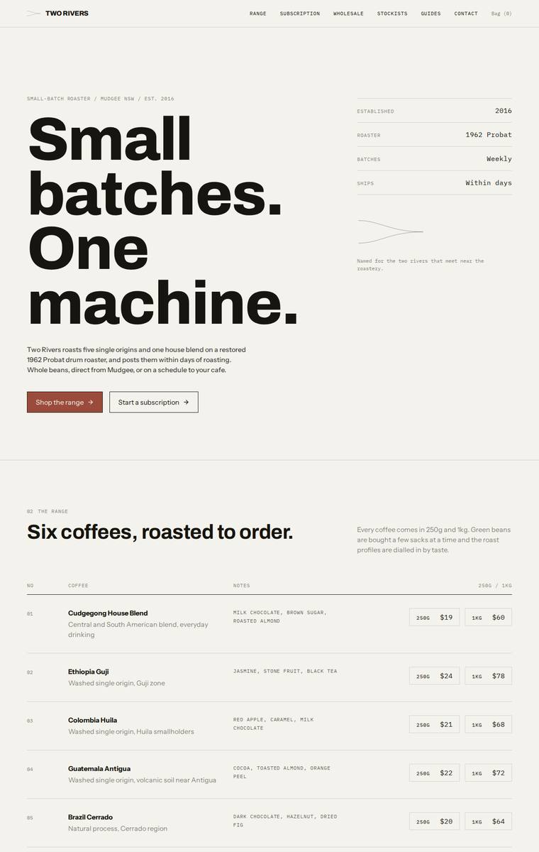
Composite 90.6%Judge 4.6/5
Judge panelAnthropic 4.8/5OpenAI 4.8/5Google 4.0/5
single-judge (Claude) 4.8/5 → leave-one-family-out 4.6/5
Anthropic: Every required section and fixed fact is present and correct: the six coffees with matching 250g/1kg prices, all five stockists with correct towns, the full wholesale form (cafe name, contact, email, suburb, weekly volume), subscription picker, brewing teaser, contact and newsletter. The design is a confident, coherent editorial Swiss system - a commanding oversized Archivo hero, restrained cream/terracotta palette, mono section labels, a clean numbered structure, and a witty two-lines-meeting graphic that ties to the name; the dark subscription block adds well-judged contrast. Only nit agains
OpenAI: All required sections and fixed business details are visible, including the six coffees with pricing, subscription details, wholesale form fields, five stockists, guides teaser, contact, and newsletter signup. The design is highly cohesive and polished, with strong editorial typography, restrained colour, clean spacing, and consistent table/form treatment. It feels premium and memorable, though the very minimal visual language is slightly less distinctive than a concept with richer bespoke illustration or brand imagery.
Google: Meets all brief requirements with a sophisticated, typography-led approach. The rigorous grid, refined color palette, and consistent detailing create a premium, editorial feel without needing photography.
Ingrid Kessler (claude-opus-4-8)
High reasoning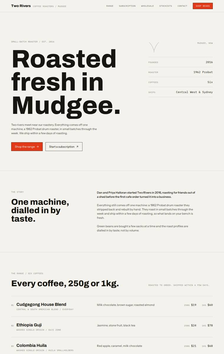
Composite 90.6%Judge 4.6/5
Judge panelAnthropic 4.8/5OpenAI 4.8/5Google 4.0/5
single-judge (Claude) 4.8/5 → leave-one-family-out 4.6/5
Anthropic: Every required section is present and correct: hero, story, all six coffees with accurate 250g/1kg pricing and tasting notes, the dark subscription block, a wholesale form collecting exactly the five requested fields, all five stockists with locations, the four brewing guides, and contact plus newsletter. The editorial system is confident and coherent - oversized condensed Archivo headlines, warm cream ground, a single red accent, and monospaced metadata labels create a strong, modern roaster identity with disciplined grid and spacing. Craft is finished throughout with consistent numbering, al
OpenAI: All required sections and fixed business details are present, including the six coffees, subscription terms, wholesale form fields, stockists, brewing teaser, contact, and newsletter. The design is highly coherent and polished, with strong editorial typography, disciplined spacing, and a restrained coffee-appropriate palette. It feels premium and distinctive, though its stark typographic minimalism is more refined than emotionally memorable.
Google: The design executes the brief perfectly with a strong, modern typographic approach and a disciplined, minimalist layout. The use of a vibrant accent color against the muted background creates a premium, distinctive feel suitable for a contemporary coffee roaster. Craft and spacing are consistently excellent throughout the single-page build.
Ingrid Kessler (claude-fable-5)
High reasoning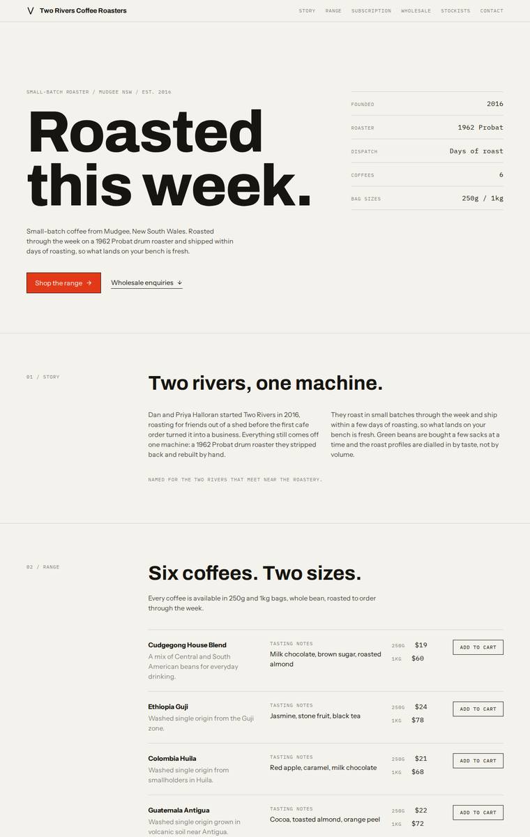
Composite 90.6%Judge 4.6/5
Judge panelAnthropic 4.8/5OpenAI 5.0/5Google 3.8/5
single-judge (Claude) 4.8/5 → leave-one-family-out 4.6/5
Anthropic: Every required section is present and correct: hero, story, all six coffees with tasting notes and both 250g/1kg prices, subscription with the size/frequency/shipping detail, a wholesale form collecting cafe name, contact, email, suburb and weekly volume, all five stockists, the brewing-guides teaser, and contact plus newsletter. The execution is a confident Swiss/editorial system: a massive Archivo "Roasted this week." hero, restrained off-white ground with a single orange accent, monospace section numbering, and cleanly aligned data tables and forms that feel finished with no broken or janky
OpenAI: All required sections and fixed content are present, including the six coffees with prices, subscription details, wholesale form fields, five stockists, brewing teaser, contact email, and newsletter signup. The restrained editorial layout, strong typography, precise grid, and minimal colour palette feel premium and highly consistent, with no visible broken or unfinished elements.
Google: The design presents a clean, grid-based aesthetic that effectively organizes the required content with strong typography and consistent spacing. While highly polished and faithful to the brief, the strict minimalist approach feels slightly sterile and lacks visual warmth.
Mara Vieira (claude-fable-5)
High reasoning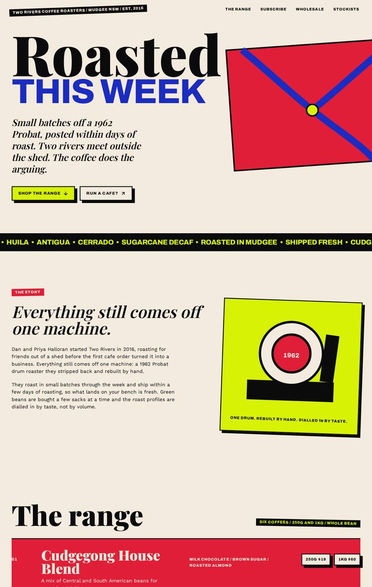
Composite 90.6%Judge 4.6/5
Judge panelAnthropic 4.8/5OpenAI 4.8/5Google 4.0/5
single-judge (Claude) 4.8/5 → leave-one-family-out 4.6/5
Anthropic: Every required section is present and correct: hero, story with the 1962 Probat detail, all six coffees with flavour notes and 250g/1kg prices, subscription with size/frequency controls, a wholesale form collecting all five fields, all five stockists with locations, brewing-guides teaser, and contact plus newsletter. The design is a confident, cohesive neo-brutalist editorial system - bold red/blue/acid-green palette, expanded display type against a serif, hard-edged borders and offset shadows applied consistently, giving a distinctive result a reviewer would stop on. Craft is strong overall,
OpenAI: All required sections and fixed business details are visible, including the six coffees with prices, subscription terms, wholesale form fields, stockists, brewing teaser, contact details, and newsletter signup. The visual direction is highly distinctive and cohesive, with bold editorial typography, confident colour, and strong composition. Craft is mostly polished, though a few intentionally oversized elements and clipped stickers/graphics feel slightly close to janky at the page edges.
Google: The design faithfully includes all required brief elements within a bold, cohesive neo-brutalist aesthetic. Typography, high-contrast colors, and abstract graphics are applied consistently, resulting in a striking and memorable visual identity.
Ingrid Kessler (grok-4.5)
High reasoning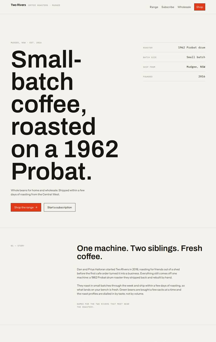
Composite 90.6%Judge 4.6/5
Judge panelAnthropic 4.8/5OpenAI 4.8/5Google 4.0/5
single-judge (Claude) 4.8/5 → leave-one-family-out 4.6/5
Anthropic: Every required section is present and correct: hero with the exact tagline, numbered story/range/subscription/wholesale/stockists/brewing/contact sections, all six coffees with correct 250g and 1kg prices in a clean table, the wholesale form with all five requested fields, the five stockists, brewing-guide teaser, and a newsletter signup. The execution is a confident Swiss-editorial system - huge Archivo headline, warm cream ground with a single orange accent, monospace section labels and metadata, and disciplined spacing - that reads as coherent, modern, and finished with no visible janky bit
OpenAI: All required sections, products, stockists, subscription details, wholesale fields, contact information, and newsletter content are present and accurate. The visual system is highly coherent and polished, with strong editorial typography, disciplined spacing, and consistent linework, though the austere monochrome approach is slightly less distinctive than a more ownable coffee-roaster identity could be.
Google: The design strictly adheres to the brief with a sophisticated, grid-driven layout and strong typographic hierarchy. Consistent spacing and a restrained color palette create a highly polished, premium aesthetic. Execution is precise across all sections without feeling cluttered.
Mara Vieira (gpt-5.5)
High reasoning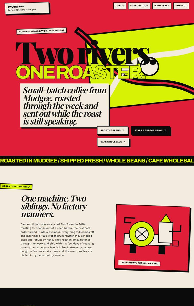
Composite 90.6%Judge 4.6/5
Judge panelAnthropic 4.8/5OpenAI 4.8/5Google 4.0/5
single-judge (Claude) 4.8/5 → leave-one-family-out 4.6/5
Anthropic: Every required section is present and correct: hero ("Two Rivers, One Roaster"), story, all six coffees with tasting notes and 250g/1kg prices, subscription ("Put it on repeat"), a wholesale form with the right fields ("Feed the bar"), all five stockists with towns ("Shelf proof"), a brewing-guides teaser covering pour-over/plunger/espresso/AeroPress, and contact plus newsletter signup. The visual language is a confident, distinctive editorial/neo-brutalist system - chartreuse, red, black and cream with heavy Archivo-Expanded display type, sharp bordered cards and a hand-drawn roaster illustra
OpenAI: All required sections and fixed business details are visible, including the six coffees, subscription, wholesale form fields, five stockists, brewing teaser, contact details and newsletter signup. The visual direction is bold, coherent and highly distinctive with strong typography, colour and custom illustration; minor legibility/overlap issues in the hero and some small body text keep craft just shy of perfect.
Google: The design fulfills all brief requirements with a highly distinctive, neo-brutalist aesthetic. The aggressive color palette and heavy typography are unconventional for coffee but executed with consistent craft, resulting in a bold, memorable page.
Yuki Tanabe (gpt-5.6-sol)
High reasoning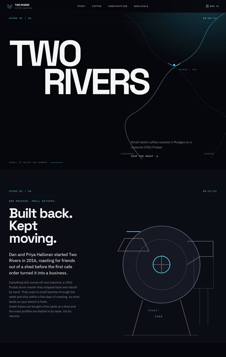
Composite 90.6%Judge 4.6/5
Judge panelAnthropic 4.8/5OpenAI 4.8/5Google 4.0/5
single-judge (Claude) 4.8/5 → leave-one-family-out 4.6/5
Anthropic: Every required section is present and correct: bold hero, story, all six coffees with tasting notes and correct 250g prices, a configurable subscription picker, a wholesale form collecting cafe/contact/email/suburb/volume, all five stockists, the four brewing-guide teasers, and both contact and newsletter blocks. The execution is a confident, editorial dark theme with an Archivo-Expanded display face, a cyan accent, a distinctive "SCENE 0X/09" scene-numbering system, and a hand-drawn Probat drum-roaster diagram that ties the identity to the brief - coherent, modern, and genuinely premium. It l
OpenAI: All required sections are visible and the business facts, six coffees, wholesale form, stockists, brewing teaser, contact, and newsletter are largely represented. The main fidelity issue is that the 1kg prices for the coffees are not visibly provided, only selectable, so a fixed product detail from the brief is missing in the screenshot. Visually it is highly polished, cohesive, distinctive, and premium, with strong typography, spacing, and custom illustrative detail.
Google: The design employs a striking, technical aesthetic that effectively interprets the mechanical precision of coffee roasting. All brief requirements are seamlessly integrated into a strict grid with custom, thematic graphics, yielding a highly distinctive and cohesive result.
Ingrid Kessler (gpt-5.6-luna)
High reasoning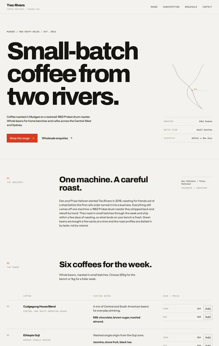
Composite 90.6%Judge 4.6/5
Judge panelAnthropic 4.8/5OpenAI 5.0/5Google 3.8/5
single-judge (Claude) 4.8/5 → leave-one-family-out 4.6/5
Anthropic: Every required section is present and accurate: hero, story, all six coffees with correct 250g/1kg pricing and Add buttons, subscription with coffee/size/frequency controls, a dark-contrast wholesale form collecting cafe name/contact/email/suburb/weekly volume, all five stockists with locations, the four-method brewing teaser, and contact plus newsletter signup. The execution is a confident Swiss-editorial system: oversized Archivo Expanded headlines, disciplined mono section labels with numbering, generous whitespace, a single orange accent, and a well-aligned range table, all consistent and
OpenAI: All required sections and fixed content are visible, including the six coffees with prices, subscription details, wholesale form fields, five stockists, brewing teaser, contact details, and newsletter signup. The design is highly coherent and polished, with strong editorial typography, restrained colour, excellent spacing, and a distinctive premium roaster feel. Details such as the river-map illustration, numbered sections, table styling, and dark wholesale block add craft and memorability without compromising clarity.
Google: The design satisfies all brief requirements using a highly structured, editorial layout. Typography and grid alignments are handled with excellent consistency, yielding a clean aesthetic that is effective but visually understated.
Yuki Tanabe (Opus 4.8)
High reasoning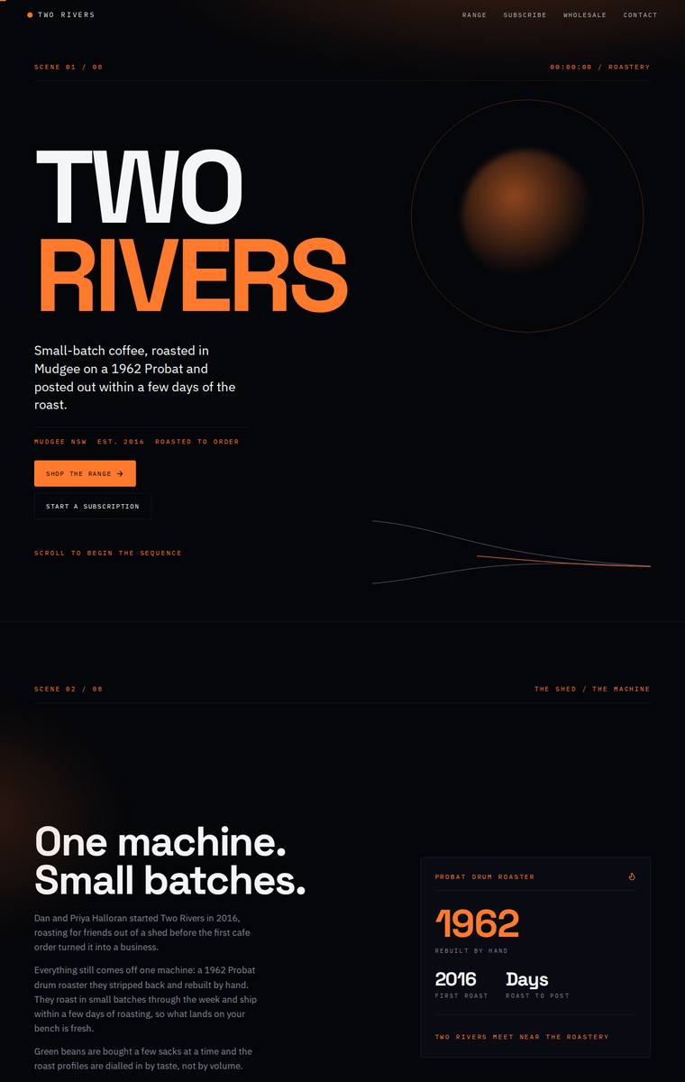
Composite 89.1%Judge 4.6/5
Judge panelAnthropic 4.3/5OpenAI 5.0/5Google 4.0/5
single-judge (Claude) 4.3/5 → leave-one-family-out 4.6/5
Anthropic: All required sections are present and correct: bold hero, story with the 1962/2016 stat card, all six coffees with correct 250g/1kg prices and tasting notes, subscription builder, wholesale form (cafe name, contact, email, suburb, weekly volume), the five stockists with towns, brewing-guides teaser (pour-over/plunger/espresso/AeroPress), and contact plus newsletter with the correct email. The design is a coherent, confident editorial dark theme with heavy Archivo-Expanded display type and a single warm-orange accent, numbered section labels, and a nice radial-glow hero orb, all consistently ap
OpenAI: All required sections are visible with the six coffees, prices, subscription details, wholesale form fields, five stockists, brewing teaser, contact, and newsletter included accurately. The design is highly cohesive and premium, with a distinctive dark cinematic roastery aesthetic, strong typography, disciplined spacing, and consistent orange accent system. The execution feels polished and memorable, with only minor readability tradeoffs from the very small mono labels.
Google: The design accurately incorporates all brief requirements within a cohesive, premium dark-mode aesthetic. Typography and layout are meticulously crafted, featuring a distinctive 'scene-by-scene' structure that elevates the brand presentation.
Noor El-Amin (Opus 4.8)
High reasoning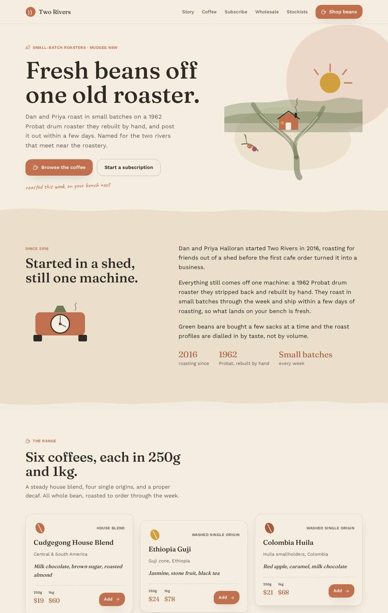
Composite 89.1%Judge 4.6/5
Judge panelAnthropic 4.3/5OpenAI 5.0/5Google 4.0/5
single-judge (Claude) 4.3/5 → leave-one-family-out 4.6/5
Anthropic: Every required section is present and correct: hero, story with the 2016/1962/small-batches stat row, all six coffees with accurate 250g/1kg prices and tasting notes, a subscription builder form, a wholesale form collecting exactly the five specified fields, all five stockists with towns, the brewing-guides teaser, and contact plus newsletter signup. The visual system is coherent and appropriate to a craft roaster: warm cream/terracotta/sage palette, a Fraunces-style serif display face paired with clean sans body, tidy card grids and a hand-drawn hero vignette that gives it character. Craft is
OpenAI: The page visibly includes every required section with all six coffees, all five stockists, subscription details, wholesale form fields, brewing teaser, contact email, and newsletter signup. The visual system is cohesive and polished, with warm coffee-inspired colours, elegant typography, strong spacing, custom illustration, and consistent card/form treatments. Overall it feels premium, distinctive, and highly finished for the business.
Google: The design demonstrates excellent brief fidelity, accurately incorporating all requested sections and copy. An earthy palette, strong typography, and charming illustrations create a cohesive, premium aesthetic. Execution is polished, featuring consistent spacing and well-crafted UI components throughout.
Mara Vieira (claude-opus-4-8)
High reasoning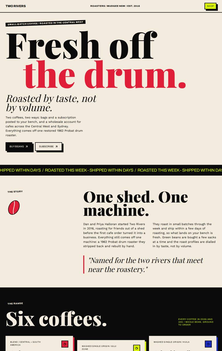
Composite 89.1%Judge 4.6/5
Judge panelAnthropic 4.8/5OpenAI 4.8/5Google 3.8/5
single-judge (Claude) 4.8/5 → leave-one-family-out 4.6/5
Anthropic: Every required section is present and correct: hero, story, all six coffees with tasting notes and both 250g/1kg prices, subscription with weekly/fortnightly/monthly and free-shipping note, the full wholesale form (cafe name, contact, email, suburb, weekly volume), all five stockists with towns, brewing-guides teaser, and contact plus newsletter. The design is a confident editorial/brutalist system - bold Fraunces-style serif display, a striking cream/red/blue/black/lime palette held together by consistent black-bordered cards and a running marquee - modern, distinctive, and the kind of page a
OpenAI: All required sections, six coffees, prices, wholesale form fields, stockists, brewing teaser, contact, and newsletter are visible and mostly accurate, though the hero copy incorrectly says “Two coffees, two ways” despite the six-coffee range. The visual system is bold, cohesive, and highly distinctive with strong editorial typography, confident colour blocking, and polished spacing/detail throughout.
Google: The design delivers all brief requirements through a striking, typography-led aesthetic with consistent tactile styling. The bold palette and retro layout create strong impact, though abstract icon choices slightly detach from the core coffee theme.
Yuki Tanabe (claude-sonnet-4-6)
High reasoning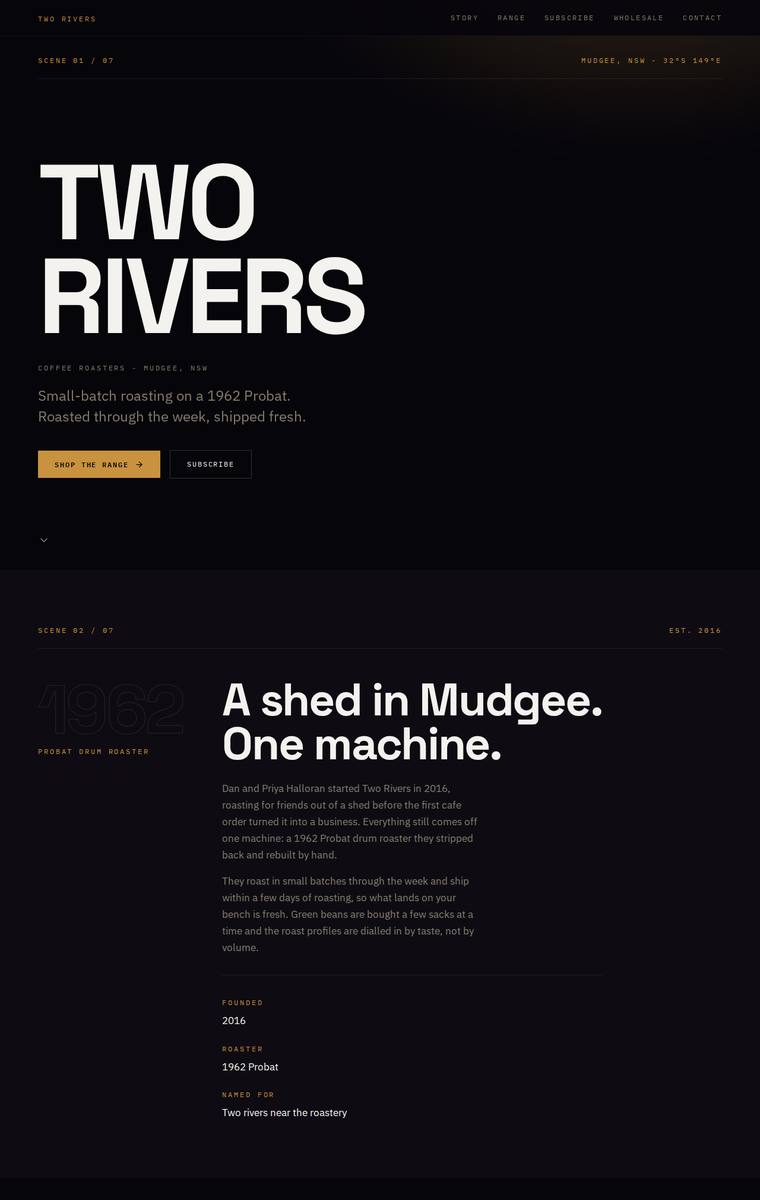
Composite 89.1%Judge 4.6/5
Judge panelAnthropic 4.3/5OpenAI 5.0/5Google 4.0/5
single-judge (Claude) 4.3/5 → leave-one-family-out 4.6/5
Anthropic: All required sections are present and correct: the bold hero, the story ("A shed in Mudgee. One machine."), the full range with all six coffees plus 250g/1kg prices and tasting notes, the subscription steps, a wholesale form collecting cafe name/contact/email/suburb/weekly volume, all five stockists, the brewing-guides teaser, and contact plus newsletter signup. The dark editorial treatment is coherent and modern - a strong condensed display face, a disciplined gold accent, consistent section numbering, and generous spacing give it a confident premium feel. It loses a little on impact and craf
OpenAI: All required sections and fixed business details are present, including the six coffees with prices, subscription terms, wholesale form fields, five stockists, brewing teaser, contact details, and newsletter signup. The design is highly cohesive and premium, with strong typographic hierarchy, disciplined dark palette, refined spacing, and consistent editorial detailing throughout. It feels finished and distinctive, with only minor possible legibility tradeoffs in the muted body text.
Google: All required sections and copy are accurately implemented. The dark, editorial visual language and structured grid establish a premium brand feel. Consistent typography and refined spacing demonstrate strong technical execution.
Ingrid Kessler (claude-sonnet-5)
High reasoning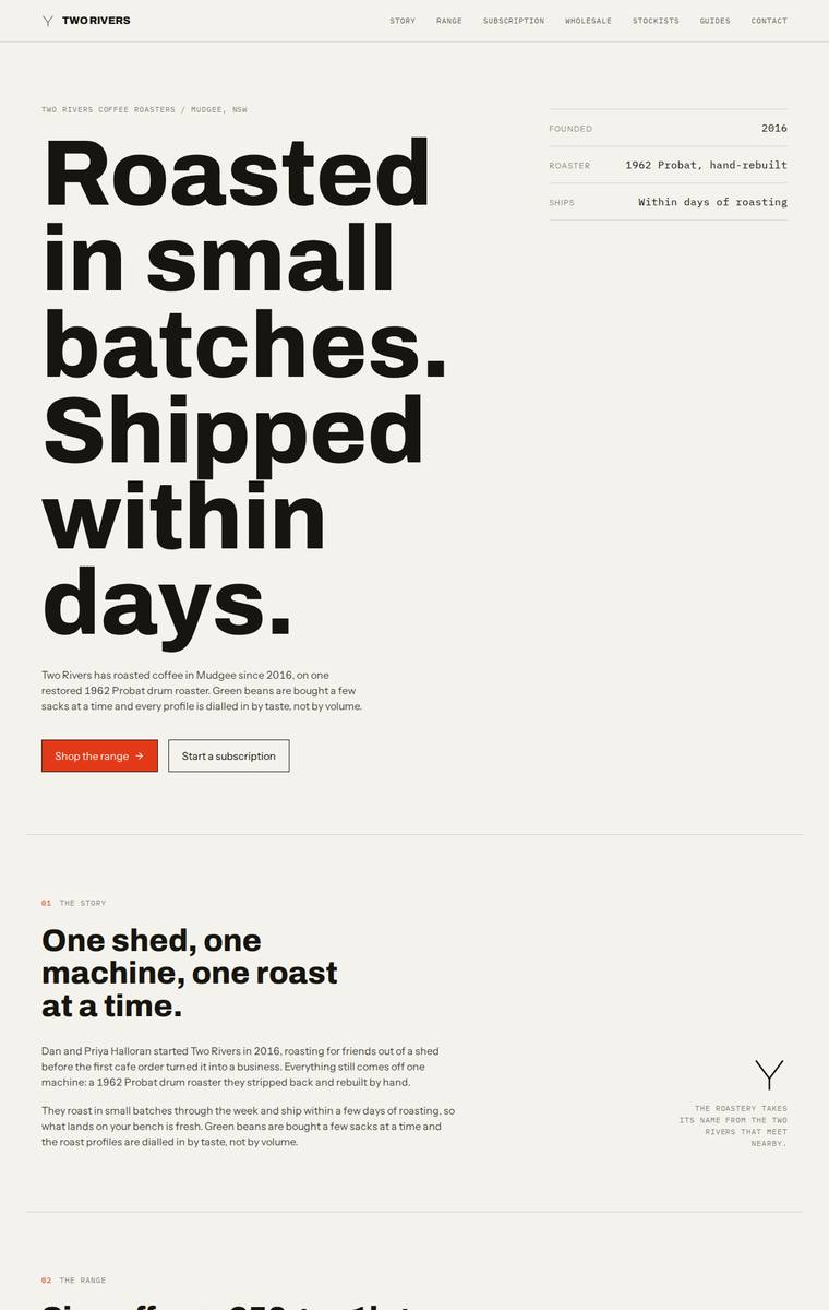
Composite 89.1%Judge 4.6/5
Judge panelAnthropic 4.8/5OpenAI 4.8/5Google 3.8/5
single-judge (Claude) 4.8/5 → leave-one-family-out 4.6/5
Anthropic: Every required section is present and correct: hero, story, all six coffees with 250g/1kg prices, subscription details, wholesale form with all five specified fields, five stockists, brewing guides teaser, and contact plus newsletter. The design is a confident, coherent Swiss-editorial system - warm off-white ground, a single rust accent, oversized Archivo hero, monospace labels, numbered sections and a recurring Y mark - with clean table alignment and tidy form inputs and no janky detail. It is premium and would make a reviewer stop, though it leans on a familiar high-end editorial template r
OpenAI: All required sections and fixed facts are visible, including the six coffees with prices, wholesale form fields, five stockists, brewing teaser, contact, and newsletter. The design is highly coherent and polished, with a strong editorial grid, confident typography, restrained palette, and consistent spacing. Its stark minimalism is distinctive and premium, though the lack of richer visual texture or product imagery keeps the overall impact just short of exceptional.
Google: The design accurately includes all brief requirements within a highly structured, grid-based layout. Typography and spacing convey a premium aesthetic, though the entirely text-based approach feels slightly clinical.
Mara Vieira (glm-5.2)
default reasoning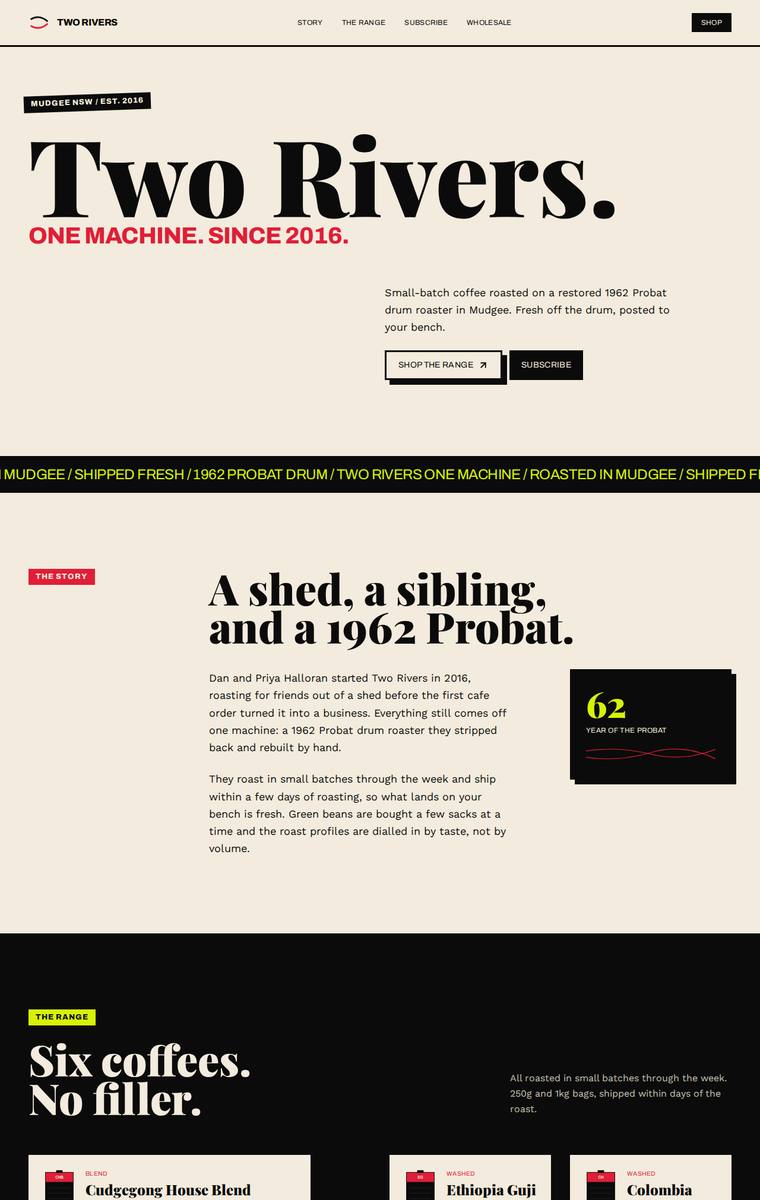
Composite 89.1%Judge 4.6/5
Judge panelAnthropic 4.8/5OpenAI 5.0/5Google 3.5/5
single-judge (Claude) 4.8/5 → leave-one-family-out 4.6/5
Anthropic: Every required section is present and correct: hero, story, all six coffees with 250g/1kg prices, subscription, a wholesale form with the exact five fields, all five stockists with towns, the four brewing methods, and contact plus newsletter. The visual language is confident editorial - a huge serif "Two Rivers." lockup, a running marquee, and bold full-bleed colour blocks (cream, red, cobalt, black, chartreuse) that hold together as one coherent, modern brand. Craft is high with consistent cards and alignment, docked slightly for a few text-dense passages, but the overall result is distinctiv
OpenAI: All required sections and fixed facts are visible, including the six coffees with details and prices, subscription copy, wholesale form fields, five stockists, brewing teaser, contact, and newsletter. The design is highly cohesive and distinctive, with bold editorial typography, confident colour blocking, strong spacing, and consistent branded details that feel premium and memorable.
Google: The layout accurately integrates all brief requirements with strong typography and solid structural execution. However, the abrupt transitions between bright, primary color blocks slightly undermine the cohesion and premium feel of the brand.
Ingrid Kessler (kimi-k3)
default reasoning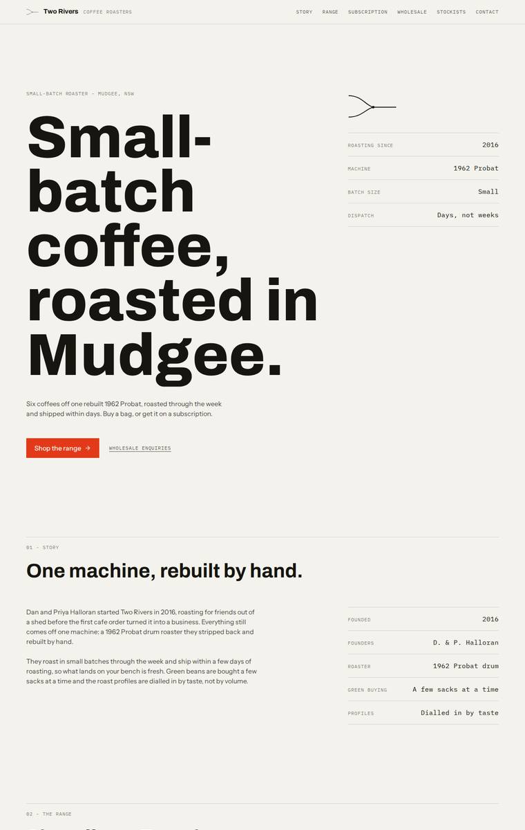
Composite 89.1%Judge 4.6/5
Judge panelAnthropic 5.0/5OpenAI 4.8/5Google 3.8/5
single-judge (Claude) 5.0/5 → leave-one-family-out 4.6/5
Anthropic: Every required section is present and factually correct: hero, story with a founding-facts spec block, all six coffees with correct 250g/1kg pricing and tasting notes, the three-step subscription, a wholesale form capturing all five fields, all five stockists, the four-method brewing teaser, and contact plus newsletter. The design is a disciplined editorial system - oversized Archivo Expanded hero, warm off-white ground, a single orange accent, and monospace data labels used consistently across specs and tables, with a black subscription band for rhythm. Craft is tight and finished with no jan
OpenAI: All required sections and fixed business details are visible, including the full six-coffee range with prices, wholesale form fields, five stockists, brewing teaser, contact and newsletter. The design is highly coherent and polished, with strong editorial typography, disciplined spacing, and a restrained coffee-adjacent palette. It feels premium and distinctive, though its very austere, mostly text-led approach gives it slightly less warmth and product appetite than the strongest possible coffee retail site.
Google: The design demonstrates strong fidelity to the brief, incorporating all required sections with a clean, grid-based layout. Its utilitarian aesthetic and strong typographic hierarchy create a premium, editorial feel, supported by consistent spacing and alignment. While slightly stark, the visual execution is highly professional and well-crafted.
Mara Vieira (gemini-3.5-flash)
default reasoning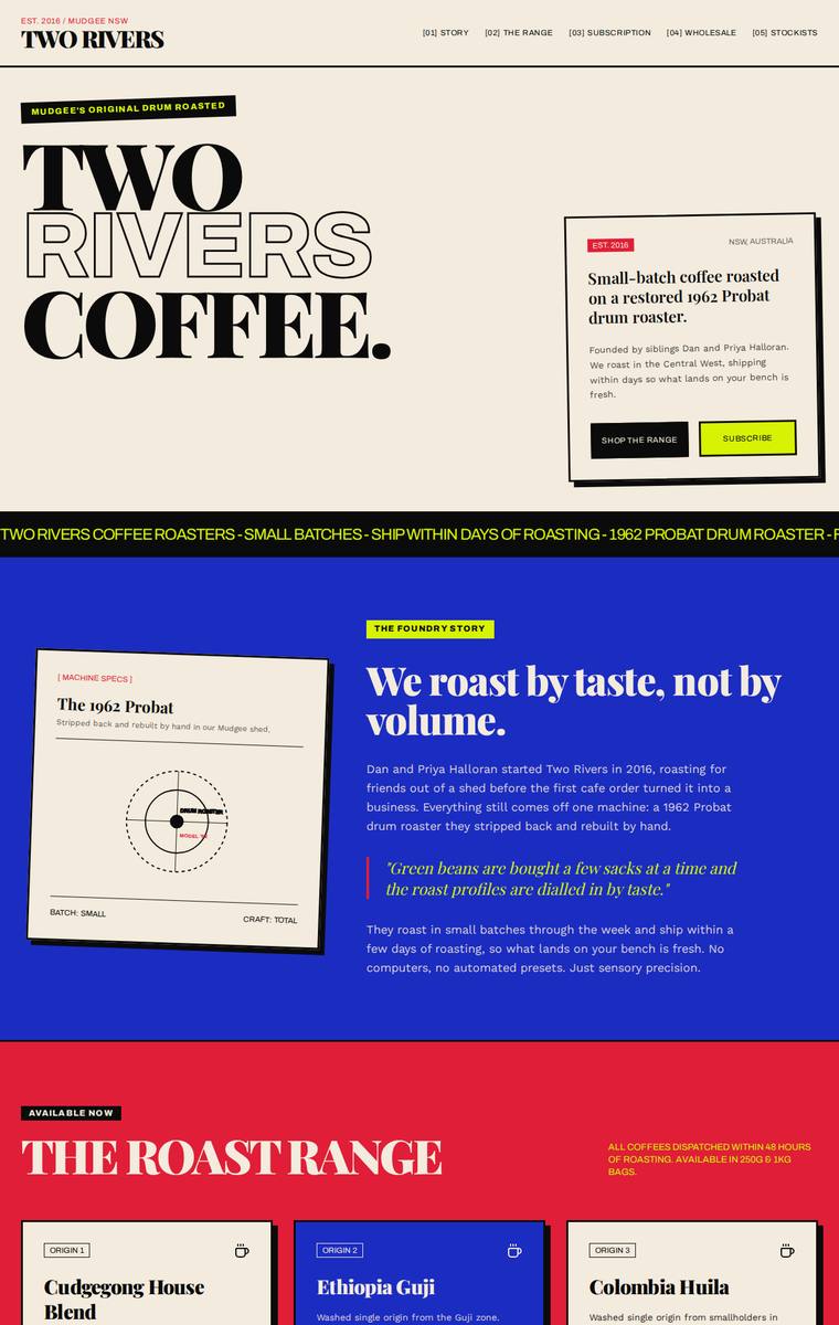
Composite 89.1%Judge 4.6/5
Judge panelAnthropic 4.5/5OpenAI 5.0/5Google 4.0/5
single-judge (Claude) 4.5/5 → leave-one-family-out 4.6/5
Anthropic: Every required section is present and accurate: hero, story with the roaster detail and pull-quote, all six coffees with correct 250g/1kg prices, a subscription configurator, a wholesale form collecting all five requested fields, the five stockists with towns, the brewing-guides teaser, and contact plus newsletter. The design is a confident editorial/Swiss system with heavy display serif, a marquee band, and bold cream/blue/red/lime colour-blocking that reads as coherent and intentional rather than random, with strong type hierarchy and disciplined card grids. Craft is high with only minor loo
OpenAI: All required sections and fixed business details are visible, including the six coffees with prices, subscription terms, wholesale form fields, five stockists, brewing teaser, contact details, and newsletter signup. The execution is highly distinctive and cohesive, with bold editorial typography, confident colour blocking, strong spacing, and polished card/form details that feel finished and memorable.
Google: A striking neo-brutalist design that flawlessly integrates all brief requirements. Bold typography and a primary color palette are applied with meticulous consistency.
Noor El-Amin (gemini-3.5-flash)
default reasoning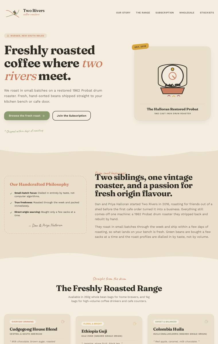
Composite 89.1%Judge 4.6/5
Judge panelAnthropic 4.3/5OpenAI 5.0/5Google 4.0/5
single-judge (Claude) 4.3/5 → leave-one-family-out 4.6/5
Anthropic: Every required section is present and correct: hero with the "two rivers meet" line, the sibling story, all six coffees with accurate 250g/1kg pricing, an interactive subscription builder, the wholesale form collecting cafe name/contact/email/suburb/volume, all five stockists, the brewing-guides teaser, and contact plus newsletter in the footer. The warm cream palette, Fraunces-style serif display, olive-green accents, and Caveat script eyebrows form a coherent, on-brand editorial roaster look with tidy card grids and consistent spacing. It reads as finished and tasteful; the main thing holdin
OpenAI: All required sections are visible and complete, including the six coffees with correct prices, subscription details, wholesale form fields, five stockists, brewing teaser, contact details, and newsletter signup. The design is cohesive and polished, with a warm roastery palette, distinctive serif/script typography, thoughtful illustration, strong spacing, and consistent component styling that feels premium and memorable.
Google: The design delivers a strong artisanal aesthetic through warm, earthy tones and excellent typography. All brief requirements are seamlessly integrated into a polished layout, resulting in a highly cohesive and premium outcome.
Ingrid Kessler (gpt-5.5)
High reasoning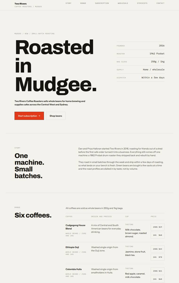
Composite 89.1%Judge 4.6/5
Judge panelAnthropic 4.8/5OpenAI 4.8/5Google 3.8/5
single-judge (Claude) 4.8/5 → leave-one-family-out 4.6/5
Anthropic: Every required section is present and correct: hero, story, all six coffees with the fixed prices in a clean editorial table, the subscription picker, a wholesale form collecting all five specified fields, the five stockists, the four brewing methods, and contact plus newsletter. The Swiss/editorial system is confident and cohesive - a huge Archivo Expanded display wordmark ("Roasted in Mudgee."), a warm cream ground, a single orange accent, and monospace section labels with hairline-ruled tables, all consistently applied with generous spacing and no visible janky bits. It is genuinely premium
OpenAI: All required sections are visible and the fixed business details, six coffees, subscription terms, wholesale form fields, five stockists, brewing teaser, contact details, and newsletter signup are present and accurate. The execution is polished, with a strong editorial grid, confident typography, restrained colour palette, and consistent spacing/detail throughout. It feels premium and memorable, though the lack of imagery or a more ownable brand motif keeps the overall impact just shy of exceptional.
Google: The design achieves complete brief fidelity through a sophisticated, typography-led editorial layout. The rigid grid and restrained palette communicate a premium feel, while precise alignment demonstrates strong craft, though the strict minimalism slightly dampens overall impact.
Noor El-Amin (gpt-5.5)
High reasoning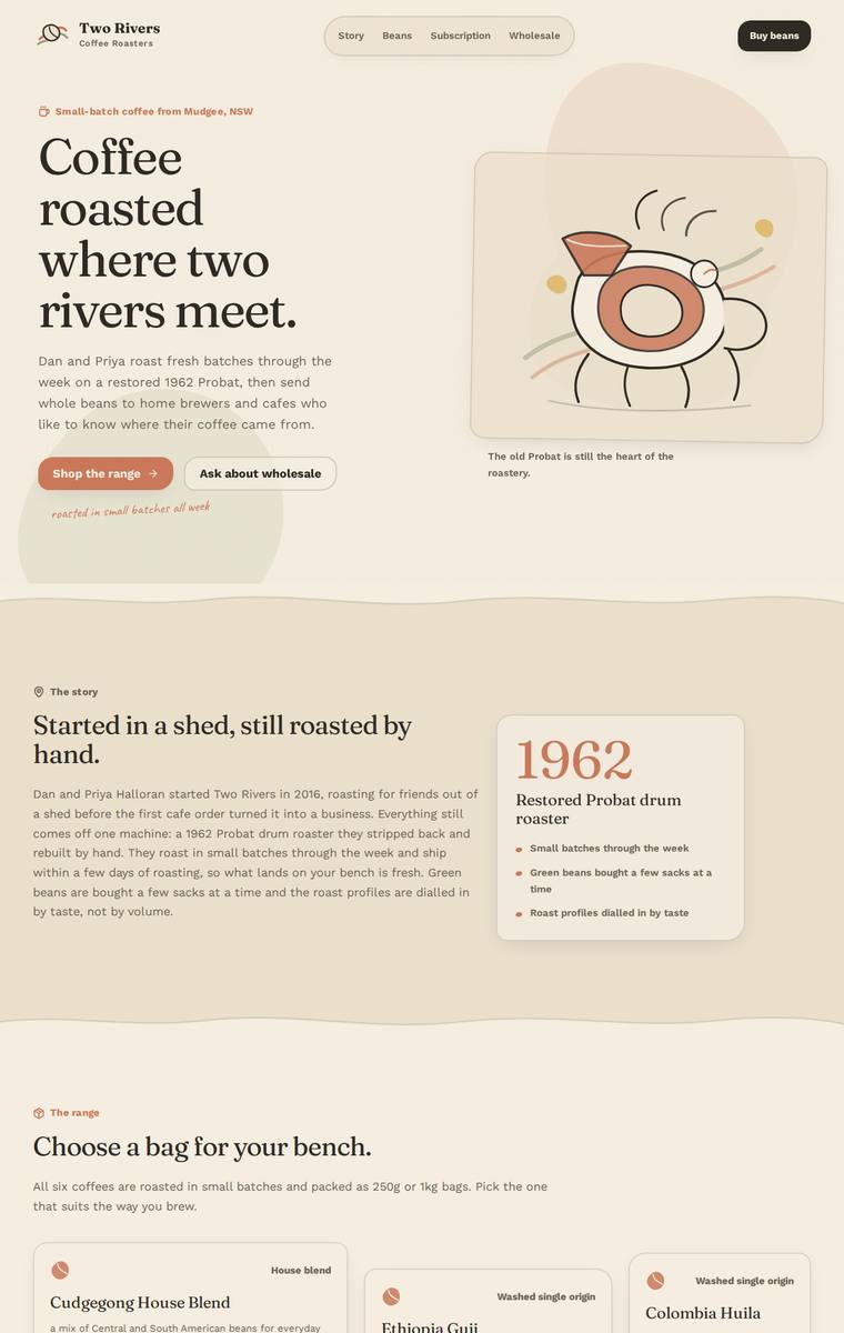
Composite 89.1%Judge 4.6/5
Judge panelAnthropic 4.3/5OpenAI 5.0/5Google 4.0/5
single-judge (Claude) 4.3/5 → leave-one-family-out 4.6/5
Anthropic: Every required section is present and correct: hero, story with the 1962 Probat callout, all six coffees with accurate 250g/1kg prices and tasting notes, subscription with a configurable form, a wholesale form collecting all five requested fields, all five stockists, the four-method brewing teaser, and contact plus newsletter signup. The warm cream-and-terracotta palette, editorial serif display headings, hand-drawn coffee illustrations, and alternating section bands read as coherent, on-brand, and well-composed. Craft is clean and consistent across cards and forms with no obvious broken bits;
OpenAI: All required sections and fixed content are present, including the full six-coffee range with prices, subscription, wholesale form fields, five stockists, brewing teaser, contact, and newsletter. The visual system is cohesive and polished, with warm colours, elegant type pairing, custom illustration, consistent cards, and thoughtful wavy section transitions. It feels finished, distinctive, and highly appropriate for a small-batch regional coffee roaster.
Google: The design features a warm, organic aesthetic that suits the boutique coffee brand perfectly. All required content sections are present and well-structured, utilizing consistent typography and appealing subtle wave dividers to create a cohesive layout.
Mara Vieira (gpt-5.6-sol)
High reasoning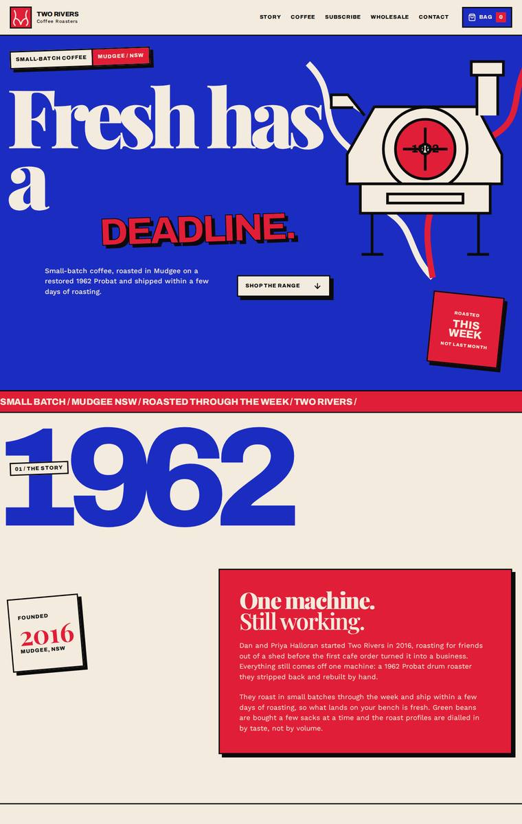
Composite 89.1%Judge 4.6/5
Judge panelAnthropic 4.8/5OpenAI 4.8/5Google 3.8/5
single-judge (Claude) 4.8/5 → leave-one-family-out 4.6/5
Anthropic: Every required section is present and correct: hero, story (1962 Probat, founded 2016), all six coffees with their correct prices and tasting notes, the subscription builder, a wholesale form collecting cafe name/contact/email/suburb/weekly volume, all five stockists with locations, a brewing-guides teaser, and contact plus newsletter signup. The visual language is confident and distinctive - oversized Archivo Expanded headlines, a tight blue/red/cream palette used in bold colour blocks, and a custom inline SVG of the drum roaster that ties the identity together, reading as premium and editori
OpenAI: All required sections are present with the six coffees, wholesale form fields, stockists, brewing teaser, contact details, and newsletter signup, though the range cards only visibly show the 250g prices rather than the fixed 1kg prices. The visual system is bold, cohesive, and highly distinctive, with strong editorial typography, confident colour, custom illustration, and polished spacing/detail throughout.
Google: The design includes all required elements within a striking, brutalist-inspired visual language. The bold typography and high-contrast palette create a strong identity, though some illustrative elements feel slightly simplistic.
Noor El-Amin (gpt-5.6-luna)
High reasoning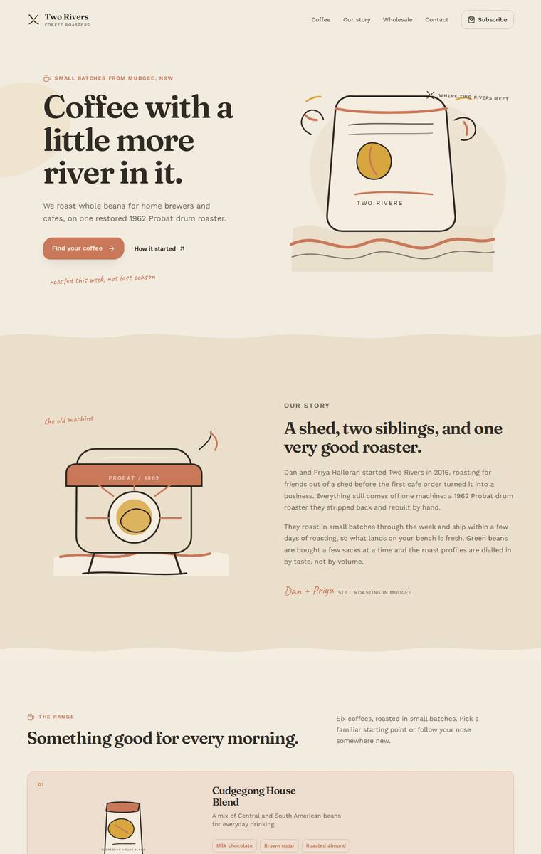
Composite 89.1%Judge 4.6/5
Judge panelAnthropic 4.3/5OpenAI 5.0/5Google 4.0/5
single-judge (Claude) 4.3/5 → leave-one-family-out 4.6/5
Anthropic: Every required section is present and correct: hero, story, all six coffees with prices and tasting-note tags, subscription form, wholesale enquiry with the five specified fields, five stockists, the four brewing guides, and contact plus newsletter in the terracotta footer. The warm cream-and-terracotta palette, editorial serif headlines, and consistent hand-drawn SVG illustrations (coffee bag, drum roaster, jars) give it a cohesive, characterful artisan-roaster identity that feels on-brand and modern. Craft is clean and finished with only minor irregularity in the range-card grid rhythm; the
OpenAI: The page visibly includes every required section with all six coffees, correct prices/flavour notes, subscription details, wholesale form fields, five stockists, brewing teaser, contact and newsletter copy. The design is polished and distinctive, with cohesive typography, warm colour, custom illustrative coffee/river motifs, strong spacing, and consistent component detail throughout.
Google: The design accurately incorporates all brief requirements within a highly cohesive layout. Warm terracotta tones and bespoke vector illustrations establish a charming, premium identity, while polished typography ensures a professional finish.
Noor El-Amin (claude-opus-4-8)
High reasoning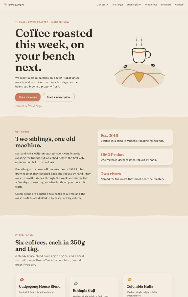
Composite 87.5%Judge 4.5/5
Judge panelAnthropic 4.3/5OpenAI 4.8/5Google 4.0/5
single-judge (Claude) 4.3/5 → leave-one-family-out 4.5/5
Anthropic: Every required section is present and correct: hero, story with the founding facts, all six coffees with matching 250g/1kg prices and tasting notes, subscription block, a wholesale form collecting cafe name/contact/email/suburb/volume, all five stockists with towns, the four-method brewing teaser, and contact plus newsletter signup. The warm cream/terracotta/olive/brown palette with a slab-serif display face is coherent and well-suited to a small-batch roaster, with tidy consistent coffee cards and roast-level badges. Craft is finished and consistent, though the hero cup illustration reads sli
OpenAI: All required sections and fixed facts are visible, including the six coffees, subscription details, wholesale enquiry fields, five stockists, brewing teaser, contact and newsletter signup. The warm palette, serif-led typography, soft cards, hand-drawn illustration and wavy dividers create a coherent polished small-batch coffee identity with strong spacing and consistency. It feels highly finished and tasteful, though more charming and familiar than truly standout or premium-distinctive.
Google: The design accurately incorporates all required content with a cohesive, earthy aesthetic appropriate for a boutique roaster. Typography and layout are handled neatly, ensuring a clean and legible flow, though the hero illustration feels slightly out of step with the premium vibe elsewhere. Overall, it delivers a polished and very functional brand presence.
Yuki Tanabe (claude-sonnet-5)
High reasoning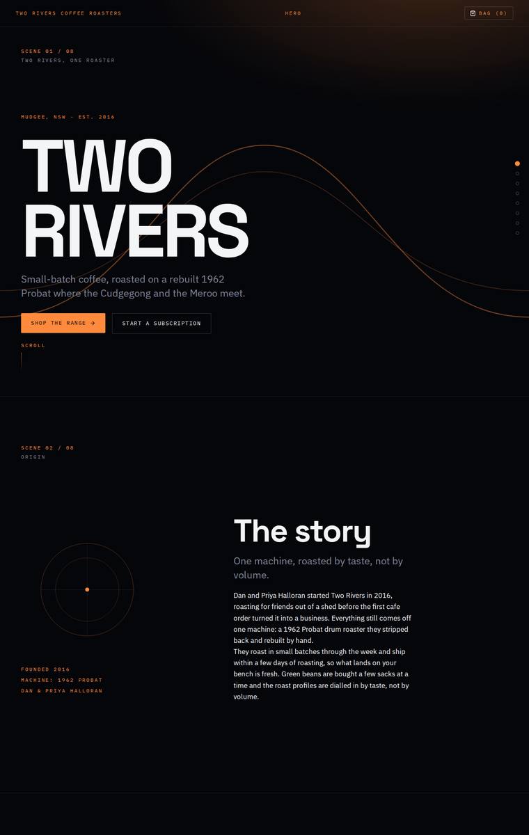
Composite 87.5%Judge 4.5/5
Judge panelAnthropic 4.3/5OpenAI 4.8/5Google 4.0/5
single-judge (Claude) 4.3/5 → leave-one-family-out 4.5/5
Anthropic: Every required section is present and correct: hero, story, the range with all six coffees and their 250g/1kg prices and tasting notes, subscription with a builder form, wholesale enquiry form (cafe name, contact, email, suburb, weekly volume), all five stockists, the four brewing guides, and contact plus newsletter signup. The design commits to a confident dark editorial system - big Archivo Expanded display type, monospace section labels with numbered wayfinding, and a single warm orange accent that suits coffee, anchored by a nice hero wave curve. It is cohesive and distinctive, but several
OpenAI: All required sections are present with strong adherence to the supplied copy, including the six coffees, wholesale form fields, stockists, brewing teaser, and newsletter/contact details. The main fidelity gap is that the range visibly shows 250g pricing but not the required 1kg prices, relying on size toggles that cannot be assumed interactive from the screenshot. Visually it is highly polished, distinctive, and premium, with a cohesive dark editorial system, sharp typography, careful spacing, and consistent orange accent detailing.
Google: The build successfully incorporates all required sections and copy from the brief. The dark color palette with orange accents establishes a premium, technical aesthetic, while consistent typography and precise spacing ensure a highly polished execution.
Mara Vieira (claude-sonnet-5)
High reasoning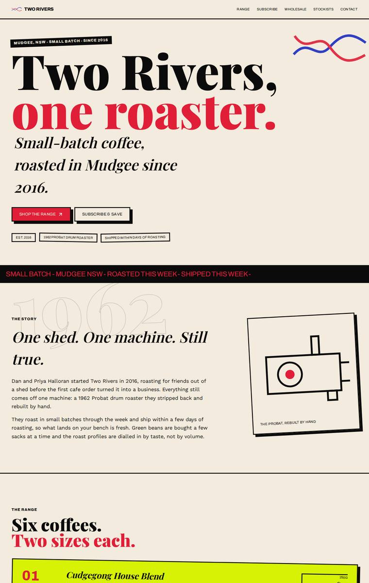
Composite 87.5%Judge 4.5/5
Judge panelAnthropic 4.5/5OpenAI 4.5/5Google 4.0/5
single-judge (Claude) 4.5/5 → leave-one-family-out 4.5/5
Anthropic: Every required section is present and correct: hero, story, all six numbered coffees with both 250g/1kg prices, subscription, a wholesale form with all five fields, the five stockists, brewing-guides teaser, and contact plus newsletter. The design has a confident editorial point of view - big Playfair-style display type, a warm cream base with bold red/blue/yellow colour-blocked sections, and a magazine feel that suits a small-batch roaster. Craft is strong but a notch below the concept: the range cards use an offset-outline treatment where the right-hand price boxes sit slightly awkwardly aga
OpenAI: All required sections are visible with the six coffees, five stockists, wholesale form fields, story, guides teaser, contact and newsletter; the only notable fidelity gap is the subscription copy omitting the free-shipping-over-$60 detail. The visual direction is bold, memorable and highly coherent, with strong editorial typography, distinctive colour blocking and custom graphic details, though a few small text/detail issues like cramped labels and minor copy/tag formatting keep craft just below perfect.
Google: The build strictly adheres to the brief, including all required content and precise copy. The neo-brutalist visual design uses bold typography, high-contrast color blocking, and consistent offset-shadow motifs to create a highly distinctive aesthetic with excellent attention to detail.
Noor El-Amin (claude-sonnet-5)
High reasoning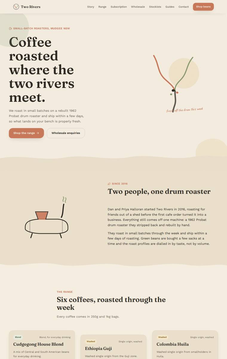
Composite 87.5%Judge 4.5/5
Judge panelAnthropic 4.3/5OpenAI 5.0/5Google 3.8/5
single-judge (Claude) 4.3/5 → leave-one-family-out 4.5/5
Anthropic: Every brief element is present and correct: hero, story, all six coffees with accurate prices and tasting notes, subscription block with a real config form, wholesale form collecting exactly the five required fields, all five stockists, brewing-guides teaser, and contact plus newsletter. The warm cream/terracotta palette with a Fraunces-style serif display is coherent, well-spaced, and on-brand for a small-batch roaster, with hand-drawn SVG touches (the drum-roaster squiggle, the little table) giving character. Craft is clean and consistent across the card grid and forms with no obvious broken
OpenAI: All required sections and fixed business details are visible, including the six coffees, five stockists, subscription terms, wholesale form fields, brewing teaser, and contact/newsletter information. The design is highly cohesive and polished, with a warm roastery palette, distinctive custom-feeling illustrations, strong typography, and careful spacing that gives the small business a premium, memorable presence.
Google: All brief requirements are fully integrated within a cohesive, earthy design system appropriate for the brand. The typography and layout demonstrate strong craftsmanship, though the abstract visual direction results in a pleasant rather than highly distinctive overall impact.
Noor El-Amin (claude-fable-5)
High reasoning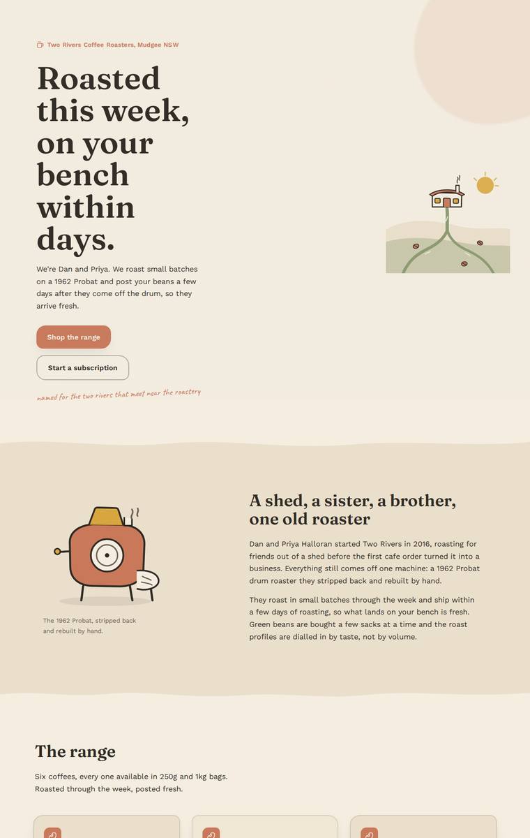
Composite 87.5%Judge 4.5/5
Judge panelAnthropic 4.3/5OpenAI 5.0/5Google 4.0/5
single-judge (Claude) 4.3/5 → leave-one-family-out 4.5/5
Anthropic: Every required section is present and correct: hero, story, all six coffees with accurate 250g/1kg pricing and tasting notes, subscription, wholesale form with all five requested fields, all five stockists with locations, brewing-guides teaser, and contact plus newsletter signup. The design is coherent and tasteful - a warm cream/terracotta palette with a Fraunces-style serif for headings, generous spacing, and charming custom SVG illustrations (the hillside roastery, the Probat, coffee bag and cup) that give it real handcrafted personality. Craft is consistent across the range cards and secti
OpenAI: All required sections and fixed content are present, including the six coffees with prices, subscription terms, wholesale form fields, five stockists, brewing teaser, contact details, and newsletter signup. The warm palette, expressive serif typography, hand-drawn illustrations, organic dividers, and consistent card/form styling create a polished, distinctive small-roaster identity with strong craft and visual impact.
Google: The build flawlessly incorporates all required content within a warm, cohesive aesthetic. Bespoke SVG illustrations and strong typographic hierarchy establish a distinctive brand identity. Execution is polished across all components, resulting in a premium, engaging interface.
Mara Vieira (gemini-3.1-pro-preview)
High reasoning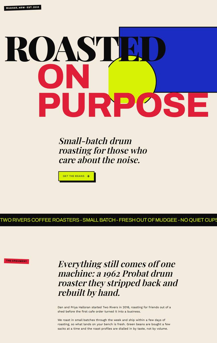
Composite 87.5%Judge 4.5/5
Judge panelAnthropic 4.8/5OpenAI 4.8/5Google 3.5/5
single-judge (Claude) 4.8/5 → leave-one-family-out 4.5/5
Anthropic: Every required section is present and correct: hero, story with the Probat pull quote, all six coffees with tasting notes and 250g/1kg prices, subscription, wholesale form collecting all five fields, the five stockists, brewing guides teaser, contact, and newsletter. The visual language is a confident brutalist-editorial system - cream/black base with red, cobalt, yellow and chartreuse accents, big Playfair-style display serif against clean sans, and distinctive staggered bordered coffee cards - that reads as modern, cohesive and premium. Craft is high but slightly dinged by low-contrast white
OpenAI: All required sections and fixed business details are visible, including the six coffees with prices, subscription terms, wholesale form fields, five stockists, brewing teaser, contact details, and newsletter signup. The visual direction is bold, cohesive, and highly distinctive with strong editorial typography and a memorable colour system. Craft is generally polished, though a few intentional overlaps/crops and the wholesale text over the green shape slightly compromise readability.
Google: The design successfully integrates all required content into a striking, brutalist-inspired layout that stands out from typical coffee sites. While the bold typography and primary colors create strong visual interest, contrast issues—such as green text on a blue background—slightly hinder legibility. Overall, it remains a consistently crafted and memorable execution.
Ingrid Kessler (gemini-3.5-flash)
default reasoning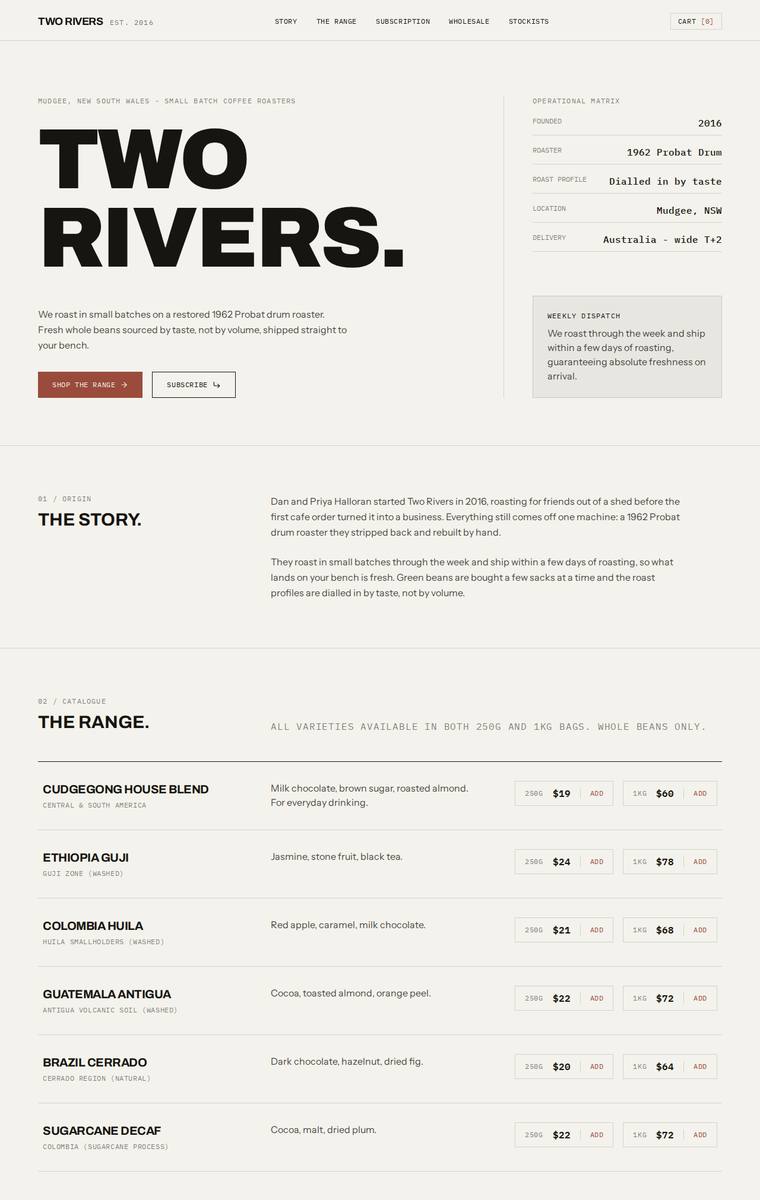
Composite 87.5%Judge 4.5/5
Judge panelAnthropic 4.3/5OpenAI 4.8/5Google 4.0/5
single-judge (Claude) 4.3/5 → leave-one-family-out 4.5/5
Anthropic: Every required section is present and correct: hero with an operational-matrix sidebar, the story, all six coffees with correct 250g/1kg pricing, an interactive subscription configurator, a wholesale form collecting the exact five fields, the five stockists with towns, a four-method brewing-guides teaser, and contact plus newsletter signup. The editorial direction is coherent and confident - cream/rust/near-black palette, oversized condensed display type against monospace labels and numbered section markers reads modern and on-brief for a small-batch roaster. Craft is clean and consistent thou
OpenAI: All required sections, six coffees with sizes/prices, wholesale form fields, stockists, brewing teaser, contact, and newsletter signup are visible and substantially match the supplied copy. The site has a highly cohesive editorial/industrial coffee-roaster aesthetic with strong typography, disciplined spacing, and consistent UI details. It feels polished and premium, though its restrained, mostly text-led approach is a little less memorable than a build with a stronger visual motif or imagery system.
Google: The design fulfills all brief requirements using a cohesive, structured layout. The strong typography, consistent grid system, and restrained color palette create a distinctive, premium aesthetic.
Mara Vieira (deepseek-v4-pro)
default reasoning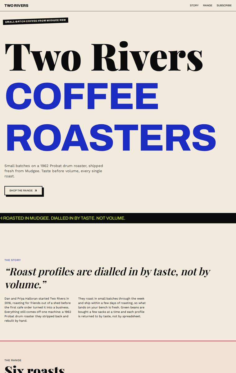
Composite 87.5%Judge 4.5/5
Judge panelAnthropic 4.3/5OpenAI 4.8/5Google 4.0/5
single-judge (Claude) 4.3/5 → leave-one-family-out 4.5/5
Anthropic: Every required section is present and correct: hero, story, all six coffees with accurate 250g/1kg prices and tasting notes, subscription, a wholesale form collecting all five fields, the five stockists, brewing guides teaser, and contact/newsletter. The design has a strong editorial point of view - cream ground, oversized black-and-electric-blue display serif, a black scrolling marquee band, and a dark wholesale section with a yellow accent - which is coherent and distinctive. Craft is solid with clear hierarchy, though the hand-drawn wobbly card borders read a touch inconsistent and the extr
OpenAI: All required sections, six coffees, five stockists, subscription copy, wholesale form fields, brewing teaser, and contact/newsletter are present and visibly aligned with the brief. The design has a bold editorial/brutalist identity with strong typography, confident colour, and memorable composition, though a few details such as clipped marquee text and oversized angled product cards feel slightly rough at the viewport edges.
Google: The design fulfills all brief requirements with a highly distinctive, editorial aesthetic. Bold typography and unexpected color accents create a memorable brand identity, while the consistent execution of complex elements like the tilted product cards demonstrates strong craft.
Yuki Tanabe (gpt-5.6-terra)
High reasoning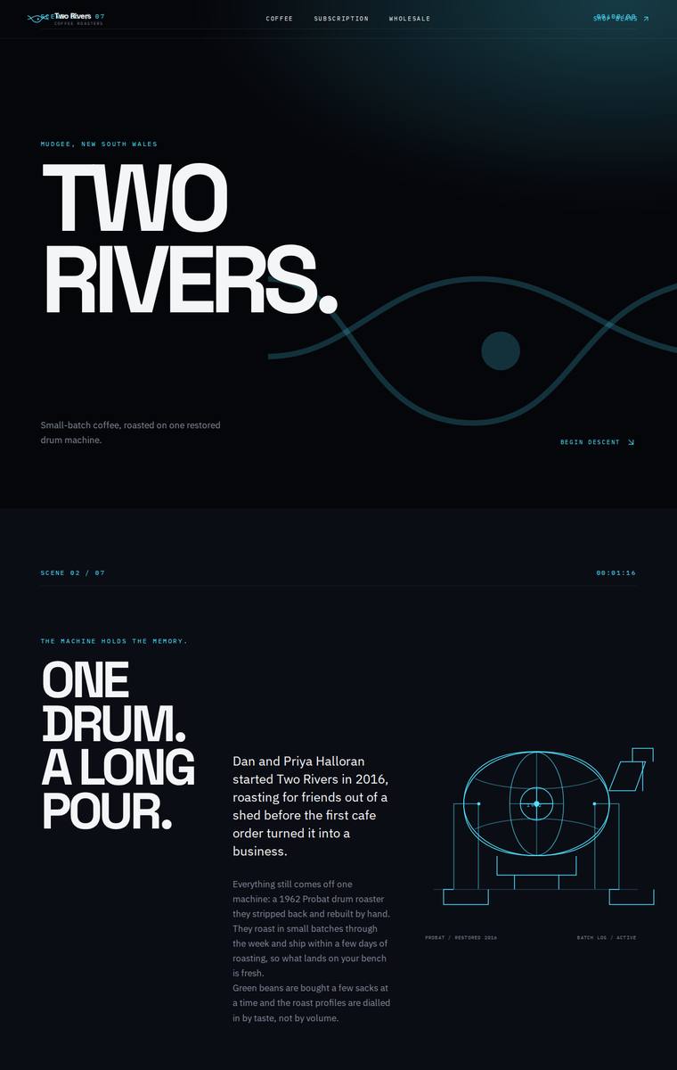
Composite 87.5%Judge 4.5/5
Judge panelAnthropic 4.8/5OpenAI 4.8/5Google 3.5/5
single-judge (Claude) 4.8/5 → leave-one-family-out 4.5/5
Anthropic: Every required section is present and correct: hero, story with a coded drum-roaster illustration, the full six-coffee range table with tasting notes and both prices, the subscription builder, a wholesale form with all requested fields, all five stockists, the brewing-guides teaser, and contact plus newsletter with the Mudgee address and email. The design is a coherent, confident editorial system - big Archivo Expanded caps, monospace scene markers ("SCENE No / 01"), a cyan accent and a two-rivers wave motif on near-black - with disciplined alignment and spacing throughout, so it reads finishe
OpenAI: All required sections and fixed content are present, including the six coffees with prices, wholesale form fields, five stockists, brewing teaser, contact, and newsletter. The visual direction is striking and cohesive with a premium dark editorial/technical aesthetic, though craft is slightly reduced by some tiny low-legibility microtype and the awkwardly wrapped email address in the footer.
Google: The design executes a highly distinctive, tech-inspired aesthetic with consistent typography and crisp graphics, meeting all brief requirements. While striking, minor craft issues like overlapping header text and awkward email wrapping slightly reduce the overall polish.
Noor El-Amin (gpt-5.6-terra)
High reasoning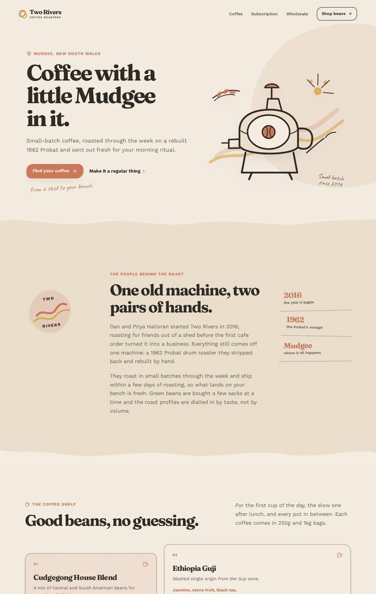
Composite 87.5%Judge 4.5/5
Judge panelAnthropic 4.3/5OpenAI 5.0/5Google 4.0/5
single-judge (Claude) 4.3/5 → leave-one-family-out 4.5/5
Anthropic: Every required section is present and correct: hero, story with 2016/1962/Mudgee fact pills, all six coffees with 250g/1kg prices and tasting notes, the subscription order-builder, a wholesale form with the five required fields, all five stockists, the brewing-guides teaser, and a contact/newsletter footer. The warm cream-and-terracotta palette, condensed serif display type, hand-drawn roaster and coffee-cup illustrations, and script accents give it a cohesive, characterful small-roaster identity that feels considered rather than generic. Craft is clean and consistent across the card grid, tho
OpenAI: All required sections and fixed business details are visible, including the six coffees with prices, subscription builder, wholesale enquiry form fields, five stockists, brewing teaser, contact details, and newsletter signup. The page has a cohesive, premium visual identity with warm colours, expressive typography, custom illustrated details, strong spacing, and a distinctive small-roaster personality.
Google: The design effectively captures the brief with a warm, brand-appropriate aesthetic and charming custom SVG illustrations. Typography and layout are highly polished, creating a premium feel while successfully integrating all required content and functional sections.
Ingrid Kessler (gpt-5.6-terra)
High reasoning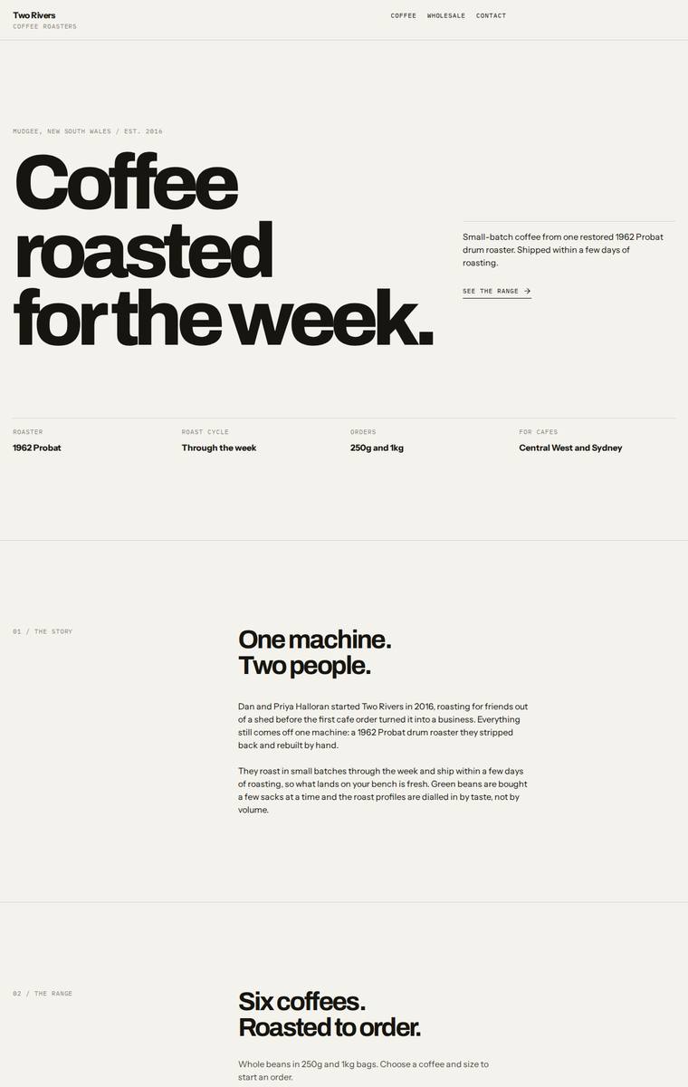
Composite 85.9%Judge 4.4/5
Judge panelAnthropic 4.8/5OpenAI 4.3/5Google 4.0/5
single-judge (Claude) 4.8/5 → leave-one-family-out 4.4/5
Anthropic: Every required section is present and correct: hero, story, all six coffees with 250g/1kg pricing and tasting notes, subscription with size/frequency controls, wholesale form with the exact five fields, all five stockists with towns, the four brewing-guide teasers, and the Mudgee contact plus newsletter signup. The execution is a confident Swiss-editorial system: oversized Archivo-Expanded display type, monospace section labels, numbered dividers, a warm cream base with a single terracotta accent and one inverted dark section, all held on a consistent grid with clean table alignment and no vis
OpenAI: All required sections are visible with the six coffees, prices, subscription details, wholesale form fields, five stockists, brewing teaser, contact, and newsletter content included accurately. The design is cohesive and premium in a stark editorial style, with strong typography and spacing, though the extreme minimalism and lack of visual coffee/roastery imagery make it feel a little austere and less distinctive. Craft is generally polished and consistent, with only minor concerns around over-spacious sections and a somewhat generic brand expression.
Google: The design executes the brief perfectly with a sophisticated, typography-led approach. Strong grid systems and elegant type hierarchy create a premium, editorial feel without relying on imagery.
Elias Byrne (gpt-5.6-luna)
High reasoning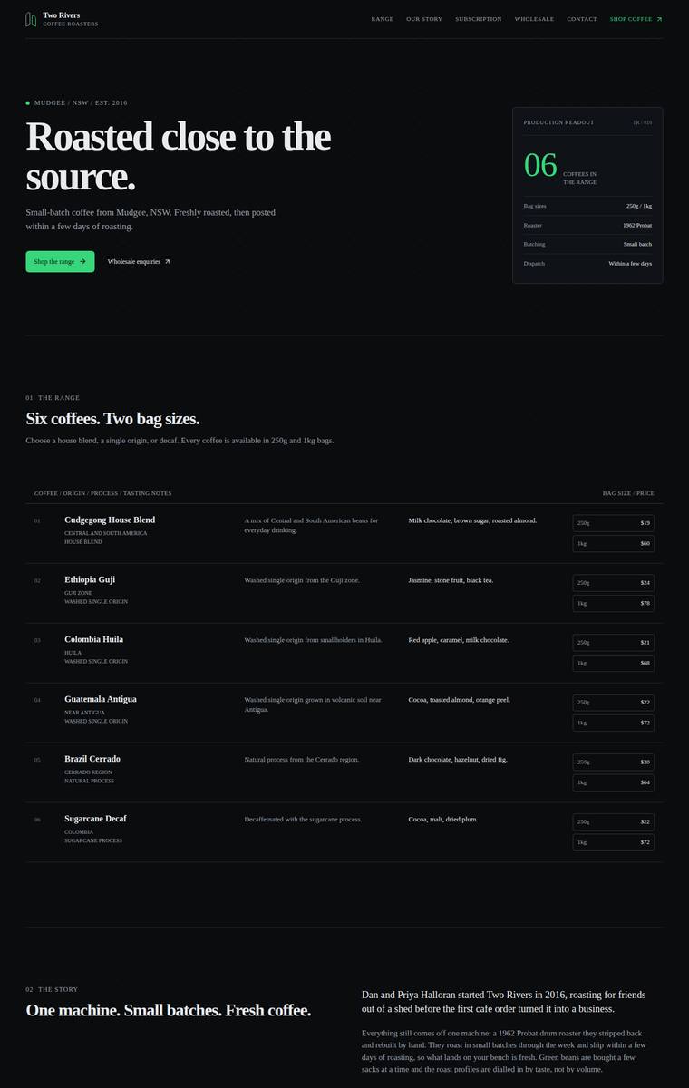
Composite 85.9%Judge 4.4/5
Judge panelAnthropic 4.3/5OpenAI 4.8/5Google 4.0/5
single-judge (Claude) 4.3/5 → leave-one-family-out 4.4/5
Anthropic: Every brief element is present and correct: hero, story with a stats row, all six coffees with tasting notes and both price tiers, subscription config, a wholesale form collecting exactly the five required fields, all five stockists, the four brewing methods, and contact plus newsletter. The dark editorial system is coherent and modern, using numbered section markers (01-07), a serif display face against mono labels, and a nice "production readout" panel in the hero. Craft is clean and consistent throughout; the very saturated green accent is a touch loud and reads slightly generic against the
OpenAI: All required sections and fixed facts are visible, including the six coffees with prices, subscription details, wholesale form fields, five stockists, brewing teaser, contact email, and newsletter signup. The dark editorial system, restrained green accent, strong typography, and precise table/card layouts feel cohesive and premium with no obvious broken elements. The result is highly polished, though its minimal industrial aesthetic is slightly restrained rather than truly unforgettable.
Google: All brief requirements are flawlessly integrated into a distinctive, grid-based dark theme. The vibrant green accents and meticulous typography create a premium, cohesive aesthetic, with precise execution throughout.
Noor El-Amin (kimi-k3)
default reasoning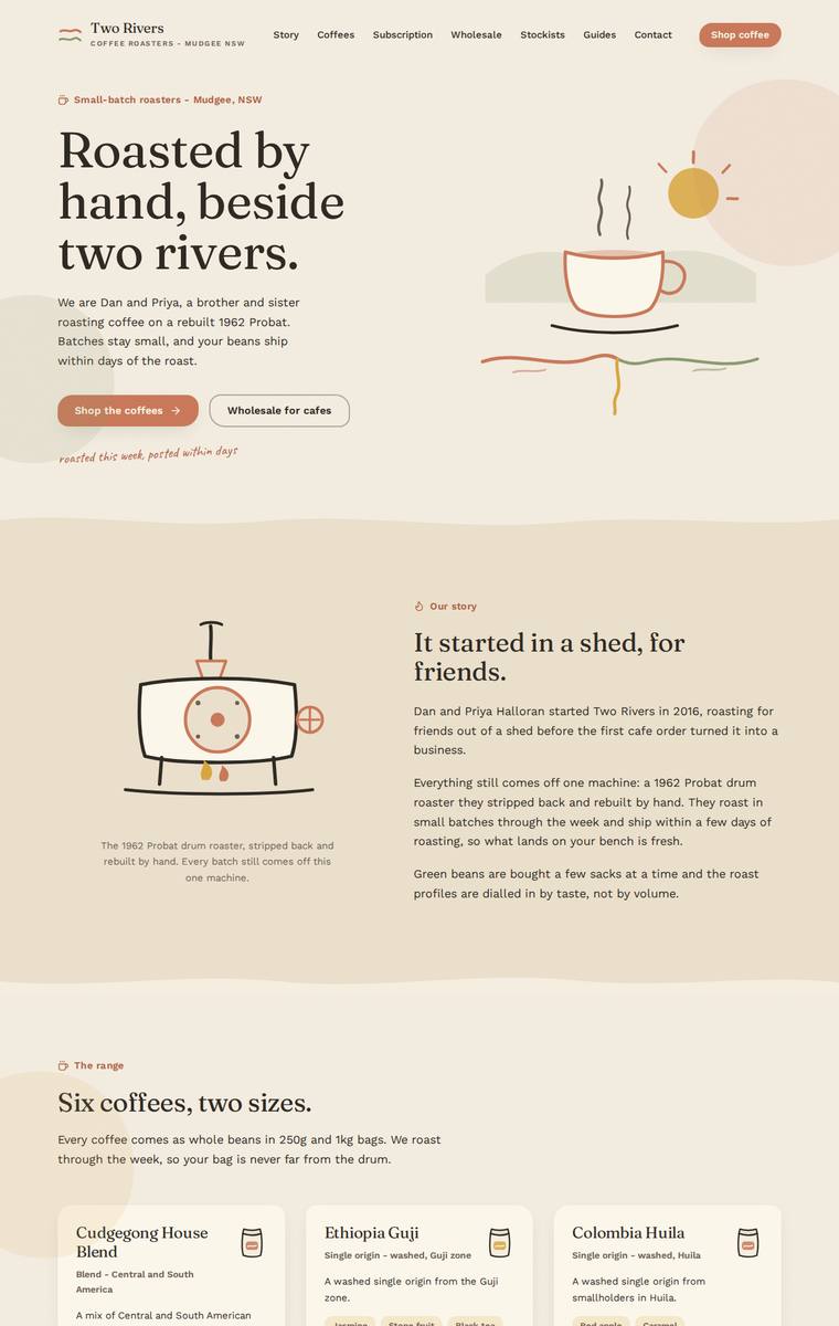
Composite 84.4%Judge 4.4/5
Judge panelAnthropic 4.5/5OpenAI 5.0/5Google 3.3/5
single-judge (Claude) 4.5/5 → leave-one-family-out 4.4/5
Anthropic: Every required section is present and correct: hero, story, all six coffees with exact prices and tasting notes, the 3-step subscription, a wholesale form with all five requested fields, the five stockists, the four-method brewing teaser, and contact plus newsletter. The visual system is coherent and confident - a warm cream/terracotta/sage palette, editorial serif display type, hand-drawn SVG illustrations of a coffee cup and the 1962 Probat roaster, and handwritten script accents that give it a genuine small-batch, artisanal feel that suits the business. Craft is finished and consistent (uni
OpenAI: All required sections are visible with the six coffees, pricing, subscription details, wholesale form fields, five stockists, brewing teaser, contact, and newsletter content represented accurately. The warm palette, serif typography, hand-drawn illustrations, wavy section transitions, and card system feel cohesive, premium, and highly appropriate for a small-batch roaster. The page appears polished and consistent throughout, with strong spacing, hierarchy, and distinctive brand character.
Google: The layout faithfully incorporates all brief requirements with accurate copy and a warm, appropriate color palette. While the structural execution is clean and consistent, the inline illustrations feel somewhat basic, limiting the overall premium feel. The result is highly functional but visually moderate in its distinctiveness.
Ingrid Kessler (gemini-3.1-pro-preview)
High reasoning
Composite 84.4%Judge 4.4/5
Judge panelAnthropic 4.3/5OpenAI 4.5/5Google 3.8/5
single-judge (Claude) 4.3/5 → leave-one-family-out 4.4/5
Anthropic: Every required section is present and correct: hero, story (Process), all six coffees with both sizes and prices, subscription with free-shipping note, a wholesale form carrying all five fields, all five stockists, the brewing-guides teaser, and contact plus newsletter. The execution is a confident editorial system - warm cream ground, oversized black display headline, one restrained orange accent, and monospace numbered section labels with italic muted tasting notes - all cleanly aligned and consistently spaced with no broken or janky elements. It reads premium and coherent, though the very m
OpenAI: All required sections and fixed details are visible, including the six coffees, five stockists, subscription terms, wholesale form fields, brewing teaser, contact, and newsletter. The design is polished and cohesive with strong typography, restrained colour, clean grid structure, and consistent spacing, though the very minimal art direction feels a little sparse and less distinctive than it could be for a premium roaster.
Google: The layout perfectly fulfills the brief with a highly consistent, grid-driven typographic approach that feels premium and orderly. While the strict minimalism might feel slightly stark for a coffee brand, the craft, spacing, and hierarchy are exceptionally well-executed.
Noor El-Amin (gemini-3.1-pro-preview)
High reasoning
Composite 84.4%Judge 4.4/5
Judge panelAnthropic 4.3/5OpenAI 5.0/5Google 3.5/5
single-judge (Claude) 4.3/5 → leave-one-family-out 4.4/5
Anthropic: Every required section is present and correct: hero, story ("Roasted by taste, not by volume"), all six coffees with their exact tasting notes and 250g/1kg prices, the subscription block, a wholesale form collecting cafe name/contact/email/suburb/weekly volume, all five stockists, the brewing-guides teaser, and contact plus newsletter signup. The warm cream-and-terracotta palette with a Fraunces-style serif, hand-drawn coffee-cup and roaster illustrations, and script accent notes ("our 1962 Probat", "pause or skip any time") give it a cohesive, characterful small-roaster feel. It is well compo
OpenAI: All required sections are visible and the fixed business details, six coffees, prices, stockists, wholesale form fields, subscription, brewing teaser, contact, and newsletter content are substantially present. The page has a cohesive small-batch roastery identity with warm colours, elegant serif typography, generous spacing, custom illustration, and consistent card/form styling. Overall it feels polished, distinctive, and premium without losing approachability.
Google: The layout successfully integrates all requested brief elements with accurate copy and appropriate form fields. An earthy color palette and strong typographic hierarchy establish a fitting artisanal tone, though the inline vector illustrations are somewhat rudimentary. The overall execution is clean and well-spaced, resulting in a pleasant but conventional boutique coffee aesthetic.
Noor El-Amin (grok-4.5)
High reasoning
Composite 84.4%Judge 4.4/5
Judge panelAnthropic 4.0/5OpenAI 5.0/5Google 3.5/5
single-judge (Claude) 4.0/5 → leave-one-family-out 4.4/5
Anthropic: Every required section is present and correct: hero, story, all six coffees with prices and tasting notes, the subscription block with a coffee/size/frequency form, a wholesale form collecting exactly the five requested fields, all five stockists, the brewing-guides teaser with the four method tabs, and contact plus newsletter. The warm cream-and-terracotta palette, Fraunces-style serif display headings, per-coffee bean glyphs and Caveat handwritten accents read as a coherent, tasteful artisan-coffee identity with clean spacing and finished forms. It is competent and consistent throughout but
OpenAI: The page includes every required section with the six coffees, five stockists, subscription details, wholesale form fields, brewing teaser, contact, and newsletter all visibly represented and accurate. The warm palette, serif/sans pairing, wavy section transitions, custom illustrations, and generous spacing create a coherent small-batch roaster identity with strong polish. Overall it feels finished, premium, and distinctive without sacrificing clarity or readability.
Google: The design achieves a warm, boutique aesthetic through an earthy palette and refined typography. All required content is seamlessly integrated into a cohesive and well-structured layout.
Mara Vieira (grok-4.20-reasoning)
default reasoning
Composite 84.4%Judge 4.4/5
Judge panelAnthropic 4.3/5OpenAI 4.5/5Google 3.8/5
single-judge (Claude) 4.3/5 → leave-one-family-out 4.4/5
Anthropic: Every required section is present and correct: hero, story (One drum, 1962 Probat), the full range with all six coffees and both 250g/1kg prices, subscription with a coffee/size/frequency picker, a wholesale form collecting cafe name, contact, email, suburb and weekly volume, all five stockists, a brewing guides teaser, and contact plus newsletter with the Mudgee address and email. The design is a confident, cohesive editorial system - cream, black and coral red with heavy Archivo Expanded display type, dark coffee cards, and a punchy chartreuse brewing block - that reads modern and distinctiv
OpenAI: All required sections and fixed content are present, including six coffees with prices, subscription details, wholesale form fields, five stockists, brewing teaser, contact, and newsletter. The visual direction is distinctive and premium with strong editorial typography and a bold colour system, though a few elements feel slightly rough or awkward, such as cropped marquee text, the oversized wholesale heading running off-screen, and the unexplained black block in stockists.
Google: The design successfully incorporates all required brief elements within a bold, editorial aesthetic characterized by striking typography and color blocking. While the visual identity is distinct and memorable, minor layout artifacts, such as the empty black block in the stockists grid, slightly detract from the overall polish.
Noor El-Amin (deepseek-v4-pro)
default reasoning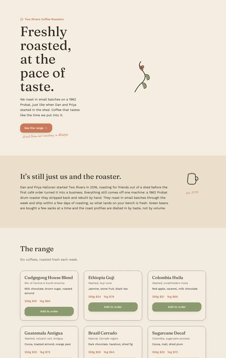
Composite 84.4%Judge 4.4/5
Judge panelAnthropic 4.3/5OpenAI 4.5/5Google 3.8/5
single-judge (Claude) 4.3/5 → leave-one-family-out 4.4/5
Anthropic: Every required section is present and correct: hero, story with "est. 2016", all six coffees with accurate 250g/1kg prices and tasting notes, subscription, a wholesale form collecting all five fields (cafe name, contact, email, suburb, weekly volume), the five stockists, brewing-guides teaser, and contact plus newsletter signup. The warm cream palette with olive-green and terracotta accents, the Fraunces-style serif display, and the handwritten Caveat microcopy give it a coherent, editorial small-batch feel that suits an artisan roaster. Composition and card alignment are clean and finished; i
OpenAI: All required sections and fixed business details are visible, including the six coffees, subscription copy, wholesale form fields, five stockists, brewing teaser, contact and newsletter. The warm palette, serif typography, restrained illustrations and spacious layout feel cohesive and appropriate for a small-batch roaster, with a high level of consistency and polish. It is tasteful and premium, though somewhat understated rather than highly distinctive.
Google: The design effectively delivers all required content with a warm, earthy palette and elegant typography suitable for an artisanal roaster. While the layout is somewhat standard, the consistent execution and clear hierarchy result in a professional and highly cohesive user experience.
Mara Vieira (gpt-5.4-mini)
High reasoning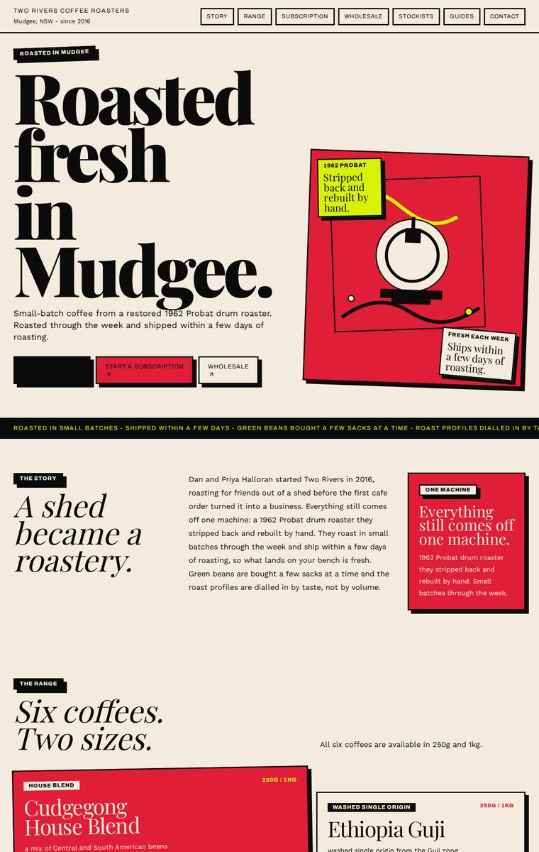
Composite 84.4%Judge 4.4/5
Judge panelAnthropic 4.3/5OpenAI 4.5/5Google 3.8/5
single-judge (Claude) 4.3/5 → leave-one-family-out 4.4/5
Anthropic: Every required section is present and correct: hero, story, all six coffees with both 250g/1kg prices, subscription with picker form, wholesale form with the exact five fields, five stockists with locations, brewing guides teaser, and contact plus newsletter. The neo-brutalist editorial system (cream/red/black with yellow accents, chunky Fraunces display type, hard-offset card shadows, and a nice hand-drawn Probat roaster illustration) is coherent, distinctive, and well-suited to a small-batch roaster. Execution is largely finished, though the range grid has some uneven card heights and empty
OpenAI: All required sections are present with the correct overall content, forms, stockists, subscription details and six coffees, though the Ethiopia Guji pricing appears obscured and one hero CTA renders as an unreadable black block. The visual direction is highly distinctive and polished, with a bold editorial/packaging-inspired system, strong typography, colour and composition. Craft is generally excellent, but the few visibility/overlap issues keep it from a perfect score.
Google: The build fulfills all brief requirements with a distinctive, high-contrast aesthetic that drives strong visual engagement. The bold typography and structured layouts are effective, though minor spacing inconsistencies slightly affect the overall polish. It remains a memorable and cohesive execution.
Elias Byrne (Opus 4.8)
High reasoning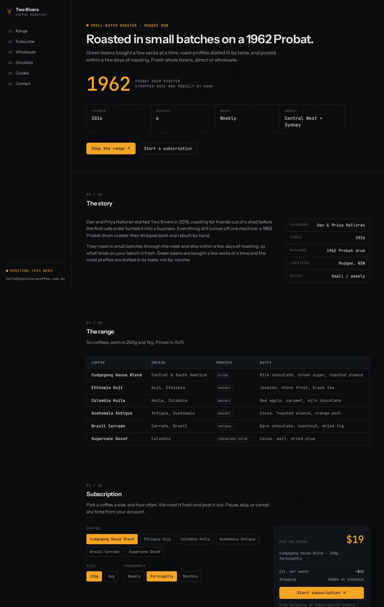
Composite 82.8%Judge 4.3/5
Judge panelAnthropic 4.0/5OpenAI 4.5/5Google 3.8/5
single-judge (Claude) 4.0/5 → leave-one-family-out 4.3/5
Anthropic: All required sections are present and correct: hero, story, all six coffees, subscription configurator with $19 pricing and free-shipping note, wholesale form with the five required fields, all five stockists, brewing-guides teaser with coming-soon tags, and contact plus newsletter. The main fidelity gap is the range table omitting the fixed 250g/1kg prices, which matters for a site meant to sell beans. The dark, monospace, numbered-section editorial system is coherent, confident, and distinctive with a well-judged amber accent and the big "1962" callout, and the execution is clean and finishe
OpenAI: All required sections are visible and the structure strongly supports shopping, subscription, wholesale, stockists, guides, and contact/newsletter goals. The main fidelity issue is that the range table omits the required 250g and 1kg prices for each coffee, despite the brief specifying those details. Visually it is highly polished, cohesive, and distinctive, with excellent spacing, typography, contrast, and a premium dark roastery identity.
Google: The highly technical, tabular design language is a distinctive and successful choice for coffee enthusiasts. Execution is tight and consistent, though omitting specific prices from the main range table slightly compromises brief fidelity.
Elias Byrne (claude-opus-4-8)
High reasoning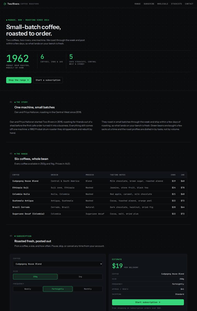
Composite 82.8%Judge 4.3/5
Judge panelAnthropic 4.3/5OpenAI 4.5/5Google 3.5/5
single-judge (Claude) 4.3/5 → leave-one-family-out 4.3/5
Anthropic: Every brief element is present and correct: hero with stat trio, story, all six coffees with 250g/1kg prices and tasting notes, a subscription configurator with a live-looking estimate panel, a wholesale form collecting exactly the five required fields, all five stockists, the brewing-guides teaser, and contact plus newsletter. The dark near-black palette with a single green accent and pervasive monospace type is coherent, confident, and cleanly spaced, with numbered section labels and well-aligned tables giving a technical roastery feel. Craft is finished and consistent with no broken or jank
OpenAI: All required sections are visible, including the six coffees, subscription area, wholesale form fields, stockists, brewing teaser, and contact/newsletter, though some fixed product/story details are condensed and the hero line “Two coffees” conflicts with the six-coffee range. The dark grid, mono typography, neon green accents, and table-driven layouts are highly coherent and polished, giving a premium industrial feel, but the overall impact is slightly restrained by the lack of richer coffee or roastery imagery.
Google: All required content is present and technically executed with excellent consistency and alignment. However, the dark, data-centric dashboard aesthetic feels mismatched for an artisanal coffee roaster, lacking necessary brand warmth and approachability.
Ingrid Kessler (claude-sonnet-4-6)
High reasoning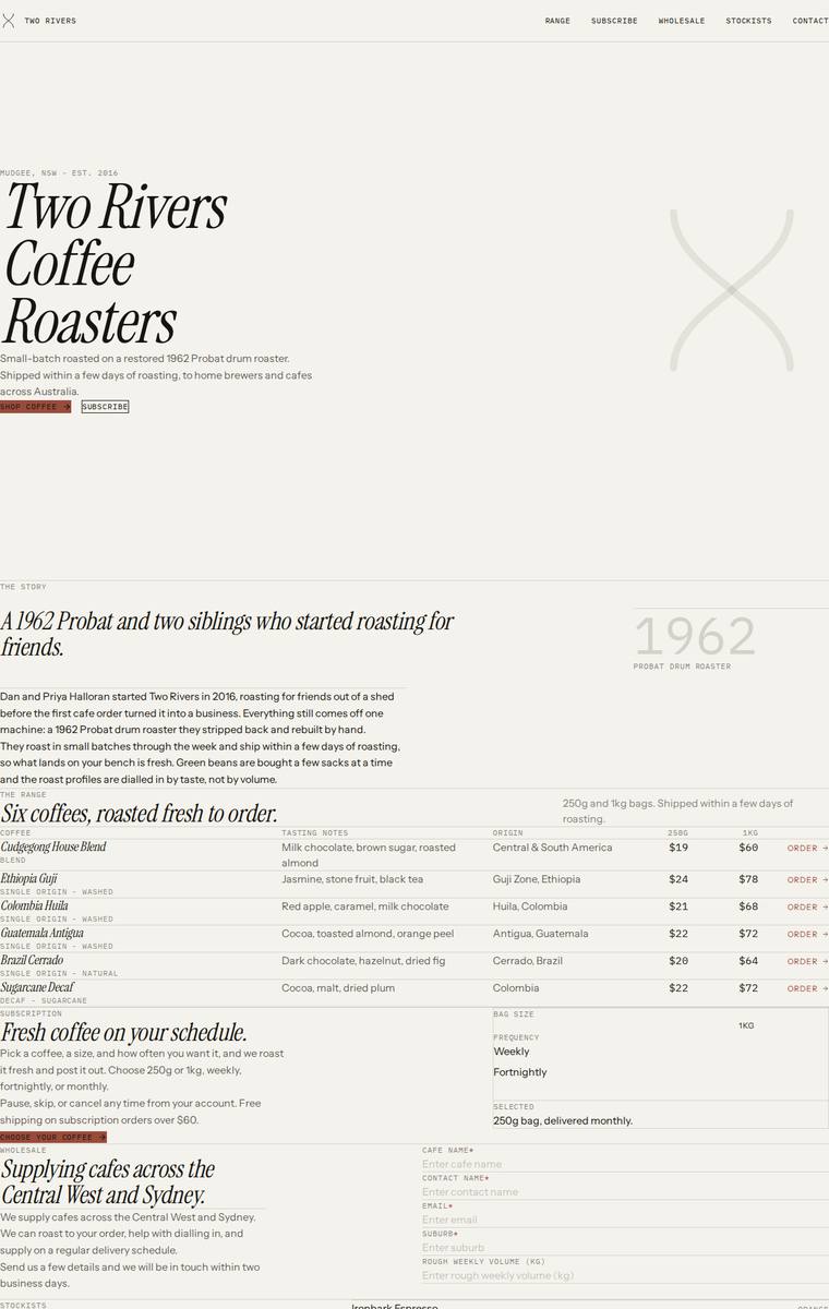
Composite 82.8%Judge 4.3/5
Judge panelAnthropic 4.0/5OpenAI 4.3/5Google 4.0/5
single-judge (Claude) 4.0/5 → leave-one-family-out 4.3/5
Anthropic: Every required section is present and correct: hero, story, all six coffees with tasting notes/origins/prices, subscription, a full wholesale form (cafe name, contact, email, suburb, weekly volume), all five stockists, brewing guides teaser, and contact plus newsletter. The design is a confident, distinctive editorial treatment - oversized Playfair/Fraunces italic display, monospace labels, warm cream and terracotta palette, and a newspaper-style range grid that reads premium and would make a reviewer stop. Craft is let down by clear horizontal overflow: the ORDER buttons, stockist town names
OpenAI: All required sections, the six coffees with prices, five stockists, subscription copy, wholesale fields, contact, and newsletter are visible and substantially match the brief. The editorial serif/mono treatment and restrained palette feel distinctive and appropriate, though the page has an extreme empty hero followed by very dense lower sections. Craft is generally consistent, with minor jank such as the subscription selector showing inconsistent selected options and the wholesale form feeling unfinished without a visible submit action.
Google: The design executes a sophisticated, ledger-inspired aesthetic that suits a small-batch roaster, utilizing strong typography to compensate for the lack of imagery. A consistent grid system organizes all required content cleanly, resulting in a distinct, premium layout.
Noor El-Amin (kimi-k2.7-code)
default reasoning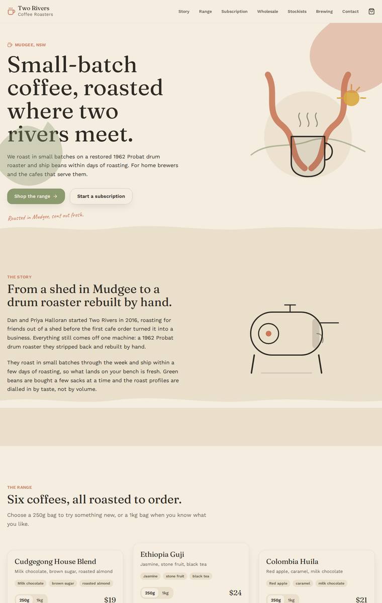
Composite 82.8%Judge 4.3/5
Judge panelAnthropic 4.3/5OpenAI 4.3/5Google 3.8/5
single-judge (Claude) 4.3/5 → leave-one-family-out 4.3/5
Anthropic: Every required section is present and correct: hero, story, all six coffees with accurate prices and tasting-note chips, subscription builder, wholesale form with all five fields (cafe name, contact, email, suburb, weekly volume), five stockists, a four-method brewing teaser, and contact plus newsletter. The warm cream palette with sage-green and terracotta accents is coherent and on-brand for a small-batch roaster, with a tasteful Fraunces-style serif, a handwritten accent line, and line-drawn illustrations (coffee cup, drum roaster) that give it a distinctive editorial feel. Detailing is con
OpenAI: The page includes all required sections and the six coffees/five stockists, with a strong warm roastery identity and polished typography, colour, cards, forms, and inline illustration. Fidelity is held back because the coffee cards omit several fixed origin/process details and only visibly show the 250g prices rather than both 250g and 1kg prices. Overall it feels cohesive and premium, though the very large blank bands and some decorative overlaps reduce the sense of final craft slightly.
Google: The build accurately features all required sections and copy. The warm palette and typography create a cohesive aesthetic, while layout and component execution remain solid throughout.
Yuki Tanabe (kimi-k3)
default reasoning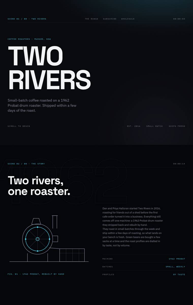
Composite 82.8%Judge 4.3/5
Judge panelAnthropic 4.3/5OpenAI 4.3/5Google 4.0/5
single-judge (Claude) 4.3/5 → leave-one-family-out 4.3/5
Anthropic: All required sections are present and correct: hero, story with the restored-Probat detail, all six coffees with sizes/prices/tasting notes, subscription with a builder form, wholesale enquiry form capturing the specified fields, five stockists, a four-method brewing teaser, and contact plus newsletter. The design commits hard to a distinctive dark blueprint/technical aesthetic with an SVG roaster diagram, "SCENE 01/06" section markers, cyan accents and a bold Archivo-Expanded wordmark, which reads coherent and memorable. It is let down slightly by very faint, tiny monospace microcopy in sever
OpenAI: All required sections are visible with the six coffees, subscription details, wholesale form fields, five stockists, brewing teaser, contact and newsletter represented accurately. The dark editorial/technical art direction is cohesive, distinctive and premium, though the very small low-contrast text and awkward email wrap reduce warmth and polish slightly.
Google: The design executes all brief requirements seamlessly within a highly distinctive, technical dark-mode aesthetic. While the terminal-inspired look is unusual for coffee, it aligns well with the mechanical focus of the Probat roaster story and is crafted with excellent precision.
Yuki Tanabe (gemini-3.1-pro-preview)
High reasoning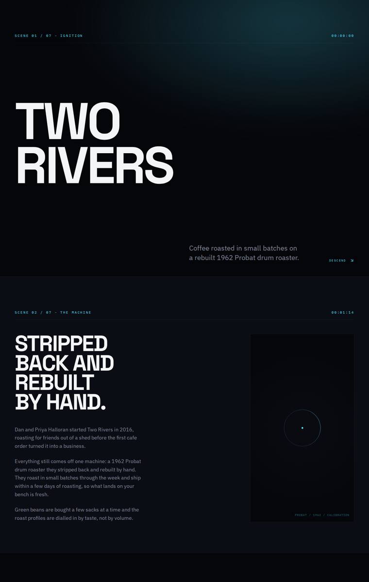
Composite 82.8%Judge 4.3/5
Judge panelAnthropic 4.8/5OpenAI 4.0/5Google 3.5/5
single-judge (Claude) 4.8/5 → leave-one-family-out 4.3/5
Anthropic: Every required section is present and correct: the TWO RIVERS hero, the by-hand story, THE RANGE with all six coffees (Cudgegong, Ethiopia Guji, Colombia Huila, Guatemala Antigua, Brazil Cerrado, Sugarcane Decaf) plus tasting notes and prices, the RHYTHM subscription, a WHOLESALE enquiry form, STOCKISTS with all five cafes, CALIBRATION brewing-guides teaser, and a COMMS contact/newsletter block. The execution is a distinctive, cinematic dark editorial system - heavy Archivo-Expanded display type, scene/timecode markers, and subtle heat-bloom gradients that a reviewer would stop on. The one wea
OpenAI: All required sections are visible with the six coffees, five stockists, wholesale form fields, subscription copy, brewing teaser, and contact/newsletter content. The execution is highly coherent and distinctive, with strong typography and a polished cinematic system aesthetic, though the cold sci-fi tone feels somewhat mismatched for a small regional coffee roaster and the sales/subscription pathways are not very clear. Craft is strong overall, but some microtext and form labels are very low contrast and the page leans more atmospheric than commercially usable.
Google: The design adopts a stark, highly technical aesthetic that is consistently executed but feels disconnected from an artisanal country coffee roaster. All required content is present and precisely laid out within this rigid framework, resulting in a distinct, if tonally surprising, final build.
Yuki Tanabe (gemini-3.5-flash)
default reasoning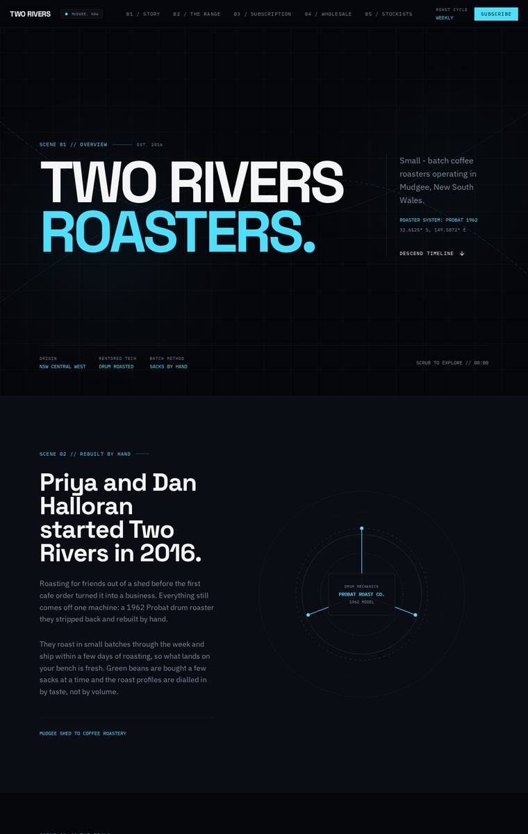
Composite 82.8%Judge 4.3/5
Judge panelAnthropic 4.3/5OpenAI 4.8/5Google 3.5/5
single-judge (Claude) 4.3/5 → leave-one-family-out 4.3/5
Anthropic: All required sections are present and correct: hero, story (Halloran/1962 Probat), all six coffees with 250g/1kg prices, the subscription builder, a wholesale form collecting cafe name, contact, email, suburb and weekly volume, all five stockists, the brewing-guides teaser, and contact plus newsletter. The execution is a confident, coherent dark "telemetry/protocol" system with a cyan accent and bold Archivo-expanded headlines, cleanly gridded and well-spaced. Craft is finished and consistent, though several sections (brewing card, telemetry footer) run very low-contrast, and the cold sci-fi f
OpenAI: All required sections and fixed business details are visible, including the six coffees with prices, subscription copy, wholesale form fields, five stockists, guides teaser, contact and newsletter signup. The execution is highly polished and consistent with strong spacing, typography, and interface detail, though the sci-fi/telemetry aesthetic feels a little cold for a small-batch coffee roaster. It is distinctive and memorable, with enough visual confidence to stand out.
Google: The design meticulously includes all requested content with excellent grid alignment and clear typographical hierarchy. However, the heavy sci-fi/terminal aesthetic feels highly incongruous for a rural small-batch coffee roaster, despite the consistent execution.
Mara Vieira (grok-4.3)
default reasoning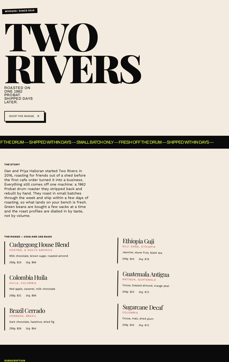
Composite 82.8%Judge 4.3/5
Judge panelAnthropic 4.5/5OpenAI 4.0/5Google 4.0/5
single-judge (Claude) 4.5/5 → leave-one-family-out 4.3/5
Anthropic: Every required section is present and correct: hero, story, all six coffees with matching 250g/1kg prices and tasting notes, subscription with a picker, a wholesale form collecting cafe name/contact/email/suburb/volume, all five stockists, brewing guides teaser, and contact plus newsletter signup. The visual design is confident and coherent editorial work: a huge Archivo/serif display hero on cream, a yellow scrolling marquee, a bold black PICK. ROAST. POST. subscription block, and a red brewing-guides band give it a distinctive magazine feel. Craft is largely clean and consistent, though the
OpenAI: All required sections are visible and the six coffees, five stockists, subscription copy, wholesale form fields, brewing teaser, and contact details are largely present. The typographic, high-contrast editorial direction is distinctive and memorable, though the layout is quite left-heavy with large unused areas, and a few details such as truncated select text and sparse newsletter/commerce treatment keep it from feeling fully polished.
Google: The design accurately includes all required sections and copy. It employs a striking, typography-led aesthetic with bold colour blocking and consistent UI details, resulting in a highly polished and memorable presentation.
Noor El-Amin (gpt-5.6-sol)
High reasoning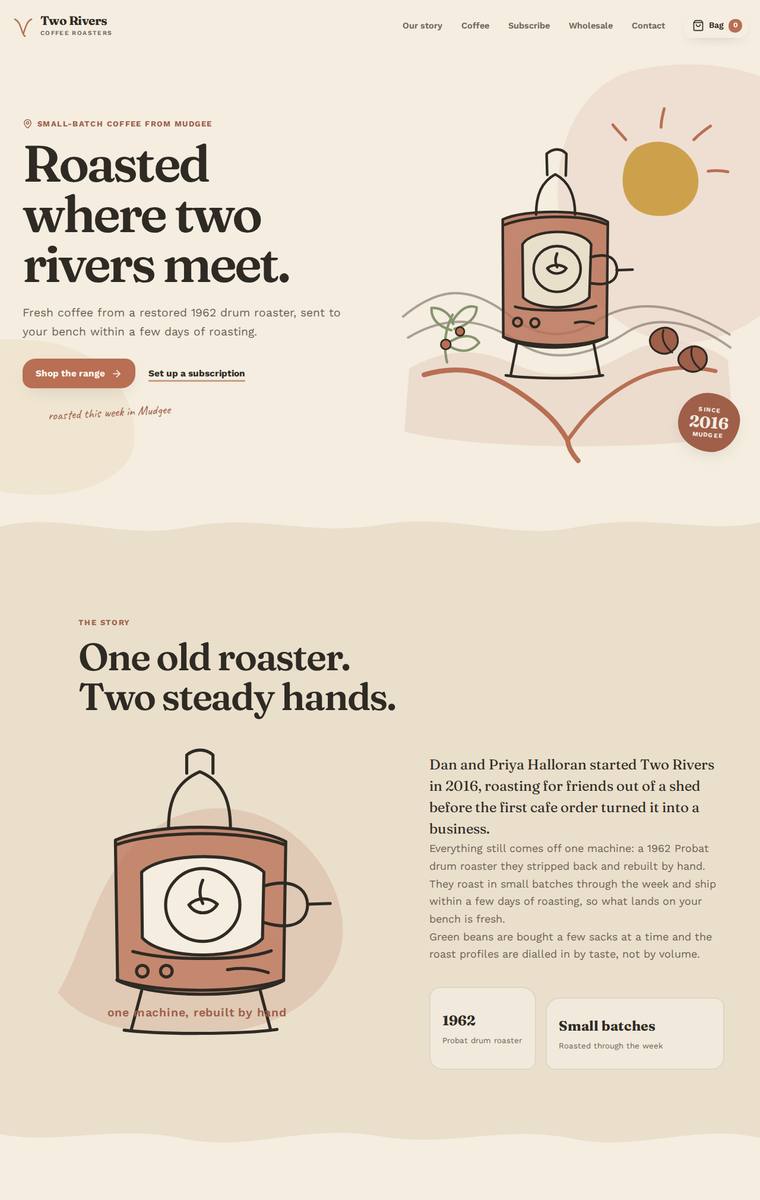
Composite 82.8%Judge 4.3/5
Judge panelAnthropic 4.3/5OpenAI 4.8/5Google 3.5/5
single-judge (Claude) 4.3/5 → leave-one-family-out 4.3/5
Anthropic: Every required section is present and correct: hero, story, all six coffees with tasting notes and 250g/1kg pricing, a subscription configurator, a wholesale form collecting the exact five fields, all five stockists with suburbs, the four brewing-method guides, and a contact/newsletter footer. The design is warm and cohesive with a tasteful cream/terracotta/brown coffee palette, elegant serif display headings, and charming hand-drawn roaster illustrations that give it character. Composition and spacing are clean and consistent throughout; it stops short of top marks because the layout is fairl
OpenAI: All required sections are visible and the business story, subscription, wholesale form, stockists, brewing teaser, contact, and newsletter content are well represented. The main fidelity issue is that the range cards only visibly show the 250g prices while the required 1kg prices are not visible in the static screenshot. Visually it is highly polished, cohesive, distinctive, and premium, with excellent illustration, typography, spacing, and colour control.
Google: All requested content and sections are accurately implemented. The earthy palette and typography establish a strong artisanal feel, though minor reuse of illustrations slightly detracts from the overall polish.
Yuki Tanabe (gpt-5.6-luna)
High reasoning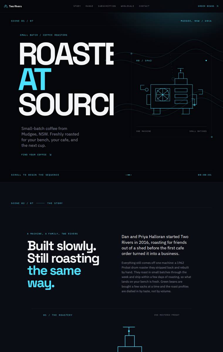
Composite 82.8%Judge 4.3/5
Judge panelAnthropic 4.3/5OpenAI 4.5/5Google 3.5/5
single-judge (Claude) 4.3/5 → leave-one-family-out 4.3/5
Anthropic: Every required section is present and correct: hero, story, all six coffees with 250g/1kg prices and tasting notes, subscription with recurring form, wholesale section with a multi-field enquiry form, all five stockists, a brewing-guides teaser (pour-over/plunger/espresso/AeroPress), and contact plus newsletter signup. The dark, technical-blueprint aesthetic with a detailed schematic line drawing of the Probat drum roaster, condensed Archivo-Expanded headlines and a cyan accent is coherent, modern and distinctive, giving it real editorial impact. Craft is mostly tight with clean grids and fini
OpenAI: All required sections are visible and the fixed business details, six coffees, prices, wholesale form fields, stockists, brewing teaser, contact and newsletter content are represented. The dark technical/blueprint art direction is cohesive, distinctive, and premium, though some microtype is very small and the hero headline/range grid show slight awkward clipping or empty-block treatment that keeps craft from feeling flawless.
Google: The build accurately includes all mandated sections and copy. The stark, blueprint-inspired aesthetic is distinctive but feels somewhat incongruous for a heritage craft roaster, and the aggressively cropped hero typography appears unintentional. Nevertheless, consistent structural rhythms and generous spacing yield a memorable layout.
Elias Byrne (claude-sonnet-4-6)
High reasoning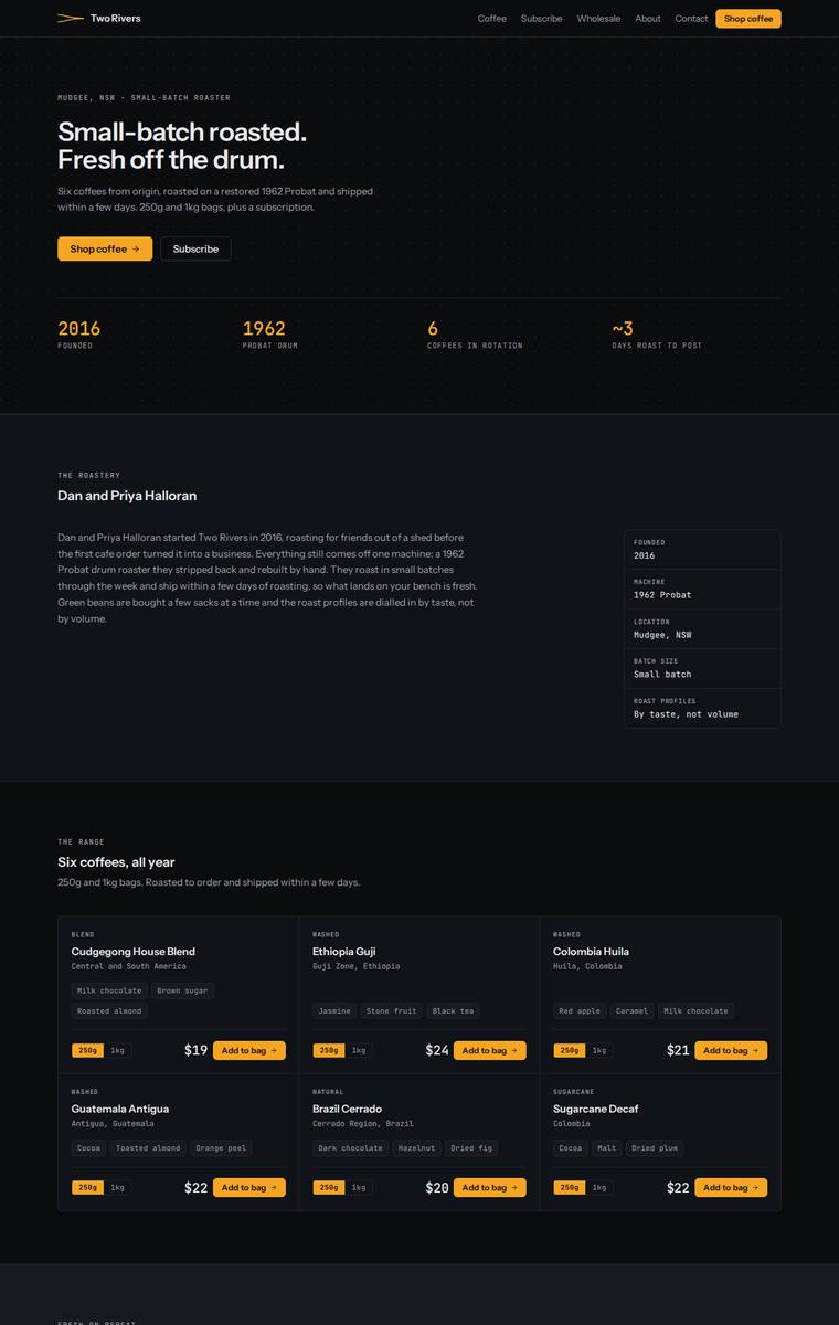
Composite 81.3%Judge 4.3/5
Judge panelAnthropic 4.0/5OpenAI 4.5/5Google 3.5/5
single-judge (Claude) 4.0/5 → leave-one-family-out 4.3/5
Anthropic: All required sections are present and correct: hero with stats, the story with a spec panel, all six coffees with tasting notes and prices, subscription with a pricing table, a wholesale form collecting the five specified fields, all five stockists, the brewing-guides teaser, and contact plus newsletter. The dark palette with amber accents and consistent mono labels reads as a coherent, modern editorial coffee brand, and the layout is cleanly aligned with no broken elements. It loses impact because it is quite text-heavy and uniformly dark with no imagery or standout hero moment, so it feels c
OpenAI: All required sections are visible and the core copy/products/stockists/form fields are represented, though the individual 1kg prices for the six coffees are not explicitly visible in the range cards. The design is polished, cohesive, and premium with strong typography, spacing, and a disciplined dark-and-amber palette. It feels highly finished, though its austere grid/mono style is a little more tech-like than warm roastery, slightly limiting distinctiveness.
Google: All required content is perfectly integrated with precise, consistent execution. The dark, utilitarian aesthetic is cohesive but feels slightly clinical for an artisanal coffee brand.
Yuki Tanabe (claude-fable-5)
High reasoning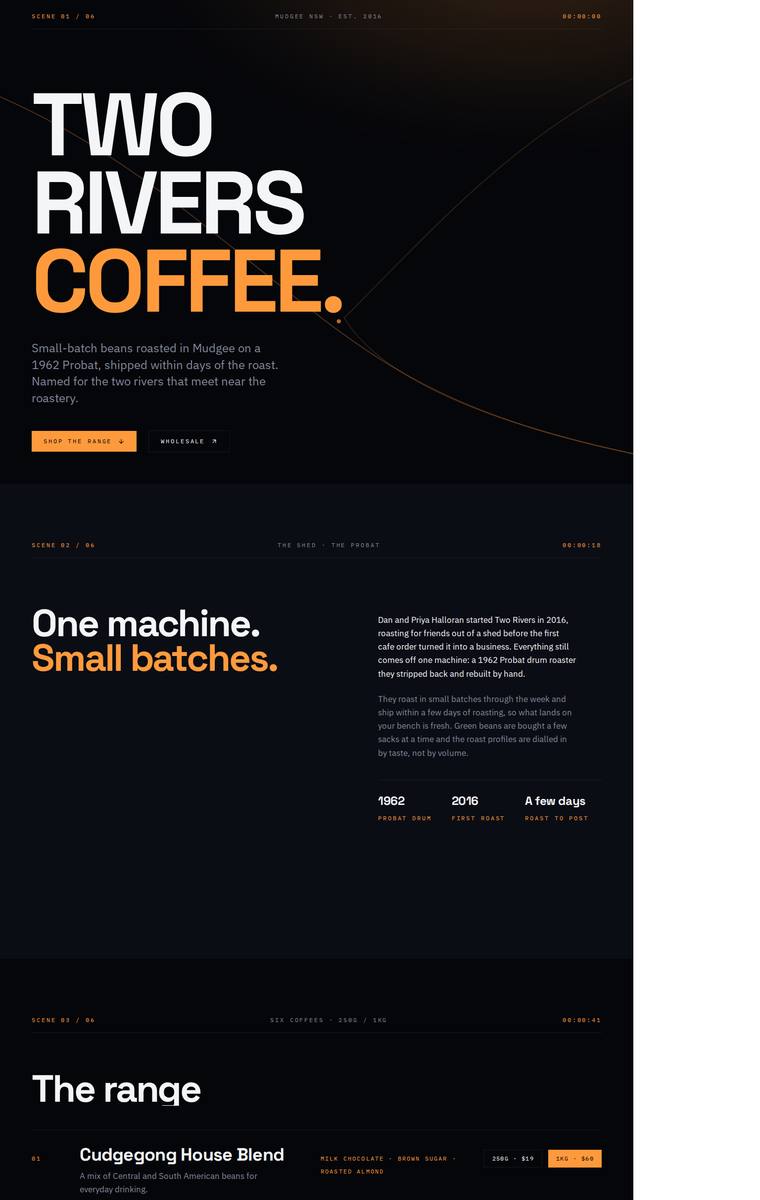
Composite 81.3%Judge 4.3/5
Judge panelAnthropic 4.0/5OpenAI 4.0/5Google 4.0/5
single-judge (Claude) 4.0/5 → leave-one-family-out 4.3/5
Anthropic: Brief fidelity is excellent: all required sections are present with the cinematic "SCENE 01/06" framing - hero, story with 1962/2016 stat row, all six coffees with correct 250g/1kg prices, the subscription picker, a wholesale form collecting cafe name/contact/email/suburb/volume, all five stockists with towns, the brewing-guides teaser, and contact plus newsletter. The dark near-black palette with a single orange accent, expanded Archivo hero type, and monospace timecode labels is coherent, modern, and genuinely distinctive, and the sequence/timecode conceit gives it stop-worthy impact. Craft
OpenAI: All required sections are visible, with the six coffees, pricing, stockists, wholesale form fields, subscription details, brewing teaser, contact and newsletter copy substantially correct. The dark cinematic art direction, bold typography and orange accent system are cohesive and distinctive. However, the build appears fixed-width or left-aligned on desktop, leaving a large blank white gutter on the right, which is a significant finishing/responsiveness flaw that hurts craft and impact.
Google: The design accurately includes all brief requirements within a bold, high-contrast dark theme. Precise grid alignments and consistent typographic hierarchy contribute to a highly polished interface.
Ingrid Kessler (kimi-k2.7-code)
default reasoning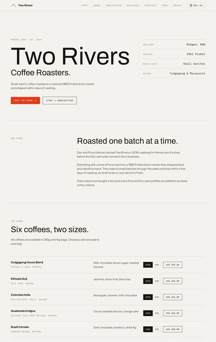
Composite 81.3%Judge 4.3/5
Judge panelAnthropic 4.0/5OpenAI 4.5/5Google 3.8/5
single-judge (Claude) 4.0/5 → leave-one-family-out 4.3/5
Anthropic: Every required section is present and correct: hero, story, all six coffees with sizes and prices, the subscription picker, a wholesale form collecting the exact five fields, all five stockists with locations, the brewing-guides teaser, and contact plus newsletter. The editorial-minimal treatment is coherent and tasteful - warm cream ground, confident large-type wordmark, monospace metadata labels, and a single rust accent button that ties the sections together, with clean alignment and consistent spacing throughout. It is well crafted but quite restrained: it relies entirely on typography on
OpenAI: The page includes all required sections, all six coffees, wholesale form fields, stockists, brewing teaser, contact and newsletter, with copy largely preserved; the main fidelity gap is that the 1kg product prices are not visibly shown. The visual system is very cohesive and polished, with strong typography, spacing, grid discipline, and a premium minimal roaster feel, though the austere approach is slightly less distinctive than a more characterful branded execution.
Google: The design successfully includes all required sections using a rigorous, typography-driven grid structure. While highly consistent and clean, the strictly utilitarian aesthetic slightly limits its overall distinctiveness.
Mara Vieira (kimi-k2.7-code)
default reasoning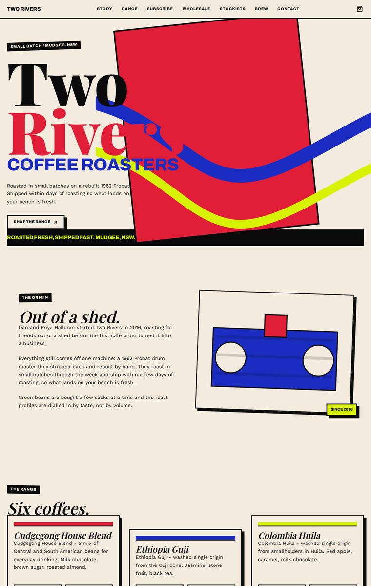
Composite 81.3%Judge 4.3/5
Judge panelAnthropic 4.0/5OpenAI 4.5/5Google 3.5/5
single-judge (Claude) 4.0/5 → leave-one-family-out 4.3/5
Anthropic: Brief fidelity is complete: hero, story, all six coffees with 250g/1kg prices, subscription form, wholesale enquiry form with the required fields, all five stockists, brewing guides teaser, and contact/newsletter are all present and correct. The visual language is a bold, distinctive primary-colour brutalist system (red/blue/yellow on cream, chunky serif headings, offset drop-shadow cards) that reads as coherent and would make a reviewer stop. Craft is let down by a clear defect in the hero, where the giant "Two Rivers" wordmark is clipped to "Two Rive" behind the red block, an obviously broke
OpenAI: All required sections, products, stockists, forms, contact details, and key copy are present and substantially correct. The bold neo-brutalist art direction is distinctive and memorable with strong colour and type choices, though a few overlaps/crops in the hero and range heading feel slightly rough rather than fully polished.
Google: The neo-brutalist aesthetic is consistently applied with bold colors, heavy borders, and distinctive typography. All required content and sections are present, yielding a technically solid and highly memorable result.
Yuki Tanabe (grok-4.5)
High reasoning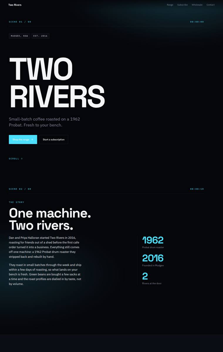
Composite 81.3%Judge 4.3/5
Judge panelAnthropic 4.3/5OpenAI 4.3/5Google 3.5/5
single-judge (Claude) 4.3/5 → leave-one-family-out 4.3/5
Anthropic: Every required section is present and correct: hero, story with 1962/2016/2 stats, all six coffees with 250g/1kg prices and tasting notes, the subscription configurator, the wholesale form with the right fields, five stockists, the four-method brewing teaser, and contact/newsletter. The dark cinematic treatment with big Archivo Expanded headlines, a cyan accent, and a "SCENE 01" mono cueing system is coherent, modern and well-composed, with tidy grids and consistent product cards. It is distinctive and finished, though the cold, techy dark palette reads slightly at odds with an artisanal coffe
OpenAI: All required sections are visible and the main copy, six coffees, wholesale form fields, stockists, brewing teaser, contact, and newsletter are included. The main fidelity gap is that the range only visibly shows 250g prices despite the brief specifying both 250g and 1kg prices. The execution is highly polished and cohesive with strong typography and spacing, though the cold cyber/scene treatment feels slightly less warm and coffee-specific than it could.
Google: All brief requirements are met with consistent attention to detail and spacing. The dark, cinematic aesthetic is an unexpected choice for a small-batch roaster, but the execution remains coherent and structurally sound throughout.
Yuki Tanabe (grok-4.20-reasoning)
default reasoning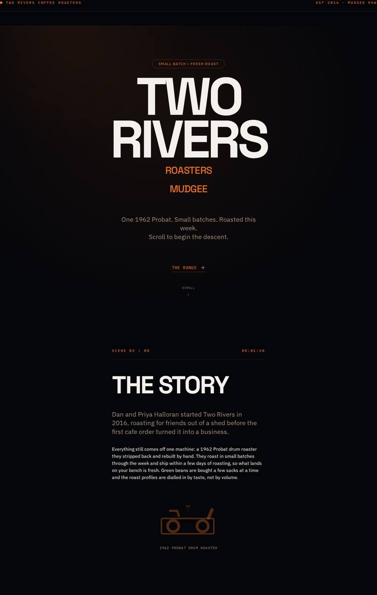
Composite 81.3%Judge 4.3/5
Judge panelAnthropic 4.3/5OpenAI 4.5/5Google 3.3/5
single-judge (Claude) 4.3/5 → leave-one-family-out 4.3/5
Anthropic: Every required section is present and correct: hero, story, all six coffees with 250g/1kg prices, subscription picker, wholesale form with the five specified fields, all five stockists with locations, the four brewing-guide teasers, and contact plus newsletter signup. The dark, warm-orange editorial treatment with the heavy Archivo-Expanded display type and numbered section headers is coherent, modern, and distinctive, with a strong hero and closing "roastery is in Mudgee" statement. Craft is clean and consistent overall, though the subscription configurator reads a little cramped and dim agai
OpenAI: All required sections are present with the six coffees, five stockists, form fields, subscription, guides, contact and newsletter visible, though some required body details are abbreviated or missing, especially parts of the subscription, wholesale support copy, and newsletter copy. The visual direction is bold, cohesive and memorable with strong typography and a premium dark/orange roastery aesthetic, but some microcopy is very small and the extreme spacing occasionally hurts usability.
Google: The stark, technical design direction is visually distinct but feels misaligned with the brand's artisanal, small-batch identity. While all structural requirements are met, the reliance on default emojis for iconography introduces a jarring stylistic clash.
Yuki Tanabe (gpt-5.4-mini)
High reasoning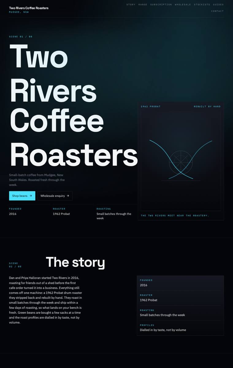
Composite 81.3%Judge 4.3/5
Judge panelAnthropic 4.0/5OpenAI 4.8/5Google 3.5/5
single-judge (Claude) 4.0/5 → leave-one-family-out 4.3/5
Anthropic: Brief fidelity is excellent: every required section is present and correct - hero, story with the founding facts, all six coffees with 250g/1kg prices, subscription with a real picker form, wholesale form with the five required fields, all five stockists with locations, the four-method brewing teaser, and contact plus newsletter signup. The dark editorial theme is coherent with strong oversized Archivo hero type and consistent alignment, but it reads uniformly dark-on-dark with many similar flat panels and the recurring "scene xx/xx" labels feel gimmicky. Craft is clean with no obvious broken
OpenAI: All required sections, coffees, stockists, subscription details, forms, contact information, and guide teaser are visible and accurately represented. The dark industrial visual system with oversized type, cyan accents, gridded cards, and abstract roaster/river motif feels highly distinctive and premium. Craft is strong overall, with only minor reservations around some very stark spacing and small alignment/nav details that feel slightly severe.
Google: The site successfully integrates all required content into a highly structured, dark-themed layout with consistent detailing. While the execution is technically sound and distinctive, the slightly sterile, tech-focused aesthetic feels somewhat disconnected from an artisanal coffee brand.
Ingrid Kessler (gpt-5.6-sol)
High reasoning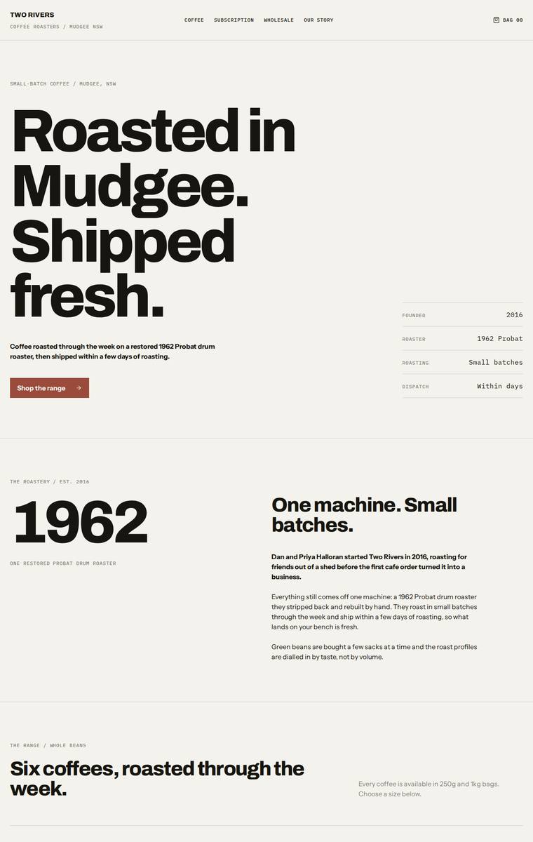
Composite 81.3%Judge 4.3/5
Judge panelAnthropic 4.3/5OpenAI 4.3/5Google 3.8/5
single-judge (Claude) 4.3/5 → leave-one-family-out 4.3/5
Anthropic: Every required section is present and correct: hero, story, all six coffees with accurate 250g prices/tasting notes and a size toggle, subscription configurator, wholesale form with all five fields, five stockists, brewing-guides teaser, and contact/newsletter. The design is a coherent, modern editorial system - heavy Archivo display type on a warm cream ground with black and a single rust accent, anchored by a strong hero stat block and the bold "1962" story moment. Craft is clean and consistent, though the long product list reads a little repetitive and spreadsheet-like, keeping it just shor
OpenAI: All required sections are visible with the six coffees, subscription, wholesale form fields, stockists, brewing teaser, contact and newsletter, though the 1kg prices are not visible and the email appears oddly spaced. The design is very coherent and polished, with strong editorial typography, disciplined spacing, and a distinctive minimalist coffee-roaster feel. Craft is high overall, but the product purchase controls feel more like static UI and a few copy/detail issues keep it from being fully flawless.
Google: Executes a rigorous, text-forward editorial layout with excellent typographic hierarchy. All brief requirements are flawlessly integrated. The highly structured aesthetic is meticulously detailed but remains somewhat austere.
Ingrid Kessler (glm-5.2)
default reasoning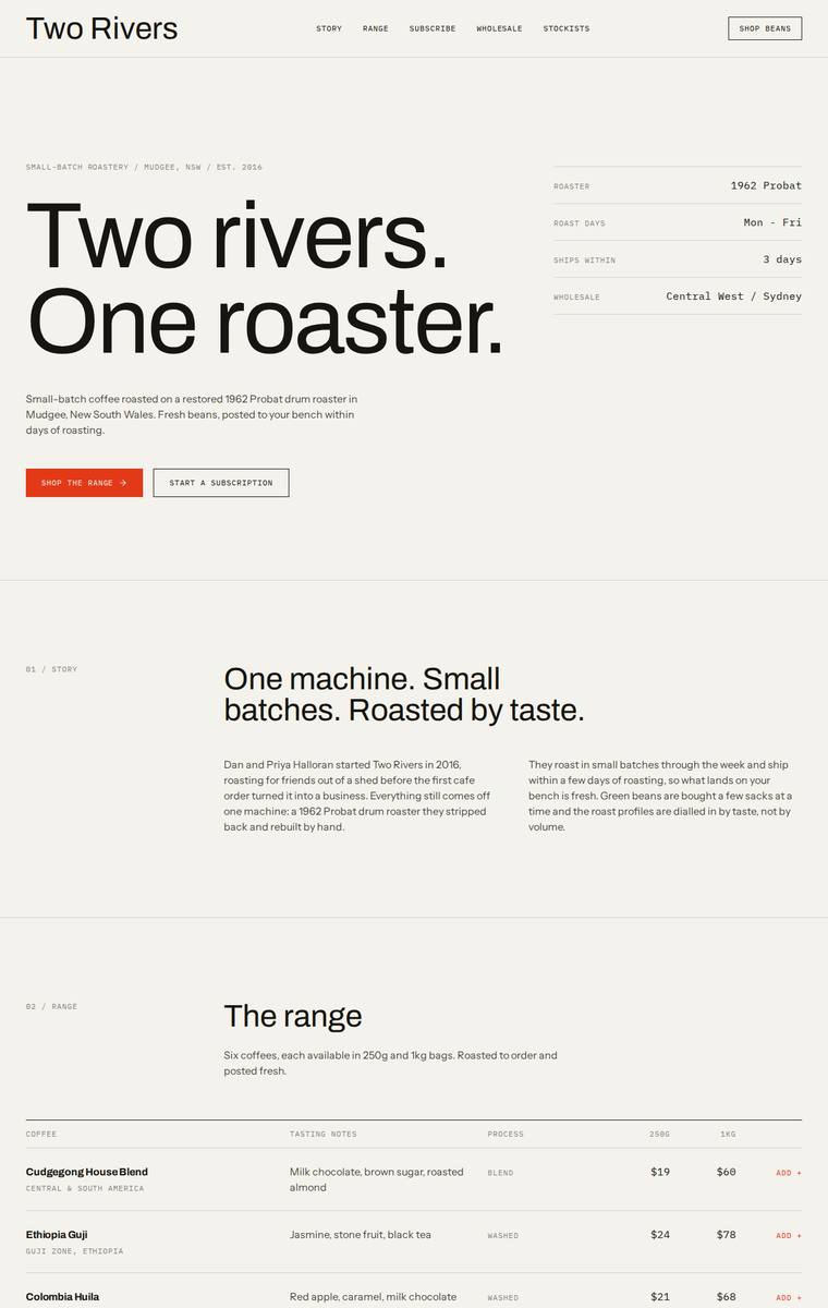
Composite 79.7%Judge 4.2/5
Judge panelAnthropic 4.3/5OpenAI 4.5/5Google 3.3/5
single-judge (Claude) 4.3/5 → leave-one-family-out 4.2/5
Anthropic: Every required section is present and correct: the big-type hero, numbered story, a range table carrying all six coffees with 250g/1kg prices and tasting notes, a dark subscription block, a wholesale form with all five requested fields, the five stockists, a four-method brewing teaser, and contact plus newsletter signup. The design is a coherent editorial system - cream ground, black text, single orange accent, condensed/expanded display headings and a consistent numbered section index - executed cleanly with aligned tables and tidy forms and no obvious broken bits. It reads confident and prem
OpenAI: All required sections are visible and the six coffees, five stockists, subscription, wholesale form fields, brewing teaser, contact and newsletter are covered, though some fixed product/body copy is condensed and a few extra invented details appear. The design is very polished: strong typographic hierarchy, restrained colour, excellent spacing, and consistent table/form systems. Its minimalist editorial direction feels premium and memorable, if a little austere rather than richly distinctive.
Google: All requested content is present within a clean, minimal structure. Typography and grid alignment are consistent, though the absence of imagery makes the visual impact somewhat stark. A highly functional and professional execution.
Elias Byrne (kimi-k3)
default reasoning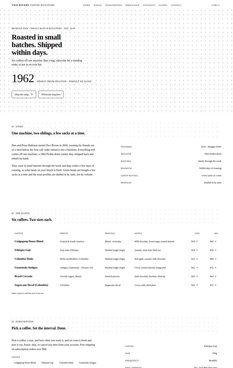
Composite 79.7%Judge 4.2/5
Judge panelAnthropic 4.0/5OpenAI 4.0/5Google 4.0/5
single-judge (Claude) 4.0/5 → leave-one-family-out 4.2/5
Anthropic: Every required section is present and correct: hero, story with a facts sidebar, all six coffees with 250g/1kg prices and tasting notes, the subscription with size/frequency and a live price, a wholesale form collecting cafe name/contact/email/suburb/volume, all five stockists with locations, the brewing-guides teaser, and contact plus newsletter signup. The execution is a coherent, intentional editorial style - numbered sections, a serif display face, dotted-grid texture, and a bold "1962" hero anchor - with clean aligned tables and consistent spacing. It is tasteful and finished, but stays a
OpenAI: All required sections and fixed content appear to be present, including the six coffees, subscription options, wholesale form fields, stockists, brewing teaser, and contact/newsletter details. The minimalist editorial grid is coherent and polished, though the extremely sparse monochrome treatment and tiny form/text details make it feel more austere than warm or premium for a coffee brand. It is distinctive in layout discipline, but lacks visual richness or a memorable coffee-specific hook.
Google: The design fulfills all brief requirements with a distinctive, ledger-inspired minimalist aesthetic. Meticulous typography and grid alignment create a premium, memorable visual identity.
Mara Vieira (grok-4.5)
High reasoning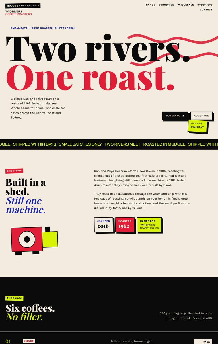
Composite 79.7%Judge 4.2/5
Judge panelAnthropic 4.0/5OpenAI 4.5/5Google 3.3/5
single-judge (Claude) 4.0/5 → leave-one-family-out 4.2/5
Anthropic: A confident, editorial magazine-style build: bold Playfair-style display type, a ticker band, and assured colour-blocking (cream, red, black, chartreuse, cobalt) give it real distinctiveness and stop-power. All required sections are present including hero, story, all six coffees, subscription and wholesale forms, brewing-guides teaser, contact and newsletter. Craft lets it down: the "On the shelf" stockist grid has two blank cards (Ironbark Espresso and Meridian Coffee appear unrendered, leaving 3 of 5 visible), and several range price tags look clipped (e.g. "$09" where $19 is expected), whic
OpenAI: The page includes all required sections and most of the fixed copy and coffee details, with a strong subscription, wholesale form, brewing teaser, and contact/newsletter area. However, the stockists section visibly omits text for two of the five required cafes, which hurts fidelity and craft. Visually it is highly distinctive, cohesive, and memorable, with bold editorial typography and a confident colour system.
Google: The brutalist design direction is bold and memorable, leveraging strong typography and a striking color palette. However, obvious craft errors—such as missing text in the stockist cards and a stray green SVG line over the wholesale section—detract from the overall execution.
Mara Vieira (deepseek-v4-flash)
default reasoning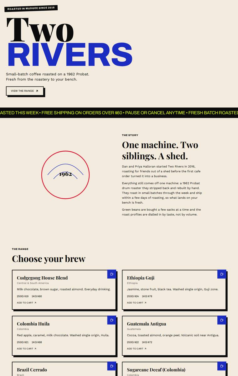
Composite 78.1%Judge 4.1/5
Judge panelAnthropic 4.3/5OpenAI 4.5/5Google 3.3/5
single-judge (Claude) 4.3/5 → leave-one-family-out 4.1/5
Anthropic: Every required section is present and correct: the oversized editorial hero, the story with the 1962 roaster badge, all six coffees with accurate origins/tasting notes/prices, subscription with size/frequency options, a wholesale form collecting all five fields, the five stockists, the brewing-guides teaser, and contact plus newsletter. The visual language is coherent and confident - cream/black with electric-blue and acid-yellow accents, a huge Playfair-style masthead, and a scrolling yellow marquee that give it a distinctive small-batch editorial feel. Craft is largely clean and consistent,
OpenAI: All required sections are visible with the six coffees, five stockists, wholesale form fields, subscription, guides teaser, contact and newsletter included, though some body copy is compressed or slightly incomplete. The design is bold, distinctive and well-composed with strong typography and a memorable colour system; minor craft issues include the clipped ticker text and a few slightly rough alignment/details.
Google: The layout successfully incorporates all requested sections and copy with clear organization. The bold typography and stark color palette create a distinct identity, while consistent styling maintains a cohesive rhythm.
Ingrid Kessler (gpt-5.4-mini)
High reasoning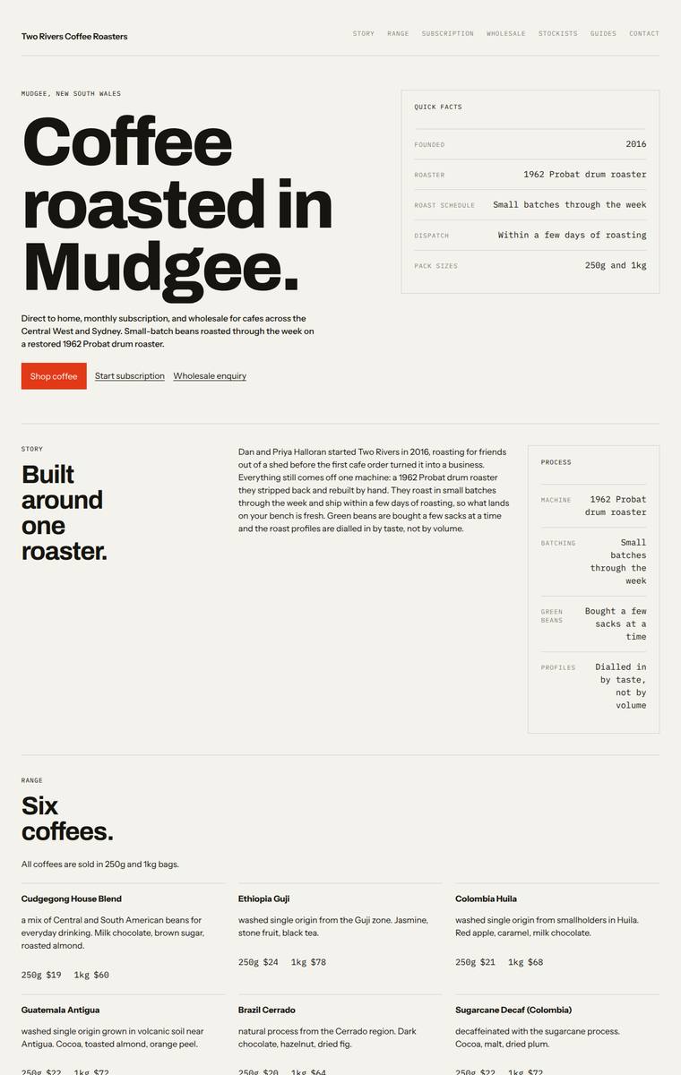
Composite 78.1%Judge 4.1/5
Judge panelAnthropic 4.0/5OpenAI 4.3/5Google 3.8/5
single-judge (Claude) 4.0/5 → leave-one-family-out 4.1/5
Anthropic: Every required section is present and correct: bold hero with a quick-facts panel, story, all six coffees with both prices, subscription form, a wholesale form collecting all five requested fields, the five stockists, brewing-guides teaser, and contact plus newsletter. The editorial system is coherent and modern - oversized Archivo-style display type, cream ground, a single warm red accent, and monospace labels with right-aligned values that give the spec tables a considered, deliberate feel, and craft is clean with consistent alignment and no broken elements. It stops short of premium impact
OpenAI: All required sections and fixed facts are present, including the six coffees, subscription details, wholesale form fields, five stockists, brewing teaser, contact, and newsletter signup. The design is cohesive and editorial with strong typography, disciplined spacing, and a clear hierarchy, though its very austere treatment and lack of richer brand imagery or texture keep it from feeling fully premium or memorable.
Google: The design employs a rigorous, utilitarian grid system with strong typographic consistency. All required elements are present, though the stark, imagery-free aesthetic feels slightly cold for an artisanal coffee brand.
Elias Byrne (glm-5.2)
default reasoning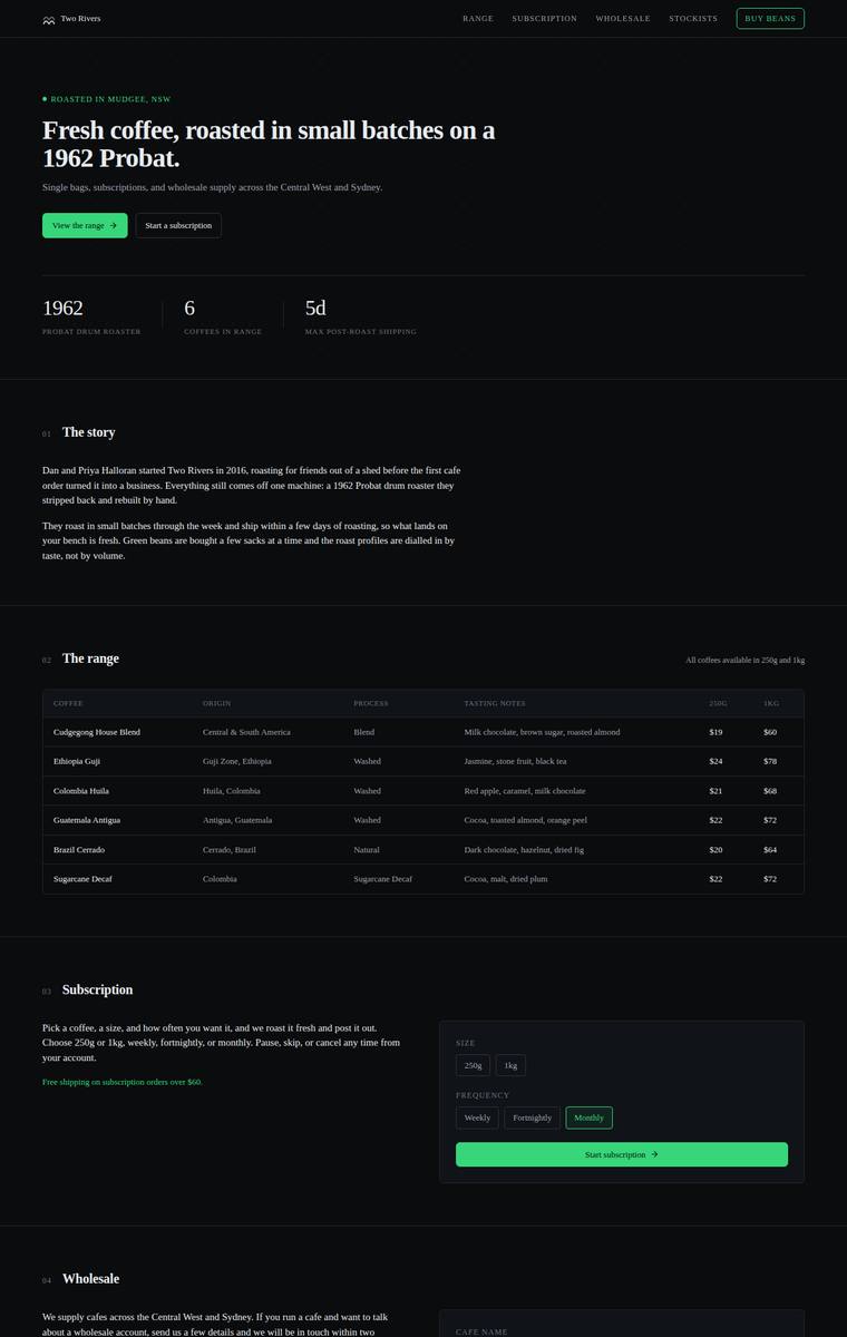
Composite 76.6%Judge 4.1/5
Judge panelAnthropic 4.0/5OpenAI 3.8/5Google 3.5/5
single-judge (Claude) 4.0/5 → leave-one-family-out 4.1/5
Anthropic: All required sections are present and correct: hero with stat bar, story, the full six-coffee range table with 250g/1kg pricing, subscription with size/frequency controls, a wholesale form collecting all five fields, five stockists, brewing guides table, and contact plus newsletter. The dark theme with a single green accent and serif numbered headings is coherent, modern, and well-spaced, though it reads as a competent, somewhat generic dark template rather than a distinctive point of view. Craft is solid with clean tables, but the stockists grid leaves a large empty dark block beside the lone
OpenAI: All required sections are visible with the six coffees, five stockists, wholesale form fields, contact, and newsletter largely covered, though the subscription UI lacks a coffee choice and the brewing guide table invents specific guide details beyond the supplied teaser. The dark editorial design is coherent and polished with strong spacing and typography, but it is quite restrained, visually sparse, and the stockists grid has a slightly awkward final-row treatment that reduces overall impact.
Google: All required sections and copy are present and functionally complete. However, the dark, highly structured, table-heavy aesthetic feels more suited to a software dashboard than an artisanal coffee roaster, lacking the expected warmth.
Noor El-Amin (grok-4.3)
default reasoning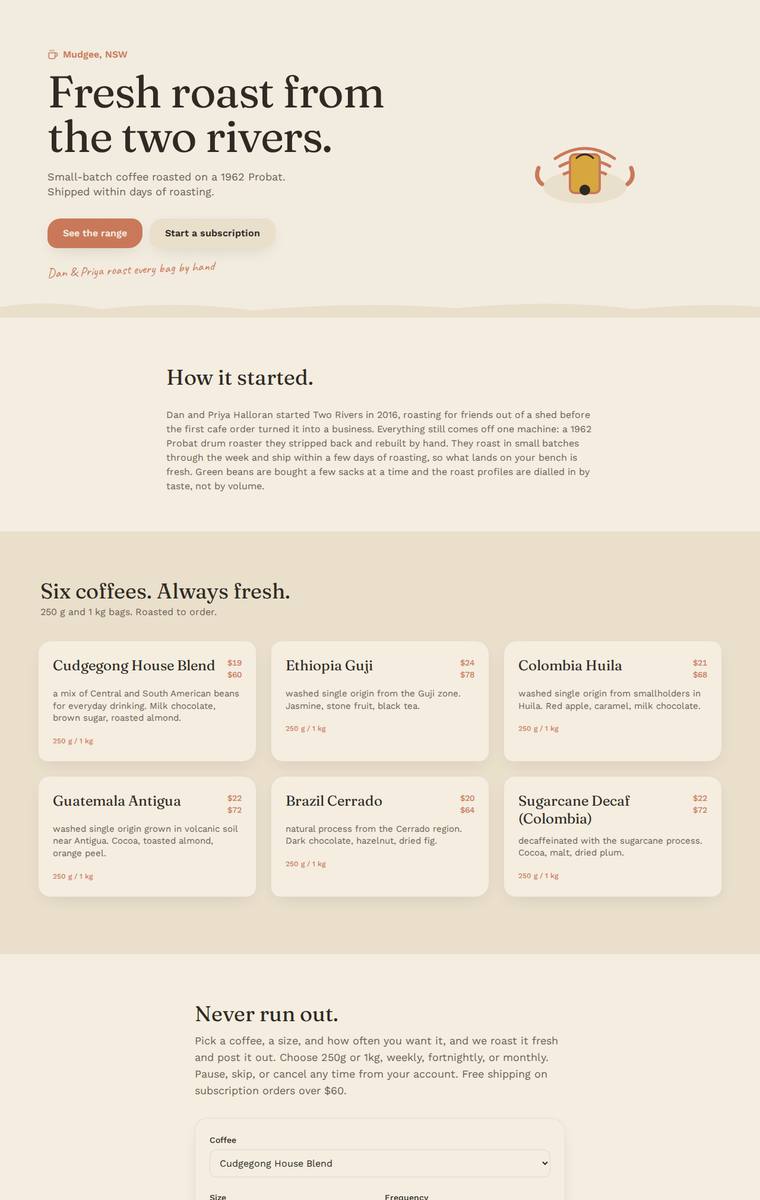
Composite 76.6%Judge 4.1/5
Judge panelAnthropic 4.0/5OpenAI 4.0/5Google 3.3/5
single-judge (Claude) 4.0/5 → leave-one-family-out 4.1/5
Anthropic: Every required section is present and correct: hero with location tag and dual CTAs, the full story, all six coffees with 250g/1kg prices, a subscription picker (coffee/size/frequency), a wholesale form with all five fields, all five stockists, the brewing-guides teaser, and contact plus newsletter signup. The warm cream-and-terracotta palette with a Fraunces-style serif display reads well for an artisan roaster and the handwritten Caveat line adds a nice human touch; spacing and card consistency are clean. It loses points because the layout is fairly conventional and centred with heavy whites
OpenAI: All required sections are present with the six coffees, five stockists, subscription, wholesale form, brewing teaser, contact and newsletter, and the copy is substantially faithful. The warm palette, serif typography and calm spacing feel appropriate and polished, though the design is fairly generic and has small craft issues such as unclear price-to-size labelling and a truncated wholesale placeholder, which limits its distinctiveness.
Google: The design delivers all requested content with high fidelity, utilizing a warm, appropriate color palette. While the typography and layout are clean, the aesthetic feels somewhat templated and lacks a distinctive premium quality. Minor polish issues in the hero illustration and grid alignment slightly reduce overall impact.
Yuki Tanabe (deepseek-v4-pro)
default reasoning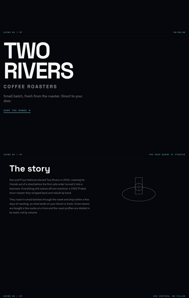
Composite 76.6%Judge 4.1/5
Judge panelAnthropic 4.3/5OpenAI 4.3/5Google 3.3/5
single-judge (Claude) 4.3/5 → leave-one-family-out 4.1/5
Anthropic: Every required section is present and correct: hero, story, all six coffees with 250g/1kg prices, subscription with size/frequency toggles, a wholesale form collecting cafe name/contact/email/suburb/volume, all five stockists, brewing-guides teaser, and contact plus newsletter. The design commits to a distinctive editorial point of view - a dark, near-black canvas with "SCENE 01/07" monospace markers, large Archivo Expanded headings and cyan accents - which is coherent and modern. It is let down by very dim, small body copy against black (contrast is weak) and large stretches of empty vertical
OpenAI: All required sections, six coffees with prices, wholesale form fields, stockists, brewing teaser, contact details, and newsletter signup are visible and largely faithful to the supplied copy. The dark editorial/cinematic system is distinctive and consistent, though the very sparse spacing and cool tech-like tone feel a little detached from a warm coffee-roaster brand and reduce ecommerce immediacy.
Google: The design accurately includes all required content and copy from the brief. The cinematic, technical aesthetic is distinctive but feels somewhat cold for a coffee brand, and the excessive vertical spacing between sections creates a disjointed layout.
Elias Byrne (claude-sonnet-5)
High reasoning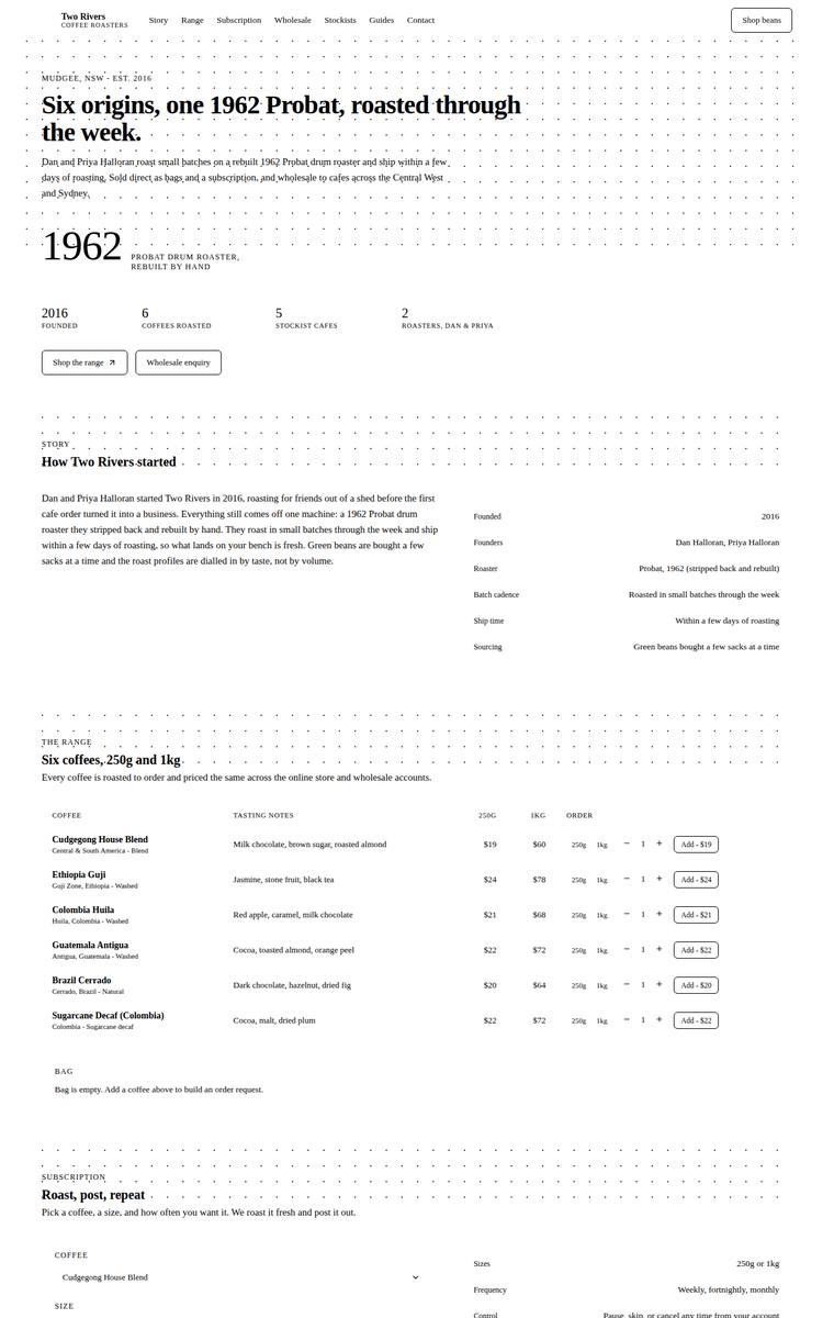
Composite 75.0%Judge 4.0/5
Judge panelAnthropic 4.3/5OpenAI 3.8/5Google 3.3/5
single-judge (Claude) 4.3/5 → leave-one-family-out 4.0/5
Anthropic: Every required section is present and correct: hero, story (with a facts table), all six coffees with tasting notes and 250g/1kg pricing plus order controls, the subscription builder, a wholesale form collecting cafe name/contact/email/suburb/weekly volume, all five stockists, the four brewing guides teaser, and contact plus newsletter signup. The editorial broadsheet aesthetic - serif headlines, dotted rules as a section motif, cream ground with a muted green accent - is a genuine, coherent point of view that suits a small-batch roaster and is executed with consistent alignment and finished d
OpenAI: All required sections and fixed business details are visible, including the six coffees, subscription terms, wholesale form fields, stockists, guides teaser, contact, and newsletter. The stark monochrome editorial/grid direction is coherent and distinctive, but it is very text-heavy with tiny type and some form fields that lack clear input affordances, which lowers polish and overall premium impact.
Google: The layout successfully incorporates all required content with precise typography and consistent tabular structures. However, the stark monochromatic aesthetic and heavy use of dotted backgrounds feel overly clinical for a coffee brand, reducing its overall premium impact.
Noor El-Amin (grok-build-0.1)
default reasoning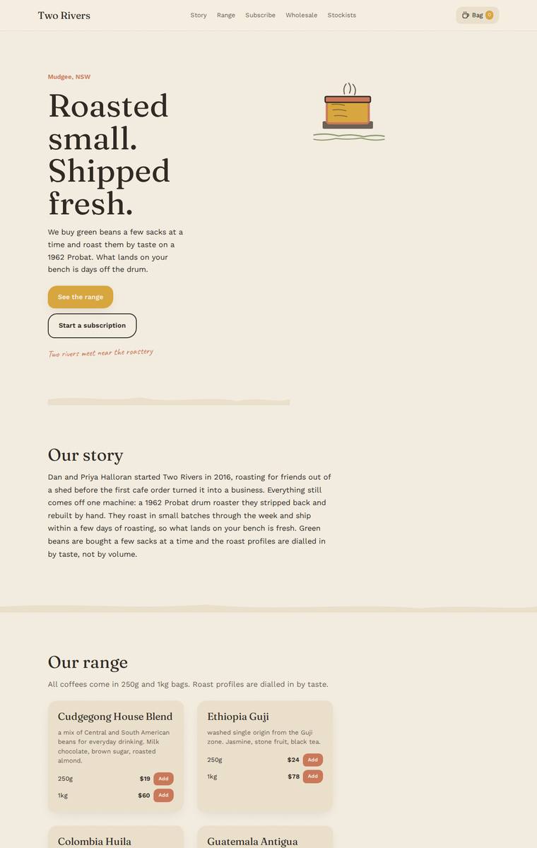
Composite 75.0%Judge 4.0/5
Judge panelAnthropic 4.0/5OpenAI 4.0/5Google 3.3/5
single-judge (Claude) 4.0/5 → leave-one-family-out 4.0/5
Anthropic: Every required section is present and correct: hero, story, all six coffees with 250g/1kg pricing, subscription with a coffee/size/frequency form, a wholesale form collecting all five fields, the five stockists, brewing-guides teaser, and contact plus newsletter signup. The warm cream palette, serif display headings, terracotta accent buttons, hand-drawn coffee-cup SVG and the Caveat scribble line give it a coherent, tasteful small-roaster feel with good type choices. What holds it back from premium is loose composition - the hero is sparse and unbalanced with large empty regions, whitespace b
OpenAI: All required sections are visible and the six coffees, five stockists, subscription details, wholesale form fields, brewing teaser, and contact/newsletter content are substantially present. The warm palette, serif typography, cards, and hand-drawn accents create a coherent roastery feel, though the layout leaves a lot of unused space and some text wrapping/clipping feels a bit plain or awkward. Overall it is polished and complete, but more charming than truly premium or distinctive.
Google: All required sections and copy are present, featuring a warm, appropriate color palette. The layout is somewhat repetitive and lacks dynamic composition, while the basic inline illustrations limit the overall premium feel.
Noor El-Amin (deepseek-v4-flash)
default reasoning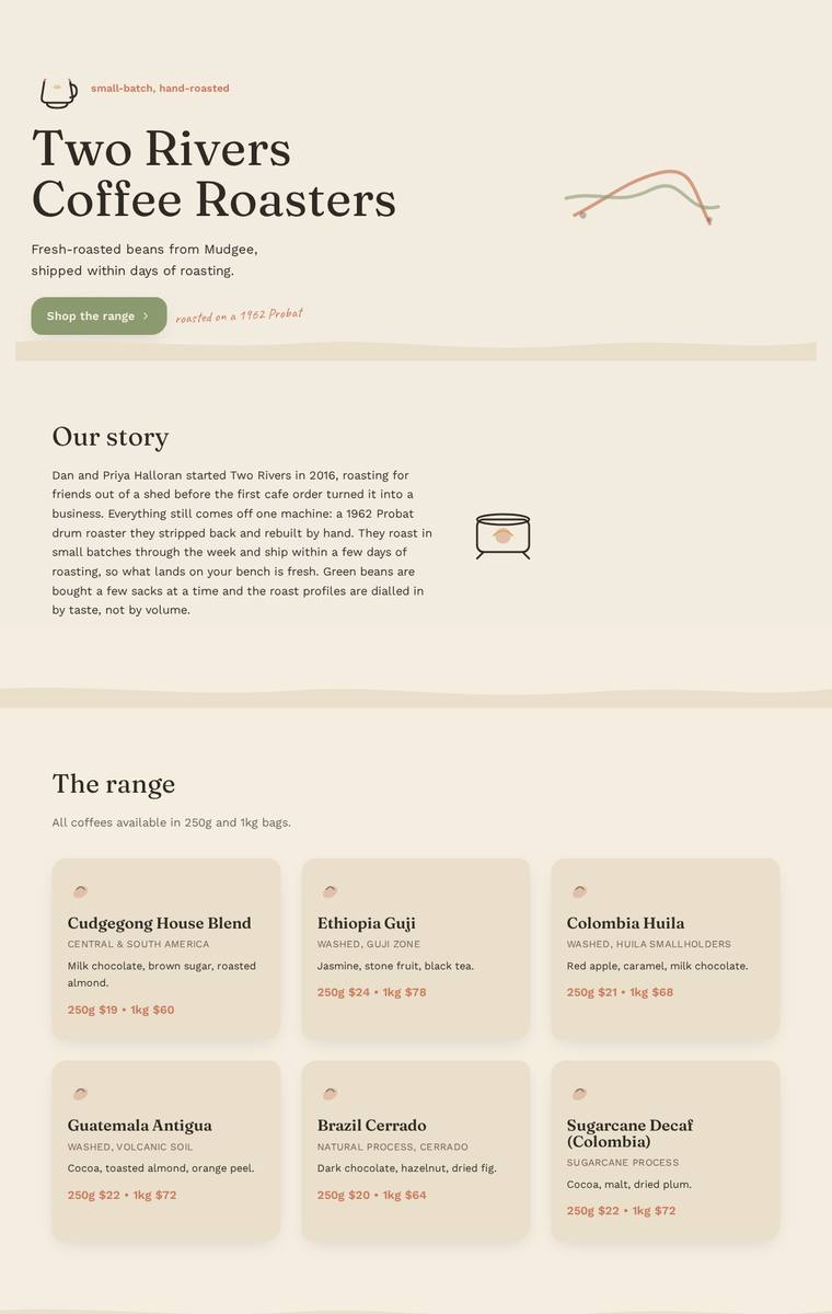
Composite 75.0%Judge 4.0/5
Judge panelAnthropic 4.0/5OpenAI 4.3/5Google 3.0/5
single-judge (Claude) 4.0/5 → leave-one-family-out 4.0/5
Anthropic: Every required element is present and correct: hero with tagline and CTA, the story, all six coffees with correct flavour notes and 250g/1kg prices, the subscription block, a wholesale form with all five fields (cafe name, contact, email, suburb, weekly volume), all five stockists, the brewing-guides teaser, and contact plus newsletter signup. The warm cream palette with sage-green and terracotta accents, serif display headings, and the hand-drawn "1962 Probat" caveat give it a coherent, on-brand small-roaster feel with tidy spacing and a clean grid of range cards. It reads as competent and fi
OpenAI: All required sections and fixed facts are visible, including the six coffees with prices, wholesale form fields, five stockists, brewing teaser, contact, and newsletter signup. The warm palette, serif typography, soft dividers, and hand-drawn motifs create a coherent small-batch roaster feel, though some sections feel overly sparse and the visual system is more pleasant than truly standout.
Google: The layout successfully incorporates all required content sections and employs a warm, context-appropriate color scheme. However, the heavy reliance on a basic single-column structure and rudimentary line-art illustrations results in a somewhat generic appearance that lacks a premium edge.
Yuki Tanabe (kimi-k2.7-code)
default reasoning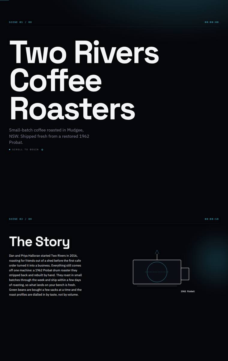
Composite 73.4%Judge 3.9/5
Judge panelAnthropic 3.3/5OpenAI 4.0/5Google 3.5/5
single-judge (Claude) 3.3/5 → leave-one-family-out 3.9/5
Anthropic: All required sections are present and correctly ordered: hero, story with a small line-drawn roaster, all six coffees, subscription with size/frequency controls, a wholesale form with the right fields, the five stockists, a four-method brewing teaser, and contact plus newsletter. The dark editorial treatment with oversized Archivo-Expanded headings is coherent and modern, but execution is uneven: enormous stretches of empty black between sections make the page feel sparse and unfinished, every coffee card reuses the same generic bag glyph, and the Ethiopia Guji price reads $34 where the brief
OpenAI: All required sections are visible and the key business facts, six coffees, wholesale form fields, stockists, guides teaser, contact and newsletter are included, though the range omits visible 1kg prices and some fixed origin/process detail. The dark cinematic, cyan-accented system is cohesive and polished with strong hierarchy, but it feels more sci-fi/technical than warm coffee-roaster premium and some microtext is very small. Overall it is distinctive and well-finished, with minor content and brand-fit shortcomings.
Google: All requested content and sections are present and precisely aligned within a rigid grid system. However, the chosen technical, sci-fi aesthetic—featuring timestamps and stark cyan wireframes—feels disconnected from a regional, small-batch artisanal coffee roaster.
Ingrid Kessler (deepseek-v4-flash)
default reasoning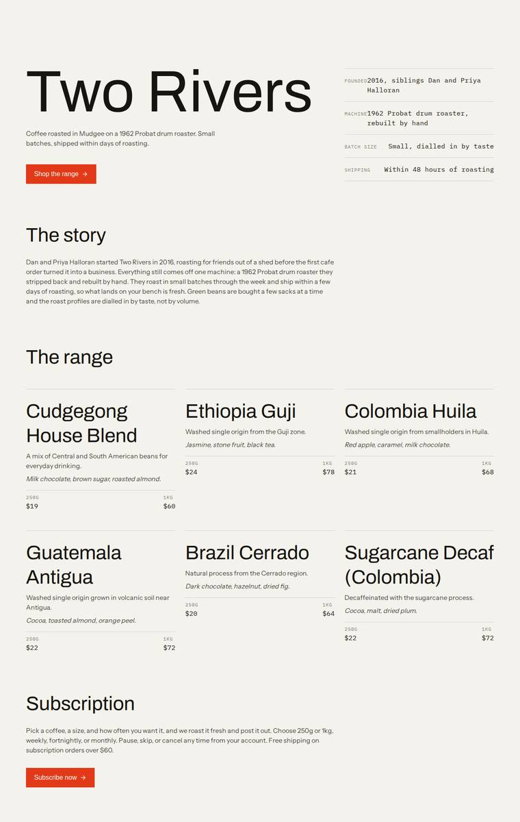
Composite 73.4%Judge 3.9/5
Judge panelAnthropic 4.0/5OpenAI 4.0/5Google 3.0/5
single-judge (Claude) 4.0/5 → leave-one-family-out 3.9/5
Anthropic: Every required section is present and correct: hero, story, all six coffees with tasting notes and 250g/1kg prices, subscription, wholesale form with the exact five fields, five stockists with locations, brewing-guides teaser, and contact plus newsletter. The editorial treatment is coherent and tasteful - warm off-white ground, oversized Archivo hero, mono labels with hairline dividers, and a single orange accent - which reads modern and on-brand for a roaster. It loses ground on impact and craft because the layout is sparse: range rows have uneven card heights and large dead space on the righ
OpenAI: All required sections are visible with the six coffees, prices, wholesale form fields, five stockists, brewing teaser, contact and newsletter content represented accurately. The design is clean, modern and well-spaced with a strong typographic system and restrained colour, though it is very minimal and lacks a more distinctive visual identity or memorable coffee-roaster atmosphere.
Google: The design accurately includes all content requested in the brief, maintaining a clean and organized structure. However, the minimalist, text-heavy aesthetic feels more like a technical wireframe than a premium artisanal coffee brand, limiting its overall visual appeal and impact.
Ingrid Kessler (grok-4.3)
default reasoning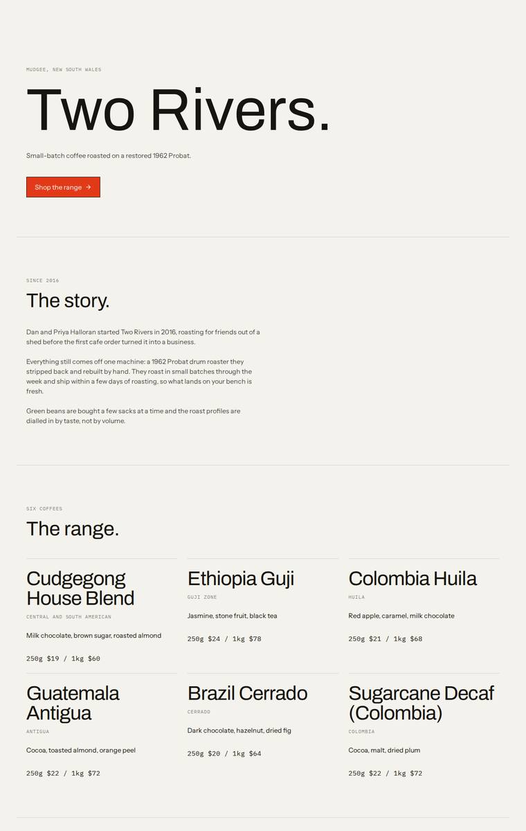
Composite 71.9%Judge 3.9/5
Judge panelAnthropic 4.0/5OpenAI 3.8/5Google 3.0/5
single-judge (Claude) 4.0/5 → leave-one-family-out 3.9/5
Anthropic: Every required section is present and accurate: hero, story, all six coffees with correct 250g/1kg prices and tasting notes, subscription, a wholesale form with all five fields, the five stockists, brewing teaser, and contact plus newsletter signup. The execution is a coherent, modern editorial system - cream background, confident oversized "Two Rivers." headline, consistent monospace kicker labels, and a single red accent used cleanly across CTAs. It reads finished and consistent, but the heavy reliance on whitespace with empty left columns in the wholesale and stockists rows, and the total a
OpenAI: All required sections, six coffees, stockists, subscription and wholesale form are visible, though some fixed product/process details and newsletter/contact copy are abbreviated or missing. The design is clean, modern and consistent with strong typography and spacing, but the extremely minimal treatment and lack of visual brand elements or coffee imagery make it feel less distinctive and premium than it could.
Google: The design faithfully incorporates all required content and sections from the brief. However, the ultra-minimalist execution feels more like a wireframe than a finished brand, lacking premium styling or distinctive visual character.
Yuki Tanabe (gpt-5.5)
High reasoning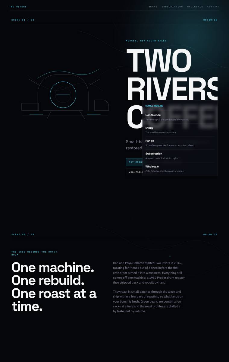
Composite 71.9%Judge 3.9/5
Judge panelAnthropic 3.5/5OpenAI 4.5/5Google 3.0/5
single-judge (Claude) 3.5/5 → leave-one-family-out 3.9/5
Anthropic: Every required section is present and correct: hero, story, the range with all six coffees and 250g/1kg pricing, subscription, a wholesale form with the five specified fields, all five stockists with towns, the brewing-guides teaser, and contact plus newsletter. The build commits to a distinctive dark, cinematic "scene 01/06" editorial concept with mono labels, timecodes and a cyan accent that reads coherent and modern. Execution flaws hold it back though: the hero brand name is clipped at the right edge ("TWO RIVERS C") with the nav card overlapping "COFFEE", and there are large empty black v
OpenAI: All required sections, coffees, stockists, subscription details, wholesale form fields, brewing teaser, contact and newsletter content are visible and substantially correct. The dark cinematic art direction is highly distinctive and cohesive, with strong typography and structure, though the hero overlay/clipped headline and some low-contrast body text slightly hurt readability and polish.
Google: The layout successfully incorporates all required brief elements within a distinct, tech-inspired aesthetic. However, a poorly positioned timeline menu in the hero section obscures the primary typography, heavily compromising readability and overall execution.
Elias Byrne (claude-fable-5)
High reasoning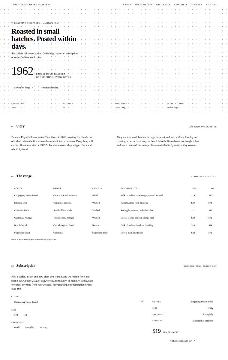
Composite 70.3%Judge 3.8/5
Judge panelAnthropic 3.5/5OpenAI 4.0/5Google 3.3/5
single-judge (Claude) 3.5/5 → leave-one-family-out 3.8/5
Anthropic: All required sections are present and correct: hero, story, the range with all six coffees and 250g/1kg prices, subscription with a size/frequency picker, wholesale form collecting cafe name/contact/email/suburb/volume, all five stockists, brewing guides teaser, and contact plus newsletter. The editorial minimalist direction (serif display type, numbered sections, the big "1962" motif, dotted-line rules and rust accent) is coherent and tasteful, but the execution is undermined by vast unexplained vertical whitespace in the subscription, wholesale, and brewing sections that reads as underfilled
OpenAI: All required sections are visible and the six coffees, five stockists, subscription details, wholesale form fields, brewing teaser, contact, and newsletter content are substantially present. The stark editorial black-and-white treatment is coherent and tasteful, with strong typographic discipline, but the page feels very sparse and table-like for an ecommerce coffee brand. Craft is consistent, though weak input/button affordances and limited visual warmth reduce the overall impact.
Google: The design adopts a distinctive, utilitarian spec-sheet aesthetic that is consistently executed across all sections. All brief requirements are faithfully included, though the stark tabular layout feels somewhat clinical for a boutique coffee roaster.
Yuki Tanabe (claude-haiku-4-5)
default reasoning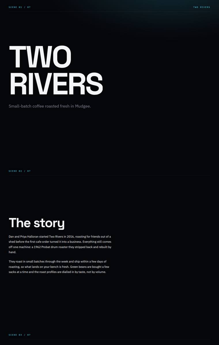
Composite 70.3%Judge 3.8/5
Judge panelAnthropic 3.5/5OpenAI 3.8/5Google 3.0/5
single-judge (Claude) 3.5/5 → leave-one-family-out 3.8/5
Anthropic: All required sections are present and correct: hero, story, the six coffees with prices, subscription options, a wholesale form with the specified fields, five stockists, brewing-guides teaser, and contact/newsletter. The bold Archivo-Expanded headlines are striking, but the dark cyan-accented aesthetic reads as generic dark-tech rather than a coffee roaster, and the layout carries a lot of dead vertical space that makes it feel loose. Craft is undercut by the leftover "SCENE 01 / 07" scaffolding labels above each section, which look like template artefacts and would jar a reviewer.
OpenAI: All required sections are visible and the main copy is substantially present, including the wholesale form fields, stockists, guides, contact, and newsletter. The main fidelity gap is in the range cards, which omit the visible 1kg prices and some origin detail despite showing six coffees. The dark editorial treatment is cohesive and polished, but the very sparse, monochrome presentation feels a bit cold for a coffee roaster and limits memorability.
Google: While faithfully containing all brief requirements, the stark, brutalist aesthetic with neon accents feels disconnected from a warm craft coffee brand. The repetitive 'scene' structure and overly wide text blocks create a visually fatiguing experience that lacks e-commerce polish.
Elias Byrne (gemini-3.5-flash)
default reasoning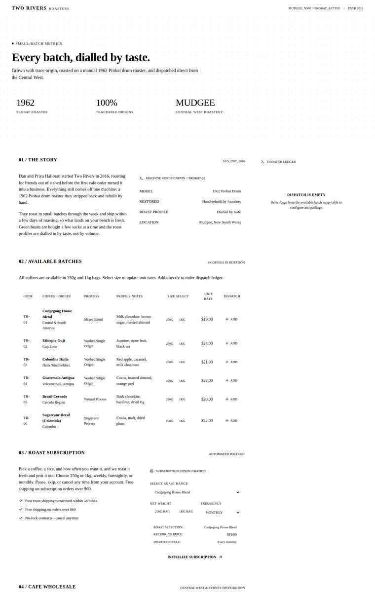
Composite 70.3%Judge 3.8/5
Judge panelAnthropic 3.3/5OpenAI 3.8/5Google 3.5/5
single-judge (Claude) 3.3/5 → leave-one-family-out 3.8/5
Anthropic: All required sections are present with a consistent "roaster-as-machine/system terminal" concept: hero, story, all six coffees (TR-01 to TR-06 with profiles and prices), subscription, wholesale form with the five required fields, five stockists, a staged brewing-guides teaser, and contact/newsletter. Fidelity slips only on the range table showing a single 250g unit rate rather than clearly presenting both 250g and 1kg prices. The concept is distinctive and coherent, but execution is thin: vast empty whitespace between sections and a near-empty extraction-parameters block with floating "STAGED"
OpenAI: The page includes all required sections, all six coffees, the wholesale fields, stockists, brewing teaser, contact and newsletter, but the range visibly omits the required 1kg prices and some sales copy is reframed into a colder system-led tone. The monochrome ledger aesthetic is coherent, distinctive and consistently executed, though the very small type, extreme whitespace and lack of warmth or product appeal make it feel more archival than premium coffee retail.
Google: The build incorporates all required content within a highly distinct, technical data-sheet aesthetic. While the laboratory-like styling lacks traditional artisanal warmth, the typography and grid structures are executed with rigorous consistency.
Elias Byrne (grok-4.5)
High reasoning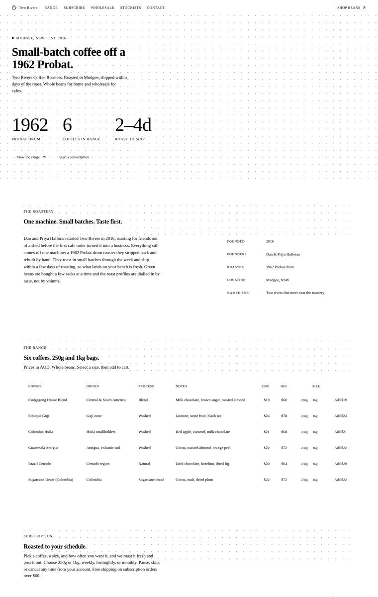
Composite 70.3%Judge 3.8/5
Judge panelAnthropic 3.3/5OpenAI 4.0/5Google 3.5/5
single-judge (Claude) 3.3/5 → leave-one-family-out 3.8/5
Anthropic: Every brief element is present and correct: hero with founding stats, story, all six coffees with 250g/1kg prices and tasting notes in a range table, the subscription builder, a wholesale form collecting cafe name, contact, email, suburb and weekly volume, all five stockists, the brewing-guides teaser, and contact plus newsletter signup. The execution is a coherent editorial-minimal treatment - serif headings, dotted-grid motifs, restrained monochrome with faint green accents - but it reads as extremely sparse: tiny low-contrast type, cavernous whitespace between sections, and forms rendered a
OpenAI: The page visibly includes every required section, all six coffees with pricing/details, the five stockists, wholesale form fields, subscription, brewing teaser, and contact/newsletter copy. The editorial black-and-white grid system is coherent and polished, though the very sparse layout, tiny type in places, and lack of imagery or colour make it feel more restrained than premium coffee-brand memorable.
Google: The build strictly adheres to the brief with a flawless, grid-driven execution of a highly technical aesthetic. While structurally perfect and distinct, the stark, monochromatic approach feels slightly detached for an artisanal coffee brand.
Ingrid Kessler (grok-4.20-reasoning)
default reasoning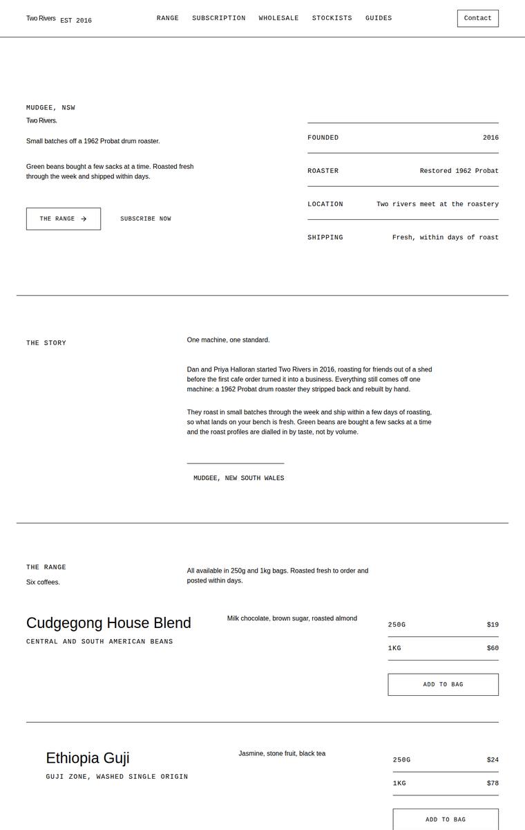
Composite 70.3%Judge 3.8/5
Judge panelAnthropic 3.5/5OpenAI 4.0/5Google 3.3/5
single-judge (Claude) 3.5/5 → leave-one-family-out 3.8/5
Anthropic: Every required section is present and correct: hero, story, all six coffees with accurate 250g/1kg prices, subscription controls, a wholesale form with the five required fields, all five stockists, a brewing-guides teaser, and contact plus newsletter signup. The execution is a restrained monochrome editorial style - monospace labels paired with clean serif/sans headings, tidy alignment, and consistent product rows - which is coherent and free of broken bits but reads as a stylish spec sheet rather than a warm, finished coffee brand. With no imagery, colour, or hero visual and large stretches o
OpenAI: All required sections are visible and the fixed business facts, six coffees, five stockists, wholesale fields, contact details, and newsletter signup are represented. The restrained monochrome editorial layout is coherent and well-spaced, but it feels somewhat stark and generic for a coffee roaster, with limited emotional warmth or standout brand character. Craft is mostly consistent, though the subscription controls show visible truncation/overflow, which keeps it from feeling fully polished.
Google: The layout successfully incorporates all required sections within a striking, minimalist typographic grid. While the utilitarian aesthetic feels premium, minor craft issues like overlapping text in the subscription form detract slightly from the execution.
Yuki Tanabe (grok-build-0.1)
default reasoning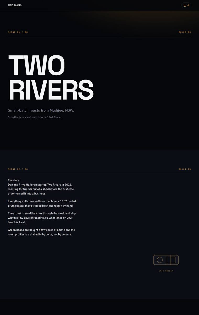
Composite 70.3%Judge 3.8/5
Judge panelAnthropic 3.5/5OpenAI 4.0/5Google 3.3/5
single-judge (Claude) 3.5/5 → leave-one-family-out 3.8/5
Anthropic: Complete on the brief: every required section is present with all six coffees (correct prices and buy buttons), all five stockists, the subscription pickers, the five-field wholesale form, brewing teaser, and newsletter signup. The dark editorial aesthetic with an oversized condensed hero and amber accent is distinctive and modern, but it is undercut by very low-contrast body text on near-black and several large empty black voids (notably the brewing-guides band), which read as sparse and unfinished. Striking hero, competent grid, but the readability and dead-space issues keep it short of prem
OpenAI: All required sections are visible, with all six coffees and five stockists included, though some fixed subscription and wholesale supporting copy appears abbreviated. The dark cinematic “scene” concept is cohesive and distinctive with strong typography, but the page is very sparse in places and a few details like tight price spacing and empty section composition keep it from feeling fully polished or richly premium.
Google: The design faithfully includes all required content and copy sections. However, the stark, technical 'scene-based' layout feels misaligned with the warmth typically associated with a small-batch coffee roaster, resulting in a well-built but thematically discordant site.
Elias Byrne (gpt-5.6-sol)
High reasoning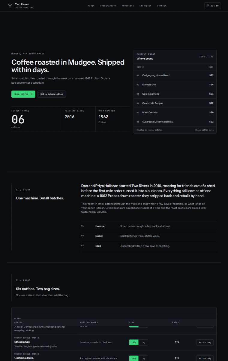
Composite 70.3%Judge 3.8/5
Judge panelAnthropic 4.0/5OpenAI 3.8/5Google 2.5/5
single-judge (Claude) 4.0/5 → leave-one-family-out 3.8/5
Anthropic: All required sections are present and correct: hero, story (with a Source/Roast/Ship breakdown), the range table with all six coffees and matching 250g prices, subscription picker with order summary, a wholesale form collecting the five specified fields, five stockists, a four-method brewing-guides teaser, and contact plus newsletter. The dark, monospace-labelled, green-accent aesthetic is coherent, modern, and cleanly spaced, giving a distinctive technical feel, though it reads more like a SaaS terminal than a warm coffee brand and body type runs quite small. Craft is let down by a clear defe
OpenAI: The page includes all required sections and most fixed copy/details, with a strong dark editorial-commerce system, but the 1kg prices are not visible and a few required list/table items are partially obscured. The visual direction is cohesive and premium, though some table header overlap and clipped first rows make the build feel less finished.
Google: The layout adopts a stark, terminal-inspired aesthetic that feels disconnected from an artisanal coffee brand's identity. Furthermore, prominent rendering bugs in the Range and Stockists tables obscure required content, compromising both craft and overall execution.
Ingrid Kessler (grok-build-0.1)
default reasoning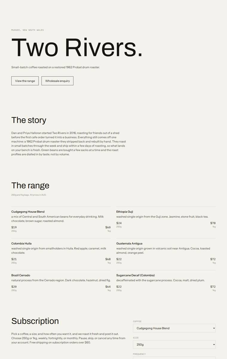
Composite 68.8%Judge 3.8/5
Judge panelAnthropic 3.8/5OpenAI 3.5/5Google 3.0/5
single-judge (Claude) 3.8/5 → leave-one-family-out 3.8/5
Anthropic: Every required section is present and correct: hero, story, all six coffees with 250g/1kg pricing, subscription with size/frequency controls, a wholesale form collecting the five specified fields, all five stockists, brewing-guides teaser, and contact plus newsletter signup. The design is a coherent, restrained editorial system - cream ground, mono uppercase labels, a single warm-red accent, and a bold "Two Rivers." masthead - and the alignment, spacing and form styling are consistently executed with no broken elements. It reads as competent and tasteful but understated: there is no imagery, t
OpenAI: All required sections, coffees, prices, stockists, forms, and core copy are present and largely accurate, though the range does not really include any visible buying action for single bags. The design is clean, coherent, and well-spaced with consistent typography, but it is extremely minimal and lacks distinctive coffee-roaster character, imagery, or memorable brand expression.
Google: The layout accurately includes all requested content with consistent alignment and functional forms. However, the visual design is overly spartan and lacks brand distinctiveness, resulting in a low-impact, wireframe-like aesthetic.
Ingrid Kessler (deepseek-v4-pro)
default reasoning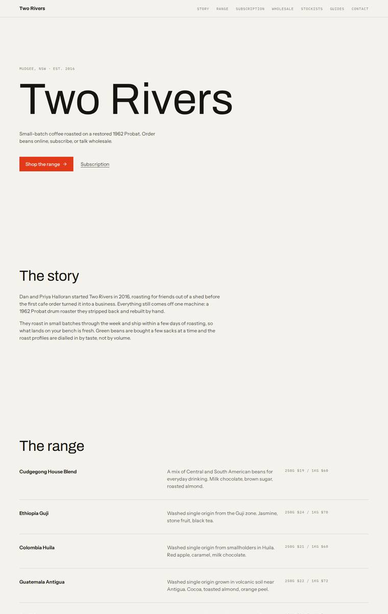
Composite 68.8%Judge 3.8/5
Judge panelAnthropic 3.8/5OpenAI 3.5/5Google 3.3/5
single-judge (Claude) 3.8/5 → leave-one-family-out 3.8/5
Anthropic: Every required section is present and correct: hero, story, the range with all six coffees and 250g/1kg prices, subscription, a wholesale form with the five required fields, all five stockists, brewing guides teaser, and contact plus newsletter signup. The execution is a clean, restrained editorial system - warm off-white ground, black type, a single orange accent for CTAs, consistent hairline dividers - which is coherent and modern but plays it very safe. It reads a touch thin: the price columns are tiny and faint, and large stretches of empty vertical space feel more sparse than intentional,
OpenAI: All required sections and fixed content appear to be present, including the six coffees, wholesale form fields, stockists, brewing teaser, contact, and newsletter signup. The design is clean and consistent with good typographic hierarchy, but it is extremely sparse and generic, with little visual storytelling or brand distinction beyond the red CTAs. Overall it feels finished but under-expressive for a premium small-batch coffee roaster.
Google: The design accurately incorporates all required content from the brief with clean, consistent typography and solid alignment. However, the entirely text-based approach lacks graphic interest, resulting in a functional but visually unmemorable layout.
Noor El-Amin (gpt-5.4-mini)
High reasoning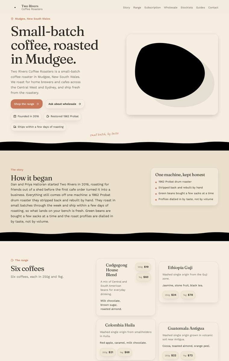
Composite 68.8%Judge 3.8/5
Judge panelAnthropic 3.0/5OpenAI 4.3/5Google 3.3/5
single-judge (Claude) 3.0/5 → leave-one-family-out 3.8/5
Anthropic: Brief fidelity is strong: all six coffees with correct 250g/1kg prices and tasting notes, all five stockists, the full wholesale form (cafe name, contact, email, suburb, weekly volume), subscription, brewing-guides teaser, contact and newsletter are all present in Australian English. But the hero art is a shapeless solid-black blob that reads as a broken or unfinished SVG, and the heavy full-width black band separators between every section are jarring against the otherwise warm cream/terracotta coffee palette, badly undercutting the composition. The warm serif-plus-sans type and the range car
OpenAI: All required sections, products, prices, stockists, subscription details, wholesale form fields, contact information, and newsletter copy are present and substantially accurate. The design is cohesive and warm with strong typography and a distinctive river-divider motif, though the repeated heavy black waves and very simple abstract bean/logo treatment keep it from feeling fully premium. Overall it is polished and consistent with only minor refinement needed in visual subtlety and brand mark craft.
Google: The layout successfully incorporates all required content sections with clean typography and an appropriate warm color palette. However, the heavy black section dividers and abstract hero placeholder feel slightly disjointed from the otherwise light and refined aesthetic.
Elias Byrne (grok-4.20-reasoning)
default reasoning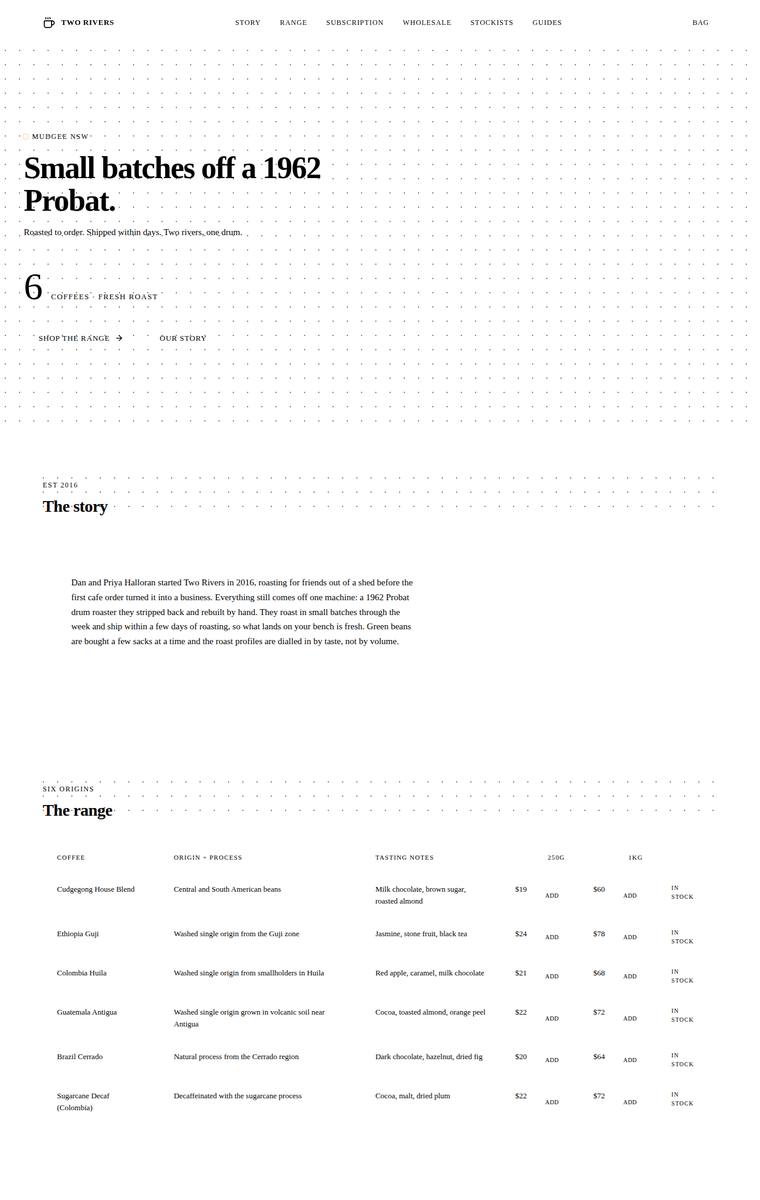
Composite 67.2%Judge 3.7/5
Judge panelAnthropic 3.5/5OpenAI 3.0/5Google 3.3/5
single-judge (Claude) 3.5/5 → leave-one-family-out 3.7/5
Anthropic: Every required section is present and correct: hero, story, a full six-coffee range table with origin/process, tasting notes, both 250g/1kg prices and stock status, the subscription picker, a wholesale form collecting all five fields, all five stockists, the four-method brewing teaser, and contact plus newsletter. The editorial, dotted-grid, serif-headline direction is coherent and tasteful but very sparse and near-monochrome, so it reads thin rather than premium. Two craft issues drag it down: the wholesale left column wraps its body copy into an awkwardly narrow ribbon, and the coloured emoj
OpenAI: Most required sections and fixed business details are visible, including all six coffees, stockists, subscription, wholesale form fields, guides, and newsletter, though some copy is compressed or omitted and the form feels skeletal. The stark editorial grid and serif typography are coherent, but the excessive empty space, tiny text, awkward wholesale layout, emoji-style guide icons, and meta footer copy make the build feel unfinished and limit its premium impact.
Google: The design accurately incorporates all requested elements within a clean, editorial layout. While the typographic grid is well-executed, the stark aesthetic and reliance on basic emojis for icons reduce the overall polish and brand warmth.
Elias Byrne (deepseek-v4-flash)
default reasoning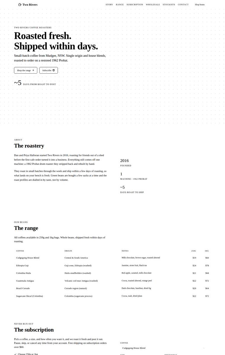
Composite 67.2%Judge 3.7/5
Judge panelAnthropic 3.8/5OpenAI 3.5/5Google 3.0/5
single-judge (Claude) 3.8/5 → leave-one-family-out 3.7/5
Anthropic: Every required section is present and correct: hero, story, all six coffees with 250g/1kg prices in a clean table, subscription with size/frequency picker, wholesale form capturing the five specified fields, all five stockists, the four-method brewing teaser, contact and newsletter. The editorial direction is coherent and tasteful - restrained cream palette, large Fraunces-style serif hero over a dotted-grid field, generous whitespace and consistent eyebrow labels. Craft is let down by a distracting bug: scattered words throughout the body paragraphs are rendered in the accent colour as if ran
OpenAI: All required sections and fixed business details are present, including the six coffees, five stockists, subscription, wholesale form, brewing teaser, contact, and newsletter. The execution is clean and consistent, but the stark black-and-white editorial treatment, tiny table-heavy commerce area, and large empty spaces feel underdeveloped for a premium coffee brand, so it lacks warmth, product desire, and memorability.
Google: The build accurately includes all requested copy and structural elements, demonstrating strong attention to the brief. However, the austere, monochrome typographic approach lacks visual warmth and feels closer to a wireframe than a premium consumer brand experience.
Elias Byrne (gpt-5.4-mini)
High reasoning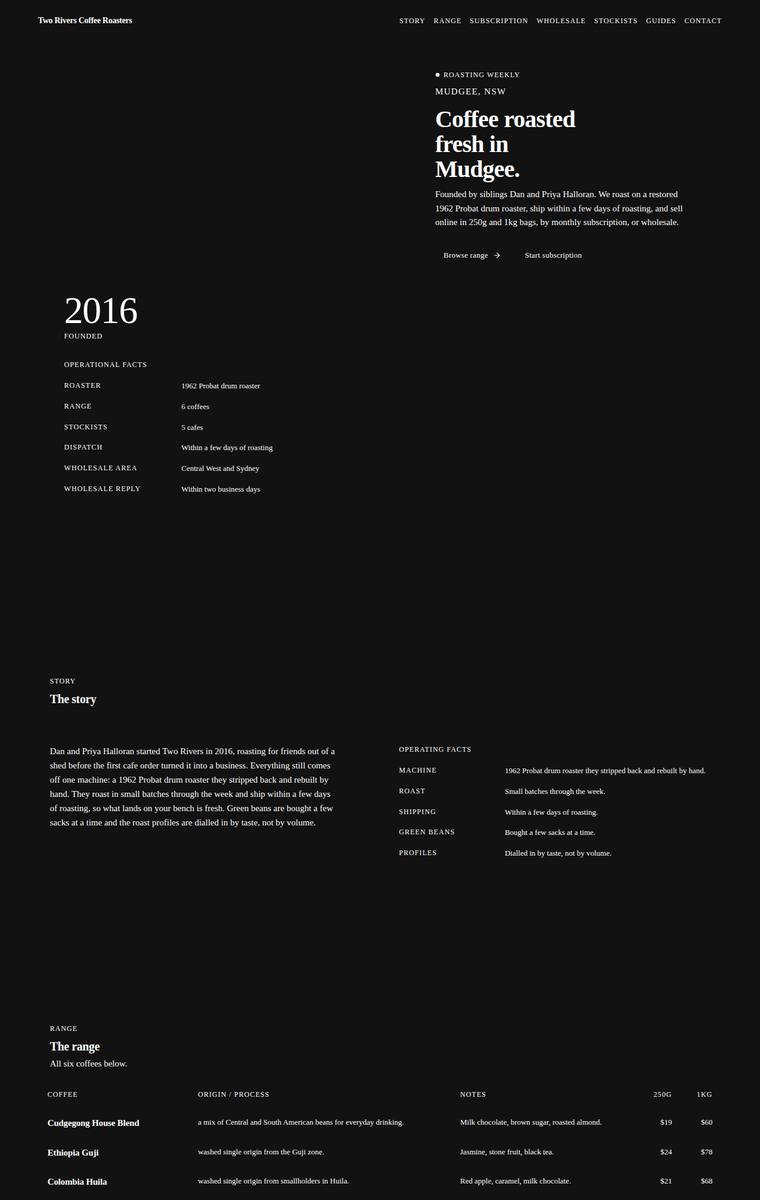
Composite 67.2%Judge 3.7/5
Judge panelAnthropic 3.5/5OpenAI 3.3/5Google 3.0/5
single-judge (Claude) 3.5/5 → leave-one-family-out 3.7/5
Anthropic: All required sections are present and correct: hero, story, the full range of six coffees with 250g/1kg prices and notes, subscription with sign-up form, wholesale enquiry form (cafe name, contact, email, suburb, weekly volume), all five stockists with locations, brewing guides teaser, and contact plus newsletter. The dark editorial aesthetic with serif headings is coherent, but very large empty black gaps between almost every section leave the page feeling stretched and unbalanced, and the uniformly small, understated type reads as thin rather than confident. Clean and consistent with no brok
OpenAI: All required sections and fixed details appear to be present, including the six coffees, subscription, wholesale form fields, five stockists, guides teaser, contact, and newsletter. The stark black-and-white editorial treatment is consistent and orderly, but it feels overly sparse and under-merchandised for a coffee roaster, with weak calls to action and form elements that read more like labels than finished inputs. It is competent but lacks warmth, product appeal, and distinctive visual impact.
Google: The build includes all required content within a precise, typography-focused dark theme. However, relying exclusively on identical two-column table layouts for every section creates a monotonous experience lacking brand warmth. While structurally sound, the absence of visual variety limits its overall distinctiveness.
Elias Byrne (gpt-5.6-terra)
High reasoning
Composite 67.2%Judge 3.7/5
Judge panelAnthropic 3.3/5OpenAI 3.5/5Google 3.0/5
single-judge (Claude) 3.3/5 → leave-one-family-out 3.7/5
Anthropic: All required sections are present (hero, story, range, subscription, wholesale form with the five specified fields, stockists, brewing teaser, contact + newsletter) and the copy is used faithfully, but the first row of both the coffee range (Cudgegong House Blend) and the stockists (Ironbark Espresso) renders as garbled text overlapping a sticky header, leaving those two required items effectively illegible. The dark editorial treatment is genuinely strong: coherent green-accent-on-near-black palette, confident serif display headings, numbered section markers, and a distinctive hand-drawn SVG
OpenAI: The page includes all major required sections and uses most of the supplied copy, with a strong premium dark editorial/technical coffee-roaster aesthetic. However, the range and stockists tables appear clipped or missing their first required entries, notably Cudgegong House Blend details and Ironbark Espresso, which hurts fidelity and craft. The overall visual system is distinctive and polished, but the tiny text, excessive spacing, and visible table glitches keep it from feeling fully finished.
Google: The design establishes a striking, technical aesthetic with a dark theme and custom SVG diagrams. However, rendering bugs obscure the first items in the coffee range and stockists lists, hurting both craft and fidelity. Despite these flaws, the precise layout and bold accent colors provide a distinct impact.
Ingrid Kessler (claude-haiku-4-5)
default reasoning
Composite 65.6%Judge 3.6/5
Judge panelAnthropic 3.8/5OpenAI 3.5/5Google 3.0/5
single-judge (Claude) 3.8/5 → leave-one-family-out 3.6/5
Anthropic: Every required section is present and correct: hero, story, all six coffees with accurate 250g/1kg prices and tasting notes, subscription picker, a wholesale form collecting all five fields, five stockists, brewing-guides teaser, and contact plus newsletter, so fidelity is excellent. The brutalist editorial direction is coherent and modern - big condensed Archivo type, warm off-white ground, single red-orange accent, mono labels, and a nice line-drawn roaster illustration in the hero. But craft is uneven: the solid full-width red Add-to-cart bars read heavy and unrefined, forms are plain unsty
OpenAI: All required sections, products, stockists, forms, and key copy are present and substantially correct. The stark brutalist direction is coherent and distinctive, but the page feels very raw with flush edges, default-looking controls, cramped section transitions, and limited compositional refinement. It has some memorable impact from the oversized hero type and simple roaster illustration, but it does not quite feel premium or highly finished.
Google: The design includes all requested content within a distinctive, brutalist-inspired layout. However, the execution lacks polish, with cramped form inputs, default browser styling on dropdowns, and a rudimentary hero illustration detracting from the overall quality.
Elias Byrne (kimi-k2.7-code)
default reasoning
Composite 60.9%Judge 3.4/5
Judge panelAnthropic 3.5/5OpenAI 3.0/5Google 3.0/5
single-judge (Claude) 3.5/5 → leave-one-family-out 3.4/5
Anthropic: Brief fidelity is excellent: every required section is present and correct - hero with a nice editorial "6 coffees available" moment, story, all six coffees with tasting notes and both prices, a subscription builder with size/frequency, a wholesale form collecting all five fields, all five stockists, the four brewing-guide teasers, and contact plus newsletter. The visual language is a restrained editorial style with serif headings, a subtle dotted texture and a warm rust accent, which is coherent but very sparse and thin for a coffee brand - no imagery or warmth, and the wholesale form inputs
OpenAI: Most required sections, coffees, prices, stockists, subscription options, contact and newsletter content are present, though some copy is abbreviated and the wholesale form appears more like labels than usable visible fields. The minimalist black-and-white editorial layout is coherent and orderly, but it feels quite plain and sparse for a coffee brand, with limited warmth, imagery, or distinctive moments. Craft is mostly consistent, but the unfinished-looking form areas and very restrained presentation reduce the premium impact.
Google: The design includes all required brief elements using clean, tabular layouts. However, the strict monochrome palette and utilitarian typography create a dry, document-like aesthetic rather than an engaging coffee brand experience, limiting overall impact.
Yuki Tanabe (grok-4.3)
default reasoning
Composite 59.4%Judge 3.4/5
Judge panelAnthropic 2.8/5OpenAI 3.0/5Google 3.3/5
single-judge (Claude) 2.8/5 → leave-one-family-out 3.4/5
Anthropic: Content coverage is strong: all six coffees with dual pricing, the story, subscription CTA, a wholesale form with the five required fields, the five stockists, brewing-guides teaser, contact, and newsletter are all present, with a distinctive numbered "Scene 01/06" editorial framing. But the execution reads as a bare wireframe - vast blank regions dominate every scene (the hero, range, and stockist sections are mostly empty white space), type is tiny and thin, and there is no imagery, colour, or warmth appropriate to a coffee roaster. The huge unfilled gaps look broken rather than intentionall
OpenAI: Most required sections and fixed details are visible, including all six coffees, subscription, wholesale form fields, stockists, brewing teaser, contact and newsletter, though some required body copy is shortened or missing. The stark monochrome editorial direction is coherent, but the extreme whitespace, tiny labels, prototype-like “Scene” framing, and minimal form treatment make it feel sparse and less commercially effective for a coffee roaster.
Google: The design accurately includes all required content and copy using a stark, highly minimalist typographic approach. However, the extreme reliance on negative space and lack of visual warmth make it feel sterile and uninviting for a coffee brand. While consistent in its brutalist style, the massive vertical gaps hinder the natural reading flow.
Ingrid Kessler (gemini-3.1-flash-lite)
default reasoning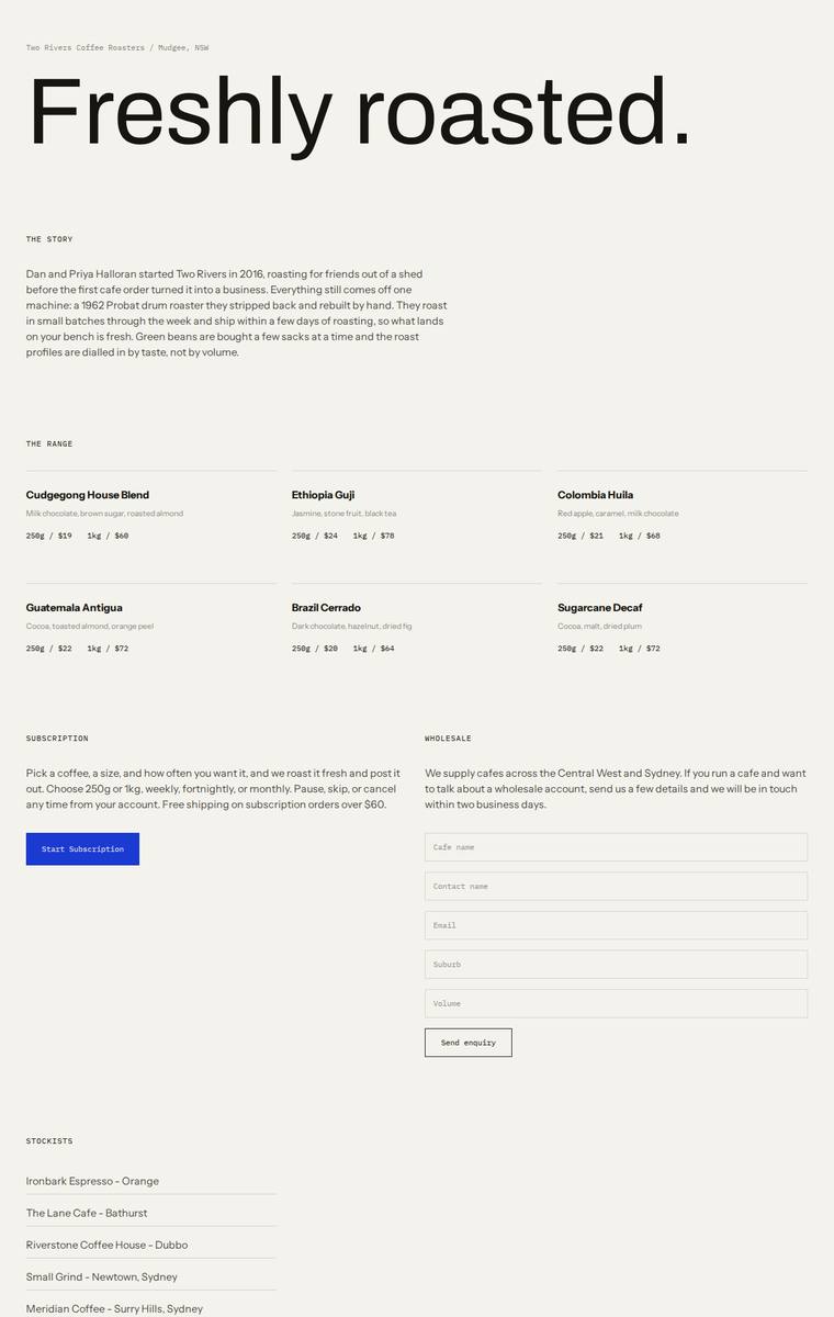
Composite 57.8%Judge 3.3/5
Judge panelAnthropic 3.0/5OpenAI 3.5/5Google 2.8/5
single-judge (Claude) 3.0/5 → leave-one-family-out 3.3/5
Anthropic: Most sections are present and correct: hero, story, all six coffees with 250g/1kg pricing, subscription with CTA, a wholesale form collecting the five required fields, all five stockists, and a brewing teaser; however the required newsletter signup is missing and contact is reduced to a bare email line. The look is a clean, coherent Swiss/editorial minimalist treatment with a big sans hero, mono labels and hairline dividers, but it reads as plain and generic with large, unbalanced empty zones (right of the hero, the sparse subscription column) and no coffee-brand character or imagery. Craft is
OpenAI: The page includes the major required sections, six coffees, stockists, subscription, wholesale form, brewing teaser and contact, but it omits or truncates several fixed details: coffee origin/process descriptions, part of the wholesale copy, Mudgee roastery contact detail, and the newsletter signup. The visual system is clean, modern and well spaced with a strong oversized hero, though the minimal treatment and sparse content presentation make it feel a bit generic and less premium or distinctive than it could be.
Google: The layout is clean and highly legible, but the stark, purely typographic execution feels more like a wireframe and lacks brand warmth. Most content is present, but the required newsletter signup is missing, and the overall result is functional rather than engaging.
Yuki Tanabe (deepseek-v4-flash)
default reasoning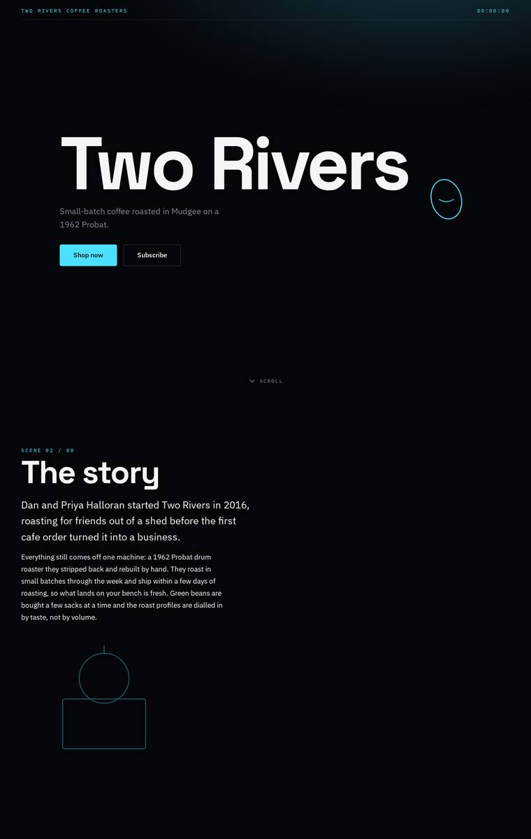
Composite 54.7%Judge 3.2/5
Judge panelAnthropic 2.5/5OpenAI 3.8/5Google 2.8/5
single-judge (Claude) 2.5/5 → leave-one-family-out 3.2/5
Anthropic: The dark, cyan-accented layout with big "Two Rivers" hero type and editorial "SCENE 0X/08" labels shows a point of view, and the six coffees, subscription bullets, and wholesale form (cafe name, name, email, suburb, volume) are present. But the required stockists section (the five cafes) appears missing, which is a real fidelity gap, and huge empty black voids between sections plus the unfinished-looking circle/rectangle placeholder shapes in the story block make the page read as sparse and janky rather than finished. The result feels under-composed and low-impact despite a clean type treatmen
OpenAI: Most required content is visible, including hero, story, all six coffees, subscription, wholesale form, brewing teaser, and contact/newsletter, but the required stockists section with five cafes is absent from the screenshot. The visual system is cohesive and distinctive with strong typography and cyan-on-black styling, though the extreme empty space and cyber-minimal tone feel a bit austere for a small coffee roaster.
Google: The design establishes a bold, modern aesthetic with strong typography and high contrast. Unfortunately, the mandatory Stockists section is entirely omitted, leaving a massive layout gap and skipped numbering that severely impacts the build's polish.
Elias Byrne (claude-haiku-4-5)
default reasoning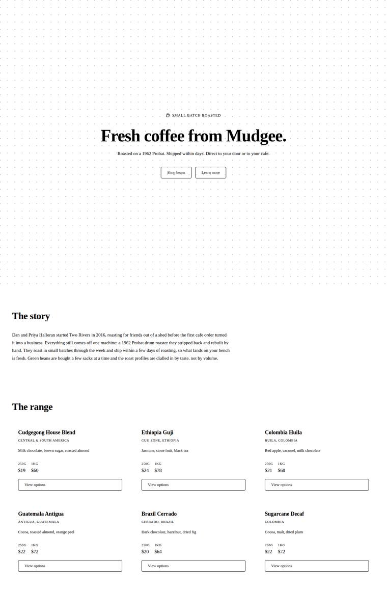
Composite 51.6%Judge 3.1/5
Judge panelAnthropic 2.8/5OpenAI 3.0/5Google 2.5/5
single-judge (Claude) 2.8/5 → leave-one-family-out 3.1/5
Anthropic: All required content is present and correct: hero, story, six coffees with accurate prices and notes, subscription, a wholesale form with the five specified fields, all five stockists, brewing teaser, contact and newsletter. But the visual execution is bare and unbalanced - huge blank vertical gaps, text crammed into a narrow left column leaving most of the page empty, and form inputs that render as floating labels with faint underlines rather than finished fields, so it reads like an unstyled wireframe. The serif headings and dotted hero give a hint of intent, but nothing here is composed, pr
OpenAI: All required sections, six coffees with prices, five stockists, subscription, wholesale form fields, brewing teaser, contact and newsletter are visibly present and mostly faithful to the supplied copy. The page is coherent and readable, but the visual direction is extremely plain, mostly default black-and-white serif typography with excessive whitespace and little coffee-brand atmosphere. Craft is acceptable but some form fields appear almost invisible or under-finished, so the result feels functional rather than premium or memorable.
Google: The build includes all requested content but suffers from an overly stark, wireframe-like aesthetic devoid of brand personality. Major usability issues exist, notably the complete absence of visible form input fields, resulting in a low-impact, unfinished product.
Mara Vieira (gemini-3.1-flash-lite)
default reasoning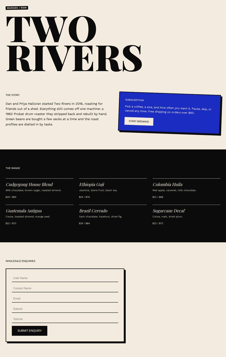
Composite 51.6%Judge 3.1/5
Judge panelAnthropic 3.0/5OpenAI 3.3/5Google 2.8/5
single-judge (Claude) 3.0/5 → leave-one-family-out 3.1/5
Anthropic: Strong editorial-brutalist look with a bold Fraunces/Playfair "TWO RIVERS" display, a confident cream/black/electric-blue palette, and an offset-shadow subscription card - visually coherent and modern. However three required sections are missing entirely: stockists (the five cafes), the brewing guides teaser, and the newsletter signup, which is a serious fidelity gap; the story copy is also truncated. Craft is otherwise clean, though the wholesale form leaves the whole right half of the page empty and there is a lot of dead space around the hero, so the result reads unfinished rather than prem
OpenAI: The page has a striking editorial/brutalist look with confident oversized typography, a restrained palette, and a memorable blue subscription card. However, several required sections are missing or incomplete in the visible full page, including stockists, brewing guides, newsletter signup, and much of the required subscription/wholesale/story copy. Craft is generally clean, but the long empty wholesale area and sparse footer make the build feel unfinished.
Google: The design establishes a strong typographic aesthetic with bold contrast. However, it severely lacks brief fidelity, omitting stockists, brewing guides, and newsletter sections entirely, limiting its overall functionality.
Elias Byrne (deepseek-v4-pro)
default reasoning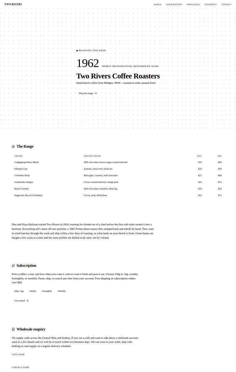
Composite 51.6%Judge 3.1/5
Judge panelAnthropic 3.3/5OpenAI 3.0/5Google 3.0/5
single-judge (Claude) 3.3/5 → leave-one-family-out 3.1/5
Anthropic: All required sections are present and correct: hero, story, the six coffees with 250g/1kg prices and tasting notes, subscription, wholesale form with all five fields, five stockists with suburbs, brewing teaser, contact and newsletter, so brief fidelity is excellent. The editorial serif direction with the "1962" numeral and dotted-grid hero is coherent and restrained, but the page reads thin and underbuilt: enormous vertical white gaps between sections, no imagery or coffee visuals, and flat plain-text tables give it a placeholder feel. Craft is undercut by the wholesale form, whose input fiel
OpenAI: All required sections are visible, including the six coffees, subscription, wholesale form fields, stockists, brewing teaser, contact, and newsletter, but the range omits several fixed product details such as origin/process descriptions. The design is coherent and clean with an editorial minimalist feel, but it is very sparse, text-heavy, and lacks hierarchy or visual warmth for a coffee brand. Craft is mostly consistent, though the invisible form fields, tiny typography, and excessive whitespace make the page feel unfinished rather than premium.
Google: The design accurately includes all required content and sections from the brief. However, the visual aesthetic is overly sparse and wireframe-like, lacking the premium warmth and distinctive character expected for a boutique coffee roaster.
Elias Byrne (gpt-5.5)
High reasoning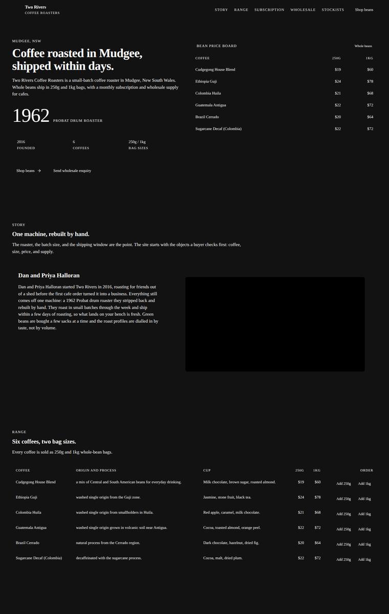
Composite 50.0%Judge 3.0/5
Judge panelAnthropic 3.8/5OpenAI 3.3/5Google 2.3/5
single-judge (Claude) 3.8/5 → leave-one-family-out 3.0/5
Anthropic: Every required section is present and correct: hero with the 1962/2016 facts, story, the full six-coffee range with 250g/1kg prices, subscription, a wholesale form collecting all five fields, all five stockists, brewing-guides teaser, and contact plus newsletter. The dark editorial treatment is coherent and tasteful, pairing serif display headings with mono eyebrow labels on a disciplined typographic grid. The main flaw is the large solid-black rectangle in the story section, which reads as an empty or broken image placeholder and undercuts the finish; combined with the heavy, uniformly dark c
OpenAI: All required sections, coffees, prices, stockists, and key copy are present, though the wholesale and newsletter forms read more like labels/placeholders than clearly usable form controls. The stark monochrome editorial direction is coherent and distinctive, but the page feels overly sparse with very small text, excessive empty space, and a large near-black blank media block that looks unfinished.
Google: The design inappropriately renders internal instructions and reasoning text as visible page copy, notably in the Story and Brewing Guides sections. The over-reliance on data tables for narrative content and the absence of styled form inputs create a stark, unfinished appearance resembling a backend dashboard rather than a premium consumer brand.
Elias Byrne (gemini-3.1-pro-preview)
High reasoning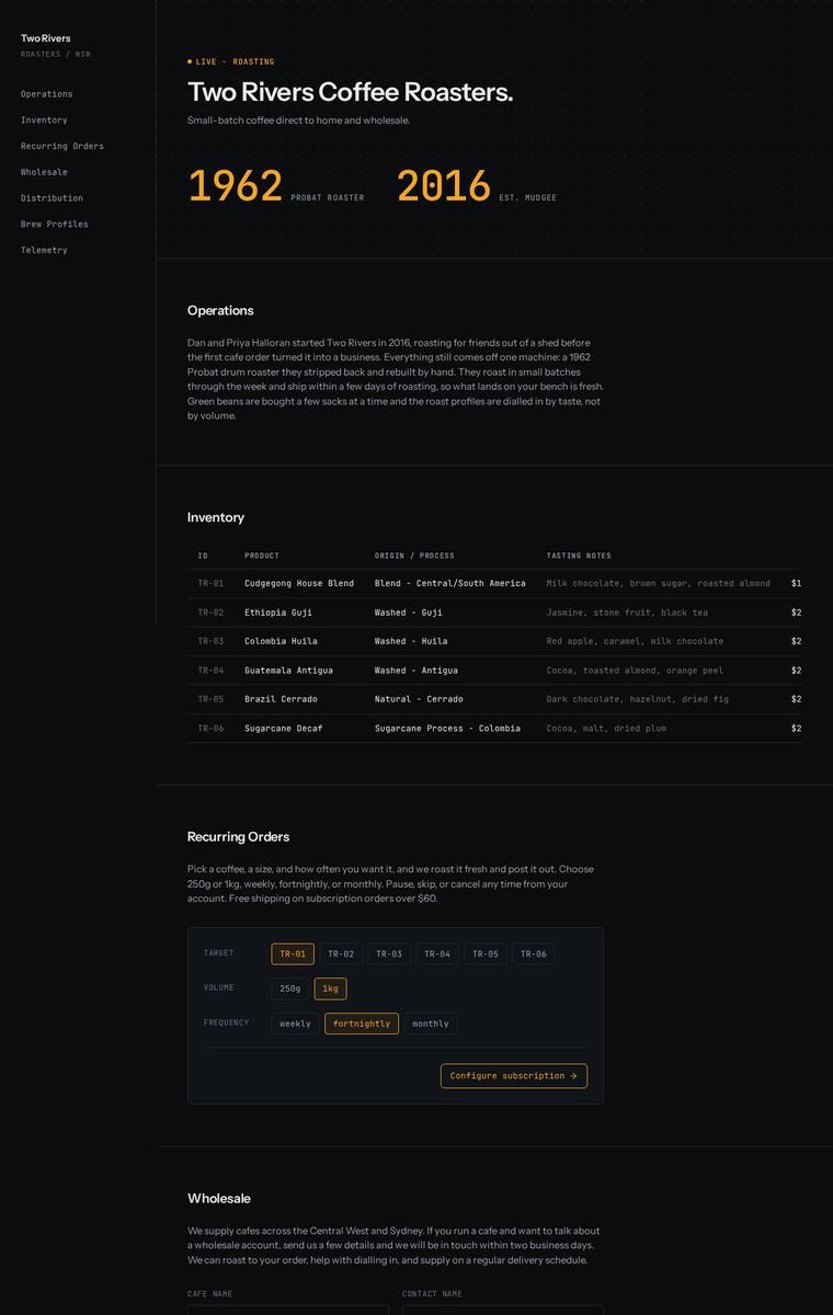
Composite 48.4%Judge 2.9/5
Judge panelAnthropic 3.3/5OpenAI 3.8/5Google 3.0/5
single-judge (Claude) 3.3/5 → leave-one-family-out 2.9/5
Anthropic: All required sections are present and reframed with a distinctive terminal/telemetry vocabulary (Operations, Inventory, Recurring Orders, Distribution, Brew Profiles, Telemetry), with all six coffees, five stockists, and the full five-field wholesale form. The dark monospace theme with amber accents and the oversized 1962/2016 stats is coherent, well-spaced, and has a clear point of view, though the cold data-dashboard aesthetic sits oddly against a warm artisan coffee brand. Craft is hurt by a real visible bug: the price column is truncated to "$1"/"$2" instead of the full 250g and 1kg prices
OpenAI: The page includes all required sections and most fixed copy, with all six coffees and five stockists present, but the range pricing is visibly incomplete/cut off and not clearly showing both 250g and 1kg prices. The dark roastery-operations dashboard concept is cohesive, distinctive, and well spaced, though it feels more technical than inviting ecommerce and the clipped table detail hurts finish.
Google: The terminal-inspired aesthetic provides a highly distinctive, consistent take on the brand. However, layout issues in the inventory table obscure required pricing details, diminishing fidelity and craft.
Noor El-Amin (claude-haiku-4-5)
default reasoning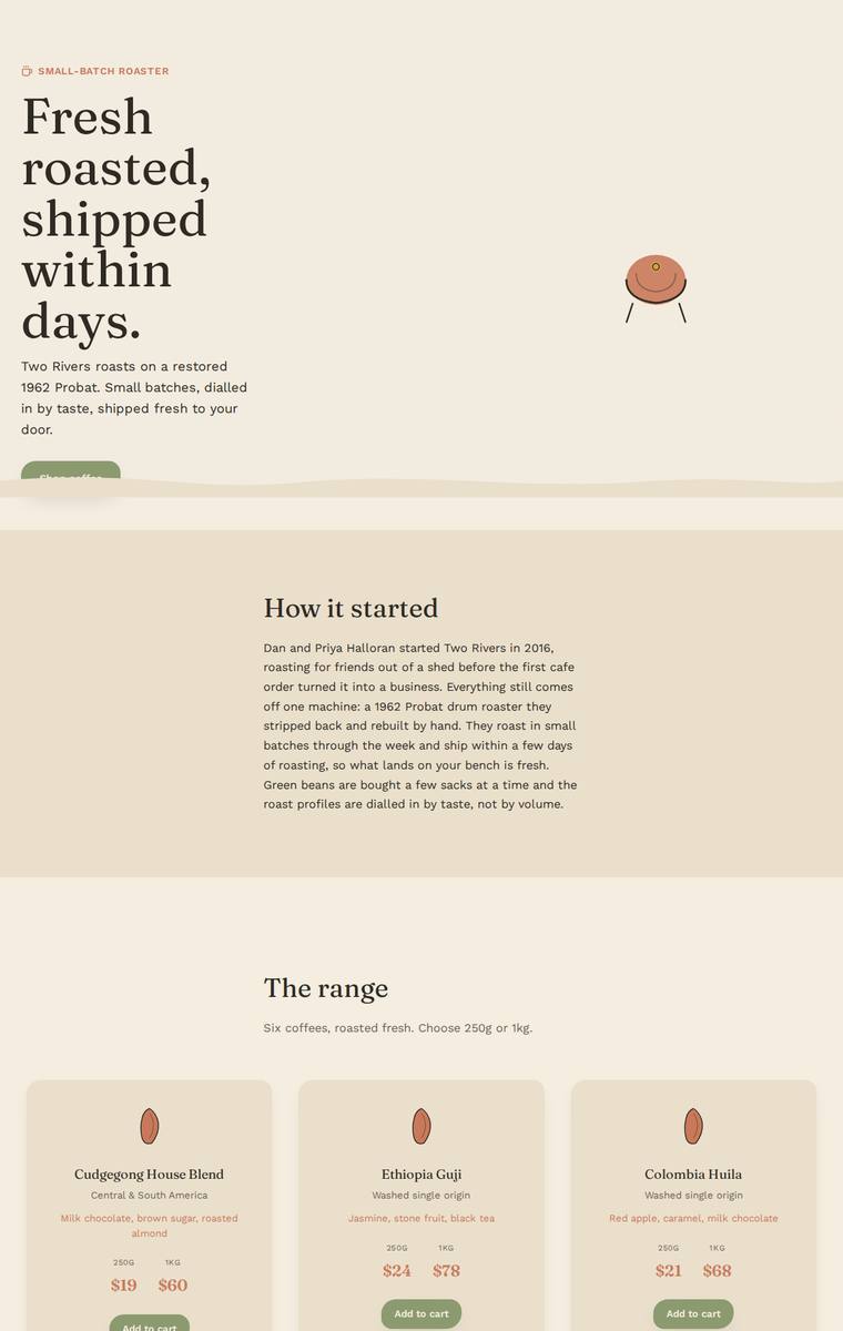
Composite 45.3%Judge 2.8/5
Judge panelAnthropic 2.5/5OpenAI 2.5/5Google 2.3/5
single-judge (Claude) 2.5/5 → leave-one-family-out 2.8/5
Anthropic: The hero, story, full six-coffee range with prices and add-to-cart, wholesale form (all five fields), brewing teaser, contact and newsletter are present, but the required stockists section renders essentially empty (the five cafes are missing) and the subscription picker is incomplete, showing only a bare "Size / 1kg" with no coffee or frequency options. The warm cream palette with serif display headings and green accent buttons is calm and coherent, but the tiny orange-oval "bean" icon is a weak placeholder and huge blank bands in the stockists and subscription areas leave the page feeling un
OpenAI: Most major sections are present and the six coffees and wholesale form are largely correct, but the stockists list is missing entirely and the subscription area appears incomplete, with key options/details not visible. The warm palette and typography are tasteful, but large empty areas, a clipped hero button, and a broken-looking subscription card make the page feel unfinished rather than premium.
Google: The design omits the required list of stockists and features a severely broken subscription interface. Additionally, craft issues such as the hero button being obscured by a decorative wave element detract from the overall polish and user experience.
Elias Byrne (grok-build-0.1)
default reasoning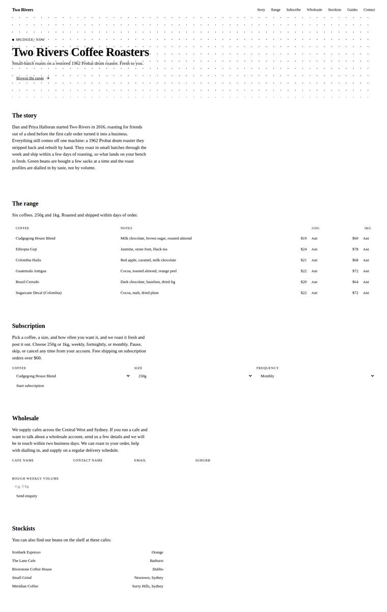
Composite 45.3%Judge 2.8/5
Judge panelAnthropic 2.8/5OpenAI 2.5/5Google 2.8/5
single-judge (Claude) 2.8/5 → leave-one-family-out 2.8/5
Anthropic: All required content is present and correct - the six coffees with both prices, the subscription, a wholesale form covering all five fields, all five stockists, brewing guides, contact and newsletter - so fidelity is strong. The minimal editorial direction (serif display type, dotted hero, restrained palette) is coherent but severely under-developed: excessive whitespace leaves sections feeling empty and disconnected, and there is little brand warmth for a coffee roaster. Craft and impact suffer most - the forms read as unfinished wireframes with no visible input borders, floating dropdown car
OpenAI: Most required sections and fixed facts are visible, including all six coffees, subscription, wholesale fields, stockists, brewing teaser, contact and newsletter, though the coffee range omits much of the specified origin/process description. The design is coherent but extremely bare, with default-feeling typography, minimal hierarchy, invisible form controls, and large empty areas that make it feel unfinished rather than premium. It has a restrained editorial idea with the dotted hero texture, but little distinctiveness or brand impact for a coffee roaster.
Google: The build includes all required content, demonstrating strong fidelity to the brief. However, the ultra-minimalist, monochrome visual direction feels excessively austere for a premium coffee brand and lacks clear UI affordances for forms. While typographically consistent, the absence of brand warmth limits overall impact.
Elias Byrne (grok-4.3)
default reasoning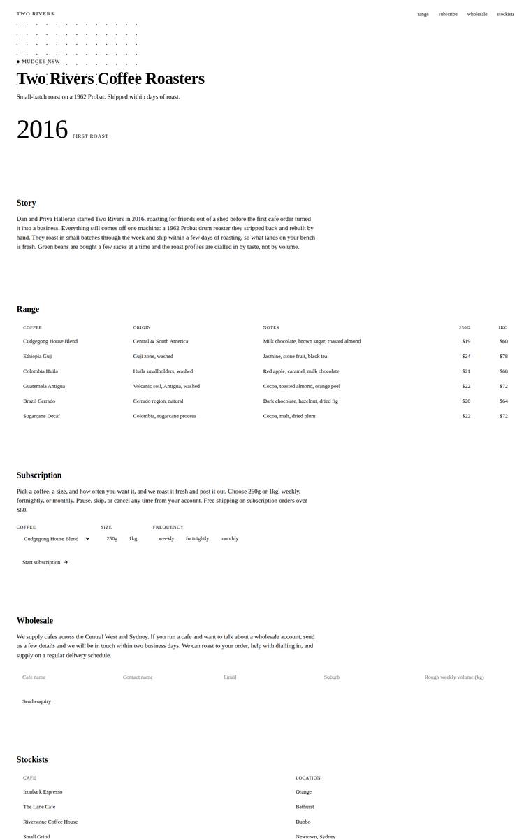
Composite 42.2%Judge 2.7/5
Judge panelAnthropic 2.5/5OpenAI 2.8/5Google 2.5/5
single-judge (Claude) 2.5/5 → leave-one-family-out 2.7/5
Anthropic: Brief coverage is strong: hero, story, all six coffees with correct origins/notes/prices, subscription controls, wholesale form with the five required fields, all five stockists, brewing teaser, and contact/newsletter are present in Australian English. But the visual execution is thin and janky: a broken dot-grid pattern at top left overlaps the "MUDGEE NSW" label, the main "Two Rivers Coffee Roasters" heading renders with a ghosted/doubled artifact, and enormous dead whitespace between every section makes the monochrome editorial layout read as an unfinished wireframe rather than a finished s
OpenAI: Most required content is present, including all six coffees, stockists, subscription, wholesale labels, brewing teaser, and contact/newsletter, though the newsletter copy is abbreviated and the wholesale form has little visible form affordance. The visual treatment is coherent but extremely sparse and default-feeling, with excessive whitespace, minimal hierarchy, no product presentation, and weak ecommerce calls to action. Craft is mostly clean typographically, but the page lacks polish and distinctiveness for a premium coffee roaster.
Google: While the design includes all required content from the brief, the extreme minimalist approach feels unfinished rather than intentional. The lack of basic UI affordances for forms and interactive elements detracts from usability, resulting in a presentation that resembles a wireframe more than a premium brand experience.
Noor El-Amin (gemini-3.1-flash-lite)
default reasoning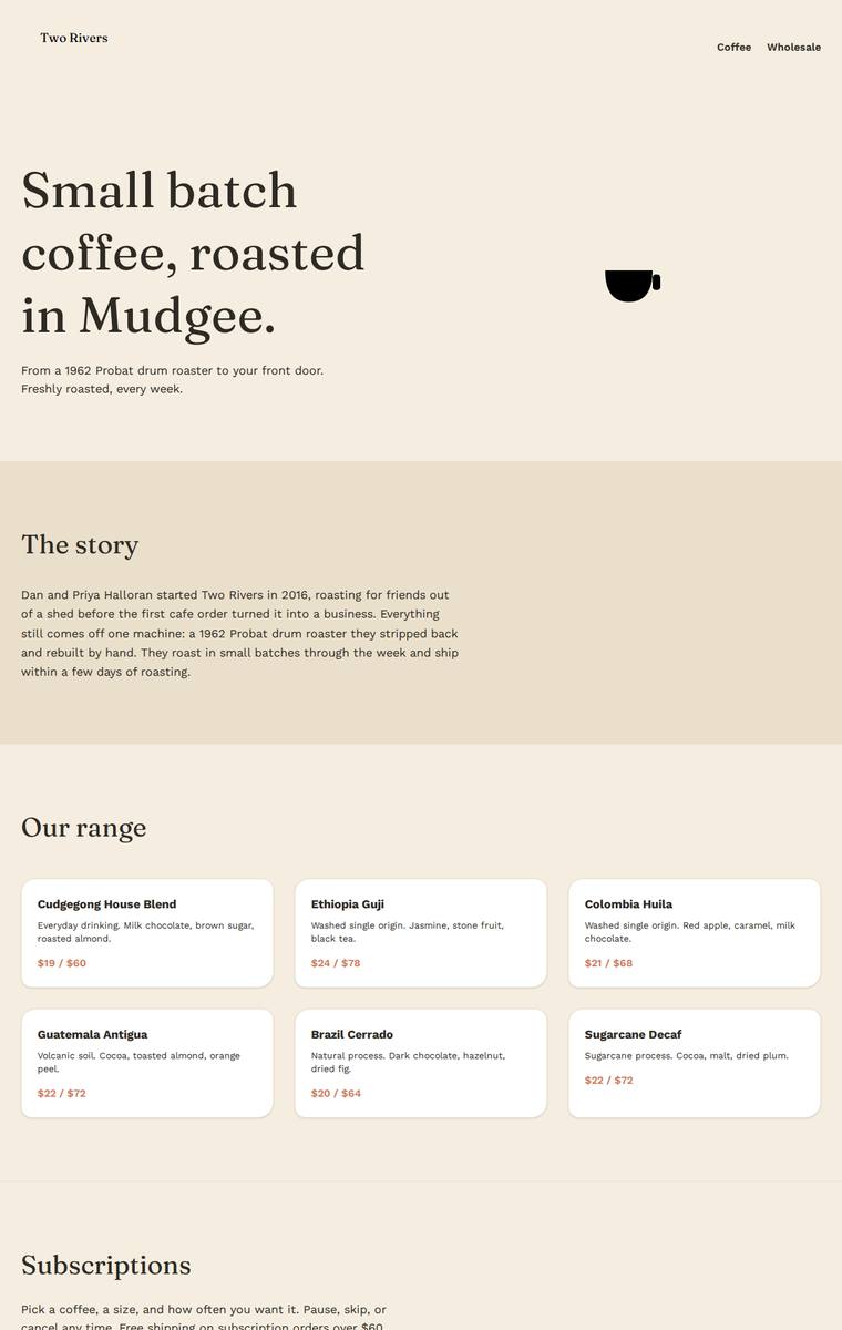
Composite 40.6%Judge 2.6/5
Judge panelAnthropic 2.5/5OpenAI 2.5/5Google 2.5/5
single-judge (Claude) 2.5/5 → leave-one-family-out 2.6/5
Anthropic: The six coffees with correct prices, the verbatim story, subscription copy, hero, and a wholesale form are present, but three required sections are missing entirely - the five stockists, the brewing guides teaser, and the newsletter signup - and the wholesale form only has three fields (missing suburb and weekly volume), so fidelity is weak. Visually it is a coherent, warm cream palette with tasteful serif headings and clean range cards, but the layout is sparse with large dead zones (an almost-empty hero anchored by a crude tiny coffee-cup SVG, and a mostly blank story column). Craft is consi
OpenAI: The page includes a hero, partial story, all six coffees, subscription, wholesale form, and basic contact, but it omits required stockists, brewing guides, newsletter signup, and several required wholesale fields and copy details. The visual style is clean and coherent with tasteful serif typography and warm neutrals, but it feels sparse and underdeveloped, with limited imagery and little premium distinctiveness.
Google: The design is clean but visually generic, relying on a basic alternating block layout. It critically omits several required sections—including stockists, brewing guides, and the newsletter—and features a partially cut-off hero icon.
Yuki Tanabe (glm-5.2)
default reasoning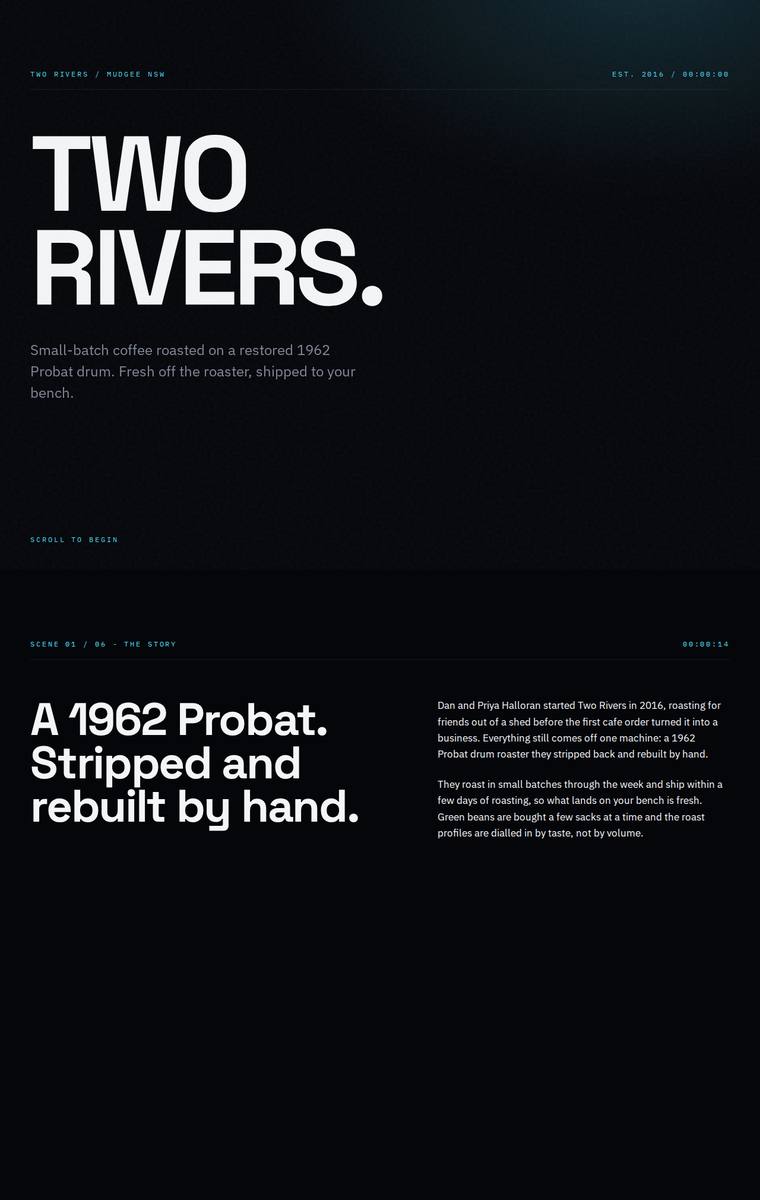
Composite 39.1%Judge 2.6/5
Judge panelAnthropic 2.5/5OpenAI 2.3/5Google 2.5/5
single-judge (Claude) 2.5/5 → leave-one-family-out 2.6/5
Anthropic: The hero and typographic system are genuinely strong - a bold Archivo Expanded "TWO RIVERS." lockup, editorial "SCENE" timecode labels, and a clean cyan-on-black palette give a distinctive, modern feel, and the range table is elegant. But the page reads as substantially incomplete in a static capture: only five of the six required coffees appear (Sugarcane Decaf is missing), and the subscription, wholesale, and much of the lower sections render as large empty black voids with no visible subscription details, wholesale form, or listed stockist cafes. Those blank regions make the build look brok
OpenAI: The build has a striking dark, cinematic typographic direction, but the visible page omits or hides major required content: the subscription and wholesale sections are blank, the wholesale form is absent, stockists are not listed, and the range shows only five coffees with reduced details. The visual system is consistent and distinctive, but the huge empty sections and missing required copy make it feel unfinished and significantly weaken both craft and brief fidelity.
Google: Sleek typography and a dark aesthetic create a strong initial impression. However, massive empty gaps indicate missing content, with the Subscription, Wholesale, and Stockists sections entirely absent.
Noor El-Amin (glm-5.2)
default reasoning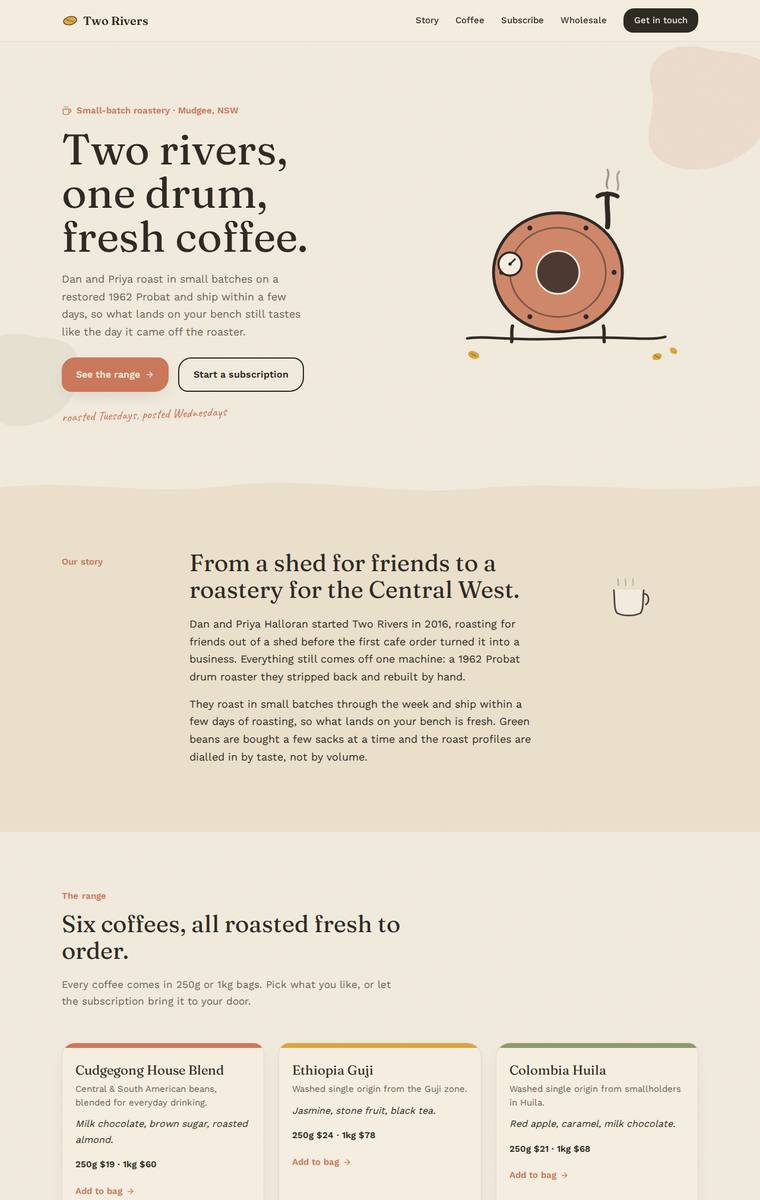
Composite 39.1%Judge 2.6/5
Judge panelAnthropic 2.3/5OpenAI 2.5/5Google 2.0/5
single-judge (Claude) 2.3/5 → leave-one-family-out 2.6/5
Anthropic: The hero, story, and full six-coffee range render well with correct copy and pricing, a tasteful cream palette, and a charming hand-drawn roaster illustration. But roughly the lower half is broken: a near-empty green band, a huge blank cream void, and a Stockists heading with no cafes listed, while the subscription content, wholesale enquiry form, and brewing guides teaser are all missing or unrendered. These empty, unfinished sections make the page read as janky and incomplete despite the strong top third.
OpenAI: The hero, story, six-product range, and contact/newsletter are visible and generally use the supplied facts, but the subscription section, wholesale enquiry form, brewing guides teaser, and actual stockist list are missing or not visible. The warm palette, typography, cards, and hand-drawn illustration are attractive, but the page has huge empty areas and an unfinished stockists section, making the overall craft feel broken despite a strong opening.
Google: The initial visual direction establishes a pleasant, earthy aesthetic with appropriate typography and charming SVG illustrations. However, the build is severely incomplete, entirely missing required sections like the wholesale form, subscription details, and brewing guides, leaving massive empty voids on the page.
Mara Vieira (grok-build-0.1)
default reasoning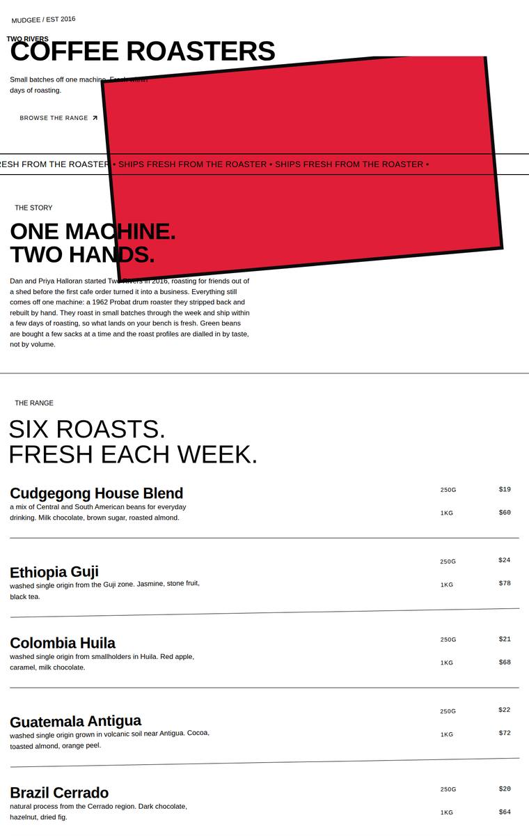
Composite 37.5%Judge 2.5/5
Judge panelAnthropic 2.5/5OpenAI 3.5/5Google 2.5/5
single-judge (Claude) 2.5/5 → leave-one-family-out 2.5/5
Anthropic: All required sections and copy are present and correct: hero, story, the six coffees with 250g/1kg prices, the subscription pickers, the wholesale form with all five fields, the five stockists, brewing guides, and contact/newsletter. But a large red rotated rectangle floats over the hero and story, colliding with the "COFFEE ROASTERS" and "ONE MACHINE / TWO HANDS" headings and the marquee bleeds off the edge - a clearly broken, unplaced element that wrecks the composition. Aside from that defect the layout is a plain black-on-white editorial treatment with heavy type but little polish, so it r
OpenAI: All required sections, coffee details, stockists, form fields, subscription copy, contact and newsletter content are visible and largely faithful to the brief. The stark brutalist direction is coherent and bold, but the huge tilted red block feels unresolved and awkwardly overlaps the hero/story area, making the page feel more raw than premium. Overall it is complete and distinctive, but the visual polish and craft are only moderate.
Google: All required content is present, but a severe layout error with a massive red rectangle obscures key hero and story text. This broken element heavily compromises the stark, brutalist typography and overall usability.
Mara Vieira (claude-haiku-4-5)
default reasoning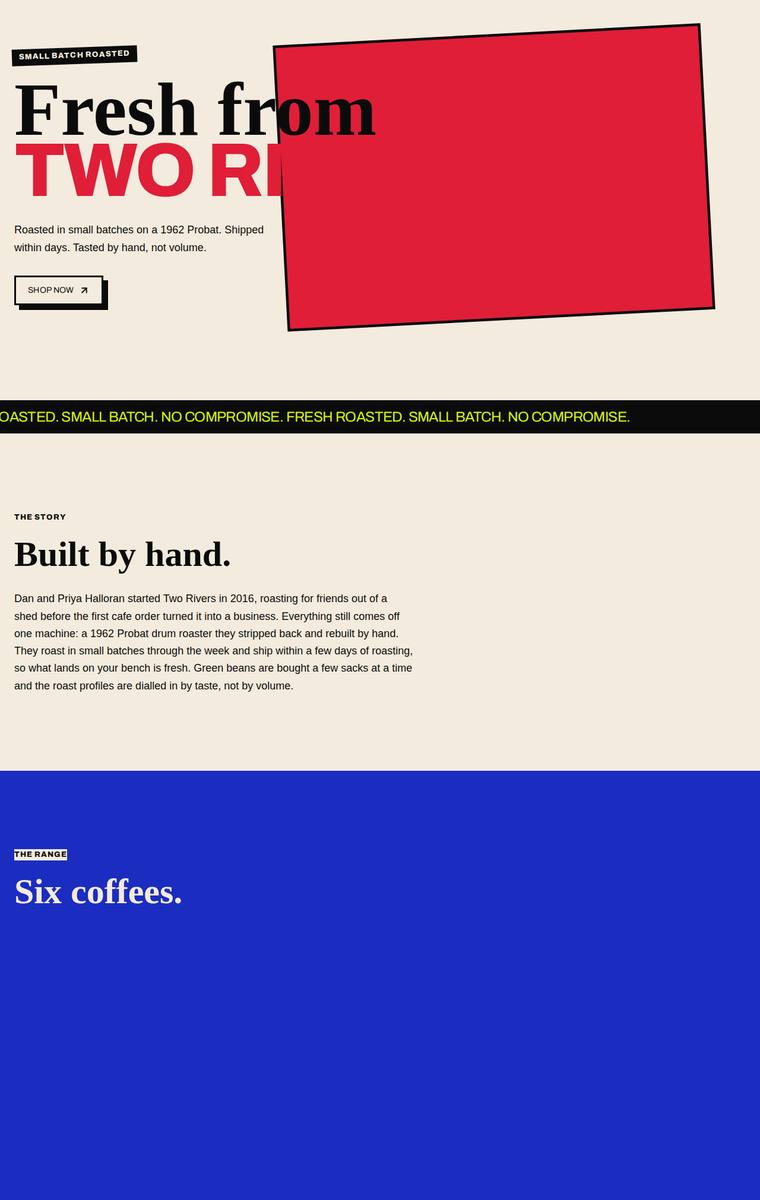
Composite 28.1%Judge 2.1/5
Judge panelAnthropic 2.0/5OpenAI 2.0/5Google 2.3/5
single-judge (Claude) 2.0/5 → leave-one-family-out 2.1/5
Anthropic: The bold neo-brutalist direction (cream base with red/blue/yellow-green blocks, heavy serif headings, marquee strip) has a distinctive point of view, but execution is badly broken. Two required sections render empty: "Six coffees." shows a blank blue block with none of the six coffee details, and "On the shelf." (stockists) is a blank cream void missing all five cafes. The hero headline is truncated/overflowing ("Fresh from TWO RI") behind an empty red box, and the large empty regions make the page feel unfinished rather than confidently spare. Subscription, wholesale form, brewing teaser, and
OpenAI: Several required content areas are missing or visibly incomplete: the range section does not show the six coffees or prices, and the stockists section shows no cafe list. The bold brutalist direction has some personality, but the hero text is awkwardly obscured and large blank sections make the page feel unfinished rather than premium.
Google: Bold brutalist direction is severely undermined by missing content, omitting the entire product range and stockist list. Craft issues like obscured hero text and massive empty blocks reduce the overall impact.
Yuki Tanabe (gemini-3.1-flash-lite)
default reasoning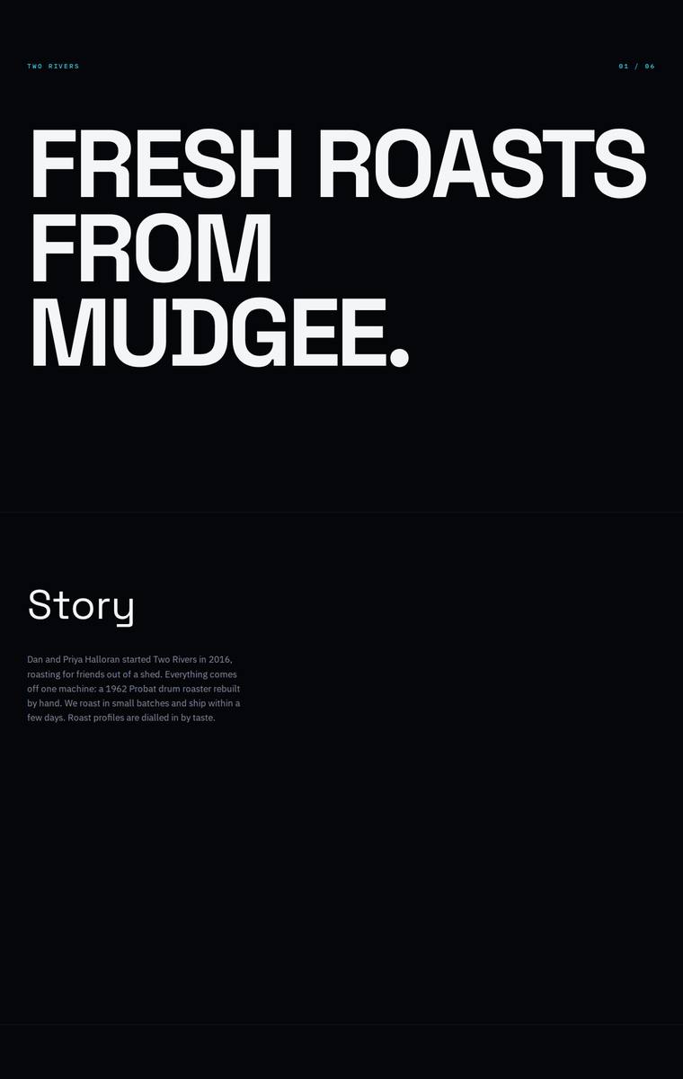
Composite 26.6%Judge 2.1/5
Judge panelAnthropic 2.3/5OpenAI 2.3/5Google 2.0/5
single-judge (Claude) 2.3/5 → leave-one-family-out 2.1/5
Anthropic: The bold condensed "FRESH ROASTS FROM MUDGEE" hero is the one genuinely striking moment, and the dark cyan-accented palette is coherent, but the build is missing several required sections: no stockists, no brewing-guides teaser, and no newsletter signup are visible, and the wholesale form drops the suburb and weekly-volume fields. Craft suffers from huge voids of dead black space under Story and Subscription that read as unfinished rather than intentional, plus very small, low-contrast grey body text. The range correctly lists all six coffees with notes and prices, but overall the page feels s
OpenAI: The page includes a hero, story, range, subscription, partial wholesale form, and contact, but it omits stockists, brewing guides, newsletter signup, much of the required wholesale form, and substantial fixed copy/product detail. The stark black-and-white typographic direction is coherent and bold, but the extreme whitespace and minimal content make it feel unfinished rather than premium. Craft is consistent at a basic level, though the missing fields, absent sections, and sparse layouts significantly weaken the build.
Google: The build fails to include key required sections like stockists, brewing guides, and the newsletter, while omitting mandated form fields. Visually, extreme vertical spacing and minimal styling create an unfinished, wireframe-like aesthetic that lacks premium brand appeal.
Elias Byrne (gemini-3.1-flash-lite)
default reasoning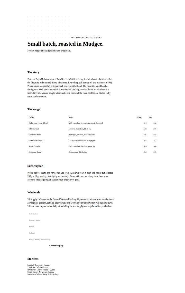
Composite 26.6%Judge 2.1/5
Judge panelAnthropic 2.3/5OpenAI 2.0/5Google 2.0/5
single-judge (Claude) 2.3/5 → leave-one-family-out 2.1/5
Anthropic: Most required sections are present and factually correct: hero, story, the full six-coffee range table with 250g/1kg prices, subscription, a wholesale form with the five requested fields, all five stockists, a brewing-guides teaser, and contact. However the newsletter signup called for in the brief is missing, and the copy on the hero and contact is thin. Visually it reads like an unstyled document rather than a designed site: a single narrow left column against a huge empty right margin, no colour, and a broken-looking dotted grid where a logo should be. The wholesale form fields have no visi
OpenAI: Most required sections are visible, including the story, six coffees, subscription, wholesale, stockists, brewing teaser and contact, but key copy/details are missing or reduced, the newsletter signup is absent, and the wholesale form fields appear barely implemented. The visual treatment is extremely plain and largely default, with minimal hierarchy, colour, branding, or composition beyond spacing. It feels unfinished rather than premium or distinctive.
Google: The design functions largely as an unstyled wireframe, missing the required newsletter signup. It completely lacks visual brand identity and a premium aesthetic.
Noor El-Amin (grok-4.20-reasoning)
default reasoning
Composite 6.3%Judge 1.3/5
Judge panelAnthropic 1.0/5OpenAI 1.0/5Google 2.0/5
single-judge (Claude) 1.0/5 → leave-one-family-out 1.3/5
Anthropic: The screenshot is a completely blank white page with no visible content of any kind. None of the required sections (hero, story, range, subscription, wholesale form, stockists, brewing guides, contact) rendered, so there is nothing to evaluate for fidelity, design, craft, or impact. This indicates the build failed to render, which is a total failure against every criterion.
OpenAI: The screenshot shows a completely blank white page, so none of the required sections, copy, products, forms, stockists, or contact details are visible. With no rendered content or design treatment present, it fails the brief and cannot demonstrate visual quality, craft, or impact.
Google: The provided image is completely blank, making it impossible to evaluate any design or content. No layout, typography, or elements from the brief are visible.