Banja Lab / Benchmarks / Test
RESPO-0002Websites · medium
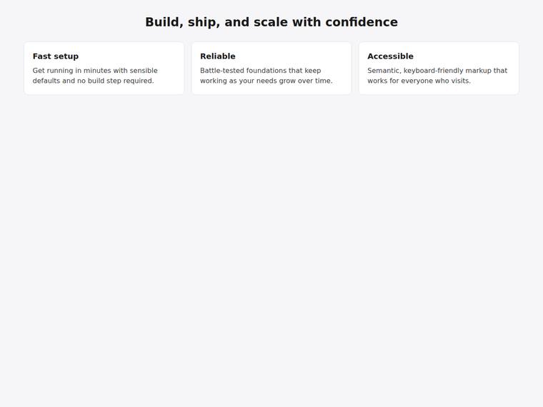
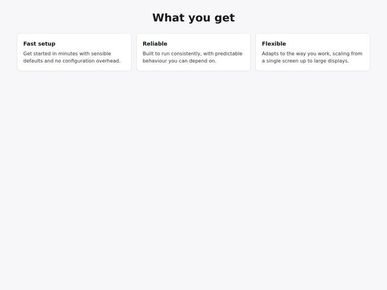
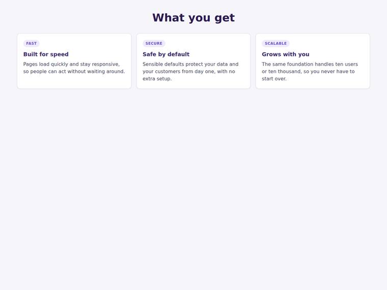
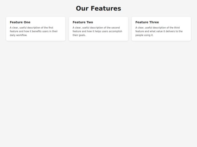
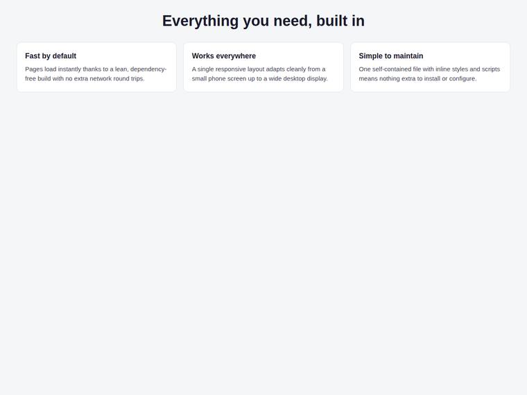
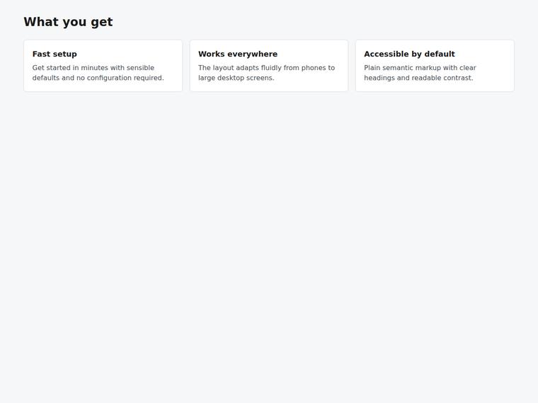
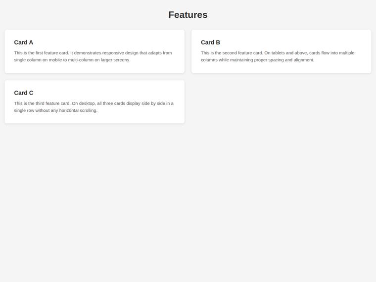
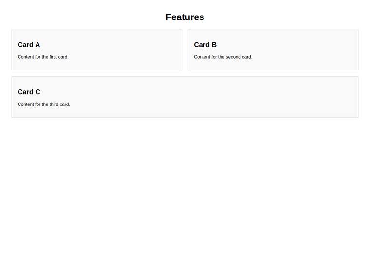
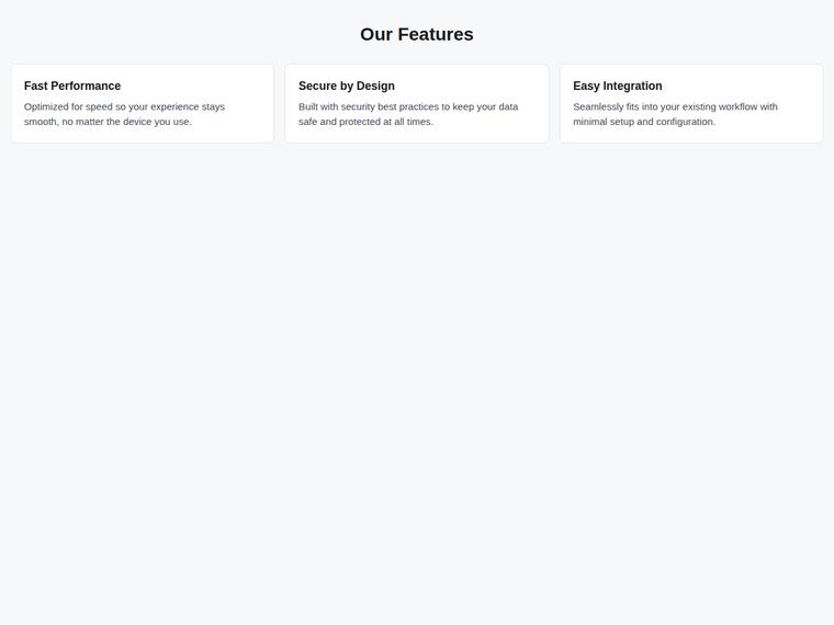
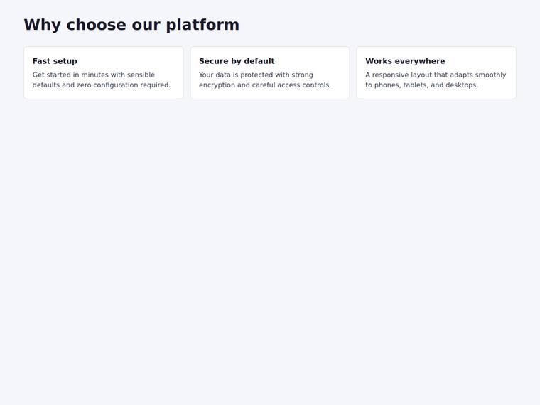
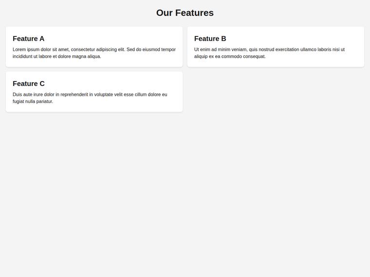
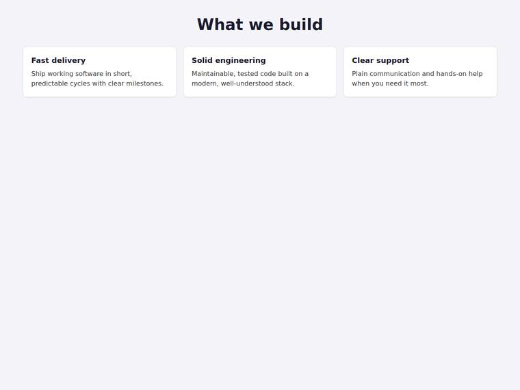
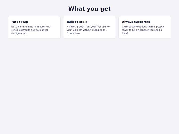
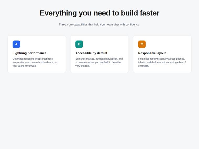
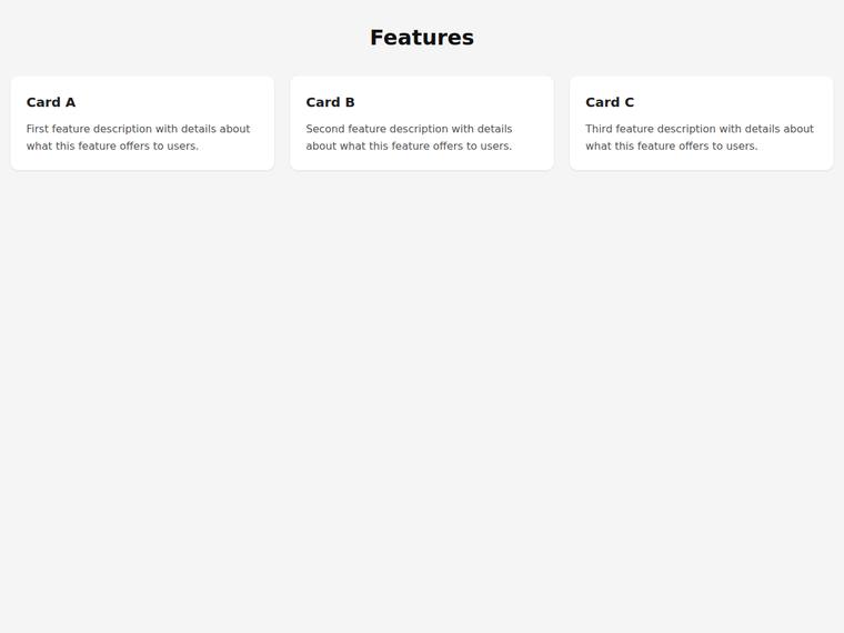
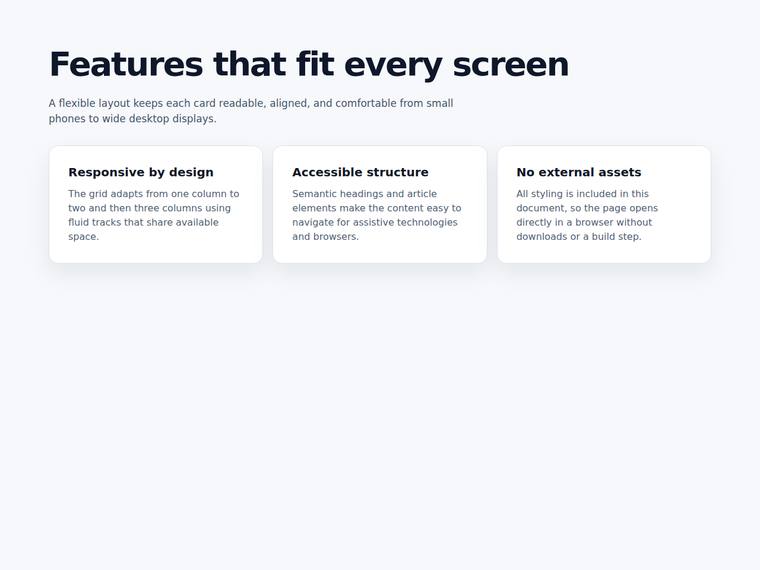
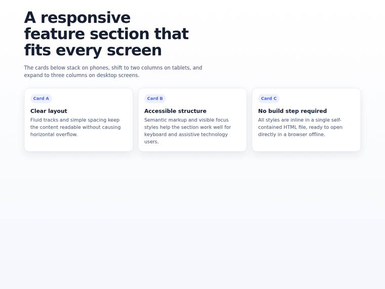
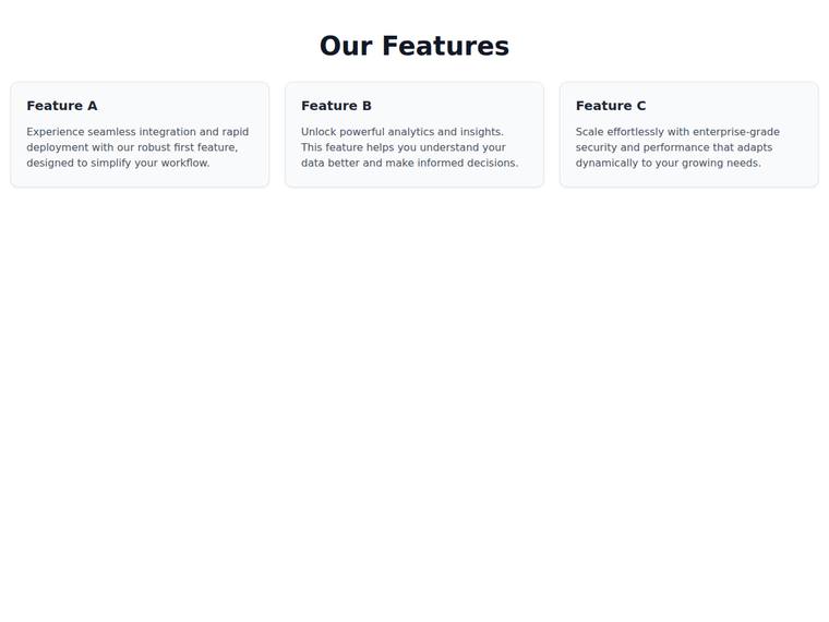
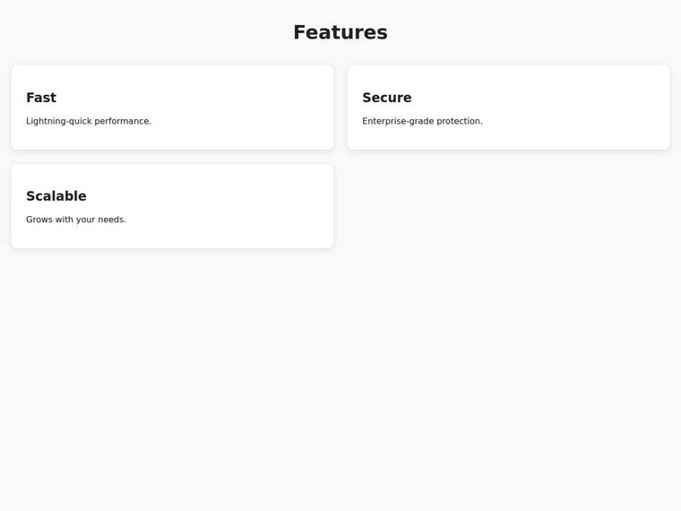
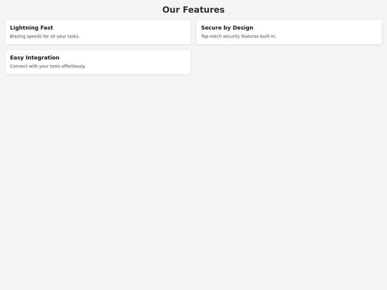
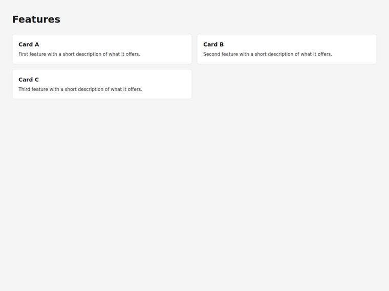
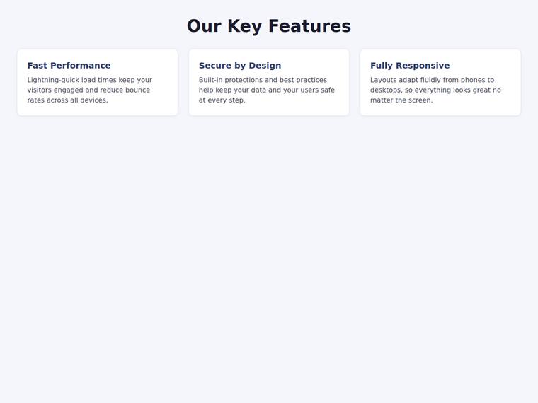
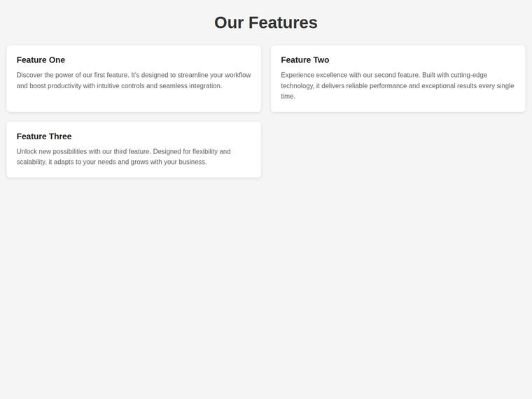
Feature grid that reflows from one to two to three columns
The same task, run on 27 models. Compare the outputs side by side, or open any one in a popup to inspect it.
Top result: claude-opus-4-8 (medium reasoning) at 100.0% composite. Lowest: deepseek-v4-pro at 0.0%. 27 models compared on this task.
How it ran
- Each model was given the brief below in a fresh, isolated session with no access to our tools, and returned a single self-contained index.html (inline CSS and JS, no external requests, no build step).
- The rendered output was scored 1 to 5 on brief fidelity, visual design, craft, and impact by a four-family vision panel - Anthropic (Claude Opus 4.8), OpenAI (GPT-5.5), Google (Gemini 3.1 Pro), and xAI (Grok 4.3) - using one identical prompt so the scores compare. The published judge score is leave-one-family-out: a model is never scored by a judge of its own family, so same-family self-preference is removed.
The brief
Build a single self-contained HTML file (`index.html`) that renders with no build step and no network calls (inline all CSS and JS; no external fonts, scripts, or images). Build a feature section with an <h1> heading and a grid of exactly three cards. Give the grid container id="feature-grid" and give the three cards, in order, id="card-a", id="card-b", and id="card-c". The grid must reflow by width: - on a phone (around 360px wide) the three cards stack in a single column (each card starts at the same left edge and sits below the one before it), - on a tablet (around 768px wide) the cards form two columns, so card-a and card-b sit side by side on the first row and card-c wraps to the second row, and - on a desktop (around 1440px wide) the cards form three columns, so card-a, card-b, and card-c all sit side by side on one row. The page must not scroll horizontally at any of 360px, 768px, or 1440px wide. Use plain, accessible markup. Prefer fluid track widths so the layout never overflows.