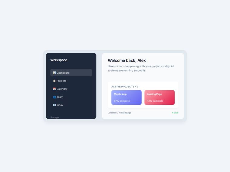
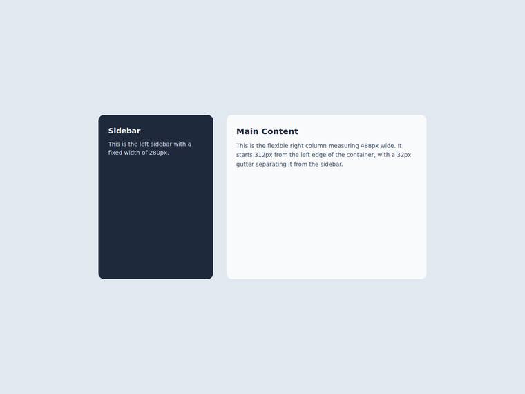
Two-column grid split with exact column widths and gutter
One task across 30 published runs. Inspect the scores and outputs together, with each run's execution method shown.
- Task
- PIXEL-0004
- Domain
- UI components
- Difficulty
- hard
Leading published run: claude-opus-4-8 (low reasoning) at 100.0% composite. Lowest: deepseek-v4-flash at 0.0%. 30 published runs shown on this task.
How this task was evaluated
Results are ordered by this task's published score. API runs use one prompt and one completion; agent runs use a coding harness with tools and iteration. Inspect the execution method when comparing results.
Objective scores use the benchmark's execution checks. Judge scores use a vision panel's fixed rubric; the published score leaves out a model's own family. Missing values are labelled rather than treated as zero.
Read the brief
Build a single self-contained HTML file (`index.html`) that renders a two-column layout, with no build step and no network calls (inline all CSS, no external fonts or scripts). The grader measures the rendered column geometry, so the widths and the gutter must be exact. Container `<div id="split">`: - `display: grid`, 800px wide, 400px tall. - A fixed left column of exactly 280px and a flexible right column, with a column gutter (gap) of exactly 32px. The right column therefore measures 488px wide and starts at left 312px. Children: - `<aside id="side">` (the left column): background #1e293b, border-radius 14px, colour #ffffff, with a heading `<h2 id="side-title">` at font-size 18px. - `<section id="main">` (the right column): background #f8fafc, border-radius 14px. The 280px sidebar, the 32px gutter, and the 488px main column are the contract.