Banja Lab / Benchmarks / Test
AUTH-0001Auth screen · medium
Register / login screen
The same task, run on 28 models. Compare the outputs side by side, or open any one in a popup to inspect it.
Top result: gemini-3.5-flash (default reasoning) at 85.4% composite. Lowest: claude-sonnet-4-6 at 8.3%. 28 models compared on this task.
How it ran
- Each model was given the brief below in a fresh, isolated session with no access to our tools, and returned a single self-contained index.html (inline CSS and JS, no external requests, no build step).
- The rendered output was scored 1 to 5 on brief fidelity, visual design, craft, and impact by a four-family vision panel - Anthropic (Claude Opus 4.8), OpenAI (GPT-5.5), Google (Gemini 3.1 Pro), and xAI (Grok 4.3) - using one identical prompt so the scores compare. The published judge score is leave-one-family-out: a model is never scored by a judge of its own family, so same-family self-preference is removed.
The brief
Build a polished authentication screen as a single page. Split-screen layout: a branded panel on one side (logo, a short value line, and a subtle decorative visual built in CSS/SVG) and a centered auth card on the other. The card toggles between "Sign in" and "Create account" (vanilla JS, animated). Fields: email and password (create-account also shows full name and a password-strength meter); inline validation with clear error and success states; show/hide password toggle; a primary submit button with a loading state; "or continue with" divider and social-login buttons; remember-me + forgot-password. Accessible (labels, focus styles, aria). Responsive (stacks on mobile).
gemini-3.5-flash
default reasoning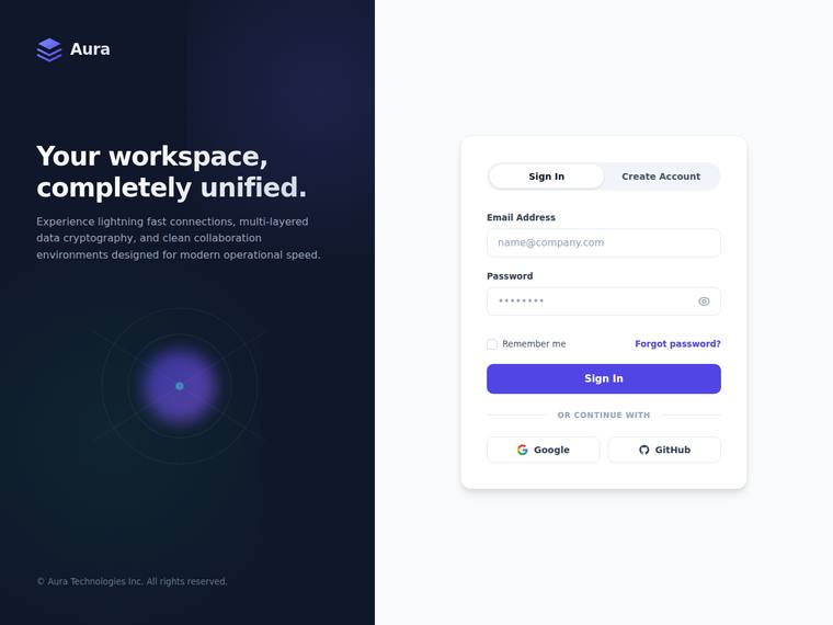
Composite 85.4%Judge 4.4/5
Judge panelAnthropic 4.5/5OpenAI 4.3/5Google 3.0/5
single-judge (Claude) 4.5/5 → leave-one-family-out 4.4/5
Anthropic: The sign-in view delivers nearly every required element: split-screen with branded dark panel (logo, value line, subtle CSS orb/ring visual), centered auth card with Sign In/Create Account toggle, email/password fields, show/hide toggle, remember-me, forgot-password, primary button, divider, and Google/GitHub social logins. Visual design is excellent - coherent violet palette, confident type hierarchy, balanced spacing, and a tasteful glowing-orb decoration that gives the dark panel depth. Craft is clean with no janky bits; the deduction in fidelity/impact is only because create-account specif
OpenAI: The visible screen strongly covers the split layout, branding panel, decorative visual, sign-in form, password reveal, remember/forgot links, divider, and social buttons, but the screenshot does not demonstrate create-account fields, password strength, validation states, loading state, accessibility behavior, or responsive stacking. The visual design is polished and cohesive with strong spacing, typography, contrast, and a refined card treatment, though the overall concept is premium-but-familiar rather than highly distinctive.
Google: The layout successfully includes the requested split-screen structure, branded panel, and required authentication fields. Visually, it is clean and professional, though standard for modern applications. The execution is solid with generally good spacing and typography.
gpt-5.5-pro
High reasoning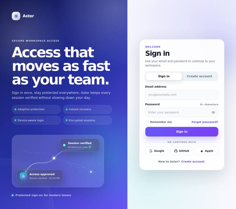
Composite 83.3%Judge 4.3/5
Judge panelAnthropic 4.5/5OpenAI 4.3/5Google 3.8/5
single-judge (Claude) 4.5/5 → leave-one-family-out 4.3/5
Anthropic: The split-screen is excellently realised: a deep violet branded panel with logo, a bold value line, feature bullets, and a genuinely nice CSS/SVG decorative visual (the "session verified / access approved" node graph), paired with a clean centred auth card. Most brief elements are visible - Sign in / Create account toggle, email + password with character hint, remember-me, forgot-password, primary submit, "or continue with" divider, and three social buttons - though the screenshot shows only the sign-in state, so the create-account-only items (full name, password-strength meter), validation st
OpenAI: The screen strongly satisfies the visible split layout, branded panel, decorative visual, sign-in card, password toggle, remember/forgot links, divider, and social buttons. However, the create-account form, password-strength meter, inline validation states, loading state, accessibility details, animation, and mobile responsiveness are not visible in this screenshot. The visual execution is polished and cohesive with excellent spacing, typography, gradients, and component consistency, though the overall concept is premium more than radically distinctive.
Google: The build accurately implements the split-screen layout with all requested elements present. Visuals are clean and well-composed, featuring solid typography and appropriate spacing. The result is professional and consistent throughout.
claude-opus-4-8
High reasoning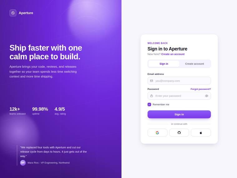
Composite 81.3%Judge 4.3/5
Judge panelAnthropic 4.5/5OpenAI 4.5/5Google 3.5/5
single-judge (Claude) 4.5/5 → leave-one-family-out 4.3/5
Anthropic: The split-screen is fully realized: a violet gradient brand panel with logo, value line, decorative orbs, a stats grid and testimonial, paired with a clean auth card carrying the Sign in/Create account toggle, email and password fields, show/hide eye, forgot-password, remember-me, an "or continue with" divider and three social buttons. Visual design and craft are excellent - coherent palette, strong type hierarchy, consistent rounded inputs and spacing, no janky bits. Brief fidelity and impact are held just under top marks because the static sign-in view cannot show the create-account-only ele
OpenAI: The visible screen strongly matches the split authentication layout with branding, decorative visual, sign-in card, password toggle, remember/forgot links, social buttons, and a sign-in/create-account switch. However, the screenshot does not visibly demonstrate create-account fields, password-strength meter, inline validation states, submit loading state, animation, or responsive behavior. The UI is polished, balanced, and premium-feeling with consistent spacing, typography, and a distinctive purple brand panel.
Google: The design fulfills the split-screen layout and includes the requested auth components. The visual aesthetic is modern, demonstrating solid overall execution.
gpt-5.5
High reasoning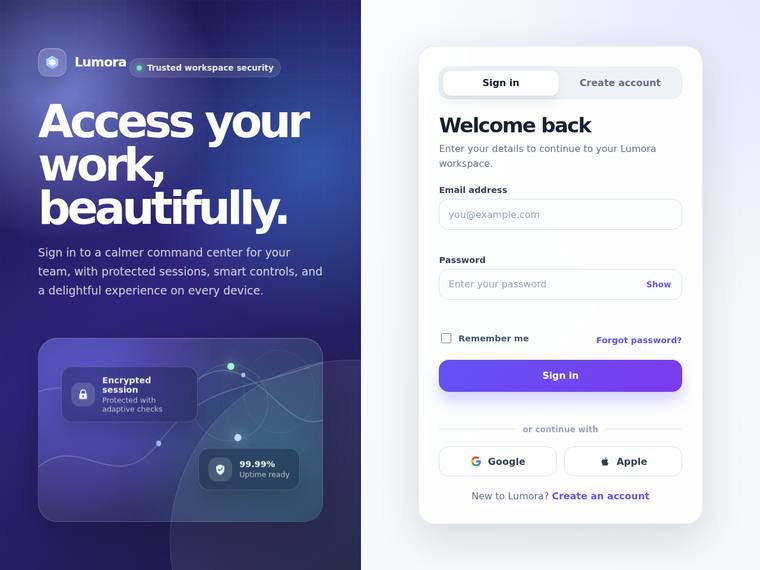
Composite 79.2%Judge 4.2/5
Judge panelAnthropic 4.8/5OpenAI 4.3/5Google 3.0/5
single-judge (Claude) 4.8/5 → leave-one-family-out 4.2/5
Anthropic: Every brief element is visible in the sign-in state: split-screen with branded panel (logo, value line, CSS/SVG decorative visual with floating stat cards), centered auth card with Sign in/Create account tabs, email + password fields, show/hide toggle, remember-me, forgot-password, primary submit, "or continue with" divider, and Google/Apple social buttons. The deep indigo-to-violet gradient panel pairs cleanly with the crisp white card; type hierarchy, spacing, and the pill tabs are well composed and consistently finished with no broken or misaligned elements. It is a premium, polished result
OpenAI: The visible sign-in state covers the split layout, branding, decorative panel, core fields, password reveal, remember/forgot links, divider, and social buttons, but the screenshot does not show create-account fields, password-strength meter, validation states, loading state, focus/accessibility cues, or responsive behavior. The visual execution is polished and cohesive with strong spacing, hierarchy, gradients, and clean component styling, producing a premium impression with no visible jank.
Google: The layout meets core requirements with a structured split-screen and clear inputs. The aesthetic is modern and generally well-executed. Overall finish is adequate, presenting a standard but professional interface.
gpt-5.4-mini
High reasoning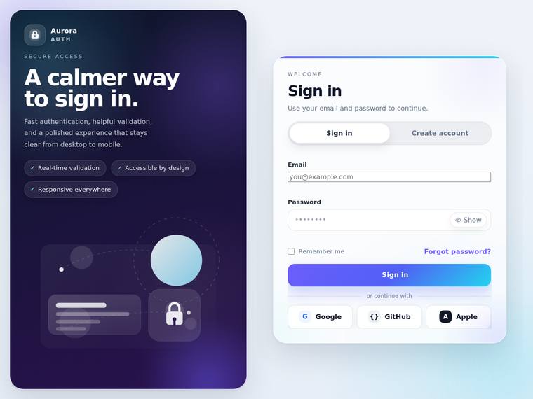
Composite 79.2%Judge 4.2/5
Judge panelAnthropic 4.0/5OpenAI 3.8/5Google 3.5/5
single-judge (Claude) 4.0/5 → leave-one-family-out 4.2/5
Anthropic: The split-screen is well realized: a dark Aurora-branded panel with logo, value line, feature pills, and CSS/SVG decorative cards plus a lock icon, paired with a clean centered auth card carrying the Sign in / Create account toggle, email/password fields, show toggle, remember-me, forgot-password, submit button, an "or continue with" divider, and three social buttons. Type, spacing, and the violet-to-dark palette are coherent and modern, and the static state reads as finished with no obvious broken bits. It stops short of top marks because the create-account-only elements (full name, password-
OpenAI: The screen strongly matches the split layout with branding, decorative art, auth card, toggle, password reveal, remember/forgot links, divider, and social buttons, but the screenshot does not show validation states, loading state, create-account fields, or password strength. The overall design is polished and premium, though the email input appears inconsistently styled compared with the rest of the card, which slightly hurts craft.
Google: The design successfully implements the split-screen layout with a modern visual aesthetic. Overall layout and typography are solid, despite minor styling inconsistencies between input fields. It provides a generally premium feel.
claude-sonnet-5
High reasoning
Composite 78.1%Judge 4.1/5
Judge panelAnthropic 4.8/5OpenAI 4.5/5Google 3.3/5
single-judge (Claude) 4.8/5 → leave-one-family-out 4.1/5
Anthropic: Almost every brief element is visible: split-screen with a branded violet panel (logo, value line, subtle CSS circle decoration, trust strip) and a centered auth card with a working Sign in/Create account toggle, labelled email/password fields, show/hide eye toggle, remember-me, forgot-password, primary submit, an "or continue with" divider and Google/GitHub social buttons. Visual design is coherent and modern with a tasteful gradient, good type hierarchy and clean spacing; craft is finished with consistent rounding, alignment and no broken bits. It is a polished, premium result, though the la
OpenAI: The visible screen strongly matches the requested split authentication layout with branding, decorative visuals, sign-in fields, password reveal, remember/forgot controls, social buttons, and a clear sign-in/create-account toggle. It is visually polished and well-crafted with cohesive spacing, typography, and color, though the screenshot does not demonstrate create-account fields, password strength, validation states, loading state, animation, accessibility, or mobile behavior. The result feels premium, but more distinctive visual character or visible state coverage would raise the impact furt
Google: The layout accurately delivers the requested branded panel and authentication card components with all visible requirements present. The visual design and craft are solid but rely heavily on standard, expected patterns. Overall execution is competent and clean, though it feels slightly generic.
claude-opus-4-8
Medium reasoning
Composite 77.1%Judge 4.1/5
Judge panelAnthropic 4.5/5OpenAI 4.0/5Google 3.5/5
single-judge (Claude) 4.5/5 → leave-one-family-out 4.1/5
Anthropic: The visible sign-in state covers most of the brief: split-screen with branded violet panel (logo, value line, subtle CSS decorative rings, trust line), centered card, Sign in/Create account toggle, email + password fields, remember-me, forgot-password, primary submit, "or continue with" divider and three social buttons. The composition is genuinely polished - tasteful gradient, generous spacing, clean type hierarchy, and no broken or misaligned bits. It stops short of top marks on fidelity and impact because the password-strength meter, show/hide toggle, and validation states are not evident i
OpenAI: The visible sign-in screen includes the split layout, branding panel, auth card, tabs, email/password fields, password reveal icon, remember/forgot links, divider, and social buttons. However, the screenshot does not show create-account fields, password strength, inline validation states, loading state, animation, accessibility details, or responsive behavior. Visually it is polished and cohesive with strong spacing, typography, and a tasteful purple brand treatment, though the overall concept is still fairly conventional.
Google: The design effectively executes the split-screen brief with a modern and polished aesthetic. Visual hierarchy is strong, utilizing a clean layout and vibrant colors.
claude-fable-5
High reasoning
Composite 76.6%Judge 4.1/5
Judge panelAnthropic 3.8/5OpenAI 4.5/5Google 3.5/5
single-judge (Claude) 3.8/5 → leave-one-family-out 4.1/5
Anthropic: The visible sign-in state covers most of the brief cleanly: split-screen with a branded left panel (logo, value line, subtle SVG orbit decoration), a card with a Sign in / Create account toggle, email + password fields, show/hide eye toggle, remember-me, forgot-password, primary submit, an "or continue with" divider and Google/GitHub/Apple buttons. Password-strength meter, full-name field, and validation/loading states belong to hidden states not shown in this static view, so fidelity can't be fully confirmed. Design is coherent and modern with tasteful violet gradients, consistent spacing and
OpenAI: The visible screen covers the split branded panel, decorative visual, auth card, sign-in fields, password toggle, remember/forgot links, divider, social buttons, and account toggle very well. However, validation states, loading state, create-account-only fields, and the strength meter are not visible in this screenshot, so full brief completion cannot be confirmed. The composition is polished and consistent with strong spacing, color, and detail, though the concept is premium rather than highly distinctive.
Google: The layout successfully delivers the requested split-screen and required form components with consistent alignment. Visuals are clean and balanced, providing a standard yet professional aesthetic.
claude-sonnet-5
High reasoning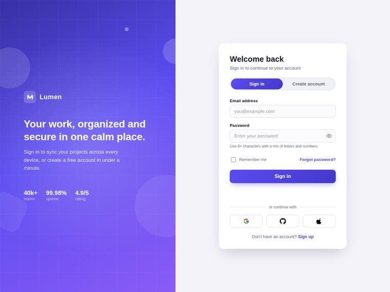
Composite 75.0%Judge 4.0/5
Judge panelAnthropic 4.3/5OpenAI 4.3/5Google 3.0/5
single-judge (Claude) 4.3/5 → leave-one-family-out 4.0/5
Anthropic: The visible sign-in state covers nearly every requested element: split-screen with a branded gradient panel (logo, value line, CSS grid/orbs decoration, stat row), a centered card with Sign in / Create account toggle, email and password fields, show/hide eye, helper text, remember-me, forgot-password, primary submit, an "or continue with" divider and three social buttons. The composition is coherent and modern with a tasteful violet gradient, good type hierarchy and spacing, and the execution looks finished with no broken bits. It loses a little on impact because the layout is a fairly convent
OpenAI: The split branded panel, centered card, sign-in fields, password reveal, remember/forgot controls, divider, social buttons, and account toggle are all visible and well executed. However, the screenshot does not show the create-account fields, password-strength meter, inline error/success validation, loading state, focus/accessibility states, or responsive behavior, so fidelity to the full brief is only partial. Visually it is polished, cohesive, and premium, though fairly conventional for a modern auth screen.
Google: The layout successfully implements the requested split-screen and core elements. Visual execution is clean and spacing is largely consistent. Overall, it provides a solid, standard interface.
claude-fable-5
High reasoning
Composite 73.4%Judge 3.9/5
Judge panelAnthropic 4.0/5OpenAI 4.3/5Google 3.5/5
single-judge (Claude) 4.0/5 → leave-one-family-out 3.9/5
Anthropic: The split-screen layout is fully realised: branded panel with logo, value line, subtle concentric-ring decorative visual and a testimonial, plus a clean centered auth card with the Sign in / Create account toggle, email and password fields, show/hide toggle, remember-me, forgot-password, primary submit, "or continue with" divider and Google/GitHub buttons. Composition is coherent and modern with a tasteful violet gradient, consistent spacing and legible type, and no visibly broken or janky elements. It loses points because several brief items cannot be confirmed in this static sign-in view (fu
OpenAI: The visible sign-in state strongly matches the split-screen brief with branding, decorative CSS-style visuals, tabs, labeled fields, show-password affordance, remember/forgot links, divider, and social buttons. However, the screenshot does not show create-account fields, password-strength meter, inline validation, loading state, focus/accessibility states, animation, or responsive behavior. The execution is polished and cohesive with strong spacing, typography, and color, though the overall concept is familiar rather than highly distinctive.
Google: The build effectively delivers the requested split-screen layout and includes key components like social logins and field toggles. Visuals are clean and balanced, though the overall aesthetic leans slightly generic. Execution is solid with consistent spacing and satisfactory typography.
glm-5.2
default reasoning
Composite 73.4%Judge 3.9/5
Judge panelAnthropic 3.5/5OpenAI 4.5/5Google 3.0/5
single-judge (Claude) 3.5/5 → leave-one-family-out 3.9/5
Anthropic: The split-screen layout is well executed: a dark branded panel with logo, value line ("Design that moves the people who matter"), checklist of benefits and a subtle decorative gradient/orb visual sits beside a clean centered auth card. The card shows the Sign in / Create account toggle, email and password fields with a show/hide toggle, remember-me, forgot-password, primary submit, an "or continue with" divider and three social buttons, so most asked-for elements are present and tastefully styled. However, the visible state only renders Sign in, so the create-account-specific elements (full na
OpenAI: The screenshot strongly matches the requested split-screen auth layout with branding, decorative visuals, sign-in card, social login, remember/forgot controls, labels, and password visibility affordance. However, the create-account form details, password-strength meter, error states, loading state, accessibility behavior, and responsive stacking are not visible, so full brief compliance cannot be confirmed. The visual polish, spacing, typography, and finish are excellent, though the overall concept is premium rather than highly distinctive.
Google: The design fulfills the main layout requirements with a clear split-screen and functional auth components. Visual execution is reasonably modern and tidy. It meets the standard without offering highly distinctive qualities.
deepseek-v4-flash
default reasoning
Composite 71.9%Judge 3.9/5
Judge panelAnthropic 3.8/5OpenAI 4.0/5Google 3.3/5
single-judge (Claude) 3.8/5 → leave-one-family-out 3.9/5
Anthropic: The split-screen layout, branded panel (logo, value line, subtle CSS circle decorations), Sign In/Create Account toggle, email/password fields, show/hide toggle, remember-me, forgot-password, primary button, "or continue with" divider, and three social buttons are all present and correctly placed. Visual design is clean and coherent with a tasteful violet gradient and well-spaced card, though it reads as a fairly conventional auth template rather than a distinctive standout. Craft is solid with consistent alignment and no broken elements; create-account-only items (full name, password-strength
OpenAI: The visible screen nails the split layout, branding panel, sign-in form, password reveal, remember/forgot links, divider, and social buttons, but the screenshot does not show validation states, loading state, create-account fields, password-strength meter, focus/accessibility cues, or responsive behavior. The visual design is polished and modern with strong spacing, typography, and a tasteful decorative brand panel, though the auth area is relatively conventional and the card itself is more implied than distinct.
Google: The interface successfully implements the split-screen layout and essential authentication components requested. The visual styling is clean and professionally constructed, though it relies heavily on standard UI patterns. Execution is solid overall without being overly distinctive.
claude-opus-4-8
Low reasoning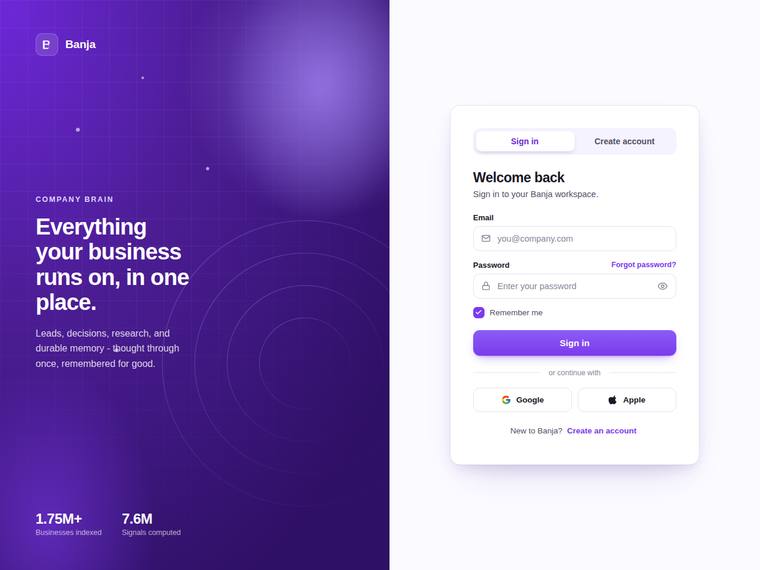
Composite 70.8%Judge 3.8/5
Judge panelAnthropic 4.3/5OpenAI 4.0/5Google 3.3/5
single-judge (Claude) 4.3/5 → leave-one-family-out 3.8/5
Anthropic: The split-screen layout is delivered cleanly: a branded violet gradient panel with logo, value line, decorative concentric-circle SVG, and stat callouts, beside a centered auth card with Sign in / Create account tabs, email + password fields, show/hide toggle, remember-me, forgot-password, a primary submit, an "or continue with" divider, and Google/Apple social buttons. Visual design is strong - confident gradient, restrained type, balanced spacing, premium feel. Brief fidelity drops slightly because the static screenshot shows only the sign-in state, so the create-account-only elements (full
OpenAI: The screenshot delivers the split branded panel, logo/value messaging, decorative CSS-style visual, centered auth card, sign-in fields, remember/forgot links, password visibility icon, divider, and social buttons. However, the visible state does not show inline validation, error/success states, loading state, create-account fields, or password-strength meter, so several required behaviors/states are unverified. Visually it is polished, modern, and well-spaced with strong color and hierarchy, though the overall concept is clean rather than especially distinctive.
Google: The build successfully implements the requested split-screen layout and core authentication features. The visual aesthetic is cohesive but standard, relying on familiar SaaS patterns. Overall execution is competent, though it lacks distinctiveness.
claude-opus-4-8
High reasoning
Composite 70.8%Judge 3.8/5
Judge panelAnthropic 3.8/5OpenAI 3.8/5Google 3.3/5
single-judge (Claude) 3.8/5 → leave-one-family-out 3.8/5
Anthropic: The split-screen layout is well realized: a gradient branded panel with logo, value line, decorative blob, and footer badges on the left, and a clean centered auth card with Sign in / Create account toggle, email and password fields with show/hide toggle, remember-me, forgot-password, a primary Sign in button, an "or continue with" divider, and Google/Apple/GitHub social buttons on the right. Type, spacing, and the violet-to-blue palette are coherent and modern. It loses points because the static screenshot can't show create-account-only elements (full name, password-strength meter), validatio
OpenAI: The visible screen satisfies the core split layout with branding, auth card, sign-in fields, password reveal icon, remember/forgot links, social buttons, and a polished divider. However, the screenshot does not show create-account fields, password-strength meter, inline validation states, loading state, animation, or responsive behavior, so several brief requirements are unverified or absent visually. The design is modern, clean, and well-crafted, though fairly conventional rather than highly distinctive.
Google: The split-screen layout effectively delivers the requested elements with a clean gradient aesthetic. Spacing and typography are consistently applied, yielding a professional look.
claude-opus-4-8
Extra-high reasoning
Composite 70.8%Judge 3.8/5
Judge panelAnthropic 4.0/5OpenAI 4.3/5Google 3.0/5
single-judge (Claude) 4.0/5 → leave-one-family-out 3.8/5
Anthropic: The split-screen is well executed: a branded purple panel with logo, value line, subtle CSS blur-orb decoration and footer, beside a clean centered card with the Sign in / Create account toggle, email + password fields, remember-me, forgot-password, primary button, "or continue with" divider and three social buttons. Type, spacing and the violet palette are coherent and modern, and the toggle is clearly in the Sign in state. It loses points because several brief elements can't be confirmed in this static default state (password-strength meter, show/hide toggle, inline error/success and loading
OpenAI: The visible screen strongly matches the core split-layout brief with branding, decorative visuals, sign-in card, tabs, email/password fields, remember/forgot links, divider, social buttons, and password visibility icon. However, the screenshot does not show inline validation states, loading state, create-account fields or password-strength meter, focus/accessibility states, or responsive behavior, so fidelity cannot be rated higher. The visual execution is polished, cohesive, and premium, though fairly conventional for a modern SaaS auth page.
Google: The split-screen layout successfully incorporates the requested branding and structural authentication components. The modern styling and consistent spacing create a clean, functional interface.
kimi-k2.7-code
default reasoning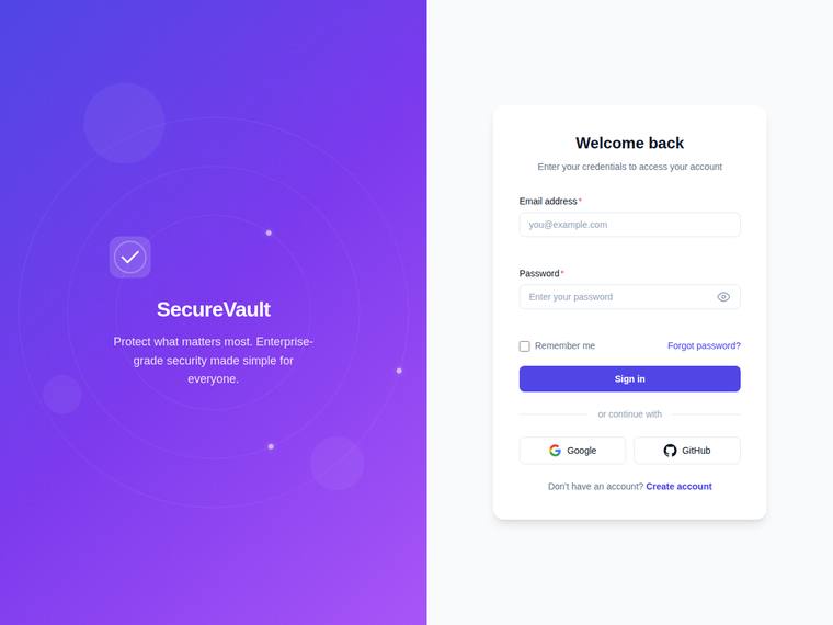
Composite 70.3%Judge 3.8/5
Judge panelAnthropic 4.0/5OpenAI 3.5/5Google 3.3/5
single-judge (Claude) 4.0/5 → leave-one-family-out 3.8/5
Anthropic: The default sign-in state covers nearly all visible brief elements: split-screen with a violet branded panel (logo badge, SecureVault name, value line, faint concentric-orbit CSS decoration), a clean centered card with required email/password fields, password show/hide toggle, remember-me, forgot-password, primary button, "or continue with" divider, and Google/GitHub social buttons with correct icons. Composition is coherent and modern with tasteful violet gradient, consistent spacing, and no broken bits. It is solid and professional rather than distinctive; the right panel is plain, the decor
OpenAI: The screenshot clearly delivers the split branded panel, centered sign-in card, email/password fields, password visibility icon, remember/forgot links, divider, and social buttons. However, the create-account state, password-strength meter, validation states, loading state, animation, accessibility behavior, and responsive stacking are not visible, so fidelity cannot be scored higher. The visual design is clean and polished with good spacing and a pleasant branded panel, though it feels fairly conventional rather than highly distinctive.
Google: The layout successfully implements the requested split-screen structure and all visible authentication elements. While the overall aesthetic is clean and professional, the design relies on standard patterns rather than standing out. Execution is competent with consistent spacing and typography.
claude-opus-4-8
Max reasoning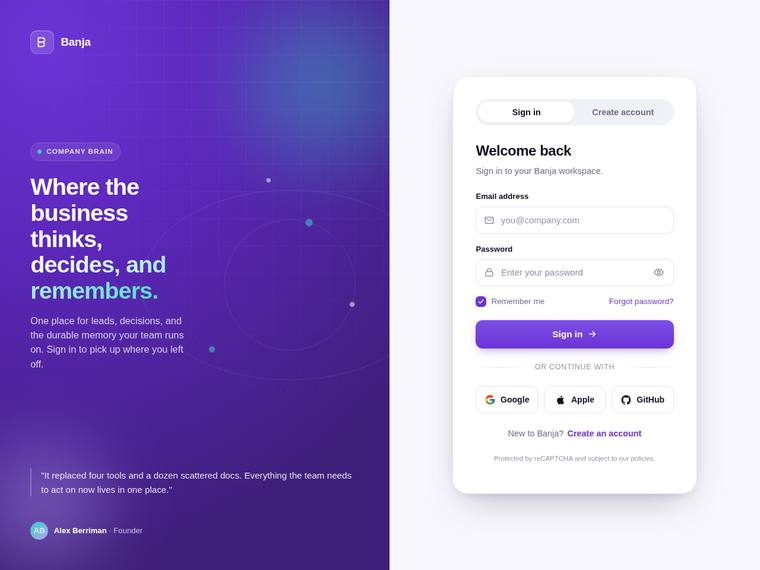
Composite 68.8%Judge 3.8/5
Judge panelAnthropic 4.5/5OpenAI 4.3/5Google 3.0/5
single-judge (Claude) 4.5/5 → leave-one-family-out 3.8/5
Anthropic: The split-screen is fully realised: branded violet panel (logo, "company brain" tag, value headline, paragraph, subtle dot decoration, testimonial card) beside a centered white auth card with the Sign in / Create account toggle, email + password fields, remember-me + forgot-password, primary submit, "or continue with" divider and Google/Apple/GitHub buttons. Visual design is polished and coherent - tasteful violet gradient, clean type hierarchy, generous spacing, a tidy card with rounded inputs and good contrast. In the visible state I cannot confirm several brief items (password-strength mete
OpenAI: The screenshot delivers a polished split-screen auth layout with branding, decorative visuals, sign-in fields, password visibility control, remember/forgot links, divider, and social buttons. However, visible evidence is missing for create-account fields/password strength, inline validation states, loading state, focus/accessibility states, animation, and mobile responsiveness. The visual execution is very refined and consistent, though the concept is more premium SaaS-polished than truly distinctive.
Google: The design executes a clean split-screen layout with professional typography and solid color choices. It meets the static structural requirements of the brief well. The overall composition feels polished and appropriate for a modern application.
claude-sonnet-4-6
High reasoning
Composite 68.8%Judge 3.8/5
Judge panelAnthropic 3.8/5OpenAI 3.8/5Google 3.3/5
single-judge (Claude) 3.8/5 → leave-one-family-out 3.8/5
Anthropic: The split-screen layout is delivered well: a violet branded panel with logo, value line, and stat callouts on the left, and a clean centered auth card on the right with Sign in / Create account tabs, email/password fields, show-password icon, remember-me, forgot-password, primary Sign In button, an "or continue with" divider, and Google/GitHub social buttons. Most brief elements are present, though create-account-only items (full name, strength meter, loading/validation states) cannot be confirmed in this static Sign-in view, and the decorative panel visual reads as flat gradient rather than a
OpenAI: The screenshot delivers a polished split-screen sign-in view with branding, decorative visuals, email/password fields, password visibility, remember/forgot links, divider, and social buttons. However, the visible state does not demonstrate create-account fields, password strength, inline validation, loading state, or responsive/accessibility behavior, and the auth area is more of a form column than a distinct card.
Google: The build successfully implements the requested split-screen layout and all essential authentication components. The visual execution is clean and properly aligned, resulting in a cohesive but relatively standard interface.
claude-haiku-4-5
High reasoning
Composite 66.7%Judge 3.7/5
Judge panelAnthropic 3.5/5OpenAI 3.5/5Google 3.3/5
single-judge (Claude) 3.5/5 → leave-one-family-out 3.7/5
Anthropic: The split-screen layout is delivered cleanly: branded violet panel with logo, value line, and a subtle CSS/SVG lock-and-grid decoration, paired with a centered auth card carrying a Sign in/Create account toggle, email and password fields, show/hide toggle, remember-me, forgot-password, an "or continue with" divider, and Google/GitHub social buttons. Visually it is coherent and modern with a tasteful gradient, even spacing, and consistent type, and craft is solid with no obvious broken elements. Brief fidelity is only mid because the static screenshot shows none of the create-account-only requi
OpenAI: The screenshot includes the split branded panel, auth form, sign-in/create toggle, password visibility icon, remember/forgot links, divider, and social buttons, but visible evidence is missing for inline validation states, loading state, create-account fields/password-strength meter, animation, and the auth card is not strongly framed as a card. The design is clean, modern, and well spaced with a pleasant branded illustration, though it feels fairly generic and not especially premium or distinctive.
Google: The design delivers the requested split-screen layout with a clean branded panel and functional inputs. Visuals are competent but standard, featuring slightly disproportionate social buttons. Execution is professional without being highly distinctive.
grok-4.20-reasoning
default reasoning
Composite 66.7%Judge 3.7/5
Judge panelAnthropic 3.5/5OpenAI 3.8/5Google 3.8/5
single-judge (Claude) 3.5/5 → leave-one-family-out 3.7/5
Anthropic: The sign-in state covers most of the brief: split-screen with branded panel (logo, value line, trust badge, CSS glow visual), a centered card with email/password, show/hide toggle, remember-me, forgot-password, a primary button, an "or continue with" divider, three social buttons, and a create-account link; the email field even shows a green success state. Visual design is coherent and modern with a clean amber-on-dark palette and tidy card composition. Craft is held back by the decorative blobs reading as oversized, blurry, and slightly unfinished (notably the grey blob bleeding off the botto
OpenAI: The visible sign-in screen covers the split layout, branding, auth card, password toggle, remember/forgot links, divider, and social buttons, but the create-account state, password-strength meter, loading state, animation, and clear inline validation messages are not visible. The design is polished, modern, and well-spaced with a strong branded side panel, though it is somewhat conventional and a few details like the green field icon feel slightly unclear.
Google: The design accurately reflects the brief with a clear split-screen layout, required fields, and visible validation states. The visual execution is clean and professional, demonstrating consistent spacing and alignment throughout. Overall impact is solid but remains somewhat conventional.
deepseek-v4-pro
default reasoning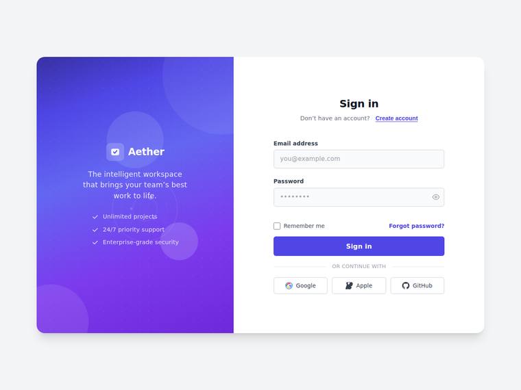
Composite 65.6%Judge 3.6/5
Judge panelAnthropic 3.8/5OpenAI 4.0/5Google 2.8/5
single-judge (Claude) 3.8/5 → leave-one-family-out 3.6/5
Anthropic: The split-screen is well executed: a violet gradient brand panel with logo, value line, feature checklist and subtle CSS circles, paired with a clean sign-in card carrying email/password, show-hide toggle, remember-me, forgot-password, primary button, an "or continue with" divider and three social buttons, plus the toggle to create an account. Type, spacing and colour are coherent and modern with no broken or janky elements visible. It loses ground because the static view shows only the sign-in state (no full-name field, password-strength meter, validation, or loading state visible) and the re
OpenAI: The visible sign-in screen includes the split branding panel, logo/value copy, email/password fields, show-password icon, remember/forgot links, primary CTA, divider, and social buttons, but the create-account state, strength meter, inline validation, loading state, animation, accessibility, and responsive behavior are not demonstrated in the screenshot. Visually it is polished and modern with strong spacing, typography, and a tasteful purple brand panel, though the overall concept is clean rather than especially distinctive.
Google: The layout successfully delivers the requested split-screen design with standard UI patterns. While most static elements are visible and cleanly executed, the overall result lacks distinctiveness. Dynamic states cannot be verified from a single screenshot.
grok-4.3
default reasoning
Composite 60.4%Judge 3.4/5
Judge panelAnthropic 3.8/5OpenAI 3.5/5Google 3.0/5
single-judge (Claude) 3.8/5 → leave-one-family-out 3.4/5
Anthropic: The split-screen is clean and on-brief: dark branded panel with logo, value line, supporting copy and a subtle CSS circle, plus a well-structured auth card with the sign-in/create-account toggle, email and password fields, show/hide eye, remember-me, forgot-password, primary button, "or continue with" divider and Google/GitHub buttons. Type, spacing and the violet accent are coherent and modern with no broken or misaligned bits visible. It loses points because the static sign-in view cannot show the create-account extras (full name, strength meter), validation/loading states or animation, and
OpenAI: The visible sign-in screen covers the split layout, branding panel, auth card, toggle, email/password fields, show-password icon, remember/forgot links, divider, and social buttons, but validation states, loading state, create-account fields/strength meter, animation, accessibility, and responsiveness are not demonstrated in the screenshot. The design is clean, balanced, and polished with consistent spacing and color, though the visual language is fairly conventional and not especially distinctive.
Google: The design provides a clean split-screen layout that meets the core structural requirements. While functional and neatly aligned, the visual execution remains fairly standard without distinctive flair.
grok-composer-2.5-fast
default reasoning
Composite 60.4%Judge 3.4/5
Judge panelAnthropic 3.8/5OpenAI 3.5/5Google 3.0/5
single-judge (Claude) 3.8/5 → leave-one-family-out 3.4/5
Anthropic: The static view covers most of the brief: split-screen with branded dark panel (logo, value line, subtle radial-glow visual) and a centered auth card carrying the Sign in / Create account toggle, email + password fields, show/hide toggle, remember-me, forgot-password, primary button, "or continue with" divider, and Google/GitHub buttons. Create-account-only elements (full name, password-strength meter), validation states, and loading state aren't observable in this default frame. Visuals are clean and modern with tasteful blue accents and good spacing, but the result is competent and conventio
OpenAI: The screenshot covers the core sign-in layout well: split branding panel, centered card, tabs, email/password fields, show/hide icon, remember/forgot, primary CTA, divider, and social buttons. However, the create-account form, password-strength meter, inline validation states, loading state, animation, accessibility, and mobile responsiveness are not visible, and the decorative branded visual is very minimal. The visual execution is clean and polished, though fairly conventional and not especially distinctive.
Google: The split-screen layout effectively incorporates all required authentication elements. Visuals are clean and consistent, though somewhat generic. Execution is solid overall but lacks a distinctive premium feel.
gemini-3.1-pro-preview
High reasoning
Composite 58.3%Judge 3.3/5
Judge panelAnthropic 3.5/5OpenAI 3.5/5Google 3.0/5
single-judge (Claude) 3.5/5 → leave-one-family-out 3.3/5
Anthropic: The Sign in state covers most asked elements: split-screen with branded panel (logo, value line, gradient decoration), centered card, email/password fields, show/hide toggle, remember-me, forgot-password, primary submit, "or continue with" divider, Google/GitHub social buttons, and a sign-up link. But several brief items aren't visible in this static shot: no create-account fields (full name, password-strength meter), no visible inline validation error/success states, no loading state, and no focus styles. Visually it's clean and coherent with a tasteful violet gradient, good type hierarchy, a
OpenAI: The split layout, branding, sign-in form, password visibility icon, remember/forgot row, divider, social buttons, and sign-up toggle link are present, but the screenshot does not show the create-account state, validation states, loading state, password-strength meter, or much of a decorative CSS/SVG visual. The design is clean and usable with good spacing and a polished purple palette, though the right side lacks a distinct auth card and the overall result feels fairly generic rather than premium or distinctive.
Google: The layout provides the requested elements, though the branded panel lacks the specified decorative visual. The overall execution is cleanly composed but feels generic rather than premium.
grok-build-0.1
default reasoning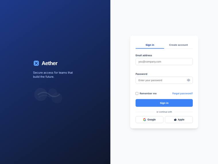
Composite 58.3%Judge 3.3/5
Judge panelAnthropic 3.8/5OpenAI 3.5/5Google 2.8/5
single-judge (Claude) 3.8/5 → leave-one-family-out 3.3/5
Anthropic: The split-screen layout is fully realized: a dark blue gradient brand panel with the Aether logo, value line, and a subtle CSS/SVG decorative wisp, paired with a clean centered auth card showing Sign in / Create account tabs, labeled email and password fields, show/hide toggle, remember-me, forgot-password, primary button, an "or continue with" divider, and Google/Apple buttons. Spacing, type hierarchy, and the blue accent are coherent and tasteful with consistent finish and no visible jank. It reads as a solid, professional auth screen rather than a standout; the decorative visual is very fai
OpenAI: The screen includes the split layout, branded panel, sign-in card, password visibility icon, remember/forgot links, divider, and social buttons, but visible evidence of create-account fields, validation states, loading state, animation, accessibility, and responsiveness is missing. The visual design is clean, modern, and well-spaced with a coherent blue palette, though it feels fairly conventional. Overall craft is solid with no obvious broken elements, but the result is more polished-standard than distinctive or premium.
Google: The layout fulfills the visual requirements with a clean split-screen design. Visuals are professional but somewhat generic. Execution is solid, though it lacks strong distinctiveness.
gemini-3.1-flash-lite
default reasoning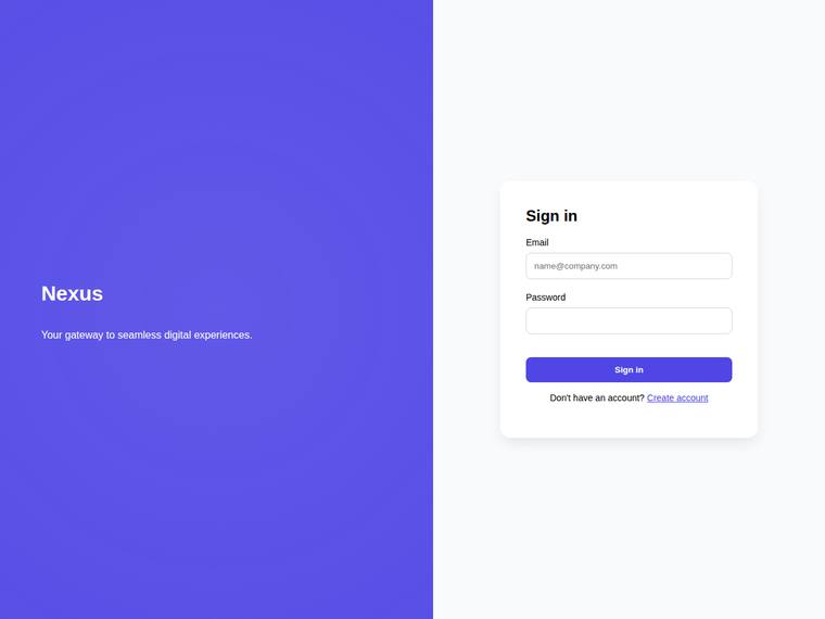
Composite 41.7%Judge 2.7/5
Judge panelAnthropic 2.5/5OpenAI 2.5/5Google 2.5/5
single-judge (Claude) 2.5/5 → leave-one-family-out 2.7/5
Anthropic: The split-screen layout, branded panel (Nexus logo + value line), and a minimal sign-in card with email/password and a create-account link are present, but most of the brief is missing from view: no "or continue with" divider or social buttons, no remember-me/forgot-password, no show/hide password toggle, and only a barely-visible radial gradient rather than a real decorative SVG. Visually it is clean and the purple accent is coherent, but the card is sparse and undersized with a lot of empty white space, the right panel feels unbalanced, and there is no inline validation or strength-meter sho
OpenAI: The screenshot includes a basic split layout with branding, value line, and a sign-in card with email/password fields and a create-account link, but many required elements are not visible: decorative visual, validation states, password visibility toggle, loading state, divider/social login, remember/forgot controls, and create-account-specific fields/strength meter. The design is clean and usable but very plain, with large empty areas and little premium polish or distinctive detail.
Google: The layout meets basic requirements but omits key features like social logins, remember-me options, and decorative visuals. The overall aesthetic is generic, lacking the premium finish requested.
claude-haiku-4-5
default reasoning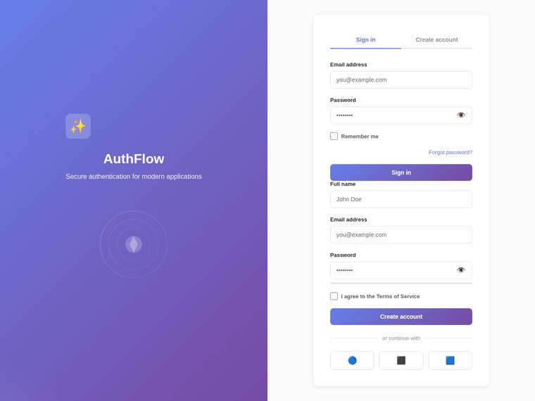
Composite 39.6%Judge 2.6/5
Judge panelAnthropic 2.5/5OpenAI 2.5/5Google 2.3/5
single-judge (Claude) 2.5/5 → leave-one-family-out 2.6/5
Anthropic: Most brief elements are present (split-screen, branded panel with logo/value line/decorative SVG, tabs, email/password, show/hide toggles, remember-me, forgot-password, divider, social buttons), but the central toggle is broken in render: both the Sign in and Create account forms display stacked at once instead of switching, producing duplicate Email/Password blocks and a confusing card, and no password-strength meter is visible. Visual design is competent and modern (clean purple gradient, tidy spacing) but undistinctive, and the sparkles-style logo icon reads as generic AI decoration. The si
OpenAI: The split-screen brand panel, auth card, tabs, fields, password toggles, remember/forgot links, divider, and social buttons are visible, but the sign-in and create-account forms appear stacked at the same time instead of toggling. There are no visible inline validation states or loading state, the password-strength meter is only a faint line, and spacing around the buttons/labels feels janky, reducing polish and premium impact.
Google: The layout features the requested split screen but critically fails by rendering both the sign-in and registration forms simultaneously. Visuals are highly generic with placeholder social icons, and the password strength meter is missing. The resulting execution feels unpolished and functionally incomplete.
claude-sonnet-4-6
High reasoning
Composite 8.3%Judge 1.3/5
Judge panelAnthropic 1.0/5OpenAI 1.0/5Google 2.0/5
single-judge (Claude) 1.0/5 → leave-one-family-out 1.3/5
Anthropic: The screenshot is entirely blank - a white page with no visible content. None of the briefed elements rendered: no split-screen layout, branded panel, auth card, fields, buttons, password toggle, or social-login. With nothing visible to evaluate, every criterion fails at the floor.
OpenAI: The screenshot appears entirely blank, with none of the required authentication UI, split-screen branded panel, form fields, controls, validation states, or decorative visuals visible. With no visible composition or implemented details to assess, it fails the brief and has no discernible visual impact.
Google: The provided screenshot is entirely blank. None of the requested brief elements are present, making evaluation impossible.