Banja Lab / Benchmarks / Test
ANIM-0001Animation · medium
Simple UI animation
The same task, run on 28 models. Compare the outputs side by side, or open any one in a popup to inspect it.
Top result: deepseek-v4-pro (default reasoning) at 64.1% composite. Lowest: claude-sonnet-4-6 at 8.3%. 28 models compared on this task.
How it ran
- Each model was given the brief below in a fresh, isolated session with no access to our tools, and returned a single self-contained index.html (inline CSS and JS, no external requests, no build step).
- The rendered output was scored 1 to 5 on brief fidelity, visual design, craft, and impact by a four-family vision panel - Anthropic (Claude Opus 4.8), OpenAI (GPT-5.5), Google (Gemini 3.1 Pro), and xAI (Grok 4.3) - using one identical prompt so the scores compare. The published judge score is leave-one-family-out: a model is never scored by a judge of its own family, so same-family self-preference is removed.
The brief
Build a single page demonstrating one tasteful, looping UI micro-animation on a clean centered stage: a primary button that, on a repeating cycle, morphs into a loading spinner and then a success checkmark and back. Smooth, eased, ~60fps, CSS-driven where possible with minimal JS to loop it. Make it feel premium - the kind of micro-interaction a top design team would ship. Include a subtle caption.
deepseek-v4-pro
default reasoning
Composite 64.1%Judge 3.6/5
Judge panelAnthropic 3.3/5OpenAI 3.5/5Google 3.5/5
single-judge (Claude) 3.3/5 → leave-one-family-out 3.6/5
Anthropic: The frame captures the loading/spinner state of the requested cycle with a centered indigo button, subtle drop shadow, and the asked-for caption ("Button → Loading → Success"), so the core brief elements are present and the rendering is clean with no broken bits. However the button and caption are very small against a large near-empty off-white stage, giving it a thin, underwhelming presence rather than a premium one, and only a single state (the spinner) is visible so the morph and checkmark cannot be assessed. Tasteful but minimal; nothing here would make a reviewer stop.
OpenAI: The screenshot shows a clean centered loading-spinner state with a subtle caption, but the primary button and success checkmark phases are not visible, so the full requested loop cannot be verified from the image alone. The composition is tasteful and polished with good spacing, color, and shadow detail, though it is very minimal and not especially distinctive or high-impact.
Google: The layout features a clean, centered stage and a subtle caption, aligning perfectly with structural requirements. Tasteful colors and soft shadows provide a premium baseline aesthetic. While the static view restricts full animation assessment, the visible execution remains solid and well-composed.
claude-opus-4-8
High reasoning
Composite 62.5%Judge 3.5/5
Judge panelAnthropic 3.8/5OpenAI 3.5/5Google 3.0/5
single-judge (Claude) 3.8/5 → leave-one-family-out 3.5/5
Anthropic: The static frame captures the loading state cleanly: a centered card with a "MICRO-INTERACTION" eyebrow, a purple circular button holding a spinner glyph, a "SUBMITTING" status with indicator dot, and a caption naming the submit/loading/done states, so most brief elements are evident. Palette (violet on near-black), type hierarchy, and spacing are coherent and modern with a soft elevated card. As a single still it reads as competent and premium-leaning but not arresting; the spinner glyph is small and the frame alone can't convey the morph cycle, so it stops short of a standout, distinctive mo
OpenAI: The screenshot shows a polished centered dark stage with a subtle caption and a visible loading/spinner state, but the primary button, success checkmark, and looping morph sequence are not directly visible in the static capture. The visual treatment is tasteful and coherent with good spacing, typography, and glow details, though the result feels restrained rather than especially distinctive.
Google: The layout provides a centered, premium composition with a visible loading state and clean typography. The visual execution is polished, though the static format limits verifying the full animation loop.
claude-opus-4-8
Extra-high reasoning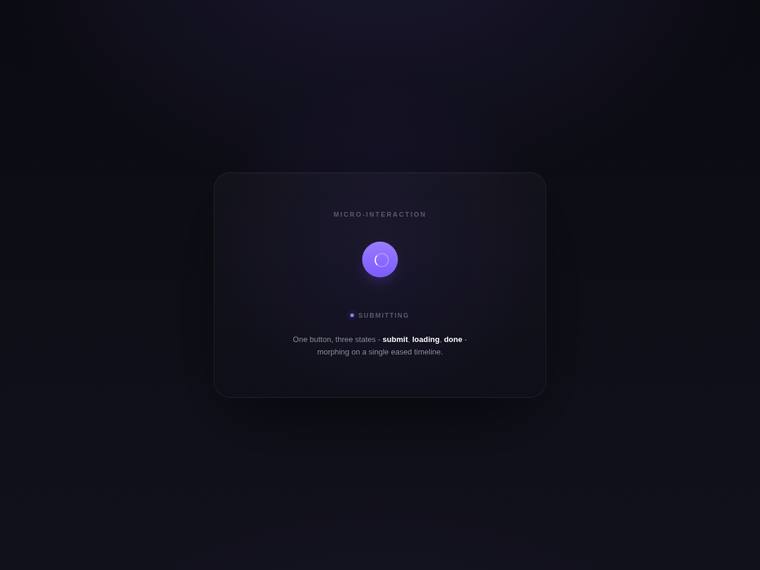
Composite 62.5%Judge 3.5/5
Judge panelAnthropic 3.8/5OpenAI 3.5/5Google 3.0/5
single-judge (Claude) 3.8/5 → leave-one-family-out 3.5/5
Anthropic: The frame captures the loading state cleanly: a violet circular button with a spinner glyph, a "SUBMITTING" status label with a small dot, and a caption naming the submit/loading/done morph cycle, all on a softly elevated dark card with a tasteful radial glow. Composition, type tracking, and the restrained violet-on-near-black palette read modern and coherent, though as a static frame only one of the three promised states (the spinner, not the button or checkmark) is verifiable. It is competent and premium-leaning but the captured moment is fairly quiet and not the kind of distinctive, stop-an
OpenAI: The page is clean, centered, and includes a subtle caption with a polished dark premium aesthetic, but the screenshot only visibly shows the loading/spinner state rather than the full button-to-spinner-to-checkmark cycle. The composition, spacing, typography, and glow treatment are refined, though the result feels restrained and not especially distinctive from a static view.
Google: The design features the requested centered stage, loading spinner state, and subtle caption. The dark theme and purple glow provide a clean, modern aesthetic. Execution is generally solid and well-composed.
claude-fable-5
High reasoning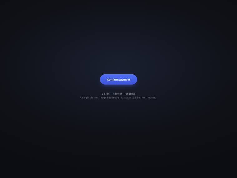
Composite 62.5%Judge 3.5/5
Judge panelAnthropic 3.8/5OpenAI 3.5/5Google 3.0/5
single-judge (Claude) 3.8/5 → leave-one-family-out 3.5/5
Anthropic: The centered "Confirm payment" pill button sits cleanly on a dark radial-gradient stage with a tasteful indigo fill and soft glow, and the required subtle caption ("Button → spinner → success" plus the CSS-driven/looping note) is present. Composition, colour and spacing are coherent and modern, and the button itself is well finished with no visible broken edges. In this single captured frame only the button state is shown (the spinner and success checkmark states are described but not visible), and while the result is polished it reads as competent rather than distinctive enough to make a revi
OpenAI: The visible page has a clean centered stage, a primary button, and a subtle caption describing the button-to-spinner-to-success loop, but the screenshot only shows the button state with no spinner or checkmark visible. The dark composition, blue pill button, spacing, and typography feel polished and coherent, though the result is understated and not especially distinctive without the animation state on display.
Google: The layout provides the requested centered button and subtle caption within a clean dark theme. Polished spacing and typography give a modern feel, though the static image limits animation assessment. Overall, it is a solid and standard structural execution.
gemini-3.5-flash
default reasoning
Composite 62.5%Judge 3.5/5
Judge panelAnthropic 3.5/5OpenAI 3.8/5Google 4.0/5
single-judge (Claude) 3.5/5 → leave-one-family-out 3.5/5
Anthropic: The frame shows a clean centered checkout card with a "Pay Securely" primary button, a step tracker (Authorize/Process/Success), and a subtle caption about state-morphing transitions, so the concept of the button-to-spinner-to-checkmark loop is implied but in this static frame only the resting button state is visible - the spinner and checkmark phases aren't shown, leaving brief fidelity unverifiable. Visually it is coherent and modern: restrained dark palette, a single violet accent, good type hierarchy on the $480.00 amount, and tasteful spacing on the card. It is competent and finished but
OpenAI: The page is clean, centered, polished, and includes a tasteful primary button with a subtle caption, but the screenshot does not visibly show the required morph into a spinner or success checkmark. Visual styling feels premium with strong spacing, typography, glow, and dark UI treatment, though the impact is limited because the core micro-animation is only implied rather than evident.
Google: The design delivers a premium centered stage featuring the required button and subtle caption. Clean typography and tasteful dark-mode glows establish a polished, modern aesthetic. The static layout strongly implies high-quality execution that aligns with the brief.
claude-opus-4-8
High reasoning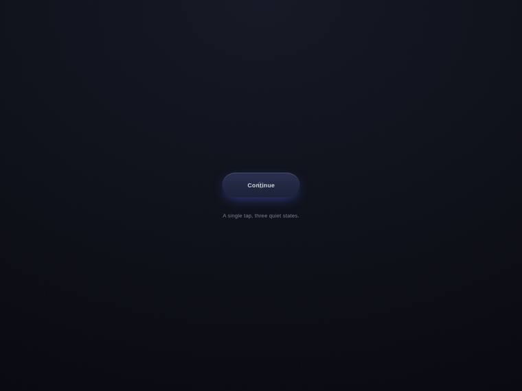
Composite 60.4%Judge 3.4/5
Judge panelAnthropic 3.5/5OpenAI 3.5/5Google 2.8/5
single-judge (Claude) 3.5/5 → leave-one-family-out 3.4/5
Anthropic: The frame shows a clean, well-centered dark stage with a tasteful violet-gradient "Continue" pill button carrying a soft glow, plus the subtle caption "A single tap, three quiet states" - composition, color, and type are coherent and premium-leaning. However the screenshot captures only the resting button state, so the spinner-and-checkmark morph that the brief centers on is not demonstrable in this still, leaving brief fidelity unconfirmed. The result is finished and polished but quiet and minimal, so it reads as competent rather than distinctively stop-worthy.
OpenAI: The screenshot shows a clean centered stage with a polished primary button and subtle caption, but the requested spinner and success checkmark states are not visible, so the core looping morphing interaction cannot be verified. The dark palette, soft glow, rounded form, and spacing feel tasteful and finished, though the result is understated rather than especially distinctive.
Google: The layout provides the requested centered button and subtle caption within a clean, dark theme. However, a visual artifact overlapping the text suggests execution issues with the rendered states. This structural flaw reduces the overall premium polish.
glm-5.2
default reasoning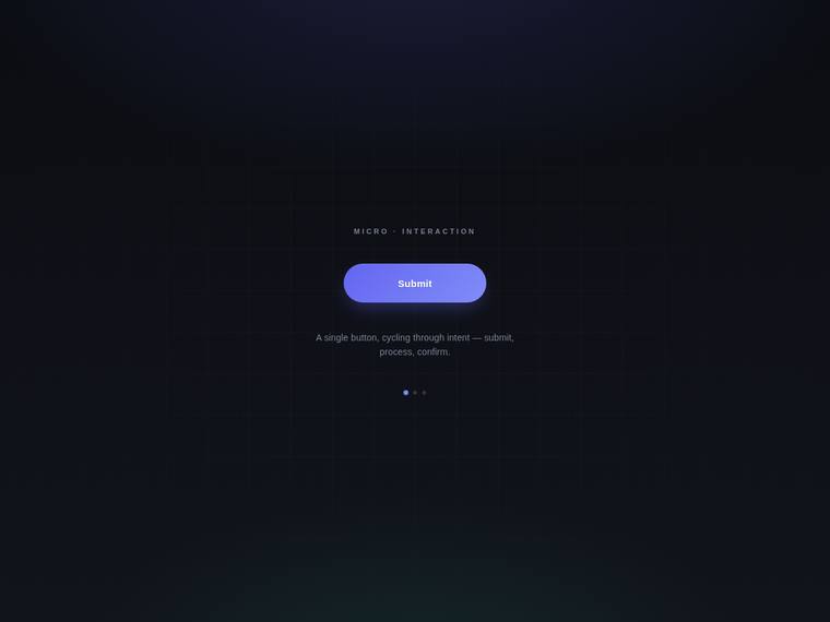
Composite 57.8%Judge 3.3/5
Judge panelAnthropic 3.5/5OpenAI 3.8/5Google 3.0/5
single-judge (Claude) 3.5/5 → leave-one-family-out 3.3/5
Anthropic: The frame shows a clean, well-composed centered stage with a tasteful violet "Submit" pill, an eyebrow label, a subtle grid background, and a caption describing the submit/process/confirm cycle - the static elements are coherent and modern with restrained color and spacing. State dots hint at the morphing loop, but in this captured frame only the "Submit" state is visible, so the brief's core spinner-to-checkmark transformation cannot be confirmed, leaving fidelity and impact moderate. Detailing is finished and consistent with no visible breakage, but the screenshot reads more like a polished
OpenAI: The page is cleanly centered with a polished primary button and subtle caption, but the screenshot only shows the submit state; the loading spinner, success checkmark, and looping morph are not visible, so the core requested interaction cannot be verified. Visual styling is modern and premium with good spacing, glow, and restrained typography, though the static frame is less distinctive without the animated states.
Google: The centered layout captures the requested premium aesthetic with strong typography and a subtle grid. The dark theme is visually polished, though the requested animation loop cannot be judged statically.
claude-sonnet-4-6
High reasoning
Composite 56.3%Judge 3.3/5
Judge panelAnthropic 2.5/5OpenAI 3.5/5Google 2.8/5
single-judge (Claude) 2.5/5 → leave-one-family-out 3.3/5
Anthropic: The frame shows the loading/spinner state on a clean centered dark stage with a state legend (Idle/Loading/Success) and a caption, covering most of the brief, though the button affordance and the morph itself read weakly in this still. Composition is restrained and centered but the stage is mostly empty negative space, and the spinner arc looks faint and slightly rough rather than crisp. Craft is undercut by the visibly thin spinner and an em-dash in the caption, and nothing here feels distinctive or premium enough to stop a reviewer.
OpenAI: The screenshot shows a clean centered stage with a loading spinner state and subtle captions, but the primary button, morph sequence, and success checkmark are not visible in this captured frame, so fidelity can only be partially credited. The dark minimalist composition, restrained purple accents, and typography feel tasteful and polished, though the button is very subdued and the overall result is more quiet than memorable.
Google: The design centers the requested animation state and subtle caption. Low contrast limits the visual clarity of the button container. Overall execution is clean but visually plain.
claude-opus-4-8
Low reasoning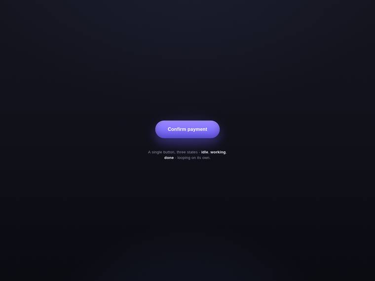
Composite 56.3%Judge 3.3/5
Judge panelAnthropic 3.5/5OpenAI 3.3/5Google 3.5/5
single-judge (Claude) 3.5/5 → leave-one-family-out 3.3/5
Anthropic: The visible frame shows a clean centered stage with a well-styled violet gradient pill button reading "Confirm payment" and a subtle caption naming the three states (idle, working, done), all on a tasteful near-black background with nice glow and spacing. As a static screenshot only the idle state is captured, so the morph-to-spinner/checkmark behavior the brief centers on cannot be confirmed visually, which caps fidelity and impact. The composition is modern and the button has clear craft (gradient, soft shadow, rounded form), but the result reads as a single resting button rather than a dist
OpenAI: The screenshot shows a clean centered stage with a polished primary button and subtle caption, but it does not visibly demonstrate the required morph into a spinner or success checkmark, so the core animation brief cannot be verified. The visual treatment is modern and tasteful with strong spacing, glow, and typography, though the static result is fairly conventional rather than especially memorable.
Google: The centered button and subtle caption effectively meet the core visual layout requirements with a clean, modern aesthetic. The gradient glow and dark theme provide a tasteful feel, though the static format limits assessing the animation's full impact.
claude-opus-4-8
Max reasoning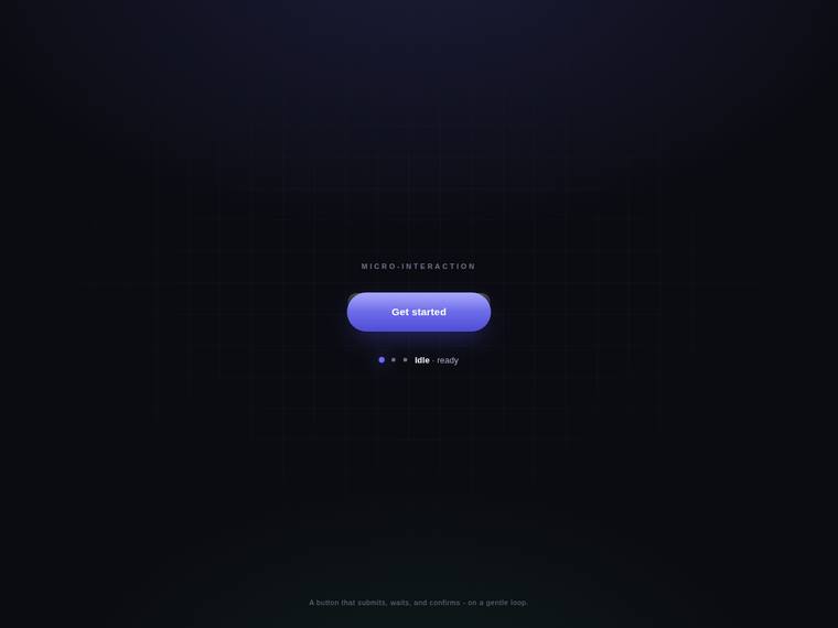
Composite 56.3%Judge 3.3/5
Judge panelAnthropic 4.0/5OpenAI 3.5/5Google 3.3/5
single-judge (Claude) 4.0/5 → leave-one-family-out 3.3/5
Anthropic: The static frame shows a clean, centered dark stage with a tasteful violet-gradient "Get started" pill button, a "MICRO-INTERACTION" eyebrow, an "Idle - ready" state indicator with dot-stepper, and the subtle caption the brief required, all on a faint perspective grid that reads as deliberate and premium. Composition, type, color, and detail are coherent and well-finished with no broken elements. It loses a point on impact and fidelity because the captured frame is only the idle state - the spinner/checkmark morph is not visible to confirm - and the button sits small in a large quiet canvas, m
OpenAI: The centered dark stage, primary button, state dots, and subtle captions are polished and aligned with the brief’s premium tone. However, the screenshot only shows the idle button state; the loading spinner, success checkmark, and morphing loop are not visible, which limits brief fidelity and impact.
Google: The layout provides a clean, premium aesthetic with good typography and spacing. The static view suggests solid overall craft.
claude-fable-5
High reasoning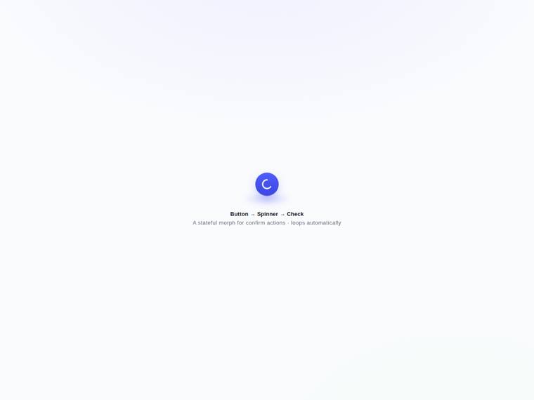
Composite 54.7%Judge 3.2/5
Judge panelAnthropic 3.8/5OpenAI 3.5/5Google 3.5/5
single-judge (Claude) 3.8/5 → leave-one-family-out 3.2/5
Anthropic: The frame shows the spinner phase of the morph on a clean, centered stage with an indigo pill/circle, a soft glow, and a subtle two-line caption ("Button → Spinner → Check" / "A stateful morph for confirm actions · loops automatically"), so the brief's core elements are represented and the palette/typography are coherent and modern. Craft looks finished with no broken bits, though the spinner arc is thin and plain. Impact is only moderate: the element is small against a lot of empty space and, in a static frame, reads as a fairly generic loading spinner rather than a distinctive, stop-and-star
OpenAI: The page is cleanly centered with a tasteful blue spinner state and a subtle caption, but the visible screenshot does not show the primary button or success checkmark states, so the full requested morphing cycle cannot be verified. The composition, type, spacing, and soft shadow feel polished, though the result is fairly minimal and generic rather than especially premium or distinctive.
Google: The layout meets the brief with a cleanly centered stage and subtle typography. The visual finish is professional, but the overall impact remains standard rather than highly distinctive.
claude-opus-4-8
Medium reasoning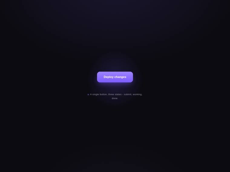
Composite 54.2%Judge 3.2/5
Judge panelAnthropic 3.5/5OpenAI 3.5/5Google 3.3/5
single-judge (Claude) 3.5/5 → leave-one-family-out 3.2/5
Anthropic: The frame shows a clean, well-composed violet "Deploy changes" button centered on a dark stage with a tasteful radial glow and a legible (if faint) caption naming the three states, so the base elements and styling are present and modern. However, the screenshot only captures the "submit" state - the spinner and checkmark morph that is the actual point of the brief is not visible in this static frame, so the core looping micro-animation can't be verified. The button itself is finished and premium-leaning, but as a still it reads as just a button rather than the distinctive multi-state interacti
OpenAI: The screenshot shows a clean centered stage with a polished primary button and subtle caption, but the required spinner and success checkmark states are not visible, so the looping morphing interaction cannot be confirmed. The dark premium styling, spacing, glow, and typography are tasteful and finished, though the visible result is fairly minimal and not especially distinctive.
Google: The layout correctly features a centered primary button and caption, meeting the static visual requirements. The dark theme and glowing elements provide a modern look, though the requested animation cannot be evaluated. It serves as a solid foundation with standard polish.
grok-composer-2.5-fast
default reasoning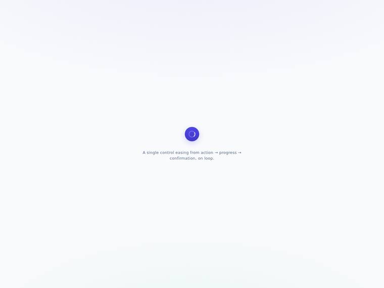
Composite 54.2%Judge 3.2/5
Judge panelAnthropic 3.0/5OpenAI 3.3/5Google 3.3/5
single-judge (Claude) 3.0/5 → leave-one-family-out 3.2/5
Anthropic: The still captures only the spinner state of the loop, with a clean centered violet control and a matching subtle caption, so the caption and at least one animation state are clearly present, but the button label and success checkmark stages cannot be confirmed from this frame. Composition is tidy and free of janky artefacts, with restrained colour and a soft gradient backdrop. However, a single small spinner on a large empty canvas reads as under-composed and plain, so it lacks the distinctive, premium presence that would make a reviewer stop.
OpenAI: The screenshot shows a clean centered stage with a subtle caption and a polished circular loading state, but the primary button and success checkmark phases are not visible, so the full requested morphing loop cannot be verified. The visual treatment is tasteful and minimal with good spacing and color, though the result feels very understated and not especially distinctive or premium from this frame alone.
Google: The design features a clean layout with the requested loading state and a subtle caption. Visuals are minimalist and use a tasteful gradient. Overall impact is competent but constrained by the static format.
gpt-5.5-pro
High reasoning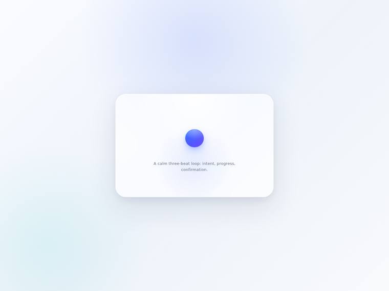
Composite 52.1%Judge 3.1/5
Judge panelAnthropic 2.5/5OpenAI 3.3/5Google 3.3/5
single-judge (Claude) 2.5/5 → leave-one-family-out 3.1/5
Anthropic: The frame shows a clean centered card with a single blue gradient sphere and a subtle caption ("A calm three-beat loop: intent, progress, confirmation"), so the stage, caption, and brand color read well. But the brief's core deliverable - a button morphing through spinner and checkmark states - is not legible here: there is no button form, no spinner, and no checkmark; only a plain dot, so brief fidelity is weak in this captured moment. The composition is tasteful and soft but generic and low-contrast, and as a static image it is not premium or distinctive enough to make a reviewer stop.
OpenAI: The page has a clean centered stage and subtle caption, but the visible state is only a blue circular element with no primary button label, spinner, or success checkmark evident in the screenshot. The soft gradients, rounded card, and spacing feel polished and modern, though the result is too minimal to fully communicate the requested premium morphing micro-animation.
Google: The layout features a clean, centered stage with a subtle caption that aligns with the requested premium aesthetic. Static constraints limit verification of the animation states, but the visible polish is competent. Overall composition is balanced and modern.
gpt-5.4-mini
High reasoning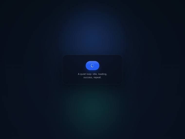
Composite 50.0%Judge 3.0/5
Judge panelAnthropic 2.8/5OpenAI 3.5/5Google 3.3/5
single-judge (Claude) 2.8/5 → leave-one-family-out 3.0/5
Anthropic: The frame captures the loading state of the requested button-to-spinner-to-checkmark cycle and includes the subtle caption, so the core brief is partially evidenced, but only the spinner phase is visible and the idle/success states cannot be confirmed from a still. The dark card, blue pill button, and ambient blue/green glows are competently composed and modern, but the layout is generic and the spinner glyph looks slightly small and undersaturated against the bright button. Nothing is broken, yet it reads as a routine loading widget rather than a premium, stop-and-look micro-interaction.
OpenAI: The screenshot shows a clean centered stage with a subtle caption and a button-like loading spinner state, but the idle button, success checkmark, and actual looping morph animation are not visible. The dark gradient, soft card, spacing, and typography feel polished and modern, though the result is quite restrained and not especially distinctive from a premium micro-interaction perspective.
Google: The design centers the requested elements on a premium, subtly glowing dark stage. The visible spinner and clean typography suggest good alignment with the micro-animation brief. Overall visual polish is solid.
gpt-5.5
High reasoning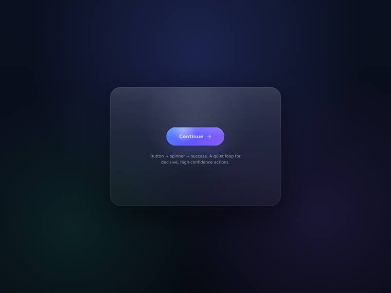
Composite 50.0%Judge 3.0/5
Judge panelAnthropic 2.8/5OpenAI 3.5/5Google 3.0/5
single-judge (Claude) 2.8/5 → leave-one-family-out 3.0/5
Anthropic: The frame shows a centered dark card with a "Continue" pill button, a small gradient morph element, and a subtle two-line caption, so the core scaffolding (centered stage, button, caption) is present, but the spinner/checkmark states cannot be confirmed from this single frame and the visible button looks mid-morph rather than resolved. The dark gradient backdrop with a faint green glow and soft glassy card is coherent but fairly generic, and the button glyph reads slightly muddy/half-rendered. Overall it is competent and tidy but not distinctive or premium enough to make a reviewer stop.
OpenAI: The page is clean, centered, and includes a primary button plus a subtle caption, but the requested spinner/checkmark morphing loop is not visible in this screenshot. The dark gradient stage and glassy panel feel polished and modern, though the result reads more like a static button demo than a standout premium micro-interaction.
Google: The design provides a premium, centered layout with a cleanly styled button and subtle caption. The aesthetic is modern, though animation cannot be assessed statically.
claude-haiku-4-5
default reasoning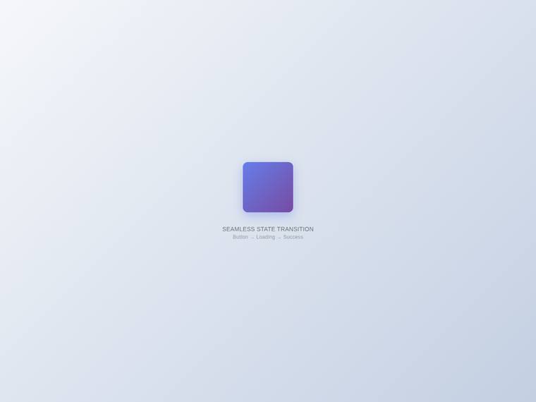
Composite 50.0%Judge 3.0/5
Judge panelAnthropic 2.8/5OpenAI 2.5/5Google 3.0/5
single-judge (Claude) 2.8/5 → leave-one-family-out 3.0/5
Anthropic: The frame shows a clean centered stage with a tasteful purple gradient rounded shape and a clear two-line caption ("SEAMLESS STATE TRANSITION" / "Button → Loading → Success"), so the concept and caption are present. However the captured state is just a featureless gradient square with no visible button label, spinner, or checkmark, so the core morph the brief asked for cannot be confirmed in this still, and the element sits small in a large empty canvas. It reads competent and clean but generic, lacking the distinctive, premium finish a reviewer would stop on.
OpenAI: The stage is clean and centered with a subtle caption, but the visible state is just a rounded purple square with no readable primary button, loading spinner, or success checkmark. The composition and colors are tasteful enough, yet the execution feels incomplete and lacks the premium micro-interaction impact requested.
Google: The layout features a clean, centered stage with a pleasant gradient and the requested subtle caption. However, the primary interactive element is ambiguous in this static frame. The visual execution is minimal but lacks distinctiveness.
deepseek-v4-flash
default reasoning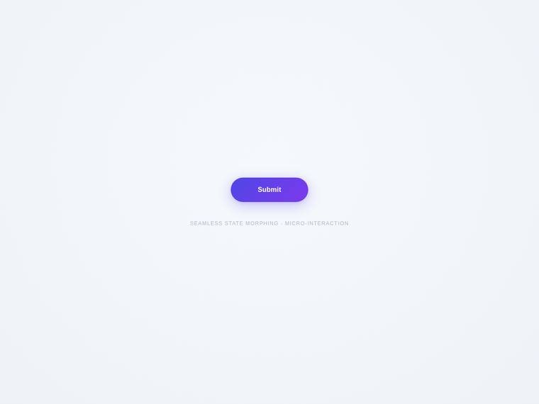
Composite 48.4%Judge 2.9/5
Judge panelAnthropic 2.8/5OpenAI 3.3/5Google 3.0/5
single-judge (Claude) 2.8/5 → leave-one-family-out 2.9/5
Anthropic: The frame shows a clean centered stage with a well-styled violet "Submit" pill (soft shadow, good padding) and an on-brief subtle caption "SEAMLESS STATE MORPHING · MICRO-INTERACTION", so the resting state and caption are correct. However the screenshot captures only the default button with no visible spinner or checkmark, so the core morph the brief asks for is unverifiable from this frame. The styling is competent but generic, with a lot of empty space and nothing distinctive enough for a reviewer to stop on.
OpenAI: The screenshot shows a clean centered primary button with a subtle caption, but it does not visibly demonstrate the required morph into a loading spinner or success checkmark. The visual styling is polished and restrained with good spacing, color, and shadow treatment, though the result is fairly conventional and lacks a distinctive premium moment in the captured state.
Google: The layout is centered with a gradient button and subtle caption, adequately addressing visible requirements. Visual elements are polished, though animation cannot be judged statically.
claude-haiku-4-5
High reasoning
Composite 47.9%Judge 2.9/5
Judge panelAnthropic 3.0/5OpenAI 3.3/5Google 2.8/5
single-judge (Claude) 3.0/5 → leave-one-family-out 2.9/5
Anthropic: The visible frame shows a clean, centered violet-gradient "Submit" button with a soft shadow and a small uppercase caption "SEAMLESS STATE MORPHING", so the base button and caption from the brief are present and the composition is tidy and well-balanced. But the screenshot only captures the default Submit state - none of the loading-spinner or success-checkmark morph states the brief centers on are evident, and the single button on a large empty background reads as plain rather than premium. Craft on the rendered element is solid (rounded corners, gradient, gentle shadow), but the result is co
OpenAI: The screenshot shows a clean centered stage with a tasteful primary button and subtle caption, but the required spinner and success checkmark states are not visible, so the core looping morphing interaction cannot be verified. The visual styling is polished and balanced with pleasant color, spacing, and shadow, though the result is relatively minimal and not especially distinctive from a static view.
Google: The layout cleanly meets the static brief requirements with a centered button and subtle caption. While the visual aesthetic is generally modern, minor typography details keep it from feeling fully premium. The execution is solid but lacks strong distinctiveness.
grok-4.3
default reasoning
Composite 47.9%Judge 2.9/5
Judge panelAnthropic 2.8/5OpenAI 3.0/5Google 3.0/5
single-judge (Claude) 2.8/5 → leave-one-family-out 2.9/5
Anthropic: The frozen frame shows the spinner state of the cycle - an indigo circular button with a soft glow and a partial loading ring - plus the required subtle caption, so the core micro-interaction and label are present and clean. However the focal element is tiny against a vast empty stage, only one of the morph states is captured, and there is no visible button-label or checkmark moment, so brief fidelity reads as partial in a still. Styling is tasteful but minimal and generic; the composition is competent yet underwhelming and would not make a reviewer stop.
OpenAI: The visible state shows a clean centered spinner-like control with a subtle caption, but the primary button, success checkmark, and looping morph are not visible in the screenshot. The composition, color, spacing, and shadow feel polished and modern, though the result is very sparse and lacks the premium, memorable impact requested.
Google: The design successfully centers a polished element with the requested subtle caption. Visuals are clean with soft shadows, though the static format limits animation review.
grok-build-0.1
default reasoning
Composite 45.8%Judge 2.8/5
Judge panelAnthropic 2.5/5OpenAI 3.0/5Google 3.0/5
single-judge (Claude) 2.5/5 → leave-one-family-out 2.8/5
Anthropic: The frame shows a blue button mid-cycle in the spinner state with a subtle "Premium micro-interaction" caption, so the core concept and caption from the brief are present, but as a static capture I can only confirm one state, not the full morph. Craft is the weak point: the button is a wide stretched oval rather than a clean pill, and the spinner arc sits off-center inside it, which reads as janky rather than polished. The overall stage is clean but very sparse and small, so it lacks the premium, stop-and-look distinctiveness a top design team's micro-interaction would carry.
OpenAI: The page is cleanly centered with a subtle caption and appears to show the button in a loading/spinner phase, but the screenshot does not visibly demonstrate the full button-to-spinner-to-checkmark cycle or a clear primary button state. The visual treatment is modern and restrained, though the animation state looks a bit faint/ambiguous with slight ghosting, and the overall result feels too minimal and generic to read as a premium standout micro-interaction.
Google: The screenshot captures a clean layout featuring the requested loading state and subtle caption. The design is neat and professional, though visually understated.
claude-sonnet-5
High reasoning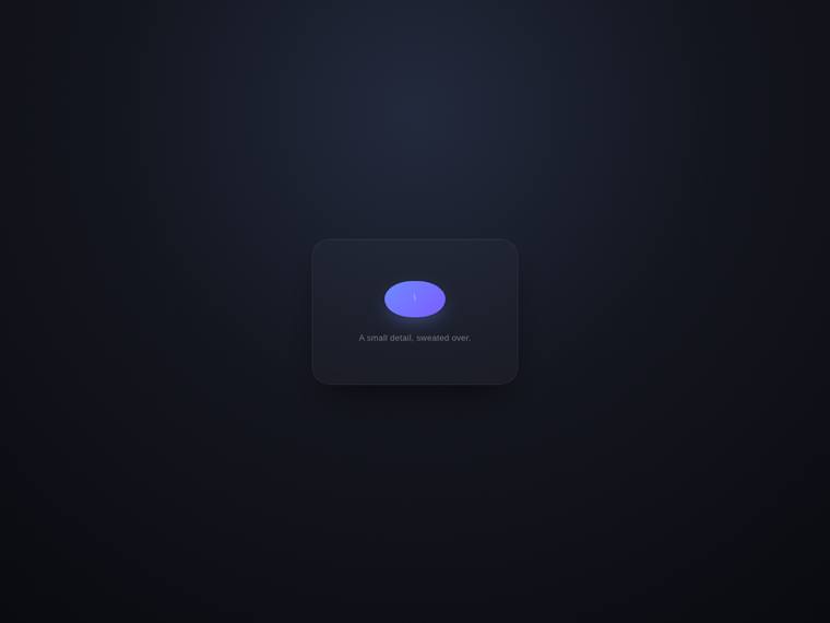
Composite 43.8%Judge 2.8/5
Judge panelAnthropic 2.5/5OpenAI 3.3/5Google 3.0/5
single-judge (Claude) 2.5/5 → leave-one-family-out 2.8/5
Anthropic: The clean centered dark stage, the rounded card with a subtle border and soft shadow, and the tasteful caption "A small detail, sweated over." are all present and on-brief. However the central morph element renders as a squashed, flattened violet ellipse with an unclear white sliver inside, so it does not clearly read as a button, spinner, or checkmark - in this frozen frame it looks malformed and janky rather than premium. The surrounding composition is competent and modern, but the broken-looking core interaction undercuts the craft and the wow factor a reviewer would stop on.
OpenAI: The composition is clean and centered with a subtle caption and a button-like animated state, but the screenshot only shows an ambiguous purple pill with a tiny white mark, not a clearly readable button-to-spinner-to-checkmark cycle. The dark premium styling and spacing are tasteful, though the micro-interaction's purpose is not visually clear enough to feel fully polished or distinctive.
Google: The design features a clean, centered dark-mode stage that meets the basic layout requirements. The static capture shows an awkward button state, limiting the perceived premium feel. Overall, it provides an adequate but unremarkable visual presentation.
grok-4.20-reasoning
default reasoning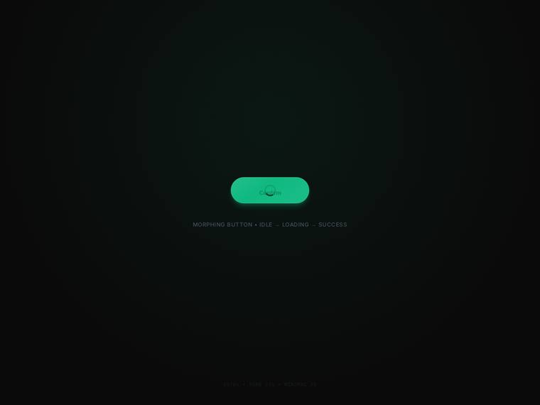
Composite 43.7%Judge 2.7/5
Judge panelAnthropic 2.5/5OpenAI 3.3/5Google 2.5/5
single-judge (Claude) 2.5/5 → leave-one-family-out 2.8/5
Anthropic: The frame shows the idle button state with a correct caption ("MORPHING BUTTON • IDLE → LOADING → SUCCESS"), so the concept is communicated, but no spinner or checkmark state is visible to confirm the full morph. The button label is blurred and smeared rather than crisp, which reads as a janky render artifact and undercuts the "premium" goal. The dark centered stage is coherent but very sparse and underlit, and the green pill alone does not produce a distinctive, stop-and-look result.
OpenAI: The centered dark stage, pill primary button, loading indicator, and subtle caption align with the brief, but the screenshot only shows a partial loading state and not a clear morph into spinner or success checkmark. The visual styling is clean and modern with good spacing and glow, though the spinner/text overlap looks unfinished and reduces the premium feel.
Google: The design includes the requested centered button and subtle captions. However, visible overlapping between the text and spinner ring reveals implementation flaws. This lack of refinement significantly undermines the requested premium aesthetic.
kimi-k2.7-code
default reasoning
Composite 42.2%Judge 2.7/5
Judge panelAnthropic 2.5/5OpenAI 2.5/5Google 3.0/5
single-judge (Claude) 2.5/5 → leave-one-family-out 2.7/5
Anthropic: The frame shows a clean centered stage with a status line ("Processing") and a subtle caption ("Auto-repeating demo"), implying the looping button-to-spinner morph the brief asked for, so the concept is present. But in this captured frame the element is just a featureless solid dark disc with no visible button label, spinner arc, or checkmark, so none of the distinctive morph states actually read - it looks like a plain blob rather than a premium micro-interaction. Type and spacing are tidy but unremarkable, and the lone dark circle gives the page little visual interest or polish.
OpenAI: The page is clean, centered, and includes a subtle caption, but the visible build only shows a dark circular state with processing text rather than a clear primary button, loading spinner, or success checkmark. The composition is tasteful but very sparse, and without visible morphing details or distinctive styling it does not read as a premium shipped micro-interaction.
Google: The layout is appropriately centered and minimal, matching the requested staging. While the visual alignment is solid, the static frame lacks the distinctiveness to leave a strong impression.
gemini-3.1-pro-preview
High reasoning
Composite 41.7%Judge 2.7/5
Judge panelAnthropic 2.8/5OpenAI 2.5/5Google 3.3/5
single-judge (Claude) 2.8/5 → leave-one-family-out 2.7/5
Anthropic: The frame shows the expected centered dark circular control mid-spinner with a subtle caption on a clean light stage, so the core concept reads, but as a still it only proves one state (spinner) - the button, success checkmark, and morph cannot be confirmed from this frame. Composition is tidy and the subtle shadow is a nice touch, yet it is very minimal and generic: a small dark dot with a thin spinner arc and faint grey caption text. Nothing here is distinctive or premium enough to make a reviewer stop, and the tiny scale plus near-invisible caption limit the impact.
OpenAI: The screenshot shows a clean centered spinner state with a subtle caption, but it does not visibly demonstrate the primary button, success checkmark, or the morphing cycle requested. The composition is tidy and restrained, though very sparse and generic, with limited premium detail or distinctive visual polish.
Google: The layout provides a clean, centered stage with the requested UI element and a subtle caption. The minimalist approach demonstrates solid alignment and craft, though the extreme simplicity moderates its overall distinctiveness in a static format.
gemini-3.1-flash-lite
default reasoning
Composite 39.6%Judge 2.6/5
Judge panelAnthropic 1.8/5OpenAI 3.3/5Google 2.8/5
single-judge (Claude) 1.8/5 → leave-one-family-out 2.6/5
Anthropic: The frame captures the spinner state of the morphing button on a clean centered stage, and a subtle caption ("UI COMPONENT STATE CYCLE") is present, so the basic structure of the brief is attempted. But the execution looks unfinished and janky: the spinner sits inside an oversized black pill with awkward empty space rather than a refined morph, the type is a plain grey label with no premium feel, and the composition reads as a generic loader rather than a polished button micro-interaction. Nothing here would make a reviewer stop; it lacks the eased, considered detail and visual coherence a top
OpenAI: The screenshot shows a clean centered stage with a pill-shaped control, loading spinner, and subtle caption, but the primary button label and success checkmark state are not visible, so the full requested morphing cycle cannot be confirmed. The composition is tasteful and minimal with good spacing, though the result feels quite generic and lacks the premium distinctiveness expected from the brief.
Google: The layout provides a clean, centered stage with the requested loading state and subtle caption. Visual execution is competent but highly minimal, resulting in a lack of strong visual distinction. The static presentation meets baseline requirements without making a significant impression.
claude-sonnet-5
High reasoning
Composite 37.5%Judge 2.5/5
Judge panelAnthropic 2.8/5OpenAI 2.8/5Google 2.8/5
single-judge (Claude) 2.8/5 → leave-one-family-out 2.5/5
Anthropic: The frame shows the required primary "Get Started" button on a clean centered dark stage with a "looping demo" caption, so the core elements are present, but the morph-to-spinner/checkmark states cannot be evidenced in this single frame and the redundant "CLICK TO CONTINUE" label muddies the "subtle caption" intent. The button itself reads as a flat, muted slate pill that looks unfinished rather than premium, and the background gradient mixes a purple top-left with an off-palette green bottom-right that feels muddy. Composition is competent and nothing is broken, but the result is unremarkable
OpenAI: The screenshot shows a clean centered primary button with subtle captioning, but the required spinner, success checkmark, and morphing loop are not visible, so fidelity to the core animation brief is limited. The dark gradient stage and spacing feel tasteful and modern, though the result is very understated and lacks the premium, distinctive micro-interaction impact requested.
Google: The design provides a clean, centered stage with competent dark-themed aesthetics and subtle captions. While visually polished, the overall layout lacks a truly distinctive feel. Furthermore, the required animation states cannot be evaluated from a static image.
claude-sonnet-4-6
High reasoning
Composite 8.3%Judge 1.3/5
Judge panelAnthropic 1.0/5OpenAI 1.0/5Google 2.0/5
single-judge (Claude) 1.0/5 → leave-one-family-out 1.3/5
Anthropic: The screenshot is entirely blank - a fully white page with no visible content whatsoever. None of the brief's required elements (the morphing button, spinner, checkmark, centered stage, or caption) are rendered. This is a broken or failed build with nothing to evaluate.
OpenAI: The screenshot appears to be a blank white page with no visible button, spinner, checkmark, animation stage, or caption. With no rendered UI elements present, it does not satisfy the brief and provides no visual craft or premium impact to evaluate.
Google: The provided screenshot is entirely blank, missing all requested elements like the button, animation, and caption. It fails to meet the brief's basic design requirements. The build appears unrendered.